This textbook was authored for the CC 120 - Web Page Development course at Kansas State University. This front matter is specific to that course. If you are not enrolled in the course, please disregard this section.
Welcome to CC120! Please take the time to read through the syllabus. Content for this course will be delivered through a variety of platforms, all can be found by starting in Canvas. This textbook as well as Codio (link in Canvas) will be the primary sources of information.
Subsections of Course Information
Fall 2023 Syllabus
CC 120 - Web Page Design - Fall 2024
Contact
Info
Our preferred method of contact will be through the Edstem Discussion board. Any questions or feedback can be posted there. More detail on using this platform can be found below and in Canvas.
All emails for the course should be sent to cc120-help@KSUemailProd.onmicrosoft.com (sorry I know it’s a long address). This will contact the professors and ALL the TAs for the course and guarantee the fastest response time if contacting via email. You are welcome to send emails that may contain more sensitive information directly to intended recipients.
Please allow at least one full business day for responses to any inquiry.
This semester, we will be using edstem.org, specifically, there Ed Discussion platform. Ed Discussion is a reddit/forum style web app that allows students to post and ask questions. This will be our preferred way of communication when it comes to questions/etc. in the course. Please adhere to the following guidelines:
Before creating a new thread, please make sure there isn’t a similar one already made.
If you are asking a question in Ed Discussion, please correctly mark it as such along with the correct tags.
Please make your thread public when possible in case others have the same questions.
Threads can be made anonymous when needed. Course staff may anonymize private threads and make them public if they find it to be beneficial for the class.
When posting code, please do not post solutions or part of solutions to homework. If you need to share your code with us, please make your thread private.
If you would like a new category or tag made, please let us know!
If you need help getting started with the platform, please go through the following links:
The Internet, web browsers, and web-page-development technology: web-page design and implementation with Hypertext Markup Language (HTML), and CSS. Integration of program script into web pages. Introduction to graphics design, animation, and server utilization.
Required Texts
This course does not have a required print textbook. The resources presented in the modules are also organized into an online textbook that can be accessed here: https://textbooks.cs.ksu.edu/cc120/. You may find this a useful reference if you prefer a traditional textbook layout. Additionally, since the textbook exists outside of Canvas’ access control, you can continue to utilize it after the course ends.
Warning
Please note that the materials presented in Canvas have additional graded assignments and exercises worked into the reading order that do not appear in the online edition of the textbook. You are responsible for completing these!
CS Departmental Textbook Server
The CC 120 course textbook is only one of several textbooks authored by your instructors and made available on the departmental server. For example, your CC 120 textbook is also available there for you to go back and review. You can access any of these textbooks at the site https://textbooks.cs.ksu.edu
O’Riley for Higher Education
If you are looking for additional resources to support your learning, a great resource that is available to Kansas State University students is the O’Riley For Higher Education digital library offered through the Kansas State University Library. These include electronic editions of thousands of popular textbooks as well as videos and tutorials. As of this writing, a search for HTML returns 29,226 results, CSS returns 9106 results, and JavaScript returns 19,015 results. In particular, I would recommend these books:
There are likewise materials for other computer science topics you may have an interest in - it is a great resource for all your CS coursework. It costs you nothing (technically, your access was paid for by your tuition and fees), so you might as well make use of it!
MDN Web Docs
The MDN Web Dos is a collection of documentation and developer resources. It documents the web standards and discusses exactly how different browsers have implemented them. It is the official documentation source for the Mozilla browser AND for Google, Microsoft, and Samsung’s browsers.
Course Description
In this course students gain experience writing web pages using the three core client-side technologies of the world-wide web: HTML, CSS, and JavaScript. Additionally, we examine how the world-wide-web works, especially HTTP requests and responses. The goal is to help you develop the fundamental skills to develop interesting, effective, accessible, and reliable web pages using current industry standards.
Major Course Topics
The World-Wide-Web
Web Pages
Browsers and web clients
Hyper-Text Transfer Protocol (HTTP)
Hyper Text Markup Language (HTML)
Cascading Style Sheets (CSS)
CSS Animations
JavaScript (JS)
The Document Object Model (DOM)
Web Accessability
Web Forms
Web Requests
Web Graphics
Web Hosting
Common Web Libraries
Student Learning Outcomes
After completing this course, a successful student will be able to:
Create valid HTML webpages using separation of concerns with HTML, CSS, and JavaScript.
Use CSS rules to create engaging, effective, accessible, and responsive web page designs.
Utilize HTML forms to submit data to a web API
Use JavaScript to dynamically modify the structure and appearance of a webpage.
Employ AJAX/Fetch requests to interact with Web APIs.
Think critically about web page design and apply solid web page design principles to their work.
Course Structure
These courses are being taught 100% online, and each module is self-paced. There may be some bumps in the road as we refine the overall course structure. Students will work at their own pace through a set of modules, with approximately one module being due each week. Material will be provided in the form of recorded videos, online tutorials, links to online resources, and discussion prompts. Each module will include a coding project or assignment, many of which will be graded automatically through Codio. Assignments may also include portions which will be graded manually via Canvas or other tools.
A common axiom in learner-centered teaching is “the person doing the work is the person doing the learning.” What this really means is that students primarily learn through grappling with the concepts and skills of a course while attempting to apply them. Simply seeing a demonstration or hearing a lecture by itself doesn’t do much in terms of learning. This is not to say that they don’t serve an important role - as they set the stage for the learning to come, helping you to recognize the core ideas to focus on as you work. The work itself consists of applying ideas, practicing skills, and putting the concepts into your own words.
The Work
Warning
There is no shortcut to becoming a web developer. Only by doing the work will you develop the skills and knowledge to make you a successful computer scientist. This course is built around that principle, and gives you ample opportunity to do the work, with as much support as we can offer. Posting (even if you don’t get a response) course content on Stack Overflow, Chegg, or other similar websites is expressly forbidden and will result in an XF. This also includes viewing solutions to course content that has not been provided to you through canvas by your instructor or TA. The use of AI assisted tools to write your assignments is also explicitly forbidden (ChatGPT, GitHub Code Pilot, etc.). You may use these tools as help in the learning process, but work that you submit for a grade must be 100% done by you and only you.
*If you are struggling in the course or you have doubts on something, please ask! Your instructors and TAs are here to help!*
Quizzes Many modules will include quizzes which cover the theory, concepts, and vocabulary used in web development. This is all information you should be familiar with as a future web developer. Most quizzes will allow multiple retakes.
Tutorials & Examples: Each module will include many tutorial assignments and examples that will take you step-by-step through using a particular concept or technique. The point is not simply to complete the example, but to practice the technique and coding involved. You will be expected to implement these techniques on your own in project assignments, so it is important that you take the time to learn from these.
Project Assignments: Throughout the semester you will be building a number of web pages, including a personal website. Note that all web pages you build for this course should be valid - your HTML, CSS, and JavaScript must conform to the standards. Additionally, you will be expected to address accessibility and security in your projects once we’ve covered these topics.
Grading
In theory, each student begins the course with an A. As you submit work, you can either maintain your A (for good work) or chip away at it (for less adequate or incomplete work). In practice, each student starts with 0 points in the gradebook and works upward toward a final point total earned out of the possible number of points. In this course, each assignment constitutes a portion of the final grade, as detailed below:
30% - Quizzes
30% - Tutorials & Exercises
40% - Projects
Up to 5% of the total grade in the class is available as extra credit. See the Extra Credit - Bug Bounty & Extra Credit - Helping Hands assignments for details.
Letter grades will be assigned following the standard scale:
90% - 100% → A
80% - 89.99% → B
70% - 79.99% → C
60% - 69.99% → D
00% - 59.99% → F
Submission, Regrading, and Early Grading Policy
As a rule, submissions in this course will not be graded until after they are due, even if submitted early. Students may resubmit assignments many times before the due date, and only the latest submission will be graded. For assignments submitted via GitHub release tag, only the tagged release that was submitted to Canvas will be graded, even if additional commits have been made. Students must create a new tagged release and resubmit that tag to have it graded for that assignment.
Once an assignment is graded, students are not allowed to resubmit the assignment for regrading or additional credit without special permission from the instructor to do so. In essence, students are expected to ensure their work is complete and meets the requirements before submission, not after feedback is given by the instructor during grading. However, students should use that feedback to improve future assignments and milestones.
For the website milestones, it is solely at the discretion of the instructor whether issues noted in the feedback for a milestone will result in grade deductions in a later milestones if they remain unresolved, though the instructor will strive to give students ample time to resolve issues before any additional grade deductions are made.
Likewise, students may ask questions of the instructor while working on the assignment and receive help, but the instructor will not perform a full code review nor give grading-level feedback until after the assignment is submitted and the due date has passed. Again, students are expected to be able to make their own judgments on the quality and completion of an assignment before submission.
That said, a student may email the instructor to request early grading on an assignment before the due date, in order to move ahead more quickly. The instructor’s receipt of that email will effectively mean that the assignment for that student is due immediately, and all limitations above will apply as if the assignment’s due date has now passed.
Collaboration Policy
In this course, all work submitted by a student should be created solely by the student without any outside assistance beyond the instructor and TA/GTAs. Students may seek outside help or tutoring regarding concepts presented in the course, but should not share or receive any answers, source code, program structure, or any other materials related to the course. Learning to debug coding problems is a vital skill, and students should strive to ask good questions and perform their own research instead of just sharing broken source code when asking for assistance.
Late Work
Warning
Read this late work policy very carefully! If you are unsure how to interpret it, please contact the instructors via email. Not understanding the policy does not mean that it won’t apply to you!
Since this course is entirely online, students may work at any time and at their own pace through the modules. However, to keep everyone on track, there will be approximately one module due each week. Each graded item in the module will have a specific due date specified. Any assignment submitted late will have that assignment’s grade reduced by 10% of the total possible points on that project for each day it is late (pro-rated by hour). This penalty will be assessed automatically in the Canvas gradebook. For the purposes of record keeping, a combination of the time of a submission via Canvas and the creation of a release in GitHub will be used to determine if the assignment was submitted on time.
However, even if a module is not submitted on time, it must still be completed before a student is allowed to begin the next module. So, students should take care not to get too far behind, as it may be very difficult to catch up.
Finally, all course work must be submitted on or before the last day of the semester in which the student is enrolled in the course in order for it to be graded on time.
If you have extenuating circumstances, please discuss them with the instructor as soon as they arise so other arrangements can be made. If you find that you are getting behind in the class, you are encouraged to speak to the instructor for options to make up missed work.
Recommended Texts & Supplies
To participate in this course, students must have access to a modern web browser and broadband internet connection. All course materials will be provided via Canvas and Codio. Modules may also contain links to external resources for additional information, such as programming language documentation.
Students may choose to do some development work on their own computer. The recommended software is Visual Studio Code along with access to a system running Ubuntu. For Windows systems, Ubuntu can be installed via the Windows Subsystem for Linux. For Mac systems, Ubuntu can be installed in a virtual machine through VirtualBox.
Safe Zone Statement
We are part of the SafeZone community network of trained K-State faculty/staff/students who are available to listen and support you. As a SafeZone Ally, I can help you connect with resources on campus to address problems you face that interfere with your academic success, particularly issues of sexual violence, hateful acts, or concerns faced by individuals due to sexual orientation/gender identity. My goal is to help you be successful and to maintain a safe and equitable campus.
Incomplete Policy
Students should strive to complete this course in its entirety before the end of the semester in which they are enrolled. However, since retaking the course would be costly and repetitive for students, we would like to give students a chance to succeed with a little help rather than immediately fail students who are struggling.
If you are unable to complete the course in a timely manner, please contact the instructor to discuss an incomplete grade. Incomplete grades are given solely at the instructor’s discretion. See the official K-State Grading Policy for more information. In general, poor time management alone is not a sufficient reason for an incomplete grade.
Unless otherwise noted in writing on a signed Incomplete Agreement Form, the following stipulations apply to any incomplete grades given in Computational Core courses:
Students may receive at most two incompletes in Computational Core courses throughout their time in the program
Students will be given 6 calendar weeks from the end of the enrolled semester’s finals week to complete the course
Any modules in a future CC course which depend on incomplete work will not be accessible until the previous course is finished
For example, if a student is given an incomplete in CC 210, then all modules in CC 310 will be inaccessible until CC 210 is complete
Students understand that access to instructor and GTA assistance may be limited after the end of an academic semester due to holidays and other obligations
If a student fails to resolve an incomplete grade after 6 weeks, they will be assigned an ‘F’ in the course. In addition, they will be dropped from any other Computational Core courses which require the failed course as a prerequisite or corequisite.
Standard Syllabus Statements
Info
The statements below are standard syllabus statements from K-State and our program. The latest versions are available online here.
Academic Honesty
Kansas State University has an Honor and Integrity System based on personal integrity, which is presumed to be sufficient assurance that, in academic matters, one’s work is performed honestly and without unauthorized assistance. Undergraduate and graduate students, by registration, acknowledge the jurisdiction of the Honor and Integrity System. The policies and procedures of the Honor and Integrity System apply to all full and part-time students enrolled in undergraduate and graduate courses on-campus, off-campus, and via distance learning. A component vital to the Honor and Integrity System is the inclusion of the Honor Pledge which applies to all assignments, examinations, or other course work undertaken by students. The Honor Pledge is implied, whether or not it is stated: “On my honor, as a student, I have neither given nor received unauthorized aid on this academic work.” A grade of XF can result from a breach of academic honesty. The F indicates failure in the course; the X indicates the reason is an Honor Pledge violation.
For this course, a violation of the Honor Pledge will result in sanctions such as a 0 on the assignment or an XF in the course, depending on severity. Actively seeking unauthorized aid, such as posting lab assignments on sites such as Chegg or StackOverflow, or asking another person to complete your work, even if unsuccessful, will result in an immediate XF in the course.
This course assumes that all your course work will be done by you. Use of AI text and code generators such as ChatGPT and GitHub Copilot in any submission for this course is strictly forbidden unless explicitly allowed by your instructor. Any unauthorized use of these tools without proper attribution is a violation of the K-State Honor Pledge.
We reserve the right to use various platforms that can perform automatic plagiarism detection by tracking changes made to files and comparing submitted projects against other students’ submissions and known solutions. That information may be used to determine if plagiarism has taken place.
Students with Disabilities
At K-State it is important that every student has access to course content and the means to demonstrate course mastery. Students with disabilities may benefit from services including accommodations provided by the Student Access Center. Disabilities can include physical, learning, executive functions, and mental health. You may register at the Student Access Center or to learn more contact:
Manhattan/Olathe/Global Campus – Student Access Center
Students already registered with the Student Access Center please request your Letters of Accommodation early in the semester to provide adequate time to arrange your approved academic accommodations. Once SAC approves your Letter of Accommodation it will be e-mailed to you, and your instructor(s) for this course. Please follow up with your instructor to discuss how best to implement the approved accommodations.
Expectations for Conduct
All student activities in the University, including this course, are governed by the Student Judicial Conduct Code as outlined in the Student Governing Association By Laws, Article V, Section 3, number 2. Students who engage in behavior that disrupts the learning environment may be asked to leave the class.
Mutual Respect and Inclusion in K-State Teaching & Learning Spaces
At K-State, faculty and staff are committed to creating and maintaining an inclusive and supportive learning environment for students from diverse backgrounds and perspectives. K-State courses, labs, and other virtual and physical learning spaces promote equitable opportunity to learn, participate, contribute, and succeed, regardless of age, race, color, ethnicity, nationality, genetic information, ancestry, disability, socioeconomic status, military or veteran status, immigration status, Indigenous identity, gender identity, gender expression, sexuality, religion, culture, as well as other social identities.
Faculty and staff are committed to promoting equity and believe the success of an inclusive learning environment relies on the participation, support, and understanding of all students. Students are encouraged to share their views and lived experiences as they relate to the course or their course experience, while recognizing they are doing so in a learning environment in which all are expected to engage with respect to honor the rights, safety, and dignity of others in keeping with the K-State Principles of Community.
This is our personal policy and not a required syllabus statement from K-State. It has been adapted from this statement from K-State Online, and theRecurse Center Manual. We have adapted their ideas to fit this course.
Online communication is inherently different than in-person communication. When speaking in person, many times we can take advantage of the context and body language of the person speaking to better understand what the speaker means, not just what is said. This information is not present when communicating online, so we must be much more careful about what we say and how we say it in order to get our meaning across.
Here are a few general rules to help us all communicate online in this course, especially while using tools such as Canvas or Discord:
Use a clear and meaningful subject line to announce your topic. Subject lines such as “Question” or “Problem” are not helpful. Subjects such as “Logic Question in Project 5, Part 1 in Java” or “Unexpected Exception when Opening Text File in Python” give plenty of information about your topic.
Use only one topic per message. If you have multiple topics, post multiple messages so each one can be discussed independently.
Be thorough, concise, and to the point. Ideally, each message should be a page or less.
Include exact error messages, code snippets, or screenshots, as well as any previous steps taken to fix the problem. It is much easier to solve a problem when the exact error message or screenshot is provided. If we know what you’ve tried so far, we can get to the root cause of the issue more quickly.
Consider carefully what you write before you post it. Once a message is posted, it becomes part of the permanent record of the course and can easily be found by others.
If you are lost, don’t know an answer, or don’t understand something, speak up! Email and Canvas both allow you to send a message privately to the instructors, so other students won’t see that you asked a question. Don’t be afraid to ask questions anytime, as you can choose to do so without any fear of being identified by your fellow students.
Class discussions are confidential. Do not share information from the course with anyone outside of the course without explicit permission.
Do not quote entire message chains; only include the relevant parts. When replying to a previous message, only quote the relevant lines in your response.
Do not use all caps. It makes it look like you are shouting. Use appropriate text markup (bold, italics, etc.) to highlight a point if needed.
No feigning surprise. If someone asks a question, saying things like “I can’t believe you don’t know that!” are not helpful, and only serve to make that person feel bad.
No “well-actually’s.” If someone makes a statement that is not entirely correct, resist the urge to offer a “well, actually…” correction, especially if it is not relevant to the discussion. If you can help solve their problem, feel free to provide correct information, but don’t post a correction just for the sake of being correct.
Do not correct someone’s grammar or spelling. Again, it is not helpful, and only serves to make that person feel bad. If there is a genuine mistake that may affect the meaning of the post, please contact the person privately or let the instructors know privately so it can be resolved.
Avoid subtle -isms and microaggressions. Avoid comments that could make others feel uncomfortable based on their personal identity. See the syllabus section on Diversity and Inclusion above for more information on this topic. If a comment makes you uncomfortable, please contact the instructor.
Avoid sarcasm, flaming, advertisements, lingo, trolling, doxxing, and other bad online habits. They have no place in an academic environment. Tasteful humor is fine, but sarcasm can be misunderstood.
As a participant in course discussions, you should also strive to honor the diversity of your classmates by adhering to the K-State Principles of Community.
Discrimination, Harassment, and Sexual Harassment
Kansas State University is committed to maintaining academic, housing, and work environments that are free of discrimination, harassment, and sexual harassment. Instructors support the University’s commitment by creating a safe learning environment during this course, free of conduct that would interfere with your academic opportunities. Instructors also have a duty to report any behavior they become aware of that potentially violates the University’s policy prohibiting discrimination, harassment, and sexual harassment, as outlined by PPM 3010.
Kansas State University is a community of students, faculty, and staff who work together to discover new knowledge, create new ideas, and share the results of their scholarly inquiry with the wider public. Although new ideas or research results may be controversial or challenge established views, the health and growth of any society requires frank intellectual exchange. Academic freedom protects this type of free exchange and is thus essential to any university’s mission.
Moreover, academic freedom supports collaborative work in the pursuit of truth and the dissemination of knowledge in an environment of inquiry, respectful debate, and professionalism. Academic freedom is not limited to the classroom or to scientific and scholarly research, but extends to the life of the university as well as to larger social and political questions. It is the right and responsibility of the university community to engage with such issues.
Campus Safety
Kansas State University is committed to providing a safe teaching and learning environment for student and faculty members. In order to enhance your safety in the unlikely case of a campus emergency make sure that you know where and how to quickly exit your classroom and how to follow any emergency directives. Current Campus Emergency Information is available at the University’s Advisory webpage.
Student Resources
K-State has many resources to help contribute to student success. These resources include accommodations for academics, paying for college, student life, health and safety, and others. Check out the Student Guide to Help and Resources: One Stop Shop for more information.
Your mental health and good relationships are vital to your overall well-being. Symptoms of mental health issues may include excessive sadness or worry, thoughts of death or self-harm, inability to concentrate, lack of motivation, or substance abuse. Although problems can occur anytime for anyone, you should pay extra attention to your mental health if you are feeling academic or financial stress, discrimination, or have experienced a traumatic event, such as loss of a friend or family member, sexual assault or other physical or emotional abuse.
If you are struggling with these issues, do not wait to seek assistance.
K-State has a University Excused Absence policy (Section F62). Class absence(s) will be handled between the instructor and the student unless there are other university offices involved. For university excused absences, instructors shall provide the student the opportunity to make up missed assignments, activities, and/or attendance specific points that contribute to the course grade, unless they decide to excuse those missed assignments from the student’s course grade. Please see the policy for a complete list of university excused absences and how to obtain one. Students are encouraged to contact their instructor regarding their absences.
Face Coverings
Kansas State University strongly encourages, but does not require, that everyone wear masks while indoors on university property, including while attending in-person classes. For additional information and the latest updates, see K-State’s face covering policy.
Subject to Change
The details in this syllabus are not set in stone. Due to the flexible nature of this class, adjustments may need to be made as the semester progresses, though they will be kept to a minimum. If any changes occur, the changes will be posted on the K-State Canvas page for this course and emailed to all students.
Copyright Notification
Copyright 2023 (Joshua L. Weese and Nathan H. Bean) as to this syllabus, all lectures, and course content. During this course students are prohibited from selling notes to or being paid for taking notes by any person or commercial firm without the express written permission of the professor teaching this course. In addition, students in this class are not authorized to provide class notes or other class-related materials to any other person or entity, other than sharing them directly with another student taking the class for purposes of studying, without prior written permission from the professor teaching this course.
Subsections of Fall 2023 Syllabus
Fall 2023 Syllabus
CC 120 - Web Page Design - Fall 2023
Contact
Info
Our preferred method of contact will be through the Edstem Discussion board. Any questions or feedback can be posted there. More detail on using this platform can be found below and in Canvas.
All emails for the course should be sent to cc120-help@KSUemailProd.onmicrosoft.com (sorry I know it’s a long address). This will contact the professors and ALL the TAs for the course and guarantee the fastest response time if contacting via email. You are welcome to send emails that may contain more sensitive information directly to intended recipients.
Please allow at least one full business day for responses to any inquiry.
This semester, we will be using edstem.org, specifically, there Ed Discussion platform. Ed Discussion is a reddit/forum style web app that allows students to post and ask questions. This will be our preferred way of communication when it comes to questions/etc. in the course. Please adhere to the following guidelines:
Before creating a new thread, please make sure there isn’t a similar one already made.
If you are asking a question in Ed Discussion, please correctly mark it as such along with the correct tags.
Please make your thread public when possible in case others have the same questions.
Threads can be made anonymous when needed. Course staff may anonymize private threads and make them public if they find it to be beneficial for the class.
When posting code, please do not post solutions or part of solutions to homework. If you need to share your code with us, please make your thread private.
If you would like a new category or tag made, please let us know!
If you need help getting started with the platform, please go through the following links:
The Internet, web browsers, and web-page-development technology: web-page design and implementation with Hypertext Markup Language (HTML), and CSS. Integration of program script into web pages. Introduction to graphics design, animation, and server utilization.
Required Texts
This course does not have a required print textbook. The resources presented in the modules are also organized into an online textbook that can be accessed here: https://textbooks.cs.ksu.edu/cc120/. You may find this a useful reference if you prefer a traditional textbook layout. Additionally, since the textbook exists outside of Canvas’ access control, you can continue to utilize it after the course ends.
Warning
Please note that the materials presented in Canvas have additional graded assignments and exercises worked into the reading order that do not appear in the online edition of the textbook. You are responsible for completing these!
CS Departmental Textbook Server
The CC 120 course textbook is only one of several textbooks authored by your instructors and made available on the departmental server. For example, your CC 120 textbook is also available there for you to go back and review. You can access any of these textbooks at the site https://textbooks.cs.ksu.edu
O’Riley for Higher Education
If you are looking for additional resources to support your learning, a great resource that is available to Kansas State University students is the O’Riley For Higher Education digital library offered through the Kansas State University Library. These include electronic editions of thousands of popular textbooks as well as videos and tutorials. As of this writing, a search for HTML returns 29,226 results, CSS returns 9106 results, and JavaScript returns 19,015 results. In particular, I would recommend these books:
There are likewise materials for other computer science topics you may have an interest in - it is a great resource for all your CS coursework. It costs you nothing (technically, your access was paid for by your tuition and fees), so you might as well make use of it!
MDN Web Docs
The MDN Web Dos is a collection of documentation and developer resources. It documents the web standards and discusses exactly how different browsers have implemented them. It is the official documentation source for the Mozilla browser AND for Google, Microsoft, and Samsung’s browsers.
Course Description
In this course students gain experience writing web pages using the three core client-side technologies of the world-wide web: HTML, CSS, and JavaScript. Additionally, we examine how the world-wide-web works, especially HTTP requests and responses. The goal is to help you develop the fundamental skills to develop interesting, effective, accessible, and reliable web pages using current industry standards.
Major Course Topics
The World-Wide-Web
Web Pages
Browsers and web clients
Hyper-Text Transfer Protocol (HTTP)
Hyper Text Markup Language (HTML)
Cascading Style Sheets (CSS)
CSS Animations
JavaScript (JS)
The Document Object Model (DOM)
Web Accessability
Web Forms
Web Requests
Web Graphics
Web Hosting
Common Web Libraries
Student Learning Outcomes
After completing this course, a successful student will be able to:
Create valid HTML webpages using separation of concerns with HTML, CSS, and JavaScript.
Use CSS rules to create engaging, effective, accessible, and responsive web page designs.
Utilize HTML forms to submit data to a web API
Use JavaScript to dynamically modify the structure and appearance of a webpage.
Employ AJAX/Fetch requests to interact with Web APIs.
Think critically about web page design and apply solid web page design principles to their work.
Course Structure
These courses are being taught 100% online, and each module is self-paced. There may be some bumps in the road as we refine the overall course structure. Students will work at their own pace through a set of modules, with approximately one module being due each week. Material will be provided in the form of recorded videos, online tutorials, links to online resources, and discussion prompts. Each module will include a coding project or assignment, many of which will be graded automatically through Codio. Assignments may also include portions which will be graded manually via Canvas or other tools.
A common axiom in learner-centered teaching is “the person doing the work is the person doing the learning.” What this really means is that students primarily learn through grappling with the concepts and skills of a course while attempting to apply them. Simply seeing a demonstration or hearing a lecture by itself doesn’t do much in terms of learning. This is not to say that they don’t serve an important role - as they set the stage for the learning to come, helping you to recognize the core ideas to focus on as you work. The work itself consists of applying ideas, practicing skills, and putting the concepts into your own words.
The Work
Warning
There is no shortcut to becoming a web developer. Only by doing the work will you develop the skills and knowledge to make you a successful computer scientist. This course is built around that principle, and gives you ample opportunity to do the work, with as much support as we can offer. Posting (even if you don’t get a response) course content on Stack Overflow, Chegg, or other similar websites is expressly forbidden and will result in an XF. This also includes viewing solutions to course content that has not been provided to you through canvas by your instructor or TA. The use of AI assisted tools to write your assignments is also explicitly forbidden (ChatGPT, GitHub Code Pilot, etc.). You may use these tools as help in the learning process, but work that you submit for a grade must be 100% done by you and only you.
*If you are struggling in the course or you have doubts on something, please ask! Your instructors and TAs are here to help!*
Quizzes Many modules will include quizzes which cover the theory, concepts, and vocabulary used in web development. This is all information you should be familiar with as a future web developer. Most quizzes will allow multiple retakes.
Tutorials & Examples: Each module will include many tutorial assignments and examples that will take you step-by-step through using a particular concept or technique. The point is not simply to complete the example, but to practice the technique and coding involved. You will be expected to implement these techniques on your own in project assignments, so it is important that you take the time to learn from these.
Project Assignments: Throughout the semester you will be building a number of web pages, including a personal website. Note that all web pages you build for this course should be valid - your HTML, CSS, and JavaScript must conform to the standards. Additionally, you will be expected to address accessibility and security in your projects once we’ve covered these topics.
Grading
In theory, each student begins the course with an A. As you submit work, you can either maintain your A (for good work) or chip away at it (for less adequate or incomplete work). In practice, each student starts with 0 points in the gradebook and works upward toward a final point total earned out of the possible number of points. In this course, each assignment constitutes a portion of the final grade, as detailed below:
30% - Quizzes
30% - Tutorials & Exercises
40% - Projects
Up to 5% of the total grade in the class is available as extra credit. See the Extra Credit - Bug Bounty & Extra Credit - Helping Hands assignments for details.
Letter grades will be assigned following the standard scale:
90% - 100% → A
80% - 89.99% → B
70% - 79.99% → C
60% - 69.99% → D
00% - 59.99% → F
Submission, Regrading, and Early Grading Policy
As a rule, submissions in this course will not be graded until after they are due, even if submitted early. Students may resubmit assignments many times before the due date, and only the latest submission will be graded. For assignments submitted via GitHub release tag, only the tagged release that was submitted to Canvas will be graded, even if additional commits have been made. Students must create a new tagged release and resubmit that tag to have it graded for that assignment.
Once an assignment is graded, students are not allowed to resubmit the assignment for regrading or additional credit without special permission from the instructor to do so. In essence, students are expected to ensure their work is complete and meets the requirements before submission, not after feedback is given by the instructor during grading. However, students should use that feedback to improve future assignments and milestones.
For the website milestones, it is solely at the discretion of the instructor whether issues noted in the feedback for a milestone will result in grade deductions in a later milestones if they remain unresolved, though the instructor will strive to give students ample time to resolve issues before any additional grade deductions are made.
Likewise, students may ask questions of the instructor while working on the assignment and receive help, but the instructor will not perform a full code review nor give grading-level feedback until after the assignment is submitted and the due date has passed. Again, students are expected to be able to make their own judgments on the quality and completion of an assignment before submission.
That said, a student may email the instructor to request early grading on an assignment before the due date, in order to move ahead more quickly. The instructor’s receipt of that email will effectively mean that the assignment for that student is due immediately, and all limitations above will apply as if the assignment’s due date has now passed.
Collaboration Policy
In this course, all work submitted by a student should be created solely by the student without any outside assistance beyond the instructor and TA/GTAs. Students may seek outside help or tutoring regarding concepts presented in the course, but should not share or receive any answers, source code, program structure, or any other materials related to the course. Learning to debug coding problems is a vital skill, and students should strive to ask good questions and perform their own research instead of just sharing broken source code when asking for assistance.
Late Work
Warning
Read this late work policy very carefully! If you are unsure how to interpret it, please contact the instructors via email. Not understanding the policy does not mean that it won’t apply to you!
Since this course is entirely online, students may work at any time and at their own pace through the modules. However, to keep everyone on track, there will be approximately one module due each week. Each graded item in the module will have a specific due date specified. Any assignment submitted late will have that assignment’s grade reduced by 10% of the total possible points on that project for each day it is late (pro-rated by hour). This penalty will be assessed automatically in the Canvas gradebook. For the purposes of record keeping, a combination of the time of a submission via Canvas and the creation of a release in GitHub will be used to determine if the assignment was submitted on time.
However, even if a module is not submitted on time, it must still be completed before a student is allowed to begin the next module. So, students should take care not to get too far behind, as it may be very difficult to catch up.
Finally, all course work must be submitted on or before the last day of the semester in which the student is enrolled in the course in order for it to be graded on time.
If you have extenuating circumstances, please discuss them with the instructor as soon as they arise so other arrangements can be made. If you find that you are getting behind in the class, you are encouraged to speak to the instructor for options to make up missed work.
Recommended Texts & Supplies
To participate in this course, students must have access to a modern web browser and broadband internet connection. All course materials will be provided via Canvas and Codio. Modules may also contain links to external resources for additional information, such as programming language documentation.
Students may choose to do some development work on their own computer. The recommended software is Visual Studio Code along with access to a system running Ubuntu. For Windows systems, Ubuntu can be installed via the Windows Subsystem for Linux. For Mac systems, Ubuntu can be installed in a virtual machine through VirtualBox.
Safe Zone Statement
We are part of the SafeZone community network of trained K-State faculty/staff/students who are available to listen and support you. As a SafeZone Ally, I can help you connect with resources on campus to address problems you face that interfere with your academic success, particularly issues of sexual violence, hateful acts, or concerns faced by individuals due to sexual orientation/gender identity. My goal is to help you be successful and to maintain a safe and equitable campus.
Incomplete Policy
Students should strive to complete this course in its entirety before the end of the semester in which they are enrolled. However, since retaking the course would be costly and repetitive for students, we would like to give students a chance to succeed with a little help rather than immediately fail students who are struggling.
If you are unable to complete the course in a timely manner, please contact the instructor to discuss an incomplete grade. Incomplete grades are given solely at the instructor’s discretion. See the official K-State Grading Policy for more information. In general, poor time management alone is not a sufficient reason for an incomplete grade.
Unless otherwise noted in writing on a signed Incomplete Agreement Form, the following stipulations apply to any incomplete grades given in Computational Core courses:
Students may receive at most two incompletes in Computational Core courses throughout their time in the program
Students will be given 6 calendar weeks from the end of the enrolled semester’s finals week to complete the course
Any modules in a future CC course which depend on incomplete work will not be accessible until the previous course is finished
For example, if a student is given an incomplete in CC 210, then all modules in CC 310 will be inaccessible until CC 210 is complete
Students understand that access to instructor and GTA assistance may be limited after the end of an academic semester due to holidays and other obligations
If a student fails to resolve an incomplete grade after 6 weeks, they will be assigned an ‘F’ in the course. In addition, they will be dropped from any other Computational Core courses which require the failed course as a prerequisite or corequisite.
Standard Syllabus Statements
Info
The statements below are standard syllabus statements from K-State and our program. The latest versions are available online here.
Academic Honesty
Kansas State University has an Honor and Integrity System based on personal integrity, which is presumed to be sufficient assurance that, in academic matters, one’s work is performed honestly and without unauthorized assistance. Undergraduate and graduate students, by registration, acknowledge the jurisdiction of the Honor and Integrity System. The policies and procedures of the Honor and Integrity System apply to all full and part-time students enrolled in undergraduate and graduate courses on-campus, off-campus, and via distance learning. A component vital to the Honor and Integrity System is the inclusion of the Honor Pledge which applies to all assignments, examinations, or other course work undertaken by students. The Honor Pledge is implied, whether or not it is stated: “On my honor, as a student, I have neither given nor received unauthorized aid on this academic work.” A grade of XF can result from a breach of academic honesty. The F indicates failure in the course; the X indicates the reason is an Honor Pledge violation.
For this course, a violation of the Honor Pledge will result in sanctions such as a 0 on the assignment or an XF in the course, depending on severity. Actively seeking unauthorized aid, such as posting lab assignments on sites such as Chegg or StackOverflow, or asking another person to complete your work, even if unsuccessful, will result in an immediate XF in the course.
This course assumes that all your course work will be done by you. Use of AI text and code generators such as ChatGPT and GitHub Copilot in any submission for this course is strictly forbidden unless explicitly allowed by your instructor. Any unauthorized use of these tools without proper attribution is a violation of the K-State Honor Pledge.
We reserve the right to use various platforms that can perform automatic plagiarism detection by tracking changes made to files and comparing submitted projects against other students’ submissions and known solutions. That information may be used to determine if plagiarism has taken place.
Students with Disabilities
At K-State it is important that every student has access to course content and the means to demonstrate course mastery. Students with disabilities may benefit from services including accommodations provided by the Student Access Center. Disabilities can include physical, learning, executive functions, and mental health. You may register at the Student Access Center or to learn more contact:
Manhattan/Olathe/Global Campus – Student Access Center
Students already registered with the Student Access Center please request your Letters of Accommodation early in the semester to provide adequate time to arrange your approved academic accommodations. Once SAC approves your Letter of Accommodation it will be e-mailed to you, and your instructor(s) for this course. Please follow up with your instructor to discuss how best to implement the approved accommodations.
Expectations for Conduct
All student activities in the University, including this course, are governed by the Student Judicial Conduct Code as outlined in the Student Governing Association By Laws, Article V, Section 3, number 2. Students who engage in behavior that disrupts the learning environment may be asked to leave the class.
Mutual Respect and Inclusion in K-State Teaching & Learning Spaces
At K-State, faculty and staff are committed to creating and maintaining an inclusive and supportive learning environment for students from diverse backgrounds and perspectives. K-State courses, labs, and other virtual and physical learning spaces promote equitable opportunity to learn, participate, contribute, and succeed, regardless of age, race, color, ethnicity, nationality, genetic information, ancestry, disability, socioeconomic status, military or veteran status, immigration status, Indigenous identity, gender identity, gender expression, sexuality, religion, culture, as well as other social identities.
Faculty and staff are committed to promoting equity and believe the success of an inclusive learning environment relies on the participation, support, and understanding of all students. Students are encouraged to share their views and lived experiences as they relate to the course or their course experience, while recognizing they are doing so in a learning environment in which all are expected to engage with respect to honor the rights, safety, and dignity of others in keeping with the K-State Principles of Community.
This is our personal policy and not a required syllabus statement from K-State. It has been adapted from this statement from K-State Online, and theRecurse Center Manual. We have adapted their ideas to fit this course.
Online communication is inherently different than in-person communication. When speaking in person, many times we can take advantage of the context and body language of the person speaking to better understand what the speaker means, not just what is said. This information is not present when communicating online, so we must be much more careful about what we say and how we say it in order to get our meaning across.
Here are a few general rules to help us all communicate online in this course, especially while using tools such as Canvas or Discord:
Use a clear and meaningful subject line to announce your topic. Subject lines such as “Question” or “Problem” are not helpful. Subjects such as “Logic Question in Project 5, Part 1 in Java” or “Unexpected Exception when Opening Text File in Python” give plenty of information about your topic.
Use only one topic per message. If you have multiple topics, post multiple messages so each one can be discussed independently.
Be thorough, concise, and to the point. Ideally, each message should be a page or less.
Include exact error messages, code snippets, or screenshots, as well as any previous steps taken to fix the problem. It is much easier to solve a problem when the exact error message or screenshot is provided. If we know what you’ve tried so far, we can get to the root cause of the issue more quickly.
Consider carefully what you write before you post it. Once a message is posted, it becomes part of the permanent record of the course and can easily be found by others.
If you are lost, don’t know an answer, or don’t understand something, speak up! Email and Canvas both allow you to send a message privately to the instructors, so other students won’t see that you asked a question. Don’t be afraid to ask questions anytime, as you can choose to do so without any fear of being identified by your fellow students.
Class discussions are confidential. Do not share information from the course with anyone outside of the course without explicit permission.
Do not quote entire message chains; only include the relevant parts. When replying to a previous message, only quote the relevant lines in your response.
Do not use all caps. It makes it look like you are shouting. Use appropriate text markup (bold, italics, etc.) to highlight a point if needed.
No feigning surprise. If someone asks a question, saying things like “I can’t believe you don’t know that!” are not helpful, and only serve to make that person feel bad.
No “well-actually’s.” If someone makes a statement that is not entirely correct, resist the urge to offer a “well, actually…” correction, especially if it is not relevant to the discussion. If you can help solve their problem, feel free to provide correct information, but don’t post a correction just for the sake of being correct.
Do not correct someone’s grammar or spelling. Again, it is not helpful, and only serves to make that person feel bad. If there is a genuine mistake that may affect the meaning of the post, please contact the person privately or let the instructors know privately so it can be resolved.
Avoid subtle -isms and microaggressions. Avoid comments that could make others feel uncomfortable based on their personal identity. See the syllabus section on Diversity and Inclusion above for more information on this topic. If a comment makes you uncomfortable, please contact the instructor.
Avoid sarcasm, flaming, advertisements, lingo, trolling, doxxing, and other bad online habits. They have no place in an academic environment. Tasteful humor is fine, but sarcasm can be misunderstood.
As a participant in course discussions, you should also strive to honor the diversity of your classmates by adhering to the K-State Principles of Community.
Discrimination, Harassment, and Sexual Harassment
Kansas State University is committed to maintaining academic, housing, and work environments that are free of discrimination, harassment, and sexual harassment. Instructors support the University’s commitment by creating a safe learning environment during this course, free of conduct that would interfere with your academic opportunities. Instructors also have a duty to report any behavior they become aware of that potentially violates the University’s policy prohibiting discrimination, harassment, and sexual harassment, as outlined by PPM 3010.
Kansas State University is a community of students, faculty, and staff who work together to discover new knowledge, create new ideas, and share the results of their scholarly inquiry with the wider public. Although new ideas or research results may be controversial or challenge established views, the health and growth of any society requires frank intellectual exchange. Academic freedom protects this type of free exchange and is thus essential to any university’s mission.
Moreover, academic freedom supports collaborative work in the pursuit of truth and the dissemination of knowledge in an environment of inquiry, respectful debate, and professionalism. Academic freedom is not limited to the classroom or to scientific and scholarly research, but extends to the life of the university as well as to larger social and political questions. It is the right and responsibility of the university community to engage with such issues.
Campus Safety
Kansas State University is committed to providing a safe teaching and learning environment for student and faculty members. In order to enhance your safety in the unlikely case of a campus emergency make sure that you know where and how to quickly exit your classroom and how to follow any emergency directives. Current Campus Emergency Information is available at the University’s Advisory webpage.
Student Resources
K-State has many resources to help contribute to student success. These resources include accommodations for academics, paying for college, student life, health and safety, and others. Check out the Student Guide to Help and Resources: One Stop Shop for more information.
Your mental health and good relationships are vital to your overall well-being. Symptoms of mental health issues may include excessive sadness or worry, thoughts of death or self-harm, inability to concentrate, lack of motivation, or substance abuse. Although problems can occur anytime for anyone, you should pay extra attention to your mental health if you are feeling academic or financial stress, discrimination, or have experienced a traumatic event, such as loss of a friend or family member, sexual assault or other physical or emotional abuse.
If you are struggling with these issues, do not wait to seek assistance.
K-State has a University Excused Absence policy (Section F62). Class absence(s) will be handled between the instructor and the student unless there are other university offices involved. For university excused absences, instructors shall provide the student the opportunity to make up missed assignments, activities, and/or attendance specific points that contribute to the course grade, unless they decide to excuse those missed assignments from the student’s course grade. Please see the policy for a complete list of university excused absences and how to obtain one. Students are encouraged to contact their instructor regarding their absences.
Face Coverings
Kansas State University strongly encourages, but does not require, that everyone wear masks while indoors on university property, including while attending in-person classes. For additional information and the latest updates, see K-State’s face covering policy.
Subject to Change
The details in this syllabus are not set in stone. Due to the flexible nature of this class, adjustments may need to be made as the semester progresses, though they will be kept to a minimum. If any changes occur, the changes will be posted on the K-State Canvas page for this course and emailed to all students.
Copyright Notification
Copyright 2023 (Joshua L. Weese and Nathan H. Bean) as to this syllabus, all lectures, and course content. During this course students are prohibited from selling notes to or being paid for taking notes by any person or commercial firm without the express written permission of the professor teaching this course. In addition, students in this class are not authorized to provide class notes or other class-related materials to any other person or entity, other than sharing them directly with another student taking the class for purposes of studying, without prior written permission from the professor teaching this course.
The World-Wide-Web
Proudly serving resources since 1991
Subsections of The World-Wide-Web
Introduction
While working for CERN (the European Organization for Nuclear Research), Tim Burners-Lee proposed bringing the ideas of hyper-text documents together with emerging Internet technologies like the Transmission Control Protocol (TCP) and the Domain Name System (DNS) to create the World-Wide Web. He defined the Hyper Text Transfer Protocol (HTTP), the first web server, and the first web browser, in 1990 demonstrating the feasibility of the idea. Since that time, the web has grown to contain around 1.7 billion webpages1.
The web is more a social creation than a technical one. I designed it for a social effect — to help people work together — and not as a technical toy. The ultimate goal of the Web is to support and improve our weblike existence in the world. We clump into families, associations, and companies. We develop trust across the miles and distrust around the corner.
-Sir Tim Berners-Lee
Tim Burners-Lee went on to found the World Wide Web Consortium (W3C) to continue developing and maintaining web standards. He has been the recipient of numerous prestigious international awards and was knighted by Queen Elizabeth in 2004 for his contributions to society.
When Tim-Berners Lee presented his original ideas for the World-Wide Web, it consisted of a protocol for requesting web documents - HTTP, and a markup language those documents could be written in - HTML. These initial technologies continue to be the foundation of the world-wide web, and have been enhanced by additional languages to style webpages - CSS - and modify them - JavaScript.
Each of these technologies has continued to evolve under the guidance of the W3C. As of this writing, HTTP is in its 2nd version, HTML is in its 5th, CSS is in its 4th, and JavaScript is in its 7th. Each of these technologies is explored in its own chapter of the book.
The full standards for each can be found in the World Wide Web Consortium (W3C) organization’s website www.w3c.org, with the exception of JavaScript, which uses the ECMAScript standard maintained by ECMA International.
Great developer support is offered on each through the Mozilla Developer Networkdeveloper.mozilla.org. While originally the official documentation for Mozilla’s Firefox browser, Microsoft partnered with MDN as the official documentation source for their Edge browser. Additionally, MDN documents how the Safari, Opera, and IE browsers support the web standards, making it a great reference for a web developer.
Why Standards?
The Web Standards the W3C and ECMA International maintain are a critical piece of the web infrastructure. Having a standard for how HTML, CSS, and JavaScript should be interpreted by a web browser means that every browser can display the same webpage in the same way - allowing you the choice of your favorite browser without worrying your web browsing experience would be impacted.
This was not always the case; during the early days of the world-wide-web in a period known as the Browser Wars the browsers Netscape Navigator and Internet Explorer both added features to their browsers not defined in the standards, and web developers had to decide which browser to build against.
Even after that point, Microsoft’s Internet Explorer did not adopt the full standards, forcing web developers to build their web pages to display in a standards-compliant browser (like Firefox, Chrome, or Safari), then modify their design to work within Internet Explorer. Thankfully, even Microsoft grew frustrated with maintaining the non-compliant Internet Explorer, and replaced it with Microsoft Edge.
The web standards also provide a mechanism for adding new features. The approach involves all stakeholders in the process, and allows browser manufacturers to add “experimental” features so that new ideas can be tried out before being adopted. In fact, browser manufacturers often adopt different approaches to a potential feature, allowing for a comparison before a final standard is adopted.
Warning
All standards maintained by the W3C are voluntary - there is no mechanism to force a browser manufacturer to support a particular feature. Some features may take a long time to be adopted by all browsers, or may never be adopted. The MDN Web Docs offer a table with each feature identifying which version (if any) of the major web browsers have adopted the feature.
Summary
This textbook will guide you through the three core client-side web technologies (HTML, CSS, & JS), as well as discuss the role HTTP plays in retrieving resources for a web client (like a browser) from the web. It is organized into chapters focused on each of those technologies in turn:
Once you understand client-side web technologies, you may want to turn your attention to the server side. The follow up textbook to this one covers those topics: Full Stack Web Development
Hyper-Text Transfer Protocol
Responding to requests since 1991
Subsections of Hyper-Text Transfer Protocol
Introduction
At the heart of the world wide web is the Hyper-Text Transfer Protocol (HTTP). This is a protocol defining how HTTP servers (which host web pages) interact with HTTP clients (which display web pages).
It starts with a request initiated from the web browser or other client. This request is sent over the Internet using the TCP protocol to a web server. Once the web server receives the request, it must decide the appropriate response - ideally sending the requested resource back to the browser to be displayed. The following diagram displays this typical request-response pattern.
This HTTP request-response pattern is at the core of how all web applications communicate. Even those that use websockets begin with an HTTP request.
Note
The HTTP standard, along with many other web technologies, is maintained by the World-Wide-Web Consortium (abbreviated W3C), stakeholders who create and maintain web standards. The full description of the Hyper-Text Transfer Protocol can be found here w3c’s protocols page.
URIs and URLs
Before a web request can be made, the browser needs to know where the resource requested can be found. This is the role that a Universal Resource Locator (a URL) plays. A URL is a specific kind of Universal Resource Indicator (URI) that specifies how a specific resource can be retrieved.
Info
URLs and URIs
The terms URL and URI are often used interchangeably in practice. However, a URL is a specific subset of URIs that indicate how to retrieve a resource over a network; while a URI identifies a unique resource, it does not necessarily indicate how to retrieve it. For example, a book’s ISBN can be represented as a URI in the form urn:isbn:0130224189. But this URI cannot be put into a browser’s Location to retrieve the associated book.
A URI consists of several parts, according to the definition (elements in brackets are optional):
URI = scheme:[//[userinfo@]host[:port]]path[?query][#fragment]
Let’s break this down into individual parts:
scheme: The scheme refers to the resource is identified and (potentially) accessed. For web development, the primary schemes we deal with are http (hyper-text transfer protocol), https (secure hyper-text transfer protocol), and file (indicating a file opened from the local computer).
userinfo: The userinfo is used to identify a specific user. It consists of a username optionally followed by a colon (:) and password. We will discuss its use in the section on HTTP authentication, but note that this approach is rarely used today, and carries potential security risks.
host: The host consists of either a fully quantified domain name (i.e. google.com, cs.ksu.edu, or gdc.ksu.edu) or an ip address (i.e. 172.217.1.142 or [2607:f8b0:4004:803::200e]). IPv4 addresses must be separated by periods, and IPv6 addresses must be closed in brackets. Additionally, web developers will often use the loopback host, localhost, which refers to the local machine rather than a location on the network.
port: The port refers to the port number on the host machine. If it is not specified (which is typical), the default port for the scheme is assumed: port 80 for HTTP, and port 443 for HTTPS.
path: The path refers to the path to the desired resource on the server. It consists of segments separated by forward slashes (/).
query: The query consists of optional collection of key-value pairs (expressed as key:value), separated by ampersands (&), and proceeded by a question mark (?). The query string is used to supply modifiers to the requested resource (for example, applying a filter or searching for a term).
fragment: The fragment is an optional string proceeded by a hashtag (#). It identifies a portion of the resource to retrieve. It is most often used to auto-scroll to a section of an HTML document, and also for navigation in some single-page web applications.
Thus, the URL https://google.com indicates we want to use the secure HTTP scheme to access the server at google.com using its port 443. This should retrieve Google’s main page.
Similarly, the url https://google.com/search?q=HTML will open a Google search result page for the term HTML (Google uses the key q to identify search terms).
Developer Tools Network Panel
Now that we’ve discussed the request-response pattern and address resolution, let’s turn our attention to how requests are processed in the browser. The following tutorial from Google describes the network panel in Chrome:
Now that you are familiar with the network panel, let’s explore the primary kind of request you’re already used to making - requests originating from a browser. Every time you use a browser to browse the Internet, you are creating a series of HTTP (or HTTPS) requests that travel across the networks between you and a web server, which responds to your requests.
When you type in an address in your browser (or click a hyperlink), this initiates a HTTP request against the server located at that address. Ideally, the request succeeds, and you are sent the webpage you requested. As the browser parses that webpage, it may also request additional resources linked in that page (such as images, CSS files, and JavaScript files).
To help illustrate how these requests are made, we’ll once again turn to our developer tools. Open the example page this link. On that tab, open your developer tools with CTRL + SHIFT + i or by right-clicking the page and selecting “Inspect” from the context menu. Then choose the “Network” tab:
The network tab displays details about each request the browser makes. Initially it will probably be empty, as it does not log requests while not open. Try refreshing the page - you should see it populate with information:
The first entry is the page itself - the HTML file. But then you should see entries for site.css, brazil.gif, fiber-4814456_960_720.jpg, jquery-3.5.1.slim.min.js, and site.js. Each of these entries represents an additional resource the browser fetched from the web in order to display the page.
Take, for example, the two images brazil.gif and fiber-4814456_960_720.jpg. These correspond to <img> tags in the HTML file:
<imgalt="Paper scene from the film Brazil"src="brazil.gif"/>
<imgalt="Fiber optic cables"src="https://cdn.pixabay.com/photo/2020/02/03/00/12/fiber-4814456_960_720.jpg"/>
The important takeaway here is that the image is requested separately from the HTML file. As the browser reads the page and encounters the <img> tag, it makes an additional request for the resource supplied in its src attribute. When that second request finishes, the downloaded image is added to the web page.
Notice too that while one image was on our webserver, the other is retrieved from Pixabay.com’s server.
You can use the network tab to help debug issues with resources. Click on one of the requested resources, and it will open up details about the request:
Notice that it reports the status code along with details about the request and response, and provides a preview of the requested resource.
Status Codes
A HTTP response includes a status code - a numeric code and a human-readable description. The codes themselves are 3-digit numbers, with the first number indicating a general category the response status falls into. Essentially, the status code indicates that the request is being fulfilled, or the reason it cannot be.
1XX Status Codes
Codes falling in the 100’s provide some kind of information, often in response to a HEAD or upgrade request. See the MDN Documentation for a full list.
2XX Status Codes
Codes in the 200’s indicate success in some form. These include:
200 OK A status of 200 indicates the request was successful. This is by far the most common response.
201 Created Issued in response to a successful POST request, indicates the resource POSTed to the server has been created.
202 Accepted Indicates the request was received but not yet acted upon. This is used for batch-style processes. An example you may be familiar with is submitting a DARS report request - the DARS server, upon receiving one, adds it to a list of reports to process and then sends a 202 response indicating it was added to the list, and should be available at some future point.
There are additional 200 status codes. See the MDN Documentation for a full list.
3XX Status Codes
Codes in the 300’s indicate redirects. These should be used in conjunction with a Location response header to notify the user-agent where to redirect. The three most common are:
301 Moved Permanently Indicates the requested resource is now permanently available at a different URI. The new URI should be provided in the response, and the user-agent may want to update bookmarks and caches.
302 Found Also redirects the user to a different URI, but this redirect should be considered temporary and the original URI used for further requests.
304 Not Modified Indicates the requested resource has not changed, and therefore the user-agent can use its cached version. By sending a 304, the server does not need to send a potentially large resource and consume unnecessary bandwidth.
There are additional 300 status codes. See the MDN Documentation for a full list.
4XX Status Codes
Codes in the 400’s indicate client errors. These center around badly formatted requests and authentication status.
400 Bad Request is a request that is poorly formatted and cannot be understood.
401 Unauthorized means the user has not been authenticated, and needs to log in.
403 Forbidden means the user does not have permissions to access the requested resource.
404 Not Found means the requested resource is not found on the server.
There are many additional 400 status codes. See the MDN Documentation for a full list.
5XX Status Codes
Status codes in the 500’s indicate server errors.
500 Server Error is a generic code for “something went wrong in the server.”
501 Not Implemented indicates the server does not know how to handle the request method.
503 Service Unavailable indicates the server is not able to handle the request at the moment due to being down, overloaded, or some other temporary condition.
There are additional 500 status codes. See the MDN Documentation for a full list.
Request Methods
When a web client like a browser makes a request, it must specify the request method, indicating what kind of request this is (sometimes we refer to the method as a HTTP Verb).
The two most common are GET and POST requests, as these are typically the only kinds supported by browsers. Other request methods include PUT, PATCH, and DELETE, which are typically used by other kinds of web clients. We’ll focus on just GET and POST requests here.
GET
A GET request seeks to retrieve a specific resource from the web server - often an HTML document or binary file. GET requests typically have no body and are simply used to retrieve data. If the request is successful, the response will typically provide the requested resource in its body.
POST
The POST request submits an entity to the resource, i.e. uploading a file or form data. It typically will have a body, which is the upload or form.
Info
You can learn about other HTTP Methods in the MDN Web Docs. HTTP Methods are defined in W3C’s RFC2616.
Request Headers
Request headers take the form of key-value pairs, and represent specific aspects of the request. For example:
Accept-Encoding: gzip
Indicates that the browser knows how to accepted content compressed in the Gzip format.
Note that request headers are a subset of message headers that apply specifically to requests. There are also message headers that apply only to HTTP responses, and some that apply to both.
While there are many possible request headers, some of the more commonly used are:
Accept Specifies the types a server can send back, its value is a MIME type.
Accept-Charset Specifies the character set a browser understands.
Accept-Encoding Informs the server about encoding algorithms the client can process (most typically compression types)
Accept-Language Hints to the server what language content should be sent in.
Authorization Supplies credentials to authenticate the user to the server. Will be covered in the authentication chapter.
Content-Length The length of the request body sent, in octets
Content-Type The MIME type of the request body
Content-Encoding The encoding method of the request body
Cookie Sends a site cookie - see the section on cookies later
User-Agent A string identifying the agent making the request (typically a browser name and version)
Hyper-Text Markup Language
Hyper-Text Markup Language
Providing structured content to the web since 1993
Subsections of Hyper-Text Markup Language
Introduction
Hyper-Text Markup Language (HTML) alongside Hyper-Text Transfer Protocol (HTTP) formed the core of Sir Tim Berners-Lee’s world-wide web. As the name implies, HTTP is a markup language, one that combines the text of what is being said with instructions on how to display it.
The other aspect of HTML is its hyper-text nature. Hyper-text refers to text that links to additional resources - primarily the links in the document, but also embedded multimedia.
This ability to author structured pages that linked to other structured pages with a single mouse click is at the heart of the World-Wide-Web.
Note
The HTML standard, along with many other web technologies, is maintained by the World-Wide-Web Consortium (abbrivated W3C), stakeholders who create and maintain web standards. The full description of the Hyper-Text Markup Language can be found here w3c’s HTML page.
HTML Element Structure
HTML was built from the SGML (Structured Generalized Markup Language) standard, which provides the concept of “tags” to provide markup and structure within a text document. Each element in HTML is defined by a unique opening and closing tag, which in turn are surrounded by angle brackets (<>).
For example, a top-level heading in HTML would be written:
<h1>Hello World</h1>
And render:
Hello World
The <h1> is the opening tag and the </h1> is the closing tag. The name of the tag appears immediately within the <> of the opening tag, and within the closing tag proceeded by a forward slash (/). Between the opening tag and closing tag is the content of the element. This can be text (as in the case above) or it can be another HTML element.
For example:
<h1>Hello <i>World</i>!</h1>
Renders:
Hello World
Nesting Elements
An element nested inside another element in this way is called a child of the element it is nested in. The containing element is a parent. If more than one tag is contained within the parent, the children are referred to as siblings of one another. Finally, a element nested several layers deep inside another element is called a descendant of that element, and that element is called an ancestor.
Matching Tags
Every opening tag must have a matching closing tag. Moreover, nested tags must be matched in order, much like when you use parenthesis and curly braces in programming. While whitespace is ignored by HTML interpreters, best developer practices use indentation to indicate nesting, i.e.:
<div>
  <h1>Hello World!</h1>
  <p>
    This is a paragraph, followed by an unordered list...
  </p>
  <ul>
    <li>List item #1</li>
    <li>List item #2</li>
    <li>List item #3</li>
  </ul>
</div>
Getting tags out of order results in invalid HTML, which may be rendered unpredictably in different browsers.
Void Elements
Also, some elements are not allowed to contain content, and should not be written with an end tag, like the break character:
<br>
However, there is a more strict version of HTML called XHTML which is based on XML (another SGML extension). In XHTML void tags are self-closing, and must include a / before the last >, i.e.:
<br/>
In practice, most browsers will interpret <br> and <br/> interchangeably, and you will see many websites and even textbooks use one or the other strategy (sometimes both on the same page). But as a computer scientist, you should strive to use the appropriate form based type of document you are creating.
Tag Name Case
Similarly, by the standards, HTML is case-insensitive when evaluating tag names, but the W3C recommends using lowercase characters. In XHTML tag names must be in lowercase, and React’s JSX format uses lowercase to distinguish between HTML elements and React components. Thus, it makes sense to always use lowercase tag names.
Info
XHTML is intended to allow HTML to be interpreted by XML parsers, hence the more strict formatting. While it is nearly identical to HTML, there are important structural differences that need to be followed for it to be valid. And since the point of XHTML is to make it more easily parsed by machines, these must be followed to meet that goal. Like HTML, the XHTML standard is maintained by W3C: https://www.w3.org/TR/xhtml11/.
Attributes
In addition to the tag name, tags can have attributes embedded within them. These are key-value pairs that can modify the corresponding HTML element in some way. For example, an image tag must have a src (source) attribute that provides a URL where the image data to display can be found:
This allows the image to be downloaded and displayed within the browser:
Note that the <img> element is another void tag. Also, <img> elements should always have an alt attribute set - this is text that is displayed if the image cannot be downloaded, and is also read by a screen reader when viewed by the visually impaired.
Attributes come in the form of key-value pairs, with the key and value separated by an equal sign (=) and the individual attributes and the tag name separated by whitespace. Attributes can only appear in an opening or void tag. Some attributes (like readonly) do not need a value.
There should be no spaces between the attribute key, the equal sign (=), and the attribute value. Attribute values should be quoted using single or double quotes if they contain a space character, single quote, or double quote character.
Additionally, while there are specific attributes defined within the HTML standard that browsers know how to interpret, specific technologies like Angular and React add their own, custom attributes. Any attribute a browser does not know is simply ignored by the browser.
HTML Document Structure
When authoring an HTML page, HTML elements should be organized into an HTML Document. This format is defined in the HTML standard. HTML that does not follow this format are technically invalid, and may not be interpreted and rendered correctly by all browsers. Accordingly, it is important to follow the standard.
The basic structure of a valid HTML5 document is:
<!doctype HTML>
<html lang="en">
  <head>
    <title>Page Title Goes Here</title>
  </head>
  <body>
    <p>Page body and tags go here...</p>
  </body>
</html>
We’ll walk through each section of the page in detail.
Doctype
The SGML standard that HTML is based on requires a !doctype tag to appear as the first tag on the page. The doctype indicates what kind of document the file represents. For HTML5, the doctype is simply HTML. Note the doctype is not an element - it has no closing tag and is not self-closing.
Info
For SGML, the doctype normally includes a URL pointing at a definition for the specific type of document. For example, in HTML4, it would have been <!DOCTYPE HTML PUBLIC "-//W3C//DTD HTML 4.01//EN" "http://www.w3.org/TR/html4/strict.dtd">. HTML5 broke with the standard by only requiring HTML be included, making the doctype much easier to remember and type.
HTML Element
The next element should be an <html> element. It should include all other elements in the document, and its closing tag should be the last tag on the page. It is best practice to include a lang attribute to indicate what language is used in the document - here we used "en" for English. The <html> element should only contain two children - a <head> and <body> tag in that order.
Info
The list of valid langauge subtags are maintained by the Internet Assigned Numbers Authority (IANA), which also oversees domains and IP addresses. The full list can be reached here.
The Head Element
The next element is the <head> element. A valid HTML document will only have one head element, and it will always be the first child of the <html> element. The head section contains metadata about the document - information about the document that is not rendered in the document itself. This typically consists of meta and link elements, as well as a <title>. Traditionally, <script> elements would also appear here, though current best practice places them as the last children of the <body> tag.
The Title Element
The <head> element should always have exactly one child <title> element, which contains the title of the page (as text; the <title> element should never contain other HTML elements). This title is typically displayed in the browser tab.
The Body Element
The next element is the <body> element. A valid HTML document will only have one body element, and it will always be the second child of the <html> element. The <body> tag contains all the HTML elements that make up the page. It can be empty, though that makes for a very boring page.
Flow Model
Given that the role of HTML is markup, i.e. providing structure and formatting to text, HTML elements can broadly be categorized into two categories depending on how they affect the flow of text - inline and block.
Inline elements referred to elements that maintained the flow of text, i.e. the bring attention to (<b>) element used in a paragraph of text, would bold the text without breaking the flow:
<p>The quick brown <b>fox</b> lept over the log</p>
The quick brown fox lept over the log
In contrast, block elements break the flow of text. For example, the <blockquote> element used to inject a quote into the middle of the same paragraph:
<p>The quick brown fox <blockquote>What does the fox say? - YLVIS</blockquote> lept over the log</p>
The quick brown fox
What does the fox say? - YLVIS
lept over the log
While HTML elements default to either block or inline behavior, this can be changed with the CSS display property.
Tables
Tables were amongst the first addition to HTML (along with images), as they were necessary for the primary role of early HTML, disseminating research.
A table requires a lot of elements to be nested in a specific manner. It is best expressed through an example:
Tables should only be used for displaying tabular data. There was a time, not long ago, when early web developers used them to create layouts by cutting images into segments and inserting them into table cells. This is very bad practice! It will not display as expected in all browsers, and wreaks havoc with screen readers for the visually impaired. Instead, pages should be laid out with CSS, as is discussed in the CSS layouts section.
A far more detailed discussion of tables can be found in MDN’s guides.
Forms
Forms were also amongst the first additions to the HTML standard, and provide the ability to submit data to a web server. A web form is composed of <input>, <textarea>, <select> and similar elements nested within a <form> element.
The Form Element
The form element primarily is used to organize input elements and specify how they should be submitted. In its simplest form, it is simply a tag that other elements are nested within:
<form></form>
However, it can be modified with a number of attributes:
action The action attribute specifies the url that this form data should be sent to. By default, it is the page the form exists on (i.e. if the form appears on http://foo.com/bar, then it will submit to http://foo.com/bar). The url can be relative to the current page, absolute, or even on a different webserver. See the discussion of URLs in the HTTP section.
enctype The enctype attribute specifies the format that form data will be submitted in. The most common values are application/x-www-form-urlencoded (the default), which serializes the key/value pairs using the urlencoding strategy, and multipart/form-data, which uses the multipart encoding scheme, and can interweave binary (file) data into the submission. These encoding strategies are discussed more thoroughly in the chapter on submitting form data.
method The method attribute specifies the HTTP method used to submit the form. The values are usually GET or POST. If the method is not specified, it will be a GET request.
target The target attribute specifies how the server response to the form submission will be displayed. By default, it loads in the current frame (the _self) value. A value of _blank will load the response in a new tab. If <iframe> elements are being used, there are additional values that work within <iframe> sets.
The Input Element
Most inputs in a form are variations of the <input> element, specified with the type attribute. Many additional specific types were introduced in the HTML5 specification, and may not be available in older browsers (in which case, they will be rendered as a text type input). Currently available types are (an asterisk indicate a HTML5-defined type):
button: A push button with no default behavior.
checkbox: A check box allowing single values to be selected/deselected. It has an extra attributed checked, which is a boolean specifying if it is checked.
color*: A control for specifying a color.
date*: A control for entering a date (year, month, and day, with no time).
datetime-local*: A control for entering a date and time, with no time zone.
email: HTML5 A field for editing an e-mail address.
file: A control that lets the user select a file. Use the accept attribute to define the types of files that the control can select.
hidden: A control that is not displayed but whose value is submitted to the server.
image: A graphical submit button. You must use the src attribute to define the source of the image and the alt attribute to define alternative text. You can use the height and width attributes to define the size of the image in pixels.
month*: A control for entering a month and year, with no time zone.
number*: A control for entering a number.
password: A single-line text field whose value is obscured.
radio: A radio button, allowing a single value to be selected out of multiple choices.
range*: A control for entering a number whose exact value is not important.
reset: A button that resets the contents of the form to default values.
search*: A single-line text field for entering search strings. Line-breaks are automatically removed from the input value.
submit: A button that submits the form.
tel*: A control for entering a telephone number.
text: A single-line text field. Line-breaks are automatically removed from the input value.
time*: A control for entering a time value with no time zone.
url*: A field for entering a URL.
week*: A control for entering a date consisting of a week-year number and a week number with no time zone.
In addition to the type attribute, some other commonly used input attributes are:
name The name of the attribute, which is used to identify the submitted value (the name and value attributes define a key/value pair)
value The input’s current value
placeholder A string to display in the input until a value is entered (typically used as a prompt). The placeholder is never submitted as a value.
readonly A boolean attribute that when true, indicates the input value cannot be changed
required A boolean value indicating that the input is required to have a value before it can be submitted.
tabindex Indicates the order in which inputs can be reached by hitting the tab key. For dense input forms, this can be important.
disabled A boolean value that when true, means the input is disabled (does not submit a value, cannot be interacted with, and is grayed out)
Other “Input” Elements
In addition to the <input> element, some other elements exist that provide input-type functionality within a form, and implement the same attributes as an <input>. These are:
Textarea
The <textarea> element provides a method for entering larger chunks of text than a <input type="text"> does. Most importantly, it preserves line-breaks (the <input type="text"> removes them). Instead of using the value attribute, the current value appears inside the opening and closing tags, i.e.:
<textareaname="exampleText">
This text is displayed within the textarea
</textarea>
In addition, the rows and cols attribute can be used to specify the size of the textarea in characters.
Select
The <select> element allows you to define a drop-down list. It can contain as children, <option> and <optgroup> elements. The <select> element should have its name attribute specified, and each <option> element should have a unique value attribute. The selected <option>’s value is then submitted with the <select>’s name as a key/value pair.
Each <select> element should also have a closing tag, and its child text is what is displayed to the user.
The <optgroup> provides a way of nesting <option> elements under a category identifier (a label attribute specified on the <optgroup>).
Finally, multiple selections can be allowed by specifying a multiple attribute as true.
Labels
In addition to inputs, a <form> often uses <label> elements to help identify the inputs and their function. A label will typically have its for attribute set to match the name attribute of the <input> it corresponds to. When connected in this fashion, clicking the label will give focus to the input. Also, when the <input type="checkbox">, clicking the label will also toggle the checked attribute of the checkbox.
Fieldsets
Finally, the <fieldset> element can be used to organize controls and labels into a single subcontainer within the form. Much like <div> elements, this can be used to apply specific styles to the contained elements.
Common HTML Elements
This page details some of the most commonly used HTML elements. For a full reference, see MDN’s HTML Element Reference.
Document-Level Elements
These elements describe the basic structure of the HTML document.
<html>
The <html> element contains the entire HTML document. It should have exactly two children, the <head> and the <body> elements, appearing in that order.
<head>
The <head> element contains any metadata describing the document. The most common children elements are <title>, <meta>, and <link>.
<body>
The <body> element should be the second child of the <html> element. It contains the actual rendered content of the page, typically as nested HTML elements and text. Elements that appear in the body can define structure, organize content, embed media, and play many other roles.
Metadata Elements
These elements add properties to the document.
<link>
The <link> element links to an external resource using the href attribute and defines that resource’s relationship with the document with the rel attibute.
This is most commonly used to link a stylesheet which will modify how the page is rendered by the browser (see the chapter on CSS). A stylesheet link takes the form:
The <meta> elements is used to describe metadata not covered by other elements. In the early days, its most common use was to list keywords for the website for search engines to use:
<meta keywords="html html5 web development webdev"/>
However, this was greatly abused and search engines have stopped relying on them. One of the most common uses today is to set the viewport to the size of the rendering device for responsive design (see the chapter on responsive design):
Also, best practice is to author HTML documents in utf-8 character format and specify that encoding with a metadata tag with the charset attribute:
<meta charset="utf-8">
<style>
The style element allows for embedding CSS text directly into the head section of the HTML page. The Separation of Concerns discussion discusses the appropriateness of using this approach.
<title>
The <title> element should only appear once in the <head> element, and its content should be text (no HTML elements). It specifies the title of the document. In modern browsers, the title is displayed on the browser tab displaying the document. In earlier browsers, it would appear in the window title bar.
Sectioning Elements
Many HTML Elements help define the structure of the document by breaking it into sections. These are intended to hold other elements and text. These elements are block type elements.
headings
The <h1>, <h2>, <h3>, <h4>, <h5>, and <h6> elements are headings and subheadings with six possible levels of nesting. They are used to enclose the title of the section.
<main>
A <main> element identifies the content most central in the page. There should be only one per page (or, if multiple main elements are used, the others should have their visible attribute set to false).
<aside >
An <aside> element identifies content separate from the main focus of the page. It can be used for callouts, advertisements, and the like.
<article>
An <article> element identifies a stand-alone piece of content. Unlike an aside, it is intended for syndication (reprinting) in other forms.
<header>
The <header> element identifies a header for the page, often containing the site banner, navigation, etc.
<footer>
The <footer> element identifies a footer for the page, often containing copyright and contact information.
<nav>
The <nav> element typically contains navigation links and/or menus.
<section>
A <section> element is a general-purpose container for sectioning a page where a more specific container does not make sense.
Text Content
These HTML elements are used to organize text content. Each of these is a block element, meaning it breaks up the flow of text on the page.
<blockquote>
The <blockquote> is used to contain a long quotation.
<figure>
The <figure> is used to contain a figure (typically a <img> or other media element).
<figcaption>
The <figcaption> provides a caption for a figure
<hr>
The <hr> provides a horizontal rule (line) to separate text.
lists
There are three types of lists available in HTML, ordered, unordered, and definition. Ordered lists number their contents, and consist of list item elements (<li>) nested in an ordered list element (<ol>). Unordered lists are bulleted, and consist of list item elements (<li>) nested in an unordered list element (<ul>). List items can contain any kind of HTML elements, not just text.
Definition lists nest a definition term (<dt>) and its corresponding definition (<dd>) inside a definition list (<dl>) element. While rarely used, they can be handy when you want to provide lists of definitions (as in a glossary) in a way a search engine will recognize.
<div>
The <div> element provides a wrapper around text content that is normally used to attach styles to.
<pre>
The <pre> tag informs the browser that its content has been preformatted, and its contents should be displayed exactly as written (i.e. whitespace is respected, and angle brackets (<>) are rendered rather than interpreted as HTML. It is often used in conjunction with a <code> element to display source code within a webpage.
Inline Text Elements
The following elements modify nested text while maintaining the flow of the page. As the name suggests, these are inline type elements.
<a>
The <a> anchor element is used to link to another document on the web (i.e. ‘anchoring’ it). This element is what makes HTML hyper-text, so clearly it is important. It should always have a source (src) attribute defined (use "#" if you are overriding its behavior with JavaScript).
text callouts
A number of elements seek to draw specific attention to a snippet of text, including <strong>, <mark>, <em>, <b>, <i>
<strong>
The <strong> element indicates the text is important in some way. Typically browsers will render its contents in boldface.
<em>
The <em> element indicates stress emphasis on the text. Typically a browser will render it in italics.
<mark>
The <mark> element indicates text of specific relevance. Typically the text appears highlighted.
<b>
The bring to attention element (<b>) strives to bring attention to the text. It lacks the semantic meaning of the other callouts, and typically is rendered as boldface (in early versions of HTML, it referred to bold).
<i>
The <i> element sets off the contained text for some reason other than emphasis. It typically renders as italic (in early versions of HTML, the i referred to italics).
<br>
The break element (<br>) inserts a line break into the text. This is important as all whitespace in the text of an HTML document is collapsed into a single space when interpreted by a browser.
<code>
The <code> element indicates the contained text is computer code.
<span>
The <span> element is the inline equivalent of the <div> element; it is used primarily to attach CSS rules to nested content.
Media Elements
A number of elements bring media into the page.
<img>
The <img> element represents an image. It should have a source (src) attribute defined, consisting of a URL where the image data can be retrieved, and an alternative text (alt) attribute with text to be displayed when the image cannot be loaded or when the element is read by a screen reader.
<audio>
The <audio> element represents audio data. It should also have a source (src) attribute to provide the location of the video data. Alternatively, it can contain multiple <source> elements defining alternative forms of the video data.
<video>
The <video> element represents a video. It should also have a source (src) attribute to provide the location of the video data. Alternatively, it can contain multiple <source> elements defining alternative forms of the audio data.
<source>
The <source> element specifies one form of multimedia data, and should be nested inside a <video> or <audio> element. Providing multiple sources in this way allows the browser to use the first one it understands (as most browsers do not support all possible media formats, this allows you to serve the broadest possible audience). Each <source> element should have a source attribute (src) defining where its multimedia data can be located, as well as a type attribute defining what format the data is in.
Document Object Model
The Document Object Model (or DOM) is a data structure representing the content of a web page, created by the browser as it parses the website. The browser then makes this data structure accessible to scripts running on the page. The DOM is essentially a tree composed of objects representing the HTML elements and text on the page.
Consider this HTML:
<!DOCTYPE html><html>
<head>
<title>Hello DOM!</title>
<linkhref="site.css"/>
</head>
<body>
<divclass="banner">
<h1>Hello DOM!</h1>
<p>
The Document Object Model (DOM) is a programming API for HTML and XML documents. It defines the logical structure of documents and the way a document is accessed and manipulated. In the DOM specification, the term "document" is used in the broad sense - increasingly, XML is being used as a way of representing many different kinds of information that may be stored in diverse systems, and much of this would traditionally be seen as data rather than as documents. Nevertheless, XML presents this data as documents, and the DOM may be used to manage this data.
</p>
<ahref="https://www.w3.org/TR/WD-DOM/introduction.html">From w3.org's What is the Document Object Model?</a>
</div>
</body>
<html>
When it is parsed by the browser, it is transformed into this tree:
The DOM Tree and Developer Tools
Most browsers also expose the DOM tree through their developer tools. Try opening the example page in Chrome or your favorite browser using this link.
Now open the developer tools for your browser:
ChromeCTRL + SHIFT + i or right-click and select ‘Inspect’ from the context menu.
EdgeCTRL + SHIFT + i or right-click and select ‘Inspect element’ from the context menu.
FirefoxCTRL + SHIFT + i or right-click and select ‘Inspect Element’ from the context menu.
You should see a new panel open in your browser, and under its ’elements’ tab the DOM tree is displayed:
Collapsed nodes can be expanded by clicking on the arrow next to them.
Try moving your mouse around the nodes in the DOM tree, and you’ll see the corresponding element highlighted in the page. You can also dynamically edit the DOM tree from the elements tab by right-clicking on a node.
Try right-clicking on the <h1> node and selecting ’edit text’. Change the text to “Hello Browser DOM”. See how it changes the page?
The page is rendered from the DOM, so editing the DOM changes how the page appears. However, the initial structure of the DOM is derived from the loaded HTML. This means if we refresh the page, any changes we made to the DOM using the developer tools will be lost, and the page will return to its original state. Give it a try - hit the refresh button.
Note
For convenience, this textbook will use the Chrome browser for all developer tool reference images and discussions, but the other browsers offer much of the same functionality. If you prefer to use a different browser’s web tools, look up the details in that browser’s documentation.
You’ve now seen how the browser creates the DOM tree by parsing the HTML document and that DOM tree is used to render the page. We’ll revisit this concept in the chapters on CSS and JavaScript when we see how those technologies interact with the DOM.
Cascading Style Sheets
Cascading Style Sheets
Bringing style to the web since 1998
Subsections of Cascading Style Sheets
Introduction
Style sheets are collections of rules for modifying how a SGML document appears. Cascading Style Sheets (CSS) are the specific implementation adopted by the W3C for HTML.
The core concept of CSS is that defines rules altering the appearance of HTML elements that can be selectively applied. These rules are held in a document (the style sheet) and are applied in a well-defined priority order (the cascading part of CSS).
As of CSS Version 3, CSS technologies were split into separate modules allowing them to be revised and maintained separately. Each module adds or extends features to those defined in CSS Version 2, in order to maintain backwards compatibility.
Info
The CSS standards, along with many other web technologies, are maintained by the World-Wide-Web Consortium (abbreviated W3C), stakeholders who create and maintain web standards. The full drafts of the Cascading Style Sheets standards can be found here w3c’s CSS page.
CSS Rules
CSS properties consist of key-value pairs separated by a colon (:). For example:
color: red
indicates that the styled HTML elements should be given a red color.
Multiple properties are separated by semicolons (;), i.e.:
color: red;
background-color: green;
Rules are CSS properties grouped within curly braces ({}) and proceeded by a CSS selector to identify the HTML element(s) they should be applied to:
p {
  color: red;
  background-color: green;
}
In this example, all paragraph elements (<p>) should have red text on a green background (how festive!).
And difficult to read!
Short Forms
Some properties have multiple forms allowing for some abbreviation. For example, the CSS property:
border: 1px solid black
is a short form for three separate border-related properties:
As new features are considered for inclusion in CSS, browsers may adopt experimental implementations. To separate these from potentially differing future interpretations, these experimental properties are typically prefixed with a browser-specific code:
-webkit- Webkit Browsers (Chrome, Safari, newer Opera versions, and iOS)
-moz- Mozilla
-ms- Microsoft browsers (IE, Edge)
-o- Older Opera versions
For example, most browsers adopted the box-shadow property before it achieved candidate status, so to use it in the Mozilla browser at that point you would use:
-moz-box-shadow: black 2px 2px 2px
To make it work for multiple browsers, and future browsers when it was officially adopted, you might use:
-webkit-box-shadow: black 2px 2px 2px;
-moz-box-shadow: black 2px 2px 2px;
-ms-box-shadow: black 2px 2px 2px;
box-shadow: black 2px 2px 2px;
The browser will ignore any properties it does not recognize, hence in Chrome 4, the -webkit-box-shadow will be used and the rest ignored, while in Chrome 10+ the box-shadow property will be used.
Note
You should always place the not-prefixed version last, to override the prefixed version if the browser supports the official property.
Tip
The Mozilla Developer Network maintains a wiki of comprehensive descriptions of CSS properties and at the bottom of each property’s page is a table of detailed browser support. For example, the box-shadow property description can be found at: https://developer.mozilla.org/en-US/docs/Web/CSS/box-shadow. By combining the css property name and the keyword mdn in a Google search, you can quickly reach the appropriate page.
CSS Selectors
In the example from the previous section, we saw:
p {
  color: red;
  background-color: green;
}
Here the p is a CSS Selector, which tells us what elements on the page the CSS rules should be applied to.
Simple Selectors
The most basic CSS selectors come in several flavors, which we’ll take a look at next. Simple selectors are a string composed of alphanumeric characters, dashes (-), and underscores (_). Certain selectors also use additional special characters.
Type Selector
Type selectors apply to a specific type of HTML element. The p in our example is a type selector matching the paragraph element.
A type selector is simply the name of the HTML element it applies to - the tag name from our discussion of HTML element structure.
Class Selector
A class selector is a proceeded by a period (.), and applies to any HTML element that has a matching class attribute. For example, the CSS rule:
.danger {
  color: red;
}
would apply to both the paragraph and button elements:
<h1>Hello</h1>
<pclass="danger">You are in danger</p>
<buttonclass="danger">Don't click me!</button>
as both have the class danger. A HTML element can have multiple classes applied, just separate each class name with a space:
<pclass="danger big-text">I have two classes!</p>
ID Selector
An ID selector is proceeded by a hash (#) and applies to the HTML element that has a matching id attribute. Hence:
<pid="lead">This paragraph has an id of "lead"</p>
would be matched by:
#lead {
  font-size: 16pt;
}
It is important to note that the id attribute should be unique within the page. If you give the same id to multiple elements, the results will be unpredictable (and doing so is invalid HTML).
Universal Selector
The asterisk (*) is the universal selector, and applies to all elements. It is often used as part of a reset - CSS rules appearing at the beginning of a CSS document to remove browser-specific styles before applying a site’s specific ones. For example:
* {
  margin: 0;
  padding: 0;
}
sets all element margins and paddings to 0 instead of a browser default. Later rules can then apply specific margins and padding.
Attribute Selector
The attribute selector is wrapped in square brackets ([]) and selects HTML elements with matching attribute values, i.e.:
[readonly] {
  color: gray;
}
will make any element with a readonly attribute have gray text. The value can also be specified exactly, i.e.
Simple selectors can be used in conjunction for greater specificity. For example, a.external-link selects all <a> elements with a class of external-link, and input[type=checkbox] selects all <input> elements with an attribute type set to checkbox.
Pseudo-Class
Pseudo-class selectors are proceeded with a single colon (:), and refer to the state of the element they modify. Pseudo-classes must therefore be appended to a selector.
The most commonly used pseudo-class is :hover, which is applied to an element that the mouse is currently over. Moving the mouse off the element will make this selector no longer apply. For example, a:hover applies only to <a> elements with the mouse directly over them.
Another extremely useful pseudo-class is :nth-child(), which applies to the nth child (specify as an argument), i.e. ul:nth-child(2) will apply to the second child of any unordered list. Additionally, tr:nth-child(odd) will apply to the odd-numbered rows of a table.
Combinators can be used to combine both simple and compound selectors using an operator.
Adjacent Sibling Combinator
The plus symbol (+) can be used to select an adjacent sibling HTML element. To be siblings, the first element must be followed by the second, and both must be children of a shared parent. I.e.:
h1+p {
font-weight: bold;
}
will bold all paragraphs that directly follow a first-level header.
General Sibling Combinator
The tilde symbol (~) also selects a sibling, but they do not need to be adjacent, just children of the same parent. The first element must still appear before the second (just not immediately after).
Child Combinator
The greater than symbol (>) selects elements that are direct children of the first element. For example:
p>a {
font-weight: bold;
}
Will bold all anchor elements that are direct children of a paragraph element.
Descendant Combinator
A space () selects elements that are descendants of the first element.
Multiple Selectors
Finally, we can apply the same rules to a collection of selectors by separating the selectors with commas, i.e.:
Applies Comic Sans as the font for all <a>, <p>, and <span> elements.
Pseudo-Elements
An interesting newer development in CSS is the development of psuedo-elements, selectors that go beyond the elements included in the HTML of the page. They are proceeded by two colons (::). For example, the ::first-letter selector allows you to change the first letter of a HTML element. Thus:
There are multiple ways CSS rules can be applied to HTML elements. A document containing CSS rules can be attached to a HTML document with a <link> element, embedded directly into the html page with a <style> element, or applied directly to a HTML element with the style attribute. Let’s look at each option.
Linked CSS Documents
The <link> HTML element can be used to link the HTML page it appears in to a text file of CSS rules. These rules will then be applied to the HTML elements in the HTML document.
The <link> element should provide a hypertext reference attribute (href) providing a location for the linked document, and a relationship attribute (rel) describing the relationship between the HTML document and the stylesheet (hint: for a stylesheet the relationship is "stylesheet"). If either of these attributes is missing or invalid, the stylesheet’s rules will not be used.
For example, if the stylesheet is in the file styles.css, and our page is page.html, and both reside at the root of our website, the <link> element would be:
By placing our CSS rules in a separate file and linking them to where they are used, we can minimize code duplication. This approach also contributes to the separation of concerns. Thus, it is widely seen as a best practice for web development.
The <link> element should be declared within the <head> element.
HTML <style> Element
The <style> HTML element can be used to embed CSS rules directly in an HTML page. Its content is the CSS rules to be applied. The <style> element must be a child of a <head> or <body> element, though placing it into the <head> element is best practice.
To repeat our earlier efforts of making paragraphs have red text and green backgrounds with the <style> element:
<!DOCTYPE html><html>
<head>
<title>Style Element Example</title>
<style>
p {
color: 'red';
background-color: 'green';
}
</style>
</head>
<body>
</body>
</html>
Unlike the <link> element approach, CSS rules defined with the <style> element can only be used with one file - the one in which they are embedded. Thus, it can lead to code duplication. And embedding CSS rules in an HTML document also breaks the separation of concerns design principle.
However, there are several use cases for which the <style> element is a good fit. Most obvious is a HTML page that is being distributed as a file, rather than hosted on a server. If the style information is embedded in that HTML file, the recipient only needs to receive the one file, rather than two. Similarly, emails with HTML bodies typically use a <style> element to add styling to the email body.
The HTML Element Style Attribute
The style attribute of any HTML element can be used to apply CSS rules to that specific element. These rules are provided a string consisting of key/value pairs separated by semicolons. For example:
<p>This is a normal paragraph.</p>
<pstyle="color: orange; font-weight: bold">But this one has inline styles applied to it.</p>
Produces this:
This is a normal paragraph.
But this one has inline styles applied to it.
It should be clear from a casual glance that inline styles will make your code more difficult to maintain, as your styling rules will be scattered throughout a HTML document, instead of collected into a <style> element or housed in a separate CSS file. And while inline styles can be used to selectively modify individual elements, CSS selectors (covered in the previous section) are typically a better approach.
Where inline styles make the most sense is when we manipulate the elements on the page directly using JavaScript. Also, the browser developer tools let us manipulate inline styles directly, which can be helpful when tweaking a design. Finally, some component-based design approaches (such as React) pivot the Separation of Concerns design principle to break a user interface into autonomous reusable components; in this approach content, style, and functionality are merged at the component level, making inline styles more appropriate.
CSS Cascade
Now that we know how to create an apply CSS rules to our HTML, let’s explore how they actually are used. A core idea behind CSS is the cascade algorithm, the cascading in cascading style sheets (CSS). The core idea behind the cascade algorithm is that as the browser encounters and parses CSS rules, they are collectively applied to the elements they match with. If the same rule is set multiple times, say color, the cascading algorithm decides which should be applied.
CSS Sources
Before we look at how cascades work, we need to understand the sources of CSS rules. So far we’ve focused on CSS rules created by the author - that is, the developer of the website. But there are two other sources of CSS rules, the user-agent and the user.
User-Agent
The term user-agent is the technical way of describing the browser (or other software) that is accessing the webpage. Most browsers define default styles for their browser that help differentiate them from other browsers. These default values work well for less-styled websites, but for a carefully designed user experience, an unexpected rule can wreak havoc.
For this reason, many websites use a special CSS file that overrides user-agent sheets to allow the website to start from a well-known state. This is possible because rules appearing in sheets defined by the author override those defined in user-agent sheets.
Author
The author is simply the creator of the webpage. Thus, rules included with the <link> or <style> elements, as well as in-line styles defined on the elements themselves with the style attribute, fall into this category. Author styles always override user-agent styles, and are overridden in turn by user styles.
User
The user is the actual user of the browser, and they can add their own styles to an HTML document in a variety of ways. One that you may encounter the most is adding custom styles with the web developer tools. One that you may have not encountered, but is common in practice, are styles intended to make the website easier for the vision impaired to read and work with. Increasing or decreasing text size with [CTRL] + [+] or [CTRL] + [-] is a simple example of this kind of tool.
Cascading Order
Thus, the general order of rules applied by the cascading algorithm is user-agent, author, user. However, there is also the !important directive that can be added to CSS rules, i.e.:
p {
color: red!important}
which escalates them to a higher pass. Also, CSS animations and transitions are evaluated at their own priority level. Thus, we have a cascade order of:
Origin
Importance
1
user agent
normal
2
user
normal
3
author
normal
4
animations
5
author
!important
6
user
!important
7
user agent
!important
8
transitions
A more thorough discussion of the Cascade Algorithm can be found in the MDN Documentation.
CSS Specificity
But what about two rules that conflict that appear in the same level of the cascade order? For example, given the CSS:
p {
  color: black;
}
.warning {
  color: red;
}
what would the color of <p class="warning"> be? You might say it would be red because the .warning CSS rules come after the p rules. And that would be true if the two rules had the same specificity. An example of that is:
p {color: black}
p {color: red}
Clearly the two selectors are equivalent, so the second color rule overrides the first. But what if we go back to our first example, but flip the rules?
.warning {
  color: red;
}
p {
  color: black;
}
In this case, the color is stillred, because .warning is more specific than p. This is the concept of specificity in CSS, which has an actual, calculable value.
Specificity Calculations
The specificity of a selector increases by the type and number of selectors involved. In increasing value, these are:
Type selectors and pseudo-elements
Class selectors, attribute selectors, and pseudo-classes
ID selectors
Each of these is trumped by in-line CSS rules, which can be thought of as the highest specificity. Thus, we can think of specificity as a 4-element tuple (A, B, C, D):
We can then calculate the values of A,B,C,D:
Count 1 if the declaration is from a ‘style’ attribute (inline style) rather than a rule with a selector, 0 otherwise (= A).
Count the number of IDs in the selector (= B).
Count the number of Classes, attributes and pseudo-classes in the selector (= C).
Count the number of Element names and pseudo-elements in the selector (= D).
The !important Loophole
Finally, there is an extra trick that we can use when we are having trouble creating enough specificity for a CSS rule. We can add !important to the rule declaration. For example:
p {
color: red!important;
}
The !important rule overrides any other CSS declarations, effectively sidestepping specificity calculations. It should be avoided whenever possible (by making good use of specificity), but there are occasions it might be necessary.
If multiple rules use !important, then their priority is again determined by specificity amongst the group.
CSS Units
When specifying CSS rules, you often need to provide a unit of measurement. Any time you provide a measurement in a CSS rule, you must provide the units that measurement is being expressed in, following the value. For example:
#banner {
  width: 300px;
}
sets the width of the element with id banner to 300 pixels.
There are actually a lot of units available in CSS, and we’ll summarize the most common in this section.
Units of Absolute Size
Absolute units don’t change their size in relation to other settings, hence the name. The most common one encountered is pixels, which are expressed with the abbreviation px.
Other absolute measurements include:
q, mm, cm, in which are quarter-millimeters, millimeters, centimeters, and inches. These are rarely used outside of rules applied when printing websites.
pt, pc which are points and picas, common units of measurement within the publishing industry.
Units of Relative Size
Relative units are based on (relative to) the font-size property of the element, the viewport size, or grid container sizes. These are expressed as proportions of the units they are relative to, i.e.
.column {
  width: 30vw;
}
sets columns to be 30% of the width of the viewport.
Units Relative to Font Size
Setting dimensions of borders, padding, and margins using units relative to font sizes can help make these appear consistent at different resolutions. Consider a margin of 70px - it might make sense on a screen 1024 pixels wide, but on a phone screen 300 pixels wide, nearly half the available space would be margins!
Units that are relative to the font-size include:
em one em is the font-size of the current element (which may be inherited from a parent).
rem is same measurement as em, but disregards inherited font sizes. Thus, it is more consistent with intent than em, and is largely displacing its use (though it is not supported in older versions of Internet Explorer).
Units Relative to Viewport Size
The units vh and vw refer to 1/100th the height of the viewport (the size of the screen space the page can appear within).
It may be helpful to think of these as the percentage of the viewport width and viewport height, and they work much like percentages. However, in specifying heights, the vh will always set the height of an element, unlike %.
Fraction Units
The Grid model introduced the fraction (fr) unit, which is a fraction of the available space in a grid, after subtracting gutters and items sized in other units. See the discussion of the CSS Grid Model or CSS Tricks’ A Complete Guide to Grid for more details.
Percentage Units
You can also specify percentages (%) for many properties, which are typically interpreted as a percentage of the parent element’s width or height. For example:
.column {
  width: 33%;
}
sets elements with the class column to be 33% the width of their parent element. Similarly:
.row {
  height: 20%;
}
sets elements with a class row to be 20% the height of their parent element.
If the parent does not have an explicit width, the width of the next ancestor with a supplied width is used instead, and if no ancestor has a set width, that of the viewport is used. The same is almost true of the height; however, if no elements have a specified height, then the percentage value is ignored - the element is sized according to its contents, as would be the case with height: auto.
Tip
One of the most frustrating lessons beginning HTML authors must learn is the difference in how width and height are handled when laying out a webpage. Using the percentage unit (%) to set the height almost never accomplishes the goal you have in mind - it only works if the containing element has a set height.
While there are hacky techniques that can help, they only offer partial solutions. It is usually best not to fight the design of HTML, and adopt layouts that can flow down the page rather than have a height determined at render time.
CSS Functions
CSS provides a number of useful functions that calculate values. Functions are written in the form name(arg1, arg2, ...) and are provided as values to CSS properties. For example, this CSS code sets the height of the content area to the available space on screen for content after subtracting a header and footer:
Here 100vh is the height of the viewport, and the header and footer are defined in terms of pixels.
Note
You might want to apply the box-sizing: border-box on these elements if they have padding and borders, or these additional dimensions will need to be included in the calculation. See the section on the CSS Box Model for more details.
Math Functions
CSS provides a number of useful math functions:
The Calc Function
As you have seen above, the calc() function can be used to calculate values by performing arithmetic upon values. These values can be in different units (i.e. calc(200px - 5mm) or even determined as the webpage is being interpreted (i.e. calc(80vw + 5rem)). See the MDN Documentation for more details.
The Min and Max Functions
CSS also provides min() and max() function, which provide the smallest or largest from the provided arguments (which can be arbitrary in number). As with calc(), it can do so with interpretation-time values.
The Clamp Function
The clamp() function clamps a value within a provided range. Its first argument is the minimum value, the second the preferred value, and the third the max. If the preferred value is between the min and max value, it is returned. If it is less than the minimum, the min is instead returned, or if it is greater than the maximum, the max value is returned.
Color Functions
Several CSS functions are used to create an modify colors. These are described in the CSS Color section.
Transformation Functions
Many CSS functions exist for specifying CSS transforms. See the MDN documentation for details.
Image Filter Functions
CSS allows for filters to be applied to images. More details can be found in the Mozilla Documentation.
Counter Functions
Finally CSS uses counters to determine row number and ordered list numbers. These can be manipulated and re-purposed in various ways. See the MDN Documentation for details.
CSS Colors
CSS also has many properties that can be set to a color, i.e. color, background-color, border-color, box-shadow, etc. Colors consist of three or four values corresponding to the amount of red, green, and blue light blended to create the color. The optional fourth value is the alpha, and is typically used to specify transparency.
Colors are stored as 24-bit values, with 8 bits for each of the four channels (R,G,B,and A), representing 256 possible values (2^8) for each channel.
Colors can be specified in one of several ways:
Color Keywords like red, dark-gray, chartreuse correspond to well-defined values. You can find the full list in the MDN Documentation.
Hexidecimal Values like #6495ed, which corresponds to cornflower blue. The first two places represent the red component, the second the green, and the third the blue. If an additional two places are provided the last pair represents the alpha component. Each pair of hex values can represent 256 possible values (16^2), and is converted directly to the binary color representation in memory.
RGB Function a third option is to use the RGB() CSS function. This take decimal arguments for each channel which should be in the range 0-255
HSL Function a fourth option is the HSL() function, which specifies colors in terms of an alternative scheme of hue, saturation, and lightness.
RGBA and HSLA Functions finally, the RGBA() and HSLA() functions take the same arguments as their siblings, plus a value for the alpha channel between 0 and 1. This alpha channel represents the opacity/transparency of the color, with 0 being fully transparent and 1 being fully opaque. Thus, a value of .75 represents 3/4 opacity, or 1/4 transparency.
CSS and Text
As the original purpose of the World-Wide-Web was to disseminate written information, it should be no surprise that CSS would provide many properties for working with text. Some of the most commonly employed properties are:
font-family defines the font to use for the text. Its value is one or more font family or generic font names, i.e. font-family: Tahoma, serif, font-family: cursive or font-family: "Comic Sans". Font family names are typically capitalized and, if they contain spaces or special characters, double-quoted.
font-size determines the size of the font. It can be a measurement or a defined value like x-small.
font-style determines if the font should use its normal (default), italic, or oblique face.
font-weight determines the weight (boldness) of the font. It can be normal or bold as well as lighter or darker than its parent, or specified as a numeric value between 1 and 1000. Be aware that many fonts have a limited number of weights.
line-height sets the height of the line box (the distance between lines of text). It can be normal, or a numeric or percent value.
text-align determines how text is aligned. Possible values are left (default), center, right, justify, along with some newer experimental values.
text-indent indents the text by the specified value.
text-justify is used in conjunction with text-align: justify and specifies how space should be distributed. A value of inter-word distributes space between words (appropriate for English, Spanish, Arabic, etc), and inter-character between characters (appropriate for Japanese, Chinese, etc).
text-transform can be used to capitalize or lowercase text. Values include capitalize, uppercase, and lowercase.
Choosing Fonts
An important consideration when working with HTML text is that not all users will have the same fonts you have - and if the font is not on their system, the browser will fall back to a different option. Specifying a generic font name after a Font Family can help steer that fallback choice; for example:
body {
  font-family: Lucinda, cursive
}
will use Lucinda if available, or another cursive font if not. Some guidelines on font choice:
cursive fonts should typically only be used for headings, not body text.
serif fonts (those with the additional feet at the base of letters) are easier to read printed on paper, but more difficult on-screen.
sans-serif fonts are easier to read on-screen; your body text should most likely be a sans-serif.
Web-Safe Fonts
Fonts that commonly appear across computing platforms and have a strong possibility of being on a users’ machine have come to be known as web-safe. Some of these are:
Arial
Helvetica
Times
Courier New
Courier
Georgia
Lucidia Console
Palatino
Verdana
Font-Face at Rule
Alternatively, if you wish to use a less-common font, you can provide it to the browser using the @font-face rule. This defines a font and provides a source for the font file:
You can then serve the font file from your webserver.
Warning
Be aware that distributing fonts carries different legal obligations than distributing something printed in the font. Depending on the font license, you may not be legally allowed to distribute it with the @font-face rule. Be sure to check.
CSS Box Model
As the browser lays out HTML elements in a page, it uses the CSS Box Model to determine the size and space between elements. The CSS box is composed of four nested areas (or outer edges): the content edge, padding edge, border edge, and margin edge.
Box Areas
Content Area contains the actual content of the element (the text, image, etc). By default the CSS properties width and height set this size, and the min-width, min-height, max-width, max-height constrain it (but see the discussion of box-sizing below).
Padding Area provides space between the content and the border of the HTML element. It is set by the padding properties (padding-top, padding-right, padding-bottom, and padding-left, as well as the shorthand versions).
Border Area draws a border around the element. Its size is set with the border-width property. Borders can also be dashed, inset, and given rounded corners. See the MDN Border Documentation for details.
Margin Area provides the space between the border and neighboring elements. Its size is set with the margin properties (margin-top, margin-right, margin-bottom, and margin-left, as well as the shorthand versions).
Box-Sizing
By default, an element’s width and height properties set the width and height of the content area, which means any padding, borders, and margins increase the size the element consumes on-screen. This can be altered with the box-sizing CSS rule, which has the following possible values:
content-box (the default) the width and height properties set the content area’s size.
border-box includes the border area, padding area, and content area within the width and height of the HTML element. Using the CSS rule box-sizing: border-box therefore makes it easier to lay out elements on the page consistently, without having to do a lot of by-hand calculations.
Backgrounds
The background property allows you to set a color, pattern, or image as the background of an HTML element. By default the background extends to the border-area edge, but can be altered with the border-clip property to border-box, padding-box, or content-box. See the MDN Background Documentation for more details on creating backgrounds.
Box-Shadow
The box-shadow property allows you to set a drop shadow beneath the HTML element. See the MDN Documentation for more details on creating box shadows.
CSS Positioning
By default HTML elements are positioned in the page using the HTML flow algorithm. You can find a detailed discussion in the MDN Documentation. However, you may want to override this and manually position elements, which you can do with the CSS properties position, left, top, right, and bottom.
The Positioning Context
First, we need to understand the positioning context, this is basically the area an element is positioned within. The left, top, right, and bottom properties affect where an element appears within its context.
You can think of the context as a box. The left property determines how far the element is from the left side of this context, the top from the top, right from the right, and bottom from the bottom. These values can be numeric or percentage values, and can be negative.
Tip
If you define both a left and right value, only the left value will be used. Similarly, if both top and bottom are supplied, only top is used. Use the width and height properties in conjunction with the positioning rules if you want to control the element’s dimensions.
What constitutes the positioning context depends on the elements position property, which we’ll discuss next.
The Position Property
The position property can be one of several values:
Static Positioning
The default position value is static. It positions the element where it would normally be in the flow and ignores any left, top, right, and bottom properties.
Relative Positioning
The position value of relative keeps the element where it would normally be in the flow, just like static. However, the left, top, right, and bottom properties move the element relative to this position - in effect, the positioning context is the hole the element would have filled with static positioning.
Absolute Positioning
Assigning the position property the value of absolute removes the element from the flow. Other statically positioned elements will be laid out as though the absolutely positioned element was never there. The positioning context for an absolutely positioned element is its first non-statically positioned ancestor, or (if there is none), the viewport.
A common CSS trick is to create a relatively-positioned element, and then absolutely position its children.
Fixed Positioning
Assigning the value of fixed to the position property also removes the element from the flow. However, its positioning context is always the viewport. Moreover, if the page is scrolled, a fixed-position element stays in the same spot (an absolutely-positioned element will scroll with the page). This makes fixed position elements useful for dialogs, pop-ups, and the like.
Z-Order
By default, elements are drawn in the browser in the order they appear in the HTML. Thus, if we position an element further down the page, it may be covered up by succeeding elements. The z-index property provides us with a fix. The default value for the z-index is 0. Items with a larger z-index are drawn later.
CSS Layouts
We often speak of the separation of concerns principle in the context of web development as setting up the roles of HTML, CSS, and JavaScript. In this understanding, HTML provides the organization of content, CSS provides for the presentation of the content, and JavaScript provides for user interaction.
In this understanding, CSS is often tasked with the role of laying out elements on the page. More specifically, it overrides the default flow of HTML elements (see our earlier discussion of block vs. inline elements in the HTML chapter), altering how the browser arranges elements on the page.
The three most common layout approaches currently used in modern web development are float, flexbox, and grid, named for the CSS properties that make them possible. You may also encounter absolutely positioned layouts and table layouts, so we will briefly discuss those as well.
Float Layouts
By default a block-level element stretches the width of the parent element, and its siblings are pushed underneath. The CSS float property changes this behavior, allowing a block-level element to determine an appropriate width based on its content (or CSS rules), and allows sibling elements to “float” next to it. Thus, the float property has two primary values, left and right (as well as none and inherit). A float: left causes the element to float on the left side of its containing element, and a float: right floats it to the right.
A common use is to float figures and images within a page, i.e.:
<blockquote>
<imgsrc="/images/Marc-Andreessen.jpg"/>
<p>People tend to think of the web as a way to get information or perhaps as a place to carry out ecommerce. But really, the web is about accessing applications. Think of each website as an application, and every single click, every single interaction with that site, is an opportunity to be on the very latest version of that application.</p>
<span>- Marc Andreessen</span>
</blockquote>
People tend to think of the web as a way to get information or perhaps as a place to carry out ecommerce. But really, the web is about accessing applications. Think of each website as an application, and every single click, every single interaction with that site, is an opportunity to be on the very latest version of that application.
- Marc Andreessen
But floats can also be used to create multi-column layouts, i.e.:
<divclass="column one">
One
</div>
<divclass="column two">
Two
</div>
<divclass="column three">
Three
</div>
One
Two
Three
Finally, when discussing the float property, we need to discuss the clear property as well. The clear property is used to move an element below the margin area of any floating elements - basically resetting the flow of the page. It can selectively clear floating elements in the left, right, or both directions. In our column example, if we wanted to add a footer that stretched across all three columns, we’d use something like:
footer {
clear: both;
border: 1pxsolidblack;
}
<divclass="column one">
One
</div>
<divclass="column two">
Two
</div>
<divclass="column three">
Three
</div>
<footer>Footer</footer>
One
Two
Three
Flexbox Layouts
The Flexible Box Layout (flexbox) is intended to offer a greater degree of control and flexibility (pun intended) to laying out web pages. Its purpose is to provide an efficient way of laying out, aligning, and distributing elements within a container. Moreover, it can carry out this goal even when the sizes of the child elements are unknown or dynamic.
The flexbox model therefore consists of two levels of nested elements - an outer container element and inner content item elements (the content item elements themselves can have many descendant elements). The flexbox properties help define how the content item elements are laid out within their parent container.
An HTML element is turned into a flexbox container by assigning it the display property of flex. Additional properties then control how the elements contained within our new flexbox container are laid out. These include:
flex-direction determines how items are laid out, either row, column, row-reverse, or column-reverse.
wrap-items determines if the row or column wraps into multiple rows or columns. Its values are no-wrap (default), wrap, and wrap-reverse.
justify-content defines how content items will be aligned along the main axis of the container (horizontal for rows, and vertical for columns). Its possible values are: flex-start, flex-end, center, space-between, and space-around.
align-items defines how content items are aligned along the secondary axis of the container (vertically for rows, and horizontally for columns). Its possible values are flex-start (the default), flex-end, center, stretch, and baseline.
Thus, to re-create our three-column layout with flexbox, we would:
<divclass="three-column">
<divclass="one">
one
</div>
<divclass="two">
two
</div>
<divclass="three">
three
</div>
</div>
One
Two
Three
The items can also override these default behaviors with item specific CSS attributes, including allowing items to grow with flex-grow or shrink with flex-shrink to fit available space, override the default order of elements using the order attribute, or altering the alignment on a per-item basis with align-self.
You can also create very sophisticated layouts by nesting flex containers within flex containers. A superb reference for working with flexbox is CSS Tricks’ Complete Guide to Flexbox.
Grid Layouts
While flexbox brought a lot of power to the web designer, the Grid model is an even more powerful way to lay out web elements. Unlike flex, which focuses on arranging elements along one dimension (provided you aren’t wrapping), the Grid model lays elements out in a two-dimensional grid.
An HTML element is turned into a grid container by assigning it the display property of grid or inline-grid. Then you define the size of the grid elements with the properties grid-template-rows and grid-template-columns. These attributes take the measurements of the columns and rows. I.e. we could recreate our three-column layout with grid-template-columns: 33% 33% 33%. But the grid is far more powerful than that. Let’s expand our three-column layout to have a separate header and footer:
Here we use the unit fr for our column width, which proportions out the “free space remaining” after hard-coded measurements are accounted for. In our case, this translates into three equal-sized columns taking up all the available space.
For rows, our first row will be the header, and we’ve sized it to 150 pixels. The next row is our content, we’ve used the auto value to allow it to size appropriately to contain its content. The last row is the footer, and we’ve sized it to 100 pixels.
And finally, we can assign these HTML elements to part of the grid with the grid-area property, which takes the values for row start, column start, row end, column end separated by slashes (/) to define the area of the grid they span:
We’ve really only scratch the surface of what is possible with the grid. Items can be aligned and justified, and tweaked in other ways, just as with flexbox. Names can be assigned to grid rows, grid columns, and grid areas, and used to make the resulting CSS more approachable and understandable.
At one point in the 1990’s, it was common practice for graphic designers to create a web page using graphic design software, export it as an image, and then slice up the image. These pieces were then used as the background-image property of a table cell, and text was overlaid on this graphics as the contents of the cell.
Thankfully, this practice has largely been abandoned, but you may still encounter it from time to time. There are some very real problems with the approach: if you increase the text size on the page, the cells may expand beyond the size of their background image, and the seams between the images will open up. Also, if a screen reader is used, it will often read content out-of-order and will describe the portions in terms of table rows and columns.
In web design best practices, tables should only be used for tabular data. If you desire to use this kind of slice-and-dice approach, use the Grid instead. It provides the same control over the placement of text, and can use a single background-image on the container element or multiple background images for the items.
Responsive Web Design
Modern websites are displayed on a wide variety of devices, with screen sizes from 640x480 pixels (VGA resolution) to 3840x2160 pixels (4K resolution). It should be obvious therefore that one-size-fits-all approach to laying out web applications does not work well. Instead, the current best practice is a technique known as Responsive Web Design. When using this strategy your web app should automatically adjusts the layout of the page based on how large the device screen it is rendered on.
Media Queries
At the heart of the responsive CSS approach is a CSS technique called media queries. These are implemented with a CSS media at-rule (at-rules modify the behavior of CSS, and are proceeded by an at symbol (@), hence the name). The original purpose of the media rule was to define different media types - i.e. screen and print, which would be selectively applied based on the media in play. For example, the rule:
would hide all images and elements with the advertisement class when printing a web page. You can also specify the media type with the media attribute in a <link> element, i.e. <link href="print.css" rel="stylesheet" media="print"> would apply the rules from print.css only when printing the website.
However, the real usefulness of the @media rule is when it is combined with a media query, which determines if its nested rules should be applied based on some aspect of the display.
The media query consists of:
The @media keyword
An optional media type (typically screen, but could also be all, print, and speech)
The desired media features surrounded by parentheses. Multiple features can be joined by logical operators and, or logically or-ed using a ,. More advanced queries can use not to invert an expression (if using not you must specify the media type).
A block of CSS surrounded by {}
An example media query that applies only when the screen is in portrait orientation (taller than it is wide) is:
@media(orientation:portrait) {
/* rules for a portrait orientation go here... */}
The most commonly used media features are max-width, min-width, max-height, min-height, and orientation. The sizes can be specified in any CSS unit of measurement, but typically px is used. The orientation can either be portrait or landscape.
We can also combine multiple queries into a single @media rule:
@media(orientation:landscape)and(max-width:700px) {
/* rules for a landscape-oriented screen 700 pixels or less wide */}
The and in this case works like a logical and. You can also use the not keyword, which inverts the meaning of the query, or commas ,, which operate like a logical or.
More details on the use of media queries can be found in the MDN Documentation on the subject.
By combining the use of media queries, and CSS layout techniques, you can drastically alter the presentation of a web application for different devices. Most browser development tools will also let you preview the effect of these rules by selecting a specific device size and orientation. See the Chrome Device Mode documentation, Safari Developer Documentation, and Firefox Responsive Design Mode Documentation for details.
The Viewport Meta Tag
The media query size features relate to the viewport, a rectangle representing the browser’s visible area. For a desktop browser, this is usually equivalent to the client area of the browser window (the area of the window excluding the borders and menu bar). For mobile devices, however, the viewport is often much bigger than the actual screen size, and then scaled to fit on the screen:
This strategy helps legacy websites reasonably appear on mobile devices. However, with responsive designs, we want the viewport and the device size to match exactly. We can clue mobile browsers into this desire by adding a specific meta tag to the <head> of the HTML:
For a responsive design to work, it is critical that this <meta> element be included, and use the exact syntax specified.
Advanced CSS Layouts
Finally, responsive designs tend to make heavy use of two new CSS layout strategies - The Flexible Box Module (flex) and the CSS Grid Layout. These two layout tools allow for easily changing layouts within media queries - even allowing for the rearranging of elements!
With powerful graphics cards becoming commonplace, the W3C standards expanded the CSS rules to take advantage of their abilities. Specifically, the CSS transform property allows us to apply a transformation (scaling, rotating, translating, stretching, skewing, or any combination) to elements on a page. These are performed using a mathematical operation based on the use of matrices. Graphics cards are optimized to perform these matrix operations in parallel, allowing them to quickly transform graphical objects in 3-dimensional space. While a full discussion of the underlying mathematical operations is outside the scope of this course, we don’t have to create the matrices ourselves - the CSS rules provide function for building and combining the most common transformation matrices.
To explore these transformations, we will use a demonstration <div> and css rules:
<divclass="transform-example">Element to be Transformed</div>
An important concept to grasp before tackling transformations is the concept of coordinate spaces. A coordinate space is simply a way of expressing position, relative to an origin point. You have likely studied the Cartesian coordinate system in your math courses. CSS uses a similar approach for applying transforms in 2d or 3d space, with one important difference - the y-axis is reversed. Thus, the 2d coordinate system looks like:
Translation
The first transformation we’ll discuss is translation, moving an element along the x, y, or z axes. In most cases, we’re focused on just the x and y coordinates, for which we can use the translate(x, y) function:
<divclass="transform-example"id="translation-example">Element to be Translated</div>
We can also translate in three dimensions with the translate3d() function, but note that visually a change in the z position will not be visually apparent in most cases (unless we are using a perspective transformation). Additionally, we can create a translation matrix with only the x, y, or z axis using translateX(x), translateY(y), and translateZ(z), respectively.
Rotation
Rotation can happen around any of the primary axes, facilitated by the rotateX(angle), rotateY(angle), and rotateZ(angle). Rotation angles can be expressed in degrees (deg) or radians (rad). Rotation about the z is perhaps the most commonly used, as it “spins” an element on the page:
<divclass="transform-example"id="rotation-z-example">Element to be Rotated</div>
But rotations about the x or y can also be interesting, as they rotate around the screen, but to avoid looking like a squished version of the untransformed element, should be combined with a perspective transform. We’ll revisit this after discussing combining transformations.
Scale
Scaling refers to increasing or decreasing the size of the element, either all together or along a single axis. We can use the scale(x, y) to scale in two dimensions, scale(x, y, z) to scale in three, or scaleX(x), scaleY(y), or scaleZ(z) to scale along a single axis. Scale values are expressed as floating point numbers (1 = 100%, 1.5 = 150%, -0.5 = -50%).
<divclass="transform-example"id="scale-example">Element to be Scaled</div>
div#scale-example {
  transform: scale(0.5, 0.5);
}
Element to be Scaled
Skew
Skewing distorts an element, distorting each point in the element by a certain angle in the horizontal, vertical, or both (CSS skew functions are only expressed in two dimensions). You can use skew(xAngle, yAngle) to specify both vertical and horizontal, or skewX(angle) and skewY(angle) to do skew separately.
<divclass="transform-example"id="skew-example">Element to be Skewed</div>
div#skew-example {
  transform: skewX(10deg);
}
Element to be Skewed
Combining Transformations
To combine multiple transformations, just list the transformation function one after another. For example, to translate and rotate we could:
<divclass="transform-example"id="combo-example">Element to be Transformed</div>
When using three dimensions, it is helpful to apply a perspective projection. This is a mathematical transformation that makes points far from the viewer appear closer to one another than those closer to the viewer. This mimics how our eyes and brain interpret what we see in the world as depth.
The perspective projection is specified with the projection(distance) function, where the distance is how far you are from the element being transformed along the z-axis. In general, a small number will create a more dramatic transformation than a large one.
<divclass="transform-example"id="projection-example">Element to be Transformed</div>
While most CSS rules are applied as the page is loaded, some are applied at a future point. One example is pseudo-classes that apply in limited circumstances - like :hover which applies only when the mouse is over an element, or :valid and :invalid which are applied to input elements based on their validation status. Another common instance is when elements are added to the page using JavaScript, as discussed in Chapter 5 - JavaScript.
In these instances, we may want the change in styling rules to not apply instantly, but rather transition between states over a short duration. The transition property provides us this functionality. It has three sub-properties:
transition-property - the property or properties to transition. This can include any of the CSS properties that are defined as being animatible (basically those that have continuous values).
transition-duration - how long the transition should take, expressed in seconds or milliseconds.
transition-timing-function - one of several timing functions that define how the value transitions over time
We can also express all three with the shorthand `transition: [property] [duration] [timing-function].
Let’s see an example:
<divclass="transition-example">Hover over me!</div>
Alternatively, we can define multiple transitions with the sub-properties. In this case, the transition-property is a comma-separated list, and the sametransition-duration and transition-timing-function apply to all specified properties:
<divclass="transition-example-3">Hover over me!</div>
The transition property (and the animations we’ll look at shortly) both make use of timing functions - functions that define how the values of a CSS property change over time as we transition from one state to the next.
The simplest (and default) transition function is linear, which means the value smoothly transitions from its starting value to its ending value. It is specified as linear.
While linear is easy to reason about and represent mathematically, transitions often look more realistic if the start or end more slowly, speeding up in the middle. Graphically, these functions look like a curve, and can be mathematically represented by a Bezier curve. We can specify this curve with cubic-bezier(<x1>, <y1>, <x2>, <y2>) where the arguments are the coordinates of control points.
But for ease of use (and so we don’t need to learn the math behind Bezier curves), CSS also provides several pre-defined Bezier curves we can use instead:
ease - starts and ends slowly, with a rapid speeding up in the middle
ease-in - starts slowly, speeds up, and stops suddenly
ease-out - starts quickly but slows down at the end
ease-in-out - similar to ease, but the start and end transitions are more even
The transition timing functions we’ve just discussed are the most commonly employed in web design. But there are other transitions functions available in the CSS standards, and if you understand the mathematics behind Bezier curves, you can define your own as well. You can read more about the subject in the MDN Web Docs.
CSS Animation
As the web became more interactive, there was an increased desire to animate elements on webpages. Animations are a powerful tool for increasing visual interest and also conveying information. Consider the Apple sign-in dialog, which on an incorrect username/password combination shakes back and forth briefly, mimicking a human’s head shaking.
Early animations in the web relied on using JavaScript to change properties of elements on the page. While these techniques are still used, they are increasingly supplanted by new CSS rules that are easier to write and provide more precise control.
CSS Libraries
While you can write custom CSS to accomplish nearly any look you want for your webpages, many developers prefer to use a pre-written CSS library that provides rules covering many common user interface needs. For example, CSS-based menus are very challenging to write well, but a well-designed library makes the task very approachable. CSS libraries also provide a consistent UI look and feel across websites, which helps people browsing your website quickly identify how to move around.
One of the most popular CSS frameworks is Bootstrap, which is used by thousands of websites. Other popular CSS libraries include Tailwind, Semantic, and Animate which as the name suggests provides animation components.
JavaScript
JavaScript
Bringing interaction to web pages since 1995.
Subsections of JavaScript
Introduction
As the World Wide Web was gaining popularity in the mid-nineties, browser manufacturers started experimenting with interpreting program scripts embedded within webpages. By far the most successful of these was JavaScript, initially developed by Brandon Eich for Netscape.
Brandon Eich was hired to integrate the Scheme programming language into the Netscape browser. But when Netscape cut a deal with Sun Microsystems to bring Java Applets to their browser, his mission was altered to create a more Java-like language. He developed a prototype in only ten days, that blended Java syntax, the Self object-orientation approach, and Scheme functionality.
Netscape eventually submitted JavaScript to ECMA International, resulting in the ECMAScript standard, and opening the door for other browsers to adopt JavaScript. Currently all major browsers support the full ECMAScript 5 standard, and large chunks of ECMAScript 6 and some parts of later versions as well. Moreover, transpilation can be utilized to make newer ECMAScript-compliant code run on older browser versions.
Info
The ECMA standard is maintained by ECMA International, not the W3C. However, its development process is very similar, involving stakeholders developing proposals for new and improved features.
Basic Syntax
CONSOLE
Because Netscape was adopting Java at the same time they were developing what would become JavaScript, there was a push to make the syntax stay somewhat consistent between the two languages. As a result, JavaScript has much of the look and feel of an imperative language like C, C#, or Java.
However, this similarity can be deceptive, because how JavaScript operates can be quite different than those languages. This can lead to frustration for imperative programmers learning JavaScript. As we go over the basics of the language, I will strive to call out these tricky differences.
To assist you in learning JavaScript syntax, we’ve added an interactive console to this textbook where you can type in arbitrary JavaScript code and see the result of its execution, much like the console that Developer Tools provide. You can click the word “Console” on the purple tab below to expand it, and click it again to minimize it.
Interpreted Language
JavaScript is an interpreted language, which means instead of being compiled into machine code, it is interpreted by a special program - an interpreter. Each browser has its own interpreter implementation.
Let’s start with a traditional example:
console.log("hello world");
Copy/paste or type this code into the console provided at the bottom of the page. What is the output?
As you might expect, this prints the string “hello world” to standard output. Notice we didn’t need to put this code into a main function - JavaScript code is executed as it is encountered by the interpreter.
Terminating Lines of Code
Also, the semicolon is an optional way to end an expression. A new line is other way to do so, so these two programs:
console.log("Hello")
console.log("World")
and
console.log("Hello");console.log("World");
are equivalent. We can also use both a semicolon and a new line (as in the first example). A common technique for making JavaScript files smaller, known as minifying takes advantage of this fact to write an entire program in a single line! We’ll discuss how and when to do so later.
Data Types
Like any programming language, JavaScript has a number of predefined data types. We can also query the data type of a value at runtime, using the typeof keyword. Try typing some of these lines into the console:
typeof5;
typeof1.3;
typeof"Hello";
typeoftrue;
Numbers
Numbers include integers and floats, though JavaScript mostly uses the distinction for how a value is stored in memory and presents the programmer with the number type. This category also includes some special values, like NaN (not a number) and Infinity. We can perform all the standard arithmetic operations on any number (+, -, *, /).
These operations are also “safe” in the sense that they will not throw an error. For example, try typing 4/0 in the terminal below. The value you see as a result is still a number!
The JavaScript interpreter will switch between an integer and float representation internally as it makes sense to. For example, type 4.0 and you’ll see the console echoes 4 to you, showing it is storing the number as an integer. Try typing 4.1, and you’ll see it stores it as a float.
Strings
The string type in JavaScript can be declared literally using single (') or double (") quotes, and as of ES6, tick marks (`).
Double and single-quoted strings work exactly the same. They must be on the same line, though you can add newline characters to both using \n. The backslash is used as an escape character, so to include it in a string you must use a double-backslash instead \\. Finally, in a single-quoted string you can escape a single quote, i.e. 'Bob\'s Diner', and similarly for double-quotes: "\"That's funny,\" she said." Judicious choices of single-or double-quoted strings can avoid much of this complication.
You can also directly reference unicode characters with \u[ref number]. Try typing the sequence "\u1F63C".
Finally, strings enclosed with tick marks (`) are template literals that have a few special properties. First, they can span multiple lines, i.e.:
`This is a
multiline string
example`
The line breaks will be interpreted as new line characters. Secondly, you can embed arbitrary JavaScript inside of them using ${}. Give it a try:
`The sum of 2 and 3 is ${2+3}`
Info
In JavaScript there is no character type. In practice, the role characters normally play in programs is filled by strings of length one.
Booleans
JavaScript also has the boolean literals true and false. It also implements the boolean logical operators && (logical and) || (logical or), and ! (logical not).
Undefined
JavaScript has a special value undefined that means a value hasn’t been set. You probably saw it when you entered the console.log("Hello World") example above, which spit out:
>  Hello World!
<· undefined
As the console echoes the value of the prior line, it was printing the return value of console.log(). Since console.log() doesn’t return a value, this results in undefined.
Null
JavaScript also defines a null type, even though undefined fills many of the roles null fills in other languages. However, the programmer must explicitly supply a null value. So if a variable is null, you know it was done intentionally, if it is undefined, it may be that it was accidentally not initialized.
Objects
The object type is used to store more than one value, and functions much like a dictionary in other languages. Objects can be declared literally with curly braces, i.e.:
{
first:"Jim",
last:"Hawkins",
age:16}
An object is essentially a collection of key/value pairs, known as properties. We’ll discuss objects in more depth in the Objects and Classes section.
Symbols
Finally, the symbol type is a kind of identifier. We’ll discuss it more later.
Variables
JavaScript uses dynamic typing. This means the type of a variable is not declared in source code, rather it is determined at runtime. Thus, all variables in JavaScript are declared with the var keyword, regardless of type:
vara="A string"; // A string
varb=2; // A number
varc=true; // A boolean
In addition, the type of a variable can be changed at any point in the code, i.e. the statements:
vara="A string";
a=true;
is perfectly legal and workable. The type of a, changes from a string to a float when its value is changed.
In addition to the var keyword, constants are declared with const. Constants must have a value assigned with their declaration and cannot be changed.
Finally, ECMA6 introduced the let keyword, which operates similar to var but is locally scoped (see the discussion of functional scope for details).
Type Conversions
JavaScript does its best to use the specified variable, which may result in a type conversion. For example:
"foo"+3
Will result in the string 'foo3', as the + operator means concatenation for strings. However, / has no override for strings, so
"foo"/3
Will result in NaN (not a number).
Additionally, when you attempt to use a different data type as a boolean, JavaScript will interpret its ’truthiness’. The values null, undefined, and 0 are considered false. All other values will be interpreted as true.
Control Structures
JavaScript implements many of the familiar control structures of conditionals and loops.
Warning
Be aware that variables declared within a block of code using var are subject to function scope, and exist outside of the conditional branch/loop body. This can lead to unexpected behavior.
If Else Statements
The JavaScript if and if else statements look just like their Java counterparts:
JavaScript also introduces a for ... in loop, which loops over properties within an object. I.e.:
varjim= {
first:"Jim",
last:"Hawkins",
age:16}
for(keyinjim) {
console.log(`The property ${key} has value ${jim[key]}`);
}
and the for ... of which does the same for arrays and other iterables:
varfruits= ["apple", "orange", "pear"];
for(valueoffruits) {
console.log(`The fruit is a ${value}`);
}
Try writing some control structures to conditionally log messages to the console!
JavaScript Functions
CONSOLE
While JavaScript may look like an imperative language on the surface, much of how it behaves is based on functional languages like Scheme. This leads to some of the common sources of confusion for programmers new to the language. Let’s explore just what its functional roots mean.
JavaScript implements first-class functions, which means they can be assigned to a variable, passed as function arguments, returned from other functions, and even nested inside other functions. Most of these uses are not possible in a traditional imperative language, though C# and Java have been adding more functional-type behavior.
Defining Functions
Functions in JavaScript are traditionally declared using the function keyword, followed by an identifier, followed by parenthesized arguments, and a body enclosed in curly braces, i.e.:
functiondoSomething(arg1, arg2, arg3) {
// Do something here...
}
Alternatively, the name can be omitted, resulting in an anonymous function:
function (arg1, arg2, arg3) {
  // Do something here...
}
Finally ES6 introduced the arrow function syntax, a more compact way of writing anonymous functions, similar to the lambda syntax of C#:
(arg1, arg2, arg3) => {
  // Do something here...
}
However, arrow function syntax also has special implications for scope, which we will discuss shortly.
Invoking Functions
Functions are invoked with a parenthetical set of arguments, i.e.
Go ahead and define this function by typing the definition into your console.
Once you’ve done so, it can be invoked with sayHello("Bob"), and would print Hello, Bob to the console. Give it a try:
Functions can also be invoked using two methods defined for all functions, call() and apply().
Function Arguments
One of the bigger differences between JavaScript and imperative languages is in how JavaScript handles arguments. Consider the hello() function we defined above. What happens if we invoke it with no arguments? Or if we invoke it with two arguments?
Give it a try:
sayHello()
sayHello("Mary", "Bob");
What are we seeing here? In JavaScript, the number of arguments supplied to a function when it is invoked is irrelevant. The same function will be invoked regardless of the arity (number) or type of arguments. The supplied arguments will be assigned to the defined argument names within the function’s scope, according to the order. If there are less supplied arguments than defined ones, the missing ones are assigned the value undefined. And if there are extra arguments supplied, they are not assigned to a value.
Can we access those extra arguments? Yes, because JavaScript places them in a variable arguments accessible within the function body. Let’s modify our sayHello() method to take advantage of this knowledge, using the for .. of loop we saw in the last section:
And try invoking it with an arbtrary number of names:
sayHello("Mike", "Mary", "Bob", "Sue");
Warning
JavaScript does not have a mechanism for function overloading like C# and Java do. In JavaScript, if you declare a second “version” of a function that has different named arguments, you are not creating an overloaded version - you’re replacing the original function!
Thus, when we entered our second sayHello() definition in the console, we overwrote the original one. Each function name will only reference a single definition at a time within a single scope, and just like with variables, we can change its value at any point.
Finally, because JavaScript has first-order functions, we can pass a function as an argument. For example, we could create a new function, greet() that takes the greeter’s name, a function to use to greet others, and uses the arguments to greet an arbitrary number of people:
functiongreet(name, greetingFn) {
for(vari=2; i<arguments.length; i++) {
greetingFn(arguments[i]);
}
console.log(`It's good to meet you. I'm ${name}`);
}
We can then use it by passing our sayHello() function as the second argument:
Note that we don’t follow the function name with the parenthesis (()) when we pass it. If we did, we’d inovke the function at that point and what we’d pass was the return value of the function, not the function itself.
Return Values
Just like the functions you’re used to, JavaScript functions can return a value with the return statement, i.e.:
functionfoo() {
return3;
}
We can also return nothing, which is undefined:
functionbar() {
return;
}
This is useful when we want to stop execution immediately, but don’t have a real return value. Also, if we don’t specify a return value, we implicity return undefined.
And, because JavaScript has first-order functions, we can return a function:
functiongiveMeAFunction() {
returnfunction() {
console.log("Here I am!")
}
}
Function Variables
Because JavaScript has first-order functions, we can also assign a function to a variable, i.e.:
varmyFn=function(a, b) {returna+b;}
vargreetFn=greet;
varotherFn= (a, b) => {returna-b;}
varoneMoreFn=giveMeAFunction();
Functional Scope
We’ve mentioned scope several times now. Remember, scope simply refers to where a binding between a symbol and a value is valid (here the symbol could be a var or function name). JavaScript uses functional scope, which means a new scope is created within the body of every function. Moreover, the parent scope of that function remains accessible as well.
Consider the JavaScript code:
vara="foo";
varb="bar";
console.log("before coolStuff", a, b);
functioncoolStuff(c) {
vara=1;
b=4;
console.log("in coolStuff", a, b, c);
}
coolStuff(b);
console.log("after coolStuff", a, b);
What gets printed before, in, and after coolStuff()?
Before we invoke coolStuff() the values of a and b are "foo" and "bar" respectively.
Inside the body of coolStuff():
The named argument c is assigned the value passed when coolStuff() is invoked - in this case, the value of b at the time, "bar".
A new variable a is declared, and set to a value of 1. This a only exists within coolStuff(), the old a remains unchanged outside of the function body.
The value of 4 is assigned to the variable b. Note that we did not declare a new var, so this is the same b as outside the body of the function.
After the function is invoked, we go back to our original a which kept the value "foo" but our b was changed to 4.
That may not seem to bad. But let’s try another example:
Here we have nested functions, each with its own scope, and its own variable a that exists for that scope.
Block Scope
Most imperative programming langauges use block scope, which creates a new scope within any block of code. This includes function bodies, but also loop bodies and conditional blocks. Consider this snippet:
What will be printed for the value of j after the loop runs?
You might think it should have been undefined, and it certainly would have been a null exception in an imperative language like Java, as the variable j was defined within the block of the for loop. Because those languages have block scope, anything declared within that scope only exists there.
However, with JavaScript’s functional scope, a new scope is only created within the body of a function - not loop and conditional blocks! So anything created within a conditional block actually exists in the scope of the function it appears in. This can cause some headaches.
Try running this (admittedly contrived) example in the console:
You might have noticed we used an array in discussing the for .. in loop, but didn’t talk about it in our data type discussion. This is because in JavaScript, an array is not a primitive data type. Rather, it’s a special kind of object.
This is one of those aspects of JavaScript that breaks strongly with imperative languages. Brandon Eich drew heavily from Scheme, which is a functional language that focuses heavily on list processing… and the JavaScript array actually has more to do with lists than it does arrays.
Declaring Arrays
JavaScript arrays can be declared using literal syntax:
vararr= [1, "foo", true, 3.2, null];
Notice how we can put any kind of data type into our array? We can also put an array in an array:
vararr2= [arr, [1,3,4], ["foo","bar"]];
We can create the effect of an n-dimensional array, though in practice we’re creating what we call jagged arrays in computer science.
Clearly if we can do this, the JavaScript array is a very different beast than a Java or C# one.
Accessing Array Values
We can access an element in an array with bracket notation, i.e.:
will print true. We index arrays starting at 0, just as we are used to .
But what if we try accessing an index that is “out of bounds”? Try it:
vararr= [1,2,3,4];
console.log(arr[80]);
We don’t get an exception, just an undefined, because that value doesn’t exist yet. Let’s take the same array and give it a value there:
arr[80] =5;
console.log(arr[80]);
Now we see our value. But what about the values between arr[3] and arr[80]? If we try printing them, we’ll see a value of undefined. But remember how we said an array is a special kind of object? Let’s iterate over its keys and values with a for .. in loop:
for(keyinarr) {
console.log(`The index ${key} has value ${arr[key]}`);
}
Notice how we only print values for indices 0,1,2,3, and 80? The array is really just a special case of the object, using indices as property keys to store values. Everything in the array is effectively stored by reference… which means all the rules we learned about optimizing array algorithms won’t apply here.
Arrays as Special-Purpose Data Structures
You’ve also learned about a lot of specialty data structures in prior courses - stacks, queues, etc. Before you write one in JavaScript though, you may be interested to know that JavaScript arrays can emulate these with their built-in methods.
Stacks We push new elements to the top of the stack, and pop them off. The array methods push() and pop() duplicate this behavior by pushing and popping items from the end of the array.
FIFO queues A first-in-first-out queue can be mimicked with the array methods push() and shift() which push new items to the end of the array and remove the first item, respectively.
Another useful method is unshift(), which adds a new element to the front of the array.
Most data types you’ve learned about in prior courses can be emulated with some combination of JavaScript arrays and objects, including various flavors of trees, priority queues, and tries. Granted, these will not be as performant as their equivalents written in C, but they will serve for most web app needs.
Map Reduce
One of the most powerful patterns JavaScript adopted from list-processing languages is the map and reduce patterns. You may have heard of MapReduce in terms of Big Data - that is exactly these two patterns used in combination. Let’s examine how they are used in JavaScript.
Map
The basic idea of mapping is to process a list one element at a time, returning a new list containing the processed elements. In JavaScript, we implement it with the map() method of the array. It takes a function as an argument, which is invoked on each item in the array, and returns the newly processed array (the old array stays the same).
The function supplied to map() is supplied with three arguments - the item currently iterated, the index of the item in the array, and a reference to the original array. Of course, you don’t have to define your function with the second or third arguments.
This code squares each of the numbers in the array, and sets squares to have as a value the array of newly-created squares.
Notice too how by passing a function into the map function, we create a new scope for each iteration? This is how JavaScript has long dealt with the challenge of functional scope - by using functions!
Reduce
The reduce pattern also operates on a list, but it reduces the list to a single result. In JavaScript, it is implemented with the array’s reduce() method. The method takes two arguments - a reducer function and an initial accumulator value. Each time the reduce function iterates, it performs an operation on the currently iterated item and the accumulator. The accumulator is then passed forward to the next iteration, until it is returned at the end.
The function supplied to reduce has four arguments - the current accumulator value, the current iterated item, the item’s index, and the original array. As with map(), we can leave out the last two arguments if we don’t need to use them.
A common example of reduce() in action is to sum an array:
We supply the initial value of the accumulator as identity for addition, 0, and each iteration the current item in the array is added to it. At the end, the final value is returned.
MapReduce
And as we said before, MapReduce is a combination of the two, i.e. we can calculate the sum of squares by combining our two examples:
Notice how we invoked the map() function on the original array, and then invoked reduce() on the returned array? This is a syntax known as method chaining, which can make for concise code. We could also have assigned each result to a variable, and then invoked the next method on that variable.
Objects and Classes
CONSOLE
JavaScript is also an object-oriented language, but the way it implements objects is derived from the ideas of the Self programming language, rather than the C++ origins of Java and C#’s object-oriented approaches.
Object Properties
Let’s start with what an object is in JavaScript. It’s basically a collection of properties - key/value pairs, similar to the concept of a Dictionary in other languages. The properties play both the role of fields and methods of the object, as a property can be assigned a primitive value or a function.
We’ve already seen how to create an object with literal syntax, but let’s see another example:
Look at the property mother - it is its own object, nested within bob. Objects can nest as deep as we need them to (or at least, until we run out of memory).
We can then access properties with either dot notation or bracket notation, i.e.:
Property names should conform to JavaScript variable naming rules (start with a letter, $, or _, be composed of letters, numbers, $, and _, and contain no spaces) though we can use bracket notation to sidestep this:
bob["favorite thing"] ="macaroni";
However, if a property set with bracket notation does not conform to the naming rules, it cannot be accessed with dot notation. Other than that, you’re free to mix and match.
You can also use the value of a variable as a property name:
This is a handy trick when you need to set property names at runtime.
Constructors
A constructor in JavaScript is simply a function that is invoked with the keyword new. Inside the body of the function, we have access to a variable named this, which can have values assigned to it. Here is an example:
There is nothing that inherently distinguishes a constructor from any other function; we can use the new keyword with any function. However, it only makes sense to do so with functions intended to be used as constructors, and therefore JavaScript programmers have adopted the convention of starting function names intended to be used as constructors with a capital letter, and other functions with a lowercase one.
Object Methods
Methods are simply functions attached to the object as a property, which have access to the this (which refers back to the object) i.e.:
pooh.greet=function() {
console.log(`My name is ${this.name}`);
}
We can also attach a method to all objects created with a constructor by attaching them to its prototype, i.e.:
Bear.prototype.growl=function() {
console.log(`Grrr. My name is ${this.name} and I'll eat you up!`)
}
Now we can invoke pooh.growl() and see the same message. If we create a few new Bear instances:
They also has access to the growl() method, but not greet(), because that was declared on the pooh instance, not the prototype.
Of course, it doesn’t seem appropriate for Smokey the Bear to threaten to eat you. Let’s tweak his behavior:
smokey.growl=function() {
console.log("Only you can prevent forest fires!");
}
Now try invoking:
smokey.growl();
shardik.growl();
pooh.growl();
Pooh and Shardick continue to growl menacingly, but Smokey warns us about the dangers of forest fires. This leads us to the topic of prototypes.
Object Prototypes
JavaScript adopts an approach to inheritance known as prototype-based programming, which works a bit differently than you’re used to.
In JavaScript, each object keeps a reference to its constructor (in fact, you can see this for our bears with pooh.constructor, smokey.constructor, etc.). Each constructor in turn has a prototype property, which is an object with methods and properties attached to it.
When we invoke pooh.growl(), JavaScript first checks to see if the growl property is defined on the Bear instance we know as pooh. If not, then it checks the constructor’s prototype for the same property. If it exists, then it invokes it.
Inheritance in JavaScript takes the form of a prototype chain - as each prototype is an object, each prototype can have its own prototype in turn. Thus, when we invoke a method, the interpreter walks down this chain and invokes the first matching property found.
ECMA Script 2015 Class Syntax
If you find this all confusing, don’t worry, you’re not alone. ECMAScript decided to introduce a new class syntax in the 2015 version (ES6). It will look a lot more familiar:
classBear {
constructor(name) {
this.name=name;
this.growl=this.growl.bind(this);
}
growl() {
console.log(`Grrr! My name is ${this.name} and I'll eat you!`);
}
}
Here we’ve recreated our Bear class using the new syntax. We can construct a bear the same way, and invoke its growl() method:
varyogi=newBear("Yogi");
yogi.growl();
Method Binding
Under the hood we’re still using the same prototypical inheritance, which throws a slight wrench in the works. Notice the line:
this.growl=this.growl.bind(this);
in the constructor? This uses the function.prototype.bind method to bind the scope of the growl function to the this object of our class (remember, functions start a new scope, and a new scope means a new this object).
So remember when using ES6 class syntax, you need to bind your methods, or declare them in the constructor itself as arrow functions, i.e.:
classBear {
constructor(name) {
this.name=name;
this.growl= () => {
console.log(`Grrr! My name is ${this.name} and I'll eat you!`);
}
}
}
As the arrow function declaration does not open a new scope, the this object doesn’t change, and refers to the bear instance.
Inheritance
Specifying inheritance is also simplified. For example:
Remember to always invoke the parent constructor with super() as the first thing in your child class constructor.
Attaching Scripts
Much like there are multiple ways to apply CSS to a web app, there are multiple ways to bring JavaScript into one. We can use a <script> tag with a specified src attribute to load a separate document, put our code into the <script> tag directly, or even add code to attributes of an HTML element. Let’s look at each option.
Script Tag with Source
We can add a <script> tag with a src attribute that gives a url pointing to a JavaScript file. This is similar to how we used the <link> element for CSS:
A couple of important differences though. First, the <script> element is not a void tag, so we a closing </script>. Also, while traditionally we would also place <script> elements in the <head>, current best practice is to place them as the last children of the <body> element.
Script Tag with Content
The reason the <script> element isn’t a void element is that you can place JavaScript code directly into it - similar to how we used the <style> element for CSS. Typically we would also place this tag at the end of the body:
The reason for placing <script> tags at the end of the body is twofold. First, JavaScript files have grown increasingly large as web applications have become more sophisticated. And as they are parsed, there is no visible sign of this in the browser - so it can make your website appear to load more slowly when they are encountered in the <head> section. Second, JavaScript is interpreted as it is loaded - so if your code modifies part of the web page, and tries to do so before the webpage is fully loaded, it may fail.
A good trick is to place any code that should not be run until all the web pages’ assets have been downloaded within the body of an event handler tied to the 'load' event, i.e.
window.addEventListener('load', function() {

  // Put any JavaScript that should not be
  // run until the page has finished loading
  // here..

});
As an Attribute
A third alternative is to define our JavaScript as an on-event handler directly on an element. For example:
This once-common strategy has fallen out of favor as it does not provide for good separation of concerns, and can be difficult to maintain in large HTML files. Also, only one event handler can be set using this approach; we’ll see an alternative method, Element.addEventListener() in the next section that is more powerful.
However, component-based development approaches like React’s JSX make this approach more sensible, so it has seen some resurgence in interest.
Mix-and-Match
It is important to understand that all JavaScript on a page is interpreted within the same scope, regardless of what file it was loaded from. Thus, you can invoke a function in one file that was defined in a separate file - this is commonly done when incorporating JavaScript libraries like JQuery.
Warning
There is one aspect you need to be aware of though. Before you reference code artifacts like functions and variables, they must have been loaded in the interpreter. If you are using external files, these have to be retrieved by the browser as a separate request, and even though they may be declared in order in your HTML, they may be received out of order, and they will be interpreted in the order they are received
There are a couple of strategies that can help here. First, you can use the window’s load event as we discussed above to avoid triggering any JavaScript execution until all the script files have been loaded. And second, we can combine all of our script files into one single file (a process known as concatenation). This is often done with a build tool that also minifies the resulting code. We’ll explore this strategy later in the course.
The Document Object Model
Now that we’ve reviewed the basic syntax and structure of the JavaScript language, and how to load it into a page, we can turn our attention to what it was created for - to interact with web pages in the browser. This leads us to the Document Object Model (DOM).
The DOM is a tree-like structure that is created by the browser when it parses the HTML page. Then, as CSS rules are interpreted and applied, they are attached to the individual nodes of the tree. Finally, as the page’s JavaScript executes, it may modify the tree structure and node properties. The browser uses this structure and properties as part of its rendering process.
The Document Instance
The DOM is exposed to JavaScript through an instance of the Document class, which is attached to the document property of the window (in the browser, the window is the top-level, a.k.a global scope. Its properties can be accessed with or without referencing the window object, i.e. window.document and document refer to the same object).
This document instance serves as the entry point for working with the DOM.
The Dom Tree
The DOM tree nodes are instances of the Element class, which extends from the Node class, which in turn extends the EventTarget class. This inheritance chain reflects the Separation of Concerns design principle: the EventTarget class provides the functionality for responding to events, the Node class provides for managing and traversing the tree structure, and the Element class maintains the element’s appearance and properties.
Selecting Elements on the Page
One of the most important skills in working with the DOM is understanding how to get a reference to an element on the page. There are many approaches, but some of the most common are:
Selecting an Element by its ID
If an element has an id attribute, we can select it with the Document.getElementByID() method. Let’s select our button this way. Add this code to your playground.js file:
You should see the line [object HTMLButtonElement] - the actual instance of the DOM node representing our button (the class HTMLButtonElement is an extension of Element representing a button).
Selecting a Single Element by CSS Selector
While there are additional selectors for selecting by tag name, class name(s), and other attributes, in practice these have largely been displaced by functions that select elements using a CSS selector.
Which would grab the first <input> with attribute type=text.
Selecting Multiple Elements by CSS Selector
But what if we wanted to select more than one element at a time? Enter document.querySelectorAll(). It returns a NodeList containing all matching nodes. So the code:
Will populate the variable paras with a NodeList containing all <p> elements on the page with the highlight class.
Warning
While a NodeList is an iterable object that behaves much like an array, it is not an array. Its items can also be directly accessed with bracket notation ([]) or NodeList.item(). It can be iterated over with a for .. of loop, and in newer browsers, NodeList.forEach(). Alternatively, it can be converted into an array with Array.from().
Element.querySelector() and Element.querySelectorAll()
The query selector methods are also implemented on the element class, with Element.querySelector() and Element.querySelectorAll(). Instead of searching the entire document, these only search their descendants for matching elements.
Events
Once we have a reference to an element, we can add an event listener with EventTarget.addEventListener(). This takes as its first argument, the name of the event to listen for, and as the second, a method to invoke when the event occurs. There are additional optional arguments as well (such as limiting an event listener to firing only once), see the MDN documentation for more details.
For example, if we wanted to log when the user clicks our button, we could use the code:
document.getElementById("some-button").addEventListener('click', function(event) {
  event.preventDefault();
  console.log("Button was clicked!");
});
Notice we are once again using method chaining - we could also assign the element to a var and invoke addEventListener() on the variable. The event we want to listen for is identified by its name - the string 'click'. Finally, our event handler function will be invoked with an event object as its first argument.
Also, note the use of event.preventDefault(). Invoking this method on the event tells it that we are taking care of its responsibilities, so no need to trigger the default action. If we don’t do this, the event will continue to bubble up the DOM, triggering any additional event handlers. For example, if we added a 'click' event to an <a> element and did not invoke event.preventDefault(), when we clicked the <a> tag we would run our custom event handler and then the browser would load the page that the <a> element’s href attribute pointed to.
Common Event Names
The most common events you’ll likely use are
"click" triggered when an item is clicked on
"input" triggered when an input element receives input
"change" triggered when an input’s value changes
"load" triggered when the source of a image or other media has finished loading
"mouseover" and "mouseout" triggered when the mouse moves over an element or moves off an element
"mousedown" and "mouseup" triggered when the mouse button is initially pressed and when it is released (primarily used for drawing and drag-and-drop)
"mousemove" triggered when the mouse moves (used primarily for drawing and drag-and-drop)
"keydown", "keyup", and "keypressed" triggered when a key is first pushed down, released, and held.
Note that the mouse and key events are only passed to elements when they have focus. If you want to always catch these events, attach them to the window object.
There are many more events - refer to the MDN documentation of the specific element you are interested in to see the full list that applies to that element.
Event Objects
The function used as the event handler is invoked with an object representing the event. In most cases, this is a descendant class of Event that has additional properties specific to the event type. Let’s explore this a bit with our text input. Add this code to your playground.js, reload the page, and type something into the text input:
Here we access the event’s target property, which gives us the target element for the event, the original <input>. The input element has the value property, which corresponds to the value attribute of the HTML that was parsed to create it, and it changes as text is entered into the <input>.
Modifying DOM Element Properties
One of the primary uses of the DOM is to alter properties of element objects in the page. Any changes to the DOM structure and properties are almost immediately applied to the appearance of the web page. Thus, we use this approach to alter the document in various ways.
Notice too that both event handlers we have assigned to the button trigger when you click it. We can add as many event handlers as we like to a project.
Styles
The style property provides access to the element’s inline styles. Thus, we can set style properties on the element:
Remember from our discussion of the CSS cascade that inline styles have the highest priority.
Class Names
Alternatively, we can change the CSS classes applied to the element by changing its element.classList property, which is an instance of a DOMTokensList, which exposes the methods:
add() which takes one or more string arguments which are class names added to the class list
remove() which takes one or more string arguments which are class names removed from the class list
toggle() which takes one or more strings as arguments and toggles the class name in the list (i.e. if the class name is there, it is removed, and if not, it is added)
By adding, removing, or toggling class names on an element, we can alter what CSS rules apply to it based on its CSS selector.
Altering the Document Structure
Another common use for the DOM is to add, remove, or relocate elements in the DOM tree. This in turn alters the page that is rendered. For example, let’s add a paragraph element to the page just after the <h1> element:
varp= document.createElement('p');
p.innerHTML="Now I see you";
document.body.insertBefore(p, document.querySelector('h1').nextSibling);
Let’s walk through this code line-by-line.
Here we use Document.createElement() to create a new element for the DOM. At this point, the element is unattached to the document, which means it will not be rendered.
Now we alter the new <p> tag, adding the words "Now I see you" with the Element.innerHTML property.
The Node interface provides a host of properties and methods for traversing, adding to, and removing from, the DOM tree. Some of the most commonly used are:
JavaScript has been around a long time, and a lot of JavaScript code has been written by inexperienced programmers. Browser manufacturers compensated for this by allowing lenient interpretation of JavaScript programs, and by ignoring many errors as they occurred.
While this made poorly-written scripts run, arguably they didn’t run well. In ECMA5, strict mode was introduced to solve the problems of lenient interpretation.
Eliminates some JavaScript silent errors by changing them to throw errors.
Fixes mistakes that make it difficult for JavaScript engines to perform optimizations: strict mode code can sometimes be made to run faster than identical code that’s not strict mode.
Prohibits some syntax likely to be defined in future versions of ECMAScript.
You can place the interpreter in strict mode by including this line at the start of your JavaScript file:
"use strict";
In interpreters that don’t support strict mode, this expression will be interpreted as a string and do nothing.
Regular Expressions
CONSOLE
The JavaScript String prototype has some very powerful methods, such as String.prototype.includes() which recognizes when a string contains a substring - i.e.:
"foobarwhen".includes("bar")
would evaluate to true. But what if you needed a more general solution? Say, to see if the text matched a phone number pattern like XXX-XXX-XXXX? That’s where Regular Expressions come in.
Regular Expressions are a sequence of characters that define a pattern that can be searched for within a string. Unlike substrings, these patterns can have a lot of flexibility. For example, the phone number pattern above can be expressed as a JavaScript RegExp like this:
/\d{3}-\d{3}-\d{4}/
Let’s break down what each part means. First, the enclosing forward slashes (/) indicate this is a RegExp literal, the same way single or double quotes indicate a string literal. The backslash d (\d) indicates a decimal character, and will match a 0,1,2,3,4,5,6,7,8, or 9. The three in brackets {3} is a quantifier, indicating there should be three of the proceeding character - so three decimal characters. And the dash (-) matches the actual dash character.
Writing Regular Expressions and Scriptular
As you can see, regular expressions make use of a decent number of special characters, and can be tricky to write. One of the greatest tools in your arsenal when dealing with Regular Expressions is the web app Scriptular.com (click the link to open it in a new tab). It lists characters with special meanings for regular expressions on the right, and provides an interactive editor on the left, where you can try out regular expressions against target text.
You can, of course, do the same thing on the console, but I find that using Scriptular to prototype regular expressions is faster. You can also clone the Scriptular Github repo and use it locally rather than on the internet. A word of warning, however, always test your regular expressions in the context you are going to use them - sometimes something that works in Scriptular doesn’t quite in the field (especially with older browsers and Node versions).
Regular Expressions and Input Validation
So how are regular expressions used in Web Development? One common use is to validate user input - to make sure the user has entered values in the format we want. To see if a user entered string matches the phone format we declared above, for example, we can use the RegExp.prototype.test() method. It returns the boolean true if a match is found, false otherwise:
if(/\d{3}-\d{3}-\d{4}/.test(userEnteredString)) {
  console.log("String was valid");
} else {
  console.log("String was Invalid");
}
But what if we wanted to allow phone numbers in more than one format? Say X-XXX-XXX-XXXX, (XXX)XXX-XXXX, and X(XXX)XXX-XXXX)?
The pipe (|) in the middle of the RexExp acts like an OR; we can match against the pattern before OR the pattern after. The first pattern is almost the same as the one we started with, but with a new leading \d and -. These use the quantifier ?, which indicates 0 or 1 instances of the character.
The second pattern is similar, except we use a backslash s (/s) to match whitespace characters (we could also use the literal space , \s also matches tabs and newlines). And we look for parenthesis, but as parenthesis have special meaning for RegExp syntax, we must escape them with a backslash: (\( and \)).
Regular Expressions and Form Validation
In fact, the use of Regular Expressions to validate user input is such a common use-case that when HTML5 introduced form data validation it included the pattern attribute for HTML5 forms. It instructs the browser to mark a form field as invalid unless input matching the pattern is entered. Thus, the HTML:
<labelfor="phone">Please enter a phone number
<inputname="phone"pattern="\d{3}-\d{3}-\d{4}"placeholder="xxx-xxx-xxxx">
</label>
Will ensure that only validly formatted phone numbers can be submitted. Also, note that we omitted the leading and trailing forward slashes (/) with the pattern attribute.
However, be aware that older browsers may not have support for HTML5 form data validation (though all modern ones do), and that a savvy user can easily disable HTML5 form validation with the Developer Tools. Thus, you should aways validate on both the client-side (for good user experience) and the server-side (to ensure clean data). We’ll discuss data validation more in our chapter on persisting data on the server.
This is especially useful if we won’t know the pattern until runtime, as we can create our regular expression “on the fly.”
RegExp flags
You can also specify one or more flags when defining a JavaScript Regular Expression, by listing the flag after the literal, i.e. in the RegExp:
/\d{3}-\d{3}-\d{4}/g
The flag g means global, and will find all matches, not just the first. So if we wanted to find all phone numbers in a body of text, we could do:
/\d{3}-\d{3}-\d{4}/g.match(bodyOfText);
Here the RegExp.prototype.match() function returns an array of phone numbers that matched the pattern and were found in bodyOfText.
The flags defined for JavaScript regular expressions are:
g global match - normally RegExp execution stops after the first match.
i ignore case - upper and lowercase versions of a letter are treated equivalently
m multiline - makes the beginning end operators (^ and $) operate on lines rather than the whole string.
s dotAll - allows . to match newlines (normally . is a wildcard matching everything but newline characters)
u unicode - treat pattern as a sequence of unicode code points
ysticky - matches only from the lastIndex property of the Regular Expression
Capture Groups
We saw above how we can retrieve the strings that matched our regular expression patterns
Matching patterns represents only part of the power of regular expressions. One of the most useful features is the ability to capture pieces of the pattern, and expose them to the programmer.
Consider, for example, the common case where we have a comma delimited value (CSV) file where we need to tweak some values. Say perhaps we have one like this:
Name,weight,height
John Doe,150,6'2"
Sara Smith,102,5'8"
"Mark Zed, the Third",250,5'11"
... 100's more values....
which is part of a scientific study where they need the weight in Kg and the height in meters. We could make the changes by hand - but who wants to do that? We could also do the changes by opening the file in Excel, but that would also involve a lot of copy/paste and deletion, opening the door to human error. Or we can tweak the values with JavaScript.
Notice how the Mark Zed entry, because it has a comma in the name, is wrapped in double quotes, while the other names aren’t? This would make using something like String.prototype.split() impossible to use without a ton of additional logic, because it splits on the supplied delimiter (in this case, a comma), and would catch these additional commas. However, because a RegExp matches a pattern, we can account for this issue.
But we want to go one step farther, and capture the weight and height values. We can create a capture group by surrounding part of our pattern with parenthesis, i.e. the RegExp:
/^([\d\s\w]+|"[\d\s\w,]+"),(\d+),(\d+'\d+)"$/gm
Will match each line in the file. Let’s take a look at each part:
/^ ... $/mg the m flag indicates that ^ and $ should mark the start and end of each line. This makes sure we only capture values from the same line as par to a match, and the g flag means we want to find all matching lines in the file.
([\d\s\w]+|"[\d\s\w,]+") is our first capture group, and we see it has two options (separated by |). The square brackets ([]) represent a set of characters, and we’ll match any character(s) listed inside. So [\d\s\w] means any decimal (\d), whitespace (\s), or word (\w) character, and the + means one or more of these. The second option is almost the same as the first, but surrounded by double quotes (") and includes commas (,) in the set of matching characters. This means the first group will always match our name field, even if it has commas.
,(\d+), is pretty simple - we match the comma between name and weight columns, capture the weight value, and then the comma between weight and height.
(\d+'\d+)" is a bit more interesting. We capture the feet value (\d+), the apostrophe (') indicating the unit of feet, and the inches value (\d+). While we match the units for inches ("), it is not part of the capture group.
So our line-by-line captures would be:
Line 0: No match
Line 1: John Doe, 150, 6'2
Line 2: Sara Smith, 102, 5'8
Line 3: "Mark Zed, the Third", 250, 5'11
We can use this knowledge with String.prototype.replace() to reformat the values in our file. The replace() can work as you are probably used to - taking two strings - one to search for and one to use as a replacement. But it can also take a RegExp as a pattern to search for and replace. And the replacement value can also be a function, which receives as its parameters 1) the full match to the pattern, and 2) the capture group values, as subsequent parameters.
Thus, for the Line 1 match, it would be invoked with parameters: ("John Doe,150,6'2\"", "John Doe", "150", "6'2\""). We can use this understanding to write our conversion function:
functionconvertRow(match, name, weight, height) {
// Convert weight from lbs to Kgs
varlbs= parseInt(weight, 10);
varkgs=lbs/2.205;
// Convert height from feet and inches to meters
varparts=height.split("'");
varfeet= parseInt(parts[0], 10);
varinches= parseInt(parts[1], 10);
vartotalInches=inches+12*feet;
varmeters=totalInches*1.094;
// Return the new line values:
return`${name},${kgs},${meters}`;
}
And our newBody variable contains the revised file body (we’ll talk about how to get the file body in the first place, either in the browser or with Node, later on).
JSON
CONSOLE
JSON is an acronym for JavaScript Object Notation, a serialization format that was developed in conjunction with ECMAScript 3. It is a standard format, as set by ECMA-404.
JSON Format
Essentially, it is a format for transmitting JavaScript objects. Consider the JavaScript object literal notation:
As you probably notice, the two are very similar. Two differences probably stand out: First, references (like whilma and pebbles) are replaced with a JSON representation of their values. And second, all property names (the keys) are expressed as strings, not JavaScript symbols.
The JavaScript language provides a JSON object with two very useful functions: JSON.stringify() and JSON.parse(). The first converts any JavaScript variable into a JSON string. Similarly, the second method parses a JSON string and returns what it represents.
The JSON object is available in browsers and in Node. Open the console and try converting objects and primitives to JSON strings with JSON.stringify() and back with JSON.parse().
Info
While JSON was developed in conjunction with JavaScript, it has become a popular exchange format for other languages as well. There are parsing libraries for most major programming languages that can convert JSON strings into native objects:
Notice it works just fine, with Guy’s mother now serialized as a part of the guy object. But what if we add a reference from guyMother back to her son?
guyMom.son=guy;
And try JSON.stringify() on guy now…
JSON.stringify(guy);
We get a TypeError: Converting circular structure to JSON. The JSON.stringify algorithm cannot handle this sort of circular reference - it wants to serialize guy, and thus needs to serialize guyMom to represent guy.mother, but in doing so it needs to serialize guyagain as guyMother.son references it. This is a potentially infinitely recursive process… so the algorithm stops and throws an exception as soon as it detects the existence of a circular reference.
Is there a way around this in practice? Yes - substitute direct references for keys, i.e.:
Given a standardized format, you can write a helper method to automate this kind of approach.
Info
The fact that JSON serializes references into objects makes it possible to create deep clones (copies of an object where the references are also clones) using JSON, i.e.:
If we were to use this method on guy from the above example:
varguyClone=deepClone(guy);
And then alter some aspect of his mother:
varguyClone.mother.hobbies.push("Skydiving");
The original guy’s mother will be unchanged, i.e. it will not include Skydiving in her hobbies.
AJAX
Asynchronous JavaScript and XML (AJAX) is a term coined by Jesse James Garrett to describe a technique of using the XMLHttpRequest object to request resources directly from JavaScript. As the name implies, this was originally used to request XML content, but the technique can be used with any kind of data.
The XMLHttpRequest
The XMLHttpRequest object is modeled after how the window object makes web requests. You can think of it as a state machine that can be in one of several possible states, defined by both a constant and an unsigned short value:
UNSENT or 0 The client has been created, but no request has been made. Analogus to a just-opened browser before you type an address in the address bar.
OPENED or 1 The request has been made, but the response has not been received. The browser analogue would be you have just pressed enter after typing the address.
HEADERS_RECIEVED or 2 The first part of the response has been processed. We’ll talk about headers in the next chapter.
LOADING or 3 The content of the response is being downloaded. In the browser, this would be the stage where the HTML is being received and parsed into the DOM.
DONE or 4 The resource is fully loaded. In the DOM, this would be equivalent to the 'load' event.
XMLHttpRequest Properties
The XMLHttpRequest object also has a number of properties that are helpful:
readyState - the current state of the property
response - the body of the response, an ArrayBuffer, Blob, Document, or DOMString based on the value of the responseType
responseType - the mime type of response
status - returns an unsigned short with the HTTP response status (or 0 if the response has not been received)
statusText - returns a string containing the response string fro the server, i.e. "200 OK"
timeout - the number of milliseconds the request can take before being terminated
XMLHttpRequest Events
The XMLHttpRequest object implements the EventTarget interface, just like the Element and Node of the DOM, so we can attach event listeners with addEventListener(). The specific events we can listen for are:
abort - fired when the request has been aborted (you can abort a request with the XMLHttpRequest.abort() method)
error - fired when the request encountered an error
load - fired when the request completes successfully
loadend - fired when the request has completed, either because of success or after an abort or error.
loadstart - fired when the request has started to load data
progress - fired periodically as the request receives data
timeout - fired when the progress is expired due to taking too long
Several of these events have properties you can assign a function to directly to capture the event:
onerror - corresponds to the error event
onload - corresponds to the load event
onloadend - corresponds to the loadend event
onloadstart - corresponds to the loadstart event
onprogress - corresponds to the progress event
ontimeout - corresponds to the timeout event
In addition, there is an onreadystatechange property which acts like one of these properties and is fired every time the state of the request changes. In older code, you may see it used instead of the load event, i.e.:
xhr.onreadystatechange(function(){
if(xhr.readyState===4&&xhr.status===200) {
// Request has finished successfully, do logic
}
});
Using AJAX
Of course the point of learning about the XMLHttpRequest object is to perform AJAX requests. So let’s turn our attention to that task.
Creating the XMLHttpRequest
The first step in using AJAX is creating the XMLHttpRequest object. To do so, we simply call its constructor, and assign it to a variable:
varxhr=newXMLHttpRequest();
We can create as many of these requests as we want, so if we have multiple requests to make, we’ll usually create a new XMLHttpRequest object for each.
Attaching the Event Listeners
Usually, we’ll want to attach our event listener(s) before doing anything else with the XMLHttpRequest object. The reason is simple - because the request happens asynchronously, it is entirely possible the request will be finished before we add the event listener to listen for the load event. In that case, our listener will never trigger.
At a minimum, you probably want to listen to load events, i.e.:
xhr.addEventListener('load', () => {
    // do something with xhr object
});
But it is also a good idea to listen for the error event as well:
xhr.addEventListener('error', () => {
    // report the error
});
Opening the XMLHttpRequest
Much like when we manually made requests, we first need to open the connection to the server. We do this with the XMLHttpRequest.open() method:
The first argument is the HTTP request method to use, and the second is the URL to open.
There are also three optional parameters that can be used to follow - a boolean determining if the request should be made asynchronously (default true) and a user and password for HTTP authentication. Since AJAX requests are normally made asynchronously, and HTTP authentication has largely been displaced by more secure authentication approaches, these are rarely used.
Setting Headers
After the XMLHttpRequest has been opened, but before it is sent, you can use XMLHttpRequest.setRequestHeader() to set any request headers you need. For example, we might set an Accept header to image/png to indicate we would like image data as our response:
xhr.setRequestHeader('Accept', 'image/png');
Sending the XMLHttpRequest
Finally, the XMLHttpRequest.send() method will send the request asynchronously (unless the async parameter in XMLHttpRequest.open() was set to false). As the response is received (or fails) the appropriate event handlers will be triggered. To finish our example:
xhr.send();
JavaScript Libraries
Up to this point, we’ve been focused on core JavaScript functionality. However, there are lots of additional JavaScript libraries you can use in your web development efforts. A library is a collection of source code that is intended to be used in other projects. Unlike core libraries, these are written by third parties, and often released under an open-source license which describes how they can legally be used in your projects.
One of the more important and well-known early JavaScript libraries is JQuery. JQuery provides many features to support DOM manipulation, and also provides a wrapper that simplifies making AJAX requests. It was created at a time when browser implementations of JavaScript were inconsistent and often incomplete (especially Internet Explorer) and thus became an important tool for making sure your JavaScript code executed the same in all major browsers. Over time the features it introduced have been folded into core JavaScript, and browsers have improved their support. While this has reduced the need for JQuery, many legacy sites are still written using it, and many developers prefer its more abbreviated syntax to vanilla JavaScript.
Another library for simplifying requests is Axios. Like JQuery, it simplifies making AJAX calls, and adds support for handling redirects, authentication, and other challenging kinds of HTTP requests.
A third category of JavaScript library works in conjunction with CSS libraries to bring cohesive functionality like dialog boxes, dynamically tiled layouts, infinite scrolls, and other features to your web applications. Bootstrap is perhaps the best known of these. D3 provides support for generating graphs and other views of data. Other libraries provide extra control for drawing with the Canvas or SVG elements.
Finally, there are libraries that represent full rendering frameworks, like React, Angular, and Vue. These libraries are used to generate the contents of a webpage from data, rather than writing the HTML directly. Moreover, they are what is known as a single-page application as the webpage they create is dynamic and interactive, essentially its own program. This kind of application will be discussed in the web application course.
Accessibility
Accessibility
Making the web useable for all people.
Subsections of Accessibility
Introduction
An important consideration when designing a website is how people will work with it. We want to design our websites in a way that they are useable by everyone in our anticipated audience - bet that everyone in the world, university students, employees at our company, or customers of our business. But there is a segment of each of these audiences that is often overlooked - those with disabilities.
The power of the Web is in its universality.
Access by everyone regardless of disability is an essential aspect. - Sir Tim Berners-Lee
Globally, about 15% of the world’s population experiences some form of disability. The UN Convention on the Rights of Persons with DIsabilities recognizes access to the Web, and the information it makes available, as a basic human right. Many countries have followed suit, even codifying accessibility requirements into laws like the Americans with Disabilities Act.
In short, it is vital when you author a website, you consider how those with disabilities will interact with it. Moreover, building your website to be accessible will also make your website more usable for all users.
The specific W3C standards covering web accessibility are:
Web Content Accessibility Guidelines (WCAG)
The WACG is built around four principles for content delivered through the web. It should be 1:
Perceivable - Information and user interface components must be presentable to users in ways they can perceive. This means that users must be able to perceive the information being presented (it can’t be invisible to all of their senses).
Operable - User interface components and navigation must be operable. This means that users must be able to operate the interface (the interface cannot require interaction that a user cannot perform)
Understandable - Information and the operation of user interface must be understandable. This means that users must be able to understand the information as well as the operation of the user interface (the content or operation cannot be beyond their understanding)
Robust - Content must be robust enough that it can be interpreted reliably by a wide variety of user agents, including assistive technologies. This means that users must be able to access the content as technologies advance (as technologies and user agents evolve, the content should remain accessible)
A discussion of the WCAG standards and the standards themselves can be found on the W3C WCAG page.
Authoring Tool Accessibility Guidelines (ATAG)
These guidelines apply to software tools made to help people author web content (i.e. wikis, content management systems, and web publishing tools). Increasingly, these are web apps that people use to author websites and other web apps. A discussion of the WCAG standards and the standards themselves can be found on the W3C ATAG page.
User Agent Accessibility Guidelines (UAAG)
These guidelines apply to user agents - software that consumes and displays information from the web. The best-known of these are web browsers and media players. A discussion of the WCAG standards and the standards themselves can be found on the W3C ATAG page.
What makes web content perceivable? Broadly speaking, the user must be able to see the content through one of their senses. We primarily think about this in terms of sight - the user should be able to see the content of the rendered page. But what we hear can also be a critical piece of perception.
Vision
We often think of vision as the primary sense for engaging with web content - after all we read text and view pictures and videos. So where does perception through vision have potential issues?
Screen Resolutions
Let’s start by revisiting an idea we covered in Chapter 4, responsive design. When a website that does not use responsive design is viewed on a cell phone screen, it is rendered at a larger screen size, then scaled down to fit in the actual viewport. This helps preserve the layout of the page as it was designed, but also means the text is scaled too small to read, and the user must zoom in and pan to see it. Responsive design avoids this pitfall by using a more appropriate layout on a smaller screen.
Browser Zoom
Most browsers also support zooming in and out using either a keyboard shortcut ([ctrl] + [+] to increase, or [ctrl] + [-] to decrease) or a menu option. This can make it easier to read (much like large-print books), but changes the viewport size much like described above. Thus, responsive websites work much better with browser zoom.l
Screen Magnification
This also reflect the experience of using a computer for many low-vision users. They often utilize magnification tools that are built into modern operating systems to zoom in on a section of the screen. Try it yourself using the tool available on your operating system:
You will likely find that while it makes a portion of the screen easier to see, you now must pan carefully to see the full content of a page. Keep this in mind as you consider complex layouts where text flows around elements. While they may be visually appealing at normal sizes, these disjunctions can be difficult to follow when using a magnification tool.
Colorblindness
Colorblindness is a condition where a person cannot distinguish the difference between certain colors. It is a very common condition affecting 1 in 12 men, and 1 in 200 women. Broadly it is categorized into categories by what colors are difficult to perceive differences between:
Shades of red and green
Shades of blue and yellow
Any colors
In addition, as eyes age the lenses yellow, which causes blue light to scatter when entering the eye. Older people may therefore have trouble distinguishing shades of blue, green, and violet.
When using colors to convey meaning to your users, it is therefore a good idea to:
Use strongly contrasting colors (i.e. opposites on the color wheel, along with highly contrasting shades)
Provide an alternative method for communicating the meaning implied by color choices (i.e. use icons or words along with the color)
Screen Readers
A second important tool for the visually impaired is a screen reader - a program that reads the content of a screen. As with magnifier tools, screen readers are built into modern operating systems. Find yours and give it a try:
Some important things to keep in mind for screen readers:
Images should always have a descriptive alt attribute to describe what the image conveys.
Table-based layouts (a staple of 90’s web development) are a bane for screen readers. Try using a screen reader to read the 1996 Space Jam Website - you’ll quickly see why that is a terrible idea. Tables should be reserved for tabular data.
Interactive widgets constructed from DOM elements are largely ignored by screen readers, unless you’ve used ARIA tag attributes. Whenever possible, use the widgets that are part of standard HTML, as these will be read correctly. If not, make sure you use ARIA (we’ll discuss that soon).
Likewise, elements like <div> don’t convey any kind of role to a screen reader. Consider using the semantic equivalents, i.e. <main> for main content, <aside> for sidebars, <nav> for navigation elements, etc. Otherwise, include aria-role attributes in your <div> elements.
Labels and inputs need to be linked with the for attribute so that the screen reader associates the label with the right input.
Audio
Other content is delivered through sound - especially video and audio recordings. Video can (and should) be provided with the option of closed captioning. Audio and video both can have a script provided.
Operable Content
In short, the user should be able to interact effectively with your website. There are two primary tools we use to interact with websites - the mouse and the keyboard. Additionally, many assistive technologies mimic one or both of these.
Keyboard-Only Control
While most of us use a mouse as our primary control tool for working with any software, many users cannot use a mouse effectively. For these users, it is important that the entire web page can be controlled using the keyboard.
Tab Order
An important mechanism for replacing mouse movement in a keyboard-only control scheme is the use of the [Tab] key to move focus to a particular element on the page. Try using your tab key on this page - you’ll notice that different interactive elements of the page are highlighted in turn (i.e. links, buttons, videos, inputs, etc.). Pressing [Enter] while a link is focused will follow the link. Pressing [Space] will start or stop a media element (video or audio).
The order that the [Tab] key moves through the elements on the page is known as the tab order, and generally will be in the order the elements appear on the page. However, this can be overridden in HTML by the setting the tabindex attribute. This attribute can also make an element that is not normally in the tab order (like a <p> tag, tabbable).
Accessible Rich Internet Applications (ARIA)
Many web applications utilize regular HTML elements to create interactive experiences. When these rely on vision and mouse interaction (for example, image carousels), they can be inaccessible for many people. The roles and attributes defined by ARIA seeks to provide a mechanism to allow these widgets to interact more effectively with assistive technologies.
They do this in two ways - through the use of roles (which describe the role of the element in the page) and through attributes (which convey information to assistive technologies).
ARIA Roles
The roles describe the intent of an HTML tag that has no semantic meaning - i.e. a <div>. This can help convey through a screen reader what most users would deduce visually. For example, if we were displaying a math equation, we could use the math role:
<divrole="math">
y = 1/2x + 3
</div>
Likewise, an image containing an equation could be labeled with the math role:
<imgsrc="line-eq.png"alt="The equation for the line y = 1/2x + 3"role="math">
ARIA began as an extension to HTML, but many of its ideas have now been integrated directly into HTML through semantic equivalents.Where possible, use HTML5 equivalents, i.e.
article use <article>
figure use <figure>
img use <image> or <picture>
main use <main>
navigation use <nav>
region use <section>
You can find a complete list of roles and recommendations for using them in the MDN documentation.
ARIA Attributes
ARIA attributes convey information to assistive technologies. For example, the aria-hidden attribute signals to assistive technologies that a particular element can be ignored by the assistive technology. Consider a product logo that appears in multiple locations on the page.
<imgsrc="logo.png"alt="logo"aria-hidden="true"/>
The aria-hidden here indicates to a screen reader that it does not need to call out to the viewer the existence of the logo.
Understandable content means that the user can easily make sense of it. This clearly includes of reading and understanding the text of the page. You should strive to use proper grammar, correct spelling, and write to your audience’s expected reading level (or slightly below).
But this requirement also covers users understanding how to make use of interactive elements, especially graphical user interfaces. Making your content understandable benefits all users of your website, and is a staple to good web design.
Finally, it also means that navigation, especially finding information on your website - should be clear and understandable. Universities are rightly criticized for having difficult-to navigate web sites. No doubt you’ve encountered this yourself.
Consider that a staple how-to design manual for web development is titled “Don’t Make me Think”:
Tip
Note that this book is available for free to K-State students through the O’Riley for Higher Education library. It would be an excellent resource for you to draw from!
Robust Content
Finally, content should be able to be accessible even as technology advances. A robust website will continue to function well into the future. This is best done by following the existing accessibility standards.
Development Tools
Just as you can use W3C’s validator to help validate your HTML, tools exist to help evaluate the accessibility of your websites. The easiest of these are integrated into the developer tools of your browser. The following video covers using Chrome developer tools to address accessibility bugs:
We’ve also talked about Screen Readers and Magnifiers, which are typically integrated into your operating system. You can use these to experience your web page the same way a disabled user might.
Similarly, a colorblindness simulator can alter the colors in your screen to simulate what a colorblind person might see. A good example is Color Oracle, a free and open-source tool that runs on Windows, Mac, and Linux.
Summary
In this chapter, we discussed the need to build our websites to be accessible to all users. We also discussed many common disabilities that users may have, and strategies for addressing these in your web design. We also reviewed tools that we can take advantage of to build accessible websites.
We also learned that many of these techniques benefit all users. Strong color contrast can help both the vision impaired, and also help make your site visible on a screen outside on a bright day. Designing your user interface to be intuitive means it will be easier for all users to navigate.
Graphics
Graphics
Bringing visual expression to the web.
Subsections of Graphics
Introduction
In computer graphics, we have two primary approaches to representing graphical information, raster and vector representations.
Raster graphics take their name from the scan pattern of a cathode-ray tube, such as was used in older television sets and computer monitors. These, as well as modern monitors, rely on a regular grid of pixels composed of three colors of light (red, green, and blue) that are mixed at different intensities to create all colors of the visible spectrum.
Cathode Ray Tube
A cathode ray tube (CRT) screen works by firing electrons out of an electron gun (1) through electromagnetic coils (2) that steer them through a perforated mask (3) that separates the electrons corresponding to the red, green, and blue components of an individual pixels. These electrons then strike the phosphor-coated back of the screen (4), causing it to emit photons of a particular wavelength.Image courtesy of Søren Peo Pedersen, made available through the creative commons share-alike 3.0 license.
This inheritance from CRT monitors is important, because it affects several details about how computer graphics are implemented. Because CRT screens blend three colors of light (red, green, and blue) at different intensities, they needed to be supplied these intensities, and they needed to be grouped together into single pixels, as the electron gun can only light up a single cluster of phosphorus dots at once. The illusion of a continuous image is generated because the electron beam scans across the back of the screen so rapidly that the pixels appear to be constantly lit.
The scanning pattern the electron beam takes begins at the upper left corner of the screen, and sweeps from left to right. When the right edge of the screen is reached, then the beam drops to the next row, and again scans left to right. This continues until the lower right corner is reached, at which point the beam begins back in the upper left-hand corner - just like reading a book in the English language. CRT screens were first used in analog televisions, which receive a continuous signal that streams pixel intensities, so this made a lot of sense to the engineers designing them. When computers first started needing monitors, the existing CRT technology was adapted to fit them - as a result, in computer graphics, the origin is in the upper left corner of the screen, and the y-axis increases in a downward direction:
The origin being located in the upper-left corner and the Y-axis increasing in a downward direction sometimes confuses novice programmers, who expect the origin to be in the lower right corner and the y-axis to increase in an upward direction, as is the case in Euclidean geometry.
Additionally, early computers needed a location to store what should be displayed on the screen, which the computer’s VGA card could then continuously stream from to correctly display on-screen. This video memory consisted of a linear array of pixel data - each pixel was typically represented by three eight-bit numbers corresponding to the intensity of the red, green, and blue for each pixel. Thus, each intensity would range from 0 (fully off) to 255 (fully on; remember, $2^8 = 256$). This was, in the early days of computers, quite memory-consumptive (a VGA monitor would use 640 x 489 x 3 bytes, or 900 kilobytes to hold the screen’s data), so many early graphics cards supported alternative graphics modes used a color lookup table and kept corresponding indices in the linear array. While this is no longer common in modern computer equipment, some simple embedded systems still utilize these kinds of video modes.
Raster Graphic Files
Unsurprisingly, graphic files that store their data in a raster format borrow heavily from the representations discussed previously. Typically, a graphic file consists of two parts, a head and a body. This is very much like how the <head> of a HTML file provides metadata about the page and the <body> contains the actual page contents. For a raster graphic file, the head of the file contains metadata describing the image itself - the color format, along with the width and height of the image. The body contains the actual raster data, in a linear array much like that used by the computer screen.
This data may be compressed, depending on the file format used. Some compression algorithms, like the one used in JPEG files, are lossy (that is, they “lose” some of the fine detail of the image as a side-effect of the compression algorithm). Tagged image file format (tiff), bitmaps (bmp), and portable network graphics (png) are popular formats for the web with the latter (png) especially suitable for websites.
The origin of a raster graphic file is also in the upper left corner, and the raster data is typically comprised of three or four eight-bit color channels corresponding to Red, Green, Blue, and Alpha (the alpha channel is typically used to represent the opacity of the pixel, with 255 being completely solid and 0 being completely transparent). Because the raster data for video memory and for raster graphic files are ordered in the same way, putting a raster graphic on-screen simply requires copying the pixel data from one linear array into the other - a relatively fast process (Computer scientists would describe it as having a complexity of $O(n)$).
HTML Raster Graphics
The most obvious use of raster graphics in HTML is the <img> element, a HTML element that embodies a single raster graphic image. It is defined with the an img tag:
<imgsrc=""alt="">
The src attribute is a relative or absolute url of an image file, and the alt attribute provides a textual description of what the image portrays. It is what the browser displays if the image file does not load, and is also important for screen readers (as discussed in Chapter 6).
Any HTML element can also be given a raster graphic to use as a background through the CSS background-image property:
background-image(url([route/to/file]));
The url() function converts a relative or absolute path ([route/to/file]) for the browser to retrieve with a HTTP request (relative paths are relative to the file containing the rule declaration). By default, the image will have its origin in the upper left corner of the HTML element the rule is applied to, and will extend pixel-by-pixel until the edge of the containing element is reached (this means that to display the full image, you may need to set the width and height attributes for the element as well). If the image is smaller than the containing element, it will be tiled. Tiling can be conditionally turned off through the background-repeat property, in the X, Y, or both axes. You can also stretch, crop, and shift the image’s origin with other background properties.
In addition to these two strategies for including graphics in a web site, HTML provides a third option in the <canvas> element. We’ll discuss that next.
The Canvas Element
The <canvas> element represents a raster graphic, much like the <img> element. But instead of representing an existing image file, the <canvas> is a blank slate - a grid of pixels on which you can draw using JavaScript. Becuase a canvas doesn’t determine its size from an image file, you need to always declare it with a width and height attribute (otherwise, it has a width and height of 0):
You probably noticed that there appears to be nothing on the page above - but our canvas is there, it is just empty! Clicking the Fill button will fill it with a solid color, and the Clear button will erase it. So how does this work?
To draw into a canvas, we also need a context, a JavaScript object that allows us to draw onto the canvas. We’ll specifically be using the CanvasRenderingContext2D. To get one, we:
Get a reference to the canvas object
Call its getContext() method with an argument of '2d'
The result can be seen in the canvas above. Next, let’s discuss how the canvas element and context work together.
The Pen Metaphor
Most 2D graphics libraries adopt a “pen” metaphor to model how they interact with the graphics they draw. Think of an imaginary pen that you use to draw on the screen. When you put the pen down and move it across the screen you draw a line - the stroke. When you lift the pen, you no longer make a mark. The movements of the pen across the canvas also define a path.
There are a number of methods that move this imaginary pen:
moveTo(x, y) picks up the imaginary pen and puts it back down at the position specified by x and y).
lineTo(x, y) moves the imaginary pen across the canvas, drawing a line from its prior position to the position specified by x and y.
bezierCurveTo(c1x, c1y, c2x, c2y, x, y) moves the imaginary pen across the canvas following a Bezier curve defined by the starting point, control points (c1x, c1y), (c2x, c2y), and ending point (x, y).
arc(x, y, radius, startAngle, endAngle) draws an arc (a segment of a circle) centered at (x,y) with radius radius and starting at startAngle and ending at endAngle (both measured in radians with the positive x-axis representing 0 radians). An optional final boolean parameter counterclockwise draws the arc counterclockwise instead of clockwise when true.
arcTo(x, y, radius, startAngle, endAngle) works as the arc() method, but it picks up the pen.
It is important to understand that the path defined by these methods does get drawn into the canvas until one or both of the context’s stroke() or fill() functions is called. These methods apply to the current path of the pen - we can also begin a new path with the beginPath() function, which clears all of the previous path. We can also make the path return to its starting point with the closePath() function.
We’ll discuss stroke and fill next, but for now, here is an example of a canvas using the ideas we just discussed:
The stroke and fill work with the current path of the context, defining how the outline and interior of a shape defined by the path are drawn.
Stroke
The stroke() draws all of the path segments where the pen was “down”. The appearance of the stroke can be altered with specific properties of the canvas:
strokeStyle allows you to set the color of the stroke, i.e. ctx.strokeStyle = 'orange';. You can use one of the named colors, i.e. 'green', a hexidecimal value, i.e. #fafafa, one of the color functions rgb(233,23,155), rgba(23,23,23, 0.4), or a gradient or pattern (see more detail in the MDN web docs).
lineWidth allows you to set the width of the drawn line, in coordinate units (pixels of the canvas), i.e. ctx.lineWidth = 3.0;
lineCap defines what the end of a line looks like, "Butt" for a squared-off end, "round" for a rounded end, or "square" for a box with width and height equal to the line’s thickness, centered on the end.
lineDashOffset adds an offset to the first dash in a dashed line. See the discussion of dashed lines below.
Lines can also be dashed. The nature of the dash is set wit the setLineDash(segmentArray) function of the context. The segmentArray is an array of distances which indicate the length of alternating lines and gaps forming the dash. For example:
ctx.setLineDash([5, 4]);
Creates a dash pattern of 5 units of line followed by 4 units of space. Then the pattern repeats, so another 5 units of line, and so on.
Let’s redraw our previous shape with some changes to our stroke:
<canvasid="example"width="500"height="300"></canvas>
<script>
varcanvas= document.getElementById('example');
varctx=canvas.getContext('2d');
ctx.strokeStyle='green';
ctx.beginPath();
ctx.moveTo(100, 100);
ctx.lineTo(100, 200);
ctx.bezierCurveTo(100, 300, 300, 300, 300, 200);
ctx.stroke();
// begin a new path so a different line style is applied
ctx.beginPath();
ctx.strokeStyle='blue';
ctx.setLineDash([5,2,1,2]);
ctx.arc(300, 200, 100, 0, Math.PI, true);
ctx.closePath();
ctx.stroke();
</script>
Info
Note how we added a beginPath() to change the line style, and also how that altered the behavior of the closePath() function (instead of closing with the original point of the first path, it closes with the first point of the second path). When drawing complex shapes, you’ll need to pay careful attention to your subpaths.
Fill
The fill() function fills in the shape outlined by the path (both the parts where the pen was “down” and also “up”). The appearance of the fill can also be altered with the fillStyle property of the canvas.
The fillStyle property allows you to change the color of the fill with one of several possible values: color i.e. ctx.fillStyle='purple';. It can use named colors (i.e. 'green'), hexidecimal values (i.e. #ffffdd), one of the color functions (i.e. rgb(0.4, 0.4. 0.9)), a gradient, which can be linear, conic, or radial, or a pattern, such as repeating images. You can find more about using each in the MDN web docs.
For ease of use, the context also supplies a number of functions for drawing shapes. Some of these just define the shape as a series of subpaths to be used with the stroke() and fill() functions.
Arcs and Circles
Of these, we’ve already seen the arc(x, y, radius, startAngle, endAngle) function. It can be used to draw an arc, or when filled, a wedge - like a pie slice. When a startAngle of 0 and endAngle of 2 * Math.PI is used, it instead draws a complete circle.
There is also an ellipse(x, y, radiusX, radiusY, startAngle, endAngle) function. It works in a similar way, creating an ellipse centered on the point (x, y) with a horizontal radius of radiusX and a vertical radius of radiusY, and starting and ending angles of startAngle and endAngle (specified in radians). As with the arc() method, a startAngle of 0 and endAngle of 2 * Math.PI creates a full ellipse.
Rectangle
The rect(x, y, width, height) function draws a rectangle with upper left corner at (x, y) and dimensions width and height. In addition to the rect() function, there are some shorthand functions that also stroke or fill the rect without altering the current path.
The first of these is fillRect(x, y, width, height) which uses the same arguments as rect() and fills the resulting rectangle with the current fill style. We used this in the introduction.
The second is the clearRect(x, y, width, height) function, which fills the rect defined by the arguments with transparent black (rgba(0,0,0,0)), effectively erasing everything in that rectangle on the canvas.
Info
Why the extra rectangle shorthands, and not other shapes? Remember, computer graphics have traditionally been rectangular, i.e. windows are rectangles. So programmers have gotten used to using rectangles in a lot of places, so having the extra shorthands made sense to the developers. Also, both fillRect() and clearRect() are used to quickly clear <canvas> elements of any prior drawing, especially when creating canvas animations.
Canvas Text
While the canvas is primarily used to draw graphics, there are times we want to use text as well. We have two methods to draw text: fillText(text, x, y) and strokeText(text, x, y). The text parameter is the text to render, and the x and y are the upper left corner of the text.
As with the fillRect() and strokeRect() functions, fillText() and strokeText() fill and stroke the text, respectively, and the text does not affect the current path. The text properties are set by properties on the context:
font is the font to use for the text. It uses the same syntax as the CSS font property. I.e. ctx.font = 10pt Arial;
textAlign sets the alignment of the text. Possible values are start, end, left, right, or center.
textBaseline sets the baseline alignment for the text. Possible values are top, hanging, middle, alphabetic, ideographic, or bottom.
direction the directionality of the text. Possible values are ltr (left-to-right), rtl (right-to-left), and inherit (inherit from the page settings).
Sometimes you might want to know how large the text will be rendered in the canvas. The measureText(text) function returns a TextMetrics object describing the size of a rectangle that the supplied text would fill, given the current canvas text properties.
Canvas and Images
The <canvas> and <img> elements are both raster representations of graphics, which introduces an interesting possibility - copying the data of an image into the canvas. This can be done with the drawImage() family of functions.
The first of these is drawImage(image, x, y). This copies the entire image held in the image variable onto the canvas, starting at (x, y).
The second, drawImage(image, x, y, width, height) scales the image as it draws it. Again the image is drawn starting at (x,y) but is scaled to be width x height.
The third, drawImage(image, sx, sy, sWidth, sHeight, x, y, width, height) draws a sub-rectangle of the source image. The source sub-rectangle starts at point (sx, sy) and has dimensions sWidth x sHeight. It draws the contents of the source rectangle into a rectangle in the canvas starting at (dx,dy) and scaled to dimensions dWidth x dHeight.
If the image is not loaded when the drawImage() call is made, nothing will be drawn to the canvas. This is why in the examples, we move the drawImage() call into the onload callback of the image - this function will only be invoked when the image finishes loading.
Tip
Because a <canvas> element is itself a grid of pixels just like an <img> element, you can also use a <canvas> in a drawImage() call! This can be used to implement double-buffering, a technique where you draw the entire scene into a <canvas> element that is not shown in the webpage (known as the back buffer), and then copying the completed scene into the on-screen <canvas> (the front buffer).
Transforms and State
Much like we can use CSS to apply transformations to HTML elements, we can use transforms to change how we draw into a canvas. The rendering context has a transformation matrix much like those we discussed in the CSS chapter, and it applies this transform to any point it is tasked with drawing.
We can replace the current transformation matrix with the setTransform() function, or multiply it by a new transformation (effectively combining the current transformation with the new one) by calling transform().
With this in mind, it can be useful to know two other functions of the context, save() and restore(). These save the current context state by pushing and popping from a stack. Think of it as a pile of papers. When we call save() we write down the current state of the context object, and drop that paper in the stack. When we call restore(), we take the topmost paper from the stack, and set context’s state back to what was written on that sheet.
So what exactly constitutes the state of our rendering context? As you might imagine, this includes the transformation matrix we just talked about. But it also includes all of the stroke and fill properties.
Now, back to the transforms. As with CSS transforms, we can define the matrix ourselves, but there also exist a number of helper functions we can leverage, specifically:
translate(tx, ty) translates by tx in the x axis, and ty along the y
rotate(angle) rotates around the z-axis by the supplied angle (specified in radians)
scale(sx,sy) scales by sx along the x axis, and sy along the y axis. This is expressed as a decimal value: 1.0 indicates 100%, 0.5 for 50%, and 1.75 for 175%
In this example, we translate the text so that its center is at the origin before we rotate it, then translate it back. As any rotation we specify is around the origin, this makes it so the text is rotated around its center and stays on canvas, rather than rotating off the canvas.
Also notice that we call the transformation functions in the opposite order we want them applied.
Animation
The canvas element provides a powerful tool for creating animations by allowing us to erase and re-draw its contents over and over. Ideally, we only want to redraw the canvas contents only as quickly as the screen is updated (typically every 1/30th or 1/60th of a second). The window.requestAnimationFrame(callback) provides an approach for doing this - it triggers the supplied callback every time the monitor refreshes.
Inside that callback, we want to erase the canvas and then draw the updated scene. Here is an example animating a ball bouncing around the canvas:
On monitors with different refresh rates, the ball will move at a different speed. The callback function supplied to requestAnimationFrame() will receive a high-resolution timestamp (the current system time). You can save the previous timestamp and subtract it from the current time to determine how much time elapsed between frames, and use this to calculate your animations. An example doing this can be found in the MDN web docs.
Vector Graphics
Up to this point, we’ve been discussing raster graphics, which are represented by a grid of pixels. In contrast, vector graphics are stored as a series of instructions to re-create the graphic. For most vector approaches, these instructions look similar to those we issued to our JavaScript rendering context when working with the <canvas> element - including the idea of paths, stroke, and fill.
The vector approach has its own benefits and drawbacks when compared to raster graphics.
More Computation Before a vector graphic can be displayed, it has to be rendered into a raster form, much like we had to instruct our context to render into a <canvas>. This requires some computation, whereas rendering a raster graphic simply requires copying its bits from one buffer to another (assuming we aren’t scaling it).
Better Scaling Perhaps the biggest benefit is that the problems we see when scaling a raster graphic don’t happen with vector graphics. If we want to make the graphic ten times larger, then when we convert it into a raster, we can scale up the drawing instructions to ten times the normal size.
Less Photorealistic Vector graphics are best suited for images with well-defined shapes with little shading - things like clipart and cartoon characters. To approach photorealism requires a lot of small shapes drawn in different colors, and will require both more memory and computation. In contrast, a raster graphic is excellent at photorealism. Digital cameras actually create a raster graphic from a grid of color sensors behind the lens.
Because of the scaling benefits, vector graphics are used for commonly used for fonts, icons, and logos, and other images that may be presented at vastly different scales.
SVG
The Scalable Vector Graphics (SVG) image format is a file format for creating a vector graphic. It uses the same ideas about path, stroke, and fill and coordinate that we discussed with the canvas. It also is a text format based on XML, as was HTML. So the contents of a XML file will look familiar to you. Here is an example:
<svgviewBox="0 0 500 200"xmlns="http://www.w3.org/2000/svg"><pathd="M 100 50 L 100 150 L 300 150 Z"stroke="black"fill="#dd3333"/></svg>
Let’s take a close look at the file format. First, like HTML and other XML derivatives, we use tags to specify elements. The <svg> tag indicates the top level of our SVG image, much like the <html> tag does for HTML. The xmlns links to the specification of the XML format, and should be included in all <svg> elements (it’s one of the requirements of the XML format - earlier versions of HTML did this as well for the HTML namespace, but HTML5 broke away from the requirement).
Likewise the <path> element defines a path, much like those we drew with the <canvas> and its rendering context. The d attribute in the <path> is its data, and it provides it a series of commands and values, separated by spaces. These instruct the program rendering the SVG in how to move the imaginary pen around. The stroke and fill attributes specify how the resulting path should be stroked and filled.
Finally, the viewBox attribute in the <svg> tag describes what part of the image should be rendered. This is specified as a rectangle, following the familiar format of x y width height, where the point (x,y) is the upper left corner, and width and height specify a distance to the left and down, respectively.
The viewBox plays an important role in how SVG graphics scale. If we used this SVG in an <img> tag and set it to have a different width, it would automatically scale the view box contents to match:
<imgsrc="/cc120/images/triangle.svg"width="200">
Now that you understand the basics, let’s turn our attention to some specific SVG elements.
Info
There is an important idea in the above discussion - the SVG file format specifies how the image should be drawn. But it is up to the program reading the SVG to actually carry out the drawing commands. As this is much more involved than simply copying raster bits, not all image viewing software support SVG files. However, all modern browsers do.
SVG Paths
SVGs use the same pen metaphor we saw with the <canvas> and one of the most basic approaches to drawing in an SVG is the <path> element. Each <path> should contain a d attribute, which holds the commands used to draw the path. These are very similar to the commands we used with the <canvas> and the CanvasRenderingContext2D we used earlier, but instead of being written as a function call, they are written as a capital letter (indicating what command to carry out) followed by numbers specifying the action. Let’s take another look at our earlier example:
The path’s data is M 100 50 L 100 150 L 300 150 Z. Let’s break it down one command at a time:
M 100 50 indicates we should move our pen to point (100, 50).
L 100 150 indicates we should draw a line from our current position to point (100, 150).
L 300 150 indicates we should draw a line from our current position to point (300, 150).
Z indicates we should close our path, drawing a line to where we started (the point specified in our first command).
Now that we’ve worked through a path example, let’s discuss the specific commands available to us:
Move To
The M x y command indicates we should move to the point (x, y), picking up our pen. It corresponds to ctx.moveTo(x, y).
Line To
The L x y command indicates we should draw a line from our current position to the point (x, y). It corresponds to ctx.lineTo(x, y).
Horizontal Line To
The H x command is shorthand for drawing a horizontal line (the y stays the same) from the current x to the provided x.
Vertical Line To
The V y command is shorthand for drawing a vertical line (the x stays the same) from the current y to the provided y.
Curve To
The C cx1 cy1, cx2 cy2, dx, dy is the shorthand for drawing a Bézier Curve from the current position to (dx, dy) using control points (cx1, cy1) and (cx2, cy2). It corresponds to ctx.curveTo(c1x, c1y, c2x, c2y, dx, dy). The MDN web docs has an excellent discussion with visual examples of Bézier curves. A visual example of the role of the effect control points have on a Bézier curve from that article appears below:
Arc To
The A rx ry x-axis-rotation large-arc-flag sweep-flag x y a rx ry x-axis-rotation large-arc-flag sweep-flag dx dy draws an arc. It is roughly analogous to the ctx.drawArc() method, but uses a different way of specifying the arc’s start, end, and direction. You can read a more detailed discussion on the MDN Web Docs
Info
The examples on this page have been adapted from the MDN web docs. You are encouraged to visit these documents for a much more detailed discussion of the concepts and techniques presented here.
SVG Shapes
Much like the CanvasRenderingContext2d we used with the <canvas> earlier allowed us to render rectangles outside of the path, the SVG format also provides mechanisms for rendering common shapes. These are specified using their own tags (like HTML elements), and there are a wide variety of shapes available:
Rectangle
The <rect> element defines a rectangle, specified by the now-familiar x, y,, width and height attributes, and with optional rounded corners with radius specified by the rx attribute.
The <ellipse> element represents an ellipse, with center (cx, cy) horizontal radius (rx) and vertical radius (ry) specified by the corresponding attributes:
The <polygon> specifies an arbitrary polygon using a series of points defined by the points attribute:
<svgviewBox="0 0 200 100"xmlns="http://www.w3.org/2000/svg"height="200"><!-- Example of a polygon with the default fill --><polygonpoints="0,100 50,25 50,75 100,0"fill="magenta"/><!-- Example of the same polygon shape with stroke and no fill --><polygonpoints="100,100 150,25 150,75 200,0"fill="none"stroke="black"/></svg>
Info
The examples on this page have been adapted from the MDN web docs. You are encouraged to visit these documents for a much more detailed discussion of the concepts and techniques presented here.
SVG Animation
SVG has several build-in approaches to add animation to a drawing, the <animate> and <animateMotion> elements.
The <animate> Element
The <animate> element is used to animate the attributes of an element over time. It must be declared as a child of the element it will animate, i.e.:
Here we have a 10 second duration repeating animation that alters the radius of a circle between a number of different values. We can combine multiple <animate> elements in one parent:
The <animateMotion> Element
The <animateMotion> element moves an element along a path (using the same rules to define a path as the <path> element):
The examples on this page have been adapted from the MDN web docs. You are encouraged to visit these documents for a much more detailed discussion of the concepts and techniques presented here.
SVG Transforms
As with CSS and the canvas, SVGs also support transformations. In an SVG, these are specified by the transform attribute and thus apply to a specific element. For example, to rotate our ellipse from the previous section by 15 degrees around its center, we would use:
Note that the transformation functions are applied in the opposite order they are specified. In this case, translating the ellipse forward moves it along a rotated axis - 15 degrees downward!
Transformation Functions
As with the other transformation approaches we’ve seen, SVG transforms are based on matrix math. And, as in those prior approaches, a variety of helpful functions are provided to create the most common kinds of transformation matrices. The specific transformation functions available in the SVG standard are:
Translate The translate(tx [ty]) translates along the x-axis by tx and the y axis by ty. If no value for ty is supplied, the value of 0 is assumed.
Scale The scale(sx [sy]) scales the image by sx along the x axis, and by sy along the y axis. If a value for sy is not supplied, then it uses the same value as sx (i.e. the element is scaled along both axes equally).
Rotate The rotate(angle [x y]) rotates the element around the point (x, y) by angle degrees. If x and y are omitted, the origin (0,0) is the center of rotation.
Skew The skewX(angle) skews along the x axis by angle degrees. Likewise, the skewY(angle) skews along the y axis by angle degrees.
Grouping Elements
The <g> element can be used to group elements together, and apply transformations to the whole group:
When using inline SVG, you can apply CSS to the SVG using any of the methods we’ve used with HTML - inline styles, the <style> element, or a CSS file. The rules work exactly the same - you select a SVG element using a CSS selector, and apply style rules. SVG elements have tag name, and can also specify id and class attributes just like HTML. For example:
As described earlier, SVG is an image file format. Thus, it can be used as the src for an <img> element in HTML:
<imgsrc="/images/triangle.svg"alt="A triangle">
However, the SVG itself is just text. And that text shares a lot of characteristics with HTML, as both are derived from XML. As SVG became more commonplace, the W3C added support for inline SVGs - placing SVG code directly in a HTML document:
<svgviewBox="0 0 500 200"xmlns="http://www.w3.org/2000/svg">
<pathd="M 100 50 L 100 150 L 300 150 Z"stroke="black"fill="#dd3333"/>
</svg>
In fact, that is how we handle most of the SVGs we are presenting to you in this chapter. There are some additional benefits to this approach:
The SVG is contained in the html document, so there is no need to download additional files as with an <img> element.
The SVG definition also contains a <a> element, which is identical to its HTML counterpart. When you use the SVG inline, it works just like a regular link in the page.
The inline SVG can also be modified by CSS and JS - we’ll take a look at each next.
SVG and JavaScript
Likewise, inline SVG elements are part of the DOM tree, and can be manipulated with JavaScript in almost the same way as any HTML element. You can retrieve a SVG node with the various query methods: document.getElementsByName(name), document.getElementById(id), document.getElementsByClassName(className), document.querySelector(), and document.querySelectorAll(selector). This works just like it does with HTML elements.
However, to work with the attributes of a SVG element, you must use the setAttributeNS(ns, attr) and getAttributeNS(ns, attr) respectively, as the SVG attributes are part of the SVG namespace, not the HTML (default) namespace.
The example below uses JavaScript to resize the circle based on a HTML <input> element:
Earlier, when we looked at HTTP in Chapter 2, we discussed how HTTP connects the client (typically a web browser) to a server, a specialized program running on a computer connected to the internet that serves web pages (and other files) in response to a HTTP request. This server is what makes your webpages available on the World Wide Web.
Somewhat confusingly, web developers and IT professionals commonly refer to both the program serving HTTP requests and the hardware it runs on as a server. To help avoid this confusion in this chapter, we’ll refer to the computer running the server as the server hardware and the software program serving HTTP requests as the server program.
In this chapter, we will look at exactly what a server (both hardware and program) is, and how it is made accessible on the web. Then we’ll examine some of the most widely used of the server programs: Apache, Nginx, and IIS. We’ll also discuss setting up domain names and security certificates - all the steps necessary for hosting your own websites.
Info
We will look at setting up these servers to serve static content - the kinds of HTML, CSS, and JavaScript files you’ve been writing in this class. However, it is important to understand that a web server can also dynamically create files to send as a response - as you see every time you use a search engine or an online store. In these cases, the HTML they send is created by the server in response to the requests made by you, the user. This kind of dynamic web content creation is the subject of the follow-on courses, CC 515 - Full Stack Web Development and CIS 526 - Web Application Development.
Server Hardware
The server hardware is really nothing more than a computer - essentially the same as your desktop or laptop. It has a CPU, RAM, hard drives, and a network card, just like your PC - often they are exactly the same hardware as you might find in a PC. But in many cases, they may be designed for sustained repeated and heavy use - basically a more robust (and expensive) version of consumer hardware. They often also are designed to use less power and generate less heat. And they often have far more RAM and hard drives than a consumer PC.
Most server hardware is installed in racks instead of the more familiar PC case. This allows a lot of servers to be installed in a single room (often called a data center) and allows more air to flow around the hardware, keeping it cool. Remember, a computer consumes electricity as it runs and generates heat - if you put a bunch of them together in a data center you are using a lot of electricity and producing a lot of heat. Thus, data centers are designed to supply a lot of electricity, and have extremely powerful air conditioning systems to remove all of that waste heat. Many data centers also have an uninterrupted power supply (UPS) system or even a generator to provide backup power during a power outage.
A data center with multiple server racks by Alexis Lê-Quôc from New York, United States
You may have noticed that data centers like the one pictured above don’t have a lot of computer monitors - because if the whole purpose of the computer is to serve responses to HTTP requests, you really don’t need to hook it up to a monitor very often. Instead, we typically connect to web server hardware through the network, from a regular laptop or PC.
This isn’t to say that you can’t run a web server from a normal PC or laptop and make it accessible on the web - you certainly can! However, to do so, you need one other thing - a static IP address - which we’ll discuss next.
Static IP Addresses
You may remember from our discussion of URIs and URLs in Chapter 2 that a HTTP request must be made against a host. This host is specified either by a fully-qualified domain name, or by an Internet Protocol (IP) address. But what exactly is an IP address?
An IP address is an address of a specific computer on the internet. Without such an address, we would not be able to send HTTP requests or responses to a computer, because we would have no idea where to send it. This is much like a mailing addresses in the real world - you need to know where to send a letter for the post office to deliver it.
Now we get to the interesting part - unlike mailing addresses, there are a limited number of IP addresses because we represent them with a specific number of bits (32 bits for IPV4 addresses, and 128 for the new IPV6 addresses).
Because of this limit, internet providers don’t assign every customer a unique IP address. Instead, they use a pool of addresses. When your computer connects to the internet, they draw a currently unused IP address from the pool and assign it to your computer. This is your computer’s address until you disconnect. The next time you connect, you may get a different IP address. It’s kind of like parking in a parking garage - you probably won’t get the same space every time.
This makes hosting a website from a consumer internet account very difficult, because every time you get a new IP address, you’d need to update everyone about where to find your web server. Also, many consumer ISP agreements actually forbid you from hosting a website on your account - so read your agreements carefully.
In contrast, when you sign up with an ISP as a web host (often a feature of business plans), your ISP provides one or more IP address that your computer(s) will always be assigned. We call these static IP addresses because they don’t change. This means that even if your computer is disconnected from the internet temporarily, when you reconnect, you will still have the same IP address. These accounts also typically provide more upstream data (the data your computer sends out across the internet), which is important as a web server will send far more data upstream than a consumer browsing the internet will.
Thus, if you plan on hosting your own website, you want a static IP address provided by a hosting plan with your ISP.
Domain Names
A domain name is a human-readable name that can be used instead of an IP address when making HTTP requests. While not actually required for hosting a website, a domain name is definitely something you’ll want to have. After all, you don’t want people to have to memorize an IP address to reach your website.
Domain names are essentially leased (rented) from a domain registrar - a company that sells domain names. Some better-known registrars are:
Domain.Com
NameCheap
GoDaddy
Google Domains
Dreamhost
HostGator
Network Solutions
A domain registrar works with the Internet Corporation for Assigned Names and Numbers (ICANN), as they “register” the domain with ICANN which oversees the domain name system (DNS). This includes a network of special web servers that respond to a query for a domain name with the corresponding IP address.
Once you own a domain name, you must also create name records within the DNS network to allow your domain name to be looked up by web browsers. These records are typically entered on a DNS server operated by your domain registrar, though some large institutions (like Kansas State University) operate their own DNS server. Name records have a standard syntax (they are basically text files), but typically are entered through a web interface that can look different depending on which registrar you are working with. You can read more about the specific name records in this article by Cloudflare.
Once you have your computer assigned a static ip address, and a domain name registered that points at that address, the next step is to ensure that the correct ports are open on your server hardware’s operating system.
Warning
As domain name to IP mappings are cached at multiple points along this network, as well as your ISP and web browser, changes to where a domain name point can take up to a day to percolate through this whole system. This delay often surprises new web developers, who are used to the “instant response” of most computing systems.
Ports
The term port is another that has multiple meanings in Computer Science and can lead to some confusion. It can refer to a physical port on the computer that you plug something into, i.e. a USB port or a CAT5e networking port. But it has another meaning for software running on a network (like the internet).
Your computer probably is running multiple programs that communicate across a network or the internet - i.e. you might be browsing the web with Chrome, checking your email with Outlook, and chatting with friends on Discord. Your computer and the network it is connected to need a way to route the messages intended for each of these separate applications to the right program. The solution that we use is that each program is assigned a unique port number, which is a 16-bit unsigned integer (thus, it can range from 0 to 65535).
A good analogy is to think of your computer as an apartment building. The apartment building itself has a street address that is common to all the apartments. This corresponds to the IP address. Then, each individual apartment has an apartment number. You need to provide both the street address and apartment number to send a letter to someone (a program) living in a particular apartment.
Each port can only be assigned to one program at a time, and this assignment is handled by the operating system (i.e. Windows or Linux). Certain common programs have a default port that we expect them to be assigned, for example:
HTTP servers use port 80
HTTPS servers use port 443
FTP (file transfer protocol) servers use port 20
DNS servers use port 53
SMTP email servers use port 25
POP3 email servers use port 110
IMAP email servers use
port 143
IRC chat servers use 194
Because of this, when you enter a url in your browser (i.e. https://ksu.edu), the browser will assume the address it is connecting to is the IP address mapped to ksu.edu with port 443 (as the secure http protocol was specified). If you want to run your server on a non-standard port, it must be included in the URL, i.e. https://ksu.edu:3000 would connect to the IP address mapped to ksu.edu with port 3000. This is not recommended for the same reasons we use domain names - port numbers are difficult for many users to understand and remember.
Each port represents an opportunity for the outside world to connect to your computer. With that opportunity comes risk - and the potential for cyber attacks against your computer. To lessen this risk, most operating systems use a firewall - a program that limits which ports are open (allowed to accept incoming messages from the network). By default, nearly all your ports are closed by a firewall, including port 80 and 443. In order to make your web server program accessible, you must open these ports by changing your firewall settings. The exact details of this process differ depending on what firewall and operating system you are using.
Server Programs
Once you have your static IP address, your domain name, and your firewall configured, you are ready to start responding to HTTP requests. This process is handled by a server program - it accepts incoming HTTP an HTTPS requests by determining and sending a response. In the simplest form, a web server program simply responds with static files that are saved in a particular location - often a folder named public_html, html, or www. Thus, a request for http://mysite.com/mypage.html might serve the file www/mypage.html. This is exactly how many web server programs operate.
When webserver programs are used to serve files from a directory like this, there is an open question of what to do when a directory rather than a file is requested, i.e. https://mysite.com or https://mysite.com/pictures. Most webserver programs configured to serve files will generate a HTML page listing the contents of the directory. For example, if your www folder contained mypage.html, mypage.css, and the directory pictures, it might generate a page like this:
<!doctype><htmllang="en">
<head>
<title>Index of /</title>
</head>
<body>
<h1>Index of /</h1>
<ul>
<li><ahref="/pictures">pictures/</a></li>
<li><ahref="/mypage.html">mypage.html</a></li>
<li><ahref="/mypage.css">mypage.css</a></li>
</ul>
</body>
</html>
As the web grew more popular, many developers wanted to serve a specific webpage when a directory was requested rather than have the web server program generate this kind of index. The widely-adopted solution is that if the directory contains a file named index.html, that is served instead of a generated index. Further, most web server programs can be configured to serve a 404 instead of generating an index.
Three of the best-known web server programs used today are Apache, Nginx, and IIS. Apache is one of the earliest widely-adopted web servers. It is free and open-source, and because of this, it was used for the bulk of web hosting during the period of rapid growth after the world-wide-web became available to the general public in the 1990s and into the 2000s. As of December 2022, Apache is used by 32% of the websites on the Internet 1. Nginx was developed as a potential successor to Apache. Also an open-source server, it focuses on being fast and lightweight. As of December 2022, it is used by 34% of the websites on the internet 2. While both Apache and Nginx can be installed on multiple operating systems, but for production web servers they are almost exclusively installed on the Linux Operating System (which is also free and open-source). In contrast, Microsoft’s IIS runs exclusively on Windows Server, and has a much more limited market share, used by only 5.8% of all websites on the internet3. Setting up these three webservers to serve content is one of the subjects covered in the CC 510 and CIS 527 courses.
Apache, Nginx, and IIS are only a fraction of the many web server programs that are commercially available. In addition, many web server programs (including Apache, Nginx, and IIS) also allow you to write some form of program scripts to generate web pages in addition to serving files. Or, you can even write your own web server programs in just about any programming language. This is covered in the CIS 526 and CC 515 courses.
Now that you have a more nuanced understanding of what it takes to host a website, we can explore options for making the process easier, and potentially more reliable. It is important to understand that few web developers actually tackle every step of the process. Instead, most turn to some form of managed hosting - allowing a business whose primary role is hosting web servers to do some of the work.
Just how much you want to do yourself, versus have a hosting company do is one of the decisions you must make. At the extreme end, you can put together your server hardware, install and configure your server software, and manage it all out of your own business or home. At the other extreme, there are companies that will provide you with a location you can upload your website files to (via secure ftp or other means), and your code will then be hosted via Apache or Nginx at a domain name you specify. Some of the most common include companies like Word Press and Squarespace. For our purposes, we are going to explore a middle-ground, or semi-managed hosting service, GitHub Pages.
GitHub Pages
There are endless number of website hosting options out there with varying ranges of prices and effort to maintain. For now, we are going to go with a middle ground option with GitHub Pages. GitHub pages offers an easy way of hosting static websites (static websites have no back-end server logic, like databases, users, etc.). You can host one public facing website for free with a basic account and more if you have a pro account. Here, we are going to walk through how to get a webpage setup on GitHub Pages.
1. Getting an Account
Getting an account on GitHub is pretty easy. To sign up, follow this link: https://github.com/signup. If you still have a few years left before you graduate, I highly recommend you use your K-State email address for your account so you can get the free student developer pack https://education.github.com/pack which has lots of free goodies. If you already have an account, you should be able to change your email address to take advantage of this perk.
2. Creating the Repository
To get starting making our webpage, we need a repository. Repositories are quite similar to file folders in Cloud Storage like OneDrive or Google Drive, they are a central storage location where people can collaborate, track changes, and develop software (among other things). The git version control system is developed with programming in mind and is a much better storage solution compared to your standard cloud storage built for documents and other types of data. You wont become a git pro in this chapter, but you can at least get an idea for what it is.
To make your repository, sign-in to GitHub and click the “+” button in the top right corner, then click “New Repository”.
That should take you to a page that looks like this:
To finish creating the repository, you need to name it “<user>.github.io” where <user> is your GitHub username. For example, mine is named “weeser.github.io”. For settings, leave the repository as “Public” and also check the “Add a README File” box. Then you can click the “Create repository” button at the bottom.
3. Configuring Page Settings
Before we make any of our web pages, we need to configure a few things on our repository because GitHub pages are not enabled by default.
Open your repo’s settings. The link to these can be found under your repository name. If you do not see the “Settings” tab, click the … to reveal the drop down menu.
On the settings page, there should be a menu on the left. Under the “Code and automation” section, click on “Pages”
Now, under “Build and deployment”, under “Source” select the “Deploy from a branch” option.
You can now use the branch dropdown menu to select a publishing source. For this example, select the “main” branch.
You do not need to select a folder for your publishing source. It should, by default, be “/(root)” Make sure you click the “Save button though.
That’s it for now as far as settings go! You should see something like the following when looking at the “Page” settings, you should see something like the following…though note that your url will look quite different than mine since I use a custom domain. Yours should be something like “http://<user>.github.io”. You might have to refresh your page if you don’t see the webpage url. But you should be able to visit your site now, but there won’t be any content there yet.
Info
If you still don’t see a URL for your page being “live” yet, try to complete the next step in adding content. You might also try editing and committing the content a couple times (adding a space or something) to force GitHub to recompile your website. Then go back and refresh your page settings to see if the link shows. Sometimes GitHub may take a few minutes to compile your site.
4. Adding Content
There are a lot of ways to work on adding content to your repository. You can upload files or create new ones right in your web browser. For our purposes, we will choose to create one inside our browser. If you want to work locally on your computer, you can choose to upload files instead, or you can watch this tutorial https://youtu.be/RGOj5yH7evk?si=t-eH2zMQGiF8kUiX on how to use git.
To save the file, commit the changes directly to the main branch as shown in the instructions on step #1.
Visit your webpage by going to “http://<user>.github.io”. You should see the “Hello World” message.
You are now off to the races! After this course, you will be able to use this repository to host any static website that you want. It is a great place to host a portfolio or CV to share with employers when interviewing and applying for jobs. We really only scratched the surface on what is possible with GitHub pages. If you want to learn more, you can explore their documentation https://docs.github.com/en/pages or check out more tutorials over on YouTube.


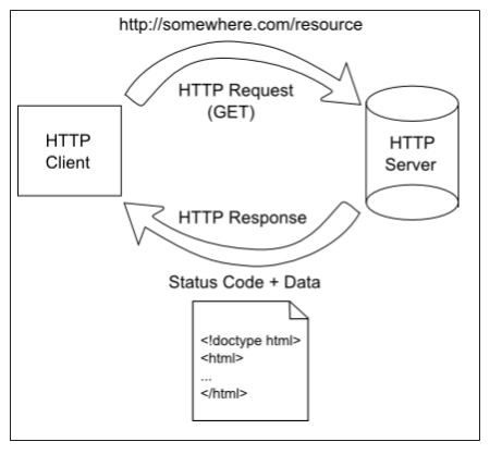
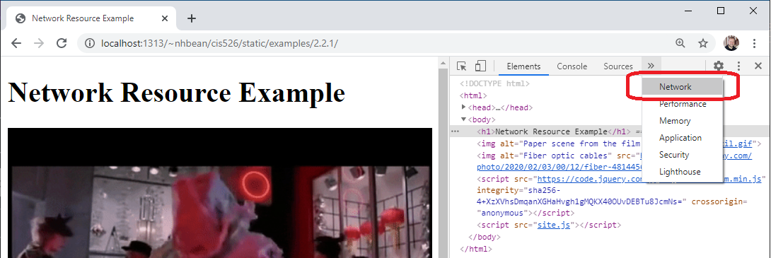
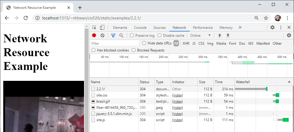
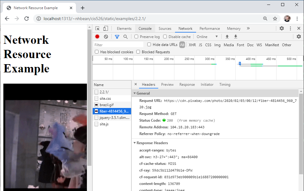