Layouts
Windows Presentation Foundation provides a number of container elements that fulfill the specialized purpose of layouts. Unlike most WPF controls, they can have multiple children, which they organize on-screen. And unlike Windows Forms, these layouts adjust to the available space.
Let’s examine each of five layouts in turn:
The Grid
The default layout is the Grid, which lays out its children elements in a grid pattern. A <Grid> is composed of columns and rows, the number and characteristics of which are defined by the grid’s ColumnDefinitions and RowDefinitions properties. These consist of a collection of ColumnDefinition and <RowDefinition/> elements. Each <ColumnDefinition/> is typically given a Width property value, while each <RowDefinition/> is given a Height property value.
Thus, you might expect the code:
<Grid>
  <Grid.ColumnDefinitions>
    <ColumnDefinition Width="200"/>
    <ColumnDefinition Width="200"/>
    <ColumnDefinition Width="200"/>
  </Grid.ColumnDefinitions>
  <Grid.RowDefinitions>
    <RowDefinition Height="100"/>
    <RowDefinition Height="100"/>
  </Grid.RowDefinitions>
  <Button Height="30" Width="120" Content="Click Me!"/>
</Grid>
Creates a grid with three columns, each 200 logical units wide, and two rows, each 100 logical units high. However, it will actually create a grid like this:
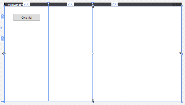
Remember, all WPF containers will fill the available space - so the grid stretches the last column and row to fill the remaining space. Also, any element declared as a child of the grid (in this case, our button), will be placed in the first grid cell - [0,0] (counted from the top-left corner).
When declaring measurements in WPF, integer values correspond to logical units, which are 1/96th of an inch. We can also use relative values, by following a measurement with a *. This indicates the ratio of remaining space a column or row should take up after the elements with an exact size are positioned. I.e. a column with a width of 2* will be twice as wide as one with a width of 1*.
Thus, to create a 3x3 grid centered in the available space to represent a game of Tic-Tac-Toe we might use:
<Grid>
    <Grid.ColumnDefinitions>
        <ColumnDefinition Width="1*"/>
        <ColumnDefinition Width="100"/>
        <ColumnDefinition Width="100"/>
        <ColumnDefinition Width="100"/>
        <ColumnDefinition Width="1*"/>
    </Grid.ColumnDefinitions>
    <Grid.RowDefinitions>
        <RowDefinition Height="1*"/>
        <RowDefinition Height="100"/>
        <RowDefinition Height="100"/>
        <RowDefinition Height="100"/>
        <RowDefinition Height="1*"/>
    </Grid.RowDefinitions>
    <TextBlock Grid.Column="1" Grid.Row="1" FontSize="100" VerticalAlignment="Center" HorizontalAlignment="Center">X</TextBlock>
    <TextBlock Grid.Column="1" Grid.Row="2" FontSize="100" VerticalAlignment="Center" HorizontalAlignment="Center">O</TextBlock>
    <TextBlock Grid.Column="2" Grid.Row="1" FontSize="100" VerticalAlignment="Center" HorizontalAlignment="Center">X</TextBlock>
</Grid>
Which would create:
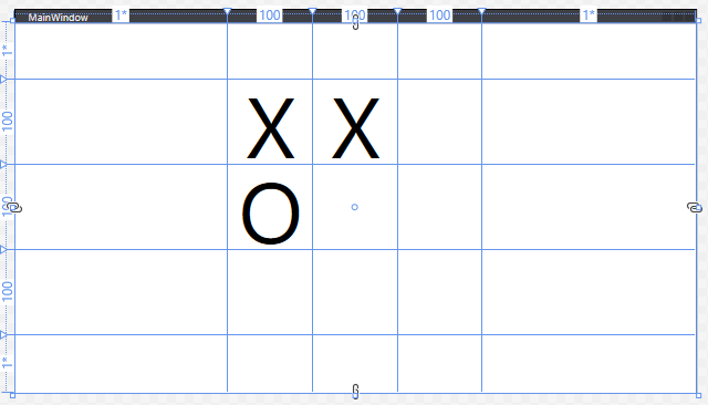
Note too that we use the properties Grid.Column and Grid.Row in the <TextBlock> elements to assign them to cells in the grid. The row and column indices start at 0 in the upper-left corner of the grid, and increase to the right and down.
The StackPanel
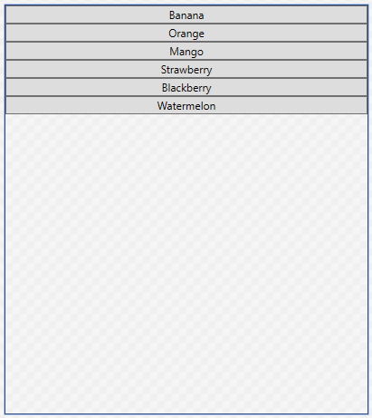
The StackPanel arranges content into a single row or column (defaults to vertical). For example, this XAML:
<StackPanel>
    <Button>Banana</Button>
    <Button>Orange</Button>
    <Button>Mango</Button>
    <Button>Strawberry</Button>
    <Button>Blackberry</Button>
    <Button>Peach</Button>
    <Button>Watermelon</Button>
</StackPanel>
Creates this layout:
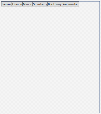
The StackPanel can be set to a horizontal orientation by setting its Orientation property to Horizontal:
<StackPanel Orientation="Horizontal">
<Button>Banana</Button>
<Button>Orange</Button>
<Button>Mango</Button>
<Button>Strawberry</Button>
<Button>Blackberry</Button>
<Button>Peach</Button>
<Button>Watermelon</Button>
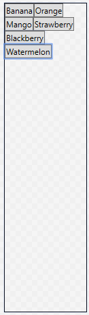
</StackPanel>The WrapPanel
The WrapPanel layout is like the <StackPanel>, with the additional caveat that if there is not enough space for its contents, it will wrap to an additional line. For example, this XAML code:
<WrapPanel>
    <Button>Banana</Button>
    <Button>Orange</Button>
    <Button>Mango</Button>
    <Button>Strawberry</Button>
    <Button>Blackberry</Button>
    <Button>Peach</Button>
    <Button>Watermelon</Button>
</WrapPanel>
Produces this layout when there is ample room:
And this one when things get tighter:
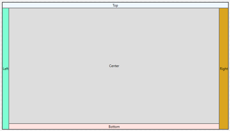
The DockPanel
The DockPanel layout should be familiar to you - it’s what Visual Studio uses. Its content items can be ‘docked’ to one of the sides, as defined by the Dock enum: Bottom, Top, Left, or Right by setting the DockPanel.Dock property on that item. The last item specified will also fill the central space. If more than one child is specified for a particular side, it will be stacked with that side.
Thus, this XAML:
<DockPanel>
    <Button DockPanel.Dock="Top">Top</Button>
    <Button DockPanel.Dock="Left">Left</Button>
    <Button DockPanel.Dock="Right">Right</Button>
    <Button DockPanel.Dock="Bottom">Bottom</Button>
    <Button>Center</Button>
</DockPanel>
Generates this layout:
The Canvas
Finally, the Canvas lays its content out strictly by their position within the <Canvas>, much like Windows Forms. This approach provides precise placement and size control, at the expense of the ability to automatically adjust to other screen resolutions. For example, the code:
<Canvas>
    <Button Canvas.Top="40" Canvas.Right="40">Do Something</Button>
    <TextBlock Canvas.Left="200" Canvas.Bottom="80">Other thing</TextBlock>
    <Canvas Canvas.Top="30" Canvas.Left="300" Width="300" Height="300" Background="SaddleBrown"/>
</Canvas>
Creates this layout:
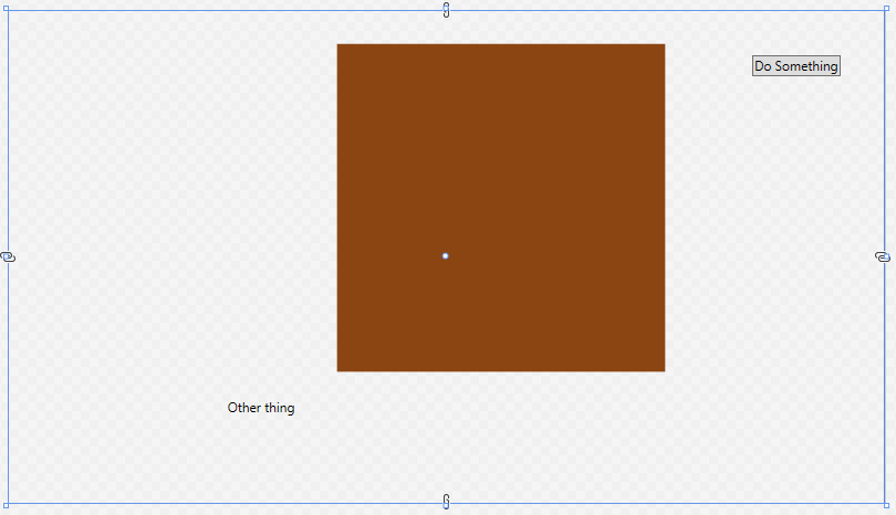
If there is a chance the <Canvas> might be resized, it is a good idea to anchor all elements in the canvas relative to the same corner (i.e. top right) so that they all are moved the same amount.