Controls
In addition to the layout controls, WPF provides a number of useful (and often familiar) controls that we can use to compose our applications. Let’s take a look at some of the most commonly used.
Border
A Border is a control that draws a border around its contents. The properties specific to a border include BorderBrush (which sets the color of the border, see the discussion of brushes on the next page), BorderThickness the number of units thick the border should be drawn, CornerRadius, which adds rounded corners, and Padding which adds space between the border and its contents.
<Border BorderBrush="Green" BorderThickness="5" CornerRadius="5" Padding="10">
    <Button>Do Something</Button>
</Border>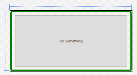
Button
A Button is a control that draws a button. This button can be interacted with by the mouse, and clicking on it triggers any Click event handlers that have been attached to it. Unlike Windows Forms buttons, it can contain any other WPF control, including images and layouts. Thus, a button featuring an image might be created with:
<Button Click="TriggerBroadcast">
    <StackPanel Orientation="Horizontal">
        <Image Source="dish.jpg" Width="100"/>
        <TextBlock FontSize="25" VerticalAlignment="Center">Broadcast</TextBlock>
    </StackPanel>
</Button>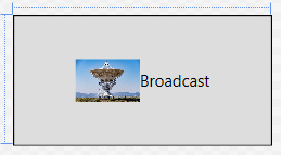
The event handler for the button needs to be declared in the corresponding .xaml.cs file, and will take two parameters, an object and RoutedEventArgs:
/// <summary>
/// An event handler that triggers a broadcast
/// </summary>
/// <param name="sender">The object sending this message</param>
/// <param name="args">The event data</param>
void TriggerBroadcast(object sender, RoutedEventArgs args) {
    // TODO: Send Broadcast
}
We’ll be discussing events in more detail soon.
CheckBox
A CheckBox provides a checkable box corresponding to a boolean value. The IsChecked property reflects the checked or unchecked state of the checkbox. A checkbox also exposes Checked and Unchecked event handlers.
<CheckBox IsChecked="True">
    The sky is blue
</CheckBox> 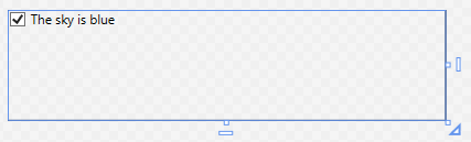
ComboBox
A ComboBox provides a drop-down selection list. The selected value can be accessed through the SelectedItem property, and the IsEditable boolean property determines if the combo box can be typed into, or simply selected from. It exposes a SelectionChanged event. The items in the ComboBox can be set declaratively:
<ComboBox>
    <ComboBoxItem>Apple</ComboBoxItem>
    <ComboBoxItem>Orange</ComboBoxItem>
    <ComboBoxItem>Peach</ComboBoxItem>
    <ComboBoxItem>Pear</ComboBoxItem>
</ComboBox>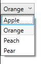
Note that the ComboBox dropdown doesn’t work in the editor - it only operates while the application is running.
Alternatively, you can expose the ComboBox in the codebehind .xaml.cs file by giving it a Name property.
<ComboBox Name="FruitSelection" Text="Fruits" SelectedValue="Apple">
</ComboBox>
Then, after the combo box has been initialized, use the ItemsSource to specify a collection declared in the corresponding .xaml.cs file.
/// <summary>
/// Interaction logic for UserControl1.xaml
/// </summary>
public partial class UserControl1 : UserControl
{
    public UserControl1()
    {
        InitializeComponent();
        FruitSelection.ItemsSource = new List<string>
        {
            "Apple",
            "Orange",
            "Peach",
            "Pear"
        };
    }
}
We could also leverage data binding to bind the item collection dynamically. We’ll discuss this approach later.
Image
The Image control displays an image. The image to display is determined by the Source property. If the image is not exactly the same size as the <Image> control, the Stretch property determines how to handle this case. Its possible values are:
"None"(the default) - the image is displayed at its original size"Fill"- the image is resized to the element’s size. This will result in stretching if the aspect ratios are not the same"Uniform"- the image is resized to fit into the element. If the aspect ratios are different, there will be blank areas in the element (letterboxing)"UniformToFill"- the image is resized to fill the element. If the aspect ratios are different, part of the image will be cropped out
The stretch values effects are captured by this graphic:
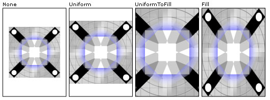
The stretching behavior can be further customized by the StretchDirection property.
Images can also be used for Background or Foreground properties, as discussed on the next page.
Label
A Label displays text on a form, and can be as simple as:
<Label>First Name:</Label>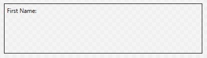
What distinguishes it from other text controls is that it can also be associated with a specific control specified by the Target parameter, whose value should be bound to the name of the control. It can then provide an access key (aka a mnemonic) that will transfer focus to that control when the corresponding key is pressed. The access key is indicated by preceding the corresponding character in the text with an underscore:
<StackPanel>
    <Label Target="{Binding ElementName=firstNameTextBox}">
        <AccessText>_First Name:</AccessText>
    </Label>
    <TextBox Name="firstNameTextBox"/>
</StackPanel>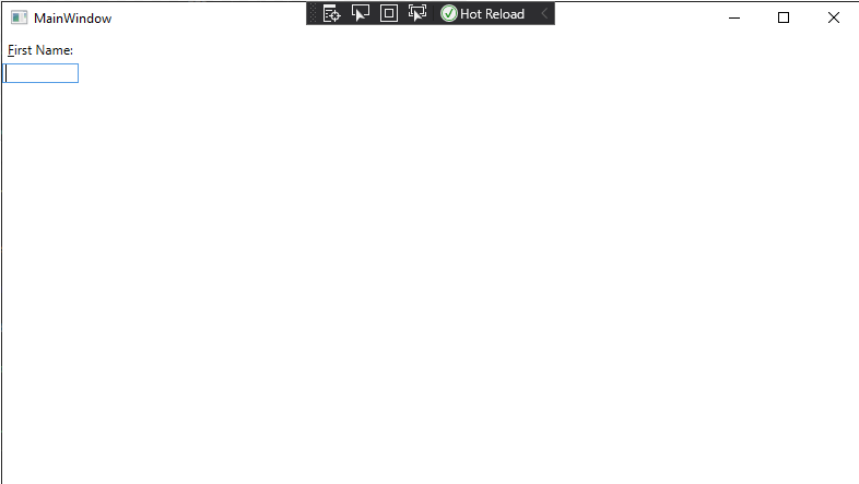
Now when the program is running, the user can press ALT + F to shift focus to the textbox, so they can begin typing (Note the character “F” is underlined in the GUI). Good use of access keys means users can navigate forms completely with the keyboard.
ListBox
A ListBox displays a list of items that can be selected. The SelectionMode property can be set to either "Single" or "Multiple", and the "SelectedItems" read-only property provides those selected items. The ItemsSource property can be set declaratively using <ListBoxItem> contents. It also exposes a SelectionChanged event handler:
<ListBox>
    <ListBoxItem>Apple</ListBoxItem>
    <ListBoxItem>Orange</ListBoxItem>
    <ListBoxItem>Peach</ListBoxItem>
    <ListBoxItem>Pear</ListBoxItem>
</ListBox>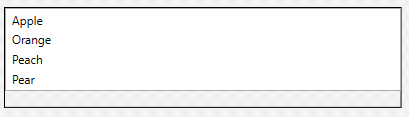
RadioButton
A group of RadioButton elements is used to present multiple options where only one can be selected. To group radio buttons, specify a shared GroupName property. Like other buttons, radio buttons have a Click event handler, and also a Checked and Unchecked event handler:
<StackPanel>
    <RadioButton GroupName="Fruit">Apple</RadioButton>
    <RadioButton GroupName="Fruit">Orange</RadioButton>
    <RadioButton GroupName="Fruit">Peach</RadioButton>
    <RadioButton GroupName="Fruit">Pear</RadioButton>
</StackPanel>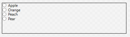
TextBlock
A TextBlock can be used to display arbitrary text. It also makes available a TextChanged event that is triggered when its text changes.
<TextBlock>Hi, I have something important to say. I'm a text block.</TextBlock>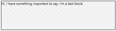
TextBox
And a TextBox is an editable text box. It’s text can be accessed through the Text property:
<TextBox Text="And I'm a textbox!"/>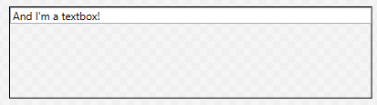
ToggleButton
Finally, a ToggleButton is a button that is either turned on or off. This can be determined from its IsChecked property. It also has event handlers for Checked and Unchecked events:
<ToggleButton>On or Off</ToggleButton>Off looks like:

And on looks like:

Other Controls
This is just a sampling of some of the most used controls. You can also reference the System.Windows.Controls namespace documentation, or the TutorialsPoint WPF Controls reference.