Control Properties
All WPF controls (including the layout controls we’ve already seen) derive from common base classes, i.e. UIElement and FrameworkElement, which means they all inherit common properties. Some of the most commonly used are described here.
Size & Placement Modifying Properties
Perhaps the most important of the control properties are those that control sizing and placement. Let’s take a look at the most important of these.
Size
WPF controls use three properties to determine the height of the element. These are MinHeight, Height, and MaxHeight. They are doubles expressed in device-independent units (measuring 1/96 of an inch). The rendering algorithm treats Height as a suggestion, but limits the calculated height to fall in the range between MinHeight and MaxHeight. The height determined by the algorithm can be accessed from the ActualHeight read-only property. Similar values exist for width: MinWidth, Width, MaxWidth, and ActualWidth.
| Property | Default Value | Description |
|---|---|---|
| MinHeight | 0.0 | The minimum element height |
| Height | NaN | The suggested element height |
| MaxHeight | PositiveInfinity | The maximum element height |
| MinWidth | 0.0 | The minimum element width |
| Width | NaN | The suggested element width |
| MaxWidth | PositiveInfinity | The maximum element width |
Margins
In addition to the size of the element, we can set margins around the element, adding empty space between this and other elements. The Margin property is actually of type Thickness, a structure with four properties: left, top, right, and bottom. We can set the Margin property in several ways using XAML.
To set all margins to be the same size, we just supply a single value:
<Button Margin="3">Do something</Button>To set different values for the horizontal and vertical margins, use two comma-separated values (horizontal comes first):
<Button Margin="10, 20">Do Something</Button> And finally, they can all be set separately as a comma-separated list (the order is left, top, right, and then bottom).
<Button Margin="10, 20, 30, 50">Do Something</Button>Alignment
You can also align the elements within the space allocated for them using the VerticalAlignment and HorizontalAlignment properties. Similarly, you can align the contents of an element with the VerticalContentAlignment and HorizontalContentAlignment properties.
For most controls, these are "Stretch" by default, which means the control or its contents will expand to fill the available space. Additional values include "Bottom", "Center", and "Top" for vertical, and "Left", "Center", and "Right" for horizontal. These options do not fill the available space - the control is sized in that dimension based on its suggested size.
| HorizontalAlignment | |
|---|---|
| Option | Description |
| Stretch | Control fills the available horizontal space |
| Left | Control is aligned along the left of the available space |
| Center | Control is centered in the available horizontal space |
| Right | Control is aligned along the right of the available space |
| VerticalAlignment | |
| Option | Description |
| Stretch | Control fills the available vertical space |
| Top | Control is aligned along the top side of the available space |
| Center | Control is centered in the available vertical space |
| Bottom | Control is aligned along the bottom side of the available space |
Text and Font Properties
As most controls prominently feature text, it is important to discuss the properties that effect how this text is presented.
Font Family
The FontFamily property sets the font used by the control. This font needs to be installed on the machine. You can supply a single font, i.e.:
<TextBlock FontFamily="Arial">Or a list of font families to supply fallback options if the requested font is not available:
<TextBlock FontFamily="Arial, Century Gothic">Font Size
The FontSize property determines the size of the font used in the control.
Font Style
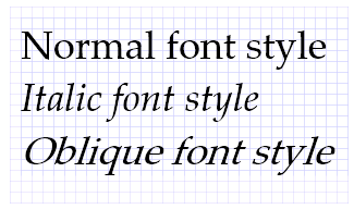
The FontStyle property sets the style of the font used. This can include "Normal", "Italic", or "Oblique". Italic is typically defined in the font itself (and created by the font creator), while Oblique is created from the normal font by applying a mathematical rendering transformation, and can be used for fonts that do not have a defined italic style.
Font Weight
The FontWeight refers to how thick a stroke is used to draw the font. It can be set to values like "Light", "Normal", "Bold", or "Ultra Bold". A list of all available options can be found here.
Text Alignment
The TextAlignment property defines how the text is aligned within its element. Possible values are "Left" (the default), "Center", "Justify", and "Right", and behave just like these options in your favorite text editor.
There is no corresponding vertical alignment option - instead use VerticalContentAlignment discussed above.
Appearance & Interactability Modifying Properties
There are often times in working with a GUI where you might want to disable or even hide a control. WPF controls provide several properties that affect the rendering and interaction of controls.
IsEnabled
The IsEnabled property is a boolean that indicates if this control is currently enabled. It defaults to true. Exactly what ’enabled’ means for a control is specific to that kind of control, but usually means the control cannot be interacted with. For example, a button with IsEnabled=false cannot be clicked on, and will be rendered grayed out, i.e.:
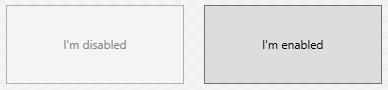
<Grid>
    <Grid.ColumnDefinitions>
        <ColumnDefinition/>
        <ColumnDefinition/>
    </Grid.ColumnDefinitions>
    <Button IsEnabled="False" Margin="10">I'm Disabled</Button>
    <Button Grid.Column="1" Margin="10">I'm Enabled</Button>
</Grid>
Opacity
A similar effect can be obtained by changing an element’s Opacity property, a double that ranges from 0.0 (completely transparent) to 1.0 (completely solid). Below you can see two <TextBlock> elements, with the one on the left set to an opacity of 0.40:

<Grid>
    <Grid.ColumnDefinitions>
        <ColumnDefinition/>
        <ColumnDefinition/>
    </Grid.ColumnDefinitions>
    <TextBlock Opacity="0.4" Foreground="Purple" VerticalAlignment="Center" HorizontalAlignment="Center">
      I'm semi-translucent!
    </TextBlock>
    <TextBlock Grid.Column="1" Foreground="Purple" VerticalAlignment="Center" HorizontalAlignment="Center">
      I'm solid!
    </TextBlock>
</Grid>
Alerting an elements’ opacity does not have any effect on its functionality, i.e. a completely transparent button can still be clicked.
Visibility
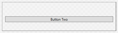
Finally, the Visible property alters how the element is considered in the WPF rendering algorithm. It has three possible values: "Visible", "Hidden", and "Collapsed". The default value is "Visible", and the element renders normally, as “Button One” does in the example below:
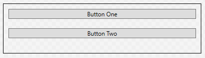
<StackPanel>
  <Button Visibility="Visible" Margin="10">Button One</Button>
  <Button Margin="10">Button Two</Button>
</StackPanel>
The "Hidden" value will hide the element, but preserve its place in the layout. A hidden element cannot be interacted with, so this is similar to setting the Opacity to 0 and IsEnabled to false:
<StackPanel>
  <Button Visibility="Hidden" Margin="10">Button One</Button>
  <Button Margin="10">Button Two</Button>
</StackPanel>
Finally, the "Collapsed" value will leave the element out of the layout calculations, as though it were not a part of the control at all. A hidden element cannot be interacted with. Note that in the example below, “Button Two” has been rendered in the space previously occupied by “Button One”:
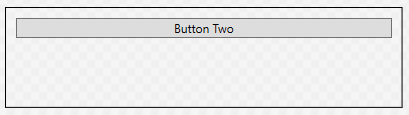
<StackPanel>
  <Button Visibility="Collapsed" Margin="10">Button One</Button>
  <Button Margin="10">Button Two</Button>
</StackPanel>
Backgrounds and Foregrounds
You may have noticed the previous examples that colors can be accomplished through the Background and Foreground properties - where the Background determines the color of the element, and Foreground determines the color of text and other foreground elements. While this is true, it is also just the beginning of what is possible. Both of these properties have the type Brush, which deserves a deeper look.
Simply put, a brush determines how to paint graphical objects. This can be as simple as painting a solid color, or as complex as painting an image. The effect used is determined by the type of brush - the Brush class itself serving as a base class for several specific types brush.
Solid Color Brushes
What we’ve been using up to this point have been SolidColorBrush objects. This is the simplest of the brush classes, and simply paints with a solid color, i.e.:
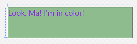
<TextBlock Foreground="BlueViolet" Background="DarkSeaGreen" FontSize="25">
  Look, Ma!  I'm in color!
</TextBlock>
The simplest way to set the color in XAML is to use a value from the predefined brush name list, like the "BlueViolet" and "DarkSeaGreen" in the example.
Alternatively, you can use a hexadecimal number defining the red, green, and blue channels in that order, i.e. to use K-State purple and white we’d use:
<TextBlock Foreground="#FFFFFF" Background="#512888" FontSize="25">
  Look, Ma!  I'm in color!
</TextBlock>
The various formats the hex values can be given are detailed here
Gradient Brushes
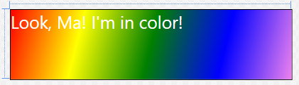
Gradient brushes gradually transition between colors. There are two kinds of gradient brushes in WPF: with a LinearGradientBrush the brush gradually changes along a line. With a RadialGradientBrush, the color changes radially from a center point.
In both cases, the gradient is defined in terms of <GradientStops> - a distance along the line (or from the center) where the expected color value is defined. In the spaces between gradient stops, the color value is interpolated between the two stops on either side of the point. The gradient stop needs both an Offset value (a double indicating the percentage of how far along the line or from the center this stop falls, between 0.0 and 1.0) and a Color value (which can be defined as with solid color brushes).
For example, the XAML:
<TextBlock Foreground="#FFFFFF" FontSize="25">
  <TextBlock.Background>
      <LinearGradientBrush>
          <LinearGradientBrush.GradientStops>
              <GradientStop Color="Red" Offset="0.0"/>
              <GradientStop Color="Yellow" Offset="0.25"/>
              <GradientStop Color="Green" Offset="0.50"/>
              <GradientStop Color="Blue" Offset="0.75"/>
              <GradientStop Color="Violet" Offset="1.0"/>
          </LinearGradientBrush.GradientStops>
      </LinearGradientBrush>
  </TextBlock.Background>
  Look, Ma!  I'm in color!
</TextBlock>
Produces this rainbow gradient:
Further, the line along which the linear gradient is created is defined by the StartPoint and EndPoint properties of the <LinearGradientBrush>. These points are relative to the area the brush is covering (i.e. the space occupied by the element), and fall in the range of [0.0 .. 1.0]. The default (as seen above) is a diagonal line from the upper left corner (0,0) to the lower right corner (1.0, 1.0).
To make the above gradient fall in the center half of the element, and be horizontal, we could tweak the gradient definition:
<TextBlock Foreground="#FFFFFF" FontSize="25">
    <TextBlock.Background>
        <LinearGradientBrush StartPoint="0.25, 0.5" EndPoint="0.75, 0.5">
            <LinearGradientBrush.GradientStops>
                <GradientStop Color="Red" Offset="0.0"/>
                <GradientStop Color="Yellow" Offset="0.25"/>
                <GradientStop Color="Green" Offset="0.50"/>
                <GradientStop Color="Blue" Offset="0.75"/>
                <GradientStop Color="Violet" Offset="1.0"/>
            </LinearGradientBrush.GradientStops>
        </LinearGradientBrush>
    </TextBlock.Background>
    Look, Ma!  I'm in color!
</TextBlock>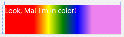
A <RadialGradientBrush> is defined similarly through the use of GradientStops, only this time they are in relation to the center around which the gradient radiates:
<TextBlock Foreground="#FFFFFF" FontSize="25">
    <TextBlock.Background>
        <RadialGradientBrush>
            <RadialGradientBrush.GradientStops>
                <GradientStop Color="Red" Offset="0.0"/>
                <GradientStop Color="Yellow" Offset="0.25"/>
                <GradientStop Color="Green" Offset="0.50"/>
                <GradientStop Color="Blue" Offset="0.75"/>
                <GradientStop Color="Violet" Offset="1.0"/>
            </RadialGradientBrush.GradientStops>
        </RadialGradientBrush>
    </TextBlock.Background>
    Look, Ma!  I'm in color!
</TextBlock>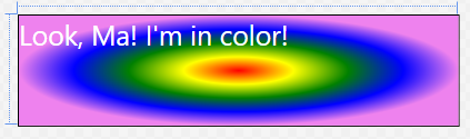
The gradient fills an ellipse defined by the Center property and the RadiusX and RadiusY properties. By default these values are (0.5. 0.5), 0.5, and 0.5 respectively. Like other gradient properties, they are doubles between 0.0 and 1.0. Finally, the gradient emanates from the GradientOrigin, also a point with values defined by this coordinate system.
To center the above gradient in the left half of the block, we would therefore use:
<TextBlock.Background>
    <RadialGradientBrush Center="0.25, 0.5" RadiusX="0.25" RadiusY="0.5" GradientOrigin="0.25, 0.5">
        <RadialGradientBrush.GradientStops>
            <GradientStop Color="Red" Offset="0.0"/>
            <GradientStop Color="Yellow" Offset="0.25"/>
            <GradientStop Color="Green" Offset="0.50"/>
            <GradientStop Color="Blue" Offset="0.75"/>
            <GradientStop Color="Violet" Offset="1.0"/>
        </RadialGradientBrush.GradientStops>
    </RadialGradientBrush>
</TextBlock.Background>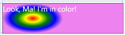
And of course, we can use a gradient for a Foreground property as well:
<TextBlock Background="White" FontSize="40">
    <TextBlock.Foreground>
        <LinearGradientBrush>
            <LinearGradientBrush.GradientStops>
                <GradientStop Color="Red" Offset="0.0"/>
                <GradientStop Color="Yellow" Offset="0.25"/>
                <GradientStop Color="Green" Offset="0.50"/>
                <GradientStop Color="Blue" Offset="0.75"/>
                <GradientStop Color="Violet" Offset="1.0"/>
            </LinearGradientBrush.GradientStops>
        </LinearGradientBrush>
    </TextBlock.Foreground>
    Look, Ma!  I'm in color!
</TextBlock>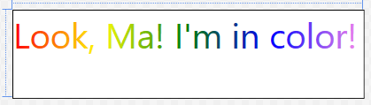
Image Brushes
To draw a saved image, we use an ImageBrush, setting its ImageSource property to the image we want to use. In XAML, that can be as simple as:
<Button Margin="40" Foreground="White" FontSize="30">
    <Button.Background>
        <ImageBrush ImageSource="Dish.jpg"/>
    </Button.Background>
    Broadcast
</Button>
We can apply image brushes to any WPF control, allowing for some interesting layering effects, i.e.:
<Grid>
    <Grid.Background>
        <ImageBrush ImageSource="watering-can.jpg"/>
    </Grid.Background>
    <Grid.ColumnDefinitions>
        <ColumnDefinition/>
        <ColumnDefinition/>
        <ColumnDefinition/>
    </Grid.ColumnDefinitions>
    <Grid.RowDefinitions>
        <RowDefinition/>
        <RowDefinition/>
        <RowDefinition/>
    </Grid.RowDefinitions>
    <Button Margin="40" Foreground="White" FontSize="30">
        <Button.Background>
            <ImageBrush ImageSource="Dish.jpg"/>
        </Button.Background>
        Broadcast
    </Button>
</Grid>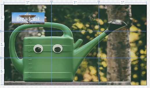
You probably notice that the dish image on the button is distorted. We can correct this by changing the Stretch property. The possible values are: "None", "Fill", "Uniform", and "UniformToFill". This graphic from the documentation visual shows these properties:
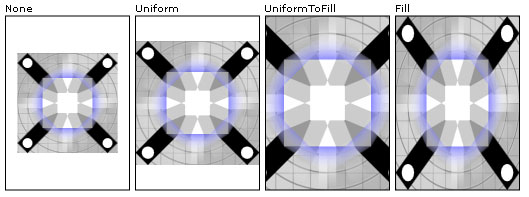
The ImageBrush extends the TileBrush, so the image can actually be tiled if the tile size is set to be smaller than the element that it is painting. The TileBrush Overview provides a detailed breakdown of applying tiling.
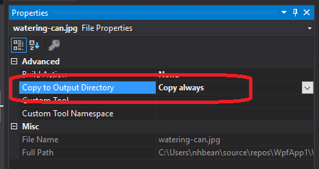
When using images with Visual Studio, it is important to understand how those are used and distributed. You should make sure the images are physically located within the project folder (so that they are included in your source control). Additionally, you want to mark the property “Copy to Output Directory” to either “Copy Always” or “Copy if Newer.” When distributing your project, these files will also need to be distributed, or the image will be unavailable to your executable.