Windows Presentation Foundation
Some clever statement…
Some clever statement…
Windows Presentation Foundation (WPF) is a open-source system for rendering Windows application user interfaces. It was released as part of the .NET framework in 2006. In many ways, it is intended to be a successor to Windows Forms. This chapter will examine the basics of working with WPF in detail.
Some key terms to learn in this chapter are:
The key skill to learn in this chapter is how to use C# and XAML to develop WPF user interfaces that adapt to device screen dimensions.
Windows Presentation Foundation is a library and toolkit for creating Graphical User Interfaces - a user interface that is presented as a combination of interactive graphical and text elements commonly including buttons, menus, and various flavors of editors and inputs. GUIs represent a major step forward in usability from earlier programs that were interacted with by typing commands into a text-based terminal (the EPIC software we looked at in the beginning of this textbook is an example of this earlier form of user interface).
You might be wondering why Microsoft introduced WPF when it already had support for creating GUIs in its earlier Windows Forms product. In part, this decision was driven by the evolution of computing technology.
No doubt you are used to having a wide variety of screen resolutions available across a plethora of devices. But this was not always the case. Computer monitors once came in very specific, standardized resolutions, and only gradually were these replaced by newer, higher-resolution monitors. The table below summarizes this time, indicating the approximate period each resolution dominated the market.
| Standard | Size | Peak Years |
|---|---|---|
| VGA | 640x480 | 1987-1990 |
| SVGA | 800x600 | 1990-2003 |
| XGA | 1024x768 | 2007-2015 |
Windows Forms was introduced in the early 2000’s, at a time where the most popular screen resolution in the United States was transitioning from SVGA to XGA, and screen resolutions (especially for business computers running Windows) had remained remarkably consistent for long periods. Moreover, these resolutions were all using the 4:3 aspect ratio (the ratio of width to height of the screen). Hence, the developers of Windows forms did not consider the need to support vastly different screen resolutions and aspect ratios. Contrast that with trends since that time:
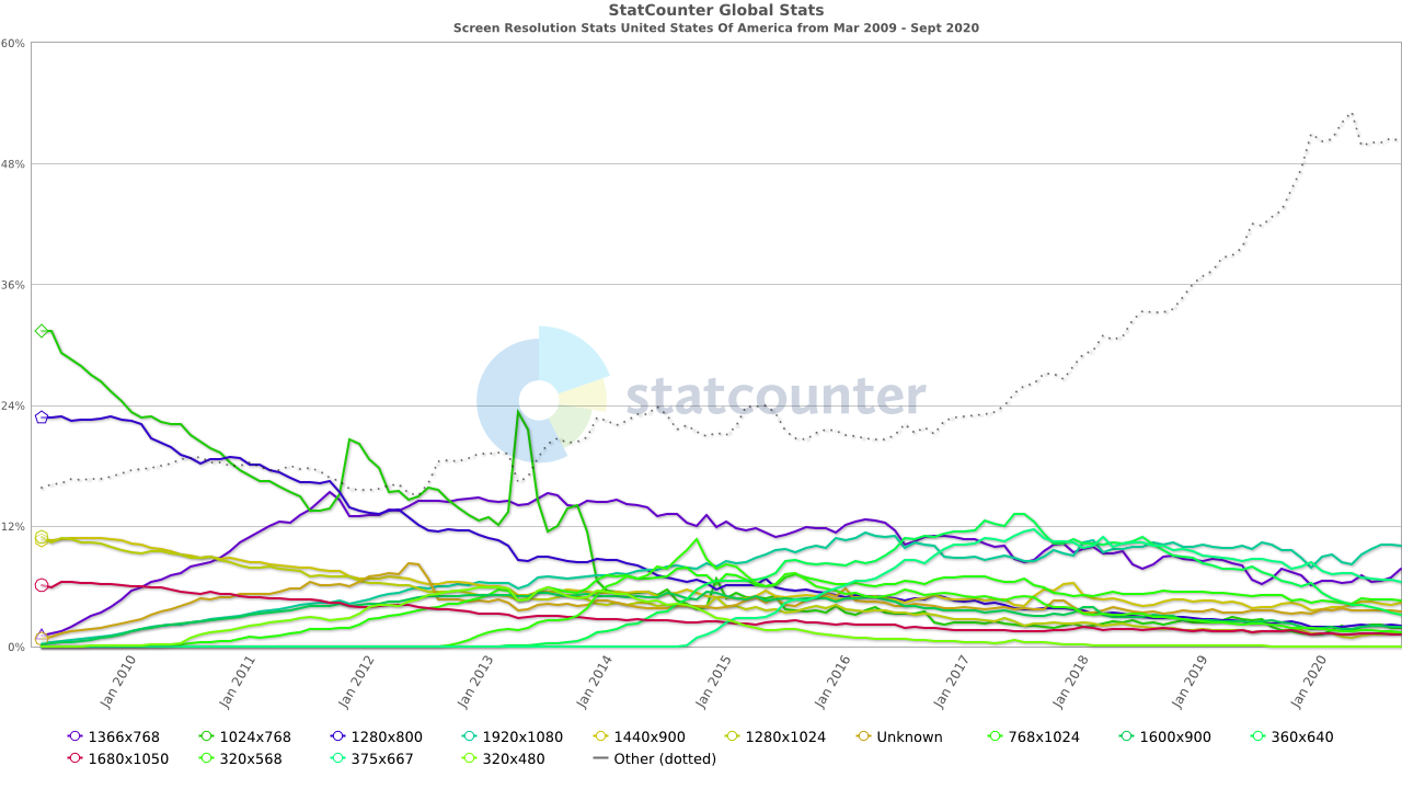
There is no longer a clearly dominating resolution, nor even an aspect ratio! Thus, it has become increasingly important for Windows applications to adapt to different screen resolutions. Windows Forms does not do this easily - each element in a Windows Forms application has a statically defined width and height, as well as its position in the window. Altering these values in response to different screen resolution requires significant calculations to resize and reposition the elements, and the code to perform these calculations must be written by the programmer.
In contrast, WPF adopts a multi-pass layout mechanism similar to that of a web browser, where it calculates the necessary space for each element within the GUI, then adapts the layout based on the actual space. With careful design, the need for writing code to position and size elements is eliminated, and the resulting GUIs adapt well to the wide range of available screen sizes.
Another major technology shift was the widespread adoption of hardware-accelerated 3D graphics. In the 1990’s this technology was limited to computers built specifically for playing video games, 3D modeling, video composition, or other graphics-intensive tasks. But by 2006, this hardware had become so widely accepted that with Windows Vista, Microsoft redesigned the Windows kernel to leverage this technology to take on the task of rendering windows applications.
WPF leveraged this decision and offloads much of the rendering work to the graphics hardware. This meant that WPF controls could be vector-based, instead of the raster-based approach adopted by Windows Forms. Vector-based rendering means the image to be drawn on-screen is created from instructions as needed, rather than copied from a bitmap. This allows controls to look as sharp when scaled to different screen resolutions or enhanced by software intended to support low-vision users. Raster graphics scaled the same way will look pixelated and jagged.
Leveraging the power of hardware accelerated graphics also allowed for the use of more powerful animations and transitions, as well as freeing up the CPU for other tasks. It also simplifies the use of 3D graphics in windows applications. WPF also leveraged this power to provide a rich storyboarding and animation system as well as inbuilt support for multimedia. In contrast, Windows Forms applications are completely rendered using the CPU and offer only limited support for animations and multimedia resources.
One additional shift is that Windows forms leverage controls built around graphical representations provided directly by the hosting Windows operating system. This helped keep windows applications looking and feeling like the operating system they were deployed on, but limits the customizability of the controls. A commonly attempted feature - placing an image on a button - becomes an onerous task within Windows Forms. Attempting to customize controls often required the programmer to take over the rendering work entirely, providing the commands to render the raw shapes of the control directly onto the control’s canvas. Unsurprisingly, an entire secondary market for pre-developed custom controls emerged to help counter this issue.
In contrast, WPF separated control rendering from windows subsystems, and implemented a declarative style of defining user interfaces using Extensible Application Markup Language (XAML). This provides the programmer complete control over how controls are rendered, and multiple mechanisms of increasing complexity to accomplish this. Style properties can be set on individual controls, or bundled into “stylesheets” and applied en-masse. Further, each control’s default style is determined by a template that can be replaced with a custom implementation, completely altering the appearance of a control.
This is just the tip of the iceberg - WPF also features a new and robust approach to data binding that will be subject of its own chapter, and allows for UI to be completely separated from logic, allowing for more thorough unit testing of application code.
Windows Presentation Foundation builds upon Extensible Application Markup Language (XAML), an extension of the XML language we’ve discussed previously. Just like XML, it consists of elements defined by opening and closing tags.
For example, a button is represented by:
<Button></Button>Which, because it has no children, could also be expressed with a self-closing tag:
<Button/>In addition, elements can have attributes, i.e we could add a height, width, and content to our button:
<Button Height="30" Width="120" Content="Click Me!"/>XAML also offers an expanded property syntax that is an alternative to attributes. For example, we could re-write the above button as:
<Button>
  <Button.Height>30</Button.Height>
  <Button.Width>120</Button.Width>
  <Button.Content>Click Me!</Button.Content>
</Button>
Note how we repeat the tag name (Button) and append the attribute name (Height, Width, and Content to it with a period between the two). This differentiates the expanded property from nested elements, i.e. in this XAML code:
<Grid>
  <Grid.ColumnDefinitions>
    <ColumnDefinition Width="200"/>
    <ColumnDefinition Width="200"/>
    <ColumnDefinition Width="200"/>
  </Grid.ColumnDefinitions>
  <Grid.RowDefinitions>
    <RowDefinition/>
    <RowDefinition/>
  </Grid.RowDefinitions>
  <Button Height="30" Width="120" Content="Click Me!"/>
</Grid>
<Grid.ColumnDefinitions> and <Grid.RowDefinitions> are attributes of the <Grid>, while <Button Height="30" Width="120" Content="Click Me!"/> is a child element of the <Grid> element.
Because XAML is an extension of XML, we can add comments the same way, by enclosing the comment within a <!-- and -->:
<!-- I am a comment -->What makes XAML different from vanilla XML is that it defines objects. The XAML used for Windows Presentation Foundation is drawn from the
namespace. This namespace defines exactly what elements exist in this flavor of XAML, and they correspond to specific classes defined in the WPF namespaces.For example, the <Button> class corresponds to the WPF Button class. This class has a Content property which defines the text or other content displayed on the button. Additionally, it has a Width and Height property. Thus the XAML:
<Button Height="30" Width="120" Content="Click Me!"/>Effectively says construct an instance of the Button class with its Height property set to 30, its Width property set to 120, and its Content property set to the string "Click Me!". Were we to write the corresponding C# code, it would look like:
var button = new Button();
button.Height = 30;
button.Width = 120;
button.Content = "Click Me!";
This is why XAML stands for Extensible Application Markup Language - it’s effectively another way of writing programs! You can find the documentation for all the controls declared in the xaml/presentation namespace on docs.microsoft.com.
In addition to being used to define objects, XAML can also be used to define part of a class. Consider this MainWindow XAML code, which is generated by the Visual Studio WPF Project Template:
<Window x:Class="WpfApp1.MainWindow"
        xmlns="http://schemas.microsoft.com/winfx/2006/xaml/presentation"
        xmlns:x="http://schemas.microsoft.com/winfx/2006/xaml"
        xmlns:d="http://schemas.microsoft.com/expression/blend/2008"
        xmlns:mc="http://schemas.openxmlformats.org/markup-compatibility/2006"
        xmlns:local="clr-namespace:WpfApp1"
        mc:Ignorable="d"
        Title="MainWindow" Height="450" Width="800">
    <Grid>
    </Grid>
</Window>
And its corresponding C# file:
namespace WpfApp1
{
    /// <summary>
    /// Interaction logic for MainWindow.xaml
    /// </summary>
    public partial class MainWindow : Window
    {
        public MainWindow()
        {
            InitializeComponent();
        }
    }
}
Notice the use of the partial modifier in the C# code? This indicates that the MainWindow class is only partially defined in this file (MainWindow.xaml.cs) - the rest of the definition exists in another file. That’s the previously referenced XAML file (MainWindow.xaml). Notice in the XAML that the <Window> element has the attribute x:Class="WpfApp1.MainWindow"? That indicates that it defines part of the class MainWindow defined in the WpfApp1 namespace - it’s the other part of our file!
When we compile this project, the XAML is actually transformed into a temporary C# file as part of the build process, and that C# file is joined with the other C# file. This temporary file defines the InitializeComponent() method, which would look something like this:
void InitializeComponent()
{
    this.Title = "MainWindow";
    this.Height = 450;
    this.Width = 800;

    var grid = new Grid();
    this.Content = grid;
}
Notice how it sets the properties corresponding to the attributes defined on the <MainWindow> element? Further, it assigns the child of that element (a <Grid> element) as the Content property of the Window. Nested XAML elements are typically assigned to either Content or Children properties, depending on if the element in question is a container element or not (container elements can have multiple children, all other elements are limited to a single child).
Any structure defined in our XAML is set up during this InitializeComponent() call. This means you should never remove the InitializeComponent(); invocation from a WPF class, or your XAML-defined content will not be added. Similarly, you should not manipulate that structure until the InitializeComponent(); method has been invoked, or the structure will not exist!
This strategy of splitting GUI code into two files is known in Microsoft parlance as codebehind, and it allows the GUI’s visual aspect to be created independently of the code that provides its logic. This approach has been a staple of both Windows Forms and Windows Presentation Foundation. This separation also allows for graphic designers to create the GUI look-and-feel without ever needing to write a line of code. There is a companion application to Visual Studio called Blend that can be used to write the XAML files for a project without needing the full weight and useability of Visual Studio.
Occasionally, Visual Studio will encounter a problem while building the temporary file from the XAML definition, and the resulting temporary file may become corrupted. When this happens, your changes to the XAML are no longer incorporated into the program when you compile, because the process can’t overwrite the corrupted temporary file. Instead, the corrupted temporary file is used - resulting in weird and unexpected behavior. If this happens to you, just run the “Build > Clean” menu option on the project to delete all the temporary files.
Partial classes weren’t a WPF-specific innovation - Windows Forms used them first. In Windows Forms, when you create a form, Visual Studio actually creates two C# files. One of these is the one intended for you to edit, and the other is used by the drag-and-drop editor, which fills it with auto-generated C# code. If you ever make the mistake of editing this file, it will cause all kinds of problems for the drag-and-drop editor (and you)! In contrast, the drag-and-drop editor for WPF actually modifies the same XAML file you do - allowing you to use the editor, manually edit the XAML, or any combination of the two.
Windows Presentation Foundation provides a number of container elements that fulfill the specialized purpose of layouts. Unlike most WPF controls, they can have multiple children, which they organize on-screen. And unlike Windows Forms, these layouts adjust to the available space.
Let’s examine each of five layouts in turn:
The default layout is the Grid, which lays out its children elements in a grid pattern. A <Grid> is composed of columns and rows, the number and characteristics of which are defined by the grid’s ColumnDefinitions and RowDefinitions properties. These consist of a collection of ColumnDefinition and <RowDefinition/> elements. Each <ColumnDefinition/> is typically given a Width property value, while each <RowDefinition/> is given a Height property value.
Thus, you might expect the code:
<Grid>
  <Grid.ColumnDefinitions>
    <ColumnDefinition Width="200"/>
    <ColumnDefinition Width="200"/>
    <ColumnDefinition Width="200"/>
  </Grid.ColumnDefinitions>
  <Grid.RowDefinitions>
    <RowDefinition Height="100"/>
    <RowDefinition Height="100"/>
  </Grid.RowDefinitions>
  <Button Height="30" Width="120" Content="Click Me!"/>
</Grid>
Creates a grid with three columns, each 200 logical units wide, and two rows, each 100 logical units high. However, it will actually create a grid like this:
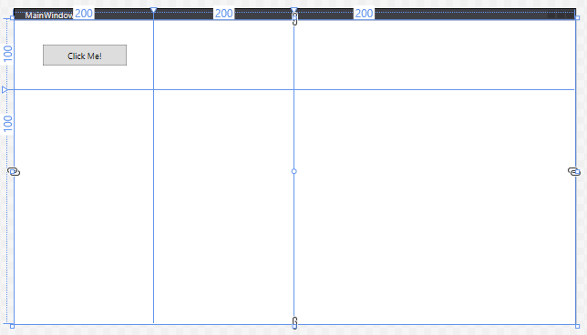
Remember, all WPF containers will fill the available space - so the grid stretches the last column and row to fill the remaining space. Also, any element declared as a child of the grid (in this case, our button), will be placed in the first grid cell - [0,0] (counted from the top-left corner).
When declaring measurements in WPF, integer values correspond to logical units, which are 1/96th of an inch. We can also use relative values, by following a measurement with a *. This indicates the ratio of remaining space a column or row should take up after the elements with an exact size are positioned. I.e. a column with a width of 2* will be twice as wide as one with a width of 1*.
Thus, to create a 3x3 grid centered in the available space to represent a game of Tic-Tac-Toe we might use:
<Grid>
    <Grid.ColumnDefinitions>
        <ColumnDefinition Width="1*"/>
        <ColumnDefinition Width="100"/>
        <ColumnDefinition Width="100"/>
        <ColumnDefinition Width="100"/>
        <ColumnDefinition Width="1*"/>
    </Grid.ColumnDefinitions>
    <Grid.RowDefinitions>
        <RowDefinition Height="1*"/>
        <RowDefinition Height="100"/>
        <RowDefinition Height="100"/>
        <RowDefinition Height="100"/>
        <RowDefinition Height="1*"/>
    </Grid.RowDefinitions>
    <TextBlock Grid.Column="1" Grid.Row="1" FontSize="100" VerticalAlignment="Center" HorizontalAlignment="Center">X</TextBlock>
    <TextBlock Grid.Column="1" Grid.Row="2" FontSize="100" VerticalAlignment="Center" HorizontalAlignment="Center">O</TextBlock>
    <TextBlock Grid.Column="2" Grid.Row="1" FontSize="100" VerticalAlignment="Center" HorizontalAlignment="Center">X</TextBlock>
</Grid>
Which would create:
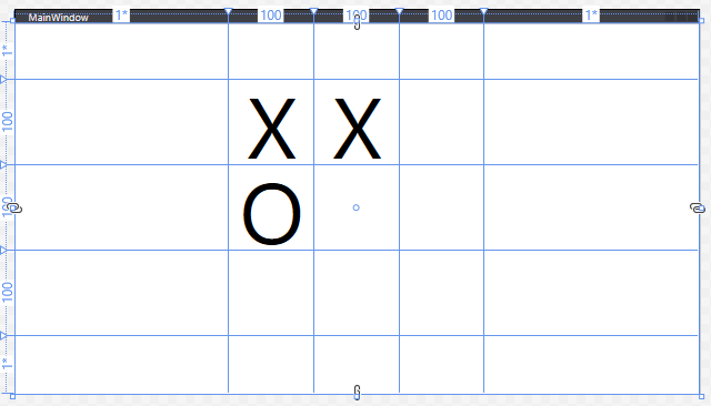
Note too that we use the properties Grid.Column and Grid.Row in the <TextBlock> elements to assign them to cells in the grid. The row and column indices start at 0 in the upper-left corner of the grid, and increase to the right and down.
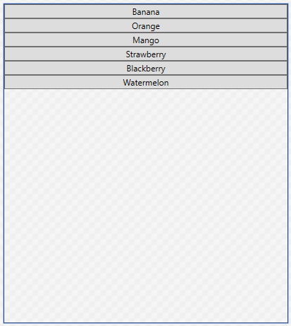
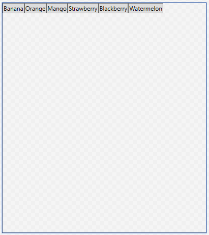
The StackPanel arranges content into a single row or column (defaults to vertical). For example, this XAML:
<StackPanel>
    <Button>Banana</Button>
    <Button>Orange</Button>
    <Button>Mango</Button>
    <Button>Strawberry</Button>
    <Button>Blackberry</Button>
    <Button>Peach</Button>
    <Button>Watermelon</Button>
</StackPanel>
Creates this layout:
The StackPanel can be set to a horizontal orientation by setting its Orientation property to Horizontal:
<StackPanel Orientation="Horizontal">
<Button>Banana</Button>
<Button>Orange</Button>
<Button>Mango</Button>
<Button>Strawberry</Button>
<Button>Blackberry</Button>
<Button>Peach</Button>
<Button>Watermelon</Button>
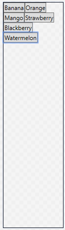
</StackPanel>The WrapPanel layout is like the <StackPanel>, with the additional caveat that if there is not enough space for its contents, it will wrap to an additional line. For example, this XAML code:
<WrapPanel>
    <Button>Banana</Button>
    <Button>Orange</Button>
    <Button>Mango</Button>
    <Button>Strawberry</Button>
    <Button>Blackberry</Button>
    <Button>Peach</Button>
    <Button>Watermelon</Button>
</WrapPanel>
Produces this layout when there is ample room:
And this one when things get tighter:
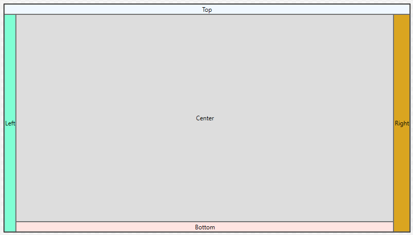
The DockPanel layout should be familiar to you - it’s what Visual Studio uses. Its content items can be ‘docked’ to one of the sides, as defined by the Dock enum: Bottom, Top, Left, or Right by setting the DockPanel.Dock property on that item. The last item specified will also fill the central space. If more than one child is specified for a particular side, it will be stacked with that side.
Thus, this XAML:
<DockPanel>
    <Button DockPanel.Dock="Top">Top</Button>
    <Button DockPanel.Dock="Left">Left</Button>
    <Button DockPanel.Dock="Right">Right</Button>
    <Button DockPanel.Dock="Bottom">Bottom</Button>
    <Button>Center</Button>
</DockPanel>
Generates this layout:
Finally, the Canvas lays its content out strictly by their position within the <Canvas>, much like Windows Forms. This approach provides precise placement and size control, at the expense of the ability to automatically adjust to other screen resolutions. For example, the code:
<Canvas>
    <Button Canvas.Top="40" Canvas.Right="40">Do Something</Button>
    <TextBlock Canvas.Left="200" Canvas.Bottom="80">Other thing</TextBlock>
    <Canvas Canvas.Top="30" Canvas.Left="300" Width="300" Height="300" Background="SaddleBrown"/>
</Canvas>
Creates this layout:
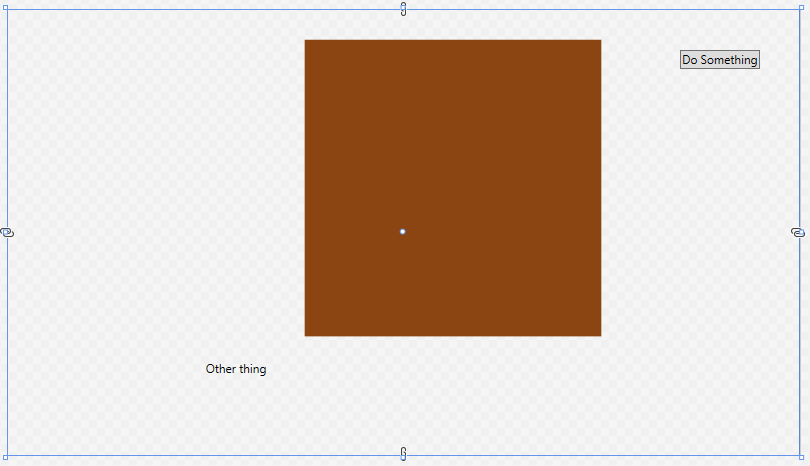
If there is a chance the <Canvas> might be resized, it is a good idea to anchor all elements in the canvas relative to the same corner (i.e. top right) so that they all are moved the same amount.
In addition to the layout controls, WPF provides a number of useful (and often familiar) controls that we can use to compose our applications. Let’s take a look at some of the most commonly used.
A Border is a control that draws a border around its contents. The properties specific to a border include BorderBrush (which sets the color of the border, see the discussion of brushes on the next page), BorderThickness the number of units thick the border should be drawn, CornerRadius, which adds rounded corners, and Padding which adds space between the border and its contents.
<Border BorderBrush="Green" BorderThickness="5" CornerRadius="5" Padding="10">
    <Button>Do Something</Button>
</Border>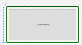
A Button is a control that draws a button. This button can be interacted with by the mouse, and clicking on it triggers any Click event handlers that have been attached to it. Unlike Windows Forms buttons, it can contain any other WPF control, including images and layouts. Thus, a button featuring an image might be created with:
<Button Click="TriggerBroadcast">
    <StackPanel Orientation="Horizontal">
        <Image Source="dish.jpg" Width="100"/>
        <TextBlock FontSize="25" VerticalAlignment="Center">Broadcast</TextBlock>
    </StackPanel>
</Button>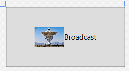
The event handler for the button needs to be declared in the corresponding .xaml.cs file, and will take two parameters, an object and RoutedEventArgs:
/// <summary>
/// An event handler that triggers a broadcast
/// </summary>
/// <param name="sender">The object sending this message</param>
/// <param name="args">The event data</param>
void TriggerBroadcast(object sender, RoutedEventArgs args) {
    // TODO: Send Broadcast
}
We’ll be discussing events in more detail soon.
A CheckBox provides a checkable box corresponding to a boolean value. The IsChecked property reflects the checked or unchecked state of the checkbox. A checkbox also exposes Checked and Unchecked event handlers.
<CheckBox IsChecked="True">
    The sky is blue
</CheckBox> 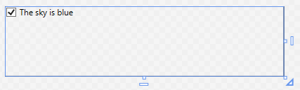
A ComboBox provides a drop-down selection list. The selected value can be accessed through the SelectedItem property, and the IsEditable boolean property determines if the combo box can be typed into, or simply selected from. It exposes a SelectionChanged event. The items in the ComboBox can be set declaratively:
<ComboBox>
    <ComboBoxItem>Apple</ComboBoxItem>
    <ComboBoxItem>Orange</ComboBoxItem>
    <ComboBoxItem>Peach</ComboBoxItem>
    <ComboBoxItem>Pear</ComboBoxItem>
</ComboBox>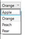
Note that the ComboBox dropdown doesn’t work in the editor - it only operates while the application is running.
Alternatively, you can expose the ComboBox in the codebehind .xaml.cs file by giving it a Name property.
<ComboBox Name="FruitSelection" Text="Fruits" SelectedValue="Apple">
</ComboBox>
Then, after the combo box has been initialized, use the ItemsSource to specify a collection declared in the corresponding .xaml.cs file.
/// <summary>
/// Interaction logic for UserControl1.xaml
/// </summary>
public partial class UserControl1 : UserControl
{
    public UserControl1()
    {
        InitializeComponent();
        FruitSelection.ItemsSource = new List<string>
        {
            "Apple",
            "Orange",
            "Peach",
            "Pear"
        };
    }
}
We could also leverage data binding to bind the item collection dynamically. We’ll discuss this approach later.
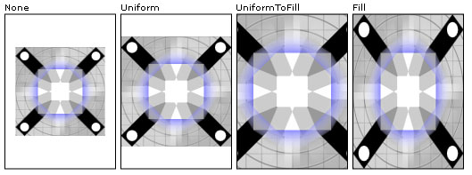
The Image control displays an image. The image to display is determined by the Source property. If the image is not exactly the same size as the <Image> control, the Stretch property determines how to handle this case. Its possible values are:
"None" (the default) - the image is displayed at its original size"Fill" - the image is resized to the element’s size. This will result in stretching if the aspect ratios are not the same"Uniform" - the image is resized to fit into the element. If the aspect ratios are different, there will be blank areas in the element (letterboxing)"UniformToFill" - the image is resized to fill the element. If the aspect ratios are different, part of the image will be cropped outThe stretch values effects are captured by this graphic:
The stretching behavior can be further customized by the StretchDirection property.
Images can also be used for Background or Foreground properties, as discussed on the next page.
A Label displays text on a form, and can be as simple as:
<Label>First Name:</Label>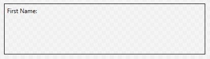
What distinguishes it from other text controls is that it can also be associated with a specific control specified by the Target parameter, whose value should be bound to the name of the control. It can then provide an access key (aka a mnemonic) that will transfer focus to that control when the corresponding key is pressed. The access key is indicated by preceding the corresponding character in the text with an underscore:
<StackPanel>
    <Label Target="{Binding ElementName=firstNameTextBox}">
        <AccessText>_First Name:</AccessText>
    </Label>
    <TextBox Name="firstNameTextBox"/>
</StackPanel>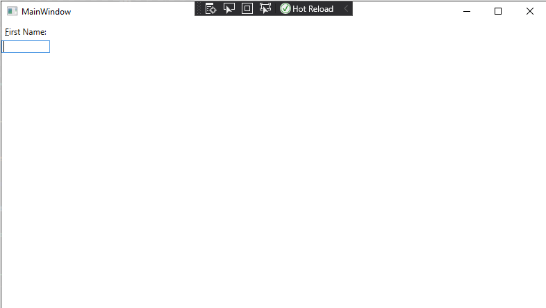
Now when the program is running, the user can press ALT + F to shift focus to the textbox, so they can begin typing (Note the character “F” is underlined in the GUI). Good use of access keys means users can navigate forms completely with the keyboard.
A ListBox displays a list of items that can be selected. The SelectionMode property can be set to either "Single" or "Multiple", and the "SelectedItems" read-only property provides those selected items. The ItemsSource property can be set declaratively using <ListBoxItem> contents. It also exposes a SelectionChanged event handler:
<ListBox>
    <ListBoxItem>Apple</ListBoxItem>
    <ListBoxItem>Orange</ListBoxItem>
    <ListBoxItem>Peach</ListBoxItem>
    <ListBoxItem>Pear</ListBoxItem>
</ListBox>
A group of RadioButton elements is used to present multiple options where only one can be selected. To group radio buttons, specify a shared GroupName property. Like other buttons, radio buttons have a Click event handler, and also a Checked and Unchecked event handler:
<StackPanel>
    <RadioButton GroupName="Fruit">Apple</RadioButton>
    <RadioButton GroupName="Fruit">Orange</RadioButton>
    <RadioButton GroupName="Fruit">Peach</RadioButton>
    <RadioButton GroupName="Fruit">Pear</RadioButton>
</StackPanel>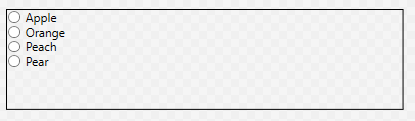
A TextBlock can be used to display arbitrary text. It also makes available a TextChanged event that is triggered when its text changes.
<TextBlock>Hi, I have something important to say. I'm a text block.</TextBlock>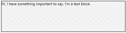
And a TextBox is an editable text box. It’s text can be accessed through the Text property:
<TextBox Text="And I'm a textbox!"/>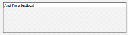
Finally, a ToggleButton is a button that is either turned on or off. This can be determined from its IsChecked property. It also has event handlers for Checked and Unchecked events:
<ToggleButton>On or Off</ToggleButton>Off looks like:

And on looks like:

This is just a sampling of some of the most used controls. You can also reference the System.Windows.Controls namespace documentation, or the TutorialsPoint WPF Controls reference.
All WPF controls (including the layout controls we’ve already seen) derive from common base classes, i.e. UIElement and FrameworkElement, which means they all inherit common properties. Some of the most commonly used are described here.
Perhaps the most important of the control properties are those that control sizing and placement. Let’s take a look at the most important of these.
WPF controls use three properties to determine the height of the element. These are MinHeight, Height, and MaxHeight. They are doubles expressed in device-independent units (measuring 1/96 of an inch). The rendering algorithm treats Height as a suggestion, but limits the calculated height to fall in the range between MinHeight and MaxHeight. The height determined by the algorithm can be accessed from the ActualHeight read-only property. Similar values exist for width: MinWidth, Width, MaxWidth, and ActualWidth.
| Property | Default Value | Description |
|---|---|---|
| MinHeight | 0.0 | The minimum element height |
| Height | NaN | The suggested element height |
| MaxHeight | PositiveInfinity | The maximum element height |
| MinWidth | 0.0 | The minimum element width |
| Width | NaN | The suggested element width |
| MaxWidth | PositiveInfinity | The maximum element width |
In addition to the size of the element, we can set margins around the element, adding empty space between this and other elements. The Margin property is actually of type Thickness, a structure with four properties: left, top, right, and bottom. We can set the Margin property in several ways using XAML.
To set all margins to be the same size, we just supply a single value:
<Button Margin="3">Do something</Button>To set different values for the horizontal and vertical margins, use two comma-separated values (horizontal comes first):
<Button Margin="10, 20">Do Something</Button> And finally, they can all be set separately as a comma-separated list (the order is left, top, right, and then bottom).
<Button Margin="10, 20, 30, 50">Do Something</Button>You can also align the elements within the space allocated for them using the VerticalAlignment and HorizontalAlignment properties. Similarly, you can align the contents of an element with the VerticalContentAlignment and HorizontalContentAlignment properties.
For most controls, these are "Stretch" by default, which means the control or its contents will expand to fill the available space. Additional values include "Bottom", "Center", and "Top" for vertical, and "Left", "Center", and "Right" for horizontal. These options do not fill the available space - the control is sized in that dimension based on its suggested size.
| HorizontalAlignment | |
|---|---|
| Option | Description |
| Stretch | Control fills the available horizontal space |
| Left | Control is aligned along the left of the available space |
| Center | Control is centered in the available horizontal space |
| Right | Control is aligned along the right of the available space |
| VerticalAlignment | |
| Option | Description |
| Stretch | Control fills the available vertical space |
| Top | Control is aligned along the top side of the available space |
| Center | Control is centered in the available vertical space |
| Bottom | Control is aligned along the bottom side of the available space |
As most controls prominently feature text, it is important to discuss the properties that effect how this text is presented.
The FontFamily property sets the font used by the control. This font needs to be installed on the machine. You can supply a single font, i.e.:
<TextBlock FontFamily="Arial">Or a list of font families to supply fallback options if the requested font is not available:
<TextBlock FontFamily="Arial, Century Gothic">The FontSize property determines the size of the font used in the control.
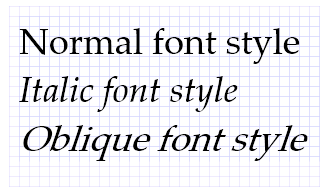
The FontStyle property sets the style of the font used. This can include "Normal", "Italic", or "Oblique". Italic is typically defined in the font itself (and created by the font creator), while Oblique is created from the normal font by applying a mathematical rendering transformation, and can be used for fonts that do not have a defined italic style.
The FontWeight refers to how thick a stroke is used to draw the font. It can be set to values like "Light", "Normal", "Bold", or "Ultra Bold". A list of all available options can be found here.
The TextAlignment property defines how the text is aligned within its element. Possible values are "Left" (the default), "Center", "Justify", and "Right", and behave just like these options in your favorite text editor.
There is no corresponding vertical alignment option - instead use VerticalContentAlignment discussed above.
There are often times in working with a GUI where you might want to disable or even hide a control. WPF controls provide several properties that affect the rendering and interaction of controls.
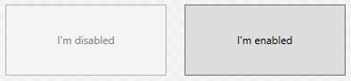
The IsEnabled property is a boolean that indicates if this control is currently enabled. It defaults to true. Exactly what ’enabled’ means for a control is specific to that kind of control, but usually means the control cannot be interacted with. For example, a button with IsEnabled=false cannot be clicked on, and will be rendered grayed out, i.e.:
<Grid>
    <Grid.ColumnDefinitions>
        <ColumnDefinition/>
        <ColumnDefinition/>
    </Grid.ColumnDefinitions>
    <Button IsEnabled="False" Margin="10">I'm Disabled</Button>
    <Button Grid.Column="1" Margin="10">I'm Enabled</Button>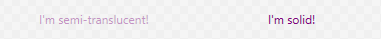
</Grid>A similar effect can be obtained by changing an element’s Opacity property, a double that ranges from 0.0 (completely transparent) to 1.0 (completely solid). Below you can see two <TextBlock> elements, with the one on the left set to an opacity of 0.40:
<Grid>
    <Grid.ColumnDefinitions>
        <ColumnDefinition/>
        <ColumnDefinition/>
    </Grid.ColumnDefinitions>
    <TextBlock Opacity="0.4" Foreground="Purple" VerticalAlignment="Center" HorizontalAlignment="Center">
      I'm semi-translucent!
    </TextBlock>
    <TextBlock Grid.Column="1" Foreground="Purple" VerticalAlignment="Center" HorizontalAlignment="Center">
      I'm solid!
    </TextBlock>
</Grid>
Alerting an elements’ opacity does not have any effect on its functionality, i.e. a completely transparent button can still be clicked.
Finally, the Visible property alters how the element is considered in the WPF rendering algorithm. It has three possible values: "Visible", "Hidden", and "Collapsed". The default value is "Visible", and the element renders normally, as “Button One” does in the example below:
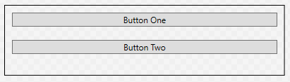
<StackPanel>
  <Button Visibility="Visible" Margin="10">Button One</Button>
  <Button Margin="10">Button Two</Button>
</StackPanel>
The "Hidden" value will hide the element, but preserve its place in the layout. A hidden element cannot be interacted with, so this is similar to setting the Opacity to 0 and IsEnabled to false:
<StackPanel>
<Button Visibility="Hidden" Margin="10">Button One</Button>
<Button Margin="10">Button Two</Button>
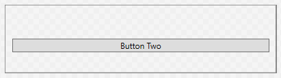
</StackPanel>Finally, the "Collapsed" value will leave the element out of the layout calculations, as though it were not a part of the control at all. A hidden element cannot be interacted with. Note that in the example below, “Button Two” has been rendered in the space previously occupied by “Button One”:
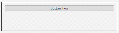
<StackPanel>
  <Button Visibility="Collapsed" Margin="10">Button One</Button>
  <Button Margin="10">Button Two</Button>
</StackPanel>You may have noticed the previous examples that colors can be accomplished through the Background and Foreground properties - where the Background determines the color of the element, and Foreground determines the color of text and other foreground elements. While this is true, it is also just the beginning of what is possible. Both of these properties have the type Brush, which deserves a deeper look.
Simply put, a brush determines how to paint graphical objects. This can be as simple as painting a solid color, or as complex as painting an image. The effect used is determined by the type of brush - the Brush class itself serving as a base class for several specific types brush.
What we’ve been using up to this point have been SolidColorBrush objects. This is the simplest of the brush classes, and simply paints with a solid color, i.e.:
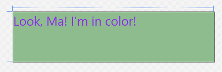
<TextBlock Foreground="BlueViolet" Background="DarkSeaGreen" FontSize="25">
  Look, Ma!  I'm in color!
</TextBlock>
The simplest way to set the color in XAML is to use a value from the predefined brush name list, like the "BlueViolet" and "DarkSeaGreen" in the example.
Alternatively, you can use a hexadecimal number defining the red, green, and blue channels in that order, i.e. to use K-State purple and white we’d use:
<TextBlock Foreground="#FFFFFF" Background="#512888" FontSize="25">
  Look, Ma!  I'm in color!
</TextBlock>
The various formats the hex values can be given are detailed here
Gradient brushes gradually transition between colors. There are two kinds of gradient brushes in WPF: with a LinearGradientBrush the brush gradually changes along a line. With a RadialGradientBrush, the color changes radially from a center point.
In both cases, the gradient is defined in terms of <GradientStops> - a distance along the line (or from the center) where the expected color value is defined. In the spaces between gradient stops, the color value is interpolated between the two stops on either side of the point. The gradient stop needs both an Offset value (a double indicating the percentage of how far along the line or from the center this stop falls, between 0.0 and 1.0) and a Color value (which can be defined as with solid color brushes).
For example, the XAML:
<TextBlock Foreground="#FFFFFF" FontSize="25">
  <TextBlock.Background>
      <LinearGradientBrush>
          <LinearGradientBrush.GradientStops>
              <GradientStop Color="Red" Offset="0.0"/>
              <GradientStop Color="Yellow" Offset="0.25"/>
              <GradientStop Color="Green" Offset="0.50"/>
              <GradientStop Color="Blue" Offset="0.75"/>
              <GradientStop Color="Violet" Offset="1.0"/>
          </LinearGradientBrush.GradientStops>
      </LinearGradientBrush>
  </TextBlock.Background>
  Look, Ma!  I'm in color!
</TextBlock>
Produces this rainbow gradient:
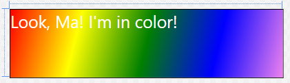
Further, the line along which the linear gradient is created is defined by the StartPoint and EndPoint properties of the <LinearGradientBrush>. These points are relative to the area the brush is covering (i.e. the space occupied by the element), and fall in the range of [0.0 .. 1.0]. The default (as seen above) is a diagonal line from the upper left corner (0,0) to the lower right corner (1.0, 1.0).
To make the above gradient fall in the center half of the element, and be horizontal, we could tweak the gradient definition:
<TextBlock Foreground="#FFFFFF" FontSize="25">
    <TextBlock.Background>
        <LinearGradientBrush StartPoint="0.25, 0.5" EndPoint="0.75, 0.5">
            <LinearGradientBrush.GradientStops>
                <GradientStop Color="Red" Offset="0.0"/>
                <GradientStop Color="Yellow" Offset="0.25"/>
                <GradientStop Color="Green" Offset="0.50"/>
                <GradientStop Color="Blue" Offset="0.75"/>
                <GradientStop Color="Violet" Offset="1.0"/>
            </LinearGradientBrush.GradientStops>
        </LinearGradientBrush>
    </TextBlock.Background>
    Look, Ma!  I'm in color!
</TextBlock>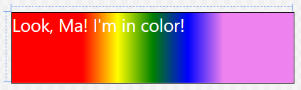
A <RadialGradientBrush> is defined similarly through the use of GradientStops, only this time they are in relation to the center around which the gradient radiates:
<TextBlock Foreground="#FFFFFF" FontSize="25">
    <TextBlock.Background>
        <RadialGradientBrush>
            <RadialGradientBrush.GradientStops>
                <GradientStop Color="Red" Offset="0.0"/>
                <GradientStop Color="Yellow" Offset="0.25"/>
                <GradientStop Color="Green" Offset="0.50"/>
                <GradientStop Color="Blue" Offset="0.75"/>
                <GradientStop Color="Violet" Offset="1.0"/>
            </RadialGradientBrush.GradientStops>
        </RadialGradientBrush>
    </TextBlock.Background>
    Look, Ma!  I'm in color!
</TextBlock>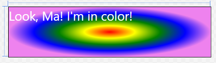
The gradient fills an ellipse defined by the Center property and the RadiusX and RadiusY properties. By default these values are (0.5. 0.5), 0.5, and 0.5 respectively. Like other gradient properties, they are doubles between 0.0 and 1.0. Finally, the gradient emanates from the GradientOrigin, also a point with values defined by this coordinate system.
To center the above gradient in the left half of the block, we would therefore use:
<TextBlock.Background>
    <RadialGradientBrush Center="0.25, 0.5" RadiusX="0.25" RadiusY="0.5" GradientOrigin="0.25, 0.5">
        <RadialGradientBrush.GradientStops>
            <GradientStop Color="Red" Offset="0.0"/>
            <GradientStop Color="Yellow" Offset="0.25"/>
            <GradientStop Color="Green" Offset="0.50"/>
            <GradientStop Color="Blue" Offset="0.75"/>
            <GradientStop Color="Violet" Offset="1.0"/>
        </RadialGradientBrush.GradientStops>
    </RadialGradientBrush>
</TextBlock.Background>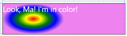
And of course, we can use a gradient for a Foreground property as well:
<TextBlock Background="White" FontSize="40">
    <TextBlock.Foreground>
        <LinearGradientBrush>
            <LinearGradientBrush.GradientStops>
                <GradientStop Color="Red" Offset="0.0"/>
                <GradientStop Color="Yellow" Offset="0.25"/>
                <GradientStop Color="Green" Offset="0.50"/>
                <GradientStop Color="Blue" Offset="0.75"/>
                <GradientStop Color="Violet" Offset="1.0"/>
            </LinearGradientBrush.GradientStops>
        </LinearGradientBrush>
    </TextBlock.Foreground>
    Look, Ma!  I'm in color!
</TextBlock>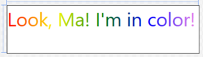
To draw a saved image, we use an ImageBrush, setting its ImageSource property to the image we want to use. In XAML, that can be as simple as:
<Button Margin="40" Foreground="White" FontSize="30">
    <Button.Background>
        <ImageBrush ImageSource="Dish.jpg"/>
    </Button.Background>
    Broadcast
</Button>
We can apply image brushes to any WPF control, allowing for some interesting layering effects, i.e.:
<Grid>
    <Grid.Background>
        <ImageBrush ImageSource="watering-can.jpg"/>
    </Grid.Background>
    <Grid.ColumnDefinitions>
        <ColumnDefinition/>
        <ColumnDefinition/>
        <ColumnDefinition/>
    </Grid.ColumnDefinitions>
    <Grid.RowDefinitions>
        <RowDefinition/>
        <RowDefinition/>
        <RowDefinition/>
    </Grid.RowDefinitions>
    <Button Margin="40" Foreground="White" FontSize="30">
        <Button.Background>
            <ImageBrush ImageSource="Dish.jpg"/>
        </Button.Background>
        Broadcast
    </Button>
</Grid>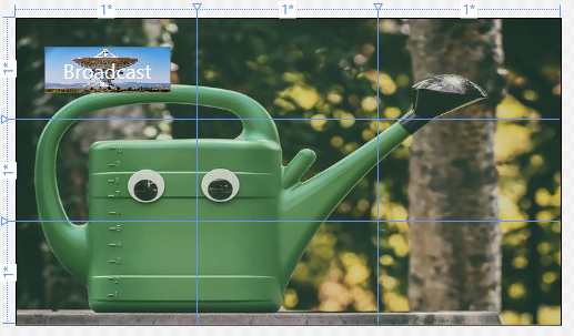
You probably notice that the dish image on the button is distorted. We can correct this by changing the Stretch property. The possible values are: "None", "Fill", "Uniform", and "UniformToFill". This graphic from the documentation visual shows these properties:
The ImageBrush extends the TileBrush, so the image can actually be tiled if the tile size is set to be smaller than the element that it is painting. The TileBrush Overview provides a detailed breakdown of applying tiling.
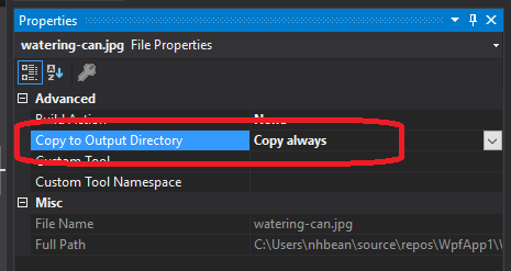
When using images with Visual Studio, it is important to understand how those are used and distributed. You should make sure the images are physically located within the project folder (so that they are included in your source control). Additionally, you want to mark the property “Copy to Output Directory” to either “Copy Always” or “Copy if Newer.” When distributing your project, these files will also need to be distributed, or the image will be unavailable to your executable.
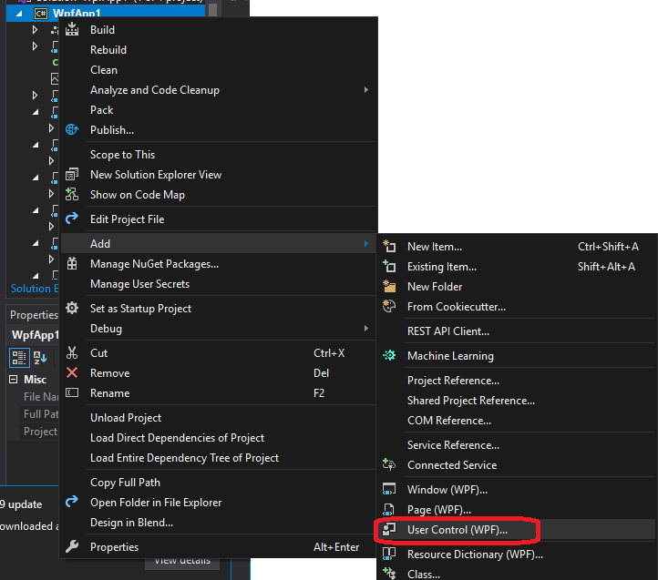
To create a new WPF control from within Visual Studio, we usually choose “Add > User Control (WPF…)” from the solution context menu.
This creates two files, the [filename].xaml:
<UserControl x:Class="WpfApp1.UserControl1"
             xmlns="http://schemas.microsoft.com/winfx/2006/xaml/presentation"
             xmlns:x="http://schemas.microsoft.com/winfx/2006/xaml"
             xmlns:mc="http://schemas.openxmlformats.org/markup-compatibility/2006"
             xmlns:d="http://schemas.microsoft.com/expression/blend/2008"
             xmlns:local="clr-namespace:WpfApp1"
             mc:Ignorable="d"
             d:DesignHeight="100" d:DesignWidth="400">
    <Grid>
    </Grid>
</UserControl>
and the codebehind for that XAML file, [filename].xaml.cs (where [filename] is the name you supplied):
using System;
using System.Collections.Generic;
using System.Collections.ObjectModel;
using System.Text;
using System.Windows;
using System.Windows.Controls;
using System.Windows.Data;
using System.Windows.Documents;
using System.Windows.Input;
using System.Windows.Media;
using System.Windows.Media.Imaging;
using System.Windows.Navigation;
using System.Windows.Shapes;

namespace WpfApp1
{
    /// <summary>
    /// Interaction logic for UserControl1.xaml
    /// </summary>
    public partial class UserControl1 : UserControl
    {
        public UserControl1()
        {
            InitializeComponent();
        }
    }

}
As was mentioned previously, the InitializeComponent() call in the constructor is what builds the structure specified in the XAML file to the object, so it should not be removed, nor should any manipulation of that structure be done before this method invocation.
Most custom controls are subclasses of the UserControl class, and choosing this option has Visual Studio create the boilerplate for us. However, if you need to extend a specific control, i.e. a ListView, it is often easiest to start with a UserControl made this way, and then change the base class to ListView in the [filename].xaml.cs file, as well as changing the <UserControl> element to a <ListView> element in the [filename].xaml.
Also, notice how the attributes of the control in the XAML file contain a local namespace:
xmlns:local="clr-namespace:WpfApp1"This is the equivalent of a using statement for XAML; it creates the local namespace and ties it to the project’s primary namespace. We can then create an element corresponding to any class in that namespace. Let’s say we have another custom control, ThingAMaJig that we want to utilize in this control. We can use the element notation to add it to our grid:
    <Grid>
      <local:ThingAMaJig>
    </Grid>
Note that we must preface the class name in the element with the local namespace, with a colon (:) separating the two.
We can also add additional namespace statements. For example:
xmlns:system="clr-namespace:System;assembly=mscorlib"This brings in the System namespace, so now we can use the classes and types defined there, i.e String:
<system:String>Hello World!</system:String>Note that for the namespace attribute, we also included the assembly information. This is necessary for any assemblies that are not defined by this project (i.e. exist in their own DLL files).
In Visual Studio, opening a WPF XAML file will open a special editor that provides a side-by-side visual and XAML code editors for the control:
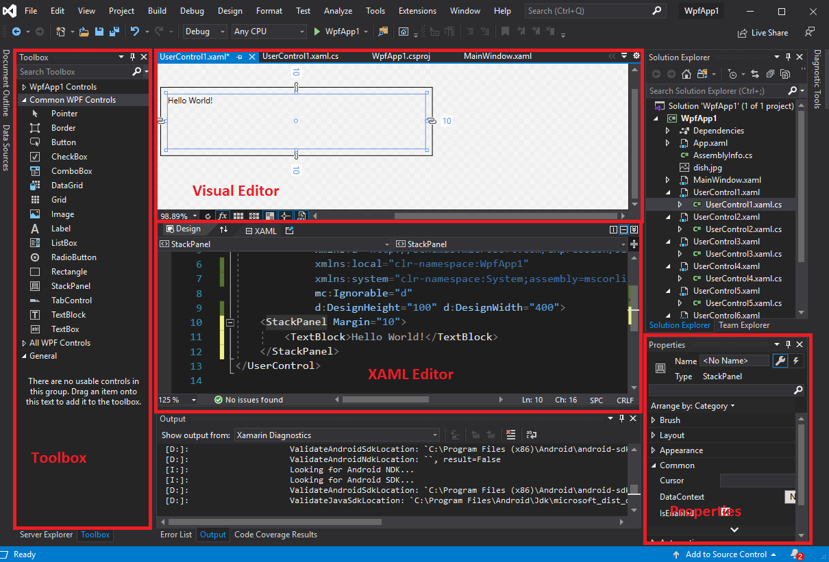
As you edit the XAML, it also updates the visualization in the visual editor. Also, many element properties can be edited from the visual editor or the properties pane - and these changes are automatically applied to the XAML. And, just like with Windows Forms, you can drag controls from the toolbox into the visualization to add them to the layout.
However, you will likely find yourselves often directly editing the XAML. This is often the fastest and most foolproof way of editing WPF controls. Remember that in WPF controls resize to fit the available space, and are not positioned by coordinates. For this reason, the visual editor will actually apply margins instead of positioning elements, which can cause unexpected results if your application is viewed at a different resolution (including some controls being inaccessible as they are covered by other controls).
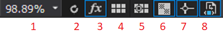
A couple of buttons in the editor deserve some closer attention:

WPF and XAML lend themselves to a design approach known as Component-Based Design or Component-Based Development, which rather than focusing on developing the entire GUI in one go, focuses on decomposing user experiences (UX) into individual, focused, and potentially reusable components. These can, in turn, be used to build larger components, and eventually, the entire GUI (see “UX Principles for Designing Component Based Systems” for more details).
Let’s dig deeper by focusing on a specific example. Let’s say we want to build an application for keeping track of multiple shopping lists. So our core component is a displayed list, plus a mechanism for adding to it. Let’s create a UserComponent to represent this.
For laying out the component, let’s say at the very top, we place the text “Shopping List For”, and directly below that we have an editable text box where the user can enter a store name. On the bottom, we’ll have a text box to enter a new item, and a button to add that item to the list. And in the space between, we’ll show the list in its current form. This sounds like an ideal fit for the DockPanel:
<UserControl x:Class="ShopEasy.ShoppingList"
             xmlns="http://schemas.microsoft.com/winfx/2006/xaml/presentation"
             xmlns:x="http://schemas.microsoft.com/winfx/2006/xaml"
             xmlns:mc="http://schemas.openxmlformats.org/markup-compatibility/2006"
             xmlns:d="http://schemas.microsoft.com/expression/blend/2008"
             xmlns:local="clr-namespace:ShopEasy"
             mc:Ignorable="d"
             d:DesignHeight="450" d:DesignWidth="200">
    <DockPanel>
        <TextBlock DockPanel.Dock="Top" FontWeight="Bold" TextAlignment="Center">
            Shopping List For:
        </TextBlock>
        <TextBox DockPanel.Dock="Top" FontWeight="Bold" TextAlignment="Center" />
        <Button DockPanel.Dock="Bottom" Click="AddItemToList">Add Item To List</Button>
        <TextBox Name="itemTextBox" DockPanel.Dock="Bottom"/>
        <ListView Name="itemsListView" />
    </DockPanel>
</UserControl>
Now in our codebehind, we’ll need to define the AddItemToList event handler:
using System.Windows;
using System.Windows.Controls;

namespace ShopEasy
{
    /// <summary>
    /// Interaction logic for ShoppingList.xaml
    /// </summary>
    public partial class ShoppingList : UserControl
    {
        /// <summary>
        /// Constructs a new ShoppingList
        /// </summary>
        public ShoppingList()
        {
            InitializeComponent();
        }

        /// <summary>
        /// Adds the item in the itemTextBox to the itemsListView
        /// </summary>
        /// <param name="sender">The object sending the event</param>
        /// <param name="e">The events describing the event</param>
        void AddItemToList(object sender, RoutedEventArgs e)
        {
            // Make sure there's an item to add
            if (itemTextBox.Text.Length == 0) return;
            // Add the item to the list
            itemsListView.Items.Add(itemTextBox.Text);
            // Clear the text box
            itemTextBox.Clear();
        }
    }
}
This particular component is pretty much self-contained. We can use it in other components that need a shopping list. In our case, we’ll add it to a collection of shopping lists we can flip through with a couple of buttons, as well as create new lists in. Let’s call this control ListSwitcher.
This time, let’s use a Grid layout and divide the available space into three columns and two rows. The columns we’ll leave with the default width ("1*"), but the bottom row we’ll set as 100 units high, leaving the top row to expand to fill the remaining space. Along the bottom we’ll create three buttons to navigate between shopping lists. On the top, we’ll use the Grid.ColumnSpan property on a Border to span the three columns, creating a container where we’ll display the current ShoppingList:
<UserControl x:Class="ShopEasy.ListSwitcher"
xmlns="http://schemas.microsoft.com/winfx/2006/xaml/presentation"
xmlns:x="http://schemas.microsoft.com/winfx/2006/xaml"
xmlns:mc="http://schemas.openxmlformats.org/markup-compatibility/2006"
xmlns:d="http://schemas.microsoft.com/expression/blend/2008"
xmlns:local="clr-namespace:ShopEasy"
mc:Ignorable="d"
d:DesignHeight="450" d:DesignWidth="200">
<Grid>
<Grid.ColumnDefinitions>
<ColumnDefinition/>
<ColumnDefinition/>
<ColumnDefinition/>
</Grid.ColumnDefinitions>
<Grid.RowDefinitions>
<RowDefinition/>
<RowDefinition Height="100"/>
</Grid.RowDefinitions>
<Border Name="listContainer" Grid.ColumnSpan="3">
</Border>
<Button Grid.Row="1" Click="OnPriorList">
< Prior List
</Button>
<Button Grid.Row="1" Grid.Column="1" Click="OnNewList">
New List
</Button>
<Button Grid.Row="1" Grid.Column="2" Click="OnNextList">
Next List >
</Button>
</Grid>
</UserControl>Now we’ll implement the three button Click event handlers in the codebehind, as well as creating a List<ShoppingList> to store all of our lists:
using System.Collections.Generic;
using System.Windows;
using System.Windows.Controls;

namespace ShopEasy
{
    /// <summary>
    /// Interaction logic for ListSwitcher.xaml
    /// </summary>
    public partial class ListSwitcher : UserControl
    {
        /// <summary>
        /// The list of shopping lists managed by this control
        /// </summary>
        List<ShoppingList> lists = new List<ShoppingList>();

        /// <summary>
        /// The index of the currently displayed shopping list
        /// </summary>
        int currentListIndex = 0;

        /// <summary>
        /// Constructs a new ListSwitcher
        /// </summary>
        public ListSwitcher()
        {
            InitializeComponent();
        }

        /// <summary>
        /// Creates a new ShoppingList and displays it
        /// </summary>
        /// <param name="sender">What triggered this event</param>
        /// <param name="e">The parameters of this event</param>
        void OnNewList(object sender, RoutedEventArgs e)
        {
            // Create a new shopping list
            var list = new ShoppingList();
            // The current count of lists will be the index of the next list added
            currentListIndex = lists.Count;
            // Add the list to the list of shopping lists
            lists.Add(list);
            // Display the list on the control
            listContainer.Child = list;
        }

        /// <summary>
        /// Displays the prior shopping list
        /// </summary>
        /// <param name="sender">What triggered this event</param>
        /// <param name="e">The parameters of this event</param>
        void OnPriorList(object sender, RoutedEventArgs e)
        {
            // don't try to access an empty list
            if (lists.Count == 0) return;
            // decrement the currentListIndex
            currentListIndex--;
            // make sure we don't go below the first index in the list (0)
            if (currentListIndex < 0) currentListIndex = 0;
            // display the indexed list
            listContainer.Child = lists[currentListIndex];
        }

        /// <summary>
        /// Displays the next shopping list
        /// </summary>
        /// <param name="sender">What triggered this event</param>
        /// <param name="e">The parameters of this event</param>
        void OnNextList(object sender, RoutedEventArgs e)
        {
            // don't try to access an empty list
            if (lists.Count == 0) return;
            // increment the currentListIndex
            currentListIndex++;
            // make sure we don't go above the last index in the list (Count - 1)
            if (currentListIndex > lists.Count - 1) currentListIndex = lists.Count - 1;
            // display the indexed list
            listContainer.Child = lists[currentListIndex];
        }
    }
}
And finally, we’ll modify our MainWindow XAML to display a ListSwitcher:
<Window x:Class="ShopEasy.MainWindow"
xmlns="http://schemas.microsoft.com/winfx/2006/xaml/presentation"
xmlns:x="http://schemas.microsoft.com/winfx/2006/xaml"
xmlns:d="http://schemas.microsoft.com/expression/blend/2008"
xmlns:mc="http://schemas.openxmlformats.org/markup-compatibility/2006"
xmlns:local="clr-namespace:ShopEasy"
mc:Ignorable="d"
Title="MainWindow" Height="450" Width="200">
<Grid>
<local:ListSwitcher/>
</Grid>
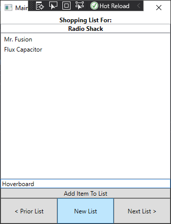
</Window>The resulting app allows us to create multiple shopping lists, and swap between them using the buttons:
Much like we can use objects to break program functionality into smaller, more focused units, we can use component-based design to break GUIs into smaller, more focused units. Both reflect one of the principles of good programming practice - the Single Responsibility Principle. This principle suggests each unit of code should focus on a single responsibility, and more complex behaviors be achieved by using multiple units together. As we see here, this principle extends across multiple programming paradigms.
In this chapter, we introduced a new desktop application programming framework - Windows Presentation Foundation (WPF). We explored how WPF uses XAML to define partial classes, allowing for a graphical design editor with regular C# codebehind. We explored XAML syntax and many of the controls found in WPF. We also compared WPF with Windows Forms, which you have previously explored in prior classes. Finally, we discussed an approach to developing GUIs, Component-Based Design, which applies the Single Responsibility Principle to controls, and builds more complex controls through composition of these simpler controls.