Exploring Elements
Our application is a tree?
Our application is a tree?
In the previous chapter, we introduced Windows Presentation Foundation and XAML, and discussed common layouts and controls, as well as some of the most common features of each of them. We also saw the concept of component-based design and explored its use. In this chapter, we’ll take a deeper dive into how WPF and XAML structure GUIs into an elements tree, and some different ways we can leverage these features for greater control and customization in our programs.
<Style><Setter>StaticResourceIn this chapter, you should learn how to navigate the elements tree, declare styles to simplify styling your applications, and declare resources that can be bound to properties of controls.
Consider the ShoppingList class we developed in the last chapter:
<UserControl x:Class="ShopEasy.ShoppingList"
             xmlns="http://schemas.microsoft.com/winfx/2006/xaml/presentation"
             xmlns:x="http://schemas.microsoft.com/winfx/2006/xaml"
             xmlns:mc="http://schemas.openxmlformats.org/markup-compatibility/2006"
             xmlns:d="http://schemas.microsoft.com/expression/blend/2008"
             xmlns:local="clr-namespace:ShopEasy"
             mc:Ignorable="d"
             d:DesignHeight="450" d:DesignWidth="200">
    <DockPanel>
        <TextBlock DockPanel.Dock="Top" FontWeight="Bold" TextAlignment="Center">
            Shopping List For:
        </TextBlock>
        <TextBox DockPanel.Dock="Top" FontWeight="Bold" TextAlignment="Center" />
        <Button DockPanel.Dock="Bottom" Click="AddItemToList">Add Item To List</Button>
        <TextBox Name="itemTextBox" DockPanel.Dock="Bottom"/>
        <ListView Name="itemsListView" />
    </DockPanel>
</UserControl>
Each element in this XAML corresponds to an object of a specific Type, and the nesting of the elements implies a tree-like structure we call the element tree. We can draw this out as an actual tree:
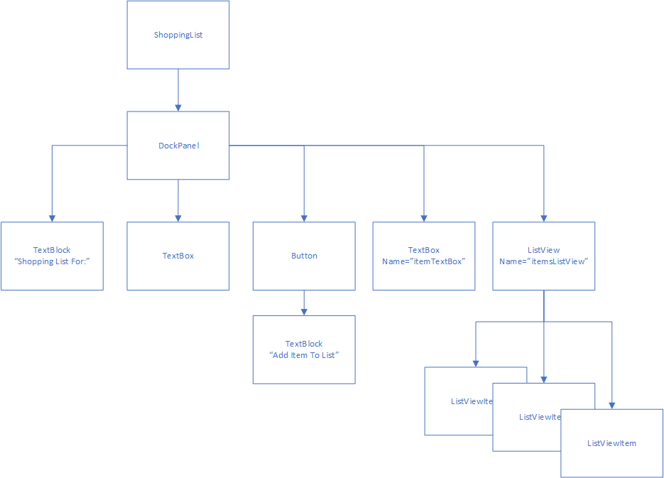
The relationships in the tree are also embodied in the code. Each element has either a Child or Children property depending on if it can have just one or multiple children, and these are populated by the elements defined in the XAML. Thus, because the <DockPanel> has nested within it, a <TextBlock>, <TextBox>, <Button>, <TextBox>, and <ListView>, these are all contained in its Children Property. In turn, the <Button> element has text as a child, which is implemented as another <TextBlock>. Also, each component has a Parent property, which references the control that is its immediate parent.
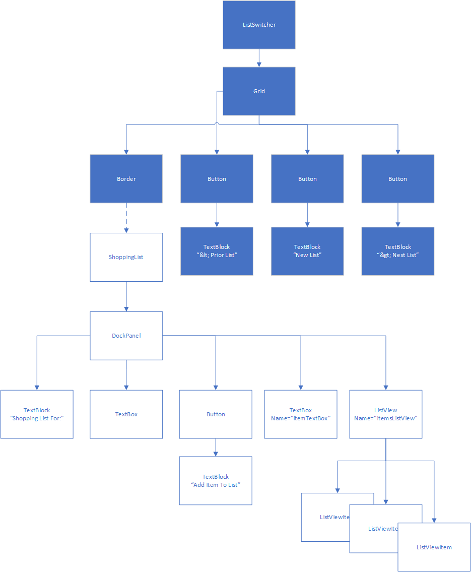
In other words, all the WPF controls are effectively nodes in a tree data structure. We can modify this data structure by adding or removing nodes. This is exactly what happens in the ListSwitcher control - when you click the “New List” button, or the “Prior” or “Next” button, you are swapping the subtree that is the child of its <Border> element:
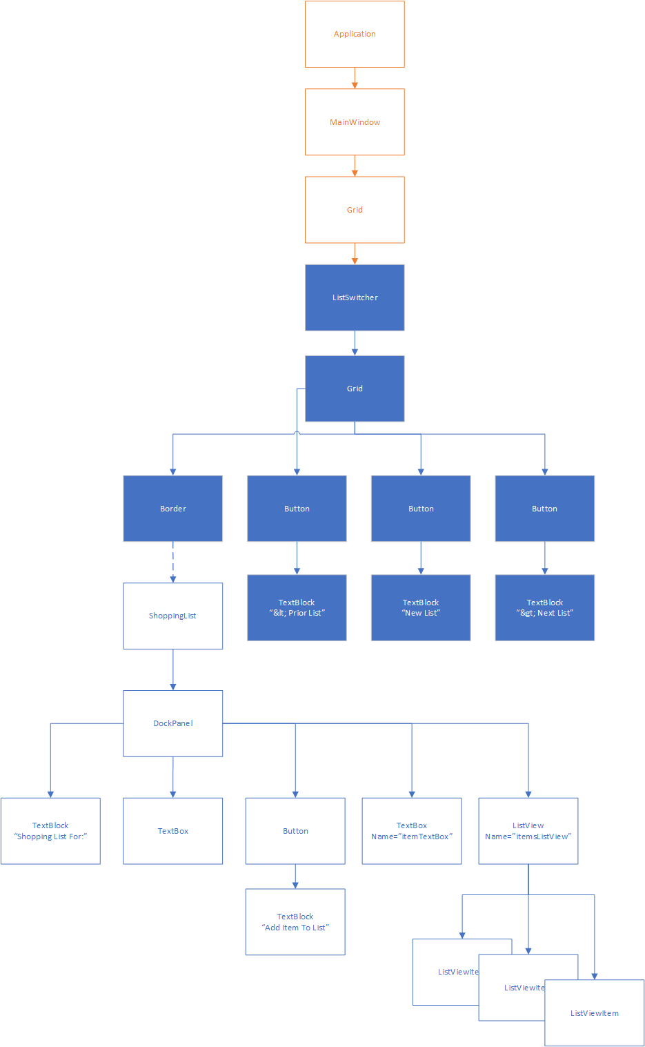
In fact, the entire application is one large tree of elements, with the <Application> as its root:
When you first learned about trees, you also learned about tree traversal algorithms. This is one reason that WPF is organized into a tree - the rendering process actually uses a tree traversal algorithm to determine how large to make each control!
You can also traverse the tree yourself, by exploring Child, Children, or Parent properties. For example, if we needed to gain access to the ListSwitcher from the ShoppingList in the previous example, you could reach it by invoking:
ListSwitcher switcher = this.Parent.Parent.Parent as ListSwitcher;In this example, this is our ShoppingList, the first Parent is the Border containing the ShoppingList, the second Parent is the Grid containing that Border, and the third Parent is the actual ListSwitcher. We have to cast it to be a ListSwitcher because the type of the Parent property is a DependencyObject (a common base class of all controls).
Of course, this is a rather brittle way of finding an ancestor, because if we add any nodes to the element tree (perhaps move the Grid within a DockPanel), we’ll need to rewrite it. It would be better to use a loop to iteratively climb the tree until we find the control we’re looking for. This is greatly aided by the LogicalTreeHelper library, which provides standardized static methods for accessing parents and children in the elements tree:
// Start climbing the tree from this node
DependencyObject parent = this;
do
{
    // Get this node's parent
    parent = LogicalTreeHelper.GetParent(parent);
}
// Invariant: there is a parent element, and it is not a ListSwitcher
while(!(parent is null || parent is ListSwitcher));
// If we get to this point, parent is either null, or the ListSwitcher we're looking for
Searching the ancestors is a relatively easy task, as each node in the tree has only one parent. Searching the descendants takes more work, as each node may have many children, with children of their own.
This approach works well for complex applications with complex GUIs, where it is infeasible to keep references around. However, for our simple application here, it might make more sense to refactor the ShoppingList class to keep track of the ListSwitcher that created it, i.e.:
using System.Windows;
using System.Windows.Controls;

namespace ShopEasy
{
    /// <summary>
    /// Interaction logic for ShoppingList.xaml
    /// </summary>
    public partial class ShoppingList : UserControl
    {
        /// <summary>
        /// The ListSwitcher that created this list
        /// </summary>
        private ListSwitcher listSwitcher;

        /// <summary>
        /// Constructs a new ShoppingList
        /// </summary>
        public ShoppingList(ListSwitcher listSwitcher)
        {
            InitializeComponent();
            this.listSwitcher = listSwitcher;
        }

        /// <summary>
        /// Adds the item in the itemTextBox to the itemsListView
        /// </summary>
        /// <param name="sender">The object sending the event</param>
        /// <param name="e">The events describing the event</param>
        void AddItemToList(object sender, RoutedEventArgs e)
        {
            // Make sure there's an item to add
            if (itemTextBox.Text.Length == 0) return;
            // Add the item to the list
            itemsListView.Items.Add(itemTextBox.Text);
            // Clear the text box
            itemTextBox.Clear();
        }
    }
}
However, this approach now tightly couples the ListSwitcher and ShoppingList - we can no longer use the ShoppingList for other contexts without a ListSwitcher.
If we instead employed the the traversal algorithm detailed above:
using System.Windows;
using System.Windows.Controls;

namespace ShopEasy
{
    /// <summary>
    /// Interaction logic for ShoppingList.xaml
    /// </summary>
    public partial class ShoppingList : UserControl
    {
        /// <summary>
        /// The ListSwitcher that created this list
        /// </summary>
        private ListSwitcher listSwitcher {
            get {
                DependencyObject parent = this;
                do
                {
                    // Get this node's parent
                    parent = LogicalTreeHelper.GetParent(parent);
                }
                // Invariant: there is a parent element, and it is not a ListSwitcher
                while(!(parent is null || parent is ListSwitcher));
                return parent;
            }
        }

        /// <summary>
        /// Constructs a new ShoppingList
        /// </summary>
        public ShoppingList()
        {
            InitializeComponent();
        }

        /// <summary>
        /// Adds the item in the itemTextBox to the itemsListView
        /// </summary>
        /// <param name="sender">The object sending the event</param>
        /// <param name="e">The events describing the event</param>
        void AddItemToList(object sender, RoutedEventArgs e)
        {
            // Make sure there's an item to add
            if (itemTextBox.Text.Length == 0) return;
            // Add the item to the list
            itemsListView.Items.Add(itemTextBox.Text);
            // Clear the text box
            itemTextBox.Clear();
        }
    }
}
We could invoke the listSwitcher property to get the ancestor ListSwitcher. If this control is being used without one, the value will be Null.
Windows Presentation Foundation takes advantage of the elements tree in other ways. One of the big ones is for styling related elements. Let’s say we are creating a calculator GUI:
<UserControl x:Class="Calculator.Calculator"
        xmlns="http://schemas.microsoft.com/winfx/2006/xaml/presentation"
        xmlns:x="http://schemas.microsoft.com/winfx/2006/xaml"
        xmlns:d="http://schemas.microsoft.com/expression/blend/2008"
        xmlns:mc="http://schemas.openxmlformats.org/markup-compatibility/2006"
        xmlns:local="clr-namespace:Calculator"
        mc:Ignorable="d"
        d:DesignWidth="450" d:DesignHeight="450">
    <Grid>
        <Grid.ColumnDefinitions>
            <ColumnDefinition/>
            <ColumnDefinition/>
            <ColumnDefinition/>
            <ColumnDefinition/>
        </Grid.ColumnDefinitions>
        <Grid.RowDefinitions>
            <RowDefinition/>
            <RowDefinition/>
            <RowDefinition/>
            <RowDefinition/>
            <RowDefinition/>
        </Grid.RowDefinitions>

        <Button Grid.Column="0" Grid.Row="1">7</Button>
        <Button Grid.Column="1" Grid.Row="1">8</Button>
        <Button Grid.Column="2" Grid.Row="1">9</Button>
        <Button Grid.Column="0" Grid.Row="2">4</Button>
        <Button Grid.Column="1" Grid.Row="2">5</Button>
        <Button Grid.Column="2" Grid.Row="2">6</Button>
        <Button Grid.Column="0" Grid.Row="3">1</Button>
        <Button Grid.Column="1" Grid.Row="3">2</Button>
        <Button Grid.Column="2" Grid.Row="3">3</Button>
        <Button Grid.Column="0" Grid.Row="4" Grid.ColumnSpan="3">0</Button>
        <Button Grid.Column="3" Grid.Row="1">+</Button>
        <Button Grid.Column="3" Grid.Row="2">-</Button>
        <Button Grid.Column="3" Grid.Row="3">*</Button>
        <Button Grid.Column="3" Grid.Row="4">/</Button>
    </Grid>
</Window>
Once we have the elements laid out, we realize the text of the buttons is too small. Fixing this would mean setting the FontSize property of each <Button>. That’s a lot of repetitive coding.
Thankfully, the XAML developers anticipated this kind of situation, and allow us to attach a <Style> resource to the control. We typically would do this above the controls we want to style - in this case, either on the <Grid> or the <UserControl>. If we were to attach it to the <Grid>, we’d declare a <Grid.Resources> property, and inside it, a <Style>:
<Grid.Resources>
    <Style>
    </Style>
</Grid.Resources>
The <Style> element allows us to specify a TargetType property, which is the Type we want the style to apply to - in this case "Button". Inside the <Style> element, we declare <Setter> elements, which need Property and Value attributes. As you might guess from the names, the <Setter> will set the specified property to the specified value on each element of the target type.
Therefore, if we use:
<Grid.Resources>
    <Style TargetType="Button">
        <Setter Property="FontSize" Value="40"/>
    </Style>
</Grid.Resources>
The result will be that all buttons that are children of the <Grid> will have their FontSize set to 40 device-independent pixels. We don’t need to add a separate FontSize="40" to each one! However, if we add FontSize="50" to a single button, that button alone will have a slightly larger font.
We can declare as many <Setters> as we want in a <Style> element, and as many <Style> elements as we want in a <.Resources> element. Moreover, styles apply to all children in the elements tree. Closer setters override those farther up the tree, and setting the property directly on an element always gives the final say.
Thus, we might put application-wide styles directly in our MainWindow using <Window.Resources>, and override those further down the elements tree when we want a different behavior.
You may notice some similarities between <Style> elements and the cascading style sheets (css) of web technologies. This is not surprising, as the styling approach used in WPF was inspired by CSS, much as XAML drew inspiration from HTML. However, the implementation details are necessarily different, as XAML is effectively declaring C# objects. Hence, the use of ‘setters’ to set ‘properties’ to a specific ‘value’.
The <Style> element represents just one kind of resource. We can provide other kinds of resources, like raw data. Say we want to provide a string to display in our program, but want that string declared somewhere easy to find and change (perhaps our customers change their mind frequently). We could declare the string in the Application resources:
<Application x:Class="WpfTutorialSamples.App"
             xmlns="http://schemas.microsoft.com/winfx/2006/xaml/presentation"
             xmlns:x="http://schemas.microsoft.com/winfx/2006/xaml"
             xmlns:sys="clr-namespace:System;assembly=mscorlib"
             StartupUri="WPF application/ExtendedResourceSample.xaml">
    <Application.Resources>
        <sys:String x:Key="StringToDisplay">Hello World!</sys:String>
    </Application.Resources>
</Application>
Then, in our actual control we can use that string as a static resource:
<TextBlock Text="{StaticResource StringToDisplay}">As long as that element is a descendant of the element the resource is declared on, it will be used in the property. In this case, we’ll display the string “Hello World!” in the TextBlock. Note that we have to use the x:Key property to identify the resource, and repeat the key in the "{StaticResource StringToDisplay}". The curly braces and the StaticResource both need to be there (technically, they are setting up a data binding, which we’ll talk about in a future chapter).
We can declare any kind of type as a resource and make it available in our XAML this way.
For example, we could create a LinearGradientBrush:
<Application x:Class="WpfTutorialSamples.App"
             xmlns="http://schemas.microsoft.com/winfx/2006/xaml/presentation"
             xmlns:x="http://schemas.microsoft.com/winfx/2006/xaml"
             xmlns:sys="clr-namespace:System;assembly=mscorlib"
             StartupUri="WPF application/ExtendedResourceSample.xaml">
    <Application.Resources>
        <LinearGradientBrush x:Key="Rainbow">
            <LinearGradientBrush.GradientStops>
                <GradientStop Color="Red" Offset="0.0"/>
                <GradientStop Color="Yellow" Offset="0.25"/>
                <GradientStop Color="Green" Offset="0.50"/>
                <GradientStop Color="Blue" Offset="0.75"/>
                <GradientStop Color="Violet" Offset="1.0"/>
            </LinearGradientBrush.GradientStops>
        </LinearGradientBrush>
    </Application.Resources>
</Application>
And then use it as a Background or Foreground property in our controls:
<Grid Background="{StaticResource Rainbow}">Since it is only defined in one place, it is now easier to reuse, and if we ever need to change it, we only need to change it in one location.
Finally, we can create static resources from images and other media. First, we have to set its build action to “Resource” in the “Properties” window after adding it to our project:
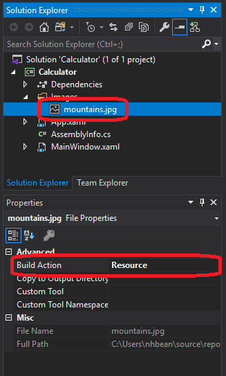
Then we can declare a <BitmapImage> resource using a UriSource property that matches the path to the image within our project:
<Application x:Class="WpfTutorialSamples.App"
             xmlns="http://schemas.microsoft.com/winfx/2006/xaml/presentation"
             xmlns:x="http://schemas.microsoft.com/winfx/2006/xaml"
             xmlns:sys="clr-namespace:System;assembly=mscorlib"
             StartupUri="WPF application/ExtendedResourceSample.xaml">
    <Application.Resources>
        <BitmapImage x:Key="MountainImage" UriSource="Images/mountains.jpg"/>
    </Applicaton.Resources>
</Application>
And then we can use this as the ImageSource for an ImageBrush:
<Grid>
    <Grid.Background>
        <ImageBrush ImageSource="{StaticResource MountainImage}"/>
    </Grid.Background>
</Grid>
The benefit of using images and other media as resources is that they are compiled into the binary assembly (the .dll or .exe file). This means they don’t need to be copied separately when we distribute our application.
Most WPF controls are themselves composed of multiple, simpler, controls. For example, a <Button> is composed of a <Border> and whatever content you place inside the button. A simplified version of this structure appears below (I removed the styling information and the VisualState components responsible for presenting the button differently when it is enabled, disabled, hovered on, or clicked):
<Border TextBlock.Foreground="{TemplateBinding Foreground}"
        x:Name="Border"
        CornerRadius="2"
        BorderThickness="1">
  <Border.BorderBrush>
    <LinearGradientBrush StartPoint="0,0"
                          EndPoint="0,1">
      <LinearGradientBrush.GradientStops>
        <GradientStopCollection>
          <GradientStop Color="{DynamicResource BorderLightColor}"
                        Offset="0.0" />
          <GradientStop Color="{DynamicResource BorderDarkColor}"
                        Offset="1.0" />
        </GradientStopCollection>
      </LinearGradientBrush.GradientStops>
    </LinearGradientBrush>
  </Border.BorderBrush>
  <Border.Background>
    <LinearGradientBrush EndPoint="0.5,1"
                          StartPoint="0.5,0">
      <GradientStop Color="{DynamicResource ControlLightColor}"
                    Offset="0" />
      <GradientStop Color="{DynamicResource ControlMediumColor}"
                    Offset="1" />
    </LinearGradientBrush>
  </Border.Background>
  <ContentPresenter Margin="2"
                    HorizontalAlignment="Center"
                    VerticalAlignment="Center"
                    RecognizesAccessKey="True" />
</Border>
This has some implications for working with the control - for example, if you wanted to add rounded corners to the <Button>, they would actually need to be added to the <Border> inside the button. This can be done by nesting styles, i.e.:
<Grid>
    <Grid.Resources>
        <Style TargetType="Button">
            <Style.Resources>
                <Style TargetType="Border">
                    <Setter Property="CornerRadius" Value="25"/>
                </Style>
            </Style.Resources>
        </Style>
    </Grid.Resources>
    <Button>I have rounded corners now!</Button>
</Grid>
Note how the <Style> targeting the <Border> is nested inside the Resources of the <Style> targeting the <Button>? This means that the style rules for the <Border> will only be applied to <Border> elements that are part of a <Button>.
Above I listed a simplified version of the XAML used to create a button. The full listing can be found in the Microsoft Documentation
What’s more, you can replace this standard rendering in your controls by replacing the Template property. For example, we could replace our button with a super-simple rounded <Border> that nested a <TextBlock> that does word-wrapping of the button content:
<Button>
    <Button.Template>
        <ControlTemplate>
            <Border CornerRadius="25">
                <TextBlock TextWrapping="Wrap">
                    <ContentPresenter Margin="2"
                        HorizontalAlignment="Center"
                        VerticalAlignment="Center"
                        RecognizesAccessKey="True" />
                </TextBlock>
            </Border>
        </ControlTemplate>
    </Button.ControlTemplate>
    This is a simple button!
</Button>
The <ContentPresenter> is what presents the content nested inside the button - in this case, the text This is a simple button!. Of course, this super-simple button will not change its appearance when you hover over it or click it, or when it is disabled. But it helps convey the idea of a <ControlTemplate>. As with any other property, you can also set the Template property of a control using a <Setter> within a <Style> targeting that element.
If you only need a simple tweak - like applying word-wrapping to the text of a button, it often makes more sense to supply as content a control that will do so, i.e.:
<Button>
    <TextBlock TextWrapping="Wrap">
        I also wrap text!
    </TextBlock>
</Button>
This allows the <Button> to continue to use the default ControlTemplate while providing the desired word-wrapping with a minimum of extra code.
A similar idea appears with <DataTemplate>, which allows you to customize how bound data is displayed in a control. For example, we often want to display the items in a <ListBox> in a different way than the default (a <TextBlock> with minimal styling). We’ll visit this in the upcoming binding lists section.
In this chapter, we saw how WPF applications are organized into a tree of controls. Moreover, we discussed how WPF uses this tree to perform its layout and rendering calculations. We also saw how we can traverse this tree in our programs to find parent or child elements of a specific type.
In addition, we saw how declaring resources at a specific point in the tree makes them available to all elements descended from that node. The resources we looked at included <Style> elements, which allow us to declare setters for properties of a specific type of element, to apply consistent styling rules.
We also saw how we could declare resources with a x:Key property, and bind them as static resources to use in our controls - including strings and other common types. Building on that idea, we saw how we could embed images and other media files as resources.
We also explored how <ControlTemplates> are used to compose complex controls from simpler controls, and make it possible to swap out that implementation for a custom one. We also briefly discussed when it may make more sense to compose the content of a control differently to get the same effect.
When we explore events and data binding in later chapters, we will see how these concepts also interact with the element tree in novel ways.