Data Binding
Linking GUIs to Data
Linking GUIs to Data
The term data binding refers to binding two objects together programmatically so that one has access to the data of the other. We most commonly see this with user interfaces and data objects - the user interface exposes some of the state of the data object to the user. As with many programming tasks, there are a number of ways to approach data binding. The Windows Presentation Foundation in C# has adopted an event and component-based approach that we will explore in this chapter.
Some key terms to learn in this chapter are:
Some key skills you need to develop in this chapter are:
INotifyPropertyChanged interfaceDataContext propertyData binding is a technique for synchronizing data between a provider and consumer, so that any time the data changes, the change is reflected in the bound elements. This strategy is commonly employed in graphical user interfaces (GUIs) to bind controls to data objects. Both Windows Forms and Windows Presentation Foundation employ data binding.
In WPF, the data object is essentially a normal C# object, which represents some data we want to display in a control. However, this object must implement the INotifyPropertyChanged interface in order for changes in the data object to be automatically applied to the WPF control it is bound to. Implementing this interface comes with two requirements. First, the class will define a PropertyChanged event:
public event PropertyChangedEventHandler? PropertyChanged;And second, it will invoke that PropertyChanged event handler whenever one of its properties changes:
PropertyChanged?.Invoke(this, new PropertyChangedEventArgs("ThePropertyName"));The string provided to the PropertyChangedEventArgs constructor must match the property name exactly, including capitalization.
For example, this simple person implementation is ready to serve as a data object:
/// <summary>
/// A class representing a person
/// </summary>
public class Person : INotifyPropertyChanged
{
    /// <summary>
    /// An event triggered when a property changes
    /// </summary>
    public event PropertyChangedEventHandler? PropertyChanged;

    private string firstName = "";
    /// <summary>
    /// This person's first name
    /// </summary>
    public string FirstName
    {
        get { return firstName; }
        set
        {
            firstName = value;
            PropertyChanged?.Invoke(this, new PropertyChangedEventArgs("FirstName"));
            PropertyChanged?.Invoke(this, new PropertyChangedEventArgs("FullName"));
        }
    }

    private string lastName = "";
    /// <summary>
    /// This person's last name
    /// </summary>
    public string LastName
    {
        get { return lastName; }
        set
        {
            lastName = value;
            PropertyChanged?.Invoke(this, new PropertyChangedEventArgs("LastName"));
            PropertyChanged?.Invoke(this, new PropertyChangedEventArgs("FullName"));
        }
    }

    /// <summary>
    /// This persons' full name
    /// </summary>
    public string FullName
    {
        get { return $"{firstName} {lastName}"; }
    }

    /// <summary>
    /// Constructs a new person
    /// </summary>
    /// <param Name="first">The person's first name</param>
    /// <param Name="last">The person's last name</param>
    public Person(string first, string last)
    {
        this.firstName = first;
        this.lastName = last;
    }
}
There are several details to note here. As the FirstName and LastName properties have setters, we must invoke the PropertyChanged event within them. Because of this extra logic, we can no longer use auto-property syntax. Similarly, as the value of FullName is derived from these properties, we must also notify that "FullName" changes when one of FirstName or LastName changes.
To accomplish the binding in XAML, we use a syntax similar to that we used for static resources. For example, to bind a <TextBlock> element to the FullName property, we would use:
<TextBlock Text="{Binding Path=FullName}" />Just as with our static resource, we wrap the entire value in curly braces ({}), and declare a Binding. The Path in the binding specifies the property we want to bind to - in this case, FullName. This is considered a one-way binding, as the TextBlock element only displays text - it is not editable. The corresponding control for editing a textual property is the <TextBox>. A two-way binding is declared the same way i.e.:
<TextBox Text="{Binding Path=FirstName}" />However, we cannot bind a read-only property (one that has no setter) to an editable control - only those with both accessible getters and setters. The XAML for a complete control for editing a person might look something like:
<UserControl x:Class="DataBindingExample.PersonControl"
             xmlns="http://schemas.microsoft.com/winfx/2006/xaml/presentation"
             xmlns:x="http://schemas.microsoft.com/winfx/2006/xaml"
             xmlns:mc="http://schemas.openxmlformats.org/markup-compatibility/2006"
             xmlns:d="http://schemas.microsoft.com/expression/blend/2008"
             xmlns:local="clr-namespace:DataBindingExample"
             xmlns:system="clr-namespace:System;assembly=mscorlib"
             mc:Ignorable="d"
             d:DesignHeight="450" d:DesignWidth="400">
    <StackPanel>
        <TextBlock Text="{Binding Path=FullName}"/>
        <Label>First</Label>
        <TextBox Text="{Binding Path=FirstName}"/>
        <Label>Last</Label>
        <TextBox Text="{Binding Path=LastName}"/>
    </StackPanel>
</UserControl>
We also need to set the DataContext property of the control. This property holds the specific data object whose properties are bound in the control. For example, we could pass a Person object into the PersonControl’s constructor and set it as the DataContext in the codebehind:
namespace DataBindingExample
{
    /// <summary>
    /// Interaction logic for PersonControl.xaml
    /// </summary>
    public partial class PersonEntry : UserControl
    {
        /// <summary>
        /// Constructs a new PersonEntrycontrol
        /// </summary>
        /// <param Name="person">The person object to data bind</param>
        public PersonEntry(Person person)
        {
            InitializeComponent();
            this.DataContext = person;
        }
    }
}
However, this approach means we can no longer declare a <PersonControl> in XAML (as objects declared this way must have a parameterless constructor). An alternative is to bind the DataContext in the codebehind of an ancestor control; for example, a window containing the control:
<Window x:Class="DataContextExample.MainWindow"
        xmlns="http://schemas.microsoft.com/winfx/2006/xaml/presentation"
        xmlns:x="http://schemas.microsoft.com/winfx/2006/xaml"
        xmlns:d="http://schemas.microsoft.com/expression/blend/2008"
        xmlns:mc="http://schemas.openxmlformats.org/markup-compatibility/2006"
        xmlns:local="clr-namespace:DataContextExample"
        mc:Ignorable="d"
        Title="MainWindow" Height="450" Width="800">
    <Grid>
        <local:PersonEntry x:Name="personEntry"/>
    </Grid>
</Window>
namespace DataContextExample
{
/// <summary>
/// Interaction logic for MainWindow.xaml
/// </summary>
public partial class MainWindow : Window
{
public MainWindow()
{
InitializeComponent();
personControl.DataContext = new Person("Bugs", "Bunny");
}
}
}Finally, the DataContext has a very interesting relationship with the elements tree. If a control in this tree does not have its own DataContext property directly set, it uses the DataContext of the first ancestor where it has been set. I.e. were we to set the DataContext of the window to a person:
namespace DataContextExample
{
    /// <summary>
    /// Interaction logic for MainWindow.xaml
    /// </summary>
    public partial class MainWindow : Window
    {
        public MainWindow()
        {
            InitializeComponent();
            this.DataContext = new Person("Elmer", "Fudd");
        }
    }
}
And have a PersonElement nested somewhere further down the elements tree:
<Window x:Class="DataBindingExample.MainWindow"
        xmlns="http://schemas.microsoft.com/winfx/2006/xaml/presentation"
        xmlns:x="http://schemas.microsoft.com/winfx/2006/xaml"
        xmlns:d="http://schemas.microsoft.com/expression/blend/2008"
        xmlns:mc="http://schemas.openxmlformats.org/markup-compatibility/2006"
        xmlns:local="clr-namespace:DataBindingExample"
        mc:Ignorable="d"
        Title="MainWindow" Height="450" Width="800">
    <Grid>
        <Border>
            <local:PersonEntry/>
        </Border>
    </Grid>
</Window>
The bound person (Elmer Fudd)’s information would be displayed in the <PersonEntry>!
In Windows Presentation Foundation, data binding is accomplished by a binding object that sits between the binding target (the control) and the binding source (the data object):
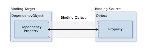
It is this Binding object that we are defining the properties of in the XAML attribute with "{Binding}". Hence, Path is a property defined on this binding.
As we mentioned before, bindings can be OneWay or TwoWay based on the direction the data flows. The binding mode is specified by the Binding object’s Mode property, which can also be set in XAML. There are actually two additional options. The first is a OneWayToSource that is basically a reversed one-way binding (the control updates the data object, but the data object does not update the control)
For example, we actually could use a <TextEditor> with a read-only property, if we changed the binding mode:
<TextEditor Text="{Binding Path=FullName Mode=OneWay}" />Though this might cause your user confusion because they would seem to be able to change the property, but the change would not actually be applied to the bound object. However, if you also set the IsEnabled property to false to prevent the user from making changes:
<TextEditor Text="{Binding Path=FullName Mode=OneWay}" IsEnabled="False" />The second binding mode is OneTime which initializes the control with the property, but does not apply any subsequent changes. This is similar to the behavior you will see from a data object that does not implement the INotifyPropertyChanged interface, as the Binding object depends on it for notifications that the property has changed.
Generally, you’ll want to use a control meant to be used with the mode you intend to employ - editable controls default to TwoWay and display controls to OneWay.
One other property of the Binding class that’s good to know is the Source property. Normally this is determined by the DataContext of the control, but you can override it in the XAML.
For list controls, i.e. ListView and ListBox, the appropriate binding is a collection implementing IEnumerable, and we bind it to the ItemsSource property. Let’s say we want to create a directory that displays information for a List<Person>. We might write a custom DirectoryControl like:
<UserControl x:Class="DataBindingExample.DirectoryControl"
             xmlns="http://schemas.microsoft.com/winfx/2006/xaml/presentation"
             xmlns:x="http://schemas.microsoft.com/winfx/2006/xaml"
             xmlns:mc="http://schemas.openxmlformats.org/markup-compatibility/2006"
             xmlns:d="http://schemas.microsoft.com/expression/blend/2008"
             xmlns:local="clr-namespace:DataBindingExample"
             mc:Ignorable="d"
             d:DesignHeight="450" d:DesignWidth="800">
    <Grid>
        <ListBox ItemsSource="{Binding}"/>
    </Grid>
</UserControl>
Notice that we didn’t supply a Path with our binding. In this case, we’ll be binding directly to the DataContext, which is a list of People objects drawn from the 1996 classic “Space Jam”, i.e.:
<Window x:Class="DataBindingExample.MainWindow"
        xmlns="http://schemas.microsoft.com/winfx/2006/xaml/presentation"
        xmlns:x="http://schemas.microsoft.com/winfx/2006/xaml"
        xmlns:d="http://schemas.microsoft.com/expression/blend/2008"
        xmlns:mc="http://schemas.openxmlformats.org/markup-compatibility/2006"
        xmlns:local="clr-namespace:DataBindingExample"
        mc:Ignorable="d"
        Title="MainWindow" Height="450" Width="800">
    <Grid>
        <local:DirectoryControl x:Name="directory"/>
    </Grid>
</Window>
/// <summary>
/// Interaction logic for MainWindow.xaml
/// </summary>
public partial class MainWindow : Window
{
public MainWindow()
{
InitializeComponent();
ObservableCollection<Person> people = new ObservableCollection<Person>()
{
new Person("Bugs", "Bunny", true),
new Person("Daffy", "Duck", true),
new Person("Elmer", "Fudd", true),
new Person("Tazmanian", "Devil", true),
new Person("Tweety", "Bird", true),
new Person("Marvin", "Martian", true),
new Person("Michael", "Jordan"),
new Person("Charles", "Barkely"),
new Person("Patrick", "Ewing"),
new Person("Larry", "Johnson")
};
DataContext = people;
}
}Instead of a List<Person>, we’ll use an ObservableCollection<Person> which is essentially a list that implements the INotifyPropertyChanged interface.
When we run this code, our results will be:
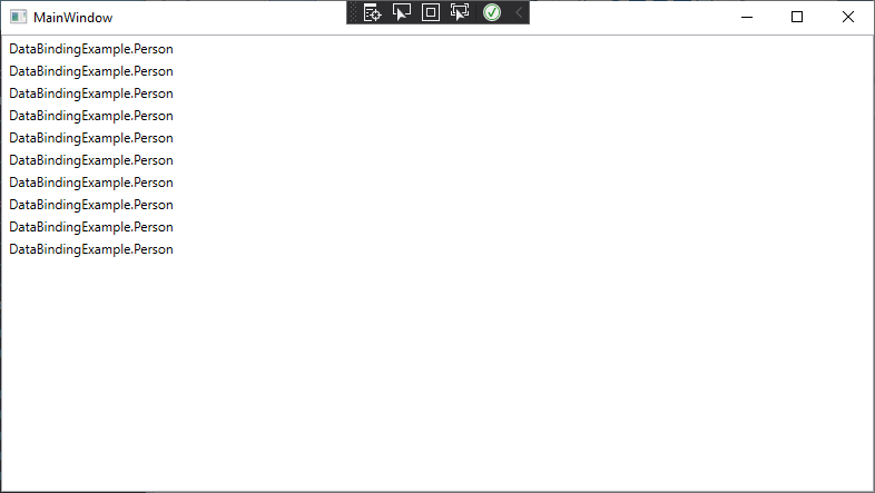
This is because the ListBox (and the ListView) by default are composed of <TextBlock> elements, so each Person in the list is being bound to a <TextBlock>’s Text property. This invokes the ToString() method on the Person object, hence the DataBindingExample.Person displayed for each entry.
We could, of course, override the ToString() method on person. But we can also overwrite the DataTemplate the list uses to display its contents. Instead of using the default <TextView>, the list will use the DataContext, and the bindings, we supply. For example, we could re-write the DirectoryControl control as:
<UserControl x:Class="DataBindingExample.DirectoryControl"
             xmlns="http://schemas.microsoft.com/winfx/2006/xaml/presentation"
             xmlns:x="http://schemas.microsoft.com/winfx/2006/xaml"
             xmlns:mc="http://schemas.openxmlformats.org/markup-compatibility/2006"
             xmlns:d="http://schemas.microsoft.com/expression/blend/2008"
             xmlns:local="clr-namespace:DataBindingExample"
             mc:Ignorable="d"
             d:DesignHeight="450" d:DesignWidth="800">
    <Grid>
        <ListBox ItemsSource="{Binding}">
            <ListBox.ItemTemplate>
                <DataTemplate>
                    <Border BorderBrush="Black" BorderThickness="2">
                        <StackPanel>
                            <TextBlock Text="{Binding Path=FullName}"/>
                            <CheckBox IsChecked="{Binding Path=IsCartoon}" IsEnabled="False">
                                Is a Looney Toon
                            </CheckBox>
                        </StackPanel>
                    </Border>
                </DataTemplate>
            </ListBox.ItemTemplate>
        </ListBox>
    </Grid>
</UserControl>
And the resulting application would display:
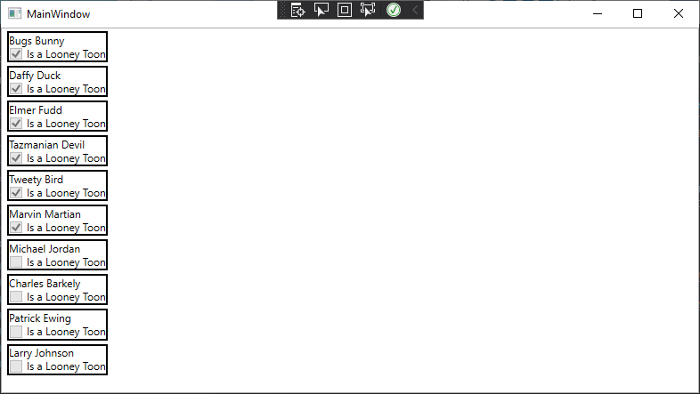
Note that in our DataTemplate, we can bind to properties in the Person object. This works because as the ListBox processes its ItemsSource property, it creates a new instance of its ItemTemplate (in this case, our custom DataTemplate) and assigns the item from the ItemSource to its DataContext.
Using custom DataTemplates for XAML controls is a powerful feature to customize the appearance and behavior of your GUI.
Lists also can interact with other elements through bindings. Let’s refactor our window so that we have a <PersonRegistry> side-by-side with our <PersonControl>:
<Window x:Class="DataBindingExample.MainWindow"
xmlns="http://schemas.microsoft.com/winfx/2006/xaml/presentation"
xmlns:x="http://schemas.microsoft.com/winfx/2006/xaml"
xmlns:d="http://schemas.microsoft.com/expression/blend/2008"
xmlns:mc="http://schemas.openxmlformats.org/markup-compatibility/2006"
xmlns:local="clr-namespace:DataBindingExample"
mc:Ignorable="d"
Title="MainWindow" Height="450" Width="800">
<Grid>
<Grid.ColumnDefinitions>
<ColumnDefinition/>
<ColumnDefinition/>
</Grid.ColumnDefinitions>
<local:PersonControl Grid.Column="0" DataContext="{Binding Path=CurrentItem}"/>
<local:DirectoryControl Grid.Column="1"/>
</Grid>
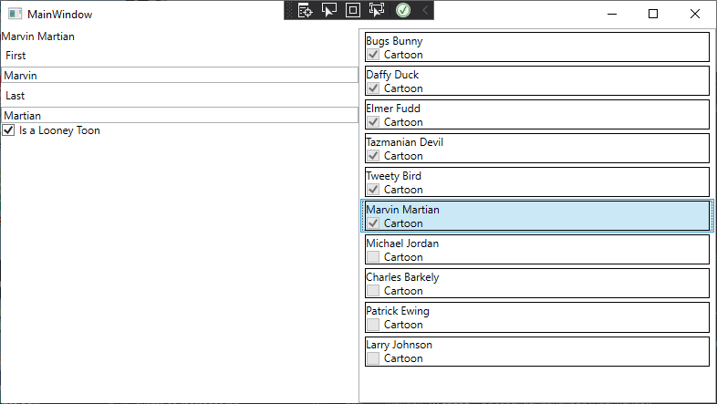
</Window>Note how we bind the <PersonControl>’s DataContext to the CurrentItem of the ObservableCollection<Person>. In our <RegistryControl>’s ListBox, we’ll also set its IsSynchronizedWithCurrentItem property to true:
<UserControl x:Class="DataBindingExample.DirectoryControl"
             xmlns="http://schemas.microsoft.com/winfx/2006/xaml/presentation"
             xmlns:x="http://schemas.microsoft.com/winfx/2006/xaml"
             xmlns:mc="http://schemas.openxmlformats.org/markup-compatibility/2006"
             xmlns:d="http://schemas.microsoft.com/expression/blend/2008"
             xmlns:local="clr-namespace:DataBindingExample"
             mc:Ignorable="d"
             d:DesignHeight="450" d:DesignWidth="800">
    <Grid>
        <ListBox ItemsSource="{Binding}" HorizontalContentAlignment="Stretch" IsSynchronizedWithCurrentItem="True">
            <ListBox.ItemTemplate>
                <DataTemplate>
                    <Border BorderBrush="Black" BorderThickness="1">
                        <StackPanel>
                            <TextBlock Text="{Binding Path=FullName}"/>
                            <CheckBox IsChecked="{Binding Path=IsCartoon, Mode=OneWay}" IsEnabled="False">Cartoon</CheckBox>
                        </StackPanel>
                    </Border>
                </DataTemplate>
            </ListBox.ItemTemplate>
        </ListBox>
    </Grid>
</UserControl>
With these changes, when we select a person in the <RegistryControl>, their information will appear in the <PersonControl>:
Now let’s delve into a more complex data binding examples - binding enumerations. For this discussion, we’ll use a simple enumeration of fruits:
/// <summary>
/// Possible fruits
/// </summary>
public enum Fruit
{
    Apple,
    Orange,
    Peach,
    Pear
}
And add a FavoriteFruit property to our Person class:
private Fruit favoriteFruit;
/// <summary>
/// The person' favorite fruit
/// </summary>
public Fruit FavoriteFruit
{
    get { return favoriteFruit; }
    set
    {
        favoriteFruit = value;
        PropertyChanged?.Invoke(this, new PropertyChangedEventArgs("FavoriteFruit"));
    }
}
For example, what if we wanted to use a ListView to select an item out of this enumeration? We’d actually need to bind two properties, the ItemSource to get the enumeration values, and the SelectedItem to mark the item being used. To accomplish this binding, we’d need to first make the fruits available for binding by creating a static resource to hold them using an ObjectDataProvider:
<ObjectDataProvider x:Key="fruits" ObjectType="system:Enum" MethodName="GetValues">
    <ObjectDataProvider.MethodParameters>
        <x:Type TypeName="local:Fruit"/>
    </ObjectDataProvider.MethodParameters>
</ObjectDataProvider>
The ObjectDataProvider is an object that can be used as a data source for WPF bindings, and wraps around an object and invokes a method to get the data - in this case the Enum class, and its static method GetValues(), which takes one parameter, the Type of the enum we want to pull the values of (provided as the nested element, <x:Type>).
Also, note that because the Enum class is defined in the System namespace, we need to bring it into the XAML with an xml namespace mapped to it, with the attribute xmlns defined on the UserControl, i.e.: xmlns:system="clr-namespace:System;assembly=mscorlib".
Now we can use the fruits key as part of a data source for a listview: <ListView ItemsSource="{Binding Source={StaticResource fruits}}" SelectedItem="{Binding Path=FavoriteFruit}"/>
Notice that we use the Source property of the Binding class to bind the ItemsSource to the enumeration values exposed in the static resource fruits. Then we bind the SelectedItem to the person’s FavoriteFruit property. The entire control would be:
<UserControl x:Class="DataBindingExample.PersonControl"
             xmlns="http://schemas.microsoft.com/winfx/2006/xaml/presentation"
             xmlns:x="http://schemas.microsoft.com/winfx/2006/xaml"
             xmlns:mc="http://schemas.openxmlformats.org/markup-compatibility/2006"
             xmlns:d="http://schemas.microsoft.com/expression/blend/2008"
             xmlns:local="clr-namespace:DataBindingExample"
             xmlns:system="clr-namespace:System;assembly=mscorlib"
             mc:Ignorable="d"
             d:DesignHeight="450" d:DesignWidth="400">
    <UserControl.Resources>
        <ObjectDataProvider x:Key="fruits" MethodName="GetValues" ObjectType="{x:Type system:Enum}">
            <ObjectDataProvider.MethodParameters>
                <x:Type TypeName="local:Fruit"/>
            </ObjectDataProvider.MethodParameters>
        </ObjectDataProvider>
    </UserControl.Resources>
    <StackPanel>
        <TextBlock Text="{Binding Path=FullName}"/>
        <Label>First</Label>
        <TextBox Text="{Binding Path=First}"/>
        <Label>Last</Label>
        <TextBox Text="{Binding Path=Last}"/>
        <CheckBox IsChecked="{Binding Path=IsCartoon}">
            Is a Looney Toon
        </CheckBox>
        <ListView ItemsSource="{Binding Source={StaticResource fruits}}" SelectedItem="{Binding Path=FavoriteFruit}"/>
    </StackPanel>
</UserControl>
Binding a <ComboBox> is almost identical to the ListView example; we just swap a ComboBox for a ListView:
<UserControl x:Class="DataBindingExample.PersonControl"
             xmlns="http://schemas.microsoft.com/winfx/2006/xaml/presentation"
             xmlns:x="http://schemas.microsoft.com/winfx/2006/xaml"
             xmlns:mc="http://schemas.openxmlformats.org/markup-compatibility/2006"
             xmlns:d="http://schemas.microsoft.com/expression/blend/2008"
             xmlns:local="clr-namespace:DataBindingExample"
             xmlns:system="clr-namespace:System;assembly=mscorlib"
             mc:Ignorable="d"
             d:DesignHeight="450" d:DesignWidth="400">
    <UserControl.Resources>
        <ObjectDataProvider x:Key="fruits" MethodName="GetValues" ObjectType="{x:Type system:Enum}">
            <ObjectDataProvider.MethodParameters>
                <x:Type TypeName="local:Fruit"/>
            </ObjectDataProvider.MethodParameters>
        </ObjectDataProvider>
    </UserControl.Resources>
    <StackPanel>
        <TextBlock Text="{Binding Path=FullName}"/>
        <Label>First</Label>
        <TextBox Text="{Binding Path=First}"/>
        <Label>Last</Label>
        <TextBox Text="{Binding Path=Last}"/>
        <CheckBox IsChecked="{Binding Path=IsCartoon}">
            Is a Looney Toon
        </CheckBox>
        <ComboBox ItemsSource="{Binding Source={StaticResource fruits}}" SelectedItem="{Binding Path=FavoriteFruit}"/>
    </StackPanel>
</UserControl>
Binding a <RadioButton> requires a very different approach, as a radio button exposes an IsChecked boolean property that determines if it is checked, much like a <CheckBox>, but we want it bound to an enumeration property. There are a lot of attempts to do this by creating a custom content converter, but ultimately they all have flaws.
Instead, we can restyle a ListView to look like radio buttons, but still provide the same functionality by adding a <Style> that applies to the ListViewItem contents of the ListView:
<Style TargetType="{x:Type ListViewItem}">
    <Setter Property="Template">
        <Setter.Value>
            <ControlTemplate>
                <RadioButton Content="{TemplateBinding ContentPresenter.Content}" IsChecked="{Binding Path=IsSelected, RelativeSource={RelativeSource TemplatedParent}, Mode=TwoWay}"/>
            </ControlTemplate>
        </Setter.Value>
    </Setter>
</Style>
This style can be used in conjunction with a ListView declared as we did above:
<UserControl x:Class="DataBindingExample.PersonControl"
             xmlns="http://schemas.microsoft.com/winfx/2006/xaml/presentation"
             xmlns:x="http://schemas.microsoft.com/winfx/2006/xaml"
             xmlns:mc="http://schemas.openxmlformats.org/markup-compatibility/2006"
             xmlns:d="http://schemas.microsoft.com/expression/blend/2008"
             xmlns:local="clr-namespace:DataBindingExample"
             xmlns:system="clr-namespace:System;assembly=mscorlib"
             mc:Ignorable="d"
             d:DesignHeight="450" d:DesignWidth="400">
    <UserControl.Resources>
        <ObjectDataProvider x:Key="fruits" MethodName="GetValues" ObjectType="{x:Type system:Enum}">
            <ObjectDataProvider.MethodParameters>
                <x:Type TypeName="local:Fruit"/>
            </ObjectDataProvider.MethodParameters>
        </ObjectDataProvider>
        <Style TargetType="{x:Type ListViewItem}">
            <Setter Property="Template">
                <Setter.Value>
                    <ControlTemplate>
                        <RadioButton Content="{TemplateBinding ContentPresenter.Content}" IsChecked="{Binding Path=IsSelected, RelativeSource={RelativeSource TemplatedParent}, Mode=TwoWay}"/>
                    </ControlTemplate>
                </Setter.Value>
            </Setter>
        </Style>
    </UserControl.Resources>
    <StackPanel>
        <TextBlock Text="{Binding Path=FullName}"/>
        <Label>First</Label>
        <TextBox Text="{Binding Path=First}"/>
        <Label>Last</Label>
        <TextBox Text="{Binding Path=Last}"/>
        <CheckBox IsChecked="{Binding Path=IsCartoon}">
            Is a Looney Toon
        </CheckBox>
        <ListView ItemsSource="{Binding Source={StaticResource fruits}}" SelectedItem="{Binding Path=FavoriteFruit}"/>
    </StackPanel>
</UserControl>In this chapter we explored the concept of data binding and how it is employed in Windows Presentation Foundation. We saw how bound classes need to implement the INotifyPropertyChanged interface for bound properties to automatically synchronize. We saw how the binding is managed by a Binding class instance, and how we can customize its Path, Mode, and Source properties in XAML to modify the binding behavior. We bound simple controls like <TextBlock> and <CheckBox> and more complex elements like <ListView> and <ListBox>. We also explored how to bind enumerations to controls. And we explored the use of templates like DataTemplate and ControlTemplate to modify WPF controls.
The full example project discussed in this chapter can be found at https://github.com/ksu-cis/DataBindingExample.