Desktop Development
Objects Go to Work
Objects Go to Work
Some clever statement…
Windows Presentation Foundation (WPF) is a open-source system for rendering Windows application user interfaces. It was released as part of the .NET framework in 2006. In many ways, it is intended to be a successor to Windows Forms. This chapter will examine the basics of working with WPF in detail.
Some key terms to learn in this chapter are:
The key skill to learn in this chapter is how to use C# and XAML to develop WPF user interfaces that adapt to device screen dimensions.
Windows Presentation Foundation is a library and toolkit for creating Graphical User Interfaces - a user interface that is presented as a combination of interactive graphical and text elements commonly including buttons, menus, and various flavors of editors and inputs. GUIs represent a major step forward in usability from earlier programs that were interacted with by typing commands into a text-based terminal (the EPIC software we looked at in the beginning of this textbook is an example of this earlier form of user interface).
You might be wondering why Microsoft introduced WPF when it already had support for creating GUIs in its earlier Windows Forms product. In part, this decision was driven by the evolution of computing technology.
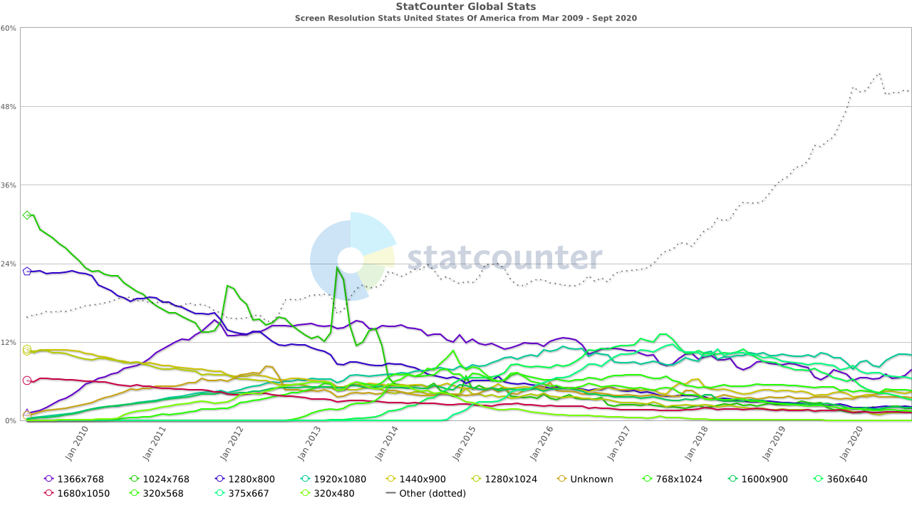
No doubt you are used to having a wide variety of screen resolutions available across a plethora of devices. But this was not always the case. Computer monitors once came in very specific, standardized resolutions, and only gradually were these replaced by newer, higher-resolution monitors. The table below summarizes this time, indicating the approximate period each resolution dominated the market.
| Standard | Size | Peak Years |
|---|---|---|
| VGA | 640x480 | 1987-1990 |
| SVGA | 800x600 | 1990-2003 |
| XGA | 1024x768 | 2007-2015 |
Windows Forms was introduced in the early 2000’s, at a time where the most popular screen resolution in the United States was transitioning from SVGA to XGA, and screen resolutions (especially for business computers running Windows) had remained remarkably consistent for long periods. Moreover, these resolutions were all using the 4:3 aspect ratio (the ratio of width to height of the screen). Hence, the developers of Windows forms did not consider the need to support vastly different screen resolutions and aspect ratios. Contrast that with trends since that time:
There is no longer a clearly dominating resolution, nor even an aspect ratio! Thus, it has become increasingly important for Windows applications to adapt to different screen resolutions. Windows Forms does not do this easily - each element in a Windows Forms application has a statically defined width and height, as well as its position in the window. Altering these values in response to different screen resolution requires significant calculations to resize and reposition the elements, and the code to perform these calculations must be written by the programmer.
In contrast, WPF adopts a multi-pass layout mechanism similar to that of a web browser, where it calculates the necessary space for each element within the GUI, then adapts the layout based on the actual space. With careful design, the need for writing code to position and size elements is eliminated, and the resulting GUIs adapt well to the wide range of available screen sizes.
Another major technology shift was the widespread adoption of hardware-accelerated 3D graphics. In the 1990’s this technology was limited to computers built specifically for playing video games, 3D modeling, video composition, or other graphics-intensive tasks. But by 2006, this hardware had become so widely accepted that with Windows Vista, Microsoft redesigned the Windows kernel to leverage this technology to take on the task of rendering windows applications.
WPF leveraged this decision and offloads much of the rendering work to the graphics hardware. This meant that WPF controls could be vector-based, instead of the raster-based approach adopted by Windows Forms. Vector-based rendering means the image to be drawn on-screen is created from instructions as needed, rather than copied from a bitmap. This allows controls to look as sharp when scaled to different screen resolutions or enhanced by software intended to support low-vision users. Raster graphics scaled the same way will look pixelated and jagged.
Leveraging the power of hardware accelerated graphics also allowed for the use of more powerful animations and transitions, as well as freeing up the CPU for other tasks. It also simplifies the use of 3D graphics in windows applications. WPF also leveraged this power to provide a rich storyboarding and animation system as well as inbuilt support for multimedia. In contrast, Windows Forms applications are completely rendered using the CPU and offer only limited support for animations and multimedia resources.
One additional shift is that Windows forms leverage controls built around graphical representations provided directly by the hosting Windows operating system. This helped keep windows applications looking and feeling like the operating system they were deployed on, but limits the customizability of the controls. A commonly attempted feature - placing an image on a button - becomes an onerous task within Windows Forms. Attempting to customize controls often required the programmer to take over the rendering work entirely, providing the commands to render the raw shapes of the control directly onto the control’s canvas. Unsurprisingly, an entire secondary market for pre-developed custom controls emerged to help counter this issue.
In contrast, WPF separated control rendering from windows subsystems, and implemented a declarative style of defining user interfaces using Extensible Application Markup Language (XAML). This provides the programmer complete control over how controls are rendered, and multiple mechanisms of increasing complexity to accomplish this. Style properties can be set on individual controls, or bundled into “stylesheets” and applied en-masse. Further, each control’s default style is determined by a template that can be replaced with a custom implementation, completely altering the appearance of a control.
This is just the tip of the iceberg - WPF also features a new and robust approach to data binding that will be subject of its own chapter, and allows for UI to be completely separated from logic, allowing for more thorough unit testing of application code.
Windows Presentation Foundation builds upon Extensible Application Markup Language (XAML), an extension of the XML language we’ve discussed previously. Just like XML, it consists of elements defined by opening and closing tags.
For example, a button is represented by:
<Button></Button>Which, because it has no children, could also be expressed with a self-closing tag:
<Button/>In addition, elements can have attributes, i.e we could add a height, width, and content to our button:
<Button Height="30" Width="120" Content="Click Me!"/>XAML also offers an expanded property syntax that is an alternative to attributes. For example, we could re-write the above button as:
<Button>
  <Button.Height>30</Button.Height>
  <Button.Width>120</Button.Width>
  <Button.Content>Click Me!</Button.Content>
</Button>
Note how we repeat the tag name (Button) and append the attribute name (Height, Width, and Content to it with a period between the two). This differentiates the expanded property from nested elements, i.e. in this XAML code:
<Grid>
  <Grid.ColumnDefinitions>
    <ColumnDefinition Width="200"/>
    <ColumnDefinition Width="200"/>
    <ColumnDefinition Width="200"/>
  </Grid.ColumnDefinitions>
  <Grid.RowDefinitions>
    <RowDefinition/>
    <RowDefinition/>
  </Grid.RowDefinitions>
  <Button Height="30" Width="120" Content="Click Me!"/>
</Grid>
<Grid.ColumnDefinitions> and <Grid.RowDefinitions> are attributes of the <Grid>, while <Button Height="30" Width="120" Content="Click Me!"/> is a child element of the <Grid> element.
Because XAML is an extension of XML, we can add comments the same way, by enclosing the comment within a <!-- and -->:
<!-- I am a comment -->What makes XAML different from vanilla XML is that it defines objects. The XAML used for Windows Presentation Foundation is drawn from the
namespace. This namespace defines exactly what elements exist in this flavor of XAML, and they correspond to specific classes defined in the WPF namespaces.For example, the <Button> class corresponds to the WPF Button class. This class has a Content property which defines the text or other content displayed on the button. Additionally, it has a Width and Height property. Thus the XAML:
<Button Height="30" Width="120" Content="Click Me!"/>Effectively says construct an instance of the Button class with its Height property set to 30, its Width property set to 120, and its Content property set to the string "Click Me!". Were we to write the corresponding C# code, it would look like:
var button = new Button();
button.Height = 30;
button.Width = 120;
button.Content = "Click Me!";
This is why XAML stands for Extensible Application Markup Language - it’s effectively another way of writing programs! You can find the documentation for all the controls declared in the xaml/presentation namespace on docs.microsoft.com.
In addition to being used to define objects, XAML can also be used to define part of a class. Consider this MainWindow XAML code, which is generated by the Visual Studio WPF Project Template:
<Window x:Class="WpfApp1.MainWindow"
        xmlns="http://schemas.microsoft.com/winfx/2006/xaml/presentation"
        xmlns:x="http://schemas.microsoft.com/winfx/2006/xaml"
        xmlns:d="http://schemas.microsoft.com/expression/blend/2008"
        xmlns:mc="http://schemas.openxmlformats.org/markup-compatibility/2006"
        xmlns:local="clr-namespace:WpfApp1"
        mc:Ignorable="d"
        Title="MainWindow" Height="450" Width="800">
    <Grid>
    </Grid>
</Window>
And its corresponding C# file:
namespace WpfApp1
{
    /// <summary>
    /// Interaction logic for MainWindow.xaml
    /// </summary>
    public partial class MainWindow : Window
    {
        public MainWindow()
        {
            InitializeComponent();
        }
    }
}
Notice the use of the partial modifier in the C# code? This indicates that the MainWindow class is only partially defined in this file (MainWindow.xaml.cs) - the rest of the definition exists in another file. That’s the previously referenced XAML file (MainWindow.xaml). Notice in the XAML that the <Window> element has the attribute x:Class="WpfApp1.MainWindow"? That indicates that it defines part of the class MainWindow defined in the WpfApp1 namespace - it’s the other part of our file!
When we compile this project, the XAML is actually transformed into a temporary C# file as part of the build process, and that C# file is joined with the other C# file. This temporary file defines the InitializeComponent() method, which would look something like this:
void InitializeComponent()
{
    this.Title = "MainWindow";
    this.Height = 450;
    this.Width = 800;

    var grid = new Grid();
    this.Content = grid;
}
Notice how it sets the properties corresponding to the attributes defined on the <MainWindow> element? Further, it assigns the child of that element (a <Grid> element) as the Content property of the Window. Nested XAML elements are typically assigned to either Content or Children properties, depending on if the element in question is a container element or not (container elements can have multiple children, all other elements are limited to a single child).
Any structure defined in our XAML is set up during this InitializeComponent() call. This means you should never remove the InitializeComponent(); invocation from a WPF class, or your XAML-defined content will not be added. Similarly, you should not manipulate that structure until the InitializeComponent(); method has been invoked, or the structure will not exist!
This strategy of splitting GUI code into two files is known in Microsoft parlance as codebehind, and it allows the GUI’s visual aspect to be created independently of the code that provides its logic. This approach has been a staple of both Windows Forms and Windows Presentation Foundation. This separation also allows for graphic designers to create the GUI look-and-feel without ever needing to write a line of code. There is a companion application to Visual Studio called Blend that can be used to write the XAML files for a project without needing the full weight and useability of Visual Studio.
Occasionally, Visual Studio will encounter a problem while building the temporary file from the XAML definition, and the resulting temporary file may become corrupted. When this happens, your changes to the XAML are no longer incorporated into the program when you compile, because the process can’t overwrite the corrupted temporary file. Instead, the corrupted temporary file is used - resulting in weird and unexpected behavior. If this happens to you, just run the “Build > Clean” menu option on the project to delete all the temporary files.
Partial classes weren’t a WPF-specific innovation - Windows Forms used them first. In Windows Forms, when you create a form, Visual Studio actually creates two C# files. One of these is the one intended for you to edit, and the other is used by the drag-and-drop editor, which fills it with auto-generated C# code. If you ever make the mistake of editing this file, it will cause all kinds of problems for the drag-and-drop editor (and you)! In contrast, the drag-and-drop editor for WPF actually modifies the same XAML file you do - allowing you to use the editor, manually edit the XAML, or any combination of the two.
Windows Presentation Foundation provides a number of container elements that fulfill the specialized purpose of layouts. Unlike most WPF controls, they can have multiple children, which they organize on-screen. And unlike Windows Forms, these layouts adjust to the available space.
Let’s examine each of five layouts in turn:
The default layout is the Grid, which lays out its children elements in a grid pattern. A <Grid> is composed of columns and rows, the number and characteristics of which are defined by the grid’s ColumnDefinitions and RowDefinitions properties. These consist of a collection of ColumnDefinition and <RowDefinition/> elements. Each <ColumnDefinition/> is typically given a Width property value, while each <RowDefinition/> is given a Height property value.
Thus, you might expect the code:
<Grid>
  <Grid.ColumnDefinitions>
    <ColumnDefinition Width="200"/>
    <ColumnDefinition Width="200"/>
    <ColumnDefinition Width="200"/>
  </Grid.ColumnDefinitions>
  <Grid.RowDefinitions>
    <RowDefinition Height="100"/>
    <RowDefinition Height="100"/>
  </Grid.RowDefinitions>
  <Button Height="30" Width="120" Content="Click Me!"/>
</Grid>
Creates a grid with three columns, each 200 logical units wide, and two rows, each 100 logical units high. However, it will actually create a grid like this:
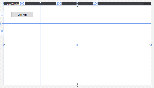
Remember, all WPF containers will fill the available space - so the grid stretches the last column and row to fill the remaining space. Also, any element declared as a child of the grid (in this case, our button), will be placed in the first grid cell - [0,0] (counted from the top-left corner).
When declaring measurements in WPF, integer values correspond to logical units, which are 1/96th of an inch. We can also use relative values, by following a measurement with a *. This indicates the ratio of remaining space a column or row should take up after the elements with an exact size are positioned. I.e. a column with a width of 2* will be twice as wide as one with a width of 1*.
Thus, to create a 3x3 grid centered in the available space to represent a game of Tic-Tac-Toe we might use:
<Grid>
    <Grid.ColumnDefinitions>
        <ColumnDefinition Width="1*"/>
        <ColumnDefinition Width="100"/>
        <ColumnDefinition Width="100"/>
        <ColumnDefinition Width="100"/>
        <ColumnDefinition Width="1*"/>
    </Grid.ColumnDefinitions>
    <Grid.RowDefinitions>
        <RowDefinition Height="1*"/>
        <RowDefinition Height="100"/>
        <RowDefinition Height="100"/>
        <RowDefinition Height="100"/>
        <RowDefinition Height="1*"/>
    </Grid.RowDefinitions>
    <TextBlock Grid.Column="1" Grid.Row="1" FontSize="100" VerticalAlignment="Center" HorizontalAlignment="Center">X</TextBlock>
    <TextBlock Grid.Column="1" Grid.Row="2" FontSize="100" VerticalAlignment="Center" HorizontalAlignment="Center">O</TextBlock>
    <TextBlock Grid.Column="2" Grid.Row="1" FontSize="100" VerticalAlignment="Center" HorizontalAlignment="Center">X</TextBlock>
</Grid>
Which would create:
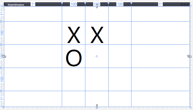
Note too that we use the properties Grid.Column and Grid.Row in the <TextBlock> elements to assign them to cells in the grid. The row and column indices start at 0 in the upper-left corner of the grid, and increase to the right and down.
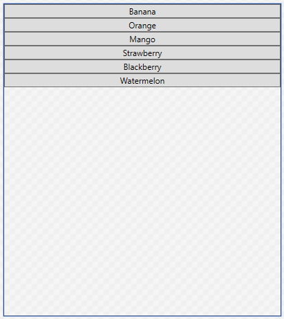
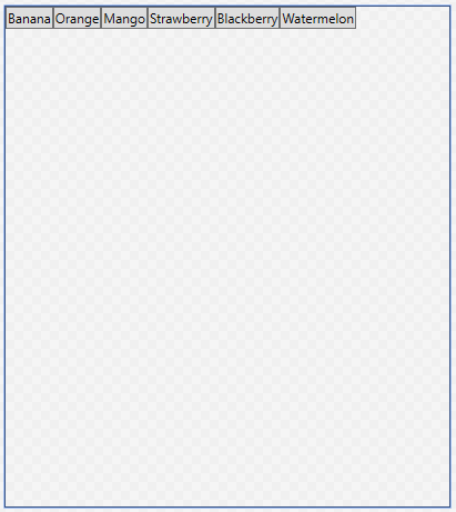
The StackPanel arranges content into a single row or column (defaults to vertical). For example, this XAML:
<StackPanel>
    <Button>Banana</Button>
    <Button>Orange</Button>
    <Button>Mango</Button>
    <Button>Strawberry</Button>
    <Button>Blackberry</Button>
    <Button>Peach</Button>
    <Button>Watermelon</Button>
</StackPanel>
Creates this layout:
The StackPanel can be set to a horizontal orientation by setting its Orientation property to Horizontal:
<StackPanel Orientation="Horizontal">
<Button>Banana</Button>
<Button>Orange</Button>
<Button>Mango</Button>
<Button>Strawberry</Button>
<Button>Blackberry</Button>
<Button>Peach</Button>
<Button>Watermelon</Button>
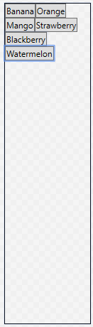
</StackPanel>The WrapPanel layout is like the <StackPanel>, with the additional caveat that if there is not enough space for its contents, it will wrap to an additional line. For example, this XAML code:
<WrapPanel>
    <Button>Banana</Button>
    <Button>Orange</Button>
    <Button>Mango</Button>
    <Button>Strawberry</Button>
    <Button>Blackberry</Button>
    <Button>Peach</Button>
    <Button>Watermelon</Button>
</WrapPanel>
Produces this layout when there is ample room:
And this one when things get tighter:
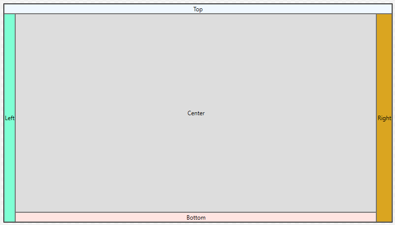
The DockPanel layout should be familiar to you - it’s what Visual Studio uses. Its content items can be ‘docked’ to one of the sides, as defined by the Dock enum: Bottom, Top, Left, or Right by setting the DockPanel.Dock property on that item. The last item specified will also fill the central space. If more than one child is specified for a particular side, it will be stacked with that side.
Thus, this XAML:
<DockPanel>
    <Button DockPanel.Dock="Top">Top</Button>
    <Button DockPanel.Dock="Left">Left</Button>
    <Button DockPanel.Dock="Right">Right</Button>
    <Button DockPanel.Dock="Bottom">Bottom</Button>
    <Button>Center</Button>
</DockPanel>
Generates this layout:
Finally, the Canvas lays its content out strictly by their position within the <Canvas>, much like Windows Forms. This approach provides precise placement and size control, at the expense of the ability to automatically adjust to other screen resolutions. For example, the code:
<Canvas>
    <Button Canvas.Top="40" Canvas.Right="40">Do Something</Button>
    <TextBlock Canvas.Left="200" Canvas.Bottom="80">Other thing</TextBlock>
    <Canvas Canvas.Top="30" Canvas.Left="300" Width="300" Height="300" Background="SaddleBrown"/>
</Canvas>
Creates this layout:
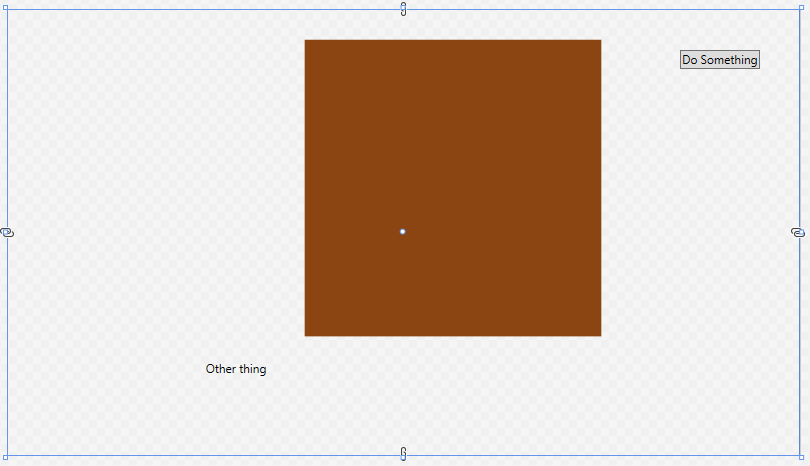
If there is a chance the <Canvas> might be resized, it is a good idea to anchor all elements in the canvas relative to the same corner (i.e. top right) so that they all are moved the same amount.
In addition to the layout controls, WPF provides a number of useful (and often familiar) controls that we can use to compose our applications. Let’s take a look at some of the most commonly used.
A Border is a control that draws a border around its contents. The properties specific to a border include BorderBrush (which sets the color of the border, see the discussion of brushes on the next page), BorderThickness the number of units thick the border should be drawn, CornerRadius, which adds rounded corners, and Padding which adds space between the border and its contents.
<Border BorderBrush="Green" BorderThickness="5" CornerRadius="5" Padding="10">
    <Button>Do Something</Button>
</Border>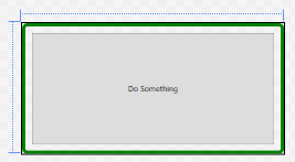
A Button is a control that draws a button. This button can be interacted with by the mouse, and clicking on it triggers any Click event handlers that have been attached to it. Unlike Windows Forms buttons, it can contain any other WPF control, including images and layouts. Thus, a button featuring an image might be created with:
<Button Click="TriggerBroadcast">
    <StackPanel Orientation="Horizontal">
        <Image Source="dish.jpg" Width="100"/>
        <TextBlock FontSize="25" VerticalAlignment="Center">Broadcast</TextBlock>
    </StackPanel>
</Button>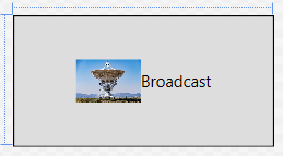
The event handler for the button needs to be declared in the corresponding .xaml.cs file, and will take two parameters, an object and RoutedEventArgs:
/// <summary>
/// An event handler that triggers a broadcast
/// </summary>
/// <param name="sender">The object sending this message</param>
/// <param name="args">The event data</param>
void TriggerBroadcast(object sender, RoutedEventArgs args) {
    // TODO: Send Broadcast
}
We’ll be discussing events in more detail soon.
A CheckBox provides a checkable box corresponding to a boolean value. The IsChecked property reflects the checked or unchecked state of the checkbox. A checkbox also exposes Checked and Unchecked event handlers.
<CheckBox IsChecked="True">
    The sky is blue
</CheckBox> 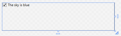
A ComboBox provides a drop-down selection list. The selected value can be accessed through the SelectedItem property, and the IsEditable boolean property determines if the combo box can be typed into, or simply selected from. It exposes a SelectionChanged event. The items in the ComboBox can be set declaratively:
<ComboBox>
    <ComboBoxItem>Apple</ComboBoxItem>
    <ComboBoxItem>Orange</ComboBoxItem>
    <ComboBoxItem>Peach</ComboBoxItem>
    <ComboBoxItem>Pear</ComboBoxItem>
</ComboBox>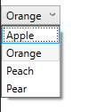
Note that the ComboBox dropdown doesn’t work in the editor - it only operates while the application is running.
Alternatively, you can expose the ComboBox in the codebehind .xaml.cs file by giving it a Name property.
<ComboBox Name="FruitSelection" Text="Fruits" SelectedValue="Apple">
</ComboBox>
Then, after the combo box has been initialized, use the ItemsSource to specify a collection declared in the corresponding .xaml.cs file.
/// <summary>
/// Interaction logic for UserControl1.xaml
/// </summary>
public partial class UserControl1 : UserControl
{
    public UserControl1()
    {
        InitializeComponent();
        FruitSelection.ItemsSource = new List<string>
        {
            "Apple",
            "Orange",
            "Peach",
            "Pear"
        };
    }
}
We could also leverage data binding to bind the item collection dynamically. We’ll discuss this approach later.
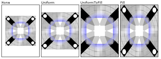
The Image control displays an image. The image to display is determined by the Source property. If the image is not exactly the same size as the <Image> control, the Stretch property determines how to handle this case. Its possible values are:
"None" (the default) - the image is displayed at its original size"Fill" - the image is resized to the element’s size. This will result in stretching if the aspect ratios are not the same"Uniform" - the image is resized to fit into the element. If the aspect ratios are different, there will be blank areas in the element (letterboxing)"UniformToFill" - the image is resized to fill the element. If the aspect ratios are different, part of the image will be cropped outThe stretch values effects are captured by this graphic:
The stretching behavior can be further customized by the StretchDirection property.
Images can also be used for Background or Foreground properties, as discussed on the next page.
A Label displays text on a form, and can be as simple as:
<Label>First Name:</Label>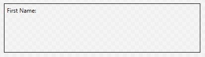
What distinguishes it from other text controls is that it can also be associated with a specific control specified by the Target parameter, whose value should be bound to the name of the control. It can then provide an access key (aka a mnemonic) that will transfer focus to that control when the corresponding key is pressed. The access key is indicated by preceding the corresponding character in the text with an underscore:
<StackPanel>
    <Label Target="{Binding ElementName=firstNameTextBox}">
        <AccessText>_First Name:</AccessText>
    </Label>
    <TextBox Name="firstNameTextBox"/>
</StackPanel>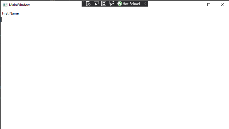
Now when the program is running, the user can press ALT + F to shift focus to the textbox, so they can begin typing (Note the character “F” is underlined in the GUI). Good use of access keys means users can navigate forms completely with the keyboard.
A ListBox displays a list of items that can be selected. The SelectionMode property can be set to either "Single" or "Multiple", and the "SelectedItems" read-only property provides those selected items. The ItemsSource property can be set declaratively using <ListBoxItem> contents. It also exposes a SelectionChanged event handler:
<ListBox>
    <ListBoxItem>Apple</ListBoxItem>
    <ListBoxItem>Orange</ListBoxItem>
    <ListBoxItem>Peach</ListBoxItem>
    <ListBoxItem>Pear</ListBoxItem>
</ListBox>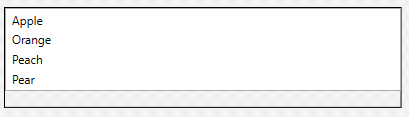
A group of RadioButton elements is used to present multiple options where only one can be selected. To group radio buttons, specify a shared GroupName property. Like other buttons, radio buttons have a Click event handler, and also a Checked and Unchecked event handler:
<StackPanel>
    <RadioButton GroupName="Fruit">Apple</RadioButton>
    <RadioButton GroupName="Fruit">Orange</RadioButton>
    <RadioButton GroupName="Fruit">Peach</RadioButton>
    <RadioButton GroupName="Fruit">Pear</RadioButton>
</StackPanel>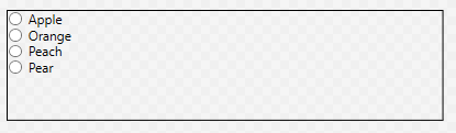
A TextBlock can be used to display arbitrary text. It also makes available a TextChanged event that is triggered when its text changes.
<TextBlock>Hi, I have something important to say. I'm a text block.</TextBlock>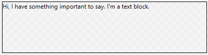
And a TextBox is an editable text box. It’s text can be accessed through the Text property:
<TextBox Text="And I'm a textbox!"/>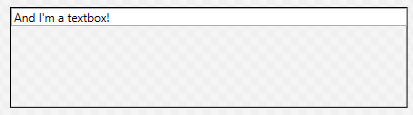
Finally, a ToggleButton is a button that is either turned on or off. This can be determined from its IsChecked property. It also has event handlers for Checked and Unchecked events:
<ToggleButton>On or Off</ToggleButton>Off looks like:

And on looks like:

This is just a sampling of some of the most used controls. You can also reference the System.Windows.Controls namespace documentation, or the TutorialsPoint WPF Controls reference.
All WPF controls (including the layout controls we’ve already seen) derive from common base classes, i.e. UIElement and FrameworkElement, which means they all inherit common properties. Some of the most commonly used are described here.
Perhaps the most important of the control properties are those that control sizing and placement. Let’s take a look at the most important of these.
WPF controls use three properties to determine the height of the element. These are MinHeight, Height, and MaxHeight. They are doubles expressed in device-independent units (measuring 1/96 of an inch). The rendering algorithm treats Height as a suggestion, but limits the calculated height to fall in the range between MinHeight and MaxHeight. The height determined by the algorithm can be accessed from the ActualHeight read-only property. Similar values exist for width: MinWidth, Width, MaxWidth, and ActualWidth.
| Property | Default Value | Description |
|---|---|---|
| MinHeight | 0.0 | The minimum element height |
| Height | NaN | The suggested element height |
| MaxHeight | PositiveInfinity | The maximum element height |
| MinWidth | 0.0 | The minimum element width |
| Width | NaN | The suggested element width |
| MaxWidth | PositiveInfinity | The maximum element width |
In addition to the size of the element, we can set margins around the element, adding empty space between this and other elements. The Margin property is actually of type Thickness, a structure with four properties: left, top, right, and bottom. We can set the Margin property in several ways using XAML.
To set all margins to be the same size, we just supply a single value:
<Button Margin="3">Do something</Button>To set different values for the horizontal and vertical margins, use two comma-separated values (horizontal comes first):
<Button Margin="10, 20">Do Something</Button> And finally, they can all be set separately as a comma-separated list (the order is left, top, right, and then bottom).
<Button Margin="10, 20, 30, 50">Do Something</Button>You can also align the elements within the space allocated for them using the VerticalAlignment and HorizontalAlignment properties. Similarly, you can align the contents of an element with the VerticalContentAlignment and HorizontalContentAlignment properties.
For most controls, these are "Stretch" by default, which means the control or its contents will expand to fill the available space. Additional values include "Bottom", "Center", and "Top" for vertical, and "Left", "Center", and "Right" for horizontal. These options do not fill the available space - the control is sized in that dimension based on its suggested size.
| HorizontalAlignment | |
|---|---|
| Option | Description |
| Stretch | Control fills the available horizontal space |
| Left | Control is aligned along the left of the available space |
| Center | Control is centered in the available horizontal space |
| Right | Control is aligned along the right of the available space |
| VerticalAlignment | |
| Option | Description |
| Stretch | Control fills the available vertical space |
| Top | Control is aligned along the top side of the available space |
| Center | Control is centered in the available vertical space |
| Bottom | Control is aligned along the bottom side of the available space |
As most controls prominently feature text, it is important to discuss the properties that effect how this text is presented.
The FontFamily property sets the font used by the control. This font needs to be installed on the machine. You can supply a single font, i.e.:
<TextBlock FontFamily="Arial">Or a list of font families to supply fallback options if the requested font is not available:
<TextBlock FontFamily="Arial, Century Gothic">The FontSize property determines the size of the font used in the control.
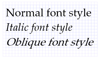
The FontStyle property sets the style of the font used. This can include "Normal", "Italic", or "Oblique". Italic is typically defined in the font itself (and created by the font creator), while Oblique is created from the normal font by applying a mathematical rendering transformation, and can be used for fonts that do not have a defined italic style.
The FontWeight refers to how thick a stroke is used to draw the font. It can be set to values like "Light", "Normal", "Bold", or "Ultra Bold". A list of all available options can be found here.
The TextAlignment property defines how the text is aligned within its element. Possible values are "Left" (the default), "Center", "Justify", and "Right", and behave just like these options in your favorite text editor.
There is no corresponding vertical alignment option - instead use VerticalContentAlignment discussed above.
There are often times in working with a GUI where you might want to disable or even hide a control. WPF controls provide several properties that affect the rendering and interaction of controls.
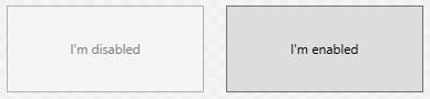
The IsEnabled property is a boolean that indicates if this control is currently enabled. It defaults to true. Exactly what ’enabled’ means for a control is specific to that kind of control, but usually means the control cannot be interacted with. For example, a button with IsEnabled=false cannot be clicked on, and will be rendered grayed out, i.e.:
<Grid>
    <Grid.ColumnDefinitions>
        <ColumnDefinition/>
        <ColumnDefinition/>
    </Grid.ColumnDefinitions>
    <Button IsEnabled="False" Margin="10">I'm Disabled</Button>
    <Button Grid.Column="1" Margin="10">I'm Enabled</Button>
</Grid>A similar effect can be obtained by changing an element’s Opacity property, a double that ranges from 0.0 (completely transparent) to 1.0 (completely solid). Below you can see two <TextBlock> elements, with the one on the left set to an opacity of 0.40:

<Grid>
    <Grid.ColumnDefinitions>
        <ColumnDefinition/>
        <ColumnDefinition/>
    </Grid.ColumnDefinitions>
    <TextBlock Opacity="0.4" Foreground="Purple" VerticalAlignment="Center" HorizontalAlignment="Center">
      I'm semi-translucent!
    </TextBlock>
    <TextBlock Grid.Column="1" Foreground="Purple" VerticalAlignment="Center" HorizontalAlignment="Center">
      I'm solid!
    </TextBlock>
</Grid>
Alerting an elements’ opacity does not have any effect on its functionality, i.e. a completely transparent button can still be clicked.
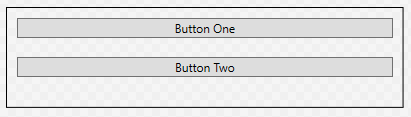
Finally, the Visible property alters how the element is considered in the WPF rendering algorithm. It has three possible values: "Visible", "Hidden", and "Collapsed". The default value is "Visible", and the element renders normally, as “Button One” does in the example below:
<StackPanel>
<Button Visibility="Visible" Margin="10">Button One</Button>
<Button Margin="10">Button Two</Button>
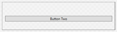
</StackPanel>The "Hidden" value will hide the element, but preserve its place in the layout. A hidden element cannot be interacted with, so this is similar to setting the Opacity to 0 and IsEnabled to false:
<StackPanel>
<Button Visibility="Hidden" Margin="10">Button One</Button>
<Button Margin="10">Button Two</Button>
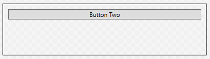
</StackPanel>Finally, the "Collapsed" value will leave the element out of the layout calculations, as though it were not a part of the control at all. A hidden element cannot be interacted with. Note that in the example below, “Button Two” has been rendered in the space previously occupied by “Button One”:
<StackPanel>
  <Button Visibility="Collapsed" Margin="10">Button One</Button>
  <Button Margin="10">Button Two</Button>
</StackPanel>You may have noticed the previous examples that colors can be accomplished through the Background and Foreground properties - where the Background determines the color of the element, and Foreground determines the color of text and other foreground elements. While this is true, it is also just the beginning of what is possible. Both of these properties have the type Brush, which deserves a deeper look.
Simply put, a brush determines how to paint graphical objects. This can be as simple as painting a solid color, or as complex as painting an image. The effect used is determined by the type of brush - the Brush class itself serving as a base class for several specific types brush.
What we’ve been using up to this point have been SolidColorBrush objects. This is the simplest of the brush classes, and simply paints with a solid color, i.e.:
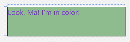
<TextBlock Foreground="BlueViolet" Background="DarkSeaGreen" FontSize="25">
  Look, Ma!  I'm in color!
</TextBlock>
The simplest way to set the color in XAML is to use a value from the predefined brush name list, like the "BlueViolet" and "DarkSeaGreen" in the example.
Alternatively, you can use a hexadecimal number defining the red, green, and blue channels in that order, i.e. to use K-State purple and white we’d use:
<TextBlock Foreground="#FFFFFF" Background="#512888" FontSize="25">
  Look, Ma!  I'm in color!
</TextBlock>
The various formats the hex values can be given are detailed here
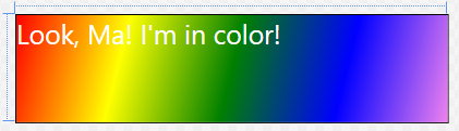
Gradient brushes gradually transition between colors. There are two kinds of gradient brushes in WPF: with a LinearGradientBrush the brush gradually changes along a line. With a RadialGradientBrush, the color changes radially from a center point.
In both cases, the gradient is defined in terms of <GradientStops> - a distance along the line (or from the center) where the expected color value is defined. In the spaces between gradient stops, the color value is interpolated between the two stops on either side of the point. The gradient stop needs both an Offset value (a double indicating the percentage of how far along the line or from the center this stop falls, between 0.0 and 1.0) and a Color value (which can be defined as with solid color brushes).
For example, the XAML:
<TextBlock Foreground="#FFFFFF" FontSize="25">
  <TextBlock.Background>
      <LinearGradientBrush>
          <LinearGradientBrush.GradientStops>
              <GradientStop Color="Red" Offset="0.0"/>
              <GradientStop Color="Yellow" Offset="0.25"/>
              <GradientStop Color="Green" Offset="0.50"/>
              <GradientStop Color="Blue" Offset="0.75"/>
              <GradientStop Color="Violet" Offset="1.0"/>
          </LinearGradientBrush.GradientStops>
      </LinearGradientBrush>
  </TextBlock.Background>
  Look, Ma!  I'm in color!
</TextBlock>
Produces this rainbow gradient:
Further, the line along which the linear gradient is created is defined by the StartPoint and EndPoint properties of the <LinearGradientBrush>. These points are relative to the area the brush is covering (i.e. the space occupied by the element), and fall in the range of [0.0 .. 1.0]. The default (as seen above) is a diagonal line from the upper left corner (0,0) to the lower right corner (1.0, 1.0).
To make the above gradient fall in the center half of the element, and be horizontal, we could tweak the gradient definition:
<TextBlock Foreground="#FFFFFF" FontSize="25">
    <TextBlock.Background>
        <LinearGradientBrush StartPoint="0.25, 0.5" EndPoint="0.75, 0.5">
            <LinearGradientBrush.GradientStops>
                <GradientStop Color="Red" Offset="0.0"/>
                <GradientStop Color="Yellow" Offset="0.25"/>
                <GradientStop Color="Green" Offset="0.50"/>
                <GradientStop Color="Blue" Offset="0.75"/>
                <GradientStop Color="Violet" Offset="1.0"/>
            </LinearGradientBrush.GradientStops>
        </LinearGradientBrush>
    </TextBlock.Background>
    Look, Ma!  I'm in color!
</TextBlock>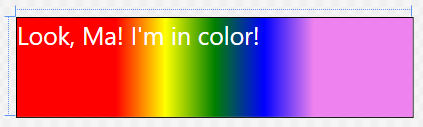
A <RadialGradientBrush> is defined similarly through the use of GradientStops, only this time they are in relation to the center around which the gradient radiates:
<TextBlock Foreground="#FFFFFF" FontSize="25">
    <TextBlock.Background>
        <RadialGradientBrush>
            <RadialGradientBrush.GradientStops>
                <GradientStop Color="Red" Offset="0.0"/>
                <GradientStop Color="Yellow" Offset="0.25"/>
                <GradientStop Color="Green" Offset="0.50"/>
                <GradientStop Color="Blue" Offset="0.75"/>
                <GradientStop Color="Violet" Offset="1.0"/>
            </RadialGradientBrush.GradientStops>
        </RadialGradientBrush>
    </TextBlock.Background>
    Look, Ma!  I'm in color!
</TextBlock>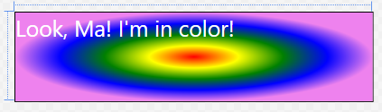
The gradient fills an ellipse defined by the Center property and the RadiusX and RadiusY properties. By default these values are (0.5. 0.5), 0.5, and 0.5 respectively. Like other gradient properties, they are doubles between 0.0 and 1.0. Finally, the gradient emanates from the GradientOrigin, also a point with values defined by this coordinate system.
To center the above gradient in the left half of the block, we would therefore use:
<TextBlock.Background>
    <RadialGradientBrush Center="0.25, 0.5" RadiusX="0.25" RadiusY="0.5" GradientOrigin="0.25, 0.5">
        <RadialGradientBrush.GradientStops>
            <GradientStop Color="Red" Offset="0.0"/>
            <GradientStop Color="Yellow" Offset="0.25"/>
            <GradientStop Color="Green" Offset="0.50"/>
            <GradientStop Color="Blue" Offset="0.75"/>
            <GradientStop Color="Violet" Offset="1.0"/>
        </RadialGradientBrush.GradientStops>
    </RadialGradientBrush>
</TextBlock.Background>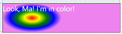
And of course, we can use a gradient for a Foreground property as well:
<TextBlock Background="White" FontSize="40">
    <TextBlock.Foreground>
        <LinearGradientBrush>
            <LinearGradientBrush.GradientStops>
                <GradientStop Color="Red" Offset="0.0"/>
                <GradientStop Color="Yellow" Offset="0.25"/>
                <GradientStop Color="Green" Offset="0.50"/>
                <GradientStop Color="Blue" Offset="0.75"/>
                <GradientStop Color="Violet" Offset="1.0"/>
            </LinearGradientBrush.GradientStops>
        </LinearGradientBrush>
    </TextBlock.Foreground>
    Look, Ma!  I'm in color!
</TextBlock>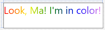
To draw a saved image, we use an ImageBrush, setting its ImageSource property to the image we want to use. In XAML, that can be as simple as:
<Button Margin="40" Foreground="White" FontSize="30">
    <Button.Background>
        <ImageBrush ImageSource="Dish.jpg"/>
    </Button.Background>
    Broadcast
</Button>
We can apply image brushes to any WPF control, allowing for some interesting layering effects, i.e.:
<Grid>
    <Grid.Background>
        <ImageBrush ImageSource="watering-can.jpg"/>
    </Grid.Background>
    <Grid.ColumnDefinitions>
        <ColumnDefinition/>
        <ColumnDefinition/>
        <ColumnDefinition/>
    </Grid.ColumnDefinitions>
    <Grid.RowDefinitions>
        <RowDefinition/>
        <RowDefinition/>
        <RowDefinition/>
    </Grid.RowDefinitions>
    <Button Margin="40" Foreground="White" FontSize="30">
        <Button.Background>
            <ImageBrush ImageSource="Dish.jpg"/>
        </Button.Background>
        Broadcast
    </Button>
</Grid>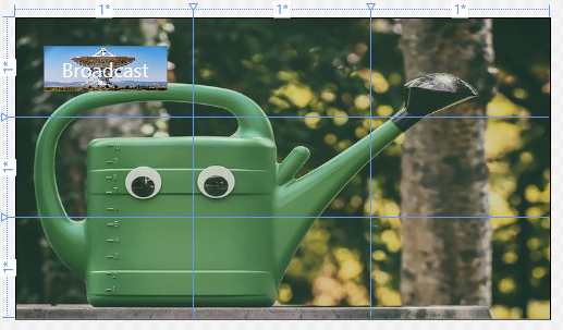
You probably notice that the dish image on the button is distorted. We can correct this by changing the Stretch property. The possible values are: "None", "Fill", "Uniform", and "UniformToFill". This graphic from the documentation visual shows these properties:
The ImageBrush extends the TileBrush, so the image can actually be tiled if the tile size is set to be smaller than the element that it is painting. The TileBrush Overview provides a detailed breakdown of applying tiling.
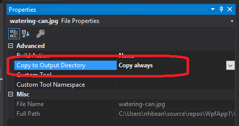
When using images with Visual Studio, it is important to understand how those are used and distributed. You should make sure the images are physically located within the project folder (so that they are included in your source control). Additionally, you want to mark the property “Copy to Output Directory” to either “Copy Always” or “Copy if Newer.” When distributing your project, these files will also need to be distributed, or the image will be unavailable to your executable.
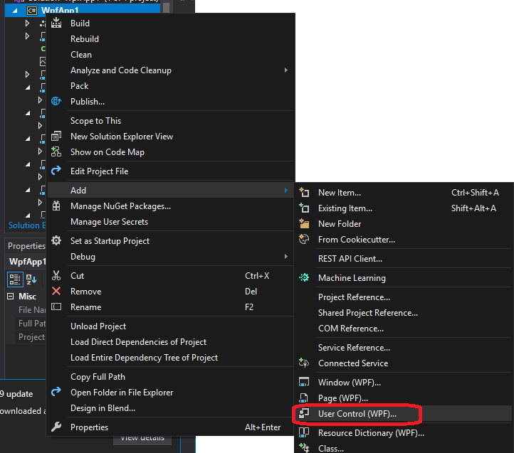
To create a new WPF control from within Visual Studio, we usually choose “Add > User Control (WPF…)” from the solution context menu.
This creates two files, the [filename].xaml:
<UserControl x:Class="WpfApp1.UserControl1"
             xmlns="http://schemas.microsoft.com/winfx/2006/xaml/presentation"
             xmlns:x="http://schemas.microsoft.com/winfx/2006/xaml"
             xmlns:mc="http://schemas.openxmlformats.org/markup-compatibility/2006"
             xmlns:d="http://schemas.microsoft.com/expression/blend/2008"
             xmlns:local="clr-namespace:WpfApp1"
             mc:Ignorable="d"
             d:DesignHeight="100" d:DesignWidth="400">
    <Grid>
    </Grid>
</UserControl>
and the codebehind for that XAML file, [filename].xaml.cs (where [filename] is the name you supplied):
using System;
using System.Collections.Generic;
using System.Collections.ObjectModel;
using System.Text;
using System.Windows;
using System.Windows.Controls;
using System.Windows.Data;
using System.Windows.Documents;
using System.Windows.Input;
using System.Windows.Media;
using System.Windows.Media.Imaging;
using System.Windows.Navigation;
using System.Windows.Shapes;

namespace WpfApp1
{
    /// <summary>
    /// Interaction logic for UserControl1.xaml
    /// </summary>
    public partial class UserControl1 : UserControl
    {
        public UserControl1()
        {
            InitializeComponent();
        }
    }

}
As was mentioned previously, the InitializeComponent() call in the constructor is what builds the structure specified in the XAML file to the object, so it should not be removed, nor should any manipulation of that structure be done before this method invocation.
Most custom controls are subclasses of the UserControl class, and choosing this option has Visual Studio create the boilerplate for us. However, if you need to extend a specific control, i.e. a ListView, it is often easiest to start with a UserControl made this way, and then change the base class to ListView in the [filename].xaml.cs file, as well as changing the <UserControl> element to a <ListView> element in the [filename].xaml.
Also, notice how the attributes of the control in the XAML file contain a local namespace:
xmlns:local="clr-namespace:WpfApp1"This is the equivalent of a using statement for XAML; it creates the local namespace and ties it to the project’s primary namespace. We can then create an element corresponding to any class in that namespace. Let’s say we have another custom control, ThingAMaJig that we want to utilize in this control. We can use the element notation to add it to our grid:
    <Grid>
      <local:ThingAMaJig>
    </Grid>
Note that we must preface the class name in the element with the local namespace, with a colon (:) separating the two.
We can also add additional namespace statements. For example:
xmlns:system="clr-namespace:System;assembly=mscorlib"This brings in the System namespace, so now we can use the classes and types defined there, i.e String:
<system:String>Hello World!</system:String>Note that for the namespace attribute, we also included the assembly information. This is necessary for any assemblies that are not defined by this project (i.e. exist in their own DLL files).
In Visual Studio, opening a WPF XAML file will open a special editor that provides a side-by-side visual and XAML code editors for the control:
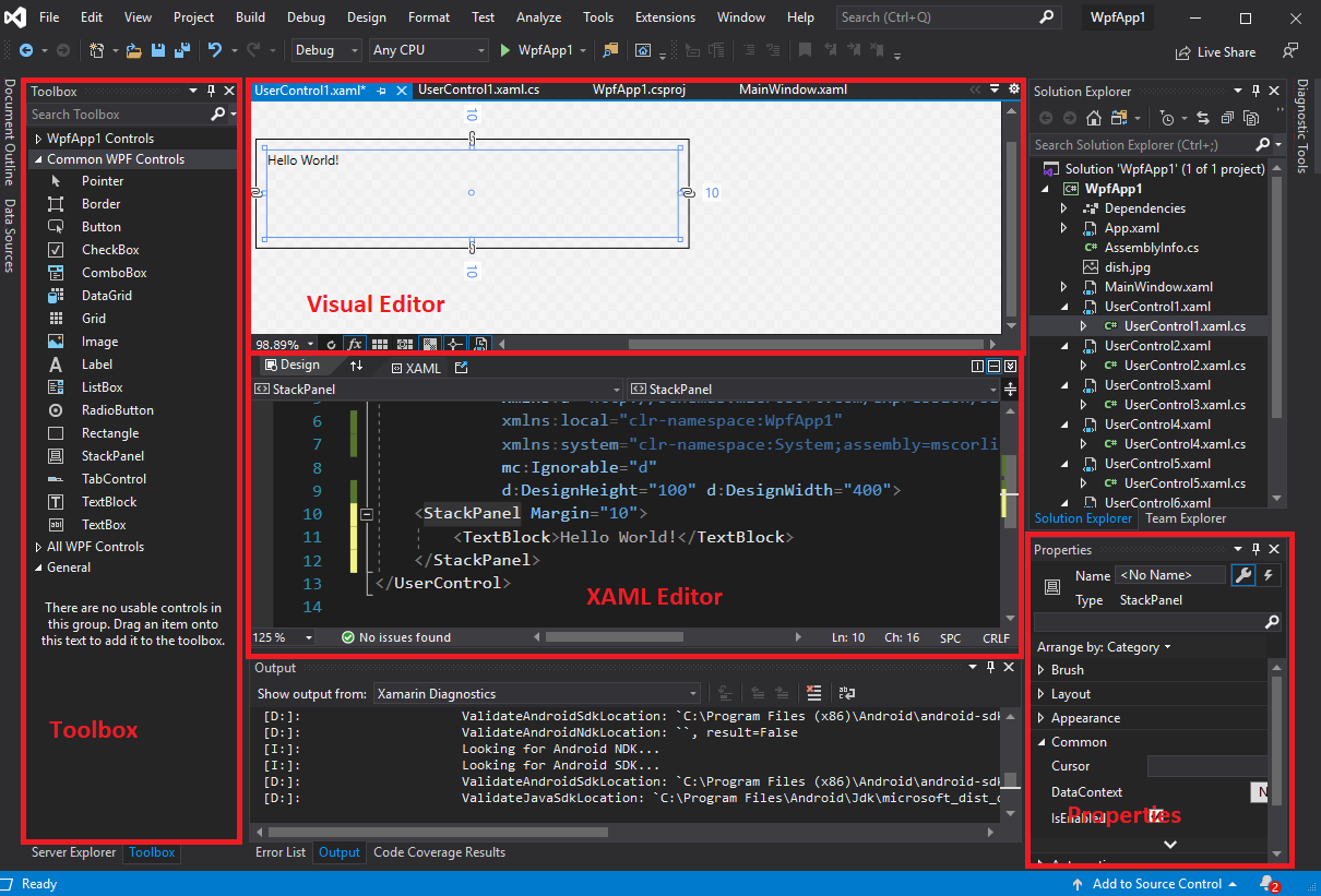
As you edit the XAML, it also updates the visualization in the visual editor. Also, many element properties can be edited from the visual editor or the properties pane - and these changes are automatically applied to the XAML. And, just like with Windows Forms, you can drag controls from the toolbox into the visualization to add them to the layout.
However, you will likely find yourselves often directly editing the XAML. This is often the fastest and most foolproof way of editing WPF controls. Remember that in WPF controls resize to fit the available space, and are not positioned by coordinates. For this reason, the visual editor will actually apply margins instead of positioning elements, which can cause unexpected results if your application is viewed at a different resolution (including some controls being inaccessible as they are covered by other controls).
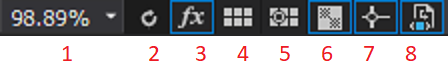
A couple of buttons in the editor deserve some closer attention:

WPF and XAML lend themselves to a design approach known as Component-Based Design or Component-Based Development, which rather than focusing on developing the entire GUI in one go, focuses on decomposing user experiences (UX) into individual, focused, and potentially reusable components. These can, in turn, be used to build larger components, and eventually, the entire GUI (see “UX Principles for Designing Component Based Systems” for more details).
Let’s dig deeper by focusing on a specific example. Let’s say we want to build an application for keeping track of multiple shopping lists. So our core component is a displayed list, plus a mechanism for adding to it. Let’s create a UserComponent to represent this.
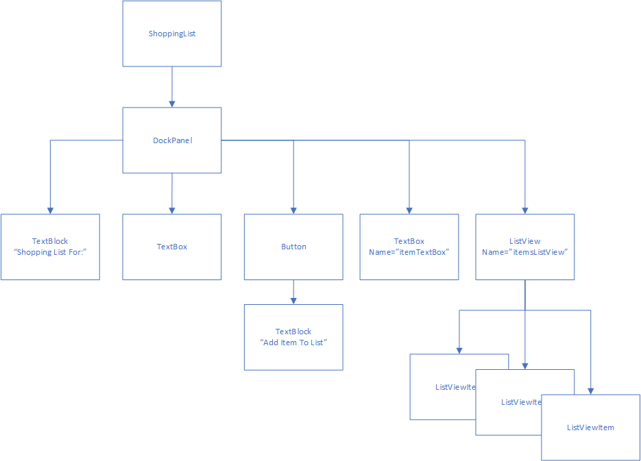
For laying out the component, let’s say at the very top, we place the text “Shopping List For”, and directly below that we have an editable text box where the user can enter a store name. On the bottom, we’ll have a text box to enter a new item, and a button to add that item to the list. And in the space between, we’ll show the list in its current form. This sounds like an ideal fit for the DockPanel:
<UserControl x:Class="ShopEasy.ShoppingList"
             xmlns="http://schemas.microsoft.com/winfx/2006/xaml/presentation"
             xmlns:x="http://schemas.microsoft.com/winfx/2006/xaml"
             xmlns:mc="http://schemas.openxmlformats.org/markup-compatibility/2006"
             xmlns:d="http://schemas.microsoft.com/expression/blend/2008"
             xmlns:local="clr-namespace:ShopEasy"
             mc:Ignorable="d"
             d:DesignHeight="450" d:DesignWidth="200">
    <DockPanel>
        <TextBlock DockPanel.Dock="Top" FontWeight="Bold" TextAlignment="Center">
            Shopping List For:
        </TextBlock>
        <TextBox DockPanel.Dock="Top" FontWeight="Bold" TextAlignment="Center" />
        <Button DockPanel.Dock="Bottom" Click="AddItemToList">Add Item To List</Button>
        <TextBox Name="itemTextBox" DockPanel.Dock="Bottom"/>
        <ListView Name="itemsListView" />
    </DockPanel>
</UserControl>
Now in our codebehind, we’ll need to define the AddItemToList event handler:
using System.Windows;
using System.Windows.Controls;
namespace ShopEasy
{
/// <summary>
/// Interaction logic for ShoppingList.xaml
/// </summary>
public partial class ShoppingList : UserControl
{
/// <summary>
/// Constructs a new ShoppingList
/// </summary>
public ShoppingList()
{
InitializeComponent();
}
/// <summary>
/// Adds the item in the itemTextBox to the itemsListView
/// </summary>
/// <param name="sender">The object sending the event</param>
/// <param name="e">The events describing the event</param>
void AddItemToList(object sender, RoutedEventArgs e)
{
// Make sure there's an item to add
if (itemTextBox.Text.Length == 0) return;
// Add the item to the list
itemsListView.Items.Add(itemTextBox.Text);
// Clear the text box
itemTextBox.Clear();
}
}
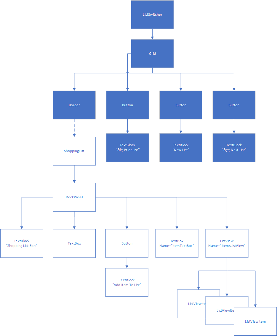
}This particular component is pretty much self-contained. We can use it in other components that need a shopping list. In our case, we’ll add it to a collection of shopping lists we can flip through with a couple of buttons, as well as create new lists in. Let’s call this control ListSwitcher.
This time, let’s use a Grid layout and divide the available space into three columns and two rows. The columns we’ll leave with the default width ("1*"), but the bottom row we’ll set as 100 units high, leaving the top row to expand to fill the remaining space. Along the bottom we’ll create three buttons to navigate between shopping lists. On the top, we’ll use the Grid.ColumnSpan property on a Border to span the three columns, creating a container where we’ll display the current ShoppingList:
<UserControl x:Class="ShopEasy.ListSwitcher"
xmlns="http://schemas.microsoft.com/winfx/2006/xaml/presentation"
xmlns:x="http://schemas.microsoft.com/winfx/2006/xaml"
xmlns:mc="http://schemas.openxmlformats.org/markup-compatibility/2006"
xmlns:d="http://schemas.microsoft.com/expression/blend/2008"
xmlns:local="clr-namespace:ShopEasy"
mc:Ignorable="d"
d:DesignHeight="450" d:DesignWidth="200">
<Grid>
<Grid.ColumnDefinitions>
<ColumnDefinition/>
<ColumnDefinition/>
<ColumnDefinition/>
</Grid.ColumnDefinitions>
<Grid.RowDefinitions>
<RowDefinition/>
<RowDefinition Height="100"/>
</Grid.RowDefinitions>
<Border Name="listContainer" Grid.ColumnSpan="3">
</Border>
<Button Grid.Row="1" Click="OnPriorList">
< Prior List
</Button>
<Button Grid.Row="1" Grid.Column="1" Click="OnNewList">
New List
</Button>
<Button Grid.Row="1" Grid.Column="2" Click="OnNextList">
Next List >
</Button>
</Grid>
</UserControl>Now we’ll implement the three button Click event handlers in the codebehind, as well as creating a List<ShoppingList> to store all of our lists:
using System.Collections.Generic;
using System.Windows;
using System.Windows.Controls;

namespace ShopEasy
{
    /// <summary>
    /// Interaction logic for ListSwitcher.xaml
    /// </summary>
    public partial class ListSwitcher : UserControl
    {
        /// <summary>
        /// The list of shopping lists managed by this control
        /// </summary>
        List<ShoppingList> lists = new List<ShoppingList>();

        /// <summary>
        /// The index of the currently displayed shopping list
        /// </summary>
        int currentListIndex = 0;

        /// <summary>
        /// Constructs a new ListSwitcher
        /// </summary>
        public ListSwitcher()
        {
            InitializeComponent();
        }

        /// <summary>
        /// Creates a new ShoppingList and displays it
        /// </summary>
        /// <param name="sender">What triggered this event</param>
        /// <param name="e">The parameters of this event</param>
        void OnNewList(object sender, RoutedEventArgs e)
        {
            // Create a new shopping list
            var list = new ShoppingList();
            // The current count of lists will be the index of the next list added
            currentListIndex = lists.Count;
            // Add the list to the list of shopping lists
            lists.Add(list);
            // Display the list on the control
            listContainer.Child = list;
        }

        /// <summary>
        /// Displays the prior shopping list
        /// </summary>
        /// <param name="sender">What triggered this event</param>
        /// <param name="e">The parameters of this event</param>
        void OnPriorList(object sender, RoutedEventArgs e)
        {
            // don't try to access an empty list
            if (lists.Count == 0) return;
            // decrement the currentListIndex
            currentListIndex--;
            // make sure we don't go below the first index in the list (0)
            if (currentListIndex < 0) currentListIndex = 0;
            // display the indexed list
            listContainer.Child = lists[currentListIndex];
        }

        /// <summary>
        /// Displays the next shopping list
        /// </summary>
        /// <param name="sender">What triggered this event</param>
        /// <param name="e">The parameters of this event</param>
        void OnNextList(object sender, RoutedEventArgs e)
        {
            // don't try to access an empty list
            if (lists.Count == 0) return;
            // increment the currentListIndex
            currentListIndex++;
            // make sure we don't go above the last index in the list (Count - 1)
            if (currentListIndex > lists.Count - 1) currentListIndex = lists.Count - 1;
            // display the indexed list
            listContainer.Child = lists[currentListIndex];
        }
    }
}
And finally, we’ll modify our MainWindow XAML to display a ListSwitcher:
<Window x:Class="ShopEasy.MainWindow"
xmlns="http://schemas.microsoft.com/winfx/2006/xaml/presentation"
xmlns:x="http://schemas.microsoft.com/winfx/2006/xaml"
xmlns:d="http://schemas.microsoft.com/expression/blend/2008"
xmlns:mc="http://schemas.openxmlformats.org/markup-compatibility/2006"
xmlns:local="clr-namespace:ShopEasy"
mc:Ignorable="d"
Title="MainWindow" Height="450" Width="200">
<Grid>
<local:ListSwitcher/>
</Grid>
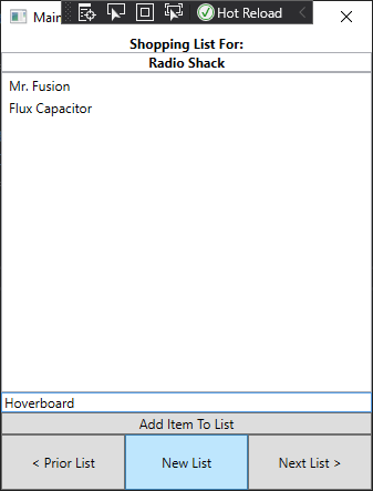
</Window>The resulting app allows us to create multiple shopping lists, and swap between them using the buttons:
Much like we can use objects to break program functionality into smaller, more focused units, we can use component-based design to break GUIs into smaller, more focused units. Both reflect one of the principles of good programming practice - the Single Responsibility Principle. This principle suggests each unit of code should focus on a single responsibility, and more complex behaviors be achieved by using multiple units together. As we see here, this principle extends across multiple programming paradigms.
In this chapter, we introduced a new desktop application programming framework - Windows Presentation Foundation (WPF). We explored how WPF uses XAML to define partial classes, allowing for a graphical design editor with regular C# codebehind. We explored XAML syntax and many of the controls found in WPF. We also compared WPF with Windows Forms, which you have previously explored in prior classes. Finally, we discussed an approach to developing GUIs, Component-Based Design, which applies the Single Responsibility Principle to controls, and builds more complex controls through composition of these simpler controls.
Our application is a tree?
In the previous chapter, we introduced Windows Presentation Foundation and XAML, and discussed common layouts and controls, as well as some of the most common features of each of them. We also saw the concept of component-based design and explored its use. In this chapter, we’ll take a deeper dive into how WPF and XAML structure GUIs into an elements tree, and some different ways we can leverage these features for greater control and customization in our programs.
<Style><Setter>StaticResourceIn this chapter, you should learn how to navigate the elements tree, declare styles to simplify styling your applications, and declare resources that can be bound to properties of controls.
Consider the ShoppingList class we developed in the last chapter:
<UserControl x:Class="ShopEasy.ShoppingList"
             xmlns="http://schemas.microsoft.com/winfx/2006/xaml/presentation"
             xmlns:x="http://schemas.microsoft.com/winfx/2006/xaml"
             xmlns:mc="http://schemas.openxmlformats.org/markup-compatibility/2006"
             xmlns:d="http://schemas.microsoft.com/expression/blend/2008"
             xmlns:local="clr-namespace:ShopEasy"
             mc:Ignorable="d"
             d:DesignHeight="450" d:DesignWidth="200">
    <DockPanel>
        <TextBlock DockPanel.Dock="Top" FontWeight="Bold" TextAlignment="Center">
            Shopping List For:
        </TextBlock>
        <TextBox DockPanel.Dock="Top" FontWeight="Bold" TextAlignment="Center" />
        <Button DockPanel.Dock="Bottom" Click="AddItemToList">Add Item To List</Button>
        <TextBox Name="itemTextBox" DockPanel.Dock="Bottom"/>
        <ListView Name="itemsListView" />
    </DockPanel>
</UserControl>
Each element in this XAML corresponds to an object of a specific Type, and the nesting of the elements implies a tree-like structure we call the element tree. We can draw this out as an actual tree:
The relationships in the tree are also embodied in the code. Each element has either a Child or Children property depending on if it can have just one or multiple children, and these are populated by the elements defined in the XAML. Thus, because the <DockPanel> has nested within it, a <TextBlock>, <TextBox>, <Button>, <TextBox>, and <ListView>, these are all contained in its Children Property. In turn, the <Button> element has text as a child, which is implemented as another <TextBlock>. Also, each component has a Parent property, which references the control that is its immediate parent.
In other words, all the WPF controls are effectively nodes in a tree data structure. We can modify this data structure by adding or removing nodes. This is exactly what happens in the ListSwitcher control - when you click the “New List” button, or the “Prior” or “Next” button, you are swapping the subtree that is the child of its <Border> element:
In fact, the entire application is one large tree of elements, with the <Application> as its root:
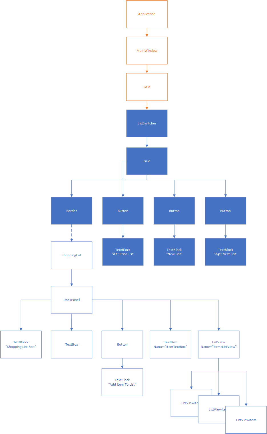
When you first learned about trees, you also learned about tree traversal algorithms. This is one reason that WPF is organized into a tree - the rendering process actually uses a tree traversal algorithm to determine how large to make each control!
You can also traverse the tree yourself, by exploring Child, Children, or Parent properties. For example, if we needed to gain access to the ListSwitcher from the ShoppingList in the previous example, you could reach it by invoking:
ListSwitcher switcher = this.Parent.Parent.Parent as ListSwitcher;In this example, this is our ShoppingList, the first Parent is the Border containing the ShoppingList, the second Parent is the Grid containing that Border, and the third Parent is the actual ListSwitcher. We have to cast it to be a ListSwitcher because the type of the Parent property is a DependencyObject (a common base class of all controls).
Of course, this is a rather brittle way of finding an ancestor, because if we add any nodes to the element tree (perhaps move the Grid within a DockPanel), we’ll need to rewrite it. It would be better to use a loop to iteratively climb the tree until we find the control we’re looking for. This is greatly aided by the LogicalTreeHelper library, which provides standardized static methods for accessing parents and children in the elements tree:
// Start climbing the tree from this node
DependencyObject parent = this;
do
{
    // Get this node's parent
    parent = LogicalTreeHelper.GetParent(parent);
}
// Invariant: there is a parent element, and it is not a ListSwitcher
while(!(parent is null || parent is ListSwitcher));
// If we get to this point, parent is either null, or the ListSwitcher we're looking for
Searching the ancestors is a relatively easy task, as each node in the tree has only one parent. Searching the descendants takes more work, as each node may have many children, with children of their own.
This approach works well for complex applications with complex GUIs, where it is infeasible to keep references around. However, for our simple application here, it might make more sense to refactor the ShoppingList class to keep track of the ListSwitcher that created it, i.e.:
using System.Windows;
using System.Windows.Controls;

namespace ShopEasy
{
    /// <summary>
    /// Interaction logic for ShoppingList.xaml
    /// </summary>
    public partial class ShoppingList : UserControl
    {
        /// <summary>
        /// The ListSwitcher that created this list
        /// </summary>
        private ListSwitcher listSwitcher;

        /// <summary>
        /// Constructs a new ShoppingList
        /// </summary>
        public ShoppingList(ListSwitcher listSwitcher)
        {
            InitializeComponent();
            this.listSwitcher = listSwitcher;
        }

        /// <summary>
        /// Adds the item in the itemTextBox to the itemsListView
        /// </summary>
        /// <param name="sender">The object sending the event</param>
        /// <param name="e">The events describing the event</param>
        void AddItemToList(object sender, RoutedEventArgs e)
        {
            // Make sure there's an item to add
            if (itemTextBox.Text.Length == 0) return;
            // Add the item to the list
            itemsListView.Items.Add(itemTextBox.Text);
            // Clear the text box
            itemTextBox.Clear();
        }
    }
}
However, this approach now tightly couples the ListSwitcher and ShoppingList - we can no longer use the ShoppingList for other contexts without a ListSwitcher.
If we instead employed the the traversal algorithm detailed above:
using System.Windows;
using System.Windows.Controls;

namespace ShopEasy
{
    /// <summary>
    /// Interaction logic for ShoppingList.xaml
    /// </summary>
    public partial class ShoppingList : UserControl
    {
        /// <summary>
        /// The ListSwitcher that created this list
        /// </summary>
        private ListSwitcher listSwitcher {
            get {
                DependencyObject parent = this;
                do
                {
                    // Get this node's parent
                    parent = LogicalTreeHelper.GetParent(parent);
                }
                // Invariant: there is a parent element, and it is not a ListSwitcher
                while(!(parent is null || parent is ListSwitcher));
                return parent;
            }
        }

        /// <summary>
        /// Constructs a new ShoppingList
        /// </summary>
        public ShoppingList()
        {
            InitializeComponent();
        }

        /// <summary>
        /// Adds the item in the itemTextBox to the itemsListView
        /// </summary>
        /// <param name="sender">The object sending the event</param>
        /// <param name="e">The events describing the event</param>
        void AddItemToList(object sender, RoutedEventArgs e)
        {
            // Make sure there's an item to add
            if (itemTextBox.Text.Length == 0) return;
            // Add the item to the list
            itemsListView.Items.Add(itemTextBox.Text);
            // Clear the text box
            itemTextBox.Clear();
        }
    }
}
We could invoke the listSwitcher property to get the ancestor ListSwitcher. If this control is being used without one, the value will be Null.
Windows Presentation Foundation takes advantage of the elements tree in other ways. One of the big ones is for styling related elements. Let’s say we are creating a calculator GUI:
<UserControl x:Class="Calculator.Calculator"
        xmlns="http://schemas.microsoft.com/winfx/2006/xaml/presentation"
        xmlns:x="http://schemas.microsoft.com/winfx/2006/xaml"
        xmlns:d="http://schemas.microsoft.com/expression/blend/2008"
        xmlns:mc="http://schemas.openxmlformats.org/markup-compatibility/2006"
        xmlns:local="clr-namespace:Calculator"
        mc:Ignorable="d"
        d:DesignWidth="450" d:DesignHeight="450">
    <Grid>
        <Grid.ColumnDefinitions>
            <ColumnDefinition/>
            <ColumnDefinition/>
            <ColumnDefinition/>
            <ColumnDefinition/>
        </Grid.ColumnDefinitions>
        <Grid.RowDefinitions>
            <RowDefinition/>
            <RowDefinition/>
            <RowDefinition/>
            <RowDefinition/>
            <RowDefinition/>
        </Grid.RowDefinitions>

        <Button Grid.Column="0" Grid.Row="1">7</Button>
        <Button Grid.Column="1" Grid.Row="1">8</Button>
        <Button Grid.Column="2" Grid.Row="1">9</Button>
        <Button Grid.Column="0" Grid.Row="2">4</Button>
        <Button Grid.Column="1" Grid.Row="2">5</Button>
        <Button Grid.Column="2" Grid.Row="2">6</Button>
        <Button Grid.Column="0" Grid.Row="3">1</Button>
        <Button Grid.Column="1" Grid.Row="3">2</Button>
        <Button Grid.Column="2" Grid.Row="3">3</Button>
        <Button Grid.Column="0" Grid.Row="4" Grid.ColumnSpan="3">0</Button>
        <Button Grid.Column="3" Grid.Row="1">+</Button>
        <Button Grid.Column="3" Grid.Row="2">-</Button>
        <Button Grid.Column="3" Grid.Row="3">*</Button>
        <Button Grid.Column="3" Grid.Row="4">/</Button>
    </Grid>
</Window>
Once we have the elements laid out, we realize the text of the buttons is too small. Fixing this would mean setting the FontSize property of each <Button>. That’s a lot of repetitive coding.
Thankfully, the XAML developers anticipated this kind of situation, and allow us to attach a <Style> resource to the control. We typically would do this above the controls we want to style - in this case, either on the <Grid> or the <UserControl>. If we were to attach it to the <Grid>, we’d declare a <Grid.Resources> property, and inside it, a <Style>:
<Grid.Resources>
    <Style>
    </Style>
</Grid.Resources>
The <Style> element allows us to specify a TargetType property, which is the Type we want the style to apply to - in this case "Button". Inside the <Style> element, we declare <Setter> elements, which need Property and Value attributes. As you might guess from the names, the <Setter> will set the specified property to the specified value on each element of the target type.
Therefore, if we use:
<Grid.Resources>
    <Style TargetType="Button">
        <Setter Property="FontSize" Value="40"/>
    </Style>
</Grid.Resources>
The result will be that all buttons that are children of the <Grid> will have their FontSize set to 40 device-independent pixels. We don’t need to add a separate FontSize="40" to each one! However, if we add FontSize="50" to a single button, that button alone will have a slightly larger font.
We can declare as many <Setters> as we want in a <Style> element, and as many <Style> elements as we want in a <.Resources> element. Moreover, styles apply to all children in the elements tree. Closer setters override those farther up the tree, and setting the property directly on an element always gives the final say.
Thus, we might put application-wide styles directly in our MainWindow using <Window.Resources>, and override those further down the elements tree when we want a different behavior.
You may notice some similarities between <Style> elements and the cascading style sheets (css) of web technologies. This is not surprising, as the styling approach used in WPF was inspired by CSS, much as XAML drew inspiration from HTML. However, the implementation details are necessarily different, as XAML is effectively declaring C# objects. Hence, the use of ‘setters’ to set ‘properties’ to a specific ‘value’.
The <Style> element represents just one kind of resource. We can provide other kinds of resources, like raw data. Say we want to provide a string to display in our program, but want that string declared somewhere easy to find and change (perhaps our customers change their mind frequently). We could declare the string in the Application resources:
<Application x:Class="WpfTutorialSamples.App"
             xmlns="http://schemas.microsoft.com/winfx/2006/xaml/presentation"
             xmlns:x="http://schemas.microsoft.com/winfx/2006/xaml"
             xmlns:sys="clr-namespace:System;assembly=mscorlib"
             StartupUri="WPF application/ExtendedResourceSample.xaml">
    <Application.Resources>
        <sys:String x:Key="StringToDisplay">Hello World!</sys:String>
    </Application.Resources>
</Application>
Then, in our actual control we can use that string as a static resource:
<TextBlock Text="{StaticResource StringToDisplay}">As long as that element is a descendant of the element the resource is declared on, it will be used in the property. In this case, we’ll display the string “Hello World!” in the TextBlock. Note that we have to use the x:Key property to identify the resource, and repeat the key in the "{StaticResource StringToDisplay}". The curly braces and the StaticResource both need to be there (technically, they are setting up a data binding, which we’ll talk about in a future chapter).
We can declare any kind of type as a resource and make it available in our XAML this way.
For example, we could create a LinearGradientBrush:
<Application x:Class="WpfTutorialSamples.App"
             xmlns="http://schemas.microsoft.com/winfx/2006/xaml/presentation"
             xmlns:x="http://schemas.microsoft.com/winfx/2006/xaml"
             xmlns:sys="clr-namespace:System;assembly=mscorlib"
             StartupUri="WPF application/ExtendedResourceSample.xaml">
    <Application.Resources>
        <LinearGradientBrush x:Key="Rainbow">
            <LinearGradientBrush.GradientStops>
                <GradientStop Color="Red" Offset="0.0"/>
                <GradientStop Color="Yellow" Offset="0.25"/>
                <GradientStop Color="Green" Offset="0.50"/>
                <GradientStop Color="Blue" Offset="0.75"/>
                <GradientStop Color="Violet" Offset="1.0"/>
            </LinearGradientBrush.GradientStops>
        </LinearGradientBrush>
    </Application.Resources>
</Application>
And then use it as a Background or Foreground property in our controls:
<Grid Background="{StaticResource Rainbow}">Since it is only defined in one place, it is now easier to reuse, and if we ever need to change it, we only need to change it in one location.
Finally, we can create static resources from images and other media. First, we have to set its build action to “Resource” in the “Properties” window after adding it to our project:
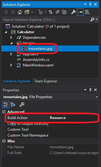
Then we can declare a <BitmapImage> resource using a UriSource property that matches the path to the image within our project:
<Application x:Class="WpfTutorialSamples.App"
             xmlns="http://schemas.microsoft.com/winfx/2006/xaml/presentation"
             xmlns:x="http://schemas.microsoft.com/winfx/2006/xaml"
             xmlns:sys="clr-namespace:System;assembly=mscorlib"
             StartupUri="WPF application/ExtendedResourceSample.xaml">
    <Application.Resources>
        <BitmapImage x:Key="MountainImage" UriSource="Images/mountains.jpg"/>
    </Applicaton.Resources>
</Application>
And then we can use this as the ImageSource for an ImageBrush:
<Grid>
    <Grid.Background>
        <ImageBrush ImageSource="{StaticResource MountainImage}"/>
    </Grid.Background>
</Grid>
The benefit of using images and other media as resources is that they are compiled into the binary assembly (the .dll or .exe file). This means they don’t need to be copied separately when we distribute our application.
Most WPF controls are themselves composed of multiple, simpler, controls. For example, a <Button> is composed of a <Border> and whatever content you place inside the button. A simplified version of this structure appears below (I removed the styling information and the VisualState components responsible for presenting the button differently when it is enabled, disabled, hovered on, or clicked):
<Border TextBlock.Foreground="{TemplateBinding Foreground}"
        x:Name="Border"
        CornerRadius="2"
        BorderThickness="1">
  <Border.BorderBrush>
    <LinearGradientBrush StartPoint="0,0"
                          EndPoint="0,1">
      <LinearGradientBrush.GradientStops>
        <GradientStopCollection>
          <GradientStop Color="{DynamicResource BorderLightColor}"
                        Offset="0.0" />
          <GradientStop Color="{DynamicResource BorderDarkColor}"
                        Offset="1.0" />
        </GradientStopCollection>
      </LinearGradientBrush.GradientStops>
    </LinearGradientBrush>
  </Border.BorderBrush>
  <Border.Background>
    <LinearGradientBrush EndPoint="0.5,1"
                          StartPoint="0.5,0">
      <GradientStop Color="{DynamicResource ControlLightColor}"
                    Offset="0" />
      <GradientStop Color="{DynamicResource ControlMediumColor}"
                    Offset="1" />
    </LinearGradientBrush>
  </Border.Background>
  <ContentPresenter Margin="2"
                    HorizontalAlignment="Center"
                    VerticalAlignment="Center"
                    RecognizesAccessKey="True" />
</Border>
This has some implications for working with the control - for example, if you wanted to add rounded corners to the <Button>, they would actually need to be added to the <Border> inside the button. This can be done by nesting styles, i.e.:
<Grid>
    <Grid.Resources>
        <Style TargetType="Button">
            <Style.Resources>
                <Style TargetType="Border">
                    <Setter Property="CornerRadius" Value="25"/>
                </Style>
            </Style.Resources>
        </Style>
    </Grid.Resources>
    <Button>I have rounded corners now!</Button>
</Grid>
Note how the <Style> targeting the <Border> is nested inside the Resources of the <Style> targeting the <Button>? This means that the style rules for the <Border> will only be applied to <Border> elements that are part of a <Button>.
Above I listed a simplified version of the XAML used to create a button. The full listing can be found in the Microsoft Documentation
What’s more, you can replace this standard rendering in your controls by replacing the Template property. For example, we could replace our button with a super-simple rounded <Border> that nested a <TextBlock> that does word-wrapping of the button content:
<Button>
    <Button.Template>
        <ControlTemplate>
            <Border CornerRadius="25">
                <TextBlock TextWrapping="Wrap">
                    <ContentPresenter Margin="2"
                        HorizontalAlignment="Center"
                        VerticalAlignment="Center"
                        RecognizesAccessKey="True" />
                </TextBlock>
            </Border>
        </ControlTemplate>
    </Button.ControlTemplate>
    This is a simple button!
</Button>
The <ContentPresenter> is what presents the content nested inside the button - in this case, the text This is a simple button!. Of course, this super-simple button will not change its appearance when you hover over it or click it, or when it is disabled. But it helps convey the idea of a <ControlTemplate>. As with any other property, you can also set the Template property of a control using a <Setter> within a <Style> targeting that element.
If you only need a simple tweak - like applying word-wrapping to the text of a button, it often makes more sense to supply as content a control that will do so, i.e.:
<Button>
    <TextBlock TextWrapping="Wrap">
        I also wrap text!
    </TextBlock>
</Button>
This allows the <Button> to continue to use the default ControlTemplate while providing the desired word-wrapping with a minimum of extra code.
A similar idea appears with <DataTemplate>, which allows you to customize how bound data is displayed in a control. For example, we often want to display the items in a <ListBox> in a different way than the default (a <TextBlock> with minimal styling). We’ll visit this in the upcoming binding lists section.
In this chapter, we saw how WPF applications are organized into a tree of controls. Moreover, we discussed how WPF uses this tree to perform its layout and rendering calculations. We also saw how we can traverse this tree in our programs to find parent or child elements of a specific type.
In addition, we saw how declaring resources at a specific point in the tree makes them available to all elements descended from that node. The resources we looked at included <Style> elements, which allow us to declare setters for properties of a specific type of element, to apply consistent styling rules.
We also saw how we could declare resources with a x:Key property, and bind them as static resources to use in our controls - including strings and other common types. Building on that idea, we saw how we could embed images and other media files as resources.
We also explored how <ControlTemplates> are used to compose complex controls from simpler controls, and make it possible to swap out that implementation for a custom one. We also briefly discussed when it may make more sense to compose the content of a control differently to get the same effect.
When we explore events and data binding in later chapters, we will see how these concepts also interact with the element tree in novel ways.
I Fight for the Users!
Event-Driven programming is a programming paradigm where the program primarily responds to events - typically generated by a user, but also potentially from sensors, network connections, or other sources. We cover it here because event-driven programming is a staple of graphical user interfaces. These typically display a fairly static screen until the user interacts with the program in some meaningful way - moving or clicking the mouse, hitting a key, or the like.
As you might suspect, event-driven programming is often used alongside other programming paradigms, including structured programming and object-orientation. We’ll be exploring how event-driven programming is implemented in C# in this chapter, especially how it interacts with Windows Presentation Foundation.
eventEventArgs+=-=?.The key skills to learn in this chapter are how to write event listeners, attach event listeners to event handlers, and how to define custom event handlers.
At the heart of every Windows program (and most operating systems), is an infinitely repeating loop we call the message loop and a data structure we call a message queue (some languages/operating systems use the term event instead of message). The message queue is managed by the operating system - it adds new events that the GUI needs to know about (i.e. a mouse click that occurred within the GUI) to this queue. The message loop is often embedded in the main function of the program, and continuously checks for new messages in the queue. When it finds one, it processes the message. Once the message is processed, the message loop again checks for a new message. The basic code for such a loop looks something like this:
function main
    initialize()
    while message != quit
        message := get_next_message()
        process_message(message)
    end while
end function
This approach works well for most GUIs as once the program is drawn initially (during the initialize() function), the appearance of the GUI will not change until it responds to some user action.
In a WPF or Windows Forms application, this loop is buried in the Application class that the App inherits from. Instead of writing the code to process these system messages directly, this class converts these messages into C# events, which are then consumed by the event listeners the programmer provides. We’ll look at these next.
In C#, we use event handlers (sometimes called event listeners in other languages) to register the behavior we want to happen in response to specific events. You’ve probably already used these, i.e. declaring a handler:
private void OnEvent(object sender, EventArgs e) {
    // TODO: Respond to the event
}
Most event handlers follow the same pattern. They do not have a return value (their return type is void), and take two parameters. The first is always an object, and it is the source of the event (hence “sender”). The second is an EventArgs object, or a class descended from EventArgs, which provides details about the event.
For example, the various events dealing with mouse input (MouseMove, MouseDown, MouseUp) supply a MouseEventArgs object. This object includes properties defining the mouse location, number of clicks, mouse wheel rotations, and which button was involved in the event.
You’ve probably attached event handlers using the “Properties” panel in Visual Studio, but you can also attach them in code:
Button button = new Button();
button.Click += OnClick;
Note you don’t include parenthesis after the name of the event handler. You aren’t invoking the event handler, you’re attaching it (so it can be invoked in the future when the event happens). Also, note that we use the += operator to signify attaching an event handler.
This syntax is a deliberate choice to help reinforce the idea that we can attach multiple event handlers in C#, i.e.:
Button button = new Button();
button.Click += onClick1;
button.Click += onClick2;
In this case, both onClick1 and onClick2 will be invoked when the button is clicked. This is also one reason to attach event handlers programmatically rather than through the “Properties” window (it can only attach one).
We can also remove an event handler if we no longer want it to be invoked when the event happens. We do this with the -= operator:
button.Click -= onClick1;Again, note we use the handler’s name without parenthesis.
Up to this point, you’ve probably only used events that were defined on library objects, like the Button’s Click event. However, you can also declare events in your own classes, and even create new event types.
In order to attach an event handler to an object in C#, we must first declare that that object has the corresponding event. To do so, we need both a name for the event, and a delegate.
In C# a Delegate is a special type that represents a method with a specific method signature and return type. A delegate allows us to associate the delegate with any method that matches that signature and return type. For example, the Click event handler we discussed earlier is a delegate which matches a method that takes two arguments: an object and an EventArgs, and returns void. Any event listener that we write that matches this specification can be attached to the button.Click. In a way, a Delegate is like an Interface, only for methods instead of objects.
Consider a class representing an egg. What if we wanted to define an event to represent when it hatched? We’d need a delegate for that event, which can be declared a couple of ways. The traditional method would be:
public delegate void HatchHandler(object sender, EventArgs args);And then in our class we’d declare the corresponding event. In C#, these are written much like a field, but with the addition of the event keyword:
public event HatchHandler Hatch;Like a field declaration, an event declaration can have an access modifier (public, private, or protected), a name (in this case Hatch), and a type (the delegate). It also gets marked with the event keyword.
When C# introduced generics, it became possible to use a generic delegate as well, EventHandler<T>, where the T is the type for the event arguments. This simplifies writing an event, because we no longer need to define the delegate ourselves. So instead of the two lines above, we can just use:
public event EventHandler<EventArgs> Hatch;The second form is increasingly preferred, as it makes testing our code much easier (we’ll see this soon), and it’s less code to write.
We might also want to create our own custom event arguments to accompany the event. Perhaps we want to provide a reference to an object representing the baby chick that hatched. To do so we can create a new class that inherits from EventArgs:
/// <summary>
/// A class representing the hatching of a chick
/// </summary>
public class HatchEventArgs : EventArgs
{
    /// <summary>
    /// The chick that hatched
    /// </summary>
    public Chick Chick { get; protected set; }

    /// <summary>
    /// Constructs a new HatchEventArgs
    /// </summary>
    /// <param name="chick">The chick that hatched</param>
    public HatchEventArgs(Chick chick)
    {
        this.Chick = chick;
    }
}
And we use this custom event args in our event declaration as the type for the generic EventHandler<T> generic:
public event EventHandler<HatchEventArgs> Hatch;Now let’s say we set up our Egg constructor to start a timer to determine when the egg will hatch:
public Egg()
{
    // Set a timer to go off in 20 days
    // (ms = 20 days * 24 hours/day * 60 minutes/hour * 60 seconds/minute * 1000 milliseconds/seconds)
    var timer = new System.Timers.Timer(20 * 24 * 60 * 60 * 1000);
    timer.Elapsed += StartHatching;
}
In the event handler StartHatching, we’ll want to create our new baby chick, and then trigger the Hatch event. To do this, we need to raise the event to pass to any attached handlers with Hatch.Invoke(), passing in both the event arguments and the source of the event (our egg):
private void StartHatching(object source, ElapsedEventArgs e)
{
    var chick = new Chick();
    var args = new HatchEventArgs(chick);
    Hatch.Invoke(this, args);
}
However we might have the case where there are no registered event handlers, in which case Hatch evaluates to null, and attempting to call Invoke() will cause an error. We can prevent this by wrapping our Invoke() within a conditional:
if(Hatch != null) {
    Hatch.Invoke(this, args);
}
However, there is a handy shorthand form for doing this (more syntactic sugar):
Hatch?.Invoke(this, args);Using the question mark (?) before the method invocation is known as the Null-condition operator. We use this to avoid calling the Invoke() method if PropertyChanged is null (which is the case if no event handlers have been assigned to it). It tests the object to see if it is null. If it is null, the method is not invoked.
You might be wondering why an event with no assigned event handlers is Null instead of some form of empty collection. The answer is rooted in efficiency - remember that each object (even empty collection) requires a certain amount of memory to hold its details. Now think about all the possible events we might want to listen for in a GUI. The System.Windows.Controls.Control Class (a base class for all WPF controls) defines around 100 events. Now multiply that by all the controls used in a single GUI, and you’ll see that small amount of memory consumption adds up quickly. By leaving unused events null, C# saves significant memory!
Thus, our complete egg class would be:
/// <summary>
/// A class representing an egg
/// </summary>
public class Egg
{
    /// <summary>
    /// An event triggered when the egg hatches
    /// </summary>
    public event EventHandler<HatchEventArgs> Hatch;

    /// <summary>
    /// Constructs a new Egg instance
    /// </summary>
    public Egg()
    {
        // Set a timer to go off in 20 days
        // (ms = 20 days * 24 hours/day * 60 minutes/hour * 60 seconds/minute * 1000 milliseconds/seconds)
        var timer = new System.Timers.Timer(20 * 24 * 60 * 60 * 1000);
        timer.Elapsed += StartHatching;
    }

    /// <summary>
    /// Handles the end of the incubation period
    /// by triggering a Hatch event
    /// </summary>
    private void StartHatching(object source, ElapsedEventArgs e)
    {
        var chick = new Chick();
        var args = new HatchEventArgs(chick);
        Hatch?.Invoke(this, args);
    }
}It might be becoming clear that in many ways, events are another form of message passing, much like methods are. In fact, they are processed much the same way: the Invoke() method of the event calls each attached event handler in turn.
Regular event invocation in C# is synchronous, just as is method calling - invoking an event passes execution to the event handlers one at a time the same way calling a method hands program execution to the method. Once they have finished executing, program execution continues back in the code that invoked the event. Let’s see a practical example based on our discussion of the Hatch event. If we were to give our chick a name:
private void StartHatching(object source, ElapsedEventArgs e)
{
    var chick = new Chick();
    var args = new HatchEventArgs(chick);
    Hatch?.Invoke(this, args);
    chick.Name = "Cluckzilla";
}
And in our event handler, we tried to print that name:
private void OnHatch(object sender, HatchEventArgs e)
{
    Console.WriteLine($"Welcome to the world, {e.Chick.Name}!");
}
The OnHatch event handler would be triggered by the Hatch?.Invoke() line before the name was set, so the Chick.Name property would be null! We would need to move the name assignment to before the Invoke() call for it to be available in any attached event handlers.
The EventArgs define what the message contains, the sender specifies which object is sending the event, and the objects defining the event handlers are the ones receiving it.
That last bit is the biggest difference between using an event to pass a message and using a method to pass the same message. With a method, we always have one object sending and one object receiving. In contrast, an event can have no objects receiving, one object receiving, or many objects receiving.
An event is therefore more flexible and open-ended. We can determine which object(s) should receive the message at any point - even at runtime. In contrast, with a method we need to know what object we are sending the message to (i.e invoking the method of) as we write the code to do so.
Let’s look at a concrete example of where this can come into play.
We often have classes which encapsulate data we might need to look at. For example, we might have a “Smart” dog dish, which keeps track of the amount of food it contains in ounces. So it exposes a Weight property.
Now let’s assume we have a few possible add-on products that can be combined with that smart bowl. One is a “dinner bell”, which makes noises when the bowl is filled (ostensibly to attract the dog, but mostly just to annoy your neighbors). Another is a wireless device that sends texts to your phone to let you know when the bowl is empty.
How can the software running on these devices determine when the bowl is empty or full? One possibility would be to check the bowl’s weight constantly, or at a set interval. We call this strategy polling:
/// <summary>
/// The run button for the Dinner Bell add-on
/// </summary>
public void Run()
{
    while(bowl.Weight != 0) {
        // Do nothing
    }
    // If we reach here, the bowl is empty!
    sendEmptyText();
}
The problem with this approach is that it means our program is running full-bore all the time. If this is a battery-operated device, those batteries will drain quickly. It might be better if we let the smart bowl notify the Dinner Bell, but if we did this using methods, the Smart Bowl would need a reference to that dinner bell… and any other accessories we plug in.
This was a common problem in GUI design - sometimes we need to know when a property changes because we are displaying that property’s value in the GUI, possibly in multiple places. But if that property is not part of a GUI display, we may not care when it changes.
The standard answer to this dilemma in .NET is the INotifyPropertyChanged interface - an interface defined in the System.ComponentModel namespace that requires you to implement a single event PropertyChanged on the class that is changing. You can define this event as:
public event PropertyChangedEventHandler? PropertyChanged;This sets up the PropertyChanged event handler on your class. Let’s first look at writing event listeners to take advantage of this event.
In our example, we would do this with the smart dog bowl, and add listeners to the dinner bell and empty notification tools. The PropertyChangedEventArgs includes the name of the property that is changing (PropertyName) - so we can check that 1) the property changing is the weight, and 2) that the weight meets our criteria, i.e.:
/// <summary>
/// A SmartBowl accessory that sends text notifications when the SmartBowl is empty
/// </summary>
public class EmptyTexter
{
    /// <summary>
    /// Constructs a new EmptyTexter object
    /// </summary>
    /// <param Name="bowl">The SmartBowl to listen to</param>
    public EmptyTexter(SmartBowl bowl)
    {
        bowl.PropertyChanged += onBowlPropertyChanged;
    }

    /// <summary>
    /// Responds to changes in the Weight property of the bowl
    /// </summary>
    /// <param Name="Sender">The bowl sending the event</param>
    /// <param Name="e">The event arguments (specifying which property changed)</param>
    private void onBowlPropertyChanged(object sender, PropertyChangedEventArgs e)
    {
        // Only move forward if the property changing is the weight
        if (e.PropertyName == "Weight")
        {
            if (sender is SmartBowl)
            {
                var bowl = sender as SmartBowl;
                if (bowl.Weight == 0) textBowlIsEmpty();
            }
        }
    }

    /// <summary>
    /// Helper method to notify bowl is empty
    /// </summary>
    private void textBowlIsEmpty()
    {
        // TODO: Implement texting
    }
}
Note that in our event listener, we need to check the specific property that is changing is the one we care about - the Weight. We also cast the source of the event back into a SmartBowl, but only after checking the cast is possible. Alternatively, we could have stored the SmartBowl instance in a class variable rather than casting.
Or, we can use the new is type pattern expression:
if(sender is SmartBowl bowl) {
    // Inside this body, bowl is the sender cast as a SmartBowl
    // TODO: logic goes here
}
This is syntactic sugar for:
if(sender is SmartBowl) {
    var bowl = sender as SmartBowl;
    // TODO: logic goes here
}
Notice how the is type pattern expression merges the if test and variable assignment?
Also, notice that the only extra information supplied by our PropertyChangedEventArgs is the name of the property - not its prior value, or any other info. This helps keep the event lightweight, but it does mean if we need to keep track of prior values, we must implement that ourselves, as we do in the DinnerBell implementation:
/// <summary>
/// A SmartBowl accessory that makes noise when the bowl is filled
/// </summary>
public class DinnerBell
{
    /// <summary>
    /// Caches the previous weight measurement
    /// </summary>
    private double lastWeight;

    /// <summary>
    /// Constructs a new DinnerBell object
    /// </summary>
    /// <param Name="bowl">The SmartBowl to listen to</param>
    public DinnerBell(SmartBowl bowl)
    {
        lastWeight = bowl.Weight;
        bowl.PropertyChanged += onBowlPropertyChanged;
    }

    /// <summary>
    /// Responds to changes in the Weight property of the bowl
    /// </summary>
    /// <param Name="Sender">The bowl sending the event</param>
    /// <param Name="e">The event arguments (specifying which property changed)</param>
    private void onBowlPropertyChanged(object sender, PropertyChangedEventArgs e)
    {
        // Only move forward if the property changing is the weight
        if (e.PropertyName == "Weight")
        {
            // Cast the sender to a smart bowl using the is type expression
            if (sender is SmartBowl bowl)
            {
                // Ring the dinner bell if the bowl is now heavier
                // (i.e. food has been added)
                if (bowl.Weight > lastWeight) ringTheBell();
                // Cache the new weight
                lastWeight = bowl.Weight;
            }
        }
    }

    /// <summary>
    /// Helper method to make noise
    /// </summary>
    private void ringTheBell()
    {
        // TODO: Implement noisemaking
    }
}For the event listeners to work as expected, we need to implement the PropertyChanged event in our SmartBowl class with:
public event PropertyChangedEventHandler? PropertyChanged;Which makes it available for the event handlers to attach to. But this is only part of the process, we also need to invoke this event when it happens. This is done with the Invoke(object sender, EventArgs e) method defined for every event handler. It takes two parameters, an object which is the source of the event, and the EventArgs defining the event. The specific kind of EventArgs corresponds to the event declaration - in our case, PropertyChangedEventArgs.
Let’s start with a straightforward example. Assume we have a Name property in the SmartBowl that is a customizable string, allowing us to identify the bowl, i.e. “Water” or “Food”. When we change it, we need to invoke the PropertyChanged event, i.e.:
private string name = "Bowl";
public string Name {
    get {return name;}
    set
    {
        name = value;
        PropertyChanged?.Invoke(this, new PropertyChangedEventArgs("Name"));
    }
}
Notice how we use the setter for Name to invoke the PropertyChanged event handler, after the change to the property has been made. This invocation needs to be done after the change, or the responding event listener may grab the old value (remember, event listeners are triggered synchronously).
Also note that we use the null-conditional operator ?. to avoid calling the Invoke() method if PropertyChanged is null (which is the case if no event listeners have been assigned).
Now let’s tackle a more complex example. Since our SmartBowl uses a sensor to measure the weight of its contents, we might be able to read the sensor data - probably through a driver or a class representing the sensor. Rather than doing this constantly, let’s set a polling interval of 1 minute:
/// <summary>
/// A class representing a "smart" dog bowl.
/// </summary>
public class SmartBowl : INotifyPropertyChanged
{
    /// <summary>
    /// Event triggered when a property changes
    /// </summary>
    public event PropertyChangedEventHandler? PropertyChanged;

    /// <summary>
    /// The weight sensor installed in the bowl
    /// </summary>
    Sensor sensor;

    private string name = "Bowl";
    /// <summary>
    /// The name of this bowl
    /// </summary>
    public string Name
    {
        get { return name; }
        set
        {
            name = value;
            PropertyChanged?.Invoke(this, new PropertyChangedEventArgs("Name"));
        }
    }

    private double weight;
    /// <summary>
    /// The weight of the bowl contents, measured in ounces
    /// </summary>
    public double Weight
    {
        get { return weight; }
        set
        {
            // We only want to treat the weight as changing
            // if the change is more than a 16th of an ounce
            if (Math.Abs(weight - value) > 1 / 16)
            {
                weight = value;
                // Notify of the property changing
                PropertyChanged?.Invoke(this, new PropertyChangedEventArgs("Weight"));
            }
        }
    }

    /// <summary>
    /// Constructs a new SmartBowl
    /// </summary>
    /// <param Name="sensor">the weight sensor</param>
    public SmartBowl(Sensor sensor)
    {
        this.sensor = sensor;
        // Set the initial weight
        weight = sensor.Value;
        // Set a timer to go off in 1 minute
        // (ms = 60 seconds/minute * 1000 milliseconds/seconds)
        var timer = new System.Timers.Timer(60 * 1000);
        // Set the timer to reset when it goes off
        timer.AutoReset = true;
        // Trigger a sensor read each time the timer elapses
        timer.Elapsed += readSensor;
    }

    /// <summary>
    /// Handles the elapsing of the polling timer by updating the weight
    /// </summary>
    private void readSensor(object Sender, System.Timers.ElapsedEventArgs e)
    {
        this.Weight = sensor.Value;
    }

}
Notice in this code, we use the setter of the Weight property to trigger the PropertyChanged event. Because we’re dealing with a real-world sensor that may have slight variations in the readings, we also only treat changes of more than 1/16th of an ounce as significant enough to change the property.
With the INotifyPropertyChanged interface, the only aspect Visual Studio checks is that the PropertyChanged event is declared. There is no built-in check that the programmer is using it as expected. Therefore it is upon you, the programmer, to ensure that you meet the expectation that comes with implementing this interface: that any public or protected property that changes will invoke the PropertyChanged event.
Finally, we should write unit tests to confirm that our PropertyChanged event works as expected:
public class SmartBowlUnitTests {

    /// <summary>
    /// A mock sensor that increases its reading by one ounce
    /// every time its Value property is invoked.
    /// </summary>
    class MockChangingWeightSensor : Sensor
    {
        double value = 0.0;

        public double Value {
            get {
                value += 1;
                return value;
            }
        }
    }

    [Fact]
    public void NameChangeShouldTriggerPropertyChanged()
    {
        var bowl = new SmartBowl(new MockChangingWeightSensor());
        Assert.PropertyChanged(bowl, "Name", () => {
            bowl.Name = "New Name";
        });
    }

    [Fact]
    public void WeightChangeShouldTriggerPropertyChanged()
    {
        var bowl = new SmartBowl(new MockChangingWeightSensor());
        Assert.PropertyChangedAsync(bowl, "Weight", () => {
            return Task.Delay(2 * 60 * 1000);
        });
    }
}
The PropertyChanged interface is so common in C# programming that we have two assertions dealing with it. The first we use to test the Name property:
[Fact]
public void NameChangeShouldTriggerPropertyChanged()
{
    var bowl = new SmartBowl(new MockChangingWeightSensor());
    Assert.PropertyChanged(bowl, "Name", () => {
        bowl.Name = "New Name";
    });
}
Notice that Assert.PropertyChanged(@object obj, string propertyName, Action action) takes three arguments - first the object with the property that should be changing, second the name of the property we expect to change, and third an action that should trigger the event. In this case, we change the name property.
The second is a bit more involved, as we have an event that happens based on a timer. To test it therefore, we have to wait for the timer to have had an opportunity to trigger. We do this with an asynchronous action, so we use the Assert.PropertyChangedAsync(@object obj, string propertyName, Func<Task> action). The first two arguments are the same, but the last one is a Func (a function) that returns an asynchronous Task object. The simplest one to use here is Task.Delay, which delays for the supplied period of time (in our case, two minutes). Since our property should change on one-minute intervals, we’ll know if there was a problem if it doesn’t change after two minutes.
Considering that C# was developed as an object-oriented language from the ground up, you would expect that events would be inheritable just like properties, fields, and methods. Unfortunately this is not the case. Remember, the C# language is compiled into intermediate language to run on the .NET Runtime, and this Runtime proceeded C# (it is also used to compile Visual Basic), and the way events are implemented in intermediate language does not lend itself to inheritance patterns.
This has some important implications for writing C# events:
virtual and override keywords used with events do not actually create an overridden event - you instead end up with two separate implementations.The standard way programmers have adapted to this issue is to:
protected helper method to that base class that will invoke the event, taking whatever parameters are neededFor example, the PropertyChanged event we discussed previously is often invoked from a helper method named OnPropertyChanged() that is defined like this:
protected virtual void OnPropertyChanged(string propertyName)
{
    this.PropertyChanged?.Invoke(this, new PropertyChangedEventArgs(propertyName));
}
In derived classes, you can indicate a property is changing by calling this event, and passing in the property name, i.e.:
private object _tag = null;

/// <summary>
/// An object to represent whatever you need
/// </summary>
public object Tag {
  get => _tag;
  set
  {
    if(value != _tag)
    {
      _tag = value;
      OnPropertyChanged(nameof(this.Tag));
    }
  }
}
Note the call to OnPropertyChanged() - this will trigger the PropertyChanged event handler on the base class.
You might have noticed the use of nameof(this.Tag) in the example code above. The nameof expression returns the name of a property as a string. This approach is preferred over just writing the string, as it makes it less likely a typo will result in your code not working as expected.
While events exist in Windows Forms, Windows Presentation Foundation adds a twist with their concept of routed events. Routed events are similar to regular C# events, but provide additional functionality. One of the most important of these is the ability of the routed event to “bubble” up the elements tree. Essentially, the event will be passed up each successive WPF element until one chooses to “handle” it, or the top of the tree is reached (in which case the event is ignored).
Consider a Click event handler for a button. In Windows Forms, we have to attach our listener directly to the button, i.e:
namespace WindowsFormsApp1
{
    public partial class Form1 : Form
    {
        public Form1()
        {
            InitializeComponent();
            IncrementButton.Click += HandleClick;
        }

        private void HandleClick(object sender, EventArgs e)
        {
            // TODO: Handle our click
        }
    }
}
With WPF we can also attach an event listener directly to the button, but we can also attach an event listener to an ancestor of the button (a component further up the element tree). The click event will “bubble” up the element tree, and each successive parent will have the opportunity to handle it. I.e. we can define a button in the ChildControl:
<UserControl x:Class="WpfApp1.ChildControl"
             xmlns="http://schemas.microsoft.com/winfx/2006/xaml/presentation"
             xmlns:x="http://schemas.microsoft.com/winfx/2006/xaml"
             xmlns:mc="http://schemas.openxmlformats.org/markup-compatibility/2006"
             xmlns:d="http://schemas.microsoft.com/expression/blend/2008"
             xmlns:local="clr-namespace:WpfApp1"
             mc:Ignorable="d"
             d:DesignHeight="450" d:DesignWidth="800">
    <Grid>
        <Button Name="IncrementButton">Count</Button>
    </Grid>
</UserControl>
And add an instance of ChildControl to our MainWindow:
<Window x:Class="WpfApp1.MainWindow"
        xmlns="http://schemas.microsoft.com/winfx/2006/xaml/presentation"
        xmlns:x="http://schemas.microsoft.com/winfx/2006/xaml"
        xmlns:d="http://schemas.microsoft.com/expression/blend/2008"
        xmlns:mc="http://schemas.openxmlformats.org/markup-compatibility/2006"
        xmlns:local="clr-namespace:WpfApp1"
        mc:Ignorable="d"
        Title="MainWindow" Height="450" Width="800">
    <Grid Button.Click="HandleClick">
        <local:ChildControl/>
    </Grid>
</Window>
Note that in our <Grid> we attached a Button.Click handler? The attached listener, HandleClick, will be invoked for all Click events arising from Buttons that are nested under the <Grid> in the elements tree. We can then write this event handler in the codebehind of our MainWindow:
namespace WpfApp1
{
    /// <summary>
    /// Interaction logic for MainWindow.xaml
    /// </summary>
    public partial class MainWindow : Window
    {
        public MainWindow()
        {
            InitializeComponent();
        }

        private void HandleClick(Object sender, RoutedEventArgs e)
        {
            if(e.OriginalSource is Button button && button.Name == "IncrementButton")
            {
                // TODO: Handle increment;

                e.Handled = true;
            }
        }
    }
}
Note that because this event listener will be triggered for all buttons, we need to make sure it’s a button we care about - so we cast the OriginalSource of the event to be a button and check its Name property. We use the RoutedEventArgs.OriginalSource because the sender won’t necessarily be the specific control the event originated in - in this case it actually is the Grid containing the button. Also, note that we mark e.Handled as true. This tells WPF it can stop “bubbling” the event, as we have taken care of it.
We’ll cover routed events in more detail in the upcoming Dependency Objects chapter, but for now you need to know that the GUI events you know from Windows Forms (Click, Select, Focus, Blur), are all routed events in WPF, and therefore take a RoutedEventArgs object instead of the event arguments you may be used to.
The PropertyChanged event notifies us when a property of an object changes, which covers most of our GUI notification needs. However, there are some concepts that aren’t covered by it - specifically, when an item is added or removed from a collection. We use a different event, NotifyCollectionChanged to convey when this occurs.
The INotifyCollectionChanged interface defined in the System.Collections.Specialized namespace indicates the collection implements the NotifyCollectionChangedEventHandler, i.e.:
public event NotifyCollectionChangedEventHandler? NotifyCollectionChanged;And, as you would expect, this event is triggered any time the collection’s contents change, much like the PropertyChanged event we discussed earlier was triggered when a property changed. However, the NotifyCollectionChangedEventArgs provides a lot more information than we saw with the PropertyChangedEventArgs,as you can see in the UML diagram below:
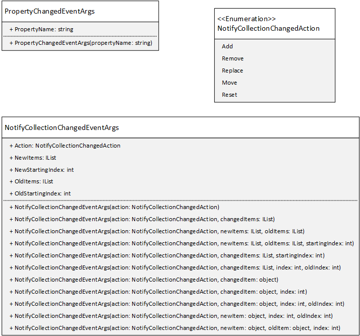
With PropertyChangedEventArgs we simply provide the name of the property that is changing. But with NotifyCollectionChangedEventArgs, we are describing both what the change is (i.e. an Add, Remove, Replace, Move, or Reset), and what item(s) we affected. So if the action was adding an item, the NotifyCollectionChangedEventArgs will let us know what item was added to the collection, and possibly at what position it was added at.
When implementing the INotifyCollectionChanged interface, you must supply a NotifyCollectionChangedEventArgs object that describes the change to the collection. This class has multiple constructors, and you must select the correct one, or your code will cause a runtime error when the event is invoked.
You might be wondering why PropertyChangedEventArgs contains so little information compared to NotifyCollectionChangedEventArgs. Most notably, the old and new values of the property could have been included. I suspect the reason they were not is that there are many times where you don’t actually need to know what the property value is - just that it changed, and you can always retrieve that value once you know you need to.
In contrast, there are situations where a GUI displaying a collection may have hundreds of entries. Identifying exactly which ones have changed means that only those entries need to be modified in the GUI. If we didn’t have that information, we’d have to retrieve the entire collection and re-render it, which can be a very computationally expensive process.
But ultimately, the two interfaces were developed by different teams at different times, which probably accounts for most of the differences.
The only property of the NotifyCollectionChangedArgs that will always be populated is the Action property. The type of This property is the NotifyCollectionChangedAction enumeration, and its values (and what they represent) are:
NotifyCollectionChangedAction.Add - one or more items were added to the collectionNotifyCollectionChangedAction.Move - an item was moved in the collectionNotifyCollectionChangedAction.Remove - one or more items were removed from the collectionNotifyCollectionChangedAction.Replace - an item was replaced in the collectionNotifyCollectionChangedAction.Reset - drastic changes were made to the collectionA second feature you probably noticed from the UML is that there are a lot of constructors for the NotifyCollectionChangedEventArgs. Each represents a different situation, and you must pick the appropriate one.
For example, the NotifyCollectionChangedEventArgs(NotifyCollectionChangedAction) constructor represents a NotifyCollectionChangedAction.Reset change. This indicates the collection’s content changed dramatically, and the best recourse for a GUI is to ask for the full collection again and rebuild the display. You should only use this one-argument constructor for a Reset action.
In C#, there is no mechanism for limiting a constructor to specific argument values. So you actually can call the above constructor for a different kind of event, i.e.:
new NotifyCollectionChangedEventArgs(NotifyCollectionChangedAction.Add);However, doing so will throw a InvalidArgumentException when the code is actually executed.
In general, if you are adding or removing an object, you need to provide the object to the constructor. If you are adding or removing multiple objects, you will need to provide an IList of the affected objects. And you may also need to provide the object’s index in the collection. You can read more about the available constructors and their uses in the Microsoft Documentation.
In the testing chapter, we introduced the XUnit assertion for testing events, Assert.Raises<T>. Let’s imagine a doorbell class that raises a Ring event when it is pressed, with information about the door, which can be used to do things like ring a physical bell, or send a text notification:
/// <summary>
/// A class representing details of a ring event
/// </summary>
public class RingEventArgs : EventArgs
{
    private string _door;

    /// <summary>
    /// The identity of the door for which the doorbell was activated
    public string Door => _door;

    /// <summary>
    /// Constructs a new RingEventArgs
    /// </summary>
    public RingEventArgs(string door)
    {
      _door = door;
    }
}

/// <summary>
/// A class representing a doorbell
/// </summary>
public class Doorbell
{
    /// <summary>
    /// An event triggered when the doorbell rings
    /// </summary>
    public event EventHandler<RingEventArgs> Ring;

    /// <summary>
    /// The name of the door where this doorbell is mounted
    /// </summary>
    public string Identifier {get; set;}

    /// <summary>
    /// Handles the push of a doorbell
    /// by triggering a Ring event
    /// </summary>
    public void Push()
    {
        Ring?.Invoke(this, new RingEventArgs(Identifier));
    }
}
To test this doorbell, we’d want to make sure that the Ring event is invoked when the Push() method is called. The Assert.Raises<T> does exactly this:
[Fact]
public void PressingDoorbellShouldRaiseRingEvent
Doorbell db = new Doorbell();
Assert.Raises<RingEventArgs>(
  handler => db.Ring += handler,
  handler => db.Ring -= handler,
  () => {
    db.Push();
  });
This code may be a bit confusing at first, so let’s step through it. The <T> is the type of event arguments we expect to receive, in this case, RingEventArgs. The first argument is a lambda expression that attaches an event handler handler (provided by the Assert.Raises method) to our object to test, db. The second argument is a lambda expression that removes the event handler handler. The third is an action (also written as a lambda expression) that should trigger the event if the code we are testing is correct.
This approach allows us to test events declared with the generic EventHandler<T>, which is one of the reasons we prefer it. It will not work with custom event handlers though; for those we’ll need a different approach.
In the previous section, we discussed using XUnit’s Assert.Raises<T> to test generic events (events declared with the EventHandler<T> generic). However, this approach does not work with non-generic events, like PropertyChanged and CollectionChanged. That is why XUnit provides an Assert.PropertyChanged() method. Unfortunately, it does not offer a corresponding test for CollectionChanged. So to test for this expectation we will need to write our own assertions.
To do that, we need to understand how assertions in the XUnit framework work. Essentially, they test the truthfulness of what is being asserted (i.e. two values are equal, a collection contains an item, etc.). If the assertion is not true, then the code raises an exception - specifically, a XunitException or a class derived from it. This class provides a UserMessage (the message you get when the test fails) and a StackTrace (the lines describing where the error was thrown). With this in mind, we can write our own assertion method. Let’s start with a simple example that asserts the value of a string is “Hello World”:
public static class MyAssert
{
  public class HelloWorldAssertionException: XunitException
  {
      public HelloWorldAssertionException(string actual) : base($"Expected \"Hello World\" but instead saw \"{actual}\"") {}
  }

  public static void HelloWorld(string phrase)
  {
    if(phrase != "Hello World") throw new HelloWorldAssertionException(phrase);
  }
}
Note that we use the base keyword to execute the XunitException constructor as part of the HelloWorldAssertionException, and pass along the string parameter actual. Then the body of the XunitException constructor does all the work of setting values, so the body of our constructor is empty.
Now we can use this assertion in our own tests:
[Theory]
[InlineData("Hello World")]
[InlineData("Hello Bob")]
public void ShouldBeHelloWorld(string phrase)
{
  MyAssert.HelloWorld(phrase);
}
The first InlineData will pass, and the second will fail with the report Expected "Hello World" but instead saw "Hello Bob".
This was of course, a silly example, but it shows the basic concepts. We would probably never use this in our own work, as Assert.Equal() can do the same thing. Now let’s look at a more complex example that we would use.
As we discussed previously, the CollectionChanged event cannot be tested with the Xunit Assert.Throws. So this is a great candidate for custom assertions. To be thorough, we should test all the possible actions (and we would do this if expanding the Xunit library). But for how we plan to use it, we really only need two actions covered - adding and removing items one at a time from the collection. Let’s start with our exception definitions:
public static class MyAssert
{
  public class NotifyCollectionChangedNotTriggeredException: XunitException
  {
      public NotifyCollectionChangedNotTriggeredException(NotifyCollectionChangedAction expectedAction) : base($"Expected a NotifyCollectionChanged event with an action of {expectedAction} to be invoked, but saw none.") {}
  }

  public class NotifyCollectionChangedWrongActionException: XunitException
  {
      public NotifyCollectionChangedWrongActionException(NotifyCollectionChangedAction expectedAction, NotifyCollectionChangedAction actualAction) : base($"Expected a NotifyCollectionChanged event with an action of {expectedAction} to be invoked, but saw {actualAction}") {}
  }

  public class NotifyCollectionChangedAddException: XunitException
  {
      public NotifyCollectionChangedAddException(object expected, object actual) : base($"Expected a NotifyCollectionChanged event with an action of Add and object {expected} but instead saw {actual}") {}
  }

  public class NotifyCollectionChangedRemoveException : XunitException
  {
    public NotifyCollectionChangedRemoveException(object expectedItem, int expectedIndex, object actualItem, int actualIndex) : base($"Expected a NotifyCollectionChanged event with an action of Remove and object {expectedItem} at index {expectedIndex} but instead saw {actualItem} at index  {actualIndex}") {}
  }
}
We have four different exceptions, each with a very specific message conveying what the failure was due to - no event being triggered, an event with the wrong action being triggered, or an event with the wrong information being triggered. We could also handle this with one exception class using multiple constructors (much like the NotifyCollectionChangedEventArgs does).
Then we need to write our assertions, which are more involved than our previous example as 1) the event uses a generic type, so our assertion also must be a generic, and 2) we need to handle an event - so we need to attach an event handler, and trigger code that should make that event occur. Let’s start with defining the signature of the Add method:
public static class MyAssert {

  public static void NotifyCollectionChangedAdd<T>(INotifyCollectionChanged collection, T item, Action testCode)
  {
    // Assertion tests here.
  }
}
We use the generic type T to allow our assertion to be used with any kind of collection - and the second parameter item is also this type. That is the object we are trying to add to the collection. Finally, the Action is the code the test will execute that would, in theory, add item to collection. Let’s flesh out the method body now:
public static class MyAssert
{
  public static void NotifyCollectionChangedAdd<T>(INotifyCollectionChanged collection, T newItem, Action testCode)
  {
    // A flag to indicate if the event triggered successfully
    bool notifySucceeded = false;

    // An event handler to attach to the INotifyCollectionChanged and be
    // notified when the Add event occurs.
    NotifyCollectionChangedEventHandler handler = (sender, args) =>
    {
      // Make sure the event is an Add event
      if (args.Action != NotifyCollectionChangedAction.Add)
      {
        throw new NotifyCollectionChangedWrongActionException(NotifyCollectionChangedAction.Add, args.Action);
      }

      // Make sure we added just one item
      if (args.NewItems?.Count != 1)
      {
        // We'll use the collection of added items as the second argument
        throw new NotifyCollectionChangedAddException(newItem, args.NewItems);
      }

      // Make sure the added item is what we expected
      if (!args.NewItems[0].Equals(newItem))
      {
        // Here we only have one item in the changed collection, so we'll report it directly
        throw new NotifyCollectionChangedAddException(newItem, args.NewItems[0]);
      }

      // If we reach this point, the NotifyCollectionChanged event was triggered successfully
      // and contains the correct item! We'll set the flag to true so we know.
      notifySucceeded = true;
    };

    // Now we connect the event handler
    collection.CollectionChanged += handler;

    // And attempt to trigger the event by running the actionCode
    // We place this in a try/catch to be able to utilize the finally
    // clause, but don't actually catch any exceptions
    try
    {
      testCode();
      // After this code has been run, our handler should have
      // triggered, and if all went well, the notifySucceed is true
      if (!notifySucceeded)
      {
        // If notifySucceed is false, the event was not triggered
        // We throw an exception denoting that
        throw new NotifyCollectionChangedNotTriggeredException(NotifyCollectionChangedAction.Add);
      }
    }
    // We don't actually want to catch an exception - we want it to
    // bubble up and be reported as a failing test.  So we don't
    // have a catch () {} clause to this try/catch.
    finally
    {
      // However, we *do* want to remove the event handler. We do
      // this in a finally block so it will happen even if we do
      // have an exception occur.
      collection.CollectionChanged -= handler;
    }
  }
}
Now we can test this in our code. For example, if we had a collection of ShoppingList objects named shoppingLists that implemented INotifyCollectionChanged, we could test adding a new shopping list, shoppingList, to it with:
var newList = new ShoppingList();
MyAssert.NotifyCollectionChangedAdd(shoppingLists, newList, () => {
  shoppingLists.Add(newList);
});
Note that we didn’t need to explicitly state T in this case is ShoppingList - the compiler infers this from the arguments supplied to the method.
Our assertion method handles adding a single item. We can use method overloading providing another method of the same name with different arguments to handle when multiple items are added. For that case, the signature might look like:
public static void NotifyCollectionChangedAdd<T>(INotifyCollectionChanged collection, ICollection<T> items, Action testCode)
{
  // Assertion tests here.
}
We’d also want to write assertion methods for handling removing items, and any other actions we might need to test. I’ll leave these as exercises for the reader.
In this chapter we discussed the Windows Message Loop and Queue, and how messages provided to this loop are transformed into C# events by the Application class. We examined C#’s approach to events, which is a more flexible form of message passing. We learned how to write both C# event listeners and handlers, and how to invoke event handlers with Invoke(). We also learned how to create and trigger our own custom events with custom event arguments.
In addition, we learned about the INotifyPropertyChanged interface, and how it can be used to notify listeners that one of an Object’s properties have changed through a NotifyPropertyChanged event handler. We also saw how to test our implementations of INotifyPropertyChanged using xUnit. In our next chapter on Data Binding, we will see how this interface is used by Windows Presentation Foundation to update user interfaces automatically when bound data objects change.
We saw that Windows Presentation Foundation also uses Routed Events, which can bubble up the elements tree and be handled by any ancestor element. This approach replaces many of the familiar UI events from Windows Forms. We’ll take a deeper look at this approach, including defining our own Routed Events and alternative behaviors like “tunnelling” down the elements tree in the upcoming Dependency Objects chapter.
Finally, we discussed testing strategies for testing if our events work as expected. We revisited the Xunit Assert.Raises<t>() and discussed how it works with generic event handlers. We also saw how for non-generic event handlers, we may have to author our own assertions, and even created one for the CollectionChanged event.
Linking GUIs to Data
The term data binding refers to binding two objects together programmatically so that one has access to the data of the other. We most commonly see this with user interfaces and data objects - the user interface exposes some of the state of the data object to the user. As with many programming tasks, there are a number of ways to approach data binding. The Windows Presentation Foundation in C# has adopted an event and component-based approach that we will explore in this chapter.
Some key terms to learn in this chapter are:
Some key skills you need to develop in this chapter are:
INotifyPropertyChanged interfaceDataContext propertyData binding is a technique for synchronizing data between a provider and consumer, so that any time the data changes, the change is reflected in the bound elements. This strategy is commonly employed in graphical user interfaces (GUIs) to bind controls to data objects. Both Windows Forms and Windows Presentation Foundation employ data binding.
In WPF, the data object is essentially a normal C# object, which represents some data we want to display in a control. However, this object must implement the INotifyPropertyChanged interface in order for changes in the data object to be automatically applied to the WPF control it is bound to. Implementing this interface comes with two requirements. First, the class will define a PropertyChanged event:
public event PropertyChangedEventHandler? PropertyChanged;And second, it will invoke that PropertyChanged event handler whenever one of its properties changes:
PropertyChanged?.Invoke(this, new PropertyChangedEventArgs("ThePropertyName"));The string provided to the PropertyChangedEventArgs constructor must match the property name exactly, including capitalization.
For example, this simple person implementation is ready to serve as a data object:
/// <summary>
/// A class representing a person
/// </summary>
public class Person : INotifyPropertyChanged
{
    /// <summary>
    /// An event triggered when a property changes
    /// </summary>
    public event PropertyChangedEventHandler? PropertyChanged;

    private string firstName = "";
    /// <summary>
    /// This person's first name
    /// </summary>
    public string FirstName
    {
        get { return firstName; }
        set
        {
            firstName = value;
            PropertyChanged?.Invoke(this, new PropertyChangedEventArgs("FirstName"));
            PropertyChanged?.Invoke(this, new PropertyChangedEventArgs("FullName"));
        }
    }

    private string lastName = "";
    /// <summary>
    /// This person's last name
    /// </summary>
    public string LastName
    {
        get { return lastName; }
        set
        {
            lastName = value;
            PropertyChanged?.Invoke(this, new PropertyChangedEventArgs("LastName"));
            PropertyChanged?.Invoke(this, new PropertyChangedEventArgs("FullName"));
        }
    }

    /// <summary>
    /// This persons' full name
    /// </summary>
    public string FullName
    {
        get { return $"{firstName} {lastName}"; }
    }

    /// <summary>
    /// Constructs a new person
    /// </summary>
    /// <param Name="first">The person's first name</param>
    /// <param Name="last">The person's last name</param>
    public Person(string first, string last)
    {
        this.firstName = first;
        this.lastName = last;
    }
}
There are several details to note here. As the FirstName and LastName properties have setters, we must invoke the PropertyChanged event within them. Because of this extra logic, we can no longer use auto-property syntax. Similarly, as the value of FullName is derived from these properties, we must also notify that "FullName" changes when one of FirstName or LastName changes.
To accomplish the binding in XAML, we use a syntax similar to that we used for static resources. For example, to bind a <TextBlock> element to the FullName property, we would use:
<TextBlock Text="{Binding Path=FullName}" />Just as with our static resource, we wrap the entire value in curly braces ({}), and declare a Binding. The Path in the binding specifies the property we want to bind to - in this case, FullName. This is considered a one-way binding, as the TextBlock element only displays text - it is not editable. The corresponding control for editing a textual property is the <TextBox>. A two-way binding is declared the same way i.e.:
<TextBox Text="{Binding Path=FirstName}" />However, we cannot bind a read-only property (one that has no setter) to an editable control - only those with both accessible getters and setters. The XAML for a complete control for editing a person might look something like:
<UserControl x:Class="DataBindingExample.PersonControl"
             xmlns="http://schemas.microsoft.com/winfx/2006/xaml/presentation"
             xmlns:x="http://schemas.microsoft.com/winfx/2006/xaml"
             xmlns:mc="http://schemas.openxmlformats.org/markup-compatibility/2006"
             xmlns:d="http://schemas.microsoft.com/expression/blend/2008"
             xmlns:local="clr-namespace:DataBindingExample"
             xmlns:system="clr-namespace:System;assembly=mscorlib"
             mc:Ignorable="d"
             d:DesignHeight="450" d:DesignWidth="400">
    <StackPanel>
        <TextBlock Text="{Binding Path=FullName}"/>
        <Label>First</Label>
        <TextBox Text="{Binding Path=FirstName}"/>
        <Label>Last</Label>
        <TextBox Text="{Binding Path=LastName}"/>
    </StackPanel>
</UserControl>
We also need to set the DataContext property of the control. This property holds the specific data object whose properties are bound in the control. For example, we could pass a Person object into the PersonControl’s constructor and set it as the DataContext in the codebehind:
namespace DataBindingExample
{
    /// <summary>
    /// Interaction logic for PersonControl.xaml
    /// </summary>
    public partial class PersonEntry : UserControl
    {
        /// <summary>
        /// Constructs a new PersonEntrycontrol
        /// </summary>
        /// <param Name="person">The person object to data bind</param>
        public PersonEntry(Person person)
        {
            InitializeComponent();
            this.DataContext = person;
        }
    }
}
However, this approach means we can no longer declare a <PersonControl> in XAML (as objects declared this way must have a parameterless constructor). An alternative is to bind the DataContext in the codebehind of an ancestor control; for example, a window containing the control:
<Window x:Class="DataContextExample.MainWindow"
        xmlns="http://schemas.microsoft.com/winfx/2006/xaml/presentation"
        xmlns:x="http://schemas.microsoft.com/winfx/2006/xaml"
        xmlns:d="http://schemas.microsoft.com/expression/blend/2008"
        xmlns:mc="http://schemas.openxmlformats.org/markup-compatibility/2006"
        xmlns:local="clr-namespace:DataContextExample"
        mc:Ignorable="d"
        Title="MainWindow" Height="450" Width="800">
    <Grid>
        <local:PersonEntry x:Name="personEntry"/>
    </Grid>
</Window>
namespace DataContextExample
{
/// <summary>
/// Interaction logic for MainWindow.xaml
/// </summary>
public partial class MainWindow : Window
{
public MainWindow()
{
InitializeComponent();
personControl.DataContext = new Person("Bugs", "Bunny");
}
}
}Finally, the DataContext has a very interesting relationship with the elements tree. If a control in this tree does not have its own DataContext property directly set, it uses the DataContext of the first ancestor where it has been set. I.e. were we to set the DataContext of the window to a person:
namespace DataContextExample
{
    /// <summary>
    /// Interaction logic for MainWindow.xaml
    /// </summary>
    public partial class MainWindow : Window
    {
        public MainWindow()
        {
            InitializeComponent();
            this.DataContext = new Person("Elmer", "Fudd");
        }
    }
}
And have a PersonElement nested somewhere further down the elements tree:
<Window x:Class="DataBindingExample.MainWindow"
        xmlns="http://schemas.microsoft.com/winfx/2006/xaml/presentation"
        xmlns:x="http://schemas.microsoft.com/winfx/2006/xaml"
        xmlns:d="http://schemas.microsoft.com/expression/blend/2008"
        xmlns:mc="http://schemas.openxmlformats.org/markup-compatibility/2006"
        xmlns:local="clr-namespace:DataBindingExample"
        mc:Ignorable="d"
        Title="MainWindow" Height="450" Width="800">
    <Grid>
        <Border>
            <local:PersonEntry/>
        </Border>
    </Grid>
</Window>
The bound person (Elmer Fudd)’s information would be displayed in the <PersonEntry>!
In Windows Presentation Foundation, data binding is accomplished by a binding object that sits between the binding target (the control) and the binding source (the data object):
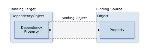
It is this Binding object that we are defining the properties of in the XAML attribute with "{Binding}". Hence, Path is a property defined on this binding.
As we mentioned before, bindings can be OneWay or TwoWay based on the direction the data flows. The binding mode is specified by the Binding object’s Mode property, which can also be set in XAML. There are actually two additional options. The first is a OneWayToSource that is basically a reversed one-way binding (the control updates the data object, but the data object does not update the control)
For example, we actually could use a <TextEditor> with a read-only property, if we changed the binding mode:
<TextEditor Text="{Binding Path=FullName Mode=OneWay}" />Though this might cause your user confusion because they would seem to be able to change the property, but the change would not actually be applied to the bound object. However, if you also set the IsEnabled property to false to prevent the user from making changes:
<TextEditor Text="{Binding Path=FullName Mode=OneWay}" IsEnabled="False" />The second binding mode is OneTime which initializes the control with the property, but does not apply any subsequent changes. This is similar to the behavior you will see from a data object that does not implement the INotifyPropertyChanged interface, as the Binding object depends on it for notifications that the property has changed.
Generally, you’ll want to use a control meant to be used with the mode you intend to employ - editable controls default to TwoWay and display controls to OneWay.
One other property of the Binding class that’s good to know is the Source property. Normally this is determined by the DataContext of the control, but you can override it in the XAML.
For list controls, i.e. ListView and ListBox, the appropriate binding is a collection implementing IEnumerable, and we bind it to the ItemsSource property. Let’s say we want to create a directory that displays information for a List<Person>. We might write a custom DirectoryControl like:
<UserControl x:Class="DataBindingExample.DirectoryControl"
             xmlns="http://schemas.microsoft.com/winfx/2006/xaml/presentation"
             xmlns:x="http://schemas.microsoft.com/winfx/2006/xaml"
             xmlns:mc="http://schemas.openxmlformats.org/markup-compatibility/2006"
             xmlns:d="http://schemas.microsoft.com/expression/blend/2008"
             xmlns:local="clr-namespace:DataBindingExample"
             mc:Ignorable="d"
             d:DesignHeight="450" d:DesignWidth="800">
    <Grid>
        <ListBox ItemsSource="{Binding}"/>
    </Grid>
</UserControl>
Notice that we didn’t supply a Path with our binding. In this case, we’ll be binding directly to the DataContext, which is a list of People objects drawn from the 1996 classic “Space Jam”, i.e.:
<Window x:Class="DataBindingExample.MainWindow"
        xmlns="http://schemas.microsoft.com/winfx/2006/xaml/presentation"
        xmlns:x="http://schemas.microsoft.com/winfx/2006/xaml"
        xmlns:d="http://schemas.microsoft.com/expression/blend/2008"
        xmlns:mc="http://schemas.openxmlformats.org/markup-compatibility/2006"
        xmlns:local="clr-namespace:DataBindingExample"
        mc:Ignorable="d"
        Title="MainWindow" Height="450" Width="800">
    <Grid>
        <local:DirectoryControl x:Name="directory"/>
    </Grid>
</Window>
/// <summary>
/// Interaction logic for MainWindow.xaml
/// </summary>
public partial class MainWindow : Window
{
public MainWindow()
{
InitializeComponent();
ObservableCollection<Person> people = new ObservableCollection<Person>()
{
new Person("Bugs", "Bunny", true),
new Person("Daffy", "Duck", true),
new Person("Elmer", "Fudd", true),
new Person("Tazmanian", "Devil", true),
new Person("Tweety", "Bird", true),
new Person("Marvin", "Martian", true),
new Person("Michael", "Jordan"),
new Person("Charles", "Barkely"),
new Person("Patrick", "Ewing"),
new Person("Larry", "Johnson")
};
DataContext = people;
}
}Instead of a List<Person>, we’ll use an ObservableCollection<Person> which is essentially a list that implements the INotifyPropertyChanged interface.
When we run this code, our results will be:
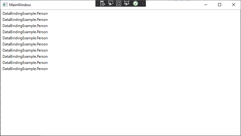
This is because the ListBox (and the ListView) by default are composed of <TextBlock> elements, so each Person in the list is being bound to a <TextBlock>’s Text property. This invokes the ToString() method on the Person object, hence the DataBindingExample.Person displayed for each entry.
We could, of course, override the ToString() method on person. But we can also overwrite the DataTemplate the list uses to display its contents. Instead of using the default <TextView>, the list will use the DataContext, and the bindings, we supply. For example, we could re-write the DirectoryControl control as:
<UserControl x:Class="DataBindingExample.DirectoryControl"
             xmlns="http://schemas.microsoft.com/winfx/2006/xaml/presentation"
             xmlns:x="http://schemas.microsoft.com/winfx/2006/xaml"
             xmlns:mc="http://schemas.openxmlformats.org/markup-compatibility/2006"
             xmlns:d="http://schemas.microsoft.com/expression/blend/2008"
             xmlns:local="clr-namespace:DataBindingExample"
             mc:Ignorable="d"
             d:DesignHeight="450" d:DesignWidth="800">
    <Grid>
        <ListBox ItemsSource="{Binding}">
            <ListBox.ItemTemplate>
                <DataTemplate>
                    <Border BorderBrush="Black" BorderThickness="2">
                        <StackPanel>
                            <TextBlock Text="{Binding Path=FullName}"/>
                            <CheckBox IsChecked="{Binding Path=IsCartoon}" IsEnabled="False">
                                Is a Looney Toon
                            </CheckBox>
                        </StackPanel>
                    </Border>
                </DataTemplate>
            </ListBox.ItemTemplate>
        </ListBox>
    </Grid>
</UserControl>
And the resulting application would display:
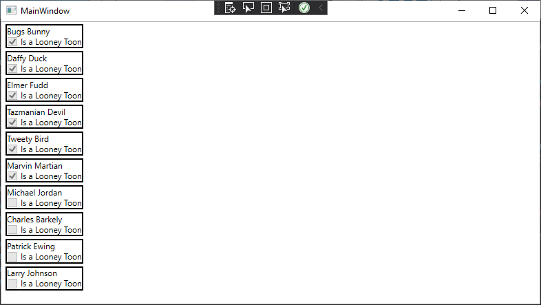
Note that in our DataTemplate, we can bind to properties in the Person object. This works because as the ListBox processes its ItemsSource property, it creates a new instance of its ItemTemplate (in this case, our custom DataTemplate) and assigns the item from the ItemSource to its DataContext.
Using custom DataTemplates for XAML controls is a powerful feature to customize the appearance and behavior of your GUI.
Lists also can interact with other elements through bindings. Let’s refactor our window so that we have a <PersonRegistry> side-by-side with our <PersonControl>:
<Window x:Class="DataBindingExample.MainWindow"
        xmlns="http://schemas.microsoft.com/winfx/2006/xaml/presentation"
        xmlns:x="http://schemas.microsoft.com/winfx/2006/xaml"
        xmlns:d="http://schemas.microsoft.com/expression/blend/2008"
        xmlns:mc="http://schemas.openxmlformats.org/markup-compatibility/2006"
        xmlns:local="clr-namespace:DataBindingExample"
        mc:Ignorable="d"
        Title="MainWindow" Height="450" Width="800">
    <Grid>
        <Grid.ColumnDefinitions>
            <ColumnDefinition/>
            <ColumnDefinition/>
        </Grid.ColumnDefinitions>
        <local:PersonControl Grid.Column="0" DataContext="{Binding Path=CurrentItem}"/>
        <local:DirectoryControl Grid.Column="1"/>
    </Grid>
</Window>
Note how we bind the <PersonControl>’s DataContext to the CurrentItem of the ObservableCollection<Person>. In our <RegistryControl>’s ListBox, we’ll also set its IsSynchronizedWithCurrentItem property to true:
<UserControl x:Class="DataBindingExample.DirectoryControl"
             xmlns="http://schemas.microsoft.com/winfx/2006/xaml/presentation"
             xmlns:x="http://schemas.microsoft.com/winfx/2006/xaml"
             xmlns:mc="http://schemas.openxmlformats.org/markup-compatibility/2006"
             xmlns:d="http://schemas.microsoft.com/expression/blend/2008"
             xmlns:local="clr-namespace:DataBindingExample"
             mc:Ignorable="d"
             d:DesignHeight="450" d:DesignWidth="800">
    <Grid>
        <ListBox ItemsSource="{Binding}" HorizontalContentAlignment="Stretch" IsSynchronizedWithCurrentItem="True">
            <ListBox.ItemTemplate>
                <DataTemplate>
                    <Border BorderBrush="Black" BorderThickness="1">
                        <StackPanel>
                            <TextBlock Text="{Binding Path=FullName}"/>
                            <CheckBox IsChecked="{Binding Path=IsCartoon, Mode=OneWay}" IsEnabled="False">Cartoon</CheckBox>
                        </StackPanel>
                    </Border>
                </DataTemplate>
            </ListBox.ItemTemplate>
        </ListBox>
    </Grid>
</UserControl>
With these changes, when we select a person in the <RegistryControl>, their information will appear in the <PersonControl>:
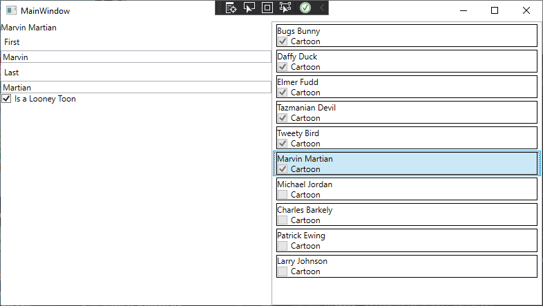
Now let’s delve into a more complex data binding examples - binding enumerations. For this discussion, we’ll use a simple enumeration of fruits:
/// <summary>
/// Possible fruits
/// </summary>
public enum Fruit
{
    Apple,
    Orange,
    Peach,
    Pear
}
And add a FavoriteFruit property to our Person class:
private Fruit favoriteFruit;
/// <summary>
/// The person' favorite fruit
/// </summary>
public Fruit FavoriteFruit
{
    get { return favoriteFruit; }
    set
    {
        favoriteFruit = value;
        PropertyChanged?.Invoke(this, new PropertyChangedEventArgs("FavoriteFruit"));
    }
}
For example, what if we wanted to use a ListView to select an item out of this enumeration? We’d actually need to bind two properties, the ItemSource to get the enumeration values, and the SelectedItem to mark the item being used. To accomplish this binding, we’d need to first make the fruits available for binding by creating a static resource to hold them using an ObjectDataProvider:
<ObjectDataProvider x:Key="fruits" ObjectType="system:Enum" MethodName="GetValues">
    <ObjectDataProvider.MethodParameters>
        <x:Type TypeName="local:Fruit"/>
    </ObjectDataProvider.MethodParameters>
</ObjectDataProvider>
The ObjectDataProvider is an object that can be used as a data source for WPF bindings, and wraps around an object and invokes a method to get the data - in this case the Enum class, and its static method GetValues(), which takes one parameter, the Type of the enum we want to pull the values of (provided as the nested element, <x:Type>).
Also, note that because the Enum class is defined in the System namespace, we need to bring it into the XAML with an xml namespace mapped to it, with the attribute xmlns defined on the UserControl, i.e.: xmlns:system="clr-namespace:System;assembly=mscorlib".
Now we can use the fruits key as part of a data source for a listview: <ListView ItemsSource="{Binding Source={StaticResource fruits}}" SelectedItem="{Binding Path=FavoriteFruit}"/>
Notice that we use the Source property of the Binding class to bind the ItemsSource to the enumeration values exposed in the static resource fruits. Then we bind the SelectedItem to the person’s FavoriteFruit property. The entire control would be:
<UserControl x:Class="DataBindingExample.PersonControl"
             xmlns="http://schemas.microsoft.com/winfx/2006/xaml/presentation"
             xmlns:x="http://schemas.microsoft.com/winfx/2006/xaml"
             xmlns:mc="http://schemas.openxmlformats.org/markup-compatibility/2006"
             xmlns:d="http://schemas.microsoft.com/expression/blend/2008"
             xmlns:local="clr-namespace:DataBindingExample"
             xmlns:system="clr-namespace:System;assembly=mscorlib"
             mc:Ignorable="d"
             d:DesignHeight="450" d:DesignWidth="400">
    <UserControl.Resources>
        <ObjectDataProvider x:Key="fruits" MethodName="GetValues" ObjectType="{x:Type system:Enum}">
            <ObjectDataProvider.MethodParameters>
                <x:Type TypeName="local:Fruit"/>
            </ObjectDataProvider.MethodParameters>
        </ObjectDataProvider>
    </UserControl.Resources>
    <StackPanel>
        <TextBlock Text="{Binding Path=FullName}"/>
        <Label>First</Label>
        <TextBox Text="{Binding Path=First}"/>
        <Label>Last</Label>
        <TextBox Text="{Binding Path=Last}"/>
        <CheckBox IsChecked="{Binding Path=IsCartoon}">
            Is a Looney Toon
        </CheckBox>
        <ListView ItemsSource="{Binding Source={StaticResource fruits}}" SelectedItem="{Binding Path=FavoriteFruit}"/>
    </StackPanel>
</UserControl>
Binding a <ComboBox> is almost identical to the ListView example; we just swap a ComboBox for a ListView:
<UserControl x:Class="DataBindingExample.PersonControl"
             xmlns="http://schemas.microsoft.com/winfx/2006/xaml/presentation"
             xmlns:x="http://schemas.microsoft.com/winfx/2006/xaml"
             xmlns:mc="http://schemas.openxmlformats.org/markup-compatibility/2006"
             xmlns:d="http://schemas.microsoft.com/expression/blend/2008"
             xmlns:local="clr-namespace:DataBindingExample"
             xmlns:system="clr-namespace:System;assembly=mscorlib"
             mc:Ignorable="d"
             d:DesignHeight="450" d:DesignWidth="400">
    <UserControl.Resources>
        <ObjectDataProvider x:Key="fruits" MethodName="GetValues" ObjectType="{x:Type system:Enum}">
            <ObjectDataProvider.MethodParameters>
                <x:Type TypeName="local:Fruit"/>
            </ObjectDataProvider.MethodParameters>
        </ObjectDataProvider>
    </UserControl.Resources>
    <StackPanel>
        <TextBlock Text="{Binding Path=FullName}"/>
        <Label>First</Label>
        <TextBox Text="{Binding Path=First}"/>
        <Label>Last</Label>
        <TextBox Text="{Binding Path=Last}"/>
        <CheckBox IsChecked="{Binding Path=IsCartoon}">
            Is a Looney Toon
        </CheckBox>
        <ComboBox ItemsSource="{Binding Source={StaticResource fruits}}" SelectedItem="{Binding Path=FavoriteFruit}"/>
    </StackPanel>
</UserControl>
Binding a <RadioButton> requires a very different approach, as a radio button exposes an IsChecked boolean property that determines if it is checked, much like a <CheckBox>, but we want it bound to an enumeration property. There are a lot of attempts to do this by creating a custom content converter, but ultimately they all have flaws.
Instead, we can restyle a ListView to look like radio buttons, but still provide the same functionality by adding a <Style> that applies to the ListViewItem contents of the ListView:
<Style TargetType="{x:Type ListViewItem}">
    <Setter Property="Template">
        <Setter.Value>
            <ControlTemplate>
                <RadioButton Content="{TemplateBinding ContentPresenter.Content}" IsChecked="{Binding Path=IsSelected, RelativeSource={RelativeSource TemplatedParent}, Mode=TwoWay}"/>
            </ControlTemplate>
        </Setter.Value>
    </Setter>
</Style>
This style can be used in conjunction with a ListView declared as we did above:
<UserControl x:Class="DataBindingExample.PersonControl"
             xmlns="http://schemas.microsoft.com/winfx/2006/xaml/presentation"
             xmlns:x="http://schemas.microsoft.com/winfx/2006/xaml"
             xmlns:mc="http://schemas.openxmlformats.org/markup-compatibility/2006"
             xmlns:d="http://schemas.microsoft.com/expression/blend/2008"
             xmlns:local="clr-namespace:DataBindingExample"
             xmlns:system="clr-namespace:System;assembly=mscorlib"
             mc:Ignorable="d"
             d:DesignHeight="450" d:DesignWidth="400">
    <UserControl.Resources>
        <ObjectDataProvider x:Key="fruits" MethodName="GetValues" ObjectType="{x:Type system:Enum}">
            <ObjectDataProvider.MethodParameters>
                <x:Type TypeName="local:Fruit"/>
            </ObjectDataProvider.MethodParameters>
        </ObjectDataProvider>
        <Style TargetType="{x:Type ListViewItem}">
            <Setter Property="Template">
                <Setter.Value>
                    <ControlTemplate>
                        <RadioButton Content="{TemplateBinding ContentPresenter.Content}" IsChecked="{Binding Path=IsSelected, RelativeSource={RelativeSource TemplatedParent}, Mode=TwoWay}"/>
                    </ControlTemplate>
                </Setter.Value>
            </Setter>
        </Style>
    </UserControl.Resources>
    <StackPanel>
        <TextBlock Text="{Binding Path=FullName}"/>
        <Label>First</Label>
        <TextBox Text="{Binding Path=First}"/>
        <Label>Last</Label>
        <TextBox Text="{Binding Path=Last}"/>
        <CheckBox IsChecked="{Binding Path=IsCartoon}">
            Is a Looney Toon
        </CheckBox>
        <ListView ItemsSource="{Binding Source={StaticResource fruits}}" SelectedItem="{Binding Path=FavoriteFruit}"/>
    </StackPanel>
</UserControl>In this chapter we explored the concept of data binding and how it is employed in Windows Presentation Foundation. We saw how bound classes need to implement the INotifyPropertyChanged interface for bound properties to automatically synchronize. We saw how the binding is managed by a Binding class instance, and how we can customize its Path, Mode, and Source properties in XAML to modify the binding behavior. We bound simple controls like <TextBlock> and <CheckBox> and more complex elements like <ListView> and <ListBox>. We also explored how to bind enumerations to controls. And we explored the use of templates like DataTemplate and ControlTemplate to modify WPF controls.
The full example project discussed in this chapter can be found at https://github.com/ksu-cis/DataBindingExample.
The Bedrock of WPF
You’ve now worked with a variety of WPF controls, laid out components using containers, traversed the elements tree, performed data binding,and worked with routed events. Each of these is made possible through the use of several classes: DependencyObject, UIElement, and FrameworkElement, which serve as a base classes for all WPF controls. In this chapter we’ll dig deeper into how these base classes implement dependency properties and routed events.
Some key terms to learn in this chapter are:
Some key skills you need to develop in this chapter are:
Perhaps the most important aspect of the DependencyObject is its support for hosting dependency properties. While these appear and can be used much like the C# properties we have previously worked with, internally they are managed very differently. Consider when we place a <TextBox> in a <Grid>:
<Grid>
    <Grid.ColumnDefinitions>
        <ColumnDefinition/>
        <ColumnDefinition/>
    </Grid.ColumnDefinitions>
    <Grid.RowDefinitions>
        <RowDefinition/>
        <RowDefinition/>
    </Grid.RowDefinitions>
    <TextBox Name="textBox" Grid.Column="1" Grid.Row="1"/>
</Grid>
Where do the Column and Row properties come from? They aren’t defined on the TextBox class - you can check the documentation. The answer is they are made available through the dependency property system.
At the heart of this system is a collection of key/value pairs much like the Dictionary. When the XAML code Grid.Column="1" is processed, this key and value are added to the TextBox’s dependency properties collection, and is thereafter accessible by the WPF rendering algorithm.
The DependencyObject exposes these stored values with the GetValue(DependencyProperty) and SetValue(DependencyProperty, value) methods. For example, we can set the Column property to 2 with:
textBox.SetValue(Grid.ColumnProperty, 2);We can also create new dependency properties on our own custom classes extending the DependencyObject (which is also a base class for all WPF controls). Let’s say we are making a custom control for entering number values on a touch screen, which we’ll call NumberBox. We can extend a UserControl to create a textbox centered between two buttons, one to increase the value, and one to decrease it:
<UserControl x:Class="CustomDependencyObjectExample.NumberBox"
             xmlns="http://schemas.microsoft.com/winfx/2006/xaml/presentation"
             xmlns:x="http://schemas.microsoft.com/winfx/2006/xaml"
             xmlns:mc="http://schemas.openxmlformats.org/markup-compatibility/2006"
             xmlns:d="http://schemas.microsoft.com/expression/blend/2008"
             xmlns:local="clr-namespace:CustomDependencyObjectExample"
             mc:Ignorable="d"
             d:DesignHeight="50" d:DesignWidth="200">
    <Grid>
        <Grid.ColumnDefinitions>
            <ColumnDefinition/>
            <ColumnDefinition Width="2*"/>
            <ColumnDefinition/>
        </Grid.ColumnDefinitions>
        <Button Grid.Column="0">+</Button>
        <TextBox Grid.Column="1" />
        <Button Grid.Column="2">-</Button>
    </Grid>
</UserControl>
Now, let’s assume we want to provide a property Step of type double, which is the amount the number should be incremented when the “+” or “-” button is pressed.
The first step is to register the dependency property by creating a DependencyProperty instance. This will serve as the key to setting and retrieving the dependency property on a dependency object. We register new dependency properties with DependencyProperty.Register(string propertyName, Type propertyType, Type dependencyObjectType). The string is the name of the property, the first type is the type of the property, and the second is the class we want to associate this property with. So our Step property would be registered with:
DependencyProperty.Register(nameof(Step), typeof(double), typeof(NumberBox));There is an optional fourth property to DependencyProperty.Register() which is a PropertyMetadata. This is used to set the default value of the property. We probably should specify a default step, so let’s add a PropertyMetadata object with a default value of 1:
DependencyProperty.Register(nameof(Step), typeof(double), typeof(NumberBox), new PropertyMetadata(1.0));The DependencyProperty.Register() method returns a registered DependencyObject to serve as a key for accessing our new property. To make sure we can access this key from other classes, we define it as a field that is public, static, and readonly. The naming convention for DependencyProperties is to name this field by appending “Property” to the name of the property.
Thus, the complete registration, including saving the result to the public static field is:
/// <summary>
/// Identifies the NumberBox.Step XAML attached property
/// </summary>
public static readonly DependencyProperty StepProperty = DependencyProperty.Register(nameof(Step), typeof(double), typeof(NumberBox), new PropertyMetadata(1.0));
We also want to declare a traditional property with the name “Step”. But instead of declaring a backing field, we will use the key/value pair stored in our DependencyObject using GetValue() and SetValue():
/// <summary>
/// The amount each increment or decrement operation should change the value by
/// </summary>
public double Step
{
    get { return (double)GetValue(StepProperty); }
    set { SetValue(StepProperty, value); }
}
As dependency property values are stored as an object, we need to cast the value to a the appropriate type when it is returned.
One of the great benefits of dependency properties is that they can be set using XAML. I.e. we could declare an instance of our <NumberBox> and set its Step using an attribute:
<StackPanel>
    <NumberBox Step="3.0"/>
</StackPanel>WPF controls are built on the foundation of dependency objects - the DependencyObject is at the bottom of their inheritance chain. But they also add additional functionality on top of that through another common base class, FrameworkElement. The FrameworkElement is involved in the layout algorithm, as well as helping to define the elements tree. Let’s add a second dependency property to our <NumberBox>, a Value property that will represent the value the <NumberBox> currently represents, which will be displayed in the <TextBox>.
We register this dependency property in much the same way as our Step. But instead of supplying the DependencyProperty.Register() method a PropertyMetadata, we’ll instead supply a FrameworkPropertyMetadata, which extends PropertyMetadata to include additional data about how the property interacts with the WPF rendering and layout algorithms. This additional data is in the form of a bitmask defined in FrameworkPropertyMetadataOptions enumeration.
Some of the possible options are:
FrameworkPropertyMetadataOptions.AffectsMeasure - changes to the property may affect the size of the controlFrameworkPropertyMetadataOptions.AffectsArrange - changes to the property may affect the layout of the controlFrameworkPropertyMetadataOptions.AffectsRender - changes to the property may affect the appearance of the controlFrameworkPropertyMetadataOptions.BindsTwoWayByDefault - This property uses two-way bindings by default (i.e. the control is an editable control)FrameworkPropertyMetadataOptions.NotDataBindable - This property does not allow data bindingIn this case, we want a two-way binding by default, so we’ll include that flag, and also we’ll note that it affects the rendering process. Multiple flags can be combined with a bitwise OR. Constructing our FrameworkPropertyMetadata object would then look like:
new FrameworkPropertyMetadata(0, FrameworkPropertyMetadataOptions.AffectsRender | FrameworkPropertyMetadataOptions.BindsTwoWayByDefault)And registering the dependency property would be:
/// <summary>
/// Identifies the NumberBox.Value XAML attached property
/// </summary>
public static readonly DependencyProperty ValueProperty = DependencyProperty.Register(nameof(Value), typeof(double), typeof(NumberBox), new FrameworkPropertyMetadata(0, FrameworkPropertyMetadataOptions.AffectsRender | FrameworkPropertyMetadataOptions.BindsTwoWayByDefault));
As with the Step, we also want to declare a traditional property with the name “Value”. But instead of declaring a backing field, we will use the key/value pair stored in our DependencyObject using GetValue() and SetValue():
/// <summary>
/// The NumberBox's displayed value
/// </summary>
public double Value {
    get { return (double)GetValue(ValueProperty); }
    set { SetValue(ValueProperty, value); }
}
If we want to display the current value of Value in the textbox of our NumberBox control, we’ll need to bind the <TextBox> element’s Text property. This is accomplished in a similar fashion to the other bindings we’ve done previously, only we need to specify a RelativeSource. This is a source relative to the control in the elements tree. We’ll specify two properties on the RelativeSource: the Mode which we set to FindAncestor to search up the tree, and the AncestorType which we set to our NumberBox. Thus, instead of binding to the DataContext, we’ll bind to the NumberBox the <TextBox> is located within. The full declaration would be:
<TextBox Grid.Column="1" Text="{Binding Path=Value, RelativeSource={RelativeSource Mode=FindAncestor, AncestorType=local:NumberBox}}"/>Now a two-way binding exists between the Value of the <NumberBox> and the Text value of the textbox. Updating either one will update the other. We’ve in effect made an editable control!
Another aspect of WPF elements are routed events. Just as dependency properties are similar to regular C# properties, but add additional functionality, routed events are similar to regular C# events, but provide additional functionality. One of the most important of these is the ability of the routed event to “bubble” up the elements tree. Essentially, the event will be passed up each successive WPF element until one chooses to “handle” it, or the top of the tree is reached (in which case the event is ignored). This routed event functionality is managed by the UIElement base class, a third base class shared by all WPF elements.
Let’s consider the two buttons we declared in our <NumberBox>. When clicked, these each trigger a Click routed event. We could attach a handler to each button, but it is also possible to instead attach it to any other element up the tree; for example, our <Grid>:
<UserControl x:Class="CustomDependencyObjectExample.NumberBox"
             xmlns="http://schemas.microsoft.com/winfx/2006/xaml/presentation"
             xmlns:x="http://schemas.microsoft.com/winfx/2006/xaml"
             xmlns:mc="http://schemas.openxmlformats.org/markup-compatibility/2006"
             xmlns:d="http://schemas.microsoft.com/expression/blend/2008"
             xmlns:local="clr-namespace:CustomDependencyObjectExample"
             mc:Ignorable="d"
             d:DesignHeight="50" d:DesignWidth="200">
    <Grid Button.Click="HandleButtonClick">
        <Grid.ColumnDefinitions>
            <ColumnDefinition/>
            <ColumnDefinition Width="2*"/>
            <ColumnDefinition/>
        </Grid.ColumnDefinitions>
        <Button Grid.Column="0" Name="Increment">+</Button>
        <TextBox Grid.Column="1" Text="{Binding Path=Value, RelativeSource={RelativeSource Mode=FindAncestor, AncestorType=local:NumberBox}}"/>
        <Button Grid.Column="2" Name="Decrement">-</Button>
    </Grid>
</UserControl>
We’d need to define HandleButtonClick in our codebehind:
/// <summary>
/// Handles the click of the increment or decrement button
/// </summary>
/// <param name="sender">The button clicked</param>
/// <param name="e">The event arguments</param>
void HandleButtonClick(object sender, RoutedEventArgs e)
{
    if(sender is Button button)
    {
        switch(button.Name)
        {
            case "Increment":
                Value += Step;
                break;
            case "Decrement":
                Value -= Step;
                break;
        }
    }
    e.Handled = true;
}
When either button is clicked, it creates a Button.Click event. As the buttons don’t handle it, the event bubbles to the next element in the elements tree - in this case, the <Grid>. As the <Grid> does attach a Button.Click listener, the event is passed to HandleButtonClick. In this method we use the button’s Name property to decide the correct action to take. Also, note that we set the RoutedEventArgs.Handled property to true. This lets WPF know that we’ve taken care of the event, and it does not need to bubble up any farther (if we didn’t, we could process the event again further up the elements tree).
Much like dependency properties, we can declare our own routed events. These also use a Register() method, but for events this is a static method of the EventHandler class: EventManager.Register(string eventName, RoutingStrategy routing, Type eventHandlerType, Type controlType). The first argument is a string, which is the name of the event, the second is one of the values from the RoutingStrategy enum, the third is the type of event handler, and the fourth is the type of the control it is declared in. This Register() method returns a RoutedEvent that is used as a key when registering event listeners, which we typically store in a public static readonly RoutedEvent field.
The RoutingStrategy options are
RoutingStrategy.Bubble - which travels up the elements tree through ancestor nodesRoutingStrategy.Tunnel - which travels down the elements tree through descendant nodesRoutingStrategy.Direct - which can only be handled by the source elementLet’s create an example routed event for our NumberBox. Let’s assume we define two more routed properties MinValue and MaxValue, and that any time we change the value of our NumberBox it must fall within this range, or be clamped to one of those values. To make it easer for UI designers to provide user feedback, we’ll create a NumberBox.ValueClamped event that will trigger in these circumstances. We need to register our new routed event:
/// <summary>
/// Identifies the NumberBox.ValueClamped event
/// </summary>
public static readonly RoutedEvent ValueClampedEvent = EventManager.RegisterRoutedEvent(nameof(ValueClamped), RoutingStrategy.Bubble, typeof(RoutedEventHandler), typeof(NumberBox));
Also like dependency properties also need to declare a corresponding C# property, routed events need to declare a corresponding C# event:
/// <summary>
/// Event that is triggered when the value of this NumberBox changes
/// </summary>
public event RoutedEventHandler ValueClamped
{
    add { AddHandler(ValueClampedEvent, value); }
    remove { RemoveHandler(ValueClampedEvent, value); }
}
Finally, we would want to raise this event whenever the value is clamped. This can be done with the RaiseEvent(RoutedEventArgs) method defined on the UIElement base class that we inherit in our custom controls. But where should we place this call?
You might think we would do this in the HandleButtonClick() method, and we could, but that misses when a user types a number directly into the textbox, as well as when Value is updated through a two-way binding. Instead, we’ll utilize the callback functionality available in the FrameworkPropertyMetadata for the Value property. Since the dependency property and its metadata are both static, our callback also needs to be declared static:
/// <summary>
/// Callback for the ValueProperty, which clamps the Value to the range
/// defined by MinValue and MaxValue
/// </summary>
/// <param name="sender">The NumberBox whose value is changing</param>
/// <param name="e">The event args</param>
static void HandleValueChanged(DependencyObject sender, DependencyPropertyChangedEventArgs e)
{
    if(e.Property.Name == "Value" && sender is NumberBox box)
    {
        if(box.Value < box.MinValue)
        {
            box.Value = box.MinValue;
            box.RaiseEvent(new RoutedEventArgs(ValueClampedEvent));
        }
        if(box.Value > box.MaxValue)
        {
            box.Value = box.MaxValue;
            box.RaiseEvent(new RoutedEventArgs(ValueClampedEvent));
        }
    }
}
Note that since this method is static, we must get the instance of the NumberBox by casting the sender. We also double-check the property name, though this is not strictly necessary as the method is private and only we should be invoking it from within this class.
Now we need to refactor our Value dependency property registration to use this callback:
/// <summary>
/// Identifies the NumberBox.Value XAML attached property
/// </summary>
public static readonly DependencyProperty ValueProperty = DependencyProperty.Register("Value", typeof(double), typeof(NumberBox), new FrameworkPropertyMetadata(0, FrameworkPropertyMetadataOptions.AffectsRender | FrameworkPropertyMetadataOptions.BindsTwoWayByDefault, HandleValueChanged));
By adding the callback to the dependency property, we ensure that any time it changes, regardless of the method the change occurs by, we will ensure the value is clamped to the specified range.
There are additional options for dependency property callbacks, including validation callbacks and the ability to coerce values. See the documentation for details.
You have probably noticed that as our use of WPF grows more sophisticated, our controls start getting large, and often filled with complex logic. You are not alone in noticing this trend. Microsoft architects Ken Cooper and Ted Peters also struggled with the idea, and introduced a new software architectural pattern to help alleviate it: Model-View-ViewModel. This approach splits the user interface code into two classes: the View (the XAML + codebehind), and a ViewModel, which applies any logic needed to format the data from the model object into a form more easily bound and consumed by the view.
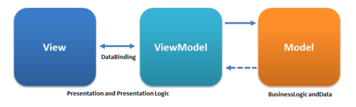
There are several benefits to this pattern:
Essentially, this pattern is an application of the Single-Responsibility Principle (that each class in your project should bear a single responsibility).
In this chapter we examined how dependency properties and routed events are implemented in WPF. The DependencyObject, which serves as a base class for WPF elements, provides a collection of key/value pairs, where the key is a DependencyProperty and the value is the object it is set to. This collection can be accessed through the GetValue() and SetValue() methods, and is also used as a backing store for regular C# properties. We also saw that we can register callbacks on dependency properties to execute logic when the property is changed. The UIElement, which also serves as a base class for WPF elements, provided similar functionality for registering routed event listeners, whose key is RoutedEvent. We saw how these routed events could “bubble” up the elements tree, or “tunnel” down it, and how marking the event Handled property would stop it. Finally, we discussed the MVVM architecture, which works well with WPF applications to keep our code manageable.
We also created an example control using these ideas. The full project can be found here.
How do we test this stuff?
Now that you’ve learned how to build a WPF application, how do you test that it is working? For that matter, how do you test any GUI-based application? In this chapter, we’ll explore some common techniques used to test GUIs. We’ll also explore the MVVM architecture developed in parallel with WPF to make unit-testing WPF apps easier.
Some key terms to learn in this chapter are:
Some key skills you need to develop in this chapter are:
Testing a GUI-based application presents some serious challenges. A GUI has a strong dependence on the environment it is running in - the operating system is ultimately responsible for displaying the GUI components, and this is also influenced by the hardware it runs on. As we noted in our discussion of WPF, screen resolution can vary dramatically. So how our GUI appears on one machine may be completely acceptable, but unusable on another.
For example, I once had an installer that used a fixed-size dialog that was so large, on my laptop the “accept” button was off-screen below the bottom of the screen - and there was no way to click it. This is clearly a problem, but the developer failed to recognize it because on their development machine (with nice large monitors) everything fit! So how do we test a GUI application in this uncertain environment?
One possibility is to fire the application up on as many different hardware platforms as we can, and check that each one performs acceptably. This, of course, requires a lot of different computers, so increasingly we see companies instead turning to virtual machines - a program that emulates the hardware of a different computer, possibly even running a different operating system! In either case, we need a way to go through a series of checks to ensure that on each platform, our application is usable.
How can we ensure rigor in this process? Ideally we’d like to automate it, just as we do with our Unit tests… and while there have been some steps in this direction, the honest truth is we’re just not there yet. Currently, there is no substitute for human eyes - and human judgement - on the problem. But humans are also notorious for losing focus when doing the same thing repeatedly… which is exactly what this kind of testing is. Thus, we develop test plans to help with this process. We’ll take a look at those next.
A testing plan is simply a step-by-step guide for a human tester to follow when testing software. You may remember that we mentioned them back on our testing chapter’s discussion on manual testing. Indeed, we can use a test plan to test all aspects of software, not just the GUI. However, automated testing is usually cheaper and more effective in many aspects of software design, which is why we prefer it when possible. So what does a GUI application testing plan look like?
It usually consists of a description of the test to perform, broken down into tasks, and populated with annotated screenshots. Here is an example:
Launch the application
Select the “Cowpoke Chili” button from the “Entrees” menu
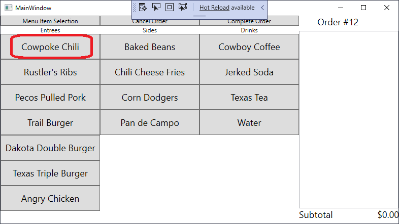
The app should switch to a customization screen that looks like this:
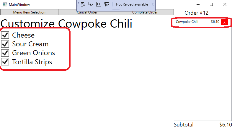
There should be a checkbox for “Cheese”, “Sour Cream”, “Green Onions”, and “Tortilla Strips”
Initial Test Item Cheese Sour Cream Green Onion Tortilla Strips A Cowpoke Chili entry should appear in the order, with a cost of $6.10
Initial Test Item Chili Entry in the order Price of $6.10
- Uncheck the checkboxes, and a corresponding “Hold” detail should appear in the order, i.e. un-checking cheese should cause the order to look like:
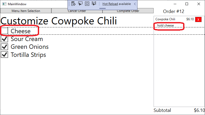
4. Click the "Menu Item Selection" Button. This should return you to the main menu screen, with the order still containing the details about the Cowpoke Chili:
Initial Test Item Cheese checkbox appears and functions Sour Cream checkbox appears and functions Green Onion checkbox appears and functions Tortilla Strips checkbox appears and functions
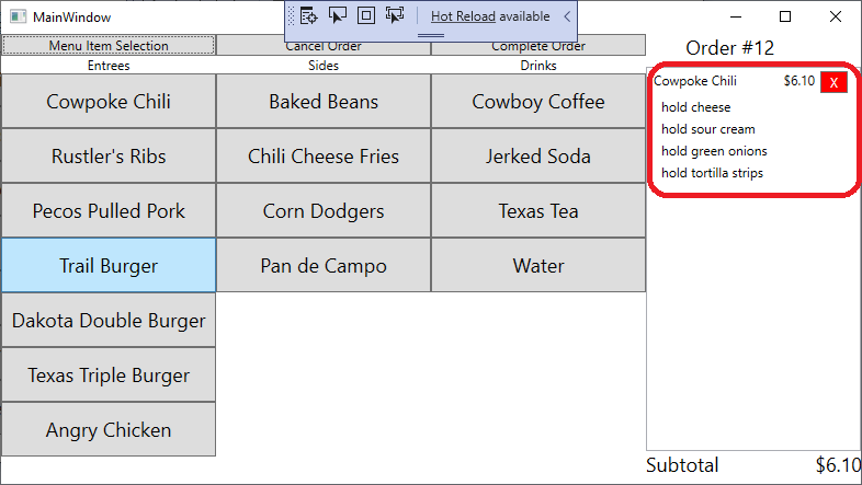
Initial Test Item Chili Entry in the order Price of $6.10 with "Hold Cheese" with "Hold Sour Cream" with "Hold Green Onion" with "Hold Tortilla Strips" If you encountered problems with this test, please describe:
The essential parts of the test plan are clear instructions of what the tester should do, and what they should see, and a mechanism for reporting issues. Note the tables in this testing plan, where the tester can initial next to each “passing” test, as well as the area for describing issues at the bottom. This reporting can either be integrated into the test document, or, it can be a separate form used with the test document (allowing the printed instructional part of the test documents to be reused). Additionally, some test documents are created in spreadsheet software or specialized testing documentation software for ease of collection and processing.
Test plans like this one are then executed by people (often titled “Tester” or “Software Tester”) by opening the application, following the steps outlined in the plan, and documenting the results. This documentation then goes back to the software developers so that they can address any issues found.
Taking screen shots of your running program is an easy way to quickly generate visuals for your testing documentation.
In Windows, CTRL + SHIFT + ALT + PRINT SCREEN takes a screen shot and copies it to the clipboard (from which you can paste it into a text editor of your choice).
On a Mac, you can take a screenshot with COMMAND + SHIFT + 4. This launches a utility that changes the mouse cursor and allows you to drag a rectangle across a section of the screen. When you release the mouse, a capture will be taken of the area, and saved as a picture to the desktop.
Compared to automated tests, using a testing plan with human testers is both slow and expensive. It should not be surprising then that Microsoft developers sought ways to shift as much of the testing burden for WPF projects to automated tests. Their solution was to develop a new architectural approach known as Model-View-ViewModel.
This approach expands upon the usual Model-View relationship in a GUI. A Model class is a class that represents some data, i.e. a Student, and the View is the GUI exposing that object’s data, i.e. a WPF <StudentControl>. Thus, we might have our Student class:
public class Student : INotifyPropertyChanged
{
    /// <summary>Notifies when a property changes</summary>
    public event PropertyChangedEventHandler? PropertyChanged;

    /// <summary>The student's course-taking history</summary>
    private List<CourseRecord> _courseRecords = new();

    /// <summary>The student's first name</summary>
    public string FirstName { get; init; }

    /// <summary>The student's last name</summary>
    public string LastName { get; init; }

    /// <summary>The student's course records</summary>
    /// <remarks>We return a copy of the course records to prevent modifications</remarks>
    public IEnumerable<CourseRecord> CourseRecords => _courseRecords.ToArray();

    /// <summary>The student's GPA</summary>
    public double GPA
    {
        get
        {
            var points = 0.0;
            var hours = 0.0;
            foreach (var cr in CourseRecords)
            {
                points += (double)cr.Grade * cr.CreditHours;
                hours += cr.CreditHours;
            }
            return points / hours;
        }
    }

    /// <summary>
    /// Adds <paramref name="cr"/> to the students' course history
    /// </summary>
    /// <param name="cr">The course record to add</param>
    public void AddCourseRecord(CourseRecord cr)
    {
        _courseRecords.Add(cr);
        PropertyChanged?.Invoke(this, new PropertyChangedEventArgs(nameof(CourseRecords)));
        PropertyChanged?.Invoke(this, new PropertyChangedEventArgs(nameof(GPA)));
    }

    /// <summary>
    /// Constructs the student object
    /// </summary>
    /// <param name="firstName">The student's first name</param>
    /// <param name="lastName">The student's last name</param>
    public Student(string firstName, string lastName)
    {
        FirstName = firstName;
        LastName = lastName;
    }
}
And our <ComputerScienceStudentControl>:
<UserControl x:Class="MvvmExample.ComputerScienceStudentControl"
             xmlns="http://schemas.microsoft.com/winfx/2006/xaml/presentation"
             xmlns:x="http://schemas.microsoft.com/winfx/2006/xaml"
             xmlns:mc="http://schemas.openxmlformats.org/markup-compatibility/2006"
             xmlns:d="http://schemas.microsoft.com/expression/blend/2008"
             xmlns:local="clr-namespace:MvvmExample"
             mc:Ignorable="d"
             d:DesignHeight="450" d:DesignWidth="300">
    <StackPanel Orientation="Vertical">
        <StackPanel Orientation="Horizontal">
            <TextBlock FontWeight="Bold" Margin="0,0,10,0">Name</TextBlock>
            <TextBlock Text="{Binding Path=FirstName}"/>
            <TextBlock Text="{Binding Path=LastName}"/>
        </StackPanel>
        <StackPanel Orientation="Horizontal">
            <TextBlock Margin="0,0,10,0" FontWeight="Bold">GPA</TextBlock>
            <TextBlock Text="{Binding Path=GPA, StringFormat={}{0:N2}}"/>
        </StackPanel>
        <TextBlock FontWeight="Bold">Course History</TextBlock>
        <ListView ItemsSource="{Binding Path=CourseRecords}" Margin="2,0,2,0"/>
    </StackPanel>
</UserControl>
Now, this control is simply a thin layer using data binding to connect it to the model class. But what if we needed to add some complex logic? Let’s say we want to display the student’s GPA calculated for only their computer science courses. We could put this in the Student class, but if every department in the university added their own custom logic and properties to that class, it would get very bloated very quickly. Instead, we might create a <ComputerScienceStudentControl> that would be used for this purpose, and compute the Computer Science GPA in its codebehind, but now we have complex logic that we’d prefer to test using automated tests.
Instead, we could create two new classes, our <ComputerScienceStudentControl> (a new View), and a ComputerScienceStudentViewModel (a ViewModel), as well as our existing Student (the Model).
Our ViewModel can now incorporate the custom logic for calculating a students’ computer science GPA, as well holding a reference to the Student class it is computed from:
public class ComputerScienceStudentViewModel : INotifyPropertyChanged
{
    /// <summary>
    /// The PropertyChanged event reports when properties change
    /// </summary>
    public event PropertyChangedEventHandler? PropertyChanged;

    /// <summary>
    /// The student this model represents
    /// </summary>
    /// <remarks>
    /// We require the student to be set in the constructor, and use
    /// the init accessor to prevent changing out the student object
    /// </remarks>
    public Student Student { get; init; }

    /// <summary>
    /// THe first name of the student
    /// </summary>
    public string FirstName => Student.FirstName;

    /// <summary>
    /// The last name of the student
    /// </summary>
    public string LastName => Student.LastName;

    /// <summary>
    /// The course history of the student
    /// </summary>
    public IEnumerable<CourseRecord> CourseRecords => Student.CourseRecords;

    /// <summary>
    /// The university GPA of the student
    /// </summary>
    public double GPA => Student.GPA;

    /// <summary>
    /// The student's Computer Science GPA
    /// </summary>
    public double ComputerScienceGPA
    {
        get
        {
            var points = 0.0;
            var hours = 0.0;
            foreach (var cr in Student.CourseRecords)
            {
                if (cr.CourseName.Contains("CIS"))
                {
                    points += (double)cr.Grade * cr.CreditHours;
                    hours += cr.CreditHours;
                }
            }
            return points / hours;
        }
    }

    /// <summary>
    /// An event handler for passing forward PropertyChanged events from the student object
    /// </summary>
    /// <param name="sender">The student object</param>
    /// <param name="e">The eventargs describing the property that is changing</param>
    private void HandleStudentPropertyChanged(object sender, PropertyChangedEventArgs e)
    {
        switch (e.PropertyName)
        {
            // Both first and last names map to properties of the same name,
            // so we can reuse the PropertyChangedEventARgs
            case nameof(FirstName):
            case nameof(LastName):
                PropertyChanged?.Invoke(this, e);
                break;
            // The Student.GPA maps to GPA, and changes to it may
            // also signal a change to the CIS GPA
            case nameof(Student.GPA):
                PropertyChanged?.Invoke(this, e);
                PropertyChanged?.Invoke(this, new PropertyChangedEventArgs(nameof(ComputerScienceGPA)));
                break;
            // We don't care about any other properites of the Student, as they
            // are not present in this ViewModel, so ignore them
            default:
                break;
        }
    }

    /// <summary>
    /// Constructs a new ComputerScienceStudentViewModel, which wraps around the
    /// <paramref name="student"/> object and provides some additional functionality.
    /// </summary>
    /// <param name="student">The student who is this view model</param>
    public ComputerScienceStudentViewModel(Student student)
    {
        Student = student;
        Student.PropertyChanged += HandleStudentPropertyChanged;
    }
}
And a control to display it:
<UserControl x:Class="MvvmExample.StudentControl"
             xmlns="http://schemas.microsoft.com/winfx/2006/xaml/presentation"
             xmlns:x="http://schemas.microsoft.com/winfx/2006/xaml"
             xmlns:mc="http://schemas.openxmlformats.org/markup-compatibility/2006"
             xmlns:d="http://schemas.microsoft.com/expression/blend/2008"
             xmlns:local="clr-namespace:MvvmExample"
             mc:Ignorable="d"
             d:DesignHeight="450" d:DesignWidth="300">
    <StackPanel Orientation="Vertical">
        <StackPanel Orientation="Horizontal">
            <TextBlock FontWeight="Bold" Margin="0,0,10,0">Name</TextBlock>
            <TextBlock Text="{Binding Path=FirstName}"/>
            <TextBlock Text="{Binding Path=LastName}"/>
        </StackPanel>
        <StackPanel Orientation="Horizontal">
            <TextBlock Margin="0,0,10,0" FontWeight="Bold">GPA</TextBlock>
            <TextBlock Text="{Binding Path=GPA, StringFormat={}{0:N2}}"/>
        </StackPanel>
        <TextBlock FontWeight="Bold">Course History</TextBlock>
        <ListView ItemsSource="{Binding Path=CourseRecords}" Margin="2,0,2,0"/>
    </StackPanel>
</UserControl>
The ComputerScienceViewModel can then be used interchangeably with the Student model class, as both have the same properties (though the view model has one additional one). We could then either tweak the student control or create a new one that binds to this new property, i.e.:
<StackPanel Orientation="Horizontal">
    <TextBlock Margin="0,0,10,0" FontWeight="Bold">Computer Science GPA</TextBlock>
    <TextBlock Text="{Binding Path=ComputerScienceGPA, StringFormat={}{0:N2}}"/>
</StackPanel>
This represents just one of the ways a ViewModel can be used. A View Model can also be leveraged to combine multiple data classes into a single object that can serve as a DataContext. One can also be utilized to create a wrapper object around a web-based API or other data source to provide the ability to data bind that source to GUI controls.
Finally, because a ViewModel is simply another data class, it can be unit tested just like any other. This helps make sure that complex logic which we want thoroughly tested is not embedded in a GUI component, and simplifies our testing strategies.
We’ve really only scratched the surface of the MVVM architecture as it is used in WPF applications. In addition to providing properties to bind to, a WPF MVVM can also define commands that decouple event handlers from their effects. When using commands, the GUI event handler simply signals the command, which is consumed by a ViewModel to perform the requested action.
Commands are outside the scope of this course, but you can refer to the Microsoft documentation and books from the O’Riley Learning Library if you would like to explore this concept in more depth.
In this chapter we looked at some of the challenges of testing GUIs, and saw why most GUI applications are still manually tested. We also explored the process of writing a test plan, a step-by-step process for a human tester to follow to provide rigor in the testing process.
We also explored the Model View ViewModel architecture in more depth, especially how it can allow us to move complex logic out of our GUI into a simple class that can be unit tested.