Media @ Rule
The @media rule was originally introduced in CSS version 2. It was used to differentiate between different kinds of devices, i.e. a computer screen, printer, etc. Only the print type saw broad adoption, but it remains useful. Let’s see how we can use it.
If we look at our Pages/Index.cshtml page, we can find an <aside> element that contains a banner advertisement for Bernie’s. The <aside> element is a semantic element - one that implies a specific meaning for what it contains. The meaning it implies is something ’extra’ to the page that isn’t part of its main thrust - in this case, an advertisement.
Beyond implying a meaning, it’s equivalent to a <div> element, it is simply a block-level element that divides up the page and can be used to attach CSS rules.
Let’s assume that we don’t want this to appear on the page when we print it. Let’s add a class of "advertisement" to it:
<aside class="advertisement">
    <img src="~/img/ad.png" alt="Eat at Bernies!"/>
</aside>
And in our wwwroot/css/site.css, let’s create an @media rule for printing:
@media print {
    .advertisement {
        display: none;
    }
}
Any CSS enclosed in the curly braces following @media print will only be applied when the page is printed. In that case, we set any element wit the class advertisement to not display. Try running the program, and in the browser, select print preview.
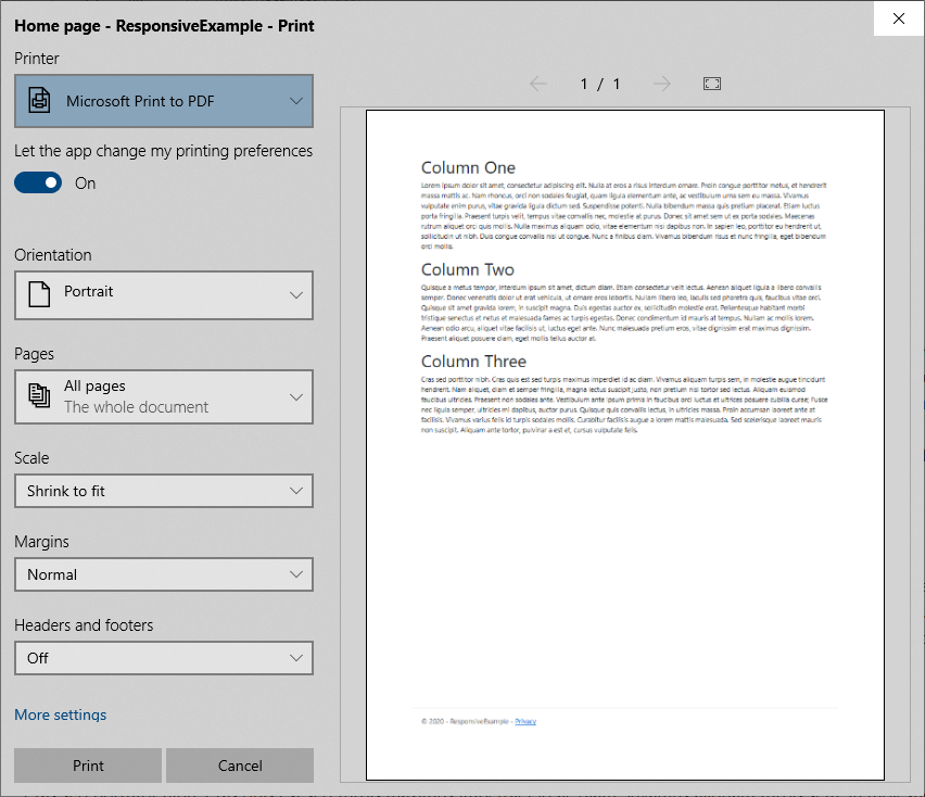
The advertisement does not appear! But it still shows up in the browser.
This simple technique can be used to easily create printer-friendly versions of your webpage by changing colors to gray tones, replacing fonts, and removing elements that will require a lot of in to print.
But the media @ rule is also the basis for an even more powerful mechanism, media queries, which we’ll look at next.