Media Queries
In CSS3, the @media rule was extended to include the concept of media queries, a technique that allows us to conditionally apply CSS rules using a broader range of values. Some of the most commonly used are:
- The width and the height of the viewport (the area on-screen)
- The width and height of the device (the monitor, phone, or other screen)
- The orientation (landscape or portrait)
- The resolution
Media queries are primarily used to enable responsive design, which refers to your page re-arranging itself for display on different devices.
A media query expands the @media rule that we used previously. It consists of the @media keyword followed by an optional media type (all, print, screen, or speech), and then any media features we want to query for within parenthesis.
Let’s start with a simple example. Let’s change the color of our h1 elements based on the orientation of the screen. Add these two rules to your wwwroot/css/site.css:
@media (orientation: landscape) {
    h1 { color: green; }
}

@media (orientation: portrait) {
    h1 { color: orange; }
}
Now if you run your server, the <h1> elements will probably be green. Resize your window until it is taller than it is wide, and they will turn orange.
Using Chrome Developer Tools
While we can definitely stretch our browser window to try different sizes, there are far better tools available. Let’s see how Chrome’s Developer Tools can make our lives as a developer easier.
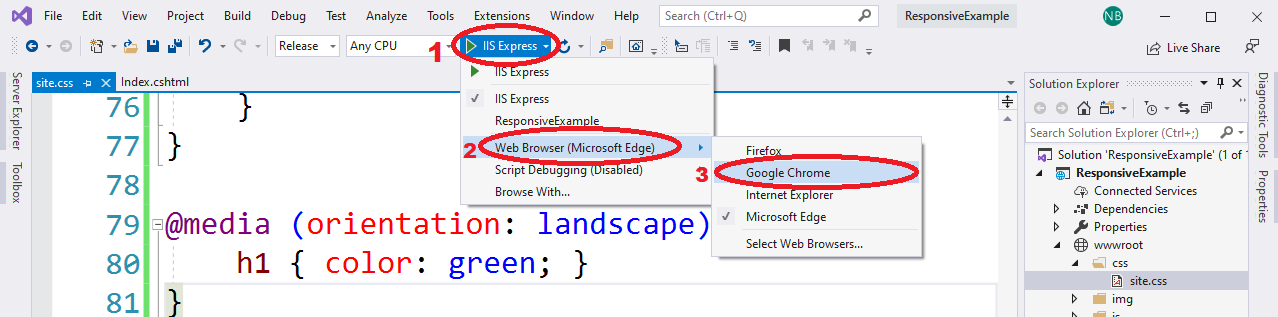
First, set Visual Studio to use Chrome as the browser it launches your website with. From the build target dropdown, select the ‘Web Browser’ option, and select ‘Google Chrome’:
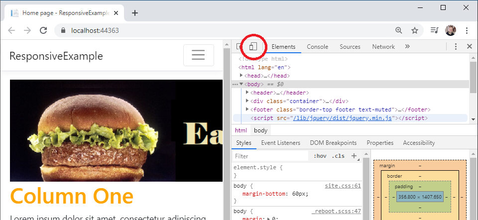
Now run your program. When Chrome loads, turn on developer tools by either pressing CTRL + SHIFT + I or right-clicking on the page and selecting ‘Inspect’. This launches the developer tools in thier own pane in the window. At the top of the developer pane is an icon that resembles a cellphone in front of a screen.
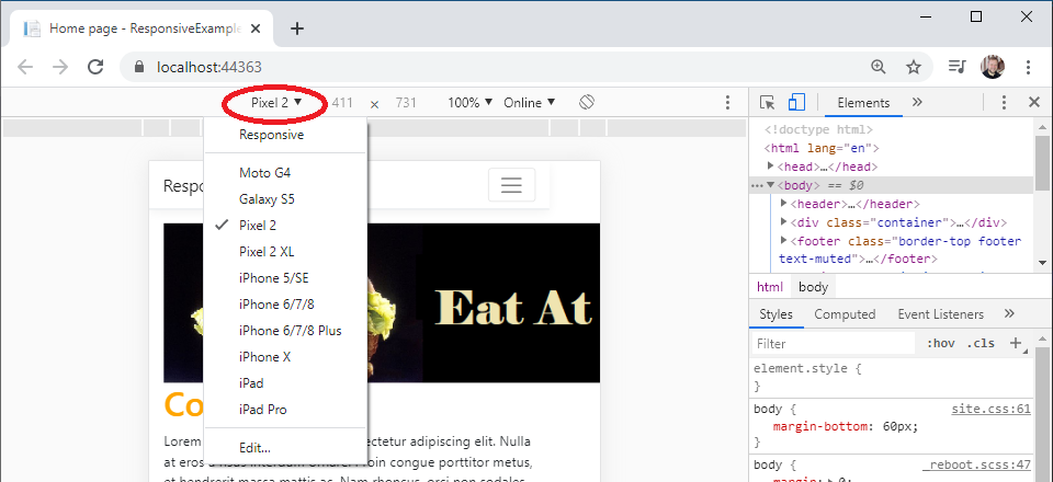
Clicking it will toggle the device toolbar, which allows you to emulate different devices, choosing from several common phones and tables, or use the ‘responsive’ category to set a custom size:
In addition, you can change the orientation of the device with the rotate button:
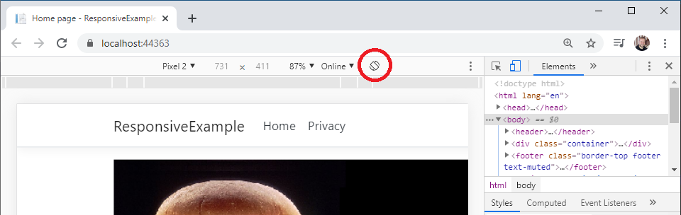
Try selecting a mobile phone and then using the rotate button to change the orientation. Watch how your <h1> elements change color!
Next we’ll look at how we use media queries in responsive design.
Developer tools are actually a part of all modern web browsers, so if you prefer to use a different browser you can learn its tools instead. Here are links to the documentation for the major browsers: