Responsive Setup
In web development, Responsive Design means making your webpages adjust to the device they are displayed on. This is especially important today, where a user might be browsing the web from a desktop, a tablet, a phone, or even a console built into a refrigerator, a car, or an airplane seat!
Before we go farther, there are a couple of concepts we need to understand. The first is the device width and device height, which are the actual size of the device’s screen. Next is the viewport, which is the area of the screen that the web browser actually gets to render into, and has its own width and height. The viewport width and height can be smaller than the device width and height, as is the case when the browser is displayed in a window that is not maximized. In that case, only the area of the browser window (less the toolbars) is the viewport.
A viewport can also be larger than the device width and height. When mobile phones first started allowing users to browse the web, they had tiny screens. Phone manufacturers had to decide how to display webpages that were never designed for these devices. They settled on an approach of setting the viewport to a size consistent with computer monitors of the day, and then scaling the entire page down to fit onto the actual screen. The result was you could see the entire webpage, but it was tiny.
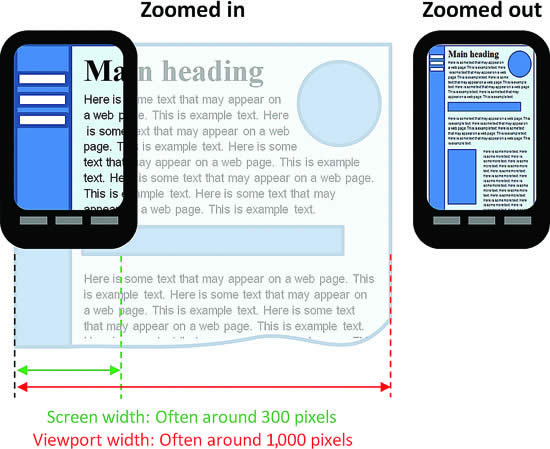
This remains the default behavior of mobile browsers to this day - and because the viewport is not aligned with the device size, media queries targeting the viewport also do not correctly account for device size.
The Viewport Meta Tag
However, this can be overridden through the use of a <meta> element. The <meta> element must be placed in the <head> of a webpage, and applies some kind of metadata to the webpage. Historically, it was used to supply key words to search engines, but this practice was routinely abused and search engines have ceased to rely on it. However, other kinds of metadata can be added with a <meta> element, and one of the most important for responsive design overrides the default viewport settings. Thus, a responsive webpage should always declare the following <meta> tag:
<meta name="viewport" content="width=device-width, initial-scale=1">
This tells the browser to set the width of the viewport to the width of the device, and to not scale the final rendering of the webpage (scale is on a range of 0 to 1, where 1 is 100%). This ensures that the viewport and the device sizes are the same.
If you look in your project’s _Pages/Shared/Layout.cshtml file, you will notice that this <meta> tag is already defined. In fact, it is included as biolerplate in all ASP.NET projects genreated by Visual Studio that include Razor pages. But if you find yourself writing pages from scratch that you want to be responsive, you’ll need to add this. You can read more about it on MDN.
Responsive Breakpoints
Once we know our viewport is set up to be the same size as our device, we can turn our attention to using media queries to respond to different widths of screens. For example, we can define all the CSS rules we would normally use, and then a media query that would limit those for a smaller screen - say under 750 pixels. Let’s try this out by adding a border to our aside, and changing its apperance in a smaller screen:
aside { border: 5px solid gray; }

@media (max-width: 750px) {
    /* applies when the screen is under 750 pixels wide */
    aside { border: 3px dashed gray; }
}
Now when the viewport is wider than 750 pixels, you’ll see a solid gray border around the banner ad:
And if you size down your viewport, you’ll see that banner go to a smaller dashed gray:
We can extend this approach by adding another media query for even smaller screens, say those under 490 pixels:
@media (max-width: 490px) {
    /* applies when the screen is under 490 pixels wide */
    aside { border: 2px dotted gray; }
}
As this rule is declared after the first two border rules, it will override them both, replacing the values for the border (note, any previously declared rules that have not been overridden will continue to apply). Now if you size your screen even smaller:

This strategy of using successively smaller media queries to override CSS styles at different screen widths is known as responsive breakpoints, because at those widths you specify, the appearance of your page changes.
It is a good idea to have the starting point of your page (when no media queries are applied) be a normal desktop resolution so that your site appears normal in very old browsers.