Float-based Responsive Layout
Now that we have seen the concept of responsive breakpoints, let’s put them to use creating a layout for our web page. Currently we have three <div> elements, each with a header and placeholder text. We’d like to arrange these into a row of three columns if the screen is large enough, and collapse them into a single column on smaller screens, such as a mobile phone.
We’re going to explore several strategies for accomplishing this. First, we’ll look at float-based layouts. This is an older strategy for creating columns, and it is based on the float css property which is traditionally used to float images and figures to the right or left of a body of text.
We can instead leverage it to create columns by setting each <div> we intend to behave as a column to have a float: left; property. This makes each column float to the left of the one after it. Let’s give it a try.
First, in your Pages/Index.cshtml, we’ll add a class to the outermost div, just under the <aside> we manipulated previously:
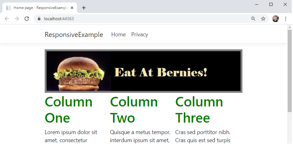
<aside class="advertisement">
    <img src="~/img/ad.png" alt="Eat at Bernies!"/>
</aside>
<div class="float-columns">
    <div>
        <h1>Column One</h1>
        ...
Then we’ll add setting the float property in our wwwroot/css/site.css:
.float-columns > div {
    float: left;
    width: 33%;
}
We use the child selection operator > to apply the css rules to all <div> elements that are a direct child of the <div> we gave the class of float-columns to. We’ll make each of those children <div> elements behave like columns by making them float to the left of the column declared after them, and set them each to be roughly 1/3 the width of the page with width: 33%.
If we run the page now, we’ll see that we have our columns:
But when you scroll down, you’ll also see a problem:

Because the use of float takes elements out of the usual flow layout algorithm, the elements that follow them often end up in unexpected positions. We have to explicitly turn the normal flow layout back on when we’re done with our floating elements with a clear property, which can be left, right, or both.
This normally is done by adding an empty div with the clear: both rule applied after the last column; a technique called a clearfix. Let’s go ahead and declare our clearfix class in wwwroot/css/site.css:
.clearfix {
    clear: both;
}
And then in our Pages/Index.cshtml, we’ll add a <div> element with that class, just after our containing <div> (it will be the last element in the file):
<div class="clearfix"></div>
Now when we render the page, we’ll see the columns behave as expected:
!The float error fixed](/images/3.3.5.3.png)
However, our page is not responsive at this point. So we’ll need to add a media query to establish a responsive breakpoint for smaller screens. Let’s use 490 pixels as our breakpoint. We’ll need to add this new rule below the ones we created for our .float-columns in wwwroot/css/site.css, as we will be overriding those when the media query is true:
@media (max-width: 490px) {
    /* Reset the columns to render with the flow of the page */
    .float-columns > div {
        float: none;
        width: 100%;
    }
}
We simply reverse the rules we applied to the columns by setting the properties back to their defaults. Now the columns will change to their stacked appearance when we look at the site on a smaller screen.