Flex-based Responsive Layout
Now, the float-based layout is really a bit of a hack, as the intent of the float property is really for the embedding of images and callouts to the sides of text content. Unfortunately, floats and tables were the only mechanisms in earlier versions of CSS to allow for more nuanced layouts.
However, that has changed with CSS3, which has introduced several new layout algorithms to supplement the traditional flow and table ones. One of these is flexbox, which we will explore now.
Flexbox provides an alternative means for laying out HTML elements within a containing element. You set the containing element’s display property to flex, and choose a flex-direction (row, column, row-reverse, or column-reverse).
It is very easy to set up our three-column layout with flexbox. Let’s do so now.
First, we’ll change the class we are applying to our containing div element in Pages/Index.cshtml. Let’s use "flex-columns" instead of our previous "float-columns":
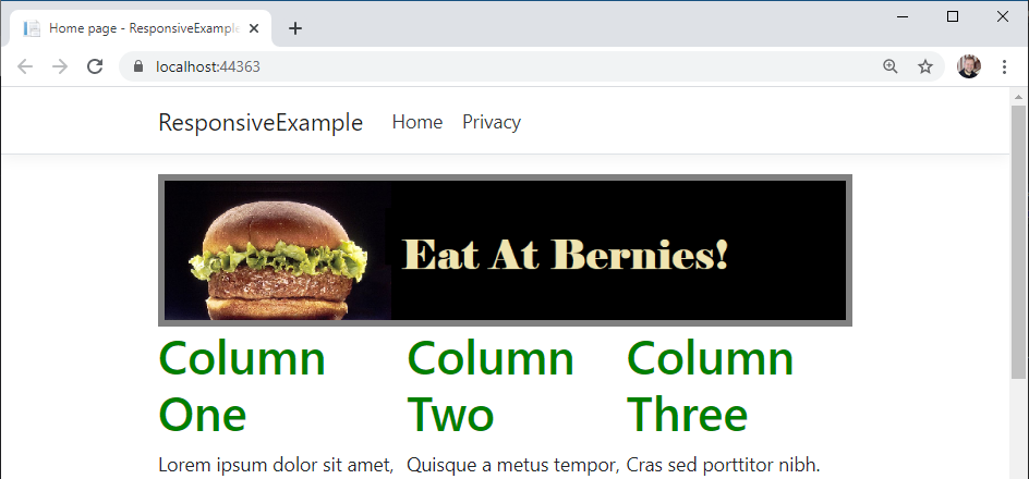
<aside class="advertisement">
    <img src="~/img/ad.png" alt="Eat at Bernies!"/>
</aside>
<div class="flex-columns">
    <div>
        <h1>Column One</h1>
        ...
We can then add additional CSS rules to our wwwroot/css/site.css to apply the flex layout:
.flex-columns {
    display: flex;
    flex-direction: row;
}
Now if we run our program and look at our page, we’ll see that the flex algorithm has automatically arranged the children <div> elements into three equally-sized columns for us!
Moreover, if we were to add or remove columns, the layout would automatically change to keep them balanced. You can also apply a number of additional properties to provide more fine-grained control of the layout; the CSS Tricks A Complete Guide to Flexbox offers a great guide to the details.
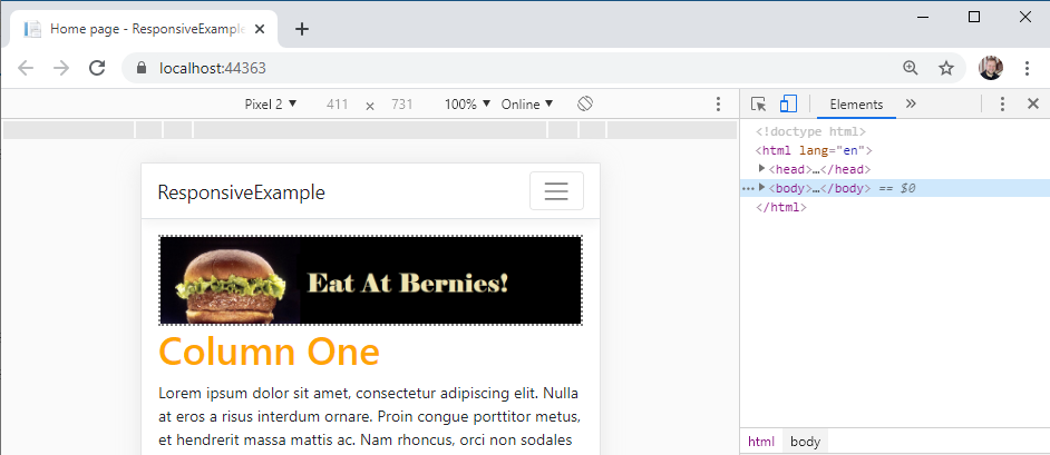
Now to make our layout responsive, we just need to switch the direction of our container:
@media (max-width: 490px) {
    .flex-columns {
        flex-direction: column;
    }
}
Now when we view our page on a smaller screen, it will use columns instead of rows!
We also no longer need to bother with a clearfix <div>, though leaving the one we created in the prior example in place won’t cause any problems.