Milestone 5 Requirements
For this milestone, you will be creating a new Windows Presentation Foundation (WPF) project to provide the functionality for a Point-of-Sale system. This is the kind of application that runs on a register used by employees to take your order at most fast-food restaurants.
General requirements:
You need to follow the style laid out in the C# Coding Conventions
Add tests for any new functionality you add to your projects.
Update your UML diagrams to reflect any changes in your project’s structure (you do not need to include test projects in the UML).
Assignment requirements:
You will need to:
Add a new WPF Project
PointOfSaleto your solution.Create GUI components by extending the WPF
UserControlbase class to create your own custom controls consisting of layout elements and customization screens for all menu items currently offered on the menuCreate/Update UML Class Diagrams corresponding to your projects (both the
DataandPointOfSaleprojects). Hint: this is when you’ll start using the has-a associations more regularly.
Purpose:
This assignment is intended to introduce you to Microsoft’s Windows Presentation Foundations’ approach to using Extensible Application Markup Language (XAML) to create user interfaces. XAML is a markup language based on XML which is used by WPF in a manner similar to how HTML defines the display of web pages. This assignment will challenge you to use a language you probably have not used before. We will focus on navigation between screens and how to connect user input with functionality.
Spelling Changes
After some internal debate in the marketing department, GyroScope has decided to adopt “Halva” as the official spelling for CancerHalvaCake. You will need to update your classes accordingly.
Creating the PointOfSale Project
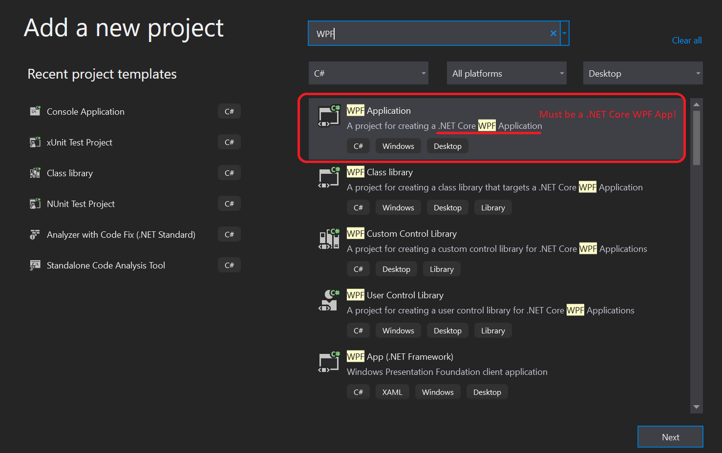
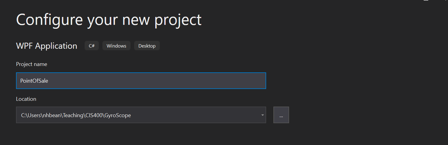
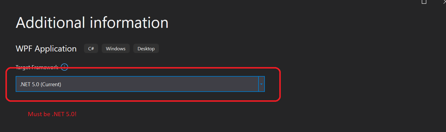
You will create a new project, named PointOfSale in your GyroScope solution. This project must be a .NET Core 5.0 WPF App, as is shown in the images below:
If you do not have this option, you may need to update your installation of Visual Studio and add the Desktop Workflow. These steps are laid out below.
Updating Visual Studio to the Latest Version
To update Visual Studio, select Help > Check for Updates:
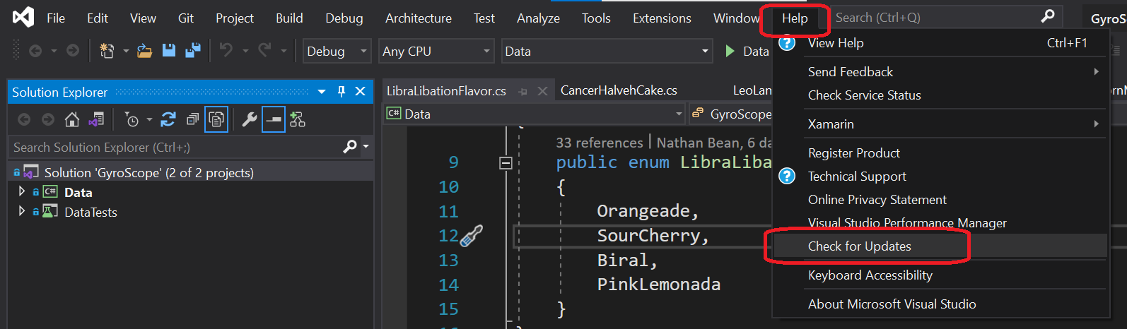
This will launch the Visual Studio installer and it will check for a newer version and prompt you to install it if there is one.
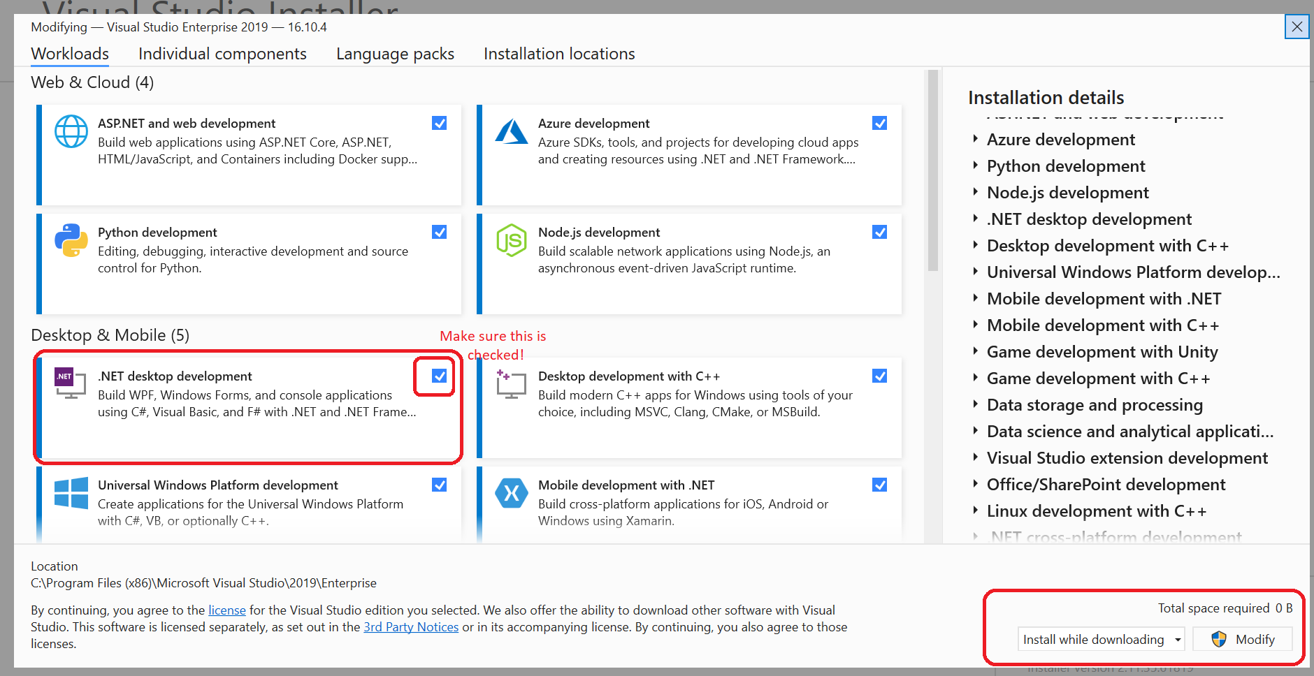
Installing the Desktop Workflow
To install the Desktop Workflow, select Tools > Get Tools and Features.... This will open the Visual Studio installer in modification mode. Make sure the .NET Desktop Development workflow is checked. If it isn’t, check it and click the Modify button.
As some students find a video walkthrough more approachable, here is the same material in video tutorial form:
Creating the GUI Components
Most of this assignment is concerned with creating custom components which bundle related functionality into a single custom control. These are created by extending the UserControl class found in WPF, and embedding controls into other controls, either by nesting them within XAML, or by adding them programmatically. The goal is to create a complete user interface for the Point of Sale system. The initial screen might look something like:
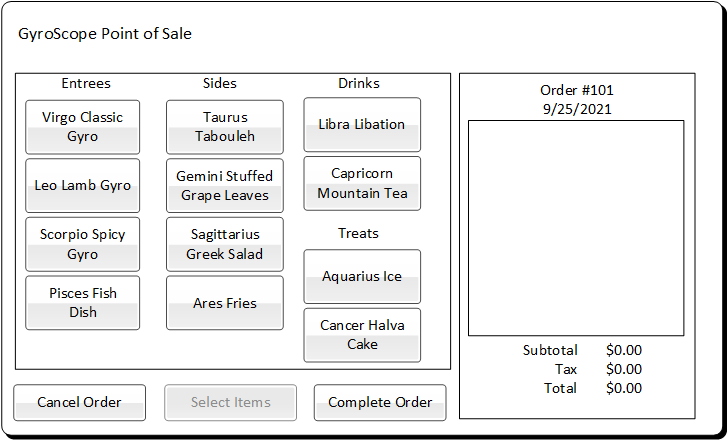
And pressing a button like the “Scorpio Spicy Gyro” button would add a Scorpio Spicy Gyro instance to the order (to be done next milestone) and will open a customization screen:
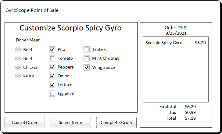
Which displays the customization options for the selected menu item. The “Select Items” button in this screen will then return back to the menu item selection screen.
In this arrangement, we see three components (The MainWindow which is composed of the other controls and manages the overall layout, an OrderSummaryControl that displays the order details, and either the MenuItemSelectionControl, or an item customization control for a specific menu item):
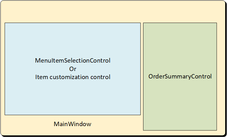
Making the MenuItemSelectionControl and the customization screens children (i.e. a composition association) of the MainWindow greatly simplifies managing the swapping between the various screens as changes are being made to the order - though this is certainly not the only way of setting up the application.
MainWindow
Every WPF application has a class that extends the MainWindow control. This serves as the topmost control and contains the other controls/components of the program, as well as managing windows operations (going fullscreen, closing, etc). Some of the logic of the application can be placed into this class as well, though in many cases it makes more sense to place this in a component that is the child of the MainWindow.
The MainWindow component also defines the default size of the application. In our case, your application should be targeting a touch screen interface with a resolution of 1920 x 1080, so you should set the Width and Height attributes of your <MainWindow> accordingly. It should also be composed of (contain) a <OrderSummaryControl> and a <MenuSelectionControl> instance (the requirements for these components appear below), and you will determine how large these components will be displayed based on how you position them within the MainWindow.
Details
You may notice that most controls have a DesignWidth and DesignHeight attribute - this determines the size the control is shown in Visual Studio’s GUI Designer. This does not reflect the actual size that will be used when the program is run (that is calculated based on the size of the container). It is a good idea to change these attributes to match the expected size of your control when displayed.
Additionally, the MainWindow should have buttons for “Cancel Order”, “Complete Order”, and “Select Items”. We will add the functionality for these buttons in the next milestone.
Order Summary Control
Define a custom component OrderSummaryControl in the files OrderSummaryControl.xaml and OrderSummaryControl.xaml.cs. This component will be used to display the order details - the order number, date, price, tax, and total, as well as all the items in the order and their details. You should create placeholders for all of this information using the standard WPF components, i.e. <TextField> and <ListView>, and organize them using one of the layout strategies you have learned.
We will bind these controls to real order data in the next milestone.
Menu Item Selection Control
Define a custom component MenuItemSelectionControl in the files MenuSelectionControl.xaml and MenuSelectionControl.xaml.cs. This component will be used to display buttons corresponding to each menu item, allowing it to be added to the order being taken at the moment (we will implement the actual functionality in the next milestone).
You can arrange these buttons in any fashion you like, but be mindful of your end-users. You should try to achieve a design that is intuitive to the average user. Also as you design this control, keep in mind usability and the cashiers who will be using it. For some cashiers, small buttons may be difficult to touch due to advanced age, neuromuscular conditions, or simply large fingertips, so making your buttons large and easy to distinguish is a good idea. Similarly, some cashiers my have various vision issues, so making text large and easy-to-read is a good idea. Finally, some cashiers may be illiterate, so pictures of the menu item are often included as well.
The MenuItemSelectionControl must allow for the selection of each menu item currently offered by GyroScope:
Entrees
- Virgo Classic Gyro
- Scorpio Spicy Gyro
- Leo Lamb Gyro
- Pisces Fish Dish
Sides
- Taurus Tabouleh
- Gemini Stuffed Grape Leaves
- Sagittarius Greek Salad
- Aries Fries
Drinks
- Libra Libation
- Capricorn Mountain Tea
Treats
- Aquarius Ice
- Cancer Halva Cake
Remember also that your MenuItemSelectionControl’s size is determined by the amount of space you have allocated for it in the MainWindow. You should use this size as your DesignWidth and DesignHeight to ensure the control is completely visible in the final program.
Item Customization Controls
For each menu item, you will need to allow the cashier to customize it to meet the customer’s requests. You will probably want to accomplish this with a custom control for each type of menu item (though you may be able to combine multiple types under a single customization control).
This means that for each boolean property in the menu item, the cashier should be able to change the boolean to true or false easily. Checkboxes, toggle buttons, and switches are all common methods for representing this kind of functionality in a GUI. Similarly, controls for changing categorical information (i.e. the enumeration types for size and flavor) need to be supplied for those items that use them. Commonly used approaches for this include drop-down selection menus and radio buttons. As with the menu selection screen, these should be large enough to be easily interacted with, and clearly denote what they change (Note these do not yet need to be functional - that will be the focus of the next milestone).
Info
Because we are giving you flexibility in how to define the item customization control classes, Pendant cannot account for all the possibilities. Accordingly, Pendant will not notify you if you have not created all the customization classes you need, or provided the requisite controls to customize them. It is your responsibility to ensure you have adequate controls.
Update your UMLs
Once you’ve created your new controls and all the classes involved, remember to add them to your UML diagram for the PointOfSale project. This can either be a new UML diagram, or you can create another namespace in your existing UML diagram.
You might wonder how to represent WPF controls in UML given that there are two files associated with each control: a .xaml and a .xaml.cs. While there are two files, they represent a single class (remember, WPF uses the partial keyword to declare control classes), so there will only be a single box for each control.
Technically, any control you embed inside another control is a composition relationship, i.e. adding a <TextBox> to a custom control. However, in the interest of legibility of the resulting UML diagram, we will only show these relationships for custom controls defined in our project. So you will need to show the relationship between MainWindow, MenuItemSelectionControl, and OrderSummaryControl.
Also, if you made any modifications to the data project, remember to update its UML diagram as well. This also includes fixing any issues your grader found in your previous diagram version.
Note: You do not need to create a UML diagram of your DataTest project, though you can if you want.
The Milestone Feature Branch
You will want to create a feature branch and push it to GitHub for your validations to be generated on https://pendant.cs.ksu.edu. For this milestone, your feature branch should be named ms5.
Submitting the Assignment
Once your project is complete, merge your feature branch back into the main branch and create a release tagged v0.5.0 with name "Milestone 5". Copy the URL for the release page and submit it to the Canvas assignment.
Grading Rubric
The grading rubric for this assignment will be:
20% Structure Did you implement the structure as laid out in the specification? Are the correct names used for classes, enums, properties, methods, events, etc? Do classes inherit from expected base classes?
20% Documentation Does every class, method, property, and field use the correct XML-style documentation? Does every XML comment tag contain explanatory text?
20% Design Are you appropriately using C# to create reasonably efficient, secure, and usable software? Does your code contain bugs that will cause issues at runtime?
20% Functionality Does the program do what the assignment asks? Do properties return the expected values? Do methods perform the expected actions?
20% UML Diagrams Does your UML diagram reflect the code actually in your release? Are all classes, enums, etc. included? Are associations correctly identified?
Warning
Projects that do not compile will receive an automatic grade of 0.