CSS Layouts
We often speak of the separation of concerns principle in the context of web development as setting up the roles of HTML, CSS, and JavaScript. In this understanding, HTML provides the organization of content, CSS provides for the presentation of the content, and JavaScript provides for user interaction.
In this understanding, CSS is often tasked with the role of laying out elements on the page. More specifically, it overrides the default flow of HTML elements (see our earlier discussion of block vs. inline elements in the HTML chapter), altering how the browser arranges elements on the page.
The three most common layout approaches currently used in modern web development are float, flexbox, and grid, named for the CSS properties that make them possible. You may also encounter absolutely positioned layouts and table layouts, so we will briefly discuss those as well.
Float Layouts
By default a block-level element stretches the width of the parent element, and its siblings are pushed underneath. The CSS float property changes this behavior, allowing a block-level element to determine an appropriate width based on its content (or CSS rules), and allows sibling elements to “float” next to it. Thus, the float property has two primary values, left and right (as well as none and inherit). A float: left causes the element to float on the left side of its containing element, and a float: right floats it to the right.
A common use is to float figures and images within a page, i.e.:
<img src="images/Marc-Andreessen.jpg"/>
<p>People tend to think of the web as a way to get information or perhaps as a place  to carry out ecommerce. But really, the web is about accessing applications. Think of each website as an application, and every single click, every single interaction with that site, is an opportunity to be on the very latest version of that application.</p>
<span>- Marc Andreessen</span>
People tend to think of the web as a way to get information or perhaps as a place to carry out ecommerce. But really, the web is about accessing applications. Think of each website as an application, and every single click, every single interaction with that site, is an opportunity to be on the very latest version of that application.
- Marc AndreessenBut floats can also be used to create multi-column layouts, i.e.:
.column {
  float: left;
  box-sizing: border-box;
  width: 33%;
  height:60px;
  color: white;
}
.one {background-color: red}
.two {background-color: blue; margin-left: 0.5%; margin-right: 0.5%}
.three {background-color: green}<div class="column one">
One
</div>
<div class="column two">
Two
</div>
<div class="column three">
Three
</div>Finally, when discussing the float property, we need to discuss the clear property as well. The clear property is used to move an element below the margin area of any floating elements - basically resetting the flow of the page. It can selectively clear floating elements in the left, right, or both directions. In our column example, if we wanted to add a footer that stretched across all three columns, we’d use something like:
footer {
  clear: both;
  border: 1px solid black;
}<div class="column one">
One
</div>
<div class="column two">
Two
</div>
<div class="column three">
Three
</div>
<footer>Footer</footer>Flexbox Layouts
The Flexible Box Layout (flexbox) is intended to offer a greater degree of control and flexibility (pun intended) to laying out web pages. Its purpose is to provide an efficient way of laying out, aligning, and distributing elements within a container. Moreover, it can carry out this goal even when the sizes of the child elements are unknown or dynamic.
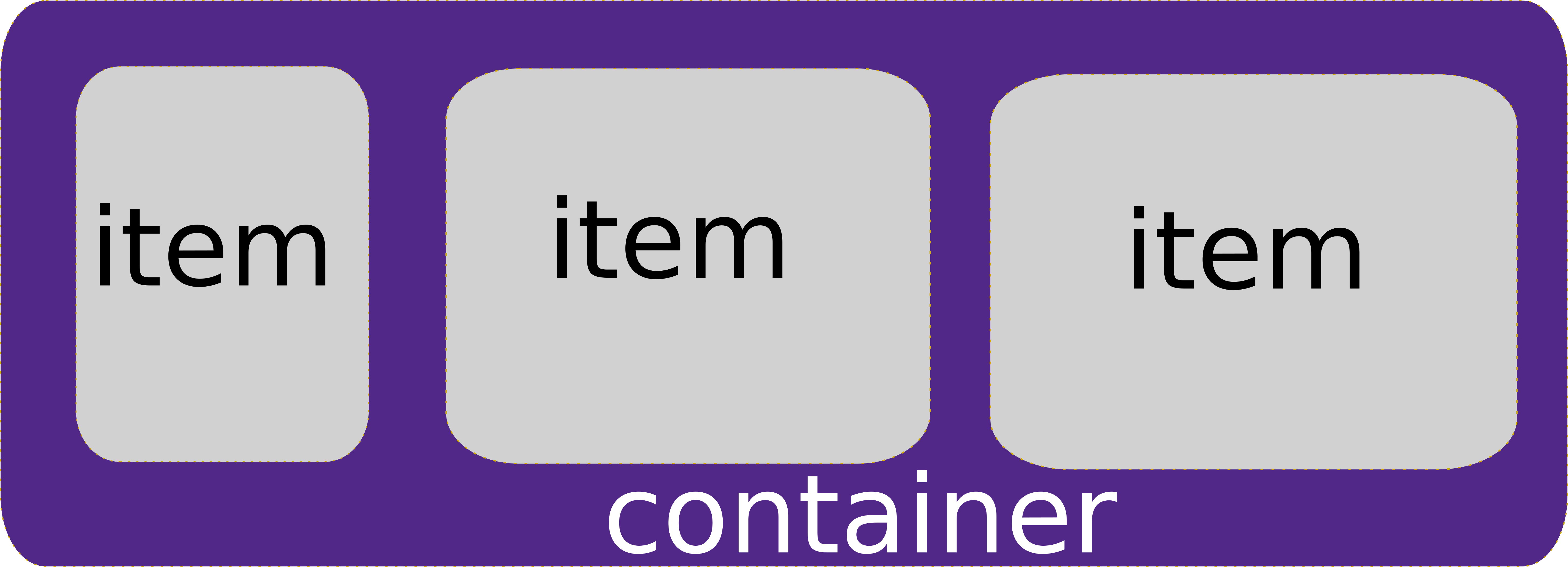
The flexbox model therefore consists of two levels of nested elements - an outer container element and inner content item elements (the content item elements themselves can have many decendent elements). The flexbox properties help define how the content item elements are laid out within their parent container.
An HTML element is turned into a flexbox container by assigning it the display property of flex. Additional properties then control how the elements contained within our new flexbox container are laid out. These include:
flex-direction determines how items are laid out, either row, column, row-reverse, or column-reverse.
wrap-items determines if the row or column wraps into multiple rows or columns. Its values are no-wrap (default), wrap, and wrap-reverse.
justify-content defines how content items will be aligned along the main axis of the container (horizontal for rows, and vertical for columns). Its possible values are: flex-start, flex-end, center, space-between, and space-around.
align-items defines how content items are aligned along the secondary axis of the container (vertically for rows, and horizontally for columns). Its possible values are flex-start (the default), flex-end, center, stretch, and baseline.
Thus, to re-create our three-column layout with flexbox, we would:
.three-column {
  display: flex;
  flex-direction: column;
  justify-content: space-between;
}
.three-column > div {
  color: white;
  width: 33%;
  height: 60px;
}<div class="three-column">
<div class="one">
one
</div>
<div class="two">
two
</div>
<div class="three">
three
</div>
</div>The items can also override these default behaviors with item specific CSS attributes, including allowing items to grow with flex-grow or shrink with flex-shrink to fit available space, override the default order of elements using the order attribute, or altering the alignment on a per-item basis with align-self.
You can also create very sophisticated layouts by nesting flex containers within flex containers. A superb reference for working with flexbox is CSS Tricks’ Complete Guide to Flexbox.
Grid Layouts
While flexbox brought a lot of power to the web designer, the Grid model is an even more powerful way to lay out web elements. Unlike flex, which focuses on arranging elements along one dimension (provided you aren’t wrapping), the Grid model lays elements out in a two-dimensional grid.
An HTML element is turned into a grid container by assigning it the display property of grid or inline-grid. Then you define the size of the grid elements with the properties grid-template-rows and grid-template-columns. These attributes take the measurements of the columns and rows. I.e. we could recreate our three-column layout with grid-template-columns: 33% 33% 33%. But the grid is far more powerful than that. Let’s expand our three-column layout to have a separate header and footer:
div#page {
  display: grid;
  grid-template-columns: 1fr 1fr 1fr;
  grid-template-rows:  150px auto 100px;
}
Here we use the unit fr for our column width, which proportions out the “free space remaining” after hard-coded measurements are accounted for. In our case, this translates into three equal-sized columns taking up all the available space.
For rows, our first row will be the header, and we’ve sized it to 150 pixels. The next row is our content, we’ve used the auto value to allow it to size appropriately to contain its content. The last row is the footer, and we’ve sized it to 100 pixels.
Our HTML would look like:
<div id="page">
  <header></header>
  <div id="one"></div>
  <div id="two"></div>
  <div id="three"></div>
  <footer></footer>
</div>
And finally, we can assign these HTML elements to part of the grid with the grid-area property, which takes the values for row start, column start, row end, column end separated by slashes (/) to define the area of the grid they span:
header {
  grid-area: 1/1/2/4;
  border: 1px solid black;
}
#one {
  grid-area: 2/1/3/2;
  height: 50px;
  background-color: red;
}
#two {
  grid-area: 2/2/3/3;
  height: 200px;
  background-color: blue;
}
#three {
  grid-area: 2/3/3/4;
  height: 300px;
  background-color: green
}
footer {
  grid-area: 3/1/4/4;
  border: 1px solid black;
}We’ve really only scratch the surface of what is possible with the grid. Items can be aligned and justified, and tweaked in other ways, just as with flexbox. Names can be assigned to grid rows, grid columns, and grid areas, and used to make the resulting CSS more approachable and understandable.
A great resource for deeper exploration is CSS Trick’s Complete Guide to Grid.
Table Layouts
At one point in the 1990’s, it was common practice for graphic designers to create a web page using graphic design software, export it as an image, and then slice up the image. These pieces were then used as the background-image property of a table cell, and text was overlaid on this graphics as the contents of the cell.
Thankfully, this practice has largely been abandoned, but you may still encounter it from time to time. There are some very real problems with the approach: if you increase the text size on the page, the cells may expand beyond the size of their background image, and the seams between the images will open up. Also, if a screen reader is used, it will often read content out-of-order and will describe the portions in terms of table rows and columns.
In web design best practices, tables should only be used for tabular data. If you desire to use this kind of slice-and-dice approach, use the Grid instead. It provides the same control over the placement of text, and can use a single background-image on the container element or multiple background images for the items.