Responsive Web Design
Modern websites are displayed on a wide variety of devices, with screen sizes from 640x480 pixels (VGA resolution) to 3840x2160 pixels (4K resolution). It should be obvious therefore that one-size-fits-all approach to laying out web applications does not work well. Instead, the current best practice is a technique known as Responsive Web Design. When using this strategy your web app should automatically adjust the layout of the page based on how large the device screen it is rendered on.
Media Queries
At the heart of the responsive CSS approach is a CSS technique called media queries. These are implemented with a CSS media at-rule (at-rules modify the behavior of CSS, and are preceded by an at symbol (@), hence the name). The original purpose of the media rule was to define different media types - i.e. screen and print, which would be selectively applied based on the media in play. For example, the rule:
@media print {
  img {
    display: none;
  }
  .advertisement {
    display: none;
  }
}
would hide all images and elements with the advertisement class when printing a web page. You can also specify the media type with the media attribute in a <link> element, i.e. <link href="print.css" rel="stylesheet" media="print"> would apply the rules from print.css only when printing the website.
However, the real usefulness of the @media rule is when it is combined with a media query, which determines if its nested rules should be applied based on some aspect of the display.
The media query consists of:
- The
@mediakeyword - An optional media type (typically
screen, but could also beall,print, andspeech) - The desired media features surrounded by parentheses. Multiple features can be joined by logical operators
and, or logically or-ed using a,. More advanced queries can usenotto invert an expression (if usingnotyou must specify the media type). - A block of CSS surrounded by
{}
An example media query that applies only when the screen is in portrait orientation (taller than it is wide) is:
@media (orientation: portrait) {
  /* rules for a portrait orientation go here... */
}
The most commonly used media features are max-width, min-width, max-height, min-height, and orientation. The sizes can be specified in any CSS unit of measurement, but typically px is used. The orientation can either be portrait or landscape.
We can also combine multiple queries into a single @media rule:
@media (orientation: landscape) and (max-width: 700px) {
  /* rules for a landscape-oriented screen 700 pixels or less wide */
}
The and in this case works like a logical and. You can also use the not keyword, which inverts the meaning of the query, or commas ,, which operate like a logical or.
More details on the use of media queries can be found in the MDN Documentation on the subject.
By combining the use of media queries, and CSS layout techniques, you can drastically alter the presentation of a web application for different devices. Most browser development tools will also let you preview the effect of these rules by selecting a specific device size and orientation. See the Chrome Device Mode documentation, Safari Developer Documentation, and Firefox Responsive Design Mode Documentation for details.
The Viewport Meta Tag
The media query size features relate to the viewport, a rectangle representing the browser’s visible area. For a desktop browser, this is usually equivalent to the client area of the browser window (the area of the window excluding the borders and menu bar). For mobile devices, however, the viewport is often much bigger than the actual screen size, and then scaled to fit on the screen:
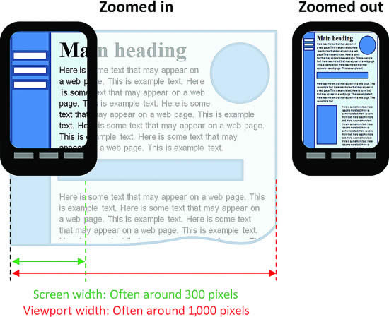
This strategy helps legacy websites reasonably appear on mobile devices. However, with responsive designs, we want the viewport and the device size to match exactly. We can clue mobile browsers into this desire by adding a specific meta tag to the <head> of the HTML:
<meta name="viewport" content="width=device-width, initial-scale=1.0">For a responsive design to work, it is critical that this <meta> element be included, and use the exact syntax specified.
Advanced CSS Layouts
Finally, responsive designs tend to make heavy use of two new CSS layout strategies - The Flexible Box Module (flex) and the CSS Grid Layout. These two layout tools allow for easily changing layouts within media queries - even allowing for the rearranging of elements!
Two great visual resources for learning the ins and outs of these layouts are CSS Trick’s A Complete Guide to Flexbox and A Complete Guide to Grid. In fact, you may want to bookmark these now.