Cascading Style Sheets
Making web pages pretty since 1994.
Making web pages pretty since 1994.
Style sheets are collections of rules for modifying how a SGML document appears. Cascading Style Sheets (CSS) are the specific implementation adopted by the W3C for HTML.
The core concept of CSS is that defines rules altering the appearance of HTML elements that can be selectively applied. These rules are held in a document (the style sheet) and are applied in a well-defined priority order (the cascading part of CSS).
As of CSS Version 3, CSS technologies were split into separate modules allowing them to be revised and maintained separately. Each module adds or extends features to those defined in CSS Version 2, in order to maintain backwards compatibility.
The CSS standards, along with many other web technologies, are maintained by the World-Wide-Web Consortium (abbreviated W3C), stakeholders who create and maintain web standards. The full drafts of the Cascading Style Sheets standards can be found here w3c’s CSS page.
CSS properties consist of key-value pairs separated by a colon (:). For example:
color: red
indicates that the styled HTML elements should be given a red color.
Multiple properties are separated by semicolons (;), i.e.:
color: red;
background-color: green;
Rules are CSS properties grouped within curly braces ({}) and proceeded by a CSS selector to identify the HTML element(s) they should be applied to:
p {
  color: red;
  background-color: green;
}
In this example, all paragraph elements (<p>) should have red text on a green background (how festive!).
And difficult to read!
Some properties have multiple forms allowing for some abbreviation. For example, the CSS property:
border: 1px solid black
is a short form for three separate border-related properties:
border-width: 1px;
border-style: solid;
border-color: black;As new features are considered for inclusion in CSS, browsers may adopt experimental implementations. To separate these from potentially differing future interpretations, these experimental properties are typically prefixed with a browser-specific code:
For example, most browsers adopted the box-shadow property before it achieved candidate status, so to use it in the Mozilla browser at that point you would use:
-moz-box-shadow: black 2px 2px 2px
To make it work for multiple browsers, and future browsers when it was officially adopted, you might use:
-webkit-box-shadow: black 2px 2px 2px;
-moz-box-shadow: black 2px 2px 2px;
-ms-box-shadow: black 2px 2px 2px;
box-shadow: black 2px 2px 2px;
The browser will ignore any properties it does not recognize, hence in Chrome 4, the -webkit-box-shadow will be used and the rest ignored, while in Chrome 10+ the box-shadow property will be used.
You should always place the not-prefixed version last, to override the prefixed version if the browser supports the official property.
The Mozilla Developer Network maintains a wiki of comprehensive descriptions of CSS properties and at the bottom of each property’s page is a table of detailed browser support. For example, the box-shadow property description can be found at: https://developer.mozilla.org/en-US/docs/Web/CSS/box-shadow. By combining the css property name and the keyword mdn in a Google search, you can quickly reach the appropriate page.
In the example from the previous section, we saw:
p {
  color: red;
  background-color: green;
}
Here the p is a CSS Selector, which tells us what elements on the page the CSS rules should be applied to.
The most basic CSS selectors come in several flavors, which we’ll take a look at next. Simple selectors are a string composed of alphanumeric characters, dashes (-), and underscores (_). Certain selectors also use additional special characters.
Type selectors apply to a specific type of HTML element. The p in our example is a type selector matching the paragraph element.
A type selector is simply the name of the HTML element it applies to - the tag name from our discussion of HTML element structure.
A class selector is a proceeded by a period (.), and applies to any HTML element that has a matching class attribute. For example, the CSS rule:
.danger {
  color: red;
}
would apply to both the paragraph and button elements:
<h1>Hello</h1>
<p class="danger">You are in danger</p>
<button class="danger">Don't click me!</button>
as both have the class danger. A HTML element can have multiple classes applied, just separate each class name with a space:
<p class="danger big-text">I have two classes!</p>An ID selector is proceeded by a hash (#) and applies to the HTML element that has a matching id attribute. Hence:
<p id="lead">This paragraph has an id of "lead"</p>would be matched by:
#lead {
  font-size: 16pt;
}
It is important to note that the id attribute should be unique within the page. If you give the same id to multiple elements, the results will be unpredictable (and doing so is invalid HTML).
The asterisk (*) is the universal selector, and applies to all elements. It is often used as part of a reset - CSS rules appearing at the beginning of a CSS document to remove browser-specific styles before applying a site’s specific ones. For example:
* {
  margin: 0;
  padding: 0;
}
sets all element margins and paddings to 0 instead of a browser default. Later rules can then apply specific margins and padding.
The attribute selector is wrapped in square brackets ([]) and selects HTML elements with matching attribute values, i.e.:
[readonly] {
  color: gray;
}
will make any element with a readonly attribute have gray text. The value can also be specified exactly, i.e.
[href="www.k-state.edu"]or partially. See MDN’s documentation for details.
Simple selectors can be used in conjunction for greater specificity. For example, a.external-link selects all <a> elements with a class of external-link, and input[type=checkbox] selects all <input> elements with an attribute type set to checkbox.
Pseudo-class selectors are proceeded with a single colon (:), and refer to the state of the element they modify. Pseudo-classes must therefore be appended to a selector.
The most commonly used pseudo-class is :hover, which is applied to an element that the mouse is currently over. Moving the mouse off the element will make this selector no longer apply. For example, a:hover applies only to <a> elements with the mouse directly over them.
Another extremely useful pseudo-class is :nth-child(), which applies to the nth child (specify as an argument), i.e. ul:nth-child(2) will apply to the second child of any unordered list. Additionally, tr:nth-child(odd) will apply to the odd-numbered rows of a table.
Additional pseudo-classes can be found in the MDN documentation
Combinators can be used to combine both simple and compound selectors using an operator.
The plus symbol (+) can be used to select an adjacent sibling HTML element. To be siblings, the first element must be followed by the second, and both must be children of a shared parent. I.e.:
h1 + p {
  font-weight: bold;
}
will bold all paragraphs that directly follow a first-level header.
The tilde symbol (~) also selects a sibling, but they do not need to be adjacent, just children of the same parent. The first element must still appear before the second (just not immediately after).
The greater than symbol (>) selects elements that are direct children of the first element. For example:
p > a {
  font-weight: bold;
}
Will bold all anchor elements that are direct children of a paragraph element.
A space ( ) selects elements that are descendants of the first element.
Finally, we can apply the same rules to a collection of selectors by separating the selectors with commas, i.e.:
a, p, span {
  font-family: "Comic Sans", sans-serif;
}
Applies Comic Sans as the font for all <a>, <p>, and <span> elements.
An interesting newer development in CSS is the development of psuedo-elements, selectors that go beyond the elements included in the HTML of the page. They are proceeded by two colons (::). For example, the ::first-letter selector allows you to change the first letter of a HTML element. Thus:
p:first-child::first-letter {
  font-size: 20px;
  font-weight: bold;
  float: left;
}
creates drop caps for all initial paragraphs.
A second use of pseudo-elements is to create new elements around existing ones with ::before or ::after. For example:
a.external-link::after {
 content: url(external-link-icon.png);
}
Would add the external-link-icon.png image after any <a> elements with the external-link class.
More information can be found in the MDN Documentation.
There are multiple ways CSS rules can be applied to HTML elements. A document containing CSS rules can be attached to a HTML document with a <link> element, embedded directly into the html page with a <style> element, or applied directly to a HTML element with the style attribute. Let’s look at each option.
The <link> HTML element can be used to link the HTML page it appears in to a text file of CSS rules. These rules will then be applied to the HTML elements in the HTML document.
The <link> element should provide a hypertext reference attribute (href) providing a location for the linked document, and a relationship attribute (rel) describing the relationship between the HTML document and the stylesheet (hint: for a stylesheet the relationship is "stylesheet"). If either of these attributes is missing or invalid, the stylesheet’s rules will not be used.
For example, if the stylesheet is in the file styles.css, and our page is page.html, and both reside at the root of our website, the <link> element would be:
<link href="/styles.css" rel="stylesheet" type="text/css"/>
By placing our CSS rules in a separate file and linking them to where they are used, we can minimize code duplication. This approach also contributes to the separation of concerns. Thus, it is widely seen as a best practice for web development.
The <link> element should be declared within the <head> element.
The <style> HTML element can be used to embed CSS rules directly in an HTML page. Its content is the CSS rules to be applied. The <style> element must be a child of a <head> or <body> element, though placing it into the <head> element is best practice.
To repeat our earlier efforts of making paragraphs have red text and green backgrounds with the <style> element:
<!DOCTYPE html>
<html>
  <head>
    <title>Style Element Example</title>
    <style>
      p {
        color: 'red';
        background-color: 'green';
      }
    </style>
  </head>
  <body>
  </body>
</html>
Unlike the <link> element approach, CSS rules defined with the <style> element can only be used with one file - the one in which they are embedded. Thus, it can lead to code duplication. And embedding CSS rules in an HTML document also breaks the separation of concerns design principle.
However, there are several use cases for which the <style> element is a good fit. Most obvious is a HTML page that is being distributed as a file, rather than hosted on a server. If the style information is embedded in that HTML file, the recipient only needs to receive the one file, rather than two. Similarly, emails with HTML bodies typically use a <style> element to add styling to the email body.
The style attribute of any HTML element can be used to apply CSS rules to that specific element. These rules are provided a string consisting of key/value pairs separated by semicolons. For example:
<p>This is a normal paragraph.</p>
<p style="color: orange; font-weight: bold">But this one has inline styles applied to it.</p>
Produces this:
This is a normal paragraph.
But this one has inline styles applied to it.
It should be clear from a casual glance that inline styles will make your code more difficult to maintain, as your styling rules will be scattered throughout a HTML document, instead of collected into a <style> element or housed in a separate CSS file. And while inline styles can be used to selectively modify individual elements, CSS selectors (covered in the previous section) are typically a better approach.
Where inline styles make the most sense is when we manipulate the elements on the page directly using JavaScript. Also, the browser developer tools let us manipulate inline styles directly, which can be helpful when tweaking a design. Finally, some component-based design approaches (such as React) pivot the Separation of Concerns design principle to break a user interface into autonomous reusable components; in this approach content, style, and functionality are merged at the component level, making inline styles more appropriate.
Now that we know how to create an apply CSS rules to our HTML, let’s explore how they actually are used. A core idea behind CSS is the cascade algorithm, the cascading in cascading style sheets (CSS). The core idea behind the cascade algorithm is that as the browser encounters and parses CSS rules, they are collectively applied to the elements they match with. If the same rule is set multiple times, say color, the cascading algorithm decides which should be applied.
Before we look at how cascades work, we need to understand the sources of CSS rules. So far we’ve focused on CSS rules created by the author - that is, the developer of the website. But there are two other sources of CSS rules, the user-agent and the user.
The term user-agent is the technical way of describing the browser (or other software) that is accessing the webpage. Most browsers define default styles for their browser that help differentiate them from other browsers. These default values work well for less-styled websites, but for a carefully designed user experience, an unexpected rule can wreak havoc.
For this reason, many websites use a special CSS file that overrides user-agent sheets to allow the website to start from a well-known state. This is possible because rules appearing in sheets defined by the author override those defined in user-agent sheets.
The author is simply the creator of the webpage. Thus, rules included with the <link> or <style> elements, as well as in-line styles defined on the elements themselves with the style attribute, fall into this category. Author styles always override user-agent styles, and are overridden in turn by user styles.
The user is the actual user of the browser, and they can add their own styles to an HTML document in a variety of ways. One that you may encounter the most is adding custom styles with the web developer tools. One that you may have not encountered, but is common in practice, are styles intended to make the website easier for the vision impaired to read and work with. Increasing or decreasing text size with [CTRL] + [+] or [CTRL] + [-] is a simple example of this kind of tool.
Thus, the general order of rules applied by the cascading algorithm is user-agent, author, user. However, there is also the !important directive that can be added to CSS rules, i.e.:
p {
  color: red !important
}
which escalates them to a higher pass. Also, CSS animations and transitions are evaluated at their own priority level. Thus, we have a cascade order of:
| Origin | Importance | |
|---|---|---|
| 1 | user agent | normal |
| 2 | user | normal |
| 3 | author | normal |
| 4 | animations | |
| 5 | author | !important |
| 6 | user | !important |
| 7 | user agent | !important |
| 8 | transitions |
A more thorough discussion of the Cascade Algorithm can be found in the MDN Documentation.
But what about two rules that conflict that appear in the same level of the cascade order? For example, given the CSS:
p {
  color: black;
}
.warning {
  color: red;
}
what would the color of <p class="warning"> be? You might say it would be red because the .warning CSS rules come after the p rules. And that would be true if the two rules had the same specificity. An example of that is:
p {color: black}
p {color: red}
Clearly the two selectors are equivalent, so the second color rule overrides the first. But what if we go back to our first example, but flip the rules?
.warning {
  color: red;
}
p {
  color: black;
}
In this case, the color is still red, because .warning is more specific than p. This is the concept of specificity in CSS, which has an actual, calculable value.
The specificity of a selector increases by the type and number of selectors involved. In increasing value, these are:
Each of these is trumped by in-line CSS rules, which can be thought of as the highest specificity. Thus, we can think of specificity as a 4-element tuple (A, B, C, D):

We can then calculate the values of A,B,C,D:
Finally, there is an extra trick that we can use when we are having trouble creating enough specificity for a CSS rule. We can add !important to the rule declaration. For example:
p {
  color: red !important;
}
The !important rule overrides any other CSS declarations, effectively sidestepping specificity calculations. It should be avoided whenever possible (by making good use of specificity), but there are occasions it might be necessary.
If multiple rules use !important, then their priority is again determined by specificity amongst the group.
When specifying CSS rules, you often need to provide a unit of measurement. Any time you provide a measurement in a CSS rule, you must provide the units that measurement is being expressed in, following the value. For example:
#banner {
  width: 300px;
}
sets the width of the element with id banner to 300 pixels.
There are actually a lot of units available in CSS, and we’ll summarize the most common in this section.
Absolute units don’t change their size in relation to other settings, hence the name. The most common one encountered is pixels, which are expressed with the abbreviation px.
Other absolute measurements include:
q, mm, cm, in which are quarter-millimeters, millimeters, centimeters, and inches. These are rarely used outside of rules applied when printing websites.
pt, pc which are points and picas, common units of measurement within the publishing industry.
Relative units are based on (relative to) the font-size property of the element, the viewport size, or grid container sizes. These are expressed as proportions of the units they are relative to, i.e.
.column {
  width: 30vw;
}
sets columns to be 30% of the width of the viewport.
Setting dimensions of borders, padding, and margins using units relative to font sizes can help make these appear consistent at different resolutions. Consider a margin of 70px - it might make sense on a screen 1024 pixels wide, but on a phone screen 300 pixels wide, nearly half the available space would be margins!
Units that are relative to the font-size include:
em one em is the font-size of the current element (which may be inherited from a parent).rem is same measurement as em, but disregards inherited font sizes. Thus, it is more consistent with intent than em, and is largely displacing its use (though it is not supported in older versions of Internet Explorer).The units vh and vw refer to 1/100th the height of the viewport (the size of the screen space the page can appear within).
It may be helpful to think of these as the percentage of the viewport width and viewport height, and they work much like percentages. However, in specifying heights, the vh will always set the height of an element, unlike %.
The Grid model introduced the fraction (fr) unit, which is a fraction of the available space in a grid, after subtracting gutters and items sized in other units. See the discussion of the CSS Grid Model or CSS Tricks’ A Complete Guide to Grid for more details.
You can also specify percentages (%) for many properties, which are typically interpreted as a percentage of the parent element’s width or height. For example:
.column {
  width: 33%;
}
sets elements with the class column to be 33% the width of their parent element. Similarly:
.row {
  height: 20%;
}
sets elements with a class row to be 20% the height of their parent element.
If the parent does not have an explicit width, the width of the next ancestor with a supplied width is used instead, and if no ancestor has a set width, that of the viewport is used. The same is almost true of the height; however, if no elements have a specified height, then the percentage value is ignored - the element is sized according to its contents, as would be the case with height: auto.
One of the most frustrating lessons beginning HTML authors must learn is the difference in how width and height are handled when laying out a webpage. Using the percentage unit (%) to set the height almost never accomplishes the goal you have in mind - it only works if the containing element has a set height.
While there are hacky techniques that can help, they only offer partial solutions. It is usually best not to fight the design of HTML, and adopt layouts that can flow down the page rather than have a height determined at render time.
CSS provides a number of useful functions that calculate values. Functions are written in the form name(arg1, arg2, ...) and are provided as values to CSS properties. For example, this CSS code sets the height of the content area to the available space on screen for content after subtracting a header and footer:
#header {height: 150px}
#footer {height: 100px}
#content {
  height: calc(100vh - 150px - 100px);
}
Here 100vh is the height of the viewport, and the header and footer are defined in terms of pixels.
You might want to apply the box-sizing: border-box on these elements if they have padding and borders, or these additional dimensions will need to be included in the calculation. See the section on the CSS Box Model for more details.
CSS provides a number of useful math functions:
As you have seen above, the calc() function can be used to calculate values by performing arithmetic upon values. These values can be in different units (i.e. calc(200px - 5mm) or even determined as the webpage is being interpreted (i.e. calc(80vw + 5rem)). See the MDN Documentation for more details.
CSS also provides min() and max() function, which provide the smallest or largest from the provided arguments (which can be arbitrary in number). As with calc(), it can do so with interpretation-time values.
The clamp() function clamps a value within a provided range. Its first argument is the minimum value, the second the preferred value, and the third the max. If the preferred value is between the min and max value, it is returned. If it is less than the minimum, the min is instead returned, or if it is greater than the maximum, the max value is returned.
Several CSS functions are used to create an modify colors. These are described in the CSS Color section.
Many CSS functions exist for specifying CSS transforms. See the MDN documentation for details.
CSS allows for filters to be applied to images. More details can be found in the Mozilla Documentation.
Finally CSS uses counters to determine row number and ordered list numbers. These can be manipulated and re-purposed in various ways. See the MDN Documentation for details.
CSS also has many properties that can be set to a color, i.e. color, background-color, border-color, box-shadow, etc. Colors consist of three or four values corresponding to the amount of red, green, and blue light blended to create the color. The optional fourth value is the alpha, and is typically used to specify transparency.
Colors are stored as 24-bit values, with 8 bits for each of the four channels (R,G,B,and A), representing 256 possible values (2^8) for each channel.
Colors can be specified in one of several ways:
Color Keywords like red, dark-gray, chartreuse correspond to well-defined values. You can find the full list in the MDN Documentation.
Hexidecimal Values like #6495ed, which corresponds to cornflower blue. The first two places represent the red component, the second the green, and the third the blue. If an additional two places are provided the last pair represents the alpha component. Each pair of hex values can represent 256 possible values (16^2), and is converted directly to the binary color representation in memory.
RGB Function a third option is to use the RGB() CSS function. This take decimal arguments for each channel which should be in the range 0-255
HSL Function a fourth option is the HSL() function, which specifies colors in terms of an alternative scheme of hue, saturation, and lightness.
RGBA and HSLA Functions finally, the RGBA() and HSLA() functions take the same arguments as their siblings, plus a value for the alpha channel between 0 and 1.
As the original purpose of the World-Wide-Web was to disseminate written information, it should be no surprise that CSS would provide many properties for working with text. Some of the most commonly employed properties are:
font-family defines the font to use for the text. Its value is one or more font family or generic font names, i.e. font-family: Tahoma, serif, font-family: cursive or font-family: "Comic Sans". Font family names are typically capitalized and, if they contain spaces or special characters, double-quoted.font-size determines the size of the font. It can be a measurement or a defined value like x-small.font-style determines if the font should use its normal (default), italic, or oblique face.font-weight determines the weight (boldness) of the font. It can be normal or bold as well as lighter or darker than its parent, or specified as a numeric value between 1 and 1000. Be aware that many fonts have a limited number of weights.line-height sets the height of the line box (the distance between lines of text). It can be normal, or a numeric or percent value.text-align determines how text is aligned. Possible values are left (default), center, right, justify, along with some newer experimental values.text-indent indents the text by the specified value.text-justify is used in conjunction with text-align: justify and specifies how space should be distributed. A value of inter-word distributes space between words (appropriate for English, Spanish, Arabic, etc), and inter-character between characters (appropriate for Japanese, Chinese, etc).text-transform can be used to capitalize or lowercase text. Values include capitalize, uppercase, and lowercase.An important consideration when working with HTML text is that not all users will have the same fonts you have - and if the font is not on their system, the browser will fall back to a different option. Specifying a generic font name after a Font Family can help steer that fallback choice; for example:
body {
  font-family: Lucinda, cursive
}
will use Lucinda if available, or another cursive font if not. Some guidelines on font choice:
cursive fonts should typically only be used for headings, not body text.serif fonts (those with the additional feet at the base of letters) are easier to read printed on paper, but more difficult on-screen.sans-serif fonts are easier to read on-screen; your body text should most likely be a sans-serif.Fonts that commonly appear across computing platforms and have a strong possibility of being on a users’ machine have come to be known as web-safe. Some of these are:
Alternatively, if you wish to use a less-common font, you can provide it to the browser using the @font-face rule. This defines a font and provides a source for the font file:
@font-face {
  font-family: examplefont;
  src: url('examplefont.ttf');
}
You can then serve the font file from your webserver.
Be aware that distributing fonts carries different legal obligations than distributing something printed in the font. Depending on the font license, you may not be legally allowed to distribute it with the @font-face rule. Be sure to check.
As the browser lays out HTML elements in a page, it uses the CSS Box Model to determine the size and space between elements. The CSS box is composed of four nested areas (or outer edges): the content edge, padding edge, border edge, and margin edge.
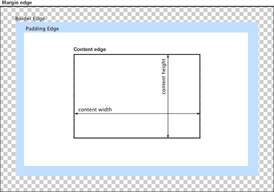
Content Area contains the actual content of the element (the text, image, etc). By default the CSS properties width and height set this size, and the min-width, min-height, max-width, max-height constrain it (but see the discussion of box-sizing below).
Padding Area provides space between the content and the border of the HTML element. It is set by the padding properties (padding-top, padding-right, padding-bottom, and padding-left, as well as the shorthand versions).
Border Area draws a border around the element. Its size is set with the border-width property. Borders can also be dashed, inset, and given rounded corners. See the MDN Border Documentation for details.
Margin Area provides the space between the border and neighboring elements. Its size is set with the margin properties (margin-top, margin-right, margin-bottom, and margin-left, as well as the shorthand versions).
By default, an element’s width and height properties set the width and height of the content area, which means any padding, borders, and margins increase the size the element consumes on-screen. This can be altered with the box-sizing CSS rule, which has the following possible values:
content-box (the default) the width and height properties set the content area’s size.
border-box includes the border area, padding area, and content area within the width and height of the HTML element. Using the CSS rule box-sizing: border-box therefore makes it easier to lay out elements on the page consistently, without having to do a lot of by-hand calculations.
The background property allows you to set a color, pattern, or image as the background of an HTML element. By default the background extends to the border-area edge, but can be altered with the border-clip property to border-box, padding-box, or content-box. See the MDN Background Documentation for more details on creating backgrounds.
The box-shadow property allows you to set a drop shadow beneath the HTML element. See the MDN Documentation for more details on creating box shadows.
By default HTML elements are positioned in the page using the HTML flow algorithm. You can find a detailed discussion in the MDN Documentation. However, you may want to override this and manually position elements, which you can do with the CSS properties position, left, top, right, and bottom.
First, we need to understand the positioning context, this is basically the area an element is positioned within. The left, top, right, and bottom properties affect where an element appears within its context.
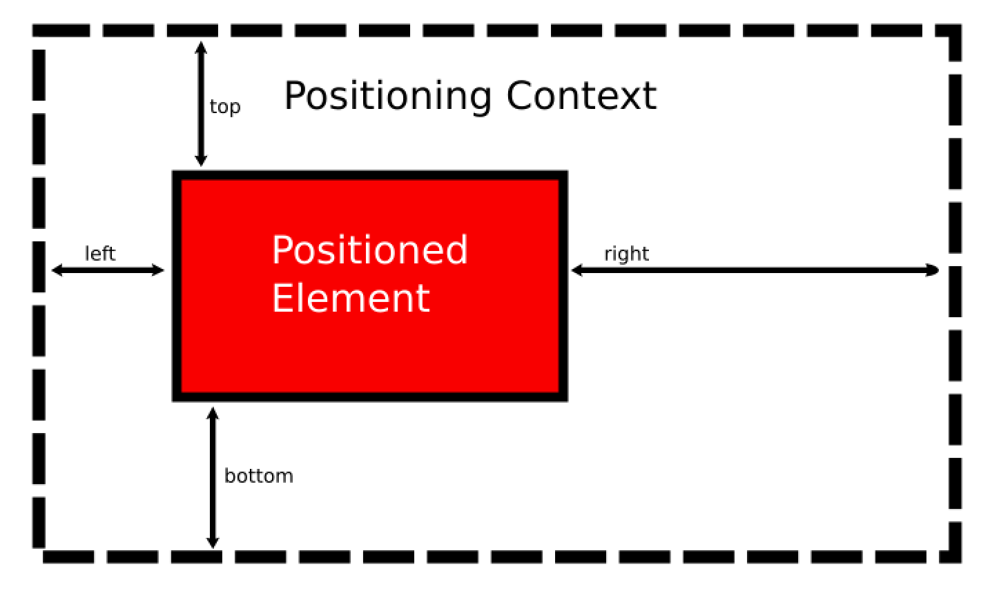
You can think of the context as a box. The left property determines how far the element is from the left side of this context, the top from the top, right from the right, and bottom from the bottom. These values can be numeric or percentage values, and can be negative.
If you define both a left and right value, only the left value will be used. Similarly, if both top and bottom are supplied, only top is used. Use the width and height properties in conjunction with the positioning rules if you want to control the element’s dimensions.
What constitutes the positioning context depends on the elements position property, which we’ll discuss next.
The position property can be one of several values:
The default position value is static. It positions the element where it would normally be in the flow and ignores any left, top, right, and bottom properties.
The position value of relative keeps the element where it would normally be in the flow, just like static. However, the left, top, right, and bottom properties move the element relative to this position - in effect, the positioning context is the hole the element would have filled with static positioning.
Assigning the position property the value of absolute removes the element from the flow. Other statically positioned elements will be laid out as though the absolutely positioned element was never there. The positioning context for an absolutely positioned element is its first non-statically positioned ancestor, or (if there is none), the viewport.
A common CSS trick is to create a relatively-positioned element, and then absolutely position its children.
Assigning the value of fixed to the position property also removes the element from the flow. However, its positioning context is always the viewport. Moreover, if the page is scrolled, a fixed-position element stays in the same spot (an absolutely-positioned element will scroll with the page). This makes fixed position elements useful for dialogs, pop-ups, and the like.
By default, elements are drawn in the browser in the order they appear in the HTML. Thus, if we position an element further down the page, it may be covered up by succeeding elements. The z-index property provides us with a fix. The default value for the z-index is 0. Items with a larger z-index are drawn later.
We often speak of the separation of concerns principle in the context of web development as setting up the roles of HTML, CSS, and JavaScript. In this understanding, HTML provides the organization of content, CSS provides for the presentation of the content, and JavaScript provides for user interaction.
In this understanding, CSS is often tasked with the role of laying out elements on the page. More specifically, it overrides the default flow of HTML elements (see our earlier discussion of block vs. inline elements in the HTML chapter), altering how the browser arranges elements on the page.
The three most common layout approaches currently used in modern web development are float, flexbox, and grid, named for the CSS properties that make them possible. You may also encounter absolutely positioned layouts and table layouts, so we will briefly discuss those as well.
By default a block-level element stretches the width of the parent element, and its siblings are pushed underneath. The CSS float property changes this behavior, allowing a block-level element to determine an appropriate width based on its content (or CSS rules), and allows sibling elements to “float” next to it. Thus, the float property has two primary values, left and right (as well as none and inherit). A float: left causes the element to float on the left side of its containing element, and a float: right floats it to the right.
A common use is to float figures and images within a page, i.e.:
<img src="images/Marc-Andreessen.jpg"/>
<p>People tend to think of the web as a way to get information or perhaps as a place  to carry out ecommerce. But really, the web is about accessing applications. Think of each website as an application, and every single click, every single interaction with that site, is an opportunity to be on the very latest version of that application.</p>
<span>- Marc Andreessen</span>
People tend to think of the web as a way to get information or perhaps as a place to carry out ecommerce. But really, the web is about accessing applications. Think of each website as an application, and every single click, every single interaction with that site, is an opportunity to be on the very latest version of that application.
- Marc AndreessenBut floats can also be used to create multi-column layouts, i.e.:
.column {
  float: left;
  box-sizing: border-box;
  width: 33%;
  height:60px;
  color: white;
}
.one {background-color: red}
.two {background-color: blue; margin-left: 0.5%; margin-right: 0.5%}
.three {background-color: green}<div class="column one">
One
</div>
<div class="column two">
Two
</div>
<div class="column three">
Three
</div>Finally, when discussing the float property, we need to discuss the clear property as well. The clear property is used to move an element below the margin area of any floating elements - basically resetting the flow of the page. It can selectively clear floating elements in the left, right, or both directions. In our column example, if we wanted to add a footer that stretched across all three columns, we’d use something like:
footer {
  clear: both;
  border: 1px solid black;
}<div class="column one">
One
</div>
<div class="column two">
Two
</div>
<div class="column three">
Three
</div>
<footer>Footer</footer>The Flexible Box Layout (flexbox) is intended to offer a greater degree of control and flexibility (pun intended) to laying out web pages. Its purpose is to provide an efficient way of laying out, aligning, and distributing elements within a container. Moreover, it can carry out this goal even when the sizes of the child elements are unknown or dynamic.
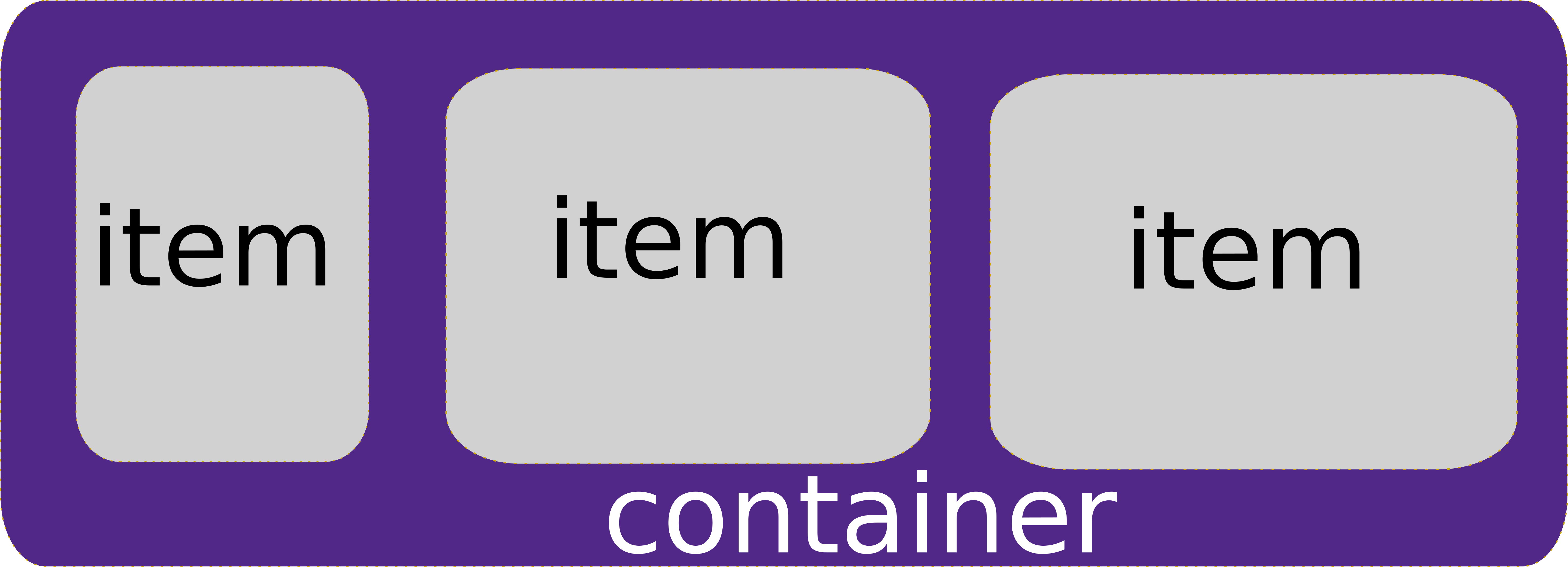
The flexbox model therefore consists of two levels of nested elements - an outer container element and inner content item elements (the content item elements themselves can have many decendent elements). The flexbox properties help define how the content item elements are laid out within their parent container.
An HTML element is turned into a flexbox container by assigning it the display property of flex. Additional properties then control how the elements contained within our new flexbox container are laid out. These include:
flex-direction determines how items are laid out, either row, column, row-reverse, or column-reverse.
wrap-items determines if the row or column wraps into multiple rows or columns. Its values are no-wrap (default), wrap, and wrap-reverse.
justify-content defines how content items will be aligned along the main axis of the container (horizontal for rows, and vertical for columns). Its possible values are: flex-start, flex-end, center, space-between, and space-around.
align-items defines how content items are aligned along the secondary axis of the container (vertically for rows, and horizontally for columns). Its possible values are flex-start (the default), flex-end, center, stretch, and baseline.
Thus, to re-create our three-column layout with flexbox, we would:
.three-column {
  display: flex;
  flex-direction: column;
  justify-content: space-between;
}
.three-column > div {
  color: white;
  width: 33%;
  height: 60px;
}<div class="three-column">
<div class="one">
one
</div>
<div class="two">
two
</div>
<div class="three">
three
</div>
</div>The items can also override these default behaviors with item specific CSS attributes, including allowing items to grow with flex-grow or shrink with flex-shrink to fit available space, override the default order of elements using the order attribute, or altering the alignment on a per-item basis with align-self.
You can also create very sophisticated layouts by nesting flex containers within flex containers. A superb reference for working with flexbox is CSS Tricks’ Complete Guide to Flexbox.
While flexbox brought a lot of power to the web designer, the Grid model is an even more powerful way to lay out web elements. Unlike flex, which focuses on arranging elements along one dimension (provided you aren’t wrapping), the Grid model lays elements out in a two-dimensional grid.
An HTML element is turned into a grid container by assigning it the display property of grid or inline-grid. Then you define the size of the grid elements with the properties grid-template-rows and grid-template-columns. These attributes take the measurements of the columns and rows. I.e. we could recreate our three-column layout with grid-template-columns: 33% 33% 33%. But the grid is far more powerful than that. Let’s expand our three-column layout to have a separate header and footer:
div#page {
  display: grid;
  grid-template-columns: 1fr 1fr 1fr;
  grid-template-rows:  150px auto 100px;
}
Here we use the unit fr for our column width, which proportions out the “free space remaining” after hard-coded measurements are accounted for. In our case, this translates into three equal-sized columns taking up all the available space.
For rows, our first row will be the header, and we’ve sized it to 150 pixels. The next row is our content, we’ve used the auto value to allow it to size appropriately to contain its content. The last row is the footer, and we’ve sized it to 100 pixels.
Our HTML would look like:
<div id="page">
  <header></header>
  <div id="one"></div>
  <div id="two"></div>
  <div id="three"></div>
  <footer></footer>
</div>
And finally, we can assign these HTML elements to part of the grid with the grid-area property, which takes the values for row start, column start, row end, column end separated by slashes (/) to define the area of the grid they span:
header {
  grid-area: 1/1/2/4;
  border: 1px solid black;
}
#one {
  grid-area: 2/1/3/2;
  height: 50px;
  background-color: red;
}
#two {
  grid-area: 2/2/3/3;
  height: 200px;
  background-color: blue;
}
#three {
  grid-area: 2/3/3/4;
  height: 300px;
  background-color: green
}
footer {
  grid-area: 3/1/4/4;
  border: 1px solid black;
}We’ve really only scratch the surface of what is possible with the grid. Items can be aligned and justified, and tweaked in other ways, just as with flexbox. Names can be assigned to grid rows, grid columns, and grid areas, and used to make the resulting CSS more approachable and understandable.
A great resource for deeper exploration is CSS Trick’s Complete Guide to Grid.
At one point in the 1990’s, it was common practice for graphic designers to create a web page using graphic design software, export it as an image, and then slice up the image. These pieces were then used as the background-image property of a table cell, and text was overlaid on this graphics as the contents of the cell.
Thankfully, this practice has largely been abandoned, but you may still encounter it from time to time. There are some very real problems with the approach: if you increase the text size on the page, the cells may expand beyond the size of their background image, and the seams between the images will open up. Also, if a screen reader is used, it will often read content out-of-order and will describe the portions in terms of table rows and columns.
In web design best practices, tables should only be used for tabular data. If you desire to use this kind of slice-and-dice approach, use the Grid instead. It provides the same control over the placement of text, and can use a single background-image on the container element or multiple background images for the items.
Modern websites are displayed on a wide variety of devices, with screen sizes from 640x480 pixels (VGA resolution) to 3840x2160 pixels (4K resolution). It should be obvious therefore that one-size-fits-all approach to laying out web applications does not work well. Instead, the current best practice is a technique known as Responsive Web Design. When using this strategy your web app should automatically adjust the layout of the page based on how large the device screen it is rendered on.
At the heart of the responsive CSS approach is a CSS technique called media queries. These are implemented with a CSS media at-rule (at-rules modify the behavior of CSS, and are preceded by an at symbol (@), hence the name). The original purpose of the media rule was to define different media types - i.e. screen and print, which would be selectively applied based on the media in play. For example, the rule:
@media print {
  img {
    display: none;
  }
  .advertisement {
    display: none;
  }
}
would hide all images and elements with the advertisement class when printing a web page. You can also specify the media type with the media attribute in a <link> element, i.e. <link href="print.css" rel="stylesheet" media="print"> would apply the rules from print.css only when printing the website.
However, the real usefulness of the @media rule is when it is combined with a media query, which determines if its nested rules should be applied based on some aspect of the display.
The media query consists of:
@media keywordscreen, but could also be all, print, and speech)and, or logically or-ed using a ,. More advanced queries can use not to invert an expression (if using not you must specify the media type).{}An example media query that applies only when the screen is in portrait orientation (taller than it is wide) is:
@media (orientation: portrait) {
  /* rules for a portrait orientation go here... */
}
The most commonly used media features are max-width, min-width, max-height, min-height, and orientation. The sizes can be specified in any CSS unit of measurement, but typically px is used. The orientation can either be portrait or landscape.
We can also combine multiple queries into a single @media rule:
@media (orientation: landscape) and (max-width: 700px) {
  /* rules for a landscape-oriented screen 700 pixels or less wide */
}
The and in this case works like a logical and. You can also use the not keyword, which inverts the meaning of the query, or commas ,, which operate like a logical or.
More details on the use of media queries can be found in the MDN Documentation on the subject.
By combining the use of media queries, and CSS layout techniques, you can drastically alter the presentation of a web application for different devices. Most browser development tools will also let you preview the effect of these rules by selecting a specific device size and orientation. See the Chrome Device Mode documentation, Safari Developer Documentation, and Firefox Responsive Design Mode Documentation for details.
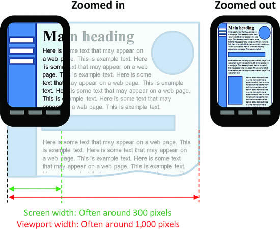
The media query size features relate to the viewport, a rectangle representing the browser’s visible area. For a desktop browser, this is usually equivalent to the client area of the browser window (the area of the window excluding the borders and menu bar). For mobile devices, however, the viewport is often much bigger than the actual screen size, and then scaled to fit on the screen:
This strategy helps legacy websites reasonably appear on mobile devices. However, with responsive designs, we want the viewport and the device size to match exactly. We can clue mobile browsers into this desire by adding a specific meta tag to the <head> of the HTML:
<meta name="viewport" content="width=device-width, initial-scale=1.0">For a responsive design to work, it is critical that this <meta> element be included, and use the exact syntax specified.
Finally, responsive designs tend to make heavy use of two new CSS layout strategies - The Flexible Box Module (flex) and the CSS Grid Layout. These two layout tools allow for easily changing layouts within media queries - even allowing for the rearranging of elements!
Two great visual resources for learning the ins and outs of these layouts are CSS Trick’s A Complete Guide to Flexbox and A Complete Guide to Grid. In fact, you may want to bookmark these now.