This example project builds on the previous RESTful API project by scaffolding a frontend application using Vue.js. This will become the basis for a full frontend for the application over the next few projects.
Project Deliverables
At the end of this example, we will have a project with the following features:
A single page frontend application running in Vue 3.
Now that we’ve built a solid backend for our application through our RESTful API, we can now start on building the frontend application that our users will actually interface with. There are many techniques and tools for writing frontend applications that we’ve covered in this course, but for this project we’re going to introduce once more, called Vue. Vue is very similar to React, but uses a more streamlined syntax and structure. It also includes a lot of built-in features that make writing an interactive web application a very seamless experience. As with any tool we’ve introduced in this set of tutorials, it is always a good idea to review the Vue Documentation as we add features to our application.
To get started, we’ll use the create-vue application to help scaffold our project. This is very similar to the express-generator tool we used to create the initial version of our backend application.
So, in the base of our project directory (not in the server folder, but in the folder that contains the server folder), we’ll run the following command:
$ npm create vue@latest
When we run this command, it will first install the package if it isn’t already installed, and then we’ll be asked a series of questions about what type of project we want to create. As of the writing of this tutorial, here are the current questions and the answers we’ll give:
Project name: client (this will place our code in the client directory; we’ll update our project name later)
Features to include: Router, Pinia, Vitest, ESLint, Prettier (use arrow keys to navigate and spacebar to select each item, then press enter to confirm the selections)
Install Oxlint for faster linting: No
All told, we should end up with output that looks like this:
┌  Vue.js - The Progressive JavaScript Framework
│
◇  Project name (target directory):
│  client
│
◇  Select features to include in your project: (↑/↓ to navigate, space to select, a to toggle all, enter to confirm)
│  Router (SPA development), Pinia (state management), Vitest (unit testing), ESLint (error prevention), Prettier (code formatting)
│
◇  Install Oxlint for faster linting? (experimental)
│  No

Scaffolding project in /workspaces/lost-communities-solution/client...
│
└  Done. Now run:

   cd client
   npm install
   npm run format
   npm run dev

| Optional: Initialize Git in your project directory with:

   git init && git add -A && git commit -m "initial commit"
So, once we’ve created our project, we can follow the last few steps to install the libraries needed for our project and then run it. First, we’ll navigate to the client directory:
$ cd client
Then, we’ll install our libraries, run the code formatter, and then start our application in development mode:
$ npm install
$ npm run format
$ npm run dev
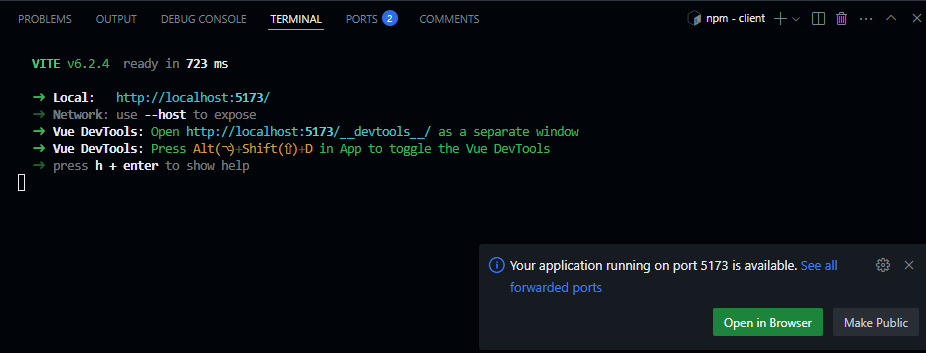
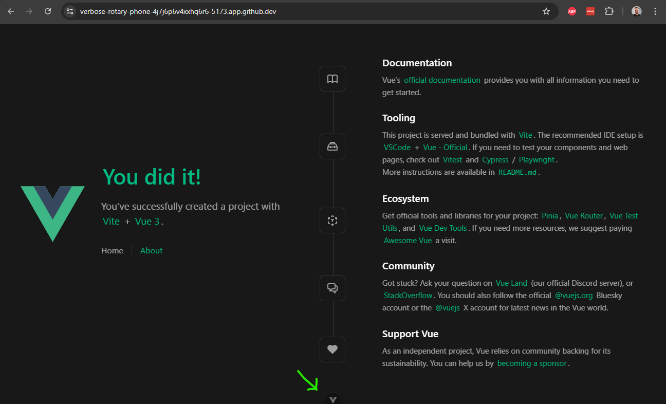
If everything works correctly, we should see our application start on port 5173 (the default port used by Vite, which is the tool used to run our Vue application in development mode). We can click the “Open in Browser” button that appears at the bottom of the page to load our application:
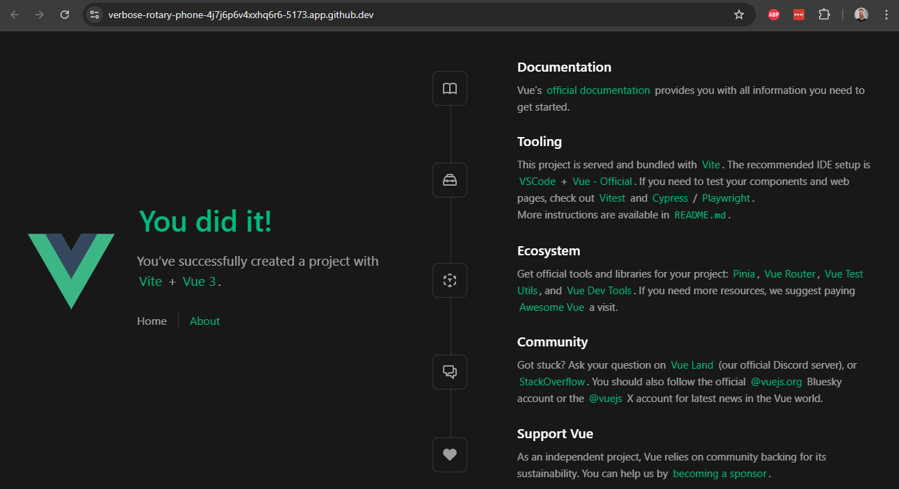
When we click that button to load our sample application, we should see the default Vue starter page appear in our browser:
There we go! That’s the basic steps to install Vue and create a scaffolded application. Let’s take a look at some of the files it created and what they do.
As always, we can stop our running application using CTRL + C.
Exploring the Vue Application
Our Vue application includes a lot of files and folders by default. Here’s a brief list of what we find:
.vscode - this folder contains settings specific to the VS Code IDE. However, since they are in a subfolder of our project, they aren’t actively being used. If we want to make use of these settings, we can move the folder up to the top level. We won’t do that for this project, but it is an option worth exploring to see what settings are recommended by the developers behind the Vue project.
public - this folder contains all public resources for our application, such as images. Right now it just contains a default favicon.ico file.
src - all of the code for our application is contained in this folder. We’ll explore this folder in depth throughout this tutorial.
.editorconfig - this contains some editor settings that can be recognized by various text editors and IDEs. To use this in VS Code, we can install the EditorConfig for VS Code extension. Again, we won’t do that for this project, but it is an option to explore.
.gitattributes and gitignore - these are settings files used by Git. We should already be familiar with the functionality provided by a .gitignore file!
.prettierrc.json - this is the settings file for the Prettier code formatter. It includes some useful default settings for that tool.
eslint.config.js - this is the settings file for the ESLint tool. Similar to Prettier, it includes some default settings.
index.html - this is the actual index page for our final application. In general, we won’t need to make many changes to it unless we need to change some of the headers on that page.
jsconfig.json - this file contains the settings used by the JavaScript language service used to build the project through Vite (we’ll look at this a bit later)
package.json and package-lock.json - these are the familiar Node package files we’ve already seen in our backend application.
vite.config.js - this is the configuration file for the Vite tool, which we use to run our application in development mode, and also the tool we’ll use to build the deployable version of our application.
vitest.config.js - this is the configuration file for the Vitest testing framework, which we’ll cover a bit later as we develop our application.
Customizing the Project
Before we move ahead, let’s update the contents of our package.json file to match the project we’re working on. We should at least set the name and version entries to the correct values, and also take a look at the various scripts available in our application:
On the next page, we’ll start building our frontend application! As we add features, we’ll slowly modify some of these configuration files to make our application easier to develop and work with.
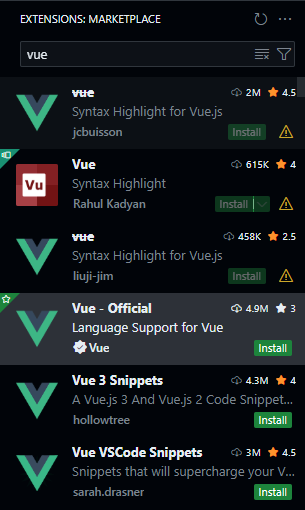
First, in our Visual Studio Code instance, we will want to install the Vue - Official extension. Make sure it is the correct, official plugin, since there are many that share a similar name in the VS Code extension marketplace:
As always, you can click the gear next to the install button to add it to the devcontainer.json file, so it will be installed in future devcontainers built using this repository. Once it is installed, you may have to restart VS Code or refresh the page in GitHub Codespaces to get it activated. Once it is, you should see syntax highlighting enabled in any files with the vue file extension.
Exploring the Source Code
Let’s take a quick look inside of the src folder to explore the structure of our application a bit more in detail.
assets - this folder contains the static assets used throughout our application, such as CSS files, SVG images, and other items that we want to include in the build pipeline of our application.
components - this folder contains the individual components used to make up our application, as well as any associated tests. We can see that there are a few components already created in our application, including HelloWorld.vue, TheWelcome.vue, and WelcomeItem.vue.
router - this folder contains the Vue Router for our application. This is similar to the routers we’ve already used in our Express application, but instead of matching URLs to endpoints, this tool is used to match URLs to different views, or pages, within our application.
stores - this folder contains the Pinia stores for our application. These stores are used to share data between components in our application, and also to connect back to our backend application through our RESTful API.
views - this folder contains the overall views of our application, sometimes referred to as pages. As we can see, right now there is a HomeView.vue and an AboutView.vue, which correspond to the Home and About pages of our existing application.
App.vue - this file contains the top-level Vue component of our entire web application. It contains items that are globally included on every page.
main.js - this file is the “setup” file for the Vue application, very similar to the app.js file in our Express backend application. This is where a variety of application settings and plugins can be installed and configured.
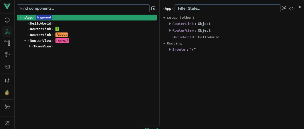
So, let’s look at our existing page in development mode. It includes a feature called Vue DevTools which is a great way to explore our application. That feature can be found by clicking the small floating button at the bottom of the page:
It will open a tool that allows us to explore the components loaded into our page, the various views available, router settings, Pinia stores, and so much more:
We can also use the component inspector (the button with the target icon that appears when we hover over the Vue DevTools button) to see how the individual components are laid out on our page, just by hovering over them:
As we work on this project, this tool will be a very helpful asset for debugging our application, or simply understanding how it works. Now is a great time to play around with this tool on our scaffolded starter page before we start building our own.
Cleaning Out the Starter Project
To start building our own application, let’s first start by clearing out the default content included in our scaffolded application. So, we can delete the following files:
assets\* - everything in the assets folder
components\* - everything in the components folder
stores\* - everything in the stores folder
Now, let’s customize a few files. First, we’ll update the index.html file to include our project’s title as the header:
Now, let’s take a look at our application in development mode to see what it looks like without all of the extra structure and style applied by the scaffolding:
$ npm run dev
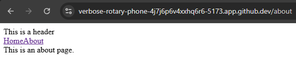
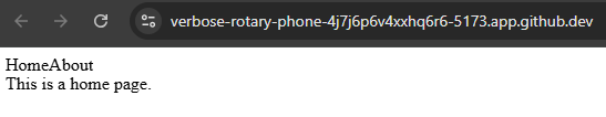
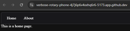
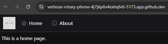
As we can see, our application is now much simpler - almost too simple! However, we can still click the links to move between the Home and About pages, and see our URL update accordingly:
This is a great baseline for our application. Now we can start building up a structure for an application that has the features we’d like to see.
Architecture of a Vue Page
The vast majority of the work we’ll be doing in Vue is creating Single File Components, which are the building blocks for larger views and pages within our application. We’ll be using the Composition API Style, which is a newer and more powerful API. It can be a bit daunting for new developers, but it provides a flexible way to define our components. It also differs from the API style used by React, making it a bit of a learning curve for experienced React developers. We can see more discussion in the Composition API FAQ document.
A Vue single file component using the Composition API style looks like this (taken from the Vue Documentation):
This file is divided into three important sections:
<script setup> - this section defines the functionality of the component, and is written using JavaScript syntax. It is the rough equivalent of the code you might put in a function called as the page begins to load in a traditional website. This code is used to configure all of the reactive elements of the user interface, as we’ll see later.
<template> - this section defines the structure of the component, and uses a syntax similar to HTML. It gives the overall layout of the component and includes all sub-components and other HTML elements. It also shows where the reactive elements defined earlier appear on the page itself.
<style> - this section defines the style of the component, and it is written using CSS. These style elements can be applied throughout the application, or we can use a <style scoped> section to ensure these styles are only applied within this component.
As we can see, Vue follows the concept of Separation of Concerns just like we’ve seen in our earlier projects. However, instead of having a global HTML template, a site-wide CSS file, and a single JavaScript file for an entire page, each component itself contains just the HTML, CSS, and JavaScript needed for that single component to function. In this way, we can treat each component as a stand-alone part of our application, and as we learn more about how to build useful and flexible components, we’ll see just how powerful this structure can be.
On the next page, we’ll start building our simple web application by using a few pre-built components from a Vue component library.
One of the first things we may want to install in our application is a library of ready-to-use components that we can use to build our application with. This can drastically cut down on the time it takes to build an application, and these libraries often come with a range of features that make our applications both user-friendly and very accessible.
While there are many different libraries to choose from, we’ll use the PrimeVue library. PrimeVue has a very large set of components to choose from, and it is very easy to install and configure. So, let’s follow the installation guide to install PrimeVue in a project that uses Vite as it’s build tool.
First, we’ll need to install the library through npm:
$ npm install primevue @primeuix/themes
Once that is installed, we need to configure the plugin by adding it to our main.js file. We’ve added some documentation comments to this file to make it easily readable, but the new lines added for PrimeVue are highlighted below:
There we go! Now we can use PrimeVue components anywhere in our application. So, let’s start building a basic framework for our application’s overall look and feel.
PrimeVue Menubar Layout
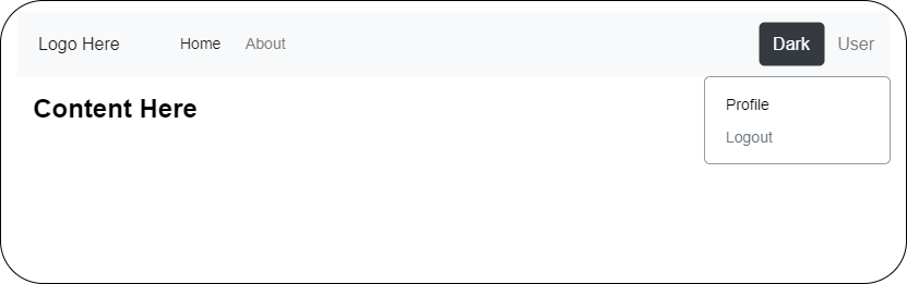
A good first step is to build the overall layout that all of our views, or pages, within our application will use. This is similar to the concept of template inheritance that we’ve explored already in this class. For this application, let’s assume we want to have a static menu bar at the top of the page that has links to other pages or views in our application across the top. On the left of that bar, we should have some settings buttons that allow the user to switch between light or dark mode, as well as a button to access their user profile and either login or logout of the system. A quick wireframe sketch of this site might look something like this:
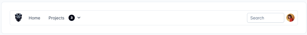
As it just so happens, as we look through the PrimeVue list of components, we see a component named Menubar that has an example template that looks very similar to our existing wireframe:
So, let’s see if we can explore how to use this PrimeVue component and make it fit our desired website structure. Of course, there is always a little give and take to using these libraries; while we may have a very specific view or layout in mind, often it is best to let the component library guide us a bit by seeing that it already does well, and then adapting it for our needs.
Using a PrimeVue Component
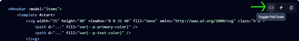
In the PrimeVue documentation, each component comes with several example templates we can use. However, by default, the template code that is visible on the website is only a small part of the whole component that is actually displayed on the screen. So, we may first want to click the “Toggle Full Code” button that appears in the upper right corner of the code panel when we hover over it - that will show us the full example component:
Once we have that full code, we can explore how it works in greater detail, comparing the code shown in each example to the component we see placed above it.
For this component, we’ll build it up from scratch just to see how each part works. Once we are more familiar with PrimeVue components and how they are structured, we can copy these code examples easily into our own components and tweak them to fit our needs.
First, let’s create a new folder named layout in our src/components folder, and then inside of that we can create a new Vue component named TopMenu.vue. Let’s start by adding the two basic sections of any Vue component, the <script setup> and <template> sections:
<scriptsetup>
/**
* @file Top menu bar of the entire application
* @author Russell Feldhausen <russfeld@ksu.edu>
*/</script>
<template>
<div>
ContentHere </div>
</template>
Next, we can import the PrimeVue Menubar component in the <script setup> section of our component, and place it in the <template> section:
<scriptsetup>
/**
* @file Top menu bar of the entire application
* @author Russell Feldhausen <russfeld@ksu.edu>
*/// Import Components
importMenubarfrom'primevue/menubar';
</script>
<template>
<div>
<Menubar:model="items" />
</div>
</template>
In the documentation, it says that we need to include a collection of menu items as the model of the component. A component’s model can be thought of as the viewmodel part of the Model View ViewModel architecture pattern we may already be familiar with. In effect, PrimeVue components take care of the view part of this pattern, and we must adapt our existing data model by providing a viewmodel reference that fits the structure expected by the component.
In this instance, we want our menubar to include links to the home and about pages, or views, of our application, so those will be the items we’ll include. To do this, we need to create a reactive state element in Vue using the ref() function. For more about how reactivity works in Vue, consult the Vue Documentation.
<scriptsetup>
/**
* @file Top menu bar of the entire application
* @author Russell Feldhausen <russfeld@ksu.edu>
*/// Import Libraries
import { ref } from"vue";
// Import Components
importMenubarfrom'primevue/menubar';
// Declare State
constitems=ref([
{
label:'Home',
},
{
label:'About',
}
])
</script>
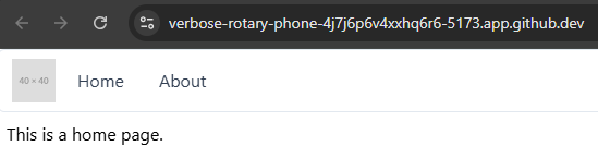
At this point we’ve created a basic structure for our TopMenu component, so let’s add it to our site and see what it looks like. To do this, we’ll import it into our App.vue file and add it to the template there (we’ll end up removing some content and libraries that were already included in that file, which is fine):
Now, let’s run our application in development mode and see what it looks like:
$ npm run dev
When we navigate to our page in the browser, we should see this layout:
While this page still seems very simple, we can use the Vue DevTools to explore the page and see that our components are present. However, they aren’t really styled the way we see in the PrimeVue examples. This is because we need to install a PrimeVue Theme that provides the overall look and feel of our application.
PrimeVue Themes
PrimeVue includes several built-in themes that we can choose from:
Aura - this theme is the one developed exclusively for PrimeVue
Lara - this theme is based on the styling found in Bootstrap
Nora - this theme is inspired by several enterprise applications that use a simple style
We can explore what each of these themes look like by selecting them on the PrimeVue documentation website - the whole website can be themed and styled based on any of the built-in options available in PrimeVue, which is a great way for us to see what is available and how it might look on our page.
For this application, we’ll use the Aura theme, so let’s install it in our main.js file:
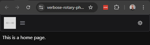
Now, when we restart our application and refresh the page, we should see a bit of a different look and feel on the page:
Now we see that our PrimeVue Menubar component is beginning to look like what we expect. We also notice that it is now using a dark theme, which is the default for the web browser this screenshot was taken from - we’ll explore how to add a toggle for light and dark themes later in this tutorial.
PrimeVue Component Slots
Many PrimeVue components include slots, which are specific locations within the template where additional components or HTML code can be added. For example, the Menubar component include two slots, #start and #end, which allow us to add content at the beginning and end of the Menubar, respectively. We can use these by simply adding a <template> inside of our Menubar component with the appropriate label. So, let’s do that now!
We know we want to add a logo to the beginning of the Menubar, so let’s start there. We don’t currently have a logo graphic for our application, but we can include a placeholder image for now.
Our Vue project already includes an instance of the Vue Router, which is used to handle routing between the various views, or pages, within our application. So, let’s take a minute to explore how the Vue Router works and how we can integrate it into our Menubar so we can move between the various views in our application.
First, let’s take a look at the existing src/router/index.js file that is generated for our application. We’ve added some comments to the file to make it easier to follow:
/**
* @file Vue Router for the application
* @author Russell Feldhausen <russfeld@ksu.edu>
* @exports router a Vue Router
*/// Import Libraries
import { createRouter, createWebHistory } from'vue-router'// Import Views
importHomeViewfrom'../views/HomeView.vue'constrouter=createRouter({
// Configure History Mode
history:createWebHistory(import.meta.env.BASE_URL),
// Configure routes
routes: [
{
path:'/',
name:'home',
component:HomeView,
},
{
path:'/about',
name:'about',
// route level code-splitting
// this generates a separate chunk (About.[hash].js) for this route
// which is lazy-loaded when the route is visited.
component: () => import('../views/AboutView.vue'),
},
],
})
exportdefaultrouter
The major portion of this file we should look at is the routes array that is present inside of the createRouter function. Each object in the routes array matches a URL path with a Vue component, typically a view or page, that should be displayed at that route. We can also give each route a helpful name to make things simple.
At the bottom, we see an example of splitting the routes up into chunks, which allows parts of our application to be lazy-loaded as the user accesses them. This can make our application initially load faster, since the default chunk is smaller, but when the user accesses a part of the application that is lazy-loaded, it may pause briefly while it loads that chunk. We’ll go ahead and leave it as-is for this example, just to see what it looks like. We’ll revisit this when we build our application for production.
Finally, we also see that this file configures a History Mode for our application. This describes how the URL may change as users move through our application. We’ll leave this setting alone for now, but as we integrate this application into our backend, we may revisit this setting. The Vue Router documentation describes the different history modes and where they are most useful.
This file is imported in our main.js file and added to the Vue application so we can reference it throughout our application.
Using the Router
Now, let’s go back to our App.vue file, and see where it uses the Vue Router:
In the template, we see a RouterView element - this is where the different views are placed in our overall application. For example, when the user wants to navigate to the /about URL, the RouterView component here will contain the AboutView component that is referenced in the router’s routes array for that URL path. It is very straightforward!
While we’re here, let’s briefly update the structure of this page to match a proper HTML file:
This template structure properly includes a <header>, <nav>, <main>, and <footer> elements that make up the overall structure of the page. For right now, we are only using the <nav> and <main> elements, but we can always add additional content to this overall page layout over time.
Navigating to a View
Finally, let’s go back to our TopMenu component and add routing to each link. There are many ways to do this, but one simple way is to add a command property to each menu item, which is a callback function that is executed when the button on the menu is activated. This function can simply use the Vue router to navigate to the correct view:
<scriptsetup>
/**
* @file Top menu bar of the entire application
* @author Russell Feldhausen <russfeld@ksu.edu>
*/// Import Libraries
import { ref } from"vue";
import { useRouter } from"vue-router";
constrouter=useRouter();
// Import Components
importMenubarfrom'primevue/menubar';
// Declare State
constitems=ref([
{
label:'Home',
command: () => {
router.push({ name:'home' })
}
},
{
label:'About',
command: () => {
router.push({ name:'about' })
}
}
])
</script>
Now, when we run our application, we should be able to click the buttons in our menu and navigate between the two views, or pages, of our application!
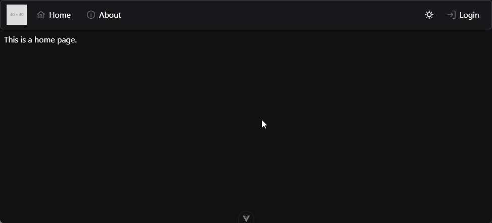
While PrimeVue includes many helpful components we can use in our application, we may still need to adjust the layout a bit to match our expected style. For example, right now the content of each of our views has no margins or padding around it:
While we can easily write our own CSS directives to handle this, now is a good time to look at one of the more modern CSS libraries to see how to make this process much easier. Tailwind CSS is a utility-based CSS framework that works really well with component libraries such as PrimeVue. So, let’s integrate it into our application and use it to help provide some additional style and structure to our application.
First, we’ll follow the installation guide to install Tailwind CSS with Vite by installing the library and the Vite plugin for Tailwind using npm:
$ npm install tailwindcss @tailwindcss/vite
Next, we’ll need to add the Tailwind CSS plugin to our Vite configuration file vite.config.js:
Now that Tailwind is installed, we need to reference it in a global CSS file that is part of our application. So, let’s create a file main.css in our src/assets folder with the following content:
We’ll also need to reference that file in our main.js file:
/**
* @file Main Vue application
* @author Russell Feldhausen <russfeld@ksu.edu>
*/// Import Libraries
import { createApp } from'vue'import { createPinia } from'pinia'importPrimeVuefrom'primevue/config';
importAurafrom'@primeuix/themes/aura';
// Import CSS
import'./assets/main.css'// Import Vue App
importAppfrom'./App.vue'// -=-=- other code omitted here -=-=-
Finally, with all of that in place, we can restart our application in development mode and begin using Tailwind CSS to style our application:
$ npm run dev
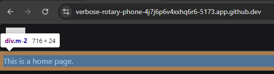
Let’s look back at our App.vue file and add a simple margin to the <div> containing our application using the Tailwind CSS Margin utility. To do this, we simply add a class="m-2" attribute to that <div> element:
Now, when we reload that page, we should see that the <div> inside of the <main> element of our page has a small margin around it. We can confirm this using the inspector tool in our browser:
There we go! Now we have full access to Tailwind CSS in our application, which will allow us to easily control the layout and spacing of the various components in our application.
Many applications today include two default themes, a “light-mode” and a “dark-mode,” and users can choose which theme they receive by default through settings made either in their browser or their operating system. However, we can easily provide functionality in our application for users to override that setting if desired. The instructions for configuring a proper dark mode setup can be found in the Tailwind CSS Documentation, the PrimeVue Documentation, and a helpful article describing how to detect the user’s preference and store it in the browser’s local storage. We’ll integrate all three of these together into our component.
To begin, we need to configure both PrimeVue and Tailwind to look for a specific CSS class applied to the base <html> element to control whether the page is viewed in dark mode or light mode. For this application, we’ll use the class app-dark-mode. So, let’s start by adding it to the PrimeVue configuration in main.js:
// -=-=- other code omitted here -=-=-
// Install Libraries
app.use(createPinia())
app.use(router)
app.use(PrimeVue, {
// Theme Configuration
theme: {
preset:Aura,
options: {
darkModeSelector:'.app-dark-mode',
}
}
});
// -=-=- other code omitted here -=-=-
Next, we’ll use the same class in a setting for Tailwind in the base main.css file:
After we add that class to our <html> element, the page should immediately refresh if we are running in development mode, and now it should be using dark mode:
Let’s go ahead and remove that class from the index.html file so that our default is still light mode. Instead, we’ll learn how to control it programmatically!
Let’s create a component we can use in our website to control dark mode. That allows the user to easily switch between light and dark modes, and we can even save their preference for later. So, let’s start by creating a component in the file src/components/layout/ThemeToggle.vue with the following content:
There is a lot going on in this component, so let’s break it down piece by piece to see how it works. First, here are the three major components of the <script setup> section.
We start by importing the ref function from Vue. This is the function that allows us to create reactive state variables in our application. A reactive state variable stores data that will be updated as our application runs, and each update will cause the user interface to be updated and redrawn for the user. Therefore, by storing our data in these reactive state variables, it allows our web application to react to changes in state. We can learn more about this in the Reactivity Fundamentals page of the Vue Documentation
Next, we create a reactive variable named theme that initially stores the string 'light-theme'. We’ll use this variable to keep track of the current theme being used by our site.
After that, we create a function called toggleDarkMode that does exactly what the name implies. First, it looks at the value of the theme reactive state variable. Notice that we must call the value property to access or update the value stored in the reactive state variable in our <script setup> section. Then, based on the value it finds, it will swap the theme by updating the value of the theme variable itself, and also either adding or removing the app-dark-mode class to the document.documentElement part of our page. According to the MDN Web Docs, that is typically the root element of the document, so in our case, it is the <html> element at the top level of our application.
Next, here is how the template is structured:
Inside of the template, we wrap everything in a <div>. While this is not strictly necessary, it helps to ensure everything inside of the component is properly isolated. We can also apply Tailwind CSS classes to this outermost <div> in order to adjust the size, layout, or spacing of our component.
Next, we include an <a> element, which we should remember represents a clickable link. However, instead of including an href attribute, we instead use the Vue @click attribute to attach a click handler to the element. This is covered in the Event Handling section of the Vue documentation. So, when this link is clicked, it will call the toggleDarkMode function to switch between light and dark mode.
Inside of the <a> element, we have two <span> elements. The first one uses a v-if directive to check and see if the theme is currently set to the 'light-theme' value. This is an example of Conditional Rendering, one of the most powerful features of a web framework such as Vue. Effectively, if that statement resolves to true, this element will be rendered on the page. If it is false, the element will not be rendered at all. Likewise, the following span containing a v-else directive will be rendered if the first one is not, and vice-versa. Effectively, only one of these two <span> elements will be visible, based on whether the theme is currently set to 'light-theme' or 'dark-theme'.
As we can see, there is a lot going on even in this very simple component!
Adding Components to our Menu Bar
Now that we’ve created our ThemeToggle component, let’s add it to our existing menu bar by updating the code in our TopMenu.vue component:
<scriptsetup>
// -=-=- other code omitted here -=-=-
// Import Components
importMenubarfrom'primevue/menubar'importThemeTogglefrom'./ThemeToggle.vue'// -=-=- other code omitted here -=-=-
</script>
<template>
<div>
<Menubar:model="items">
<template#start>
<imgsrc="https://placehold.co/40x40"alt="Placeholder Logo" />
</template>
<template#end>
<ThemeToggle />
</template>
</Menubar>
</div>
</template>
To add a component, we first must import it in our <script setup> section. Then, we can add it to our template just like any other HTML element. In this case, we want it at the end of our menu bar, so we are adding it to the #end slot of that PrimeVue component.
Now, if we load our page, we should see a button in the upper right that allows us to switch between light and dark theme!
User Preference & Storage
Let’s quickly improve our dark theme toggle by adding two additional features:
Right now, the website defaults to the light theme. However, if the user has already set a system preference for dark theme, we should respect that if no other setting has been made.
Once the user changes the theme, we should remember that setting so the next time they reload the page, it will use their previous setting if one is found.
So, let’s update the code in our ThemeToggle.vue component to handle these cases by adding a few more functions:
<scriptsetup>
/**
* @file Button to toggle light/dark theme
* @author Russell Feldhausen <russfeld@ksu.edu>
*/// Import Libraries
import { ref } from'vue'// Declare State
consttheme=ref('light-theme')
// Get Theme from Local Storage
constgetTheme=function() {
returnlocalStorage.getItem('user-theme')
}
// Get Theme from User Preference
constgetMediaPreference=function() {
consthasDarkPreference= window.matchMedia('(prefers-color-scheme: dark)').matchesif (hasDarkPreference) {
return'dark-theme' } else {
return'light-theme' }
}
// Set theme and store
constsetTheme=function() {
console.log("Setting theme to "+theme.value)
if (theme.value=='light-theme') {
document.documentElement.classList.remove('app-dark-mode');
} else {
document.documentElement.classList.add('app-dark-mode');
}
localStorage.setItem('user-theme', theme.value)
}
// Toggle theme value
consttoggleDarkMode=function() {
if (theme.value=='light-theme') {
theme.value='dark-theme' } else {
theme.value='light-theme' }
setTheme()
}
theme.value=getTheme() ||getMediaPreference()
setTheme()
</script>
Let’s go through the updates to this code and explore how it works:
First, we have a new function getTheme that will read a value from our browser’s Local Storage. This allows our application to save some settings that will be stored across browser sessions, as long as the user does not clear their browser’s cache. For this application, we will store the user’s chosen theme using the 'user-theme' key in local storage.
Next, we have another function to get the user’s preferred theme by checking for a prefers-color-scheme entry in the browser’s settings. If it finds that the setting is set to dark it will return our dark-theme option; otherwise it will default to the light-theme.
After that, we created a new setTheme function that will set the theme to whatever value is stored currently in the theme reactive state variable. It does so by adding or removing the class from the <html> element, and then it stores the current theme in the users’s local storage. We added a console.log statement so we can debug this setup using our browser’s console.
We also updated our toggleDarkMode function to just change the value stored in the theme reactive state variable, and then it calls the new setTheme() function to actually update the theme.
Finally, at the bottom of the <script setup> section are two lines of code that actually call these functions to determine the correct theme and set it. First, we call getTheme() to see if the user has a theme preference stored in local storage. If so, that value is returned and stored in the theme reactive state. However, if there is no entry in the browser’s local storage, that function will return a null value, and the or || operator will move on to the second function, getMediaPreference() which will try to determine if the user has system preference set. That function will always return a value. Finally, once we’ve determined the correct theme to use, the setTheme function is called to update the browser. It will also store the theme in the browser’s local storage, so the user’s setting will be remembered going forward.
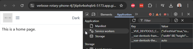
With all of that put together, our application should now seamlessly switch between light and dark themes, and remember the user’s preference in local storage so that, even if they refresh the page, their theme preference will be remembered. We can see this setup in action below, showing both the page and the browser’s local storage. Notice that the browser prefers a dark theme, so the first time the page is refreshed, it will automatically switch to dark mode. From there, the user can change the theme and refresh the page, and it will remember the previous setting.
Finally, if we want our dark mode selector button to look like it belongs on our menubar, we can add a few PrimeVue CSS classes so that it matches the existing buttons. These are all explained on the Menubar Theming tab of the PrimeVue documentation.
All of the PrimeVue CSS classes are prefixed with a p-, so they are easy to find and remember. So, even if we create our own components, we can still easily style them to match the other PrimeVue components by paying close attention to the CSS classes used.
Enabling Tooltips
One thing we included in the template above is the v-tooltip.bottom directive, which will give a small popup for the user letting them know a bit more information about what that button does. To enable it, we need to import that PrimeVue feature into our main.js file:
One of the best ways to make a web user interface very accessible and easy to use is by using globally recognized icons to represent certain actions, such as logging in, returning to the homepage, and editing items. Thankfully, there is an easy to use icon package that works directly with PrimeVue called PrimeIcons that we can use in our project. So, let’s quickly install that icon pack and see how we can use it in our application.
Other Icon Packs
PrimeVue also supports using other icon packs, such as FontAwesome as described in the PrimeVue Custom Icons documentation. For this project, we’ll keep things simple by only using PrimeIcons, but it is relatively easy to add additional icons from other sources as needed.
First, let’s install the PrimeIcons package using npm:
$ npm install primeicons
Next, we can simply import the required CSS file in our src/assets/main.css file:
With those two changes in place, we can start to use icons throughout our application! We can find a full list of icons available in the PrimeIcons Documentation.
Menubar Icons
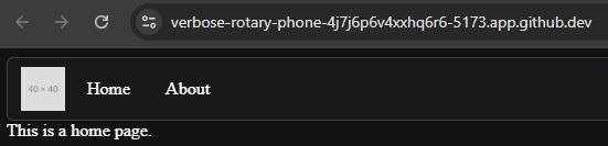
Let’s start by adding a couple of icons to our menu bar links. Thankfully, the PrimeVue Menubar Component recognizes an icon attribute that we can add to each of the menu items, so this is an easy update to make:
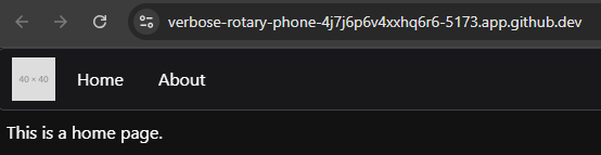
With that change, we now see those icons appear next to our buttons on the menu bar:
Theme Toggle Icons
We can also update our button to toggle the theme to just use icons! All we have to do is update the template to use icons instead of text:
<template>
<divclass="p-menubar-item">
<divclass="p-menubar-item-content">
<a@click="toggleDarkMode"class="p-menubar-item-link">
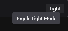
<spanv-if="theme == 'light-theme'"v-tooltip.bottom="'ToggleDarkMode'"class="p-menubar-item-label pi pi-moon" ></span>
<spanv-elsev-tooltip.bottom="'ToggleLightMode'"class="p-menubar-item-label pi pi-sun" ></span>
</a>
</div>
</div>
</template>
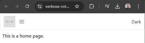
Here, we remove the text from within the <span> elements, and instead add the classes pi pi-moon for the button to switch to dark mode, and pi pi-sun to switch to light mode, respectively. Since we have enabled tooltips, it is still pretty easy for our users to figure out what these buttons do and how they work!
As we can see, adding some icons to our website makes it feel much simpler and easier to use, without a bunch of text cluttering up the interface!
Now is a great time to lint, format, and then commit and push our work!
The video adds an extra slash to the /auth route in the vite.config.js file when setting up a proxy. That slash should be removed.
Connecting to our RESTful API
Now that we have the basic structure of our application built and are becoming more familiar with both Vue and PrimeVue, let’s work on connecting to our backend RESTful API application and see if we can retrieve some data from our database. This is really the key feature that we want ensure works in our frontend application!
First, we need a way to run our backend application at the same time, and also we want to be able to connect to it directly through our frontend. So, let’s add a few features to our overall project to enable that connection.
VS Code Tasks
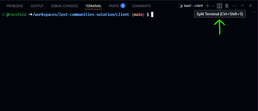
There are many ways that we can run both our frontend and backend applications simultaneously. One of the simplest is to open a second terminal in VS Code simply by clicking the “Split Terminal” button at the top right of the terminal, or by pressing CTRL+SHIFT+S to split our existing terminal.
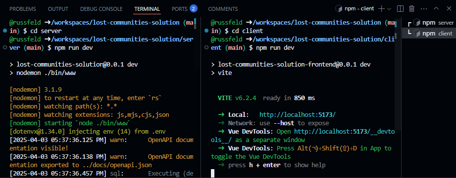
Once we have split the terminal window, we can run both parts of our application side-by-side by navigating to the correct directory and running the npm run dev command in each window:
However, that can get somewhat tedious to do all the time. Instead, we can just configure a VS Code Task that will handle this for us.
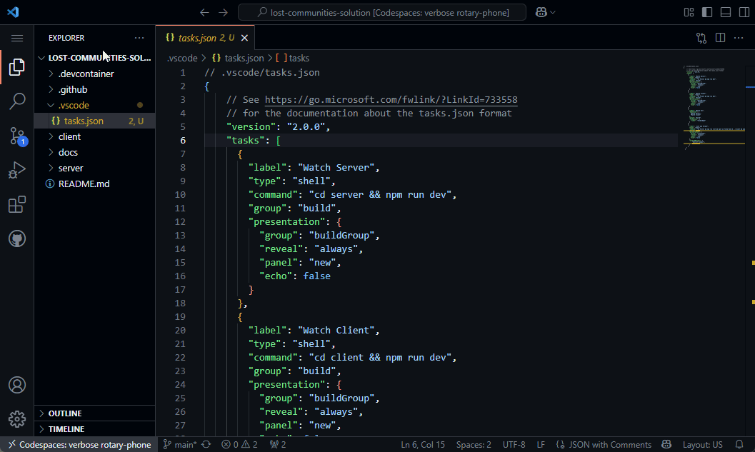
To do this, we should create a .vscode folder at the top level of our project (outside of the client and server folders we’ve been working on) if one doesn’t already exist. Inside of that folder, we’ll create a file called tasks.json with the following content:
// .vscode/tasks.json
{
  // See https://go.microsoft.com/fwlink/?LinkId=733558
  // for the documentation about the tasks.json format
  "version": "2.0.0",
  "tasks": [
    {
      "label": "Watch Server",
      "type": "shell",
      "command": "cd server && npm run dev",
      "group": "build",
      "presentation": {
        "group": "buildGroup",
        "reveal": "always",
        "panel": "new",
        "echo": false
      }
    },
    {
      "label": "Watch Client",
      "type": "shell",
      "command": "cd client && npm run dev",
      "group": "build",
      "presentation": {
        "group": "buildGroup",
        "reveal": "always",
        "panel": "new",
        "echo": false
      }
    },
    {
      "label": "Watch All",
      "dependsOn": [
        "Watch Server",
        "Watch Client"
      ],
      "group": "build",
      "runOptions": {
        "runOn": "folderOpen"
      }
    },
    {
      "label": "Lint and Format",
      "type": "shell",
      "command": "cd server && npm run lint && npm run format && cd ../client && npm run lint && npm run format",
      "group": "lint",
      "presentation": {
        "group": "lintGroup",
        "reveal": "always",
        "panel": "new",
        "echo": false
      },
      "problemMatcher": [
          "$eslint-compact",
          "$prettier"
      ]
    }
  ]
}
This file creates several tasks that we can use in our VS Code IDE:
Watch Server - this will run the backend Express server application.
Watch Client - this will run the frontend Vue client application.
Watch All - this will watch both the server and client in two new terminal windows.
Lint and Format - this will run linting and formatting for both the server and client. This is a helpful command to run before committing any code to GitHub.
Once that file is created and saved, we may need to refresh our GitHub Codespace window or restart VS Code for the changes to take effect. When we do, we should see our new Watch All task run automatically, since it was given the "runOn": "folderOpen" option. In most cases, this is the most effective option - our server and client will always be running, and we can easily restart each of them by typing either rs for the server (running in Nodemon) or just r for the client (running in Vite) without closing those terminals.
We can also access these tasks anytime from the VS Code Command Palette by pressing CTRL+SHIFT+P and searching for the “Tasks: Run Task” menu option, then selecting whichever task we want to run.
Vite Proxy
The second major feature we need to configure for our application is a proxy that allows our frontend application to access our backend RESTful API directly. In many typical development scenarios, we typically run our backend application on one port (such as port 3000, which if how our app is currently configured), and then we run our frontend application in a development server on a different port (such as 5173, the default port used by Vite). However, in this scenario, our frontend must include a hard-coded IP address and port to access our backend server in development mode.
In production, our frontend application and backend RESTful API server are generally running on the same system, so they will use the same IP address and port. So, to simplify things now, we can simulate that setup by adding a Proxy configuration to our frontend application’s development server running in Vite. In this way, our frontend application can connect directly back to the port it is running on (port 5173 in this example), and if the connection matches one that should be sent to the backend API server instead, it will be proxied to that application (running on port 3000). This greatly simplifies developing our application, since we don’t have to worry about the configuration changing between development mode and production.
So, to configure a proxy for Vite, we must modify our vite.config.js file in our client folder by adding a few additional settings:
In the new server section, we are including settings to proxy three different URL paths from our frontend to our backend:
/api - this will proxy all API requests
/docs - this allows us to easily access the OpenAPI docs on our frontend in development mode
/auth - this allows us to access the routes needed for authentication
As we can see, this covers pretty much all routes available on our backend RESTful API server. Also, we need to remember that these routes are unique to our backend server, so we cannot use these same URLs as virtual routes in our Vue router on the frontend; otherwise, we’ll have a conflict and our application may not work correctly.
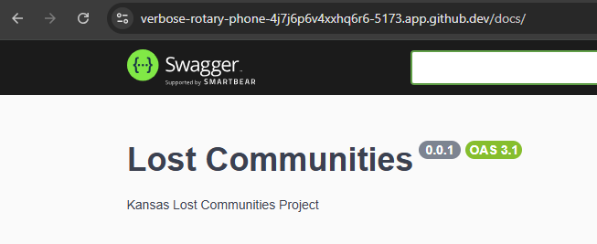
So, let’s test this by running both our client and server applications simultaneously, and then access the frontend application using port 5173 (or whatever port Vite is currently running our frontend application on). Once there, we should try to access the /docs URL. If it works, we know that our proxy is working correctly!
Notice in the screenshot above that the URL is running on port 5173 but it is able to access content that is running on port 3000 from our backend server. We can also see that it appears in the access logs on the backend server’s terminal, so we know it is working properly.
Making API Requests
Finally, let’s see how we can make an API request to our backend RESTful API server from our frontend application. First, we’ll need to install the Axios HTTP client library in our frontend application. While we can use the basic fetch commands that are available by default, we’ll quickly find that the extra features provided by Axios are worth adding an extra dependency to our application. So, let’s install it using npm in our client folder:
$ npm install axios
Next, let’s create a new Vue component we can use for simple testing. We’ll place this component in a file named TestApi.vue in the src/components/test folder:
<scriptsetup>
/**
* @file Test API Component
* @author Russell Feldhausen <russfeld@ksu.edu>
*/// Import Libraries
import { ref } from'vue'importaxiosfrom'axios'importCardfrom'primevue/card'// Create Reactive State
constapi_versions=ref([])
// Load API versions
axios .get('/api')
.then(function (response) {
api_versions.value=response.data })
.catch(function (error) {
console.log(error)
})
</script>
<template>
<div>
<Cardv-for="api_version in api_versions" :key="api_version.version">
<template#title>Version {{ api_version.version }}</template>
<template#content>
<p>URL: {{ api_version.url }}</p>
</template>
</Card>
</div>
</template>
In this component, we start by creating a reactive state variable called api_versions that is initially set to an empty array. Then, we use the Axios library to send a request to the /api URL on our server, which is being proxied to the backend RESTful API. If we receive a response back, we’ll go to the then function, which simply stores the data attached to the response in the api_versions reactive state variable, which should update our application as soon as it receives data. If there are any errors, we’ll enter the catch function and log those errors to the browser’s console.
In our template, we chose to use a PrimeVue Card, which is a very simple building block for our website to use. Since we want to include one card per API version, we are using a v-for Vue directive to allow us to iterate through a list of objects. This is discussed in detail in the List Rendering section of the Vue documentation. We are also binding a unique key to each element, which in this case is the version attribute for each api_version element.
To use this component, let’s just add it to our AboutView.vue page for testing:
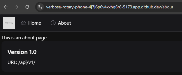
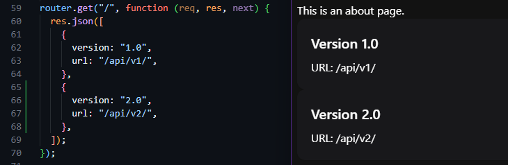
Now, when we visit our application and click on the link for the About page, we should see a list of API versions appear:
We can even test this by changing the API versions that are returned by our backend server and see the changes directly on our frontend application!
There we go! We can now request data from our backend RESTful API server, and it will provide a valid response. However, right now the only URL path that does not require authentication is the /api path, so we still need to add a way for users to authenticate themselves and get a valid JWT to access the rest of the API. We’ll cover that on the next part of this tutorial.
The time has come for us to finally handle user authentication on our frontend application. There are several different pieces that need to work together seamlessly for this to work properly, so let’s explore what that looks like and see what it takes to get our users properly authenticated so they can access secure data in our application.
Pinia Store
First, since we want the user to be able to request a JWT that can be used throughout our application, it would make the most sense to store that token in a Pinia store, instead of storing it directly in any individual component. This way we can easily access the token anywhere we need it in our application, and Pinia will handle making sure it is accessible and updated as needed.
First, we’ll need to install a library that we can use to decode a JWT and read the contents. Thankfully, we can easily use the jwt-decode library available on npm for this task:
$ npm install jwt-decode
So, let’s create a new store called Token.js in the src/stores folder with the following code:
/**
* @file JWT Token Store
* @author Russell Feldhausen <russfeld@ksu.edu>
*/// Import Libraries
import { ref, computed } from"vue";
import { defineStore } from"pinia";
import { jwtDecode } from"jwt-decode";
importaxiosfrom"axios";
// Define Store
exportconstuseTokenStore=defineStore('token', () => {
// State properties
consttoken=ref('')
// Getters
constusername=computed(() => token.value.length>0?jwtDecode(token.value)['username'] :'')
consthas_role=computed(() =>
(role) => token.value.length>0?jwtDecode(token.value)['roles'].some((r) => r.role==role) :false,
)
// Actions
/**
* Get a token for the user.
*
* If this fails, redirect to authentication page if parameter is true
*
* @param redirect if true, redirect user to login page on failure
*/asyncfunctiongetToken(redirect=false) {
console.log('token:get')
try {
constresponse=awaitaxios.get('/auth/token', { withCredentials:true })
token.value=response.data.token } catch (error) {
token.value=''// If the response is a 401, the user is not logged in
if (error.response&&error.response.status===401) {
console.log('token:get user not logged in')
if (redirect) {
console.log('token:get redirecting to login page')
window.location.href='/auth/cas' }
} else {
console.log('token:get error'+error)
}
}
}
/**
* Log the user out and clear the token
*/functionlogout() {
token.value='' window.location.href='/auth/logout' }
// Return all state, getters, and actions
return {token, username, has_role, getToken, logout }
})
Let’s take a look at each part of this Pinia store to understand how it works.
export const useTokenStore = defineStore('token', () => { - this first line creates a store with the unique name of token and exports a function that is used to make the store available in any component. We’ll use this function later on this page to access the token in the store.
const token = ref('') - next, we have a section that defines the state variables we actually want to keep in this Pinia store. Each of these are reactive state variables, just like we’ve worked with before. In this store, we’re just going to store the JWT we receive from our RESTful API backend server in the token variable here.
const username = computed(() =>... - following the state, we have a couple of Computed Properties that act as getters for our store. The first one will decode the JWT and extra the user’s username for us to use in our application.
const has_role = computed(() =>... - this getter will allow us to check if the user’s token has a given role listed. This will help us make various parts of the application visible to the user, depending on which roles they have. This getter is unique in that it is an anonymous function that returns an anonymous function!
async function getToken(redirect = false) - finally, we have a couple of actions, which are functions that can be called as part of the store, typically to retrieve the state from the server or perform some other operation on the state. The getToken function will use the Axios library to try and retrieve a token from the server. We have to include the {withCredentials: true} to direct Axios to also send along any cookies available in the browser for this request. If we receive a response, we store it in the token state for this store, showing that the user is correctly logged in. If not, we check and see if the response is an HTTP 401 response, letting us know that the user is not correctly logged in. If not, we can optionally redirect the user to the login page, or we can just silently fail. We’ll see how both options are useful a bit later on this page. This function is written using async/await so we can optionally choose to await this function if we want to make sure a user is logged in before doing any other actions.
function logout() - of course, the logout function does exactly what it says - it simply removes the token and then redirects the user to the logout route on the backend server. This is important to do, because it will tell the backend server to clear the cookie and also redirect us to the CAS server to make sure all of our sessions are closed.
Finally, at the bottom, we have to remember to return every single state, getter, or action that is part of this Pinia store.
User Profile Component
Now that we’ve created a Pinia store to handle our JWT for our user, we can create a Vue component to work with the store to make it easy for the user to log in, log out, and see their information.
For this, we’re going to create a new Vue component called UserProfile.vue and store it in the src/components/layout folder. It will contain the following content:
As we can see, our components are slowly becoming more and more complex, but we can easily break down this component into several parts to see how it works.
First, these three lines in the <script setup> portion will load our token store we created earlier. We first import it, then we call the useTokenStore function to make it accessible. Finally, we are using the storeToRefs function to extract any state and getters from the store and make them direct reactive state variables we can use in our component.
Next, we are setting up the menu items that will live in the submenu that is available when a user is logged on. These use the same menu item format that we used previously in our top-level menu bar.
// Menu Popup State
constmenu=ref()
// Menu Toggle Button Handler
consttoggle=function (event) {
menu.value.toggle(event)
}
Finally, we have a reactive state variable and a click handler function to enable our popup menu to appear and hide as users click on the profile button.
Now, let’s break down the content in the <template> section as well.
Our template consists of two different parts. First, if the token store has an empty token, we can assume that the user is not logged in. In that case, instead of showing any user profile information, we should just show a login button for the user to click. This button is styled using some PrimeVue CSS classes to match other buttons available in the top-level menu bar.
However, if the user is logged in, we instead can show a clickable link that will open a submenu with a couple of options. To display the user’s profile information, we are using a PrimeVue Avatar component with a default user icon, but we can easily replace that with a user’s profile image if one exists in our application. We are also using a PrimeVue Menu component to create a small popup menu if the user clicks on their profile icon. That menu includes options to view the user’s profile,and also to log out of the application by calling the logout method in the token store.
We also see our first instance of a scoped CSS directive in this component:
In effect, the Avatar component from PrimeVue is a bit taller than the rest of the items in the top-level menu bar. By default, the p-menuvar-item-content class has a lot of padding above and below the element, but we’ve chosen to remove that padding by overriding the padding CSS directive on the <a> element with the ID #user-icon. This is a very powerful way to make little tweaks to the overall look and feel of our application to keep it consistent.
Integrating the User Profile Component
Now we can add our new UserProfile component to our TopMenu component to make it visible in our application:
// -=-=- other code omitted here -=-=-
// Import Components
importMenubarfrom'primevue/menubar'importThemeTogglefrom'./ThemeToggle.vue'importUserProfilefrom'./UserProfile.vue'// -=-=- other code omitted here -=-=-
</script>
<template>
<div>
<Menubar:model="items">
<template#start>
<imgsrc="https://placehold.co/40x40"alt="Placeholder Logo" />
</template>
<template#end>
<divclass="flex items-center gap-1">
<ThemeToggle />
<UserProfile />
</div>
</template>
</Menubar>
</div>
</template>
As we’ve already seen before, we are simply importing the component into our file in the <script setup> section, and then adding it like any other HTML element in the <template> section. To help with layout, we’ve wrapped the items in the <template #end> slot in a <div> of their own, and applied a few CSS classes from Tailwind to handle Flex Layout, Item Alignment, and Gap Spacing.
Fixing the CAS Redirect
Finally, before we can test our authentication system, we must make one change to our website’s configuration. Right now, our CAS authentication system is set to redirect users back to port 3000, which is where our backend server is running. However, we now want users to be sent back to our frontend, which is running on port 5173. So, in our server folder, we need to update one entry in our .env file:
# -=-=- other settings omitted here -=-=-CAS_SERVICE_URL=https://$CODESPACE_NAME-5173.$GITHUB_CODESPACES_PORT_FORWARDING_DOMAIN
Now, instead of referencing the $PORT setting, we have simply hard-coded the port 5173 used by Vite for now. Once we’ve changed this setting, we must remember to manually restart our backend server by either stopping and restarting it in the terminal, or by typing rs in the running terminal window so Nodemon will restart it.
Testing Authentication
At this point, we are finally ready to test our authentication setup. So, we’ll need to make sure both our frontend and backend applications are running. Then, we can load our frontend application and try to click on the login button. If it works correctly, it should redirect us to the CAS server to log in. Once we have logged in, we’ll be sent back to our frontend application, but the login button will still be visible. This time, however, if we click it, our frontend will be able to successfully get a token from the backend (since we are already logged in and have a valid cookie), and our frontend application will switch to show the user’s profile option in the menu.
If everything is working correctly, our website should act like the example animation above! Now we just have to add a few more features to streamline this process a bit and actually request data from the server.
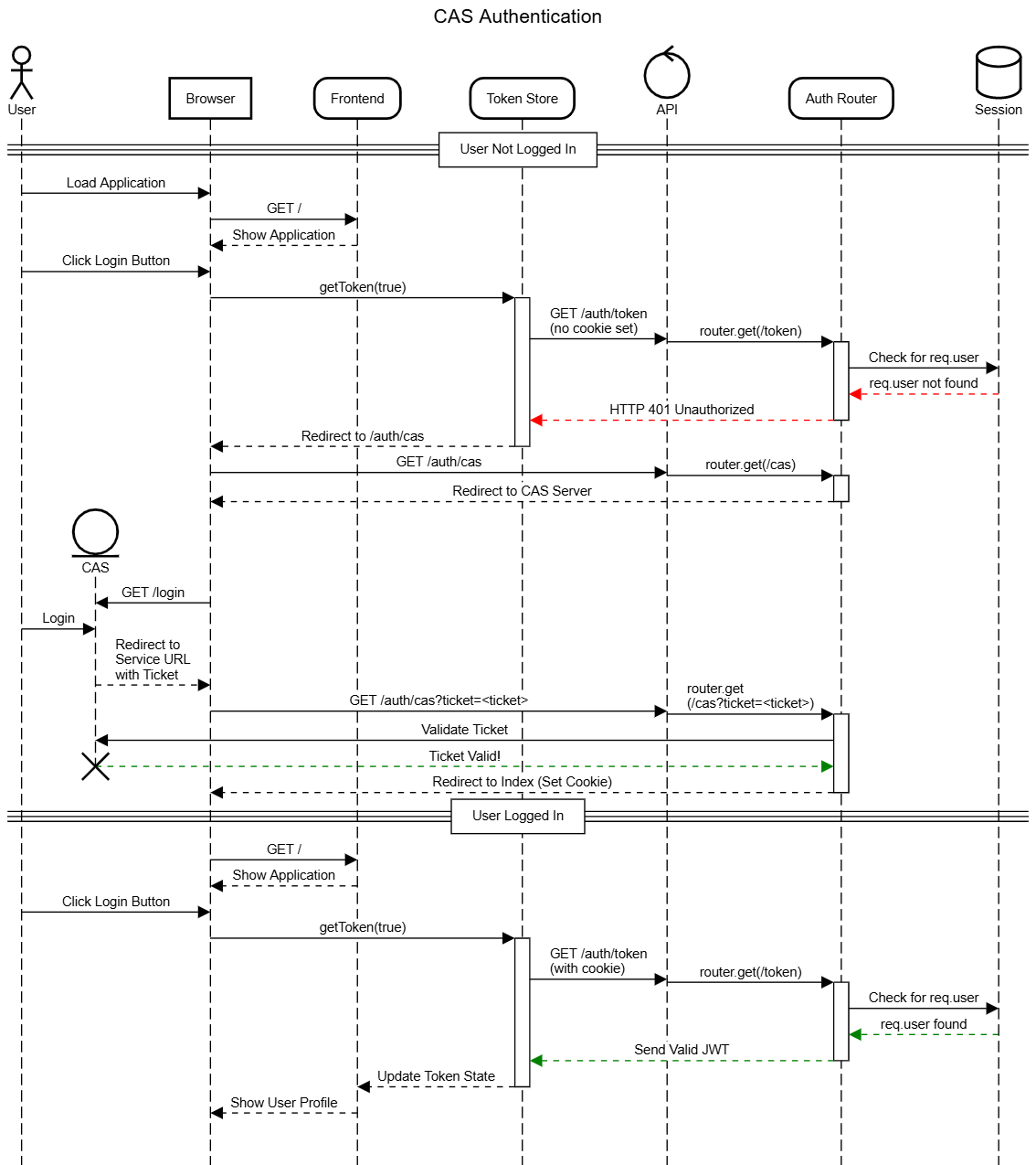
Authentication Process
Let’s take a step back to examine the complexity of the authentication process for our application as it stands currently:
As we can see, there are lots of steps involved! It is always good to create diagrams like this in mind when developing an application - they can often be very helpful when we have to debug a complicated process like authentication.
In this video, the new api.js file was accidentally created in the router folder. It should be moved to the configs folder, which is shown in the next video.
Automatically Logging In
One thing we may quickly realize as we use our application as it currently stands is that the user has to click the “Login” button twice to actually get logged into the system. That seems a bit counterintuitive, so we should take a minute to try and fix that.
Effectively, we want our application to try and request a token on behalf of the user behind the scenes as soon as the page is loaded. If a token can be received, we know the user is actually logged in and we can update the user interface accordingly. There are several approaches to do this:
We can place this code in our top-level App.vue file - this will ensure it runs when any part of the web application is loaded
We can place it in a Navigation Guard inside of our Vue Router. This will allow us to make sure the user is logged in, and we can even automatically redirect the user if they try to access something that requires them to log in first
So, let’s add a global navigation guard to our router, ensuring that we only have a single place that requests a token when the user first lands on the page.
Router Navigation Guards
To do this, we need to edit the src/router/index.js to add a special beforeEach function to the router:
/**
* @file Vue Router for the application
* @author Russell Feldhausen <russfeld@ksu.edu>
* @exports router a Vue Router
*/// Import Libraries
import { createRouter, createWebHistory } from'vue-router'// Import Stores
import { useTokenStore } from'@/stores/Token'// Import Views
importHomeViewfrom'../views/HomeView.vue'constrouter=createRouter({
// Configure History Mode
history:createWebHistory(import.meta.env.BASE_URL),
// Configure routes
routes: [
{
path:'/',
name:'home',
component:HomeView,
},
{
path:'/about',
name:'about',
// route level code-splitting
// this generates a separate chunk (About.[hash].js) for this route
// which is lazy-loaded when the route is visited.
component: () => import('../views/AboutView.vue'),
},
],
})
//Global Route Guard
router.beforeEach(async (to) => {
// Load Token Store
consttokenStore=useTokenStore();
// Allow access to 'home' and 'about' routes automatically
constnoLoginRequired= ['home', 'about']
if (noLoginRequired.includes(to.name)) {
// If there is no token already
if(!tokenStore.token.length>0) {
// Request a token in the background
tokenStore.getToken()
}
// For all other routes
} else {
// If there is no token already
if(!tokenStore.token.length>0) {
// Request a token and redirect if not logged in
awaittokenStore.getToken(true)
}
}
})
exportdefaultrouter
In this navigation guard, we have identified two routes, 'home' and 'about' that don’t require the user to log in first. So, if the route matches either of those, we request a token in the background if we don’t already have one, but we don’t await that function since we don’t need it in order to complete the process. However, for all other routes that we’ll create later in this project, we will await on the tokenStore.getToken() function to ensure that the user has a valid token available before allowing the application to load the next page. As we continue to add features to our application, we’ll see that this is a very powerful way to keep track of our user and ensure they are always properly authenticated.
Axios Interceptors
We can also simplify one other part of our application by automatically configuring Axios with a few additional settings that will automatically inject the Authorization: Bearer header into each request, as well as silently requesting a new JWT token if ours appears to have expired.
For this, we’ll create a new folder called src/configs and place a new file api.js inside of that folder with the following content:
/**
* @file Axios Configuration and Interceptors
* @author Russell Feldhausen <russfeld@ksu.edu>
*/// Import Libraries
importaxiosfrom'axios'// Import Stores
import { useTokenStore } from'@/stores/Token'// Axios Instance Setup
constapi=axios.create({
headers: {
Accept:'application/json',
'Content-Type':'application/json',
},
})
// Add Interceptors
constsetupAxios=function() {
// Configure Requests
api.interceptors.request.use(
(config) => {
// If we are not trying to get a token or API versions, send the token
if (config.url!=='/auth/token'&&config.url!=='/api') {
consttokenStore=useTokenStore()
if (tokenStore.token.length>0) {
config.headers['Authorization'] ='Bearer '+tokenStore.token }
}
returnconfig },
// If we receive any errors, reject with the error
(error) => {
return Promise.reject(error)
}
)
// Configure Response
api.interceptors.response.use(
// Do not modify the response
(res) => {
returnres },
// Gracefully handle errors
async (err) => {
// Store original request config
constconfig=err.config// If we are not trying to request a token but we get an error message
if(config.url!=='/auth/token'&&err.response) {
// If the error is a 401 unauthorized, we might have a bad token
if (err.response.status===401) {
// Prevent infinite loops by tracking retries
if (!config._retry) {
config._retry=true// Try to request a new token
try {
consttokenStore=useTokenStore();
awaittokenStore.getToken();
// Retry the original request
returnapi(config)
} catch (error) {
return Promise.reject(error)
}
} else {
// This is a retry, so force an authentication
consttokenStore=useTokenStore();
awaittokenStore.getToken(true);
}
}
}
// If we can't handle it, return the error
return Promise.reject(err)
}
)
}
export { api, setupAxios }
This file configures an Axios instance to only accept application/json requests, which makes sense for our application. Then, in the setupAxios function, it will add some basic interceptors to modify any requests sent from this instance as well as responses received:
If we try to request any URL other than /auth/token and /api, we’ll assume that the user is accessing a route that requires a valid bearer token. So, we can automatically inject that into our request.
When we receive an error as a response, we’ll check to see if it is an HTTP 401 Unauthorized error. If it comes from any URL except the /auth/token URL, we can assume that we might have an invalid token. So, we’ll quickly try to request one in the background, and then retry the original request once. If it fails a second time, we’ll redirect the user back to the login page so they can re-authenticate with the system.
To use these interceptors, we must first enable them in the src/main.js file:
Finally, let’s see what it takes to actually access data that is available in our RESTful API using a properly authenticated request. For this example, we’re going to create a simple ProfileView page that the user can access by clicking the Profile button available after they’ve logged in. This page is just a test, but it will quickly demonstrate what we can do with our existing setup.
So, let’s start by creating the TestUser component we plan on using on that page. We’ll place it in our src/components/test folder.
<scriptsetup>
/**
* @file Test User Component
* @author Russell Feldhausen <russfeld@ksu.edu>
*/// Import Libraries
import { ref } from'vue'import { api } from'@/configs/api'import { Card, Chip } from'primevue'// Create Reactive State
constusers=ref([])
// Load Users
api.get('/api/v1/users')
.then(function(response) {
users.value=response.data })
.catch(function (error) {
console.log(error)
})
</script>
<template>
<div>
<Cardv-for="user in users" :key="user.id">
<template#title>Username: {{ user.username }}</template>
<template#content>
<Chipv-for="role in user.roles" :label="role.role" :key="role.id" />
</template>
</Card>
</div>
</template>
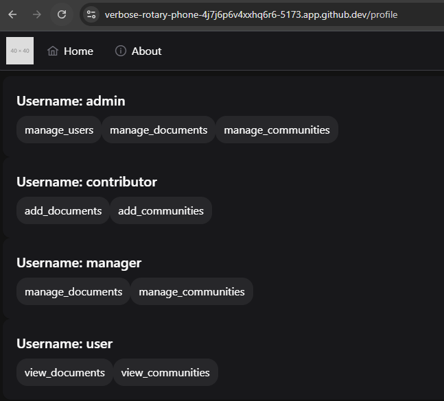
We should be easily able to compare the contents of this file to the TestApi component we developed earlier. In this case, however, we are using the api instance of Axios we created earlier to load our users. That instance will automatically send along the user’s JWT to authenticate the request. We’re also using the PrimeVue Chip component to list the roles assigned to each user.
Next, we can create our new ProfileView.vue page in our src/views folder with the following content:
This is nearly identical to our other views, so nothing is really new here.
Finally, we need to add this page to our Vue Router in src/router/index.js:
/**
* @file Vue Router for the application
* @author Russell Feldhausen <russfeld@ksu.edu>
* @exports router a Vue Router
*/// Import Libraries
import { createRouter, createWebHistory } from'vue-router'// Import Stores
import { useTokenStore } from'@/stores/Token'// Import Views
importHomeViewfrom'../views/HomeView.vue'constrouter=createRouter({
// Configure History Mode
history:createWebHistory(import.meta.env.BASE_URL),
// Configure routes
routes: [
{
path:'/',
name:'home',
component:HomeView,
},
{
path:'/about',
name:'about',
// route level code-splitting
// this generates a separate chunk (About.[hash].js) for this route
// which is lazy-loaded when the route is visited.
component: () => import('../views/AboutView.vue'),
},
{
path:'/profile',
name:'profile',
component: () => import('../views/ProfileView.vue')
}
],
})
// -=-=- other code omitted here -=-=-
Again, adding a route is as simple as giving it a name, a path, and listing the component that should be loaded.
Now, with all of that in place, we should be able to click on the Profile link on the menu under the user’s profile image to access this page:
This is the power of having a really well structured frontend application framework to build upon. Now that we’ve spent all of this time configuring routing, authentication, components, and more, it becomes very straightforward to add new features to our application.
We can even refresh this page and it should reload properly without losing access! As long as we still have a valid cookie from our backend RESTful API server, our application will load, request a token, and then request the data, all seamlessly without any interruptions.
At this point, all that is left is to lint and format our code, then commit and push to GitHub!
