Users Table
YouTube VideoUsers Table
Now that we have explored the basics of adding new menu items and routes to our application, let’s start working on the components to view and edit the users available in our application. To begin, we’ll work on the *GET ALL route, which will allow us to view all of the users on our system. For this, we’ll use the PrimeVue DataTable component, which is one of the most powerful components available in the PrimeVue library.
First, before we can do that, we must set up our new view and a route to get there, as well as a menu option. So, let’s go through that really quickly.
First, we’ll add a new route to the Vue router:
// -=-=- other code omitted here -=-=-

const router = createRouter({
  // Configure History Mode
  history: createWebHistory(import.meta.env.BASE_URL),

  // Configure routes
  routes: [
    // -=-=- other code omitted here -=-=-
    {
      path: '/users',
      name: 'users',
      component: () => import('../views/UsersListView.vue'),
      beforeEnter: requireRoles("manage_users")
    }
  ],
})

// -=-=- other code omitted here -=-=-
We’ll also add that route as a menu item in our TopMenu.vue component:
<script setup>
// -=-=- other code omitted here -=-=-

// Declare State
const items = ref([
  // -=-=- other code omitted here -=-=-
  {
    label: 'Users',
    icon: 'pi pi-users',
    command: () => {
      router.push({ name: 'users' })
    },
    roles: ['manage_users']
  },
])

// -=-=- other code omitted here -=-=-
</script>
Then, we’ll create a new view named UsersListView.vue that will contain our table component:
<script setup>
import UsersList from '../components/users/UsersList.vue'
</script>

<template>
  <UsersList />
</template>
Finally, we’ll create a new UsersList component to store our code:
<script setup>
/**
* @file Users List Component
* @author Russell Feldhausen <russfeld@ksu.edu>
*/
</script>
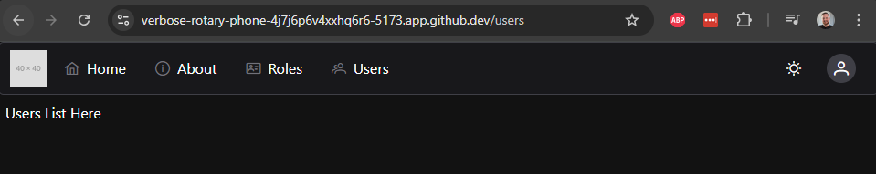
<template>
Users List Here
</template>With all of that in place, we should now be able to click on the Users button at the top of our page and get to the UsersList component on the appropriate view:
From here, we can start to build our table view.
PrimeVue DataTable
To use the PrimeVue DataTable component, we first need to get our data from the API so we can easily display it in our component. So, let’s use the Axios api instance to query the API and get our list of users. This is nearly the exact same code we used previously to get the list of users:
<script setup>
/**
 * @file Users List Component
 * @author Russell Feldhausen <russfeld@ksu.edu>
 */

// Import Libraries
import { ref } from 'vue'
import { api } from '@/configs/api'

// Create Reactive State
const users = ref([])

// Load Users
api
  .get('/api/v1/users')
  .then(function (response) {
    users.value = response.data
  })
  .catch(function (error) {
    console.log(error)
  })

</script>
Now that we have that list, we can start to construct our DataTable. First, we’ll need to import the required components in our <script setup> section:
<script setup>
/**
 * @file Users List Component
 * @author Russell Feldhausen <russfeld@ksu.edu>
 */

// Import Libraries
import { ref } from 'vue'
import { api } from '@/configs/api'
import DataTable from 'primevue/datatable';
import Column from 'primevue/column';

// -=-=- other code omitted here -=-=-
</script>
Now, in the <template> section, we can build a basic DataTable by including the data we want to view and the columns that should be included:
<template>
  <DataTable :value="users">
    <Column field="username" header="Username" />
    <Column field="roles" header="Roles" />
    <Column field="createdAt" header="Created" />
    <Column field="updatedAt" header="Updated" />
  </DataTable>
</template>
Each <Column> component includes a field name for that column, as well as a header value. With that in place, we should see a simple page with lots of helpful information about our users:
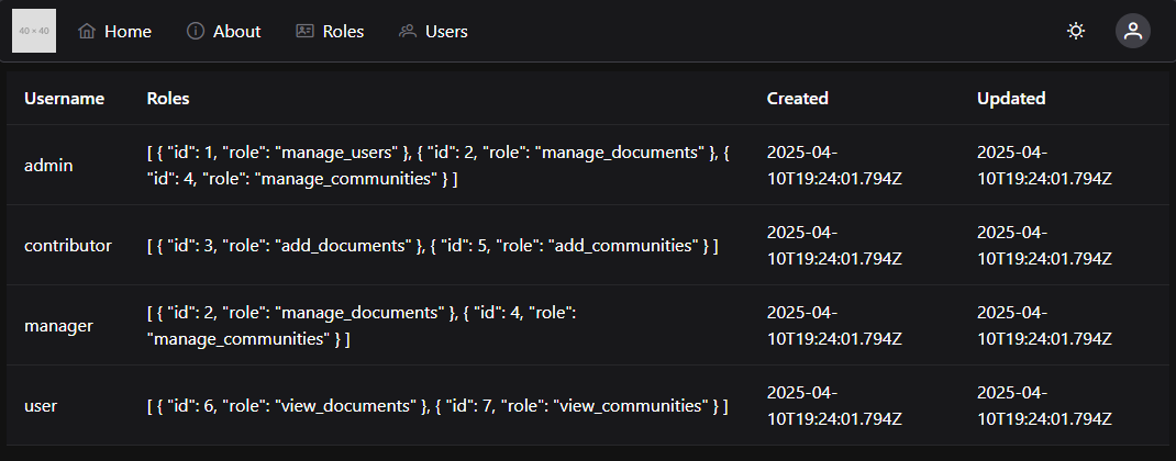
This is a great start, but we can clean this up to make it much easier for our users to read and digest the information.
Custom Column Templates
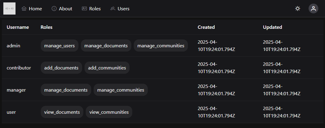
First, let’s create a couple of custom templates for columns. First, we notice that the Roles column is just outputting the entire JSON list of roles, but this is not very helpful. So, let’s modify that column to present a list of Chips representing the roles:
<script setup>
/**
 * @file Users List Component
 * @author Russell Feldhausen <russfeld@ksu.edu>
 */

// Import Libraries
import { ref } from 'vue'
import { api } from '@/configs/api'
import DataTable from 'primevue/datatable';
import Column from 'primevue/column';
import Chip from 'primevue/chip';

// -=-=- other code omitted here -=-=-
</script>

<template>
  <DataTable :value="users">
    <Column field="username" header="Username" />
    <Column field="roles" header="Roles">
      <template #body="{ data }">
        <div class="flex gap-2">
          <Chip v-for="role in data.roles" :key="role.id" :label="role.role"  />
        </div>
      </template>
    </Column>
    <Column field="createdAt" header="Created" />
    <Column field="updatedAt" header="Updated" />
  </DataTable>
</template>
Inside of the <Column> component, we place a <template> for the #body slot, and we also provide a link to the data of the <Column> component so we can access that data.
With this change, our table now looks like this:
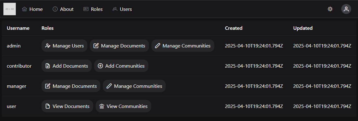
However, we can improve on that a bit by adding some additional information to our application that helps us display these roles in a bit cleaner format. Let’s create a new custom RoleChip component that will display the roles properly, along with some additional information.
<script setup>
/**
 * @file Roles Chip
 * @author Russell Feldhausen <russfeld@ksu.edu>
 */

// Import Libraries
import Chip from 'primevue/chip';

// Incoming Props
const props = defineProps({
  // Role Object
  role: Object
})

// Lookup Table
const roles = {
  1: {
    name: "Manage Users",
    icon: "pi pi-user-edit"
  },
  2: {
    name: "Manage Documents",
    icon: "pi pi-pen-to-square"
  },
  3: {
    name: "Add Documents",
    icon: "pi pi-file-plus"
  },
  4: {
    name: "Manage Communities",
    icon: "pi pi-pencil"
  },
  5: {
    name: "Add Communities",
    icon: "pi pi-plus-circle"
  },
  6: {
    name: "View Documents",
    icon: "pi pi-file"
  },
  7: {
    name: "View Communities",
    icon: "pi pi-building-columns"
  }
}
</script>

<template>
  <Chip :label="roles[props.role.id].name" :icon="roles[props.role.id].icon" />
</template>
This component includes a constant lookup table that provides some additional information about each role, based on the role’s ID. This allows us to assign a user-friendly name and icon to each role in our frontend application. In fact, if we are internationalizing this application, we could also use this component to translate the role names into localized forms here.
We are also seeing a great example of Vue Props in this component. Props allow us to pass data from one component down into another sub-component. It is a one-way data connection, which is very important to remember.
We can update our UsersList.vue component to use this new RoleChip component very easily:
<script setup>
/**
 * @file Users List Component
 * @author Russell Feldhausen <russfeld@ksu.edu>
 */

// Import Libraries
import { ref } from 'vue'
import { api } from '@/configs/api'
import DataTable from 'primevue/datatable';
import Column from 'primevue/column';
import RoleChip from '../roles/RoleChip.vue';

// -=-=- other code omitted here -=-=-
</script>

<template>
  <DataTable :value="users">
    <Column field="username" header="Username" />
    <Column field="roles" header="Roles">
      <template #body="{ data }">
        <div class="flex gap-2">
          <RoleChip v-for="role in data.roles" :key="role.id" :role="role"  />
        </div>
      </template>
    </Column>
    <Column field="createdAt" header="Created" />
    <Column field="updatedAt" header="Updated" />
  </DataTable>
</template>
Now we have a much cleaner view of the roles each user is assigned, with helpful icons to help us remember what each one does.
Handling Dates
Let’s also clean up the Created and Updated columns by rendering the dates into a more useful format. For this, we can use the date-fns library to help us format and display times easily in our project. First, we’ll need to install it:
$ npm install date-fnsThen, in our component, we can use it to format our dates by computing the distance in the past that the event occurred:
<script setup>
/**
 * @file Users List Component
 * @author Russell Feldhausen <russfeld@ksu.edu>
 */

// Import Libraries
import { ref } from 'vue'
import { api } from '@/configs/api'
import { formatDistance } from 'date-fns';
import DataTable from 'primevue/datatable';
import Column from 'primevue/column';
import RoleChip from '../roles/RoleChip.vue';

// -=-=- other code omitted here -=-=-
</script>

<template>
  <DataTable :value="users">
    <Column field="username" header="Username" />
    <Column field="roles" header="Roles">
      <template #body="{ data }">
        <div class="flex gap-2">
          <RoleChip v-for="role in data.roles" :key="role.id" :role="role"  />
        </div>
      </template>
    </Column>
    <Column field="createdAt" header="Created">
      <template #body="{ data }">
        <span v-tooltip.bottom="new Date(data.createdAt).toLocaleString()">
          {{ formatDistance(new Date(data.createdAt), new Date(), { addSuffix: true }) }}
        </span>
      </template>
    </Column>
    <Column field="updatedAt" header="Updated">
      <template #body="{ data }">
        <span v-tooltip.bottom="new Date(data.updatedAt).toLocaleString()">
          {{ formatDistance(new Date(data.updatedAt), new Date(), { addSuffix: true }) }}
        </span>
      </template>
    </Column>
  </DataTable>
</template>
With that in place, we can more easily see how long ago each user’s account was created or updated:
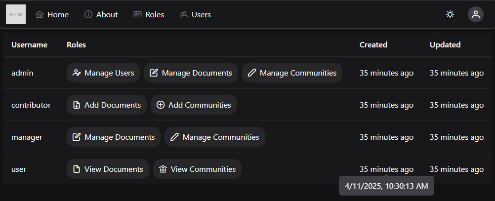
We can even hover over one of the formatted dates to see the actual date in a tooltip.
Sorting
We can also enable Sorting in our PrimeVue DataTable by simply adding the sortable property to any columns we’d like to sort. For this example, let’s add that to the username, createdAt and updatedAt fields:
<template>
  <DataTable :value="users">
    <Column field="username" header="Username" sortable />
    <Column field="roles" header="Roles">
      <template #body="{ data }">
        <div class="flex gap-2">
          <RoleChip v-for="role in data.roles" :key="role.id" :role="role"  />
        </div>
      </template>
    </Column>
    <Column field="createdAt" header="Created" sortable >
      <template #body="{ data }">
        <span v-tooltip.bottom="new Date(data.createdAt).toLocaleString()">
          {{ formatDistance(new Date(data.createdAt), new Date(), { addSuffix: true }) }}
        </span>
      </template>
    </Column>
    <Column field="updatedAt" header="Updated" sortable >
      <template #body="{ data }">
        <span v-tooltip.bottom="new Date(data.updatedAt).toLocaleString()">
          {{ formatDistance(new Date(data.updatedAt), new Date(), { addSuffix: true }) }}
        </span>
      </template>
    </Column>
  </DataTable>
</template>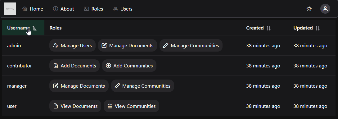
We can even define a default column and sort order for our table:
<template>
  <DataTable :value="users" sortField="username" :sortOrder="1">
    <!-- other code omitted here -->
  </DataTable>
</template>
Global Filtering
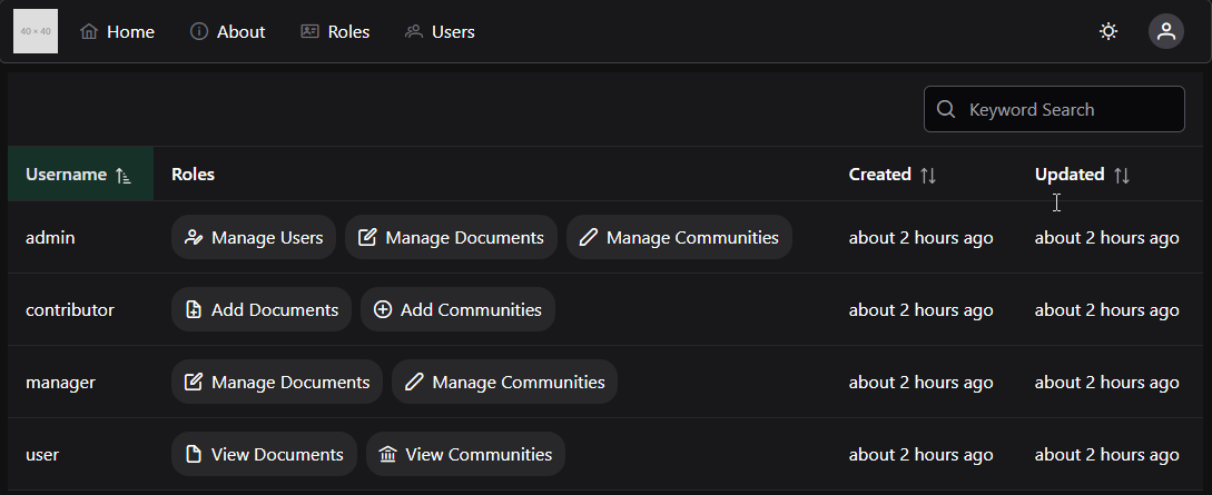
Another great feature of PrimeVue’s DataTable is the ability to quickly add Filtering features. We can define a global filter to allow us to search for a user by the username by simply defining a global filter set and a list of fields to search. We should also add a quick search box to the top of our DataTable template to accept this input.
<script setup>
/**
 * @file Users List Component
 * @author Russell Feldhausen <russfeld@ksu.edu>
 */

// Import Libraries
import { ref } from 'vue'
import { api } from '@/configs/api'
import { formatDistance } from 'date-fns';
import DataTable from 'primevue/datatable';
import Column from 'primevue/column';
import { IconField, InputIcon, InputText } from 'primevue';
import { FilterMatchMode } from '@primevue/core/api';
import RoleChip from '../roles/RoleChip.vue';

// -=-=- other code omitted here -=-=-

// Setup Filters
const filters = ref({
  global: { value: null, matchMode: FilterMatchMode.CONTAINS },
})
</script>

<template>
  <DataTable
    :value="users"
    v-model:filters="filters"
    :globalFilterFields="['username']"
    filterDisplay="menu"
    sortField="username"
    :sortOrder="1"
  >
    <template #header>
      <div class="flex justify-end">
        <IconField>
          <InputIcon>
              <i class="pi pi-search" />
          </InputIcon>
          <InputText v-model="filters['global'].value" placeholder="Keyword Search" />
        </IconField>
      </div>
    </template>
    <!-- other code omitted here -->
  </DataTable>
</template>
With this in place, we can now type in any username and filter the table for that username:
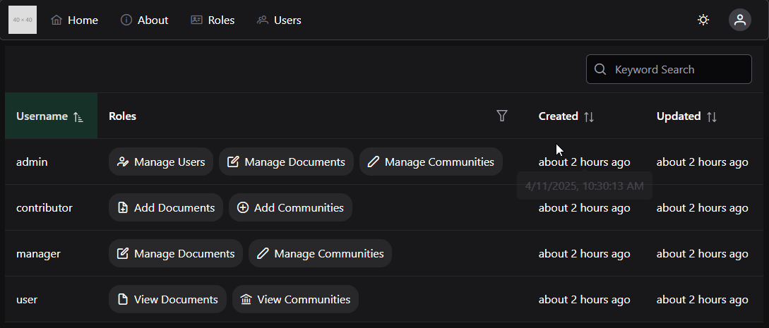
Column Filtering
We can also do more advanced filtering, such as allowing users to select roles that they’d like to search for. This is a bit more complex, as it requires us to first write our own custom filter function, and then we also have to add a small template for setting the filter options.
First, let’s create a new custom filter function in our <script setup> section. We’ll also need to get a list of the available roles in our system, so we can add that to this section as well.:
<script setup>
/**
 * @file Users List Component
 * @author Russell Feldhausen <russfeld@ksu.edu>
 */

// Import Libraries
import { ref } from 'vue'
import { api } from '@/configs/api'
import { formatDistance } from 'date-fns';
import DataTable from 'primevue/datatable';
import Column from 'primevue/column';
import { IconField, InputIcon, InputText } from 'primevue';
import { FilterMatchMode, FilterService } from '@primevue/core/api';
import RoleChip from '../roles/RoleChip.vue';

// Create Reactive State
const users = ref([])
const roles = ref([])

// Load Users
api
  .get('/api/v1/users')
  .then(function (response) {
    users.value = response.data
  })
  .catch(function (error) {
    console.log(error)
  })

// Load Roles
api
  .get('/api/v1/roles')
  .then(function (response) {
    roles.value = response.data
  })
  .catch(function (error) {
    console.log(error)
  })

// Custom Filter
FilterService.register("filterArrayOfObjectsById", (targetArray, sourceArray) => {
  if (!sourceArray || sourceArray.length == 0) {
    return true
  }
  let found = true
  sourceArray.forEach((s) => {
    found = found && targetArray.some((o) => o.id === s.id)
  })
  return found
})

// Setup Filters
const filters = ref({
  global: { value: null, matchMode: FilterMatchMode.CONTAINS },
  roles: { value: null, matchMode: "filterArrayOfObjectsById"}
})
</script>
The filterArrayOfObjectsById function should look somewhat familiar - we have an array of roles we want to search for, and we want to ensure that the user has all of these roles (this is different than some of our other functions that look like this, where we want the user to have at least one of the roles).
Now, to make this visible in our template, we add a special <template #filter> slot to the Column that is displaying the roles. We also set the filterDisplay option on the top-level DataTable component to "menu" to allow us to have pop-up menus for filtering. For this menu, we’re going to use the PrimeVue Multiselect component, so we’ll need to import it:
<script setup>
/**
 * @file Users List Component
 * @author Russell Feldhausen <russfeld@ksu.edu>
 */

// Import Libraries
import { ref } from 'vue'
import { api } from '@/configs/api'
import { formatDistance } from 'date-fns';
import DataTable from 'primevue/datatable';
import Column from 'primevue/column';
import { IconField, InputIcon, InputText, MultiSelect } from 'primevue';
import { FilterMatchMode, FilterService } from '@primevue/core/api';
import RoleChip from '../roles/RoleChip.vue';

// -=-=- other code omitted here -=-=-

</script>

<template>
  <DataTable
    :value="users"
    v-model:filters="filters"
    :globalFilterFields="['username']"
    filterDisplay="menu"
    sortField="username"
    :sortOrder="1"
  >
    <!-- other code omitted here -->
    <Column filterField="roles" :showFilterMatchModes="false" header="Roles">
      <template #body="{ data }">
        <div class="flex gap-2">
          <RoleChip v-for="role in data.roles" :key="role.id" :role="role" />
        </div>
      </template>
      <template #filter="{ filterModel }">
        <MultiSelect
          v-model="filterModel.value"
          :options="roles"
          optionLabel="role"
          placeholder="Any"
        >
          <template #option="slotProps">
            <RoleChip :role="slotProps.option" />
          </template>
        </MultiSelect>
      </template>
    </Column>
    <!-- other code omitted here -->
  </DataTable>
</template>
With all of this in place, we can now filter based on roles as well:
Buttons
Finally, let’s work on adding some buttons to our table that will allow us to create new users, edit existing users, and delete users.
First, let’s add a simple button to create a new user at the top of our DataTable component. We’ll use a PrimeVue Button component for this, and we’ll also need to import the Vue Router so we can route to a different view when this is clicked.
<script setup>
/**
 * @file Users List Component
 * @author Russell Feldhausen <russfeld@ksu.edu>
 */

// Import Libraries
import { ref } from 'vue'
import { api } from '@/configs/api'
import { formatDistance } from 'date-fns'
import DataTable from 'primevue/datatable'
import Column from 'primevue/column'
import { IconField, InputIcon, InputText, MultiSelect } from 'primevue'
import { FilterMatchMode, FilterService } from '@primevue/core/api'
import RoleChip from '../roles/RoleChip.vue'
import Button from 'primevue/button'
import { useRouter } from 'vue-router'
const router = useRouter()

// -=-=- other code omitted here -=-=-
</script>

<template>
  <DataTable
    :value="users"
    v-model:filters="filters"
    :globalFilterFields="['username']"
    filterDisplay="menu"
    sortField="username"
    :sortOrder="1"
  >
    <template #header>
      <div class="flex justify-between">
        <Button
          label="New User"
          icon="pi pi-user-plus"
          severity="success"
          @click="router.push({ name: 'newuser' })"
        />
        <IconField>
          <InputIcon>
            <i class="pi pi-search" />
          </InputIcon>
          <InputText v-model="filters['global'].value" placeholder="Keyword Search" />
        </IconField>
      </div>
    </template>
    <!-- other code omitted here -->
  </DataTable>
</template>
When we click on this button, we’ll be sent to the newuser route in our application. This route doesn’t currently exist, but we’ll add it later in this tutorial.
Likewise, we want to add buttons to allow us to edit and delete each user’s account, so let’s add a new column to our DataTable with those buttons as well.
<template>
<DataTable
:value="users"
v-model:filters="filters"
:globalFilterFields="['username']"
filterDisplay="menu"
sortField="username"
:sortOrder="1"
>
<!-- other code omitted here -->
<Column header="Actions" style="min-width: 8rem">
<template #body="slotProps">
<div class="flex gap-2">
<Button
icon="pi pi-pencil"
outlined
rounded
@click="router.push({ name: 'edituser', params: { id: slotProps.data.id } })"
v-tooltip.bottom="'Edit'"
/>
<Button
icon="pi pi-trash"
outlined
rounded
severity="danger"
@click="router.push({ name: 'deleteuser', params: { id: slotProps.data.id } })"
v-tooltip.bottom="'Delete'"
/>
</div>
</template>
</Column>
</DataTable>
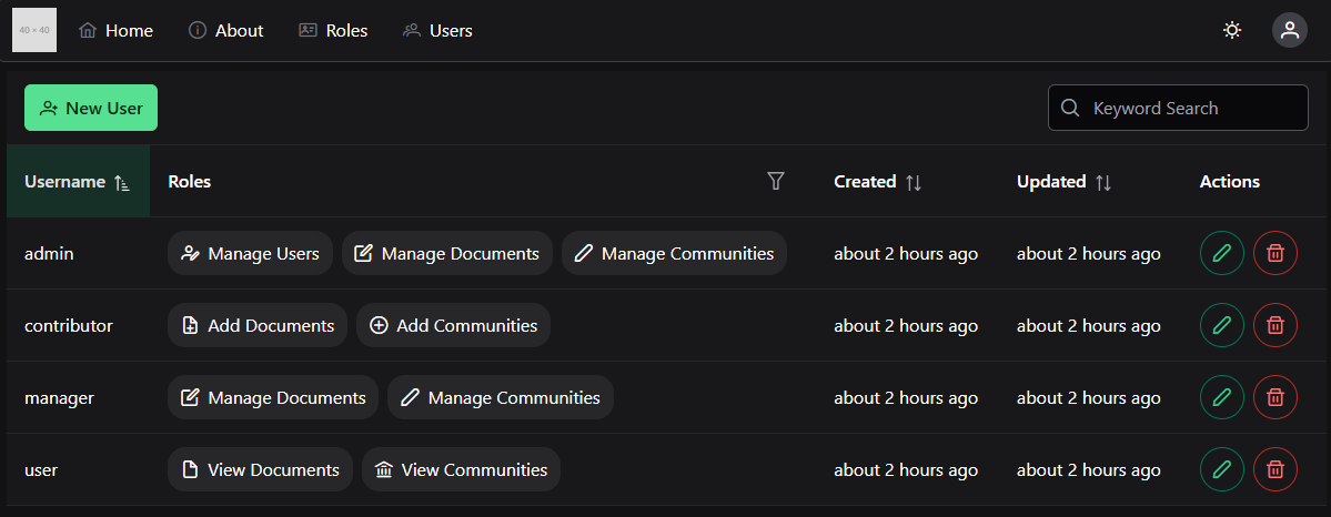
</template>These buttons will direct us to the edituser and deleteuser routes, and they even include the ID of the user to be edited or deleted in the route parameters. We’ll work on adding these features as well later in this tutorial. With these changes in place, our final DataTable for our users should look something like this:
For the rest of this tutorial, we’ll work on adding additional functionality to handle creating, editing, and deleting user accounts.