Edit User
YouTube VideoEditing a User
The next major feature we can add to our frontend application is the ability to edit a user. To do this, we’ll need to create a view and a component that contains the form fields for editing a user, as well as the logic to communicate any changes back to the API.
As always, we’ll start by adding a route to our src/router/index.js file for this route:
// -=-=- other code omitted here -=-=-

const router = createRouter({
  // Configure History Mode
  history: createWebHistory(import.meta.env.BASE_URL),

  // Configure routes
  routes: [
    // -=-=- other code omitted here -=-=-
    {
      path: '/users/:id/edit',
      name: 'edituser',
      component: () => import('../views/UsersEditView.vue'),
      beforeEnter: requireRoles('manage_users'),
      props: true
    }
  ],
})

// -=-=- other code omitted here -=-=-
In this route, we are using :id to represent a Route Parameter, which is the same syntax we saw earlier in our Express backend. Since we want that route parameter to be passed as a Vue prop to our view component, we also add the props: true entry to this route definition.
Next, we’ll create a simple UsersEditView.vue component in our src/views folder to contain the new view:
<script setup>
import UserEdit from '../components/users/UserEdit.vue'
</script>

<template>
  <UserEdit />
</template>
Finally, we’ll create our new component in the src/components/users/UserEdit.vue file with the following default content:
<script setup>
/**
 * @file User Edit Component
 * @author Russell Feldhausen <russfeld@ksu.edu>
 */

</script>

<template>
  Edit User Here
</template>
Getting User Data
To begin, let’s get the user’s data from our API. We know that this component will have a Vue prop for the user’s id available, because it is the only element on the UsersEditView page, so the property will Fallthrough to this element. So, we can declare it at the top of our component, and use it to request data about a single user in our component as a reactive state variable.
<script setup>
/**
 * @file User Edit Component
 * @author Russell Feldhausen <russfeld@ksu.edu>
 */

// Import Libraries
import { ref } from 'vue';
import { api } from '@/configs/api'

// Incoming Props
const props = defineProps({
  // User ID
  id: String,
})

// Declare State
const user = ref({})

// Load Users
api
  .get('/api/v1/users/' + props.id)
  .then(function (response) {
    user.value = response.data
  })
  .catch(function (error) {
    console.log(error)
  })
</script>
With this data in hand, we can start building a form to allow us to edit our user.
Creating a Text Field Component
Our User account has two fields that we want to be able to edit: the username field and the list of roles assigned to the user. Let’s tackle the username field first. PrimeVue includes many different components that can be used in a form. One of the simplest is their InputText field that accepts textual input from the user. However, we can also add things like an IconField to show an icon inside of the field, and a FloatLabel to easily include a descriptive label that floats over our field. One really cool feature is the ability to combine several of these into an Icon Field with a Floating Label as shown in the PrimeVue examples. However, because we know we plan on creating multiple forms with text input fields, let’s create our own custom component that combines all of these items together.
We’ll create a new component in the src/components/forms/TextField.vue with the following content:
<script setup>
/**
 * @file Custom Text Form Field Component
 * @author Russell Feldhausen <russfeld@ksu.edu>
 */

// Import Libraries
import { InputIcon, IconField, FloatLabel, InputText } from 'primevue';

// Incoming Props
const props = defineProps({
  // Field Name
  field: String,
  // Field Label
  label: String,
  // Field Icon
  icon: String,
  // Disable Editing
  disabled: {
    type: Boolean,
    default: false
  }
})

// V-model of the field to be edited
const model = defineModel()
</script>

<template>
  <FloatLabel variant="on">
    <IconField>
      <InputIcon :class="props.icon" />
      <InputText :id="props.field" :disabled="props.disabled" v-model="model" />
    </IconField>
    <label :for="props.field">{{ props.label }}</label>
  </FloatLabel>
</template>
This component includes a number of props that define the form field we want to create, and then puts them all together following the model provided in the PrimeVue documentation.
With that component in place, we can use it our UserEdit component to edit the user’s username:
<script setup>
/**
* @file User Edit Component
* @author Russell Feldhausen <russfeld@ksu.edu>
*/
// Import Libraries
import { ref } from 'vue';
import { api } from '@/configs/api'
import TextField from '../forms/TextField.vue'
// -=-=- other code omitted here -=-=-
</script>
<template>
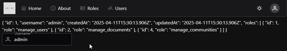
<span>{{ user }}</span>
<TextField v-model="user.username" field="username" label="Username" icon="pi pi-user" />
</template>For this example, we’ve also added a <span> element showing the current contents of the user reactive state variable, just so we can see our form field in action. As we edit the data in the field, we can also see our user state variable update!
Since we can easily just edit the user’s username without changing any other fields, we can test this by adding a Save and Cancel button to our page:
<script setup>
/**
 * @file User Edit Component
 * @author Russell Feldhausen <russfeld@ksu.edu>
 */

// Import Libraries
import { ref } from 'vue';
import { api } from '@/configs/api'
import { Button } from 'primevue'
import TextField from '../forms/TextField.vue'
import { useRouter } from 'vue-router'
const router = useRouter()

// -=-=- other code omitted here -=-=-
</script>

<template>
  <span>{{ user }}</span>
  <TextField v-model="user.username" field="username" label="Username" icon="pi pi-user" />
  <Button severity="success" @click="save" label="Save" />
  <Button severity="secondary" @click="router.push({ name: 'users' })" label="Cancel" />
</template>
The functionality of the Cancel button is pretty straightforward; it just uses the Vue Router to send the user back to the /users route. For the Save button, however, we need to implement a custom save function in our component to save the updated user:
<script setup>
// -=-=- other code omitted here -=-=-

// Save User
const save = function() {
  api
    .put('/api/v1/users/' + props.id, user.value)
    .then(function (response) {
      if (response.status === 201) {
        router.push({ name: "users"})
      }
    })
    .catch(function (error) {
      console.log(error)
    })
}
</script>
With that code in place, we can click the Save button, and it should save our edit to the user’s username and redirect us back to the /users route.
Toast Messages
However, there is no obvious visual cue that shows us the user was successfully saved, so our users may not really know if it worked or not. For that, we can use the PrimeVue Toast component to display messages to our users. To install it, we have to add a few lines to our src/main.js file:
/**
 * @file Main Vue application
 * @author Russell Feldhausen <russfeld@ksu.edu>
 */

// Import Libraries
import { createApp } from 'vue'
import { createPinia } from 'pinia'
import PrimeVue from 'primevue/config'
import Aura from '@primeuix/themes/aura'
import Tooltip from 'primevue/tooltip'
import ToastService from 'primevue/toastservice';

// Import CSS
import './assets/main.css'

// Import Vue App
import App from './App.vue'

// Import Configurations
import router from './router'
import { setupAxios } from './configs/api'

// Create Vue App
const app = createApp(App)

// Install Libraries
app.use(createPinia())
app.use(router)
app.use(PrimeVue, {
  // Theme Configuration
  theme: {
    preset: Aura,
    options: {
      darkModeSelector: '.app-dark-mode',
    },
  },
})
app.use(ToastService);

// Install Directives
app.directive('tooltip', Tooltip)

// Setup Interceptors
setupAxios()

// Mount Vue App on page
app.mount('#app')
Then, we can add our <Toast> element to the top-level App.vue page so it is available throughout our application:
<script setup>
/**
 * @file Main Vue Application
 * @author Russell Feldhausen <russfeld@ksu.edu>
 */

// Import Components
import Toast from 'primevue/toast';
import TopMenu from './components/layout/TopMenu.vue'
</script>

<template>
  <header></header>

  <nav>
    <!-- Navigation Menu -->
    <TopMenu />
  </nav>

  <main>
    <div class="m-2">
      <!-- Main Application View -->
      <RouterView />
    </div>
  </main>

  <footer></footer>

  <Toast position="bottom-right"/>
</template>
With that in place, we can use the ToastService to display messages to our user from our UserEdit component:
<script setup>
/**
 * @file User Edit Component
 * @author Russell Feldhausen <russfeld@ksu.edu>
 */

// Import Libraries
import { ref } from 'vue';
import { api } from '@/configs/api'
import { Button } from 'primevue'
import TextField from '../forms/TextField.vue'
import { useRouter } from 'vue-router'
const router = useRouter()
import { useToast } from 'primevue/usetoast';
const toast = useToast();

// -=-=- other code omitted here -=-=-

// Save User
const save = function() {
  api
    .put('/api/v1/users/' + props.id, user.value)
    .then(function (response) {
      if (response.status === 201) {
        toast.add({ severity: 'success', summary: "Success", detail: response.data.message, life: 5000 })
        router.push({ name: "users"})
      }
    })
    .catch(function (error) {
      console.log(error)
    })
}
</script>
Now, when we successfully edit a user, we’ll see a pop-up message on the lower right of our screen showing that the user was successfully saved!
Handling Errors
What if we try to edit our user and end up receiving an error from the server? What should we do in that instance?
Thankfully, our backend RESTful API is already configured to send helpful, well-structured error messages when things go wrong. So, we can take advantage of that in our frontend application to display errors for the user.
To use these error messages, in our UserEdit component, we just need to grab them and store them in a new reactive state variable that we share with all of our form components:
<script setup>
// -=-=- other code omitted here -=-=-
// Declare State
const user = ref({})
const errors = ref([])
// -=-=- other code omitted here -=-=-
// Save User
const save = function() {
errors.value = []
api
.put('/api/v1/users/' + props.id, user.value)
.then(function (response) {
if (response.status === 201) {
toast.add({ severity: 'success', summary: "Success", detail: response.data.message, life: 5000 })
router.push({ name: "users"})
}
})
.catch(function (error) {
if (error.status === 422) {
toast.add({ severity: 'warn', summary: "Warning", detail: error.response.data.error, life: 5000 })
errors.value = error.response.data.errors
} else {
toast.add({ severity: 'error', summary: "Error", detail: error, life: 5000 })
}
})
}
</script>
<template>
<span>{{ user }}</span>
<TextField v-model="user.username" field="username" label="Username" icon="pi pi-user" :errors="errors" />
<Button severity="success" @click="save" label="Save" />
<Button severity="secondary" @click="router.push({ name: 'users' })" label="Cancel" />
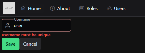
</template>Recall that these errors will have a standard structure, such as this:
{
  "error": "Validation Error",
  "errors": [
    {
      "attribute": "username",
      "message": "username must be unique"
    }
  ]
}
So, in our TextField.vue component, we can look for any errors that match the field that the component is responsible for, and we can present those to the user.
<script setup>
/**
 * @file Custom Text Form Field Component
 * @author Russell Feldhausen <russfeld@ksu.edu>
 */

// Import Libraries
import { computed } from 'vue';
import { InputIcon, IconField, FloatLabel, InputText, Message } from 'primevue';

// Incoming Props
const props = defineProps({
  // Field Name
  field: String,
  // Field Label
  label: String,
  // Field Icon
  icon: String,
  // Disable Editing
  disabled: {
    type: Boolean,
    default: false
  },
  errors: Array
})

// Find Error for Field
const error = computed(() => {
  return props.errors.find((e) => e.attribute === props.field)
})

// V-model of the field to be edited
const model = defineModel()
</script>

<template>
  <div>
    <FloatLabel variant="on">
      <IconField>
        <InputIcon :class="props.icon" />
        <InputText :id="props.field" :disabled="props.disabled" :invalid="error" v-model="model" />
      </IconField>
      <label :for="props.field">{{ props.label }}</label>
    </FloatLabel>
    <!-- Error Text -->
    <Message v-if="error" severity="error" variant="simple" size="small">{{ error.message }}</Message>
  </div>
</template>
Now, when we enter an invalid username, we’ll clearly see the error on our form: