Edit Roles
YouTube VideoEditing Roles
There are many different ways to edit the list of roles assigned to each user as well. One of the smoothest ways to select from a list of options is the PrimeVue AutoComplete component. Just like before, we can build our own version of this component that includes everything we included previously:
<script setup>
/**
 * @file Custom Autocomplete Multiple Field Component
 * @author Russell Feldhausen <russfeld@ksu.edu>
 */

// Import Libraries
import { computed, ref } from 'vue'
import { InputIcon, IconField, FloatLabel, AutoComplete, Message } from 'primevue'

// Incoming Props
const props = defineProps({
  // Field Name
  field: String,
  // Field Label
  label: String,
  // Field Icon
  icon: String,
  // Disable Editing
  disabled: {
    type: Boolean,
    default: false,
  },
  //Values to choose from
  values: Array,
  // Value Label
  valueLabel: {
    type: String,
    default: 'name',
  },
  errors: Array,
})

// Find Error for Field
const error = computed(() => {
  return props.errors.find((e) => e.attribute === props.field)
})

// V-model of the field to be edited
const model = defineModel()

// State variable for search results
const items = ref([])

// Search method
const search = function (event) {
  console.log(event)
  items.value = props.values.filter((v) => v[props.valueLabel].includes(event.query))
  console.log(items.value)
}
</script>

<template>
  <div>
    <FloatLabel variant="on">
      <IconField>
        <InputIcon :class="props.icon" />
        <AutoComplete
          :optionLabel="props.valueLabel"
          :id="props.field"
          :disabled="props.disabled"
          :invalid="error"
          v-model="model"
          forceSelection
          multiple
          fluid
          :suggestions="items"
          @complete="search"
        />
      </IconField>
      <label :for="props.field">{{ props.label }}</label>
    </FloatLabel>
    <!-- Error Text -->
    <Message v-if="error" severity="error" variant="simple" size="small">{{
      error.message
    }}</Message>
  </div>
</template>
This component is very similar to the previous one, but it includes a couple of extra props to control the value that is displayed to the user as well as a function to help search through the list of values.
To use it, we’ll need to load all of the available roles in our UserEdit.vue component so we can pass that along to the new AutoCompleteMultipleField component:
<script setup>
/**
* @file User Edit Component
* @author Russell Feldhausen <russfeld@ksu.edu>
*/
// Import Libraries
import { ref } from 'vue'
import { api } from '@/configs/api'
import { Button } from 'primevue'
import TextField from '../forms/TextField.vue'
import AutoCompleteMultipleField from '../forms/AutoCompleteMultipleField.vue'
import { useRouter } from 'vue-router'
const router = useRouter()
import { useToast } from 'primevue/usetoast'
const toast = useToast()
// Incoming Props
const props = defineProps({
// User ID
id: String,
})
// Declare State
const user = ref({})
const roles = ref([])
const errors = ref([])
// -=-=- other code omitted here -=-=-
// Load Roles
api
.get('/api/v1/roles')
.then(function (response) {
roles.value = response.data
})
.catch(function (error) {
console.log(error)
})
// -=-=- other code omitted here -=-=-
</script>
<template>
{{ user }}
<TextField
v-model="user.username"
field="username"
label="Username"
icon="pi pi-user"
:errors="errors"
/>
<AutoCompleteMultipleField
v-model="user.roles"
field="roles"
label="Roles"
icon="pi pi-id-card"
:errors="errors"
:values="roles"
valueLabel="role"
/>
<Button severity="success" @click="save" label="Save" />
<Button severity="secondary" @click="router.push({ name: 'users' })" label="Cancel" />
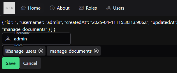
</template>With that in place, we can now see a new field to edit a user’s roles:
As we can see, however, the AutoComplete field for PrimeVue doesn’t quite support having an icon in front of it. Thankfully, we can easily fix that in our CSS by just finding the offset used in the other fields:
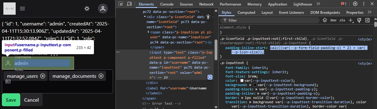
Once we have that, we can add it to our new AutoComplete component in a <style scoped> section that references the correct class:
<style scoped>
:deep(.p-autocomplete > ul) {
  padding-inline-start: calc((var(--p-form-field-padding-x) * 2) + var(--p-icon-size));
}
</style>
That will fix the padding for our icon to show up properly!
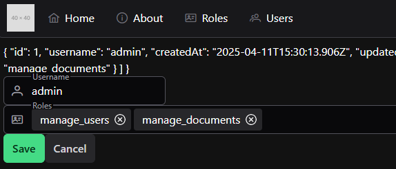
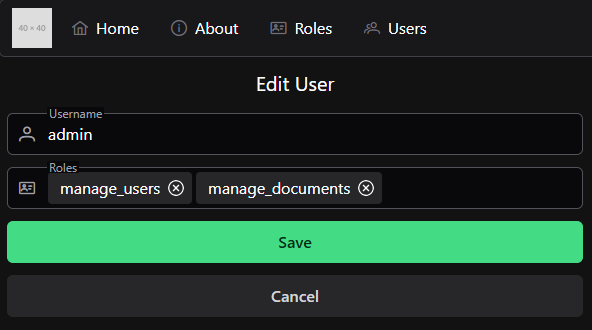
At this point, we can easily add and remove roles for this user. We can even click the save button and it should work as intended! No extra code is needed. So, we can remove the extra line in the <template> of our UserEdit.vue component to remove the debugging information.
Styling
Finally, we can use some quick CSS styling to update the content of our UserEdit.vue page to be a bit easier to follow.
<template>
  <div class="flex flex-col gap-3 max-w-xl justify-items-center">
    <h1 class="text-xl text-center m-1">Edit User</h1>
    <TextField
      v-model="user.username"
      field="username"
      label="Username"
      icon="pi pi-user"
      :errors="errors"
    />
    <AutoCompleteMultipleField
      v-model="user.roles"
      field="roles"
      label="Roles"
      icon="pi pi-id-card"
      :errors="errors"
      :values="roles"
      valueLabel="role"
    />
    <Button severity="success" @click="save" label="Save" />
    <Button severity="secondary" @click="router.push({ name: 'users' })" label="Cancel" />
  </div>
</template>
We can also add a w-full class to our TextField component to expand that field to fit the surrounding components:
<template>
  <div>
    <FloatLabel variant="on">
      <IconField>
        <InputIcon :class="props.icon" />
        <InputText
          :id="props.field"
          :disabled="props.disabled"
          :invalid="error"
          v-model="model"
          class="w-full"
        />
      </IconField>
      <label :for="props.field">{{ props.label }}</label>
    </FloatLabel>
    <!-- Error Text -->
    <Message v-if="error" severity="error" variant="simple" size="small">{{
      error.message
    }}</Message>
  </div>
</template>
With all of that in place, we have a nice looking form to edit our users!