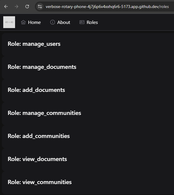
With those changes in place, we should be able to view the list of available roles in our application by clicking the new Roles link in the top menu bar:
Our application will even redirect users to the CAS server to authenticate if they aren’t already logged in!
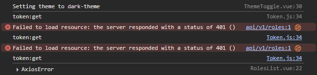
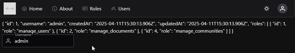
However, what if we log in using the user username instead of admin? Will this page still work? Unfortunately, because the /api/v1/roles API route requires a user to have the manage_users role, it will respond with an HTTP 401 error. We can see these errors in the console of our web browser:
So, we need to add some additional code to our application to make sure that users only see the pages and links the are actually able to access.
Hiding Menu Items
First, let’s explore how we can hide various menu items from our top menu bar based on the roles assigned to our users. To enable this, we can tag each item in the menu that has restricted access with a list of roles that are able to access that page:
Then, we can create a Vue Computed Property to filter the list of items used in the template:
<scriptsetup>
/**
* @file Top menu bar of the entire application
* @author Russell Feldhausen <russfeld@ksu.edu>
*/// Import Libraries
import { ref, computed } from'vue'import { useRouter } from'vue-router'constrouter=useRouter()
// Import Components
importMenubarfrom'primevue/menubar'importThemeTogglefrom'./ThemeToggle.vue'importUserProfilefrom'./UserProfile.vue'// Stores
import { useTokenStore } from'@/stores/Token'consttokenStore=useTokenStore()
// -=-=- other code omitted here -=-=-
constvisible_items=computed(() => {
returnitems.value.filter((item) => {
// If the item lists any roles
if (item.roles) {
// Assume the user must be logged in to view it
if (tokenStore.token.length>0) {
// If the roles is a string containing an asterisk
if (item.roles=="*") {
// Allow all roles to view
returntrue;
} else {
// Otherwise, check if any role matches a role the user has
returnitem.roles.some((r) => tokenStore.has_role(r))
}
} else {
// If not logged in, hide item
returnfalse;
}
} else {
// If no roles listed, show item even if not logged in
returntrue;
}
})
})
</script>
In this function, we are filtering the the menu items based on the roles. If they have a set of roles listed, we check to see if it is an asterisk - if so, all roles are allowed. Otherwise, we assume that it is a list of roles, and check to see if at least one role matches a role that the user has by checking the token store’s has_role getter method. Finally, if no roles are listed, we assume that the item should be visible to users even without logging in.
To use this new computed property, we just replace the items entry in the template with the new computed_items property:
That should properly hide menu items from the user based on their roles. Feel free to try it out!
Protecting Routes
Of course, hiding the item from the menu does not prevent the user from manually typing in the route path in the URL and trying to access the page that way. So, we must also add some additional logic to our router to ensure that user’s can’t access. For that, we can add a Per-Route Guard following a very similar approach. In our src/router/index.js file, we can add a new generator function to create a route guard based on roles, and then apply that guard as the beforeEnter property for a route:
// -=-=- other code omitted here -=-=-
/**
* Router Guard Function to check for role before entering route
*
* @param roles a list of roles permitted to enter the route
* @return boolean true if the navigation is permitted, else returns to the home page
*/constrequireRoles= (...roles) => {
return () => {
consttokenStore=useTokenStore()
constallow=roles.some((r) => tokenStore.has_role(r))
if (allow) {
// allow navigation
returntrue;
} else {
// redirect to home
return { name:'home'}
}
}
}
constrouter=createRouter({
// Configure History Mode
history:createWebHistory(import.meta.env.BASE_URL),
// Configure routes
routes: [
{
path:'/',
name:'home',
component:HomeView,
},
{
path:'/about',
name:'about',
// route level code-splitting
// this generates a separate chunk (About.[hash].js) for this route
// which is lazy-loaded when the route is visited.
component: () => import('../views/AboutView.vue'),
},
{
path:'/profile',
name:'profile',
component: () => import('../views/ProfileView.vue'),
},
{
path:'/roles',
name:'roles',
component: () => import('../views/RolesView.vue'),
beforeEnter:requireRoles("manage_users")
},
],
})
// -=-=- other code omitted here -=-=-
Now, even if we try to type the /roles path into the address bar in our web browser, it won’t allow us to reach that page unless we are logged in to a user account that has the correct role.
Reactive Style
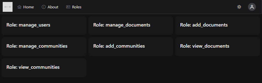
We can also use Tailwind to add some reactive style to our components. For example, we can use the Grid layout options to place the components in a grid view:
Now that we have explored the basics of adding new menu items and routes to our application, let’s start working on the components to view and edit the users available in our application. To begin, we’ll work on the *GET ALL route, which will allow us to view all of the users on our system. For this, we’ll use the PrimeVue DataTable component, which is one of the most powerful components available in the PrimeVue library.
First, before we can do that, we must set up our new view and a route to get there, as well as a menu option. So, let’s go through that really quickly.
First, we’ll add a new route to the Vue router:
// -=-=- other code omitted here -=-=-
constrouter=createRouter({
// Configure History Mode
history:createWebHistory(import.meta.env.BASE_URL),
// Configure routes
routes: [
// -=-=- other code omitted here -=-=-
{
path:'/users',
name:'users',
component: () => import('../views/UsersListView.vue'),
beforeEnter:requireRoles("manage_users")
}
],
})
// -=-=- other code omitted here -=-=-
We’ll also add that route as a menu item in our TopMenu.vue component:
<scriptsetup>
// -=-=- other code omitted here -=-=-
// Declare State
constitems=ref([
// -=-=- other code omitted here -=-=-
{
label:'Users',
icon:'pi pi-users',
command: () => {
router.push({ name:'users' })
},
roles: ['manage_users']
},
])
// -=-=- other code omitted here -=-=-
</script>
Then, we’ll create a new view named UsersListView.vue that will contain our table component:
Finally, we’ll create a new UsersList component to store our code:
<scriptsetup>
/**
* @file Users List Component
* @author Russell Feldhausen <russfeld@ksu.edu>
*/</script>
<template>
UsersListHere</template>
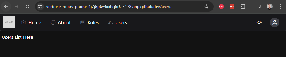
With all of that in place, we should now be able to click on the Users button at the top of our page and get to the UsersList component on the appropriate view:
From here, we can start to build our table view.
PrimeVue DataTable
To use the PrimeVue DataTable component, we first need to get our data from the API so we can easily display it in our component. So, let’s use the Axios api instance to query the API and get our list of users. This is nearly the exact same code we used previously to get the list of users:
<scriptsetup>
/**
* @file Users List Component
* @author Russell Feldhausen <russfeld@ksu.edu>
*/// Import Libraries
import { ref } from'vue'import { api } from'@/configs/api'// Create Reactive State
constusers=ref([])
// Load Users
api .get('/api/v1/users')
.then(function (response) {
users.value=response.data })
.catch(function (error) {
console.log(error)
})
</script>
Now that we have that list, we can start to construct our DataTable. First, we’ll need to import the required components in our <script setup> section:
<scriptsetup>
/**
* @file Users List Component
* @author Russell Feldhausen <russfeld@ksu.edu>
*/// Import Libraries
import { ref } from'vue'import { api } from'@/configs/api'importDataTablefrom'primevue/datatable';
importColumnfrom'primevue/column';
// -=-=- other code omitted here -=-=-
</script>
Now, in the <template> section, we can build a basic DataTable by including the data we want to view and the columns that should be included:
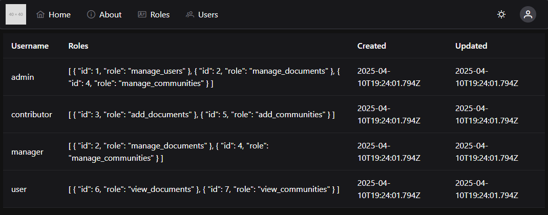
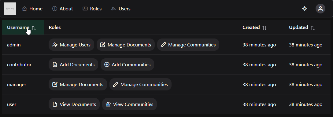
Each <Column> component includes a field name for that column, as well as a header value. With that in place, we should see a simple page with lots of helpful information about our users:
This is a great start, but we can clean this up to make it much easier for our users to read and digest the information.
Custom Column Templates
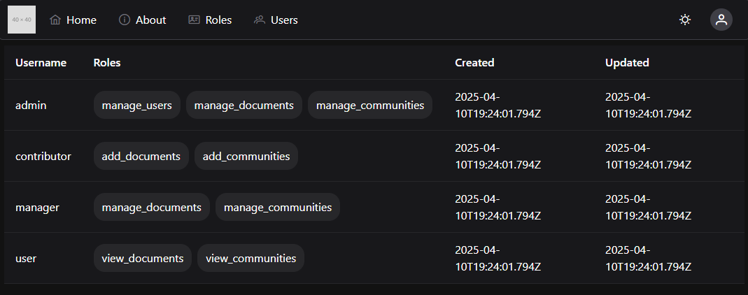
First, let’s create a couple of custom templates for columns. First, we notice that the Roles column is just outputting the entire JSON list of roles, but this is not very helpful. So, let’s modify that column to present a list of Chips representing the roles:
<scriptsetup>
/**
* @file Users List Component
* @author Russell Feldhausen <russfeld@ksu.edu>
*/// Import Libraries
import { ref } from'vue'import { api } from'@/configs/api'importDataTablefrom'primevue/datatable';
importColumnfrom'primevue/column';
importChipfrom'primevue/chip';
// -=-=- other code omitted here -=-=-
</script>
<template>
<DataTable:value="users">
<Columnfield="username"header="Username" />
<Columnfield="roles"header="Roles">
<template#body="{ data }">
<divclass="flex gap-2">
<Chipv-for="role in data.roles" :key="role.id" :label="role.role" />
</div>
</template>
</Column>
<Columnfield="createdAt"header="Created" />
<Columnfield="updatedAt"header="Updated" />
</DataTable>
</template>
Inside of the <Column> component, we place a <template> for the #body slot, and we also provide a link to the data of the <Column> component so we can access that data.
With this change, our table now looks like this:
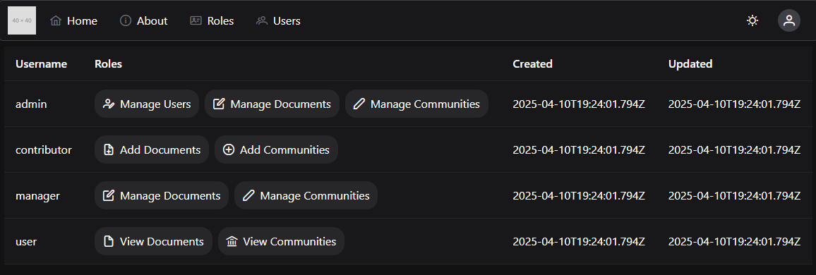
However, we can improve on that a bit by adding some additional information to our application that helps us display these roles in a bit cleaner format. Let’s create a new custom RoleChip component that will display the roles properly, along with some additional information.
This component includes a constant lookup table that provides some additional information about each role, based on the role’s ID. This allows us to assign a user-friendly name and icon to each role in our frontend application. In fact, if we are internationalizing this application, we could also use this component to translate the role names into localized forms here.
We are also seeing a great example of Vue Props in this component. Props allow us to pass data from one component down into another sub-component. It is a one-way data connection, which is very important to remember.
We can update our UsersList.vue component to use this new RoleChip component very easily:
<scriptsetup>
/**
* @file Users List Component
* @author Russell Feldhausen <russfeld@ksu.edu>
*/// Import Libraries
import { ref } from'vue'import { api } from'@/configs/api'importDataTablefrom'primevue/datatable';
importColumnfrom'primevue/column';
importRoleChipfrom'../roles/RoleChip.vue';
// -=-=- other code omitted here -=-=-
</script>
<template>
<DataTable:value="users">
<Columnfield="username"header="Username" />
<Columnfield="roles"header="Roles">
<template#body="{ data }">
<divclass="flex gap-2">
<RoleChipv-for="role in data.roles" :key="role.id" :role="role" />
</div>
</template>
</Column>
<Columnfield="createdAt"header="Created" />
<Columnfield="updatedAt"header="Updated" />
</DataTable>
</template>
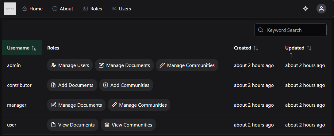
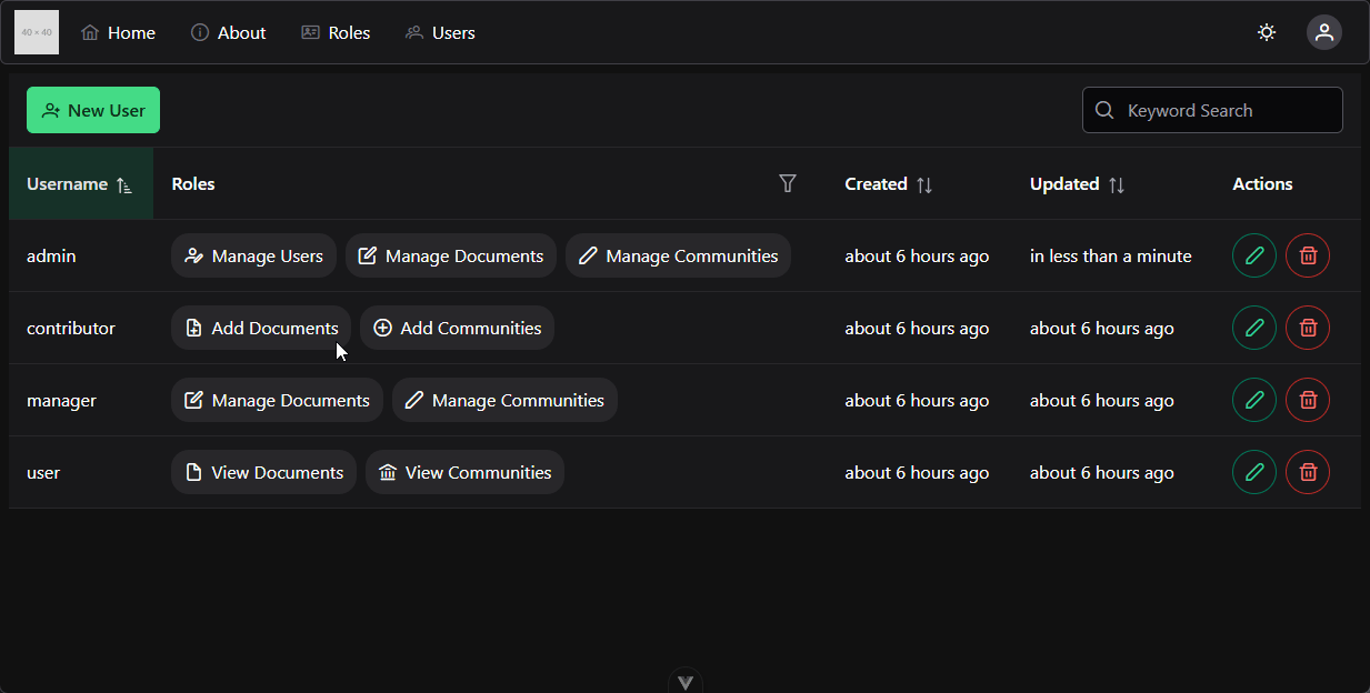
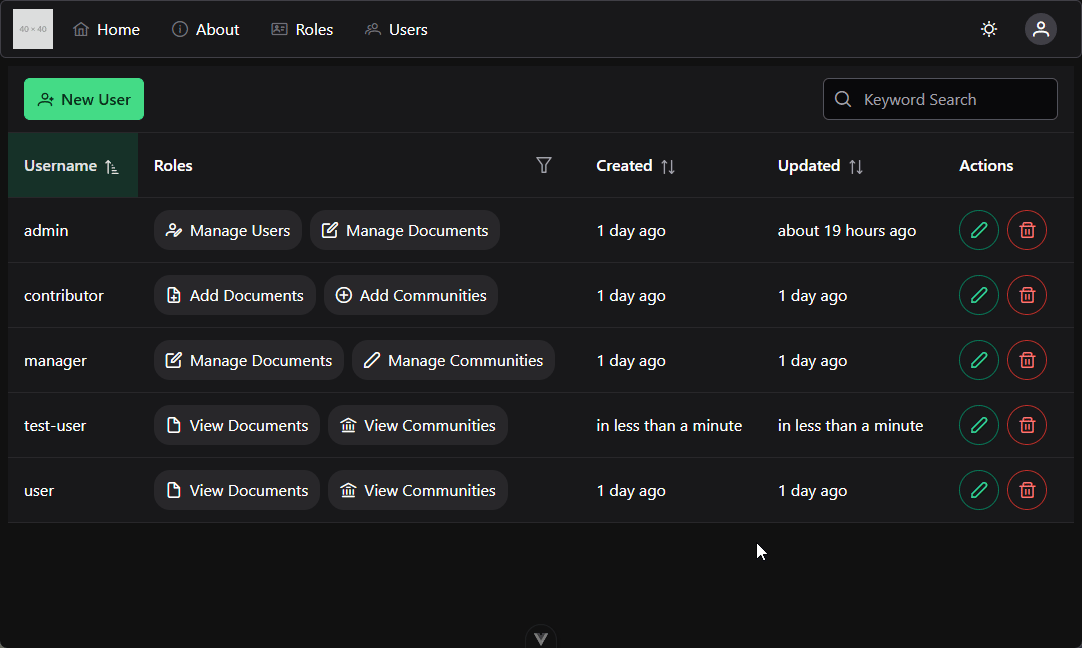
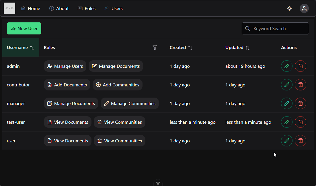
Now we have a much cleaner view of the roles each user is assigned, with helpful icons to help us remember what each one does.
Handling Dates
Let’s also clean up the Created and Updated columns by rendering the dates into a more useful format. For this, we can use the date-fns library to help us format and display times easily in our project. First, we’ll need to install it:
$ npm install date-fns
Then, in our component, we can use it to format our dates by computing the distance in the past that the event occurred:
<scriptsetup>
/**
* @file Users List Component
* @author Russell Feldhausen <russfeld@ksu.edu>
*/// Import Libraries
import { ref } from'vue'import { api } from'@/configs/api'import { formatDistance } from'date-fns';
importDataTablefrom'primevue/datatable';
importColumnfrom'primevue/column';
importRoleChipfrom'../roles/RoleChip.vue';
// -=-=- other code omitted here -=-=-
</script>
<template>
<DataTable:value="users">
<Columnfield="username"header="Username" />
<Columnfield="roles"header="Roles">
<template#body="{ data }">
<divclass="flex gap-2">
<RoleChipv-for="role in data.roles" :key="role.id" :role="role" />
</div>
</template>
</Column>
<Columnfield="createdAt"header="Created">
<template#body="{ data }">
<spanv-tooltip.bottom="newDate(data.createdAt).toLocaleString()">
{{ formatDistance(new Date(data.createdAt), new Date(), { addSuffix:true }) }}
</span>
</template>
</Column>
<Columnfield="updatedAt"header="Updated">
<template#body="{ data }">
<spanv-tooltip.bottom="newDate(data.updatedAt).toLocaleString()">
{{ formatDistance(new Date(data.updatedAt), new Date(), { addSuffix:true }) }}
</span>
</template>
</Column>
</DataTable>
</template>
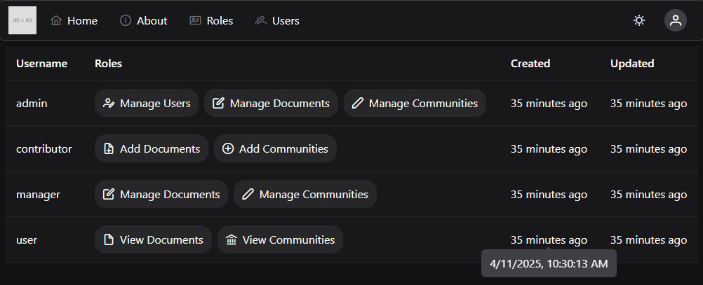
With that in place, we can more easily see how long ago each user’s account was created or updated:
We can even hover over one of the formatted dates to see the actual date in a tooltip.
Sorting
We can also enable Sorting in our PrimeVue DataTable by simply adding the sortable property to any columns we’d like to sort. For this example, let’s add that to the username, createdAt and updatedAt fields:
<template>
<DataTable:value="users">
<Columnfield="username"header="Username"sortable />
<Columnfield="roles"header="Roles">
<template#body="{ data }">
<divclass="flex gap-2">
<RoleChipv-for="role in data.roles" :key="role.id" :role="role" />
</div>
</template>
</Column>
<Columnfield="createdAt"header="Created"sortable >
<template#body="{ data }">
<spanv-tooltip.bottom="newDate(data.createdAt).toLocaleString()">
{{ formatDistance(new Date(data.createdAt), new Date(), { addSuffix:true }) }}
</span>
</template>
</Column>
<Columnfield="updatedAt"header="Updated"sortable >
<template#body="{ data }">
<spanv-tooltip.bottom="newDate(data.updatedAt).toLocaleString()">
{{ formatDistance(new Date(data.updatedAt), new Date(), { addSuffix:true }) }}
</span>
</template>
</Column>
</DataTable>
</template>
We can even define a default column and sort order for our table:
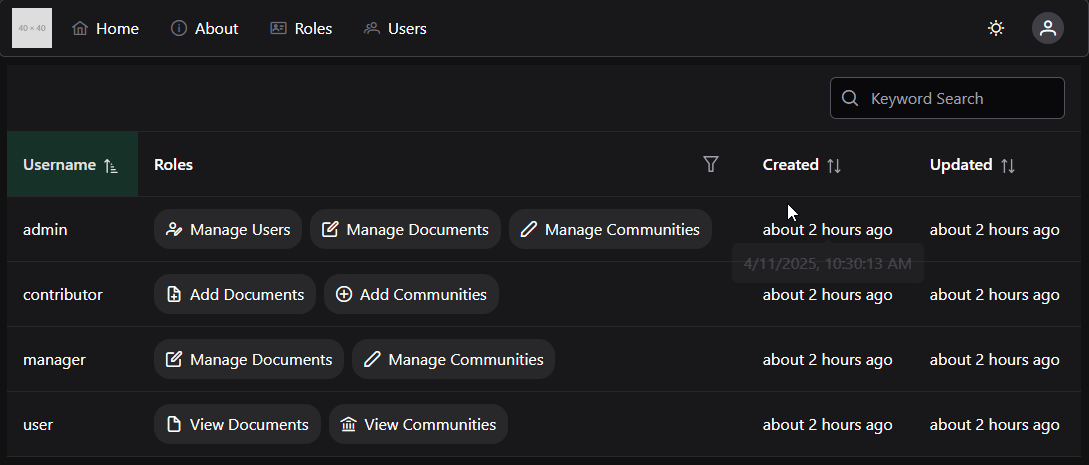
Another great feature of PrimeVue’s DataTable is the ability to quickly add Filtering features. We can define a global filter to allow us to search for a user by the username by simply defining a global filter set and a list of fields to search. We should also add a quick search box to the top of our DataTable template to accept this input.
With this in place, we can now type in any username and filter the table for that username:
Column Filtering
We can also do more advanced filtering, such as allowing users to select roles that they’d like to search for. This is a bit more complex, as it requires us to first write our own custom filter function, and then we also have to add a small template for setting the filter options.
First, let’s create a new custom filter function in our <script setup> section. We’ll also need to get a list of the available roles in our system, so we can add that to this section as well.:
The filterArrayOfObjectsById function should look somewhat familiar - we have an array of roles we want to search for, and we want to ensure that the user has all of these roles (this is different than some of our other functions that look like this, where we want the user to have at least one of the roles).
Now, to make this visible in our template, we add a special <template #filter> slot to the Column that is displaying the roles. We also set the filterDisplay option on the top-level DataTable component to "menu" to allow us to have pop-up menus for filtering. For this menu, we’re going to use the PrimeVue Multiselect component, so we’ll need to import it:
With all of this in place, we can now filter based on roles as well:
Buttons
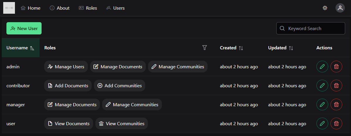
Finally, let’s work on adding some buttons to our table that will allow us to create new users, edit existing users, and delete users.
First, let’s add a simple button to create a new user at the top of our DataTable component. We’ll use a PrimeVue Button component for this, and we’ll also need to import the Vue Router so we can route to a different view when this is clicked.
When we click on this button, we’ll be sent to the newuser route in our application. This route doesn’t currently exist, but we’ll add it later in this tutorial.
Likewise, we want to add buttons to allow us to edit and delete each user’s account, so let’s add a new column to our DataTable with those buttons as well.
These buttons will direct us to the edituser and deleteuser routes, and they even include the ID of the user to be edited or deleted in the route parameters. We’ll work on adding these features as well later in this tutorial. With these changes in place, our final DataTable for our users should look something like this:
For the rest of this tutorial, we’ll work on adding additional functionality to handle creating, editing, and deleting user accounts.
The next major feature we can add to our frontend application is the ability to edit a user. To do this, we’ll need to create a view and a component that contains the form fields for editing a user, as well as the logic to communicate any changes back to the API.
As always, we’ll start by adding a route to our src/router/index.js file for this route:
// -=-=- other code omitted here -=-=-
constrouter=createRouter({
// Configure History Mode
history:createWebHistory(import.meta.env.BASE_URL),
// Configure routes
routes: [
// -=-=- other code omitted here -=-=-
{
path:'/users/:id/edit',
name:'edituser',
component: () => import('../views/UsersEditView.vue'),
beforeEnter:requireRoles('manage_users'),
props:true }
],
})
// -=-=- other code omitted here -=-=-
In this route, we are using :id to represent a Route Parameter, which is the same syntax we saw earlier in our Express backend. Since we want that route parameter to be passed as a Vue prop to our view component, we also add the props: true entry to this route definition.
Next, we’ll create a simple UsersEditView.vue component in our src/views folder to contain the new view:
Finally, we’ll create our new component in the src/components/users/UserEdit.vue file with the following default content:
<scriptsetup>
/**
* @file User Edit Component
* @author Russell Feldhausen <russfeld@ksu.edu>
*/</script>
<template>
EditUserHere</template>
Getting User Data
To begin, let’s get the user’s data from our API. We know that this component will have a Vue prop for the user’s id available, because it is the only element on the UsersEditView page, so the property will Fallthrough to this element. So, we can declare it at the top of our component, and use it to request data about a single user in our component as a reactive state variable.
<scriptsetup>
/**
* @file User Edit Component
* @author Russell Feldhausen <russfeld@ksu.edu>
*/// Import Libraries
import { ref } from'vue';
import { api } from'@/configs/api'// Incoming Props
constprops=defineProps({
// User ID
id: String,
})
// Declare State
constuser=ref({})
// Load Users
api .get('/api/v1/users/'+props.id)
.then(function (response) {
user.value=response.data })
.catch(function (error) {
console.log(error)
})
</script>
With this data in hand, we can start building a form to allow us to edit our user.
Creating a Text Field Component
Our User account has two fields that we want to be able to edit: the username field and the list of roles assigned to the user. Let’s tackle the username field first. PrimeVue includes many different components that can be used in a form. One of the simplest is their InputText field that accepts textual input from the user. However, we can also add things like an IconField to show an icon inside of the field, and a FloatLabel to easily include a descriptive label that floats over our field. One really cool feature is the ability to combine several of these into an Icon Field with a Floating Label as shown in the PrimeVue examples. However, because we know we plan on creating multiple forms with text input fields, let’s create our own custom component that combines all of these items together.
We’ll create a new component in the src/components/forms/TextField.vue with the following content:
<scriptsetup>
/**
* @file Custom Text Form Field Component
* @author Russell Feldhausen <russfeld@ksu.edu>
*/// Import Libraries
import { InputIcon, IconField, FloatLabel, InputText } from'primevue';
// Incoming Props
constprops=defineProps({
// Field Name
field: String,
// Field Label
label: String,
// Field Icon
icon: String,
// Disable Editing
disabled: {
type: Boolean,
default:false }
})
// V-model of the field to be edited
constmodel=defineModel()
</script>
<template>
<FloatLabelvariant="on">
<IconField>
<InputIcon:class="props.icon" />
<InputText:id="props.field":disabled="props.disabled"v-model="model" />
</IconField>
<label:for="props.field">{{ props.label }}</label>
</FloatLabel>
</template>
This component includes a number of props that define the form field we want to create, and then puts them all together following the model provided in the PrimeVue documentation.
With that component in place, we can use it our UserEdit component to edit the user’s username:
<scriptsetup>
/**
* @file User Edit Component
* @author Russell Feldhausen <russfeld@ksu.edu>
*/// Import Libraries
import { ref } from'vue';
import { api } from'@/configs/api'importTextFieldfrom'../forms/TextField.vue'// -=-=- other code omitted here -=-=-
</script>
<template>
<span>{{ user }}</span>
<TextFieldv-model="user.username" field="username" label="Username" icon="pi pi-user" />
</template>
For this example, we’ve also added a <span> element showing the current contents of the user reactive state variable, just so we can see our form field in action. As we edit the data in the field, we can also see our user state variable update!
Since we can easily just edit the user’s username without changing any other fields, we can test this by adding a Save and Cancel button to our page:
<scriptsetup>
/**
* @file User Edit Component
* @author Russell Feldhausen <russfeld@ksu.edu>
*/// Import Libraries
import { ref } from'vue';
import { api } from'@/configs/api'import { Button } from'primevue'importTextFieldfrom'../forms/TextField.vue'import { useRouter } from'vue-router'constrouter=useRouter()
// -=-=- other code omitted here -=-=-
</script>
<template>
<span>{{ user }}</span>
<TextFieldv-model="user.username" field="username" label="Username" icon="pi pi-user" />
<Buttonseverity="success"@click="save"label="Save" />
<Buttonseverity="secondary"@click="router.push({ name: 'users' })"label="Cancel" />
</template>
The functionality of the Cancel button is pretty straightforward; it just uses the Vue Router to send the user back to the /users route. For the Save button, however, we need to implement a custom save function in our component to save the updated user:
<scriptsetup>
// -=-=- other code omitted here -=-=-
// Save User
constsave=function() {
api .put('/api/v1/users/'+props.id, user.value)
.then(function (response) {
if (response.status===201) {
router.push({ name:"users"})
}
})
.catch(function (error) {
console.log(error)
})
}
</script>
With that code in place, we can click the Save button, and it should save our edit to the user’s username and redirect us back to the /users route.
Toast Messages
However, there is no obvious visual cue that shows us the user was successfully saved, so our users may not really know if it worked or not. For that, we can use the PrimeVue Toast component to display messages to our users. To install it, we have to add a few lines to our src/main.js file:
With that in place, we can use the ToastService to display messages to our user from our UserEdit component:
<scriptsetup>
/**
* @file User Edit Component
* @author Russell Feldhausen <russfeld@ksu.edu>
*/// Import Libraries
import { ref } from'vue';
import { api } from'@/configs/api'import { Button } from'primevue'importTextFieldfrom'../forms/TextField.vue'import { useRouter } from'vue-router'constrouter=useRouter()
import { useToast } from'primevue/usetoast';
consttoast=useToast();
// -=-=- other code omitted here -=-=-
// Save User
constsave=function() {
api .put('/api/v1/users/'+props.id, user.value)
.then(function (response) {
if (response.status===201) {
toast.add({ severity:'success', summary:"Success", detail:response.data.message, life:5000 })
router.push({ name:"users"})
}
})
.catch(function (error) {
console.log(error)
})
}
</script>
Now, when we successfully edit a user, we’ll see a pop-up message on the lower right of our screen showing that the user was successfully saved!
Handling Errors
What if we try to edit our user and end up receiving an error from the server? What should we do in that instance?
Thankfully, our backend RESTful API is already configured to send helpful, well-structured error messages when things go wrong. So, we can take advantage of that in our frontend application to display errors for the user.
To use these error messages, in our UserEdit component, we just need to grab them and store them in a new reactive state variable that we share with all of our form components:
<scriptsetup>
// -=-=- other code omitted here -=-=-
// Declare State
constuser=ref({})
consterrors=ref([])
// -=-=- other code omitted here -=-=-
// Save User
constsave=function() {
errors.value= []
api .put('/api/v1/users/'+props.id, user.value)
.then(function (response) {
if (response.status===201) {
toast.add({ severity:'success', summary:"Success", detail:response.data.message, life:5000 })
router.push({ name:"users"})
}
})
.catch(function (error) {
if (error.status===422) {
toast.add({ severity:'warn', summary:"Warning", detail:error.response.data.error, life:5000 })
errors.value=error.response.data.errors } else {
toast.add({ severity:'error', summary:"Error", detail:error, life:5000 })
}
})
}
</script>
<template>
<span>{{ user }}</span>
<TextFieldv-model="user.username" field="username" label="Username" icon="pi pi-user" :errors="errors" />
<Buttonseverity="success"@click="save"label="Save" />
<Buttonseverity="secondary"@click="router.push({ name: 'users' })"label="Cancel" />
</template>
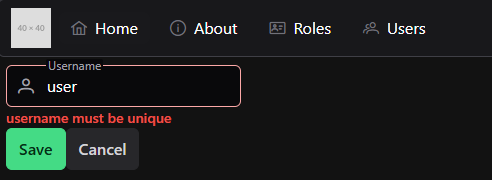
Recall that these errors will have a standard structure, such as this:
{
  "error": "Validation Error",
  "errors": [
    {
      "attribute": "username",
      "message": "username must be unique"
    }
  ]
}
So, in our TextField.vue component, we can look for any errors that match the field that the component is responsible for, and we can present those to the user.
<scriptsetup>
/**
* @file Custom Text Form Field Component
* @author Russell Feldhausen <russfeld@ksu.edu>
*/// Import Libraries
import { computed } from'vue';
import { InputIcon, IconField, FloatLabel, InputText, Message } from'primevue';
// Incoming Props
constprops=defineProps({
// Field Name
field: String,
// Field Label
label: String,
// Field Icon
icon: String,
// Disable Editing
disabled: {
type: Boolean,
default:false },
errors: Array
})
// Find Error for Field
consterror=computed(() => {
returnprops.errors.find((e) => e.attribute===props.field)
})
// V-model of the field to be edited
constmodel=defineModel()
</script>
<template>
<div>
<FloatLabelvariant="on">
<IconField>
<InputIcon:class="props.icon" />
<InputText:id="props.field":disabled="props.disabled":invalid="error"v-model="model" />
</IconField>
<label:for="props.field">{{ props.label }}</label>
</FloatLabel>
<!-- Error Text--> <Messagev-if="error" severity="error" variant="simple" size="small">{{ error.message }}</Message>
</div>
</template>
Now, when we enter an invalid username, we’ll clearly see the error on our form:
There are many different ways to edit the list of roles assigned to each user as well. One of the smoothest ways to select from a list of options is the PrimeVue AutoComplete component. Just like before, we can build our own version of this component that includes everything we included previously:
<scriptsetup>
/**
* @file Custom Autocomplete Multiple Field Component
* @author Russell Feldhausen <russfeld@ksu.edu>
*/// Import Libraries
import { computed, ref } from'vue'import { InputIcon, IconField, FloatLabel, AutoComplete, Message } from'primevue'// Incoming Props
constprops=defineProps({
// Field Name
field: String,
// Field Label
label: String,
// Field Icon
icon: String,
// Disable Editing
disabled: {
type: Boolean,
default:false,
},
//Values to choose from
values: Array,
// Value Label
valueLabel: {
type: String,
default:'name',
},
errors: Array,
})
// Find Error for Field
consterror=computed(() => {
returnprops.errors.find((e) => e.attribute===props.field)
})
// V-model of the field to be edited
constmodel=defineModel()
// State variable for search results
constitems=ref([])
// Search method
constsearch=function (event) {
console.log(event)
items.value=props.values.filter((v) => v[props.valueLabel].includes(event.query))
console.log(items.value)
}
</script>
<template>
<div>
<FloatLabelvariant="on">
<IconField>
<InputIcon:class="props.icon" />
<AutoComplete:optionLabel="props.valueLabel":id="props.field":disabled="props.disabled":invalid="error"v-model="model"forceSelectionmultiplefluid:suggestions="items"@complete="search" />
</IconField>
<label:for="props.field">{{ props.label }}</label>
</FloatLabel>
<!-- Error Text--> <Messagev-if="error" severity="error" variant="simple" size="small">{{
error.message }}</Message>
</div>
</template>
This component is very similar to the previous one, but it includes a couple of extra props to control the value that is displayed to the user as well as a function to help search through the list of values.
To use it, we’ll need to load all of the available roles in our UserEdit.vue component so we can pass that along to the new AutoCompleteMultipleField component:
<scriptsetup>
/**
* @file User Edit Component
* @author Russell Feldhausen <russfeld@ksu.edu>
*/// Import Libraries
import { ref } from'vue'import { api } from'@/configs/api'import { Button } from'primevue'importTextFieldfrom'../forms/TextField.vue'importAutoCompleteMultipleFieldfrom'../forms/AutoCompleteMultipleField.vue'import { useRouter } from'vue-router'constrouter=useRouter()
import { useToast } from'primevue/usetoast'consttoast=useToast()
// Incoming Props
constprops=defineProps({
// User ID
id: String,
})
// Declare State
constuser=ref({})
constroles=ref([])
consterrors=ref([])
// -=-=- other code omitted here -=-=-
// Load Roles
api .get('/api/v1/roles')
.then(function (response) {
roles.value=response.data })
.catch(function (error) {
console.log(error)
})
// -=-=- other code omitted here -=-=-
</script>
<template>
{{ user }}
<TextFieldv-model="user.username"field="username"label="Username"icon="pi pi-user":errors="errors" />
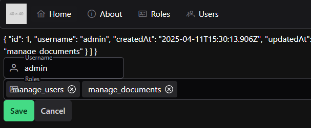
<AutoCompleteMultipleFieldv-model="user.roles"field="roles"label="Roles"icon="pi pi-id-card":errors="errors":values="roles"valueLabel="role" />
<Buttonseverity="success"@click="save"label="Save" />
<Buttonseverity="secondary"@click="router.push({ name: 'users' })"label="Cancel" />
</template>
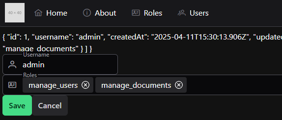
With that in place, we can now see a new field to edit a user’s roles:
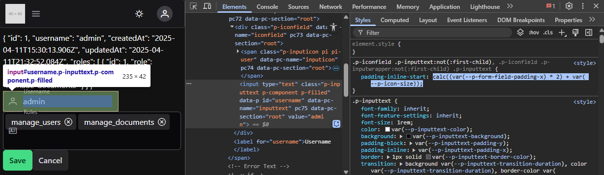
As we can see, however, the AutoComplete field for PrimeVue doesn’t quite support having an icon in front of it. Thankfully, we can easily fix that in our CSS by just finding the offset used in the other fields:
Once we have that, we can add it to our new AutoComplete component in a <style scoped> section that references the correct class:
That will fix the padding for our icon to show up properly!
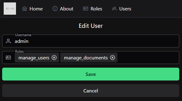
At this point, we can easily add and remove roles for this user. We can even click the save button and it should work as intended! No extra code is needed. So, we can remove the extra line in the <template> of our UserEdit.vue component to remove the debugging information.
Styling
Finally, we can use some quick CSS styling to update the content of our UserEdit.vue page to be a bit easier to follow.
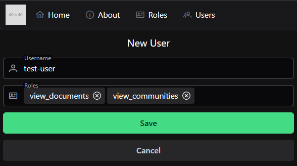
Now that we have a nice way to edit a user account, we’d like to also have a way to create a new user account. While we could easily duplicate our work in the UserEdit component and create a UserNew component, we can also add a bit more logic to our UserEdit component to handle both cases. So, let’s look at how we can do that!
First, we’ll need to add a route to our project to get us to the correct place. So, we’ll update our Vue Router:
// -=-=- other code omitted here -=-=-
constrouter=createRouter({
// Configure History Mode
history:createWebHistory(import.meta.env.BASE_URL),
// Configure routes
routes: [
// -=-=- other code omitted here -=-=-
{
path:'/users/new',
name:'newuser',
component: () => import('../views/UsersEditView.vue'),
beforeEnter:requireRoles('manage_users'),
},
],
})
// -=-=- other code omitted here -=-=-
This route will take us to the UsersEditView view, but without a prop giving the ID of the user to edit. When we get to that page without a prop, we’ll assume that the user is intending to create a new user instead. So, we’ll need to change some of our code in that component to handle this gracefully.
Thankfully, we can just look at the value of props.id for this - if it is a falsy value, then we know that it wasn’t provided and we are creating a new user. If one is provided, then we are editing a user instead.
So, at the start, if we are creating a new user, we want to set our user reactive state variable to a reasonable default value for a user. If we are editing a user, we’ll request that user’s data from the server.
<scriptsetup>
// -=-=- other code omitted here -=-=-
// Load Users
if (props.id) {
api .get('/api/v1/users/'+props.id)
.then(function (response) {
user.value=response.data })
.catch(function (error) {
console.log(error)
})
} else {
// Empty Value for User Object
user.value= {
username:'',
roles: []
}
}
// -=-=- other code omitted here -=-=-
</script>
Then, we need to change the code for saving a user to handle both situations. Thankfully, we can adjust both the method (either POST or PUT) as well as the URL easily in Axios using the Axios API.
Finally, let’s look at what it takes to delete a user. As with anything in frontend development, there are many different ways to go about this. We could follow the model we used for creating and editing users by adding a new view, route, and component for these actions. However, we can also just add a quick pop-up dialog directly to our UsersList component that will confirm the deletion before sending the request to the backend.
For this operation, we’re going to use the PrimeVue ConfirmDialog component. So, to begin, we need to install the ConfirmationService for these dialogs in our application by editing the main.js file:
In addition, we’ll add the component itself to the App.vue top-level component alongside the Toast component, so it is visible throughout our application:
Now, in our UsersList component, we can configure a confirmation dialog in our <script setup> section along with a function to actually handle deleting the user from our data:
<scriptsetup>
/**
* @file Users List Component
* @author Russell Feldhausen <russfeld@ksu.edu>
*/// Import Libraries
import { ref } from'vue'import { api } from'@/configs/api'import { formatDistance } from'date-fns'importDataTablefrom'primevue/datatable'importColumnfrom'primevue/column'import { IconField, InputIcon, InputText, MultiSelect } from'primevue'import { FilterMatchMode, FilterService } from'@primevue/core/api'importRoleChipfrom'../roles/RoleChip.vue'importButtonfrom'primevue/button'import { useRouter } from'vue-router'constrouter=useRouter()
import { useToast } from'primevue/usetoast'consttoast=useToast()
import { useConfirm } from'primevue'constconfirm=useConfirm();
// -=-=- other code omitted here -=-=-
// Delete User
constdeleteUser=function (id) {
api .delete('/api/v1/users/'+id)
.then(function (response) {
if (response.status===200) {
toast.add({
severity:'success',
summary:'Success',
detail:response.data.message,
life:5000,
})
// Remove that element from the reactive array
users.value.splice(
users.value.findIndex((u) => u.id==id),
1,
)
}
})
.catch(function (error) {
toast.add({ severity:'error', summary:'Error', detail:error, life:5000 })
})
}
// Confirmation Dialog
constconfirmDelete=function (id) {
confirm.require({
message:'Are you sure you want to delete this user?',
header:'Delete User',
icon:'pi pi-exclamation-triangle',
rejectProps: {
label:'Cancel',
severity:'secondary',
outlined:true,
},
acceptProps: {
label:'Delete',
severity:'danger',
},
accept: () => {
deleteUser(id)
},
})
}
</script>
In this code, the deleteUser function uses the Axios API instance to delete the user with the given ID. Below that, we have a function that will create a confirmation dialog that follows an example given in the PrimeVue ConfirmDialog documentation for an easy to use dialog for deleting an element from a list.
Finally, to use this dialog, we can just update our button handler for the delete button in our template to call this confirmDelete function with the ID provided:
Now, we can easily delete users from our users list by clicking the Delete button and confirming the deletion in the popup dialog!
At this point, our application is now able to perform all of the basic CRUD operations for the users in our application. We can get a list of existing users, create new users, update the existing users, and delete any users we want to delete. All that is left at this point is to lint and format our code, then commit and push!
Be Careful about Functions vs. Lambdas
This particular example exposes one of the things we must be extremely careful about when working in JavaScript. Even though it may be more straightforward to use direct function calls in our code, there are times where we must use a lambda function that itself calls the function we want to use, especially when dealing with the event-driven design of many user interface libraries.
A great example is the confirmation dialog code in this component. The accept property lists the function that should be called when the user clicks the button to accept the change. Right now it is a lambda function that calls our deleteUser function, but what if we change it to just call the deleteUser function directly?
<scriptsetup>
// -=-=- other code omitted here -=-=-
// Confirmation Dialog
constconfirmDelete=function (id) {
confirm.require({
message:'Are you sure you want to delete this user?',
header:'Delete User',
icon:'pi pi-exclamation-triangle',
rejectProps: {
label:'Cancel',
severity:'secondary',
outlined:true,
},
acceptProps: {
label:'Delete',
severity:'danger',
},
// don't do this
accept:deleteUser(id),
})
}
</script>
Unfortunately, what will happen is this function will be called as soon as the dialog is created, but BEFORE the user has clicked the button to accept the change. We can see this in the animation below - the user is deleted from the list even before we click the button in the popup dialog:
This happens because the confirmDelete function is trying to get a function pointer for the accept property, so it executes the code inside of that property, expecting it to return a function. Instead, however, it just deletes the user from the list!
So, we need to remember to wrap that function in a lambda function that will return a pointer to the function we want to use, complete with the parameter of id already populated.
<scriptsetup>
// -=-=- other code omitted here -=-=-
// Confirmation Dialog
constconfirmDelete=function (id) {
confirm.require({
message:'Are you sure you want to delete this user?',
header:'Delete User',
icon:'pi pi-exclamation-triangle',
rejectProps: {
label:'Cancel',
severity:'secondary',
outlined:true,
},
acceptProps: {
label:'Delete',
severity:'danger',
},
// use a lambda here
accept: () => {
deleteUser(id)
},
})
}
</script>