FlutterFlow Example
An example mobile application built with FlutterFlow
An example mobile application built with FlutterFlow
In this project, we’ll use the FlutterFlow tool to build a basic mobile application that could be deployed on Android and iOS devices as well as the web, all in one.
Behind the scenes, this tool develops an application using the Flutter mobile application framework, which is built on top of the Dart programming language. We’ll examine some of the code written by this tool as we go.
It is also possible to use these tools to build mobile applications outside of FlutterFlow, and for large scale projects it may be beneficial to do this. Using low-code tools like FlutterFlow make app development very accessible to a large audience, but often the code they produce is overly complex and difficult to maintain long-term. For this project, we’ll lean more on the side of rapid development and prototyping using FlutterFlow, but it is worth knowing that this may not be the best pathway for all use-cases.
There are a large number of other tools available for developing mobile applications:
In short, there is no right or wrong way to develop a mobile application, and each approach has pros and cons. So, make sure you evaluate your needs to choose the tools and frameworks that are best for your needs.
To get started in FlutterFlow, you’ll need to be invited to an existing team that has an education license already set up, or apply for education pricing yourself as a student. More information can be found on the FlutterFlow Education Pricing page. Reach out to your course instructor if you need any assistance getting your account set up through FlutterFlow itself.
FlutterFlow has a very comprehensive FlutterFlow Documentation website and FlutterFlow YouTube Channel. We recommend bookmarking both of these resources and referring to them in addition to this tutorial; we can only show a small fraction of what FlutterFlow is truly capable of in this tutorial.
Once you are logged in to FlutterFlow, you should be taken to a project dashboard:
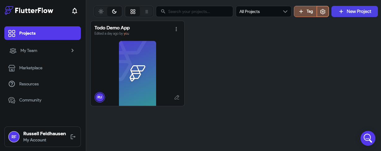
Here, you can see all of your existing projects as well as create projects, teams, and search for marketplace assets and resources. In the screenshot above, we already see a project that has been created, but your dashboard is probably blank. So, we’ll start by clicking the New Project button at the upper-right corner of the screen.
That will open up the dialog for creating a new project, shown below:
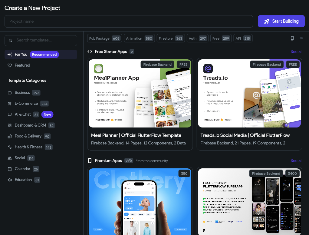
As we can see, FlutterFlow includes a large number of free and paid starter project templates that we can choose from. As you consider building other applications using this tool, these templates might be a great starting point to review and see how more complex applications can be built using this tool. However, for this tutorial, we’re going to build an app from scratch. So, enter a memorable project name in the Project name field at the top of the window and click the Start Building button to create your project. We’ll call our example “FlutterFlow Demo” for this tutorial.
Once we’ve created our project, we’ll be taken to the main interface for the FlutterFlow App Builder:
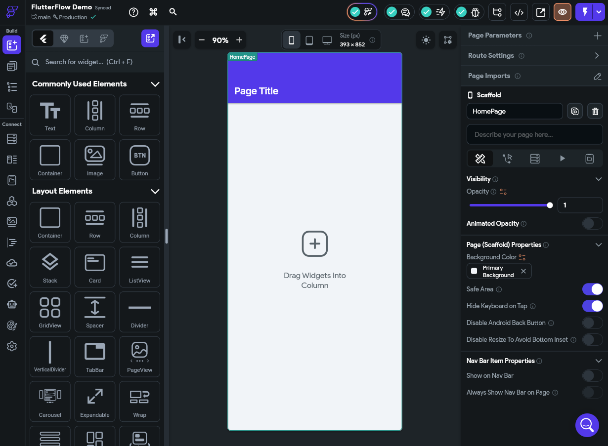
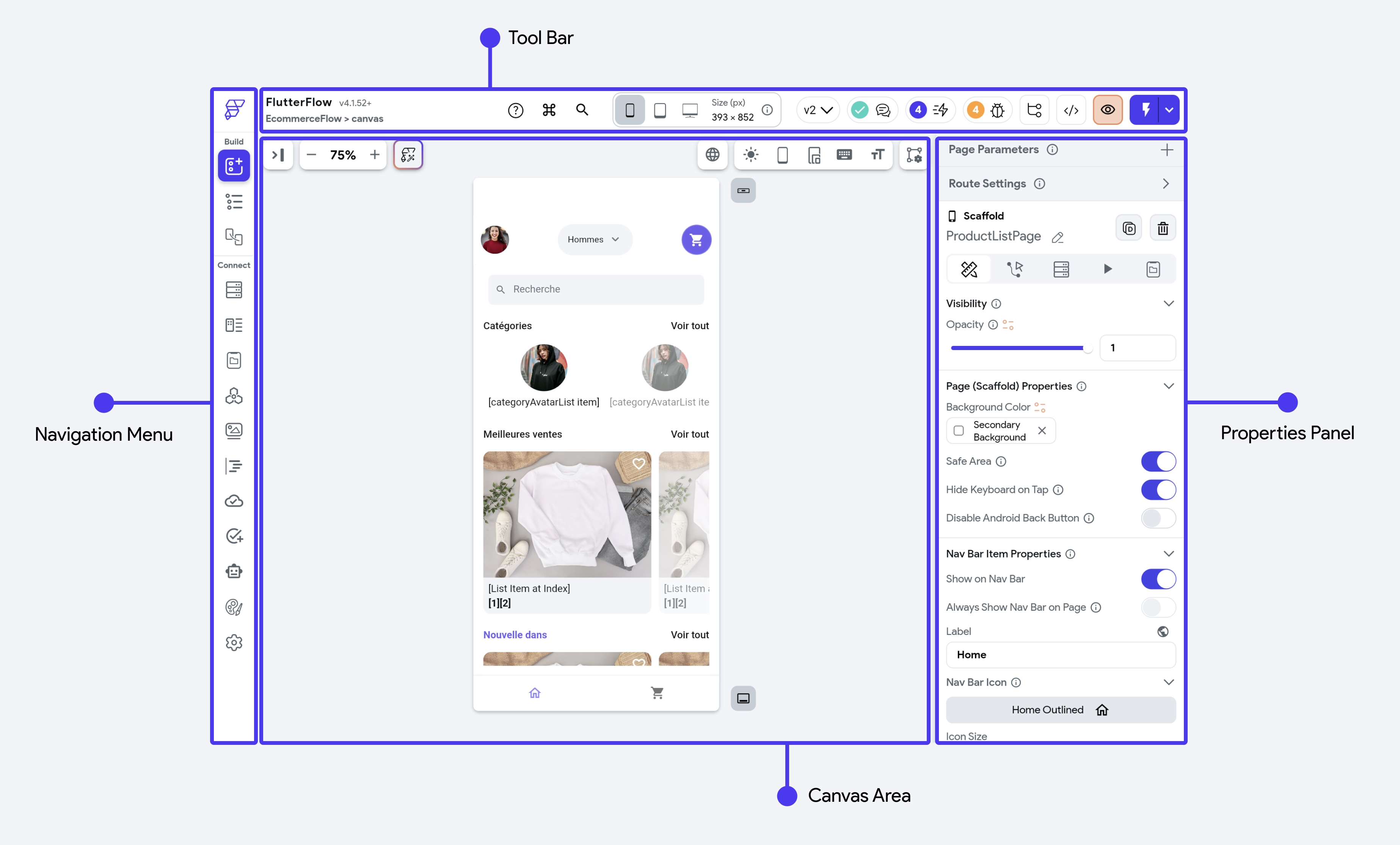
This page is full of useful features, such as the Navigation Menu on the left, the Tool Bar at the top, the Properties Panel to the right, and the Canvas Area in the middle. If you click on the buttons in the Navigation Menu, you’ll be presented with a number of additional features such as the Widget Palette, Page Selector, Widget Tree, Storyboard, and more.
The FlutterFlow Documentation has an entire section devoted to the buttons and features available in the UI of the FlutterFlow platform. It is another great resource to have available while building an application.
Before moving ahead in this tutorial, take a moment to open the FlutterFlow Documentation and review the pages describing the layout of its interface. We’ll do the best we can to use the same naming conventions as their official documentation, but we will assume you are somewhat familiar with these terms as we go. You can also refer to the video portions of these tutorials linked throughout these pages and follow along there.
Let’s take a moment to explore our new project before we start making changes.
First, in the Navigation Menu on the left side, choose the Page Selector button to view the pages in our application. We’ll see a pages folder, and we can click on that to open the folder and see our default HomePage item inside:
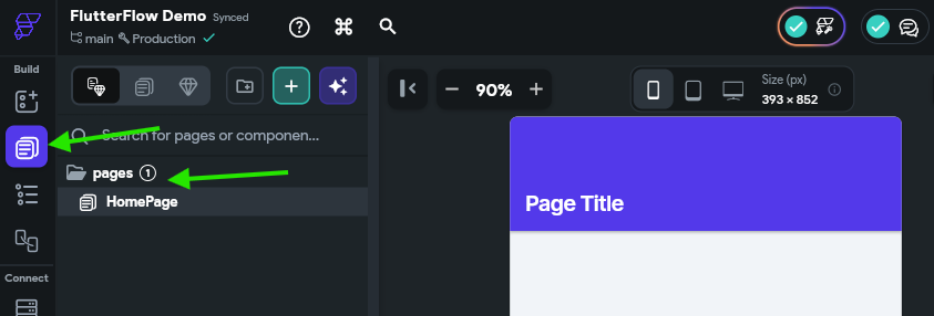
We’ll use this view to manage the large parts of our application, such as the Pages and Components that we’ll be creating. For now, it just contains the default page created for our project.
Next, let’s look at the Widget Tree by clicking that button in the Navigation Menu. It is right below the Page Selector button. Once you’ve opened that panel, use your mouse to hover over the Text item at the bottom of the Widget Tree. You should see it highlighted in the Canvas Area
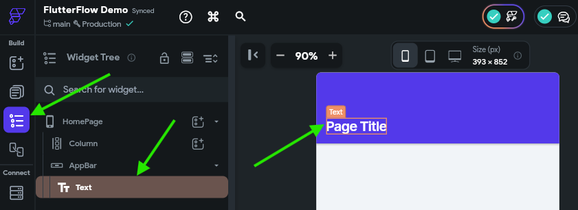
This is a great way to explore the overall structure of your individual pages. We’ll talk more about the structure of widgets in Flutter later in this tutorial.
Let’s also look at the Theme Settings by clicking that button near the bottom of the Navigation Menu.
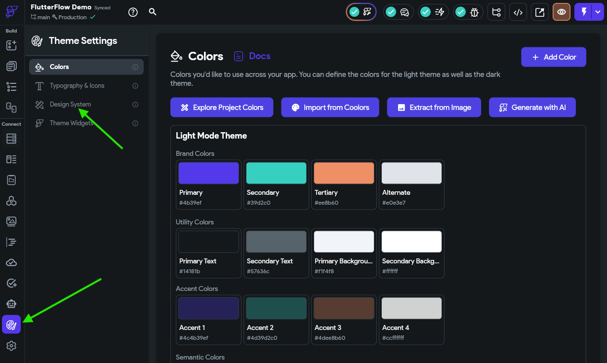
Here, you can configure many defaults for your application, such as the color palette, icons and typography settings, and more. You can also click the Design System option, highlighted in the screenshot above, to bring in information from an existing design tool such as Figma.
For this tutorial, we’ll strictly focus on functionality over design, so we won’t make any changes here for now. However, you are welcome to explore this section of FlutterFlow and customize your application as desired.
Using design tools like Figma are a great way to quickly build a wireframe for a mobile application and explore the desired look and feel before investing any development time. Thankfully, FlutterFlow makes it very easy to import a lot of your design features from Figma directly into this tool.
The full process for building a design system is a bit involved and outside the scope of this tutorial, but may be worthwhile if you’ve spent a lot of time in Figma building your design. The FlutterFlow Documentation - Design System page has a full tutorial for building these design systems and importing them into FlutterFlow.
Finally, let’s take a look at the App Settings section by clicking the bottom button on the Navigation Menu.
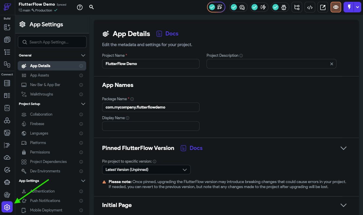
This interface gives you full access to a large number of settings and configuration options for our application. Feel free to take some time scrolling through these options and reading what is available; often you can learn an awful lot about what your app can do just by seeing what options are available to you.
We’ll come back to this page frequently as we build our application and add additional features.
In this section, we covered the basics of creating a mobile app in FlutterFlow and explored some of the important features available in the FlutterFlow user interface. With that knowledge in hand, we can start developing our application!
Image Source: https://docs.flutterflow.io/flutterflow-ui/builder ↩︎
Now that we’ve created a new project in FlutterFlow, let’s explore the process of creating our first component by adding some widgets and data.
For this tutorial, we’re going to build a simple “To Do” application to help us keep track of our tasks. Our application should have the following features:
That looks like a long list of features, but we’ll slowly work through this list over several steps to build the desired functionality for our application. Our hope is that this list of features will give you enough building blocks to start building your own applications using these features and more!
Now that we have a basic concept for our application in mind, a great place to start is by thinking about the data our application will need to store. For this initial page we are developing, we’ll start with our to do tasks. For many web and mobile applications, data is often stored and communicated in the JavaScript Object Notation (JSON) format. Thankfully, we don’t need to understand all of the details of JSON to use it in our application, and it is fairly easy to read and understand with a bit of programming background.
So, let’s start by creating a basic structure for a couple of to do tasks in a JSON format:
[
  {
    "title": "This is a title",
    "description": "This is a longer description for the task",
    "dateCreated": "2026-01-01 00:00:00.000",
    "dateDue": "2026-02-01 00:00:00.000",
    "address": "1701D Platt St., Manhattan KS 66506",
    "isCompleted": false,
    "dateCompleted": null,
    "priority": "Low"
  },
  {
    "title": "This is another task",
    "description": "This is a longer description for the task",
    "dateCreated": "2026-01-02 00:00:00.000",
    "dateDue": "2026-05-01 00:00:00.000",
    "address": null,
    "isCompleted": true,
    "dateCompleted": "2026-03-05 00:00:00.000",
    "priority": "High"
  }
]
Looking at the structure above, there are a few important things to notice:
[ ], which indicate that this JSON structure is storing an array of data.{ }. These represent objects in JSON, but they are very similar to dictionaries in other programming languages. Each attribute in the object has a name and a value.This structure gives us the basics we need to start scaffolding our application. First, we need to add this as a Data Type in our application so it knows what the structure is. To do this, click the Data Types option in the Navigation Menu to get to that page.
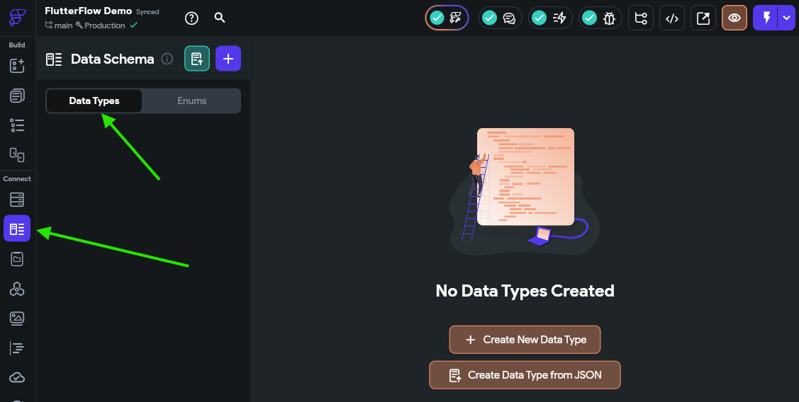
Next, click the Create Data Type from JSON, and then in the panel that appears, set the name to ToDoItemType and paste in a single to do item from the JSON above (from one curly brace { } to another) in the box:
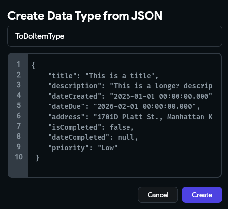
Once that is done, click the Create button to create that data type. That should create a data type that looks like the one in the screenshot below:
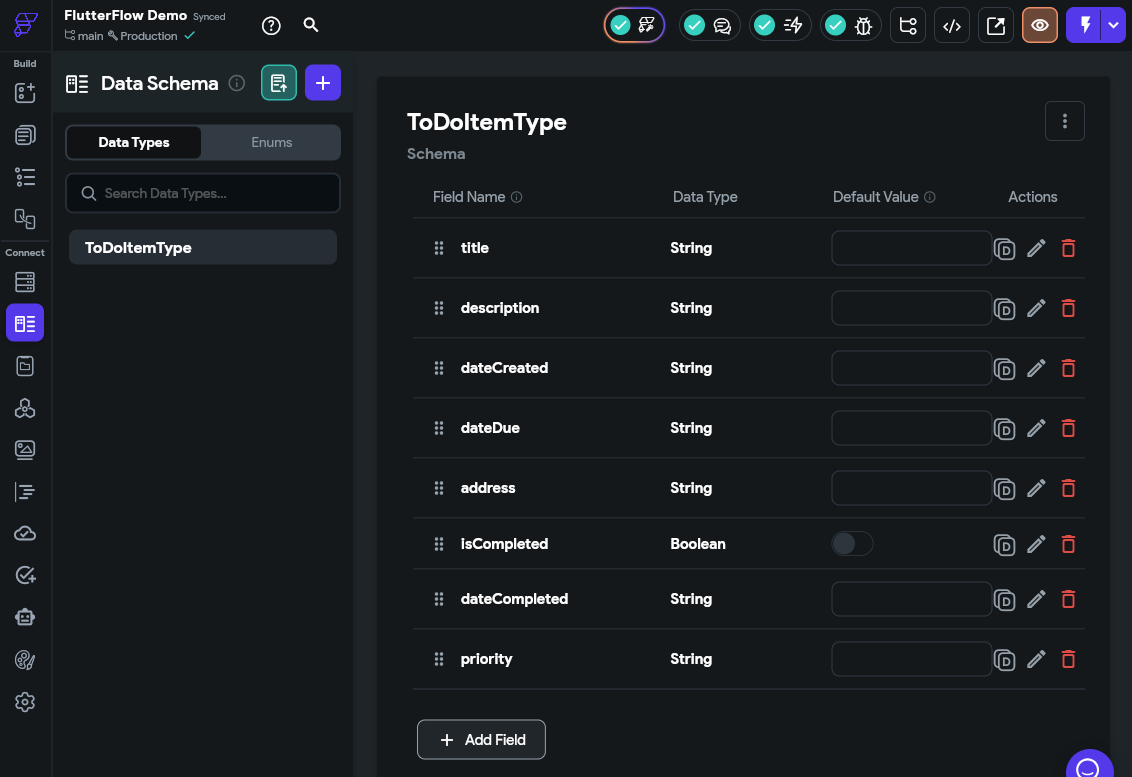
There we go! That tells FlutterFlow about the structure of the data we’ll use to represent a single to do task in our application.
Next, let’s add this data to our App Values by clicking that option in the Navigation Menu on the left side of the FlutterFlow window, and then selecting the App State option on that page.
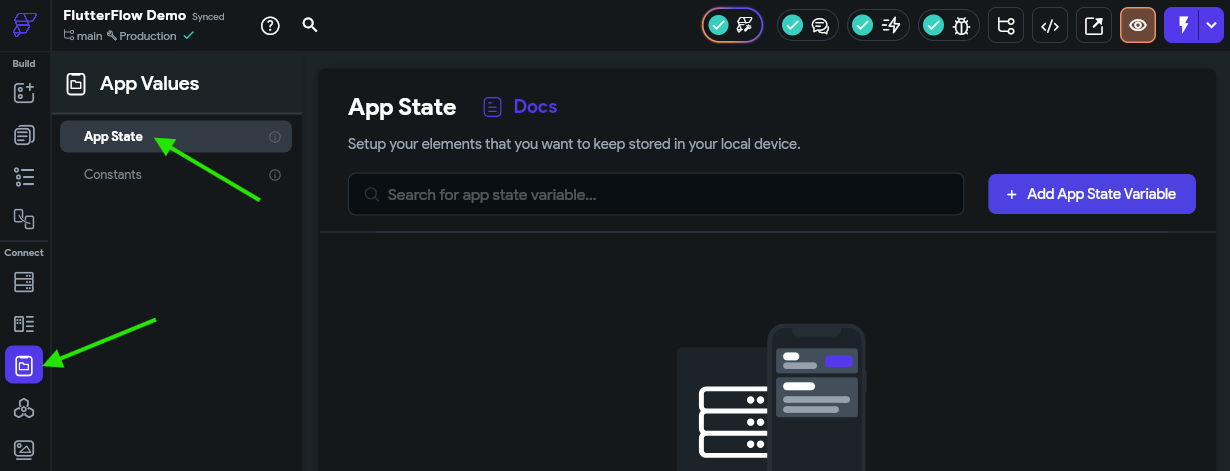
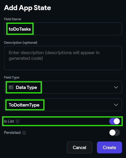
Then, we can click the Add App State Variable button on the upper right to create a new App State Variable for our application. In the popup window, let’s call our field toDoTasks in the Field Name box, and choose the Data Type Field Type. Next, we’ll need to select our ToDoItemType from the second list that appears. We also want to make sure we checkmark the Is List option, since our data type is a list of items. Finally, click the Create button to create that variable.
Once we’ve created our variable, we can add some items to the list by clicking the drop-down arrow in the Default Value column and then clicking the Add Item button.
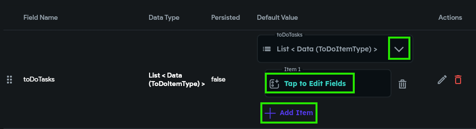
Once that adds a value to the list, we can click the Tap to Edit Fields option to add values to each field. We’ll use the values for the first to do task item in the JSON structure above.
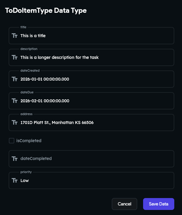
We can repeat that for our other to do task as well, so we’ll have 2 values in the list. This allows us to start building components that can display data stored in a list.
Now that we have some data in our application, we can start scaffolding our first component - a way to display a to do item in our application. So, to begin, let’s click back on the Page Selector option in the Navigation Menu to view our existing application.
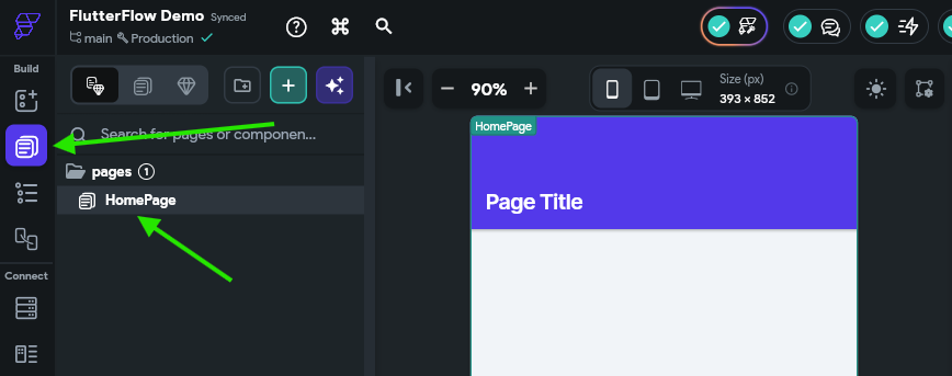
Before we add anything to our page, let’s start by creating a new stand-alone component to represent a single to do task. So, at the top of the Page Tree, click the button to create a new component.
In the popup window, choose the New Component option at the top, and then click the Create Blank option. We’ll name our component ToDoItemComponent.
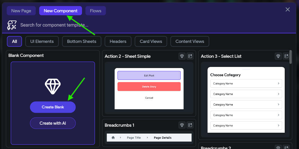
Don’t worry - we’ll come back here later and use a component template and generate a component with AI. FlutterFlow includes a plethora of useful building blocks to quickly create apps, but we’ll start by doing some of the work by hand to get a feel for the basics.
Once it has been created, we’ll see it in our Page Tree on the left side of the screen:
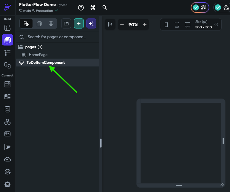
FlutterFlow also allows you to place pages and components into folders for organization. Notice that the HomePage page is already inside of a pages folder. Feel free to add folders and organization structures as desired as you build your application.
Now that we have a basic component, we can start adding widgets to that component. The FlutterFlow Documentation - UI Building Blocks section has a great deep-dive into the fundamental concepts of building user interfaces using Flutter. We recommend reading through the Overview and Widgets > Introduction to Widgets pages at a minimum to familiarize yourself with these concepts.
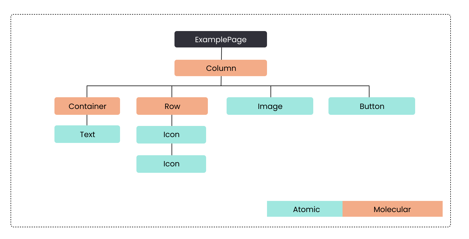
At the core, a page or component will contain a Widget Tree that contains the content on the page. Each widget in that tree may be an Atom, which is a stand-alone building block for the UI like a Text or Icon widget, or a Molecule, which is a widget that contains other widgets, like a Row, Column or List widget. Below is an example of a Widget Tree for a component.
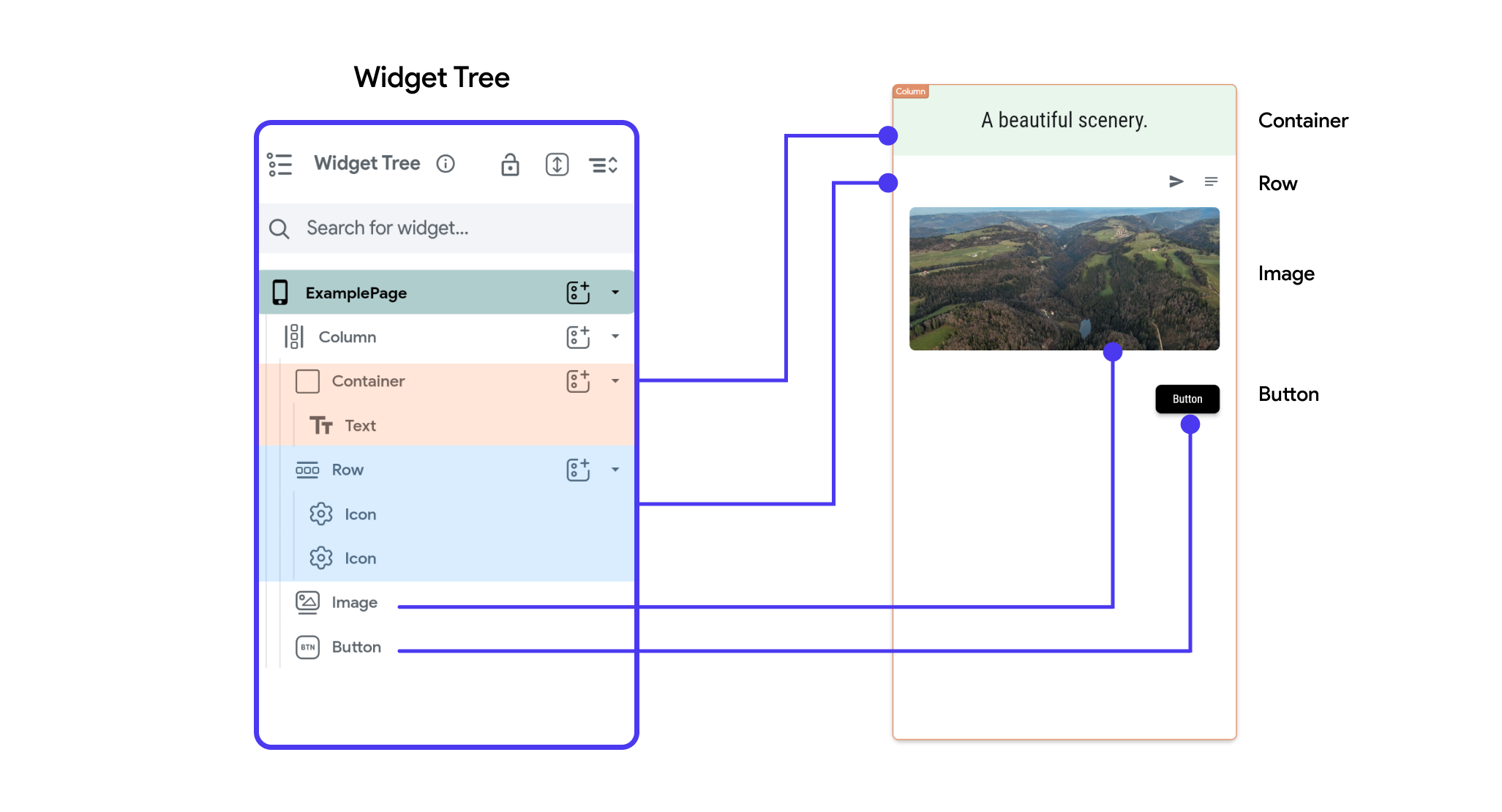
In FlutterFlow, this Widget Tree would be represented in the UI in this way:
As you can see, each item in the widget tree matches to an item in the user interface, and the structure of the tree shows how each widget is placed relative to each other in the larger structure of the application.
For our component, let’s start by adding a Column widget as our starting point. So, we’ll click on the Widget Palette button in the Navigation Menu on the left, then we’ll find the Column widget and drag it into our component.
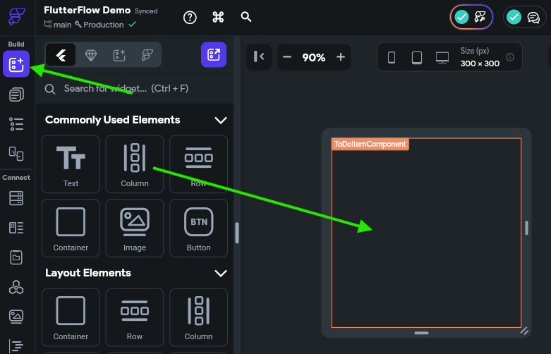
Once we’ve added that widget to our component, we’ll see the Properties Panel for the Column widget appear on the right side of the page. If it doesn’t appear, make sure you select the Column widget either on the Canvas Area or by clicking the Widget Tree option in the Navigation Menu and finding it in the Widget Tree on the left side of that view.
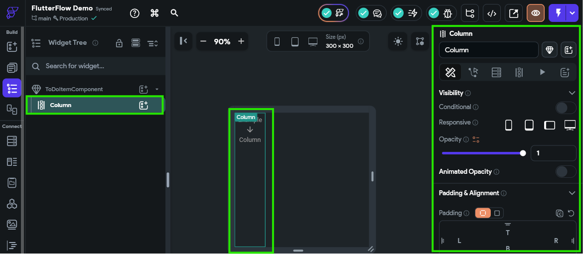
As you can see, there is a large number of settings you can configure for a single Column widget in FlutterFlow - this is where the real power of this design system appears. Unfortunately, there are so many options here that it can be difficult to know which ones are important or even to clearly describe which ones to update.
For now, there is just one option we’ll need to modify from the default. You may have to search around a bit to find it by hovering over the options, or refer to the video above for a clear description of where to find it:
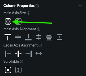
Next, let’s add a couple of rows to our Column widget. So, following the same process as before, add two Row widgets to the column widget, but be careful not to put one row inside of another, or place a row in place of the column widget. If done correctly, when looking at the Widget Tree we should see two Row widgets inside of the Column widget as shown below:
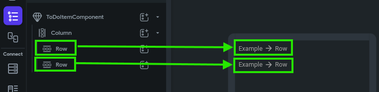
With this structure, we have a framework where each to do task will be displayed with two rows of data! Let’s continue onward to add more widgets to this framework to actually display the data.
In the first row, let’s add three more widgets in this order:
In the second row, we’ll also add two more widgets in this order:
We won’t worry about changing any of the options for these widgets yet. We’ll just focus on getting them into our Widget Tree for now. Once you’ve done that, you should have a Widget Tree that looks like this (you can also click the Toggle App Brightness icon at the top right of the Canvas Area to make it easier to see items if you are working in dark mode):
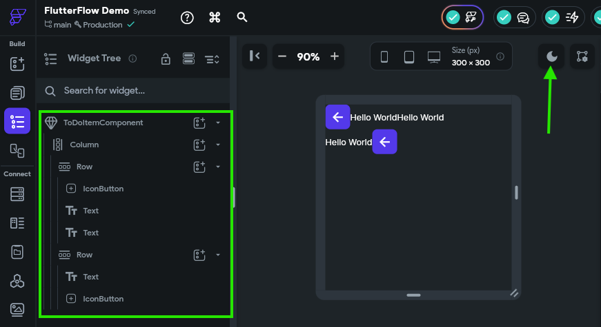
Thats a start! We have the basic building blocks for our component in place. Now let’s work on making the design a bit cleaner before moving ahead.
First, let’s add a bit of spacing between our two rows. We can do this by clicking the Column widget in the Widget Tree, and then finding the Items Spacing option in the Properties Panel to the right. Let’s set this value to 5 for now.
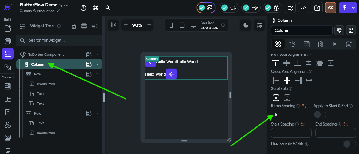
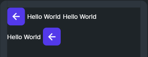
This will add a little gap between the two rows in our component. Next, let’s do the same for each Row widget, just to make sure there is a little space available there as well. Once we’ve done that, our Canvas Area should show the components with a bit more space between them.
Next, we want to add some flexible space in each row so that the last widget in that row is pushed to the very end of the row, all the way to the right. To do that, we must first configure each row so that it can expand to take up the available space in a container. This can be found in the Properties Panel for the row under Padding & Alignment - we want to choose the middle Expansion option, which is labelled “Flexible.” Then, we must also make sure the Main Axis Size under Row Properties is also set to the second option, which will use the maximum amount of size on the main axis.
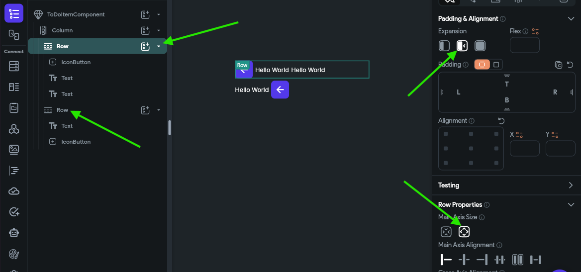
Make sure you set these properties on both Row widgets before continuing.
Then, we can add a Spacer widget to each row, right before the last component in the component tree.
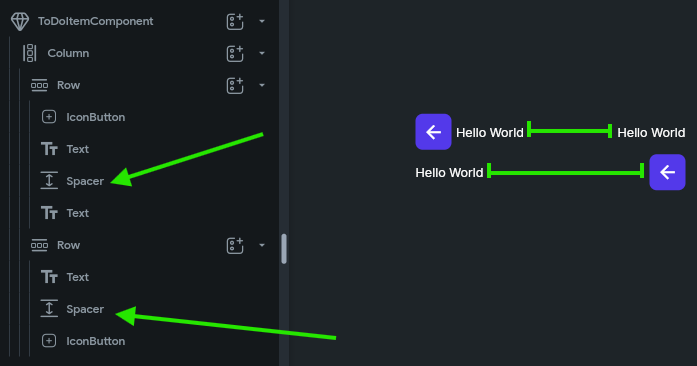
There, with that in place, the last widget on each row will be pushed to the rightmost side, expanding the row to fill the space.
Finally, before moving on, let’s quickly rename our widgets so they are easier for us to keep track of. We can do this by clicking each widget in the Widget Tree and then entering a name in the box at the top of the Properties Panel. Generally, in FlutterFlow it is recommended to name widgets using PascalCase (also known as UpperCamelCase), and we often want to include the type of the widget in the name, such as TitleText or IsCompletedIconButton.
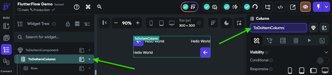
Take a moment to rename some or all of the widgets in your widget tree to something useful. After renaming our widgets, we should see something like this in our Widget Tree:
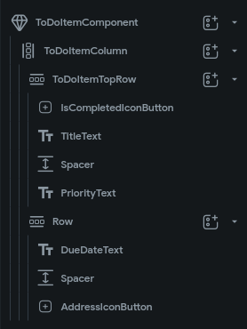
There we go! Now we have created our first widget in FlutterFlow. From here, we can start adding data to this widget and building up the interactivity in our application.
Image Source: https://docs.flutterflow.io/resources/ui/widgets ↩︎ ↩︎
Now that we have a simple component that represents a to do task, let’s work on building a list view that shows all of the tasks in our application.
First, we need to configure the component parameters for our ToDoItemComponent component and wire up all of the fields so they are displayed correctly. So, to begin, make sure you have selected the ToDoItemComponent in the Page Selector page found in the Navigation Menu, but don’t click on any of the components inside of it. To the right, we should see the Properties Panel contain an entry for Component Parmeters at the top. Click the button to add a new component parameter entry:
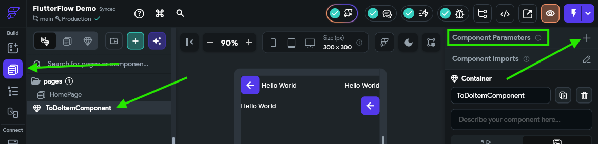
Next, click the Add Parameter to add a new parameter to the component.
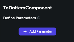
In the panel that opens, enter a memorable name for the parameter (something like toDoItemParam since parameter names must be in lowerCamelCase) and then set the type to Data Type and choose our ToDoItemType from the list of data types. We also want to checkmark the Required option, but leave the Is List option unchecked since we are dealing with a single item in this component.
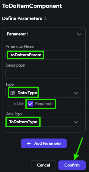
Once the parameter is configured, click the Confirm button to save the settings.
Now that our component has a parameter, we can wire up each widget in the component to display that data.
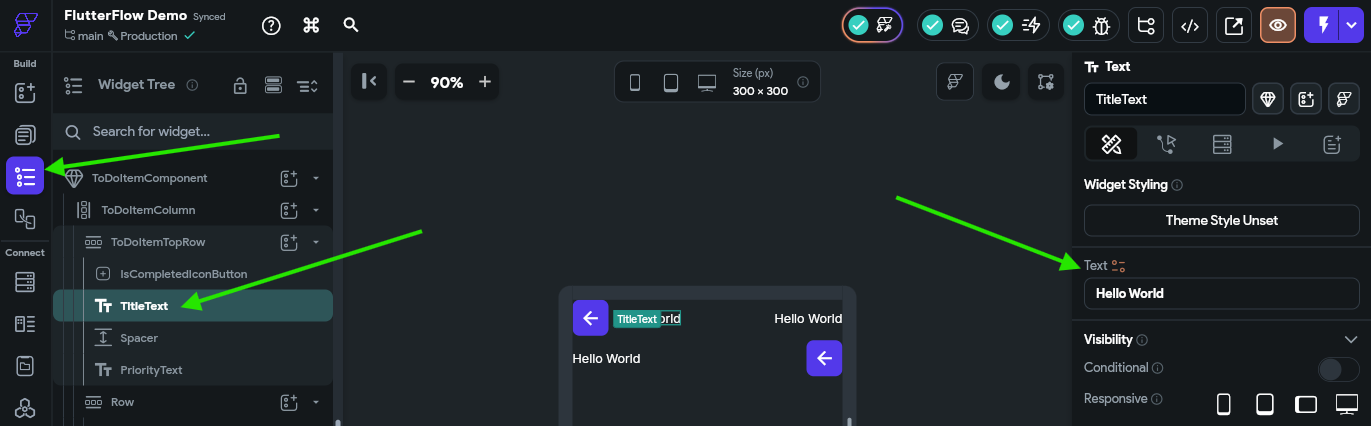
First, let’s handle the easiest ones, which are the title text and priority text widgets on the top row. First, in the Widget Tree, click the TitleText component (or whichever name you used for that component), and then look for the Text option in the Properties Panel to the right:
Next to the Text title, there is a little orange colored icon that can be clicked to link this text widget to a variable’s value. Click that button to bring up the panel to set the value from a variable:
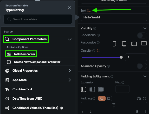
In that panel, choose the Component Parameters option, and find the toDoItemParam entry. Then, the panel will switch to a second view, where we can choose the specific field we’d like to use in that field. In the first box, we’ll choose Data Structure Field and then choose the title field in the second box. In the third box, we can enter default since we really don’t care what the default value is, but in the last box, we’ll enter some default text like To Do Item Title just to appear in our UI builder.
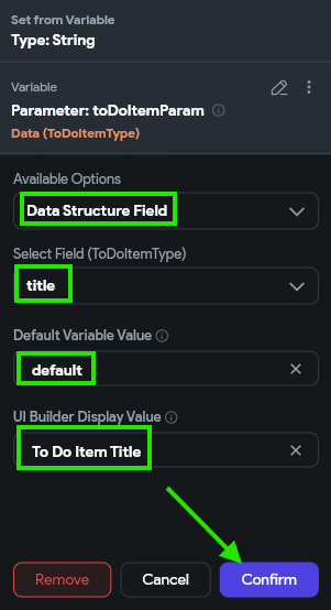
Once we have everything set, we can click the Confirm button to save our changes. Now, we should see that that text field has the value we configured:
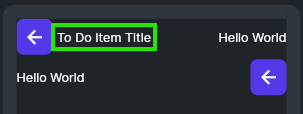
Awesome! That’s the first big step toward making our application actually work with our data. Let’s continue to set up our other fields.
Let’s do the same process for our priority text field. First, let’s set the value to display data from the priority field just like we did for the title field above. However, this time, we also want the display color to change a bit based on the value. So, we’ll scroll down to find the Text Color option under the Text Properties settings in the Properties Panel, and click the little orange icon next to that item to configure it as well:
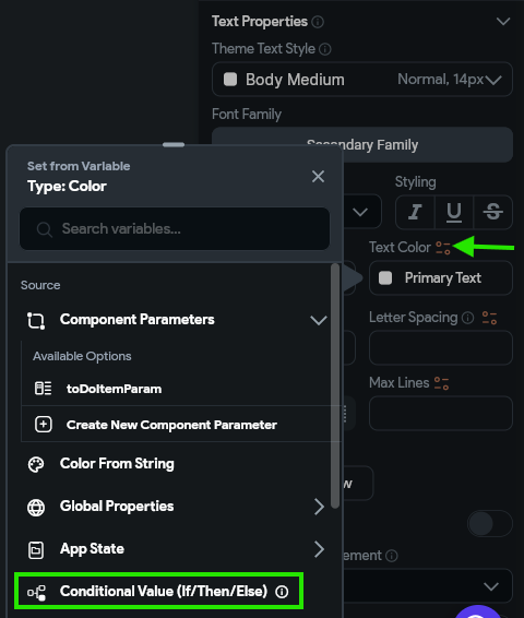
Our goal is to have items with high priority display this text in red, and low priority in white. So, we’ll select the Conditional Value (If/ThenElse) in the panel as our main option. Then, in the panel that appears, we’ll configure the IF condition by clicking it and selecting the Inline Function option. In that window, we’ll create an argument named priority and link the value to the priority attribute from our toDoItemParam. In the expression, we’ll use the following Dart code to check the priority’s value:
priority.toLowerCase() == "high"If everything checks out, we can click the Confirm button to save that inline function as our conditional. Then, we can click the color box next to the Then block and choose the red color Error and also click the color box next to the Else block and set the color to our Secondary Text color. Finally, click the Confirm button once again to save this value. The full process is shown in the animation below and in the video at the top of this page.
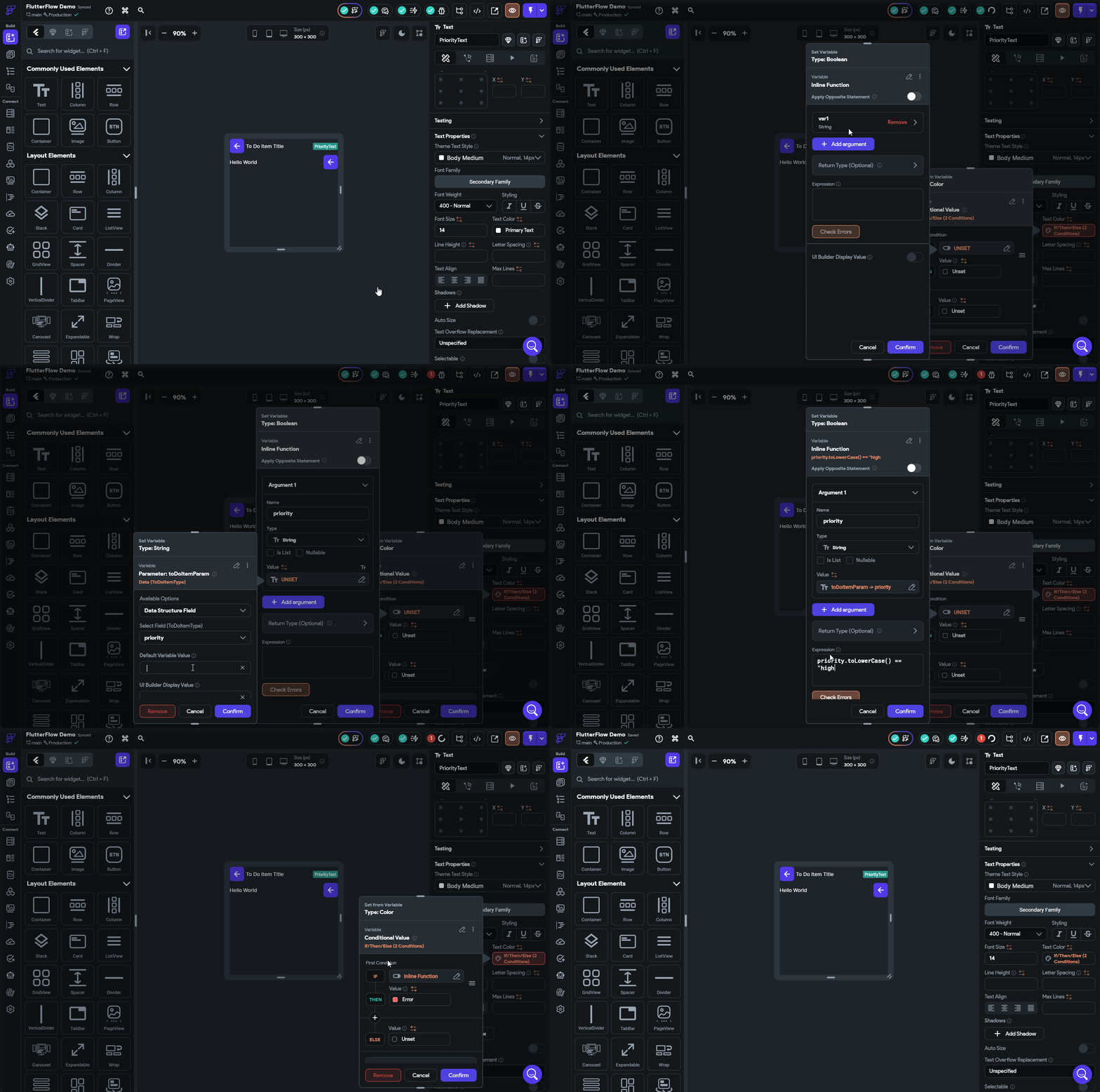
Notice that we set the text colors to the Error and Secondary Text preconfigured theme values instead of just setting them directly to red and grey/white, respectively? This is because we want our app to be responsive to design changes such as switching between light and dark modes as well as updates to our underlying theme. So, we should always aim to choose colors and fonts from our underlying theme to make things easier to update in the future.
Next, let’s configure the text widget displaying the due date, which is in the second row of our component. For this item, we want to do a bit of text parsing to convert the date into a more useful format. Our vision is to have this field display something like “in a few days” instead of the exact due date. Thankfully, FlutterFlow includes by default a library called timeago that does exactly that!
To accomplish this in FlutterFlow, we need to write a bit of custom code. So, let’s go to the Custom Code option in the Navigation Menu. Once there, we’ll click on the button at the top to create a new item, and select the Function option.
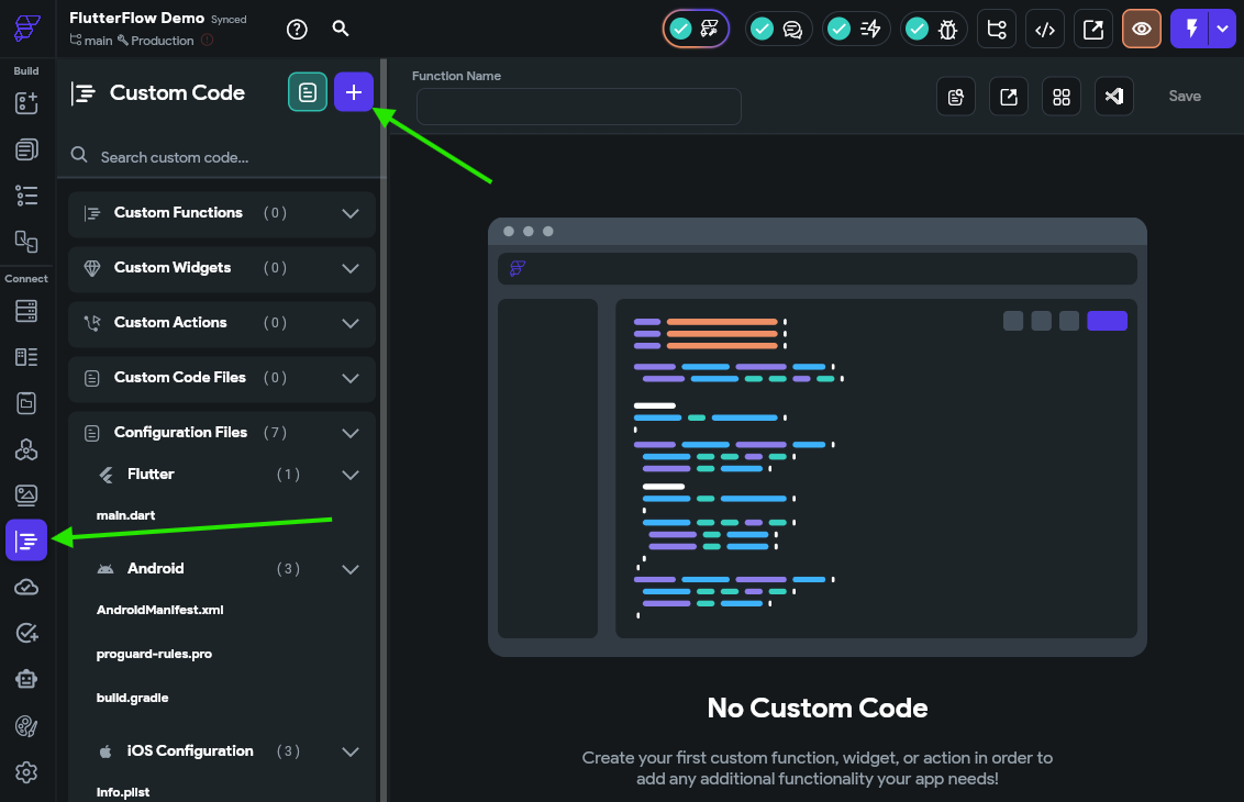
Here, we’ll be presented with a simple code editor where we can configure our function. First, in the Properties Panel to the right, we’ll click the Add Arguments button and configure an argument named date that is of type String and make sure both the Is List and Nullable options are Unchecked. Above that, we’ll also make sure our Return Value is also using the String type and both the Is List and Nullable options are Unchecked
In the code area, we’ll see a clear section where we should input our code. We’ll use the following Dart code as the body of our function:
  try {
    return timeago.format(DateTime.parse(date), allowFromNow: true);
  } catch (err) {
    return "";
  }
Finally, at the top, we’ll name our function dateToTimeAgo, then click the Save Function at the top to save our function.
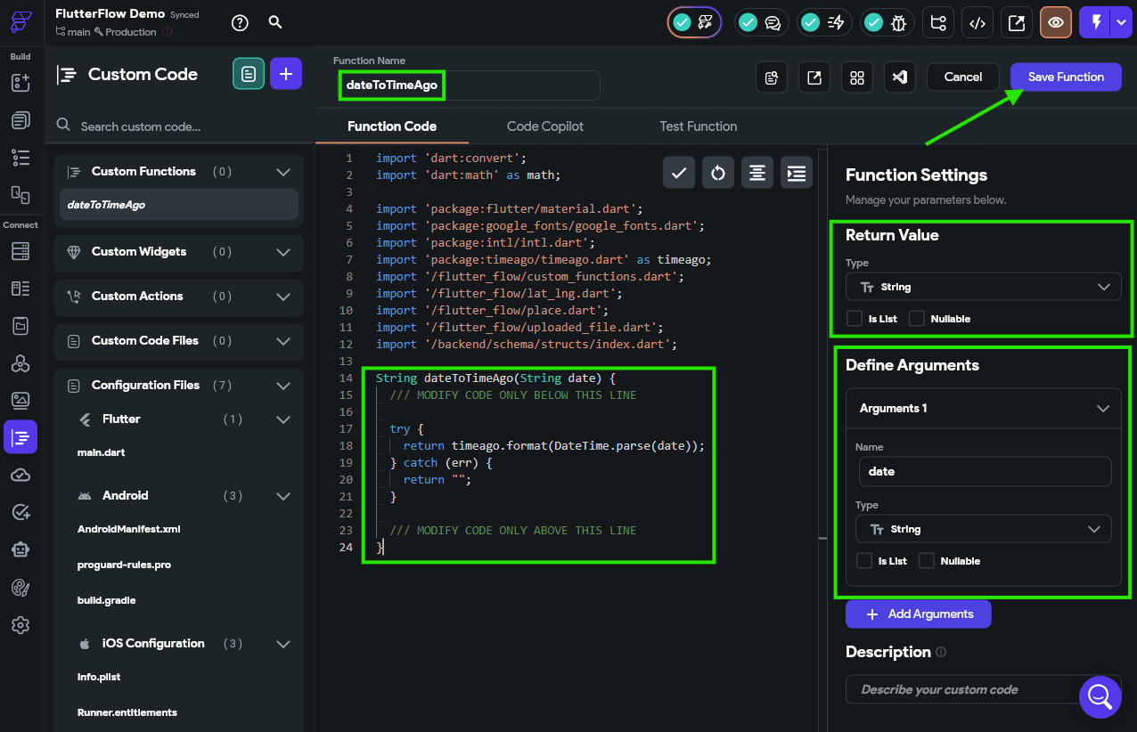
The code in the screenshot is incomplete, so make sure you use the code shown in the code block above!
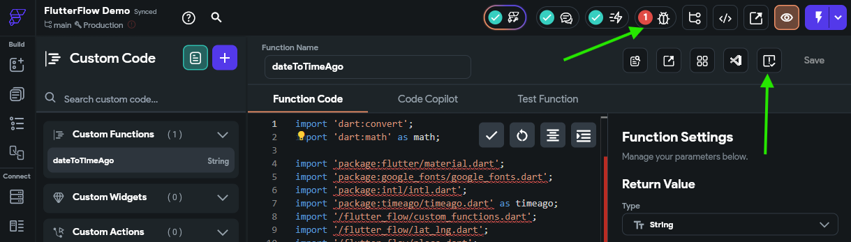
Once our function has been saved, we should also click the button that appears to check our code for any errors. Thankfully, the project analyzer in the top toolbar of FlutterFlow (the little “bug” icon) also reminds us to do this:
There we go! Now we have a custom function we can use to format a date string in that format. So, we can go back to our Widget Tree for our custom component and configure the value of the DueDateText widget to use that function. When we open the Set from Variable panel, we’ll just choose our dateToTimeAgo custom function, and set the date parameter to be the dateDue attribute from our toDoItemParam component parameter. We can also add a few default values and UI builder values as well. The full process is shown in the animation below or the video at the top of this page.
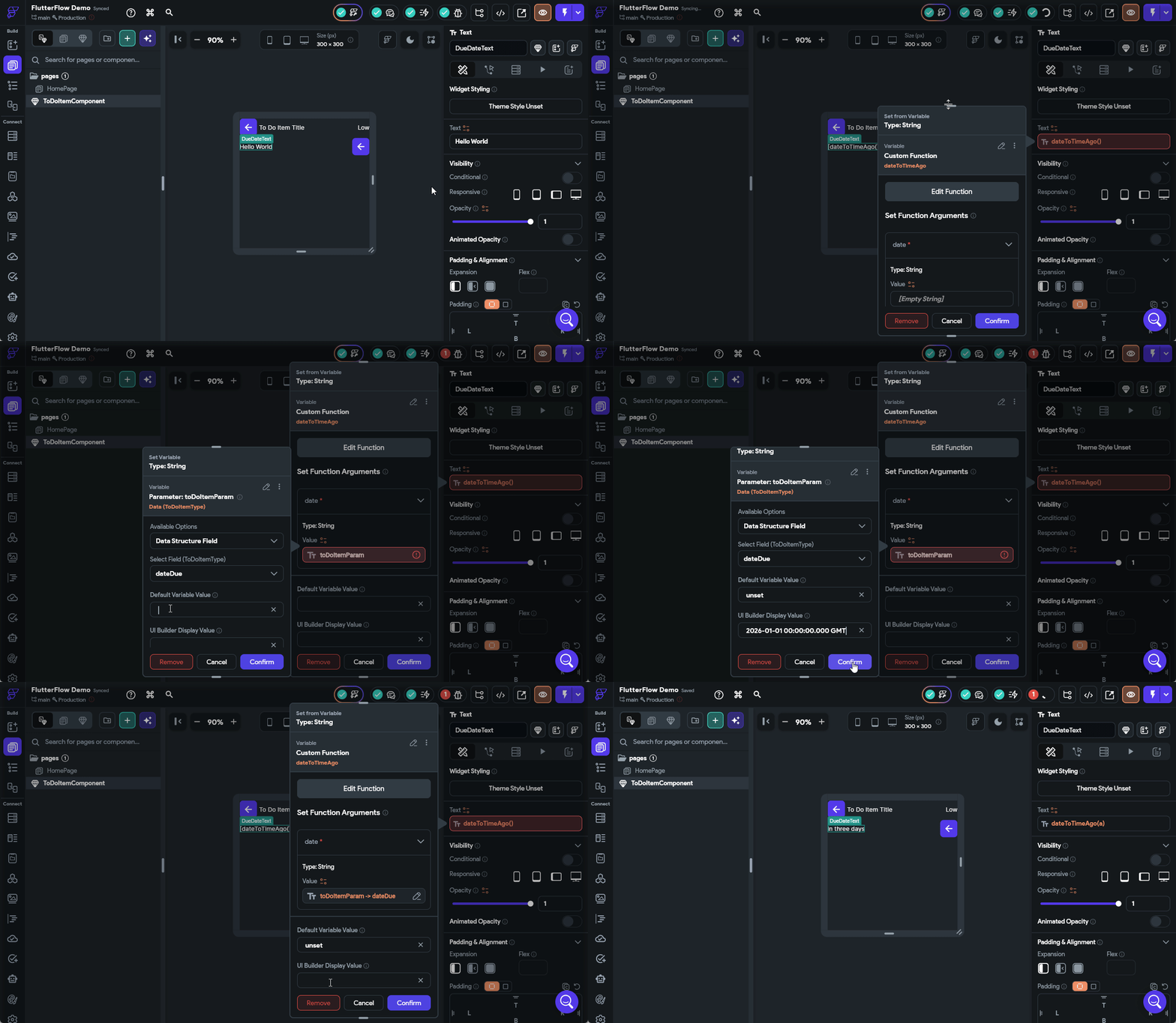
There we go! That should configure our due date to display correctly.
Next, let’s configure the AddressIconButton to only appear if the address is set for a task. To do this, click on that widget in the Widget Tree and find the Visibility option, then turn on the Conditional option. Once enabled, click the box below that to configure the visibility. Once again, we’ll use a simple Inline Function to check that the length of the address field in the toDoItemParam is greater than 0.
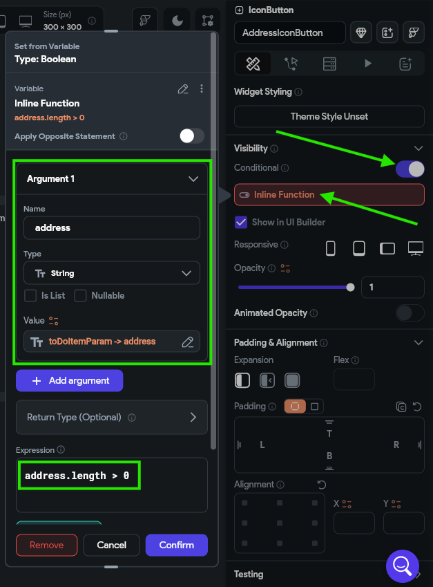
At this point, we’ll assume that you are starting to get the hang of using FlutterFlow a bit, so we won’t describe every single button and click you need to do to perform these steps. However, if you are stuck or unsure what to do, refer to the video at the top of the page for a full demonstration of the whole process.
We can also scroll down to the Icon Properties option in the Properties Panel and choose a fitting icon, such as a map pin.
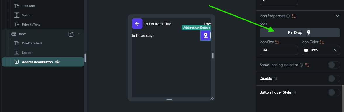
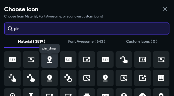
Finally, let’s configure the icon button that shows completion status. As you might guess at this point, we’ll set the icon based on the value of the isCompleted attribute of our toDoItemParam component parameter. However, if we try to do so, we’ll quickly realize that the Icon Button widget doesn’t do that very well. So, let’s swap out our IconButton widget for a Switch instead.
This widget is specifically designed to be something that can be toggled on and off, such as updating the completion status for a task. To configure this widget, we’ll scroll to the bottom of the Properties Panel and link the Switch Initial Value option to the isCompleted attribute.
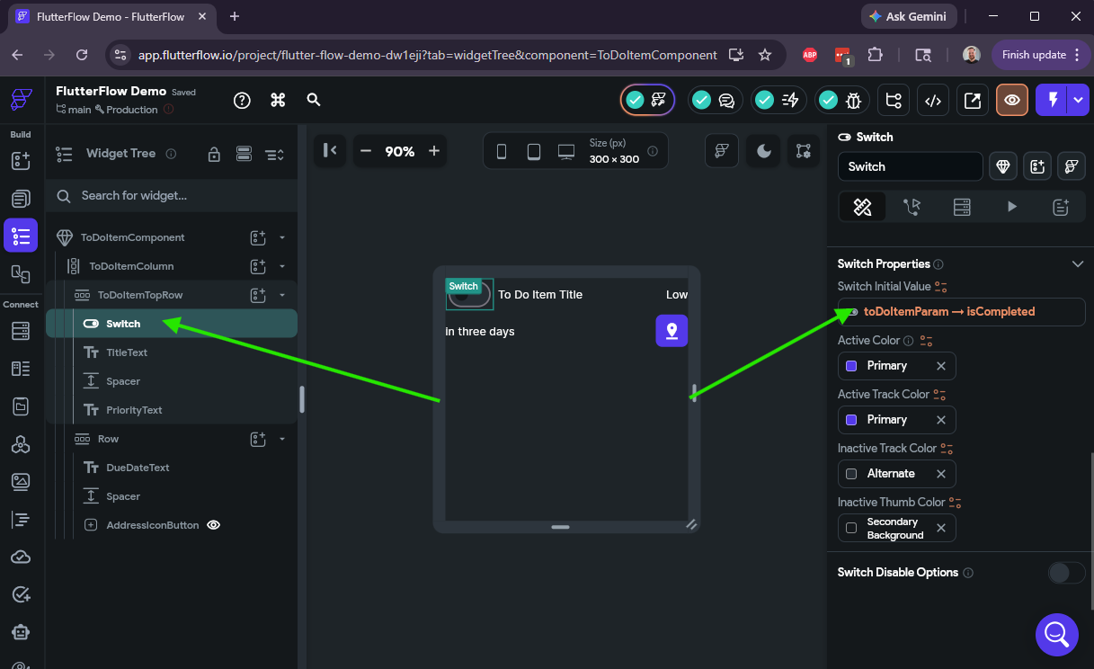
There we go! We’ve configured our first custom component and linked up all of the widgets to various data values from our component parameter. Now, let’s see how we can use it in our app.
In FlutterFlow, it’s finally time to go back to the Page Selector and select our HomePage that was created for us when we started this project. On this page, we want start by adding a ListView widget into the main column space.
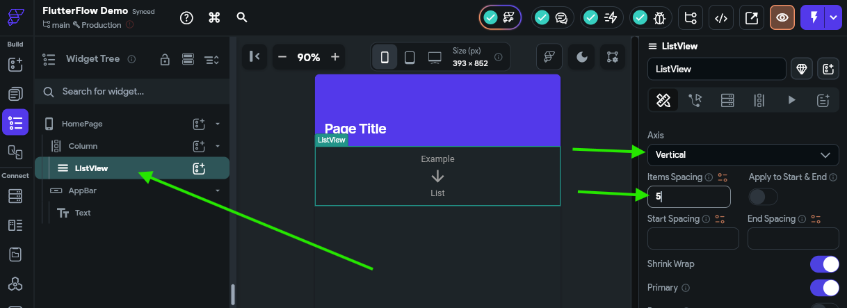
Then, in the Properties Panel, we can configure the list to use the Vertical axis and add some spacing between each item.
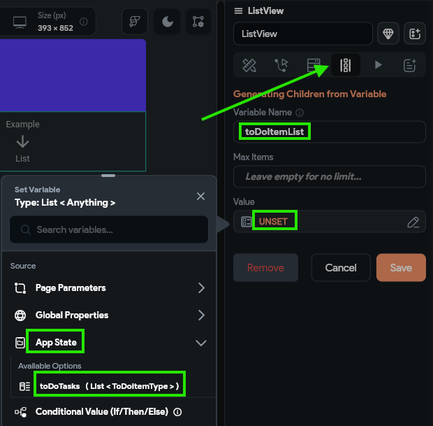
Next, we should click on the Generate Dynamic Children option near the top of the Properties Panel, and then configure a new variable called toDoItemList and set the value to our toDoTasks variable found under the App State option. After selecting the value, we’ll choose the No Further Changes option in the panel that appears, and then click the Confirm button to save our changes, then click Save
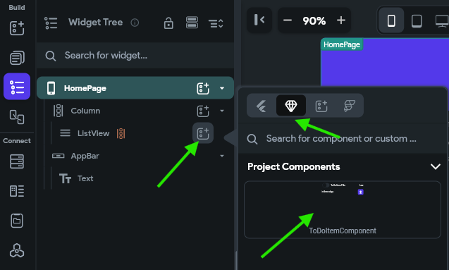
We’ll get a pop-up notice reminding us that we simply have to edit the first child of this list to configure how each list element should look. So, let’s now add our ToDoItemComponent component to our ListView component. The simplest way to do this is to click the “Add a child to this widget” button next to our ListView widget, then select the option for widgets defined in this project, and then find our ToDoItemComponent in the list and select it:
After selecting that component, it will fill our ListView with several instances of our custom component. Next, we need to configure the component parameter by finding that option in the Properties Panel and set it to the toDoItemList Item option, then selecting No Further Changes in the second page.
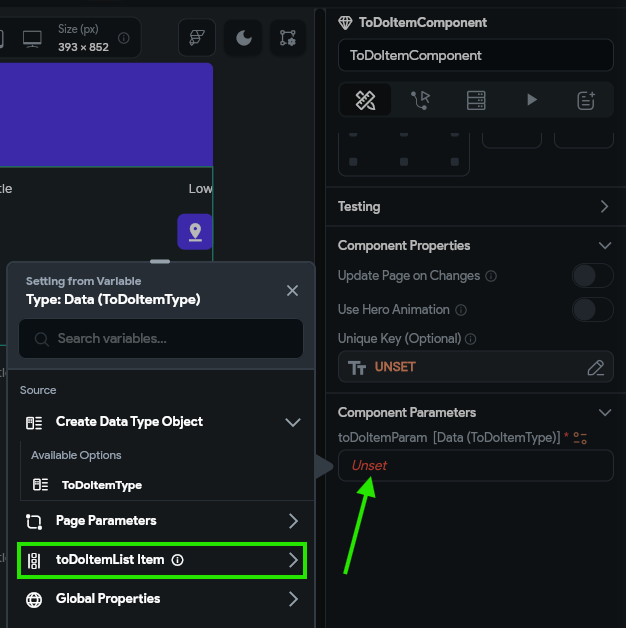
This is a great time to reflect on the importance of making sure we use helpful variable names. By naming our ListView widget’s list variable to toDoItemList, it is clear that we need to select that option instead of things like toDoTasks or ToDoItemType or any of the other, similarly-named options. By including both a descriptive name and the type of the variable in the name, it is easy to differentiate between them!
Finally, at long last, we are ready to preview our application to see how it actually looks. The easiest way to do this is to quickly publish this project to the web using the FlutterFlow test platform. First, we must configure our project to be publishable on the web in the project settings. Thankfully, we can just click the arrow next to the Run button in the upper right and it will take us directly to the settings of our application:
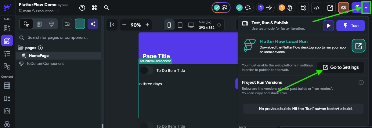
In the settings, you’ll be taken to the Platforms page. On that page, simply turn on the Web option to enable publishing to the web.
Now, we can click the actual Run button at the upper right to run our application in test mode. This will open a new browser tab, and in the background it will compile and build your application. It may take a couple of minutes to complete, but once it is done, you’ll be shown a web interface that contains your application running in the web!
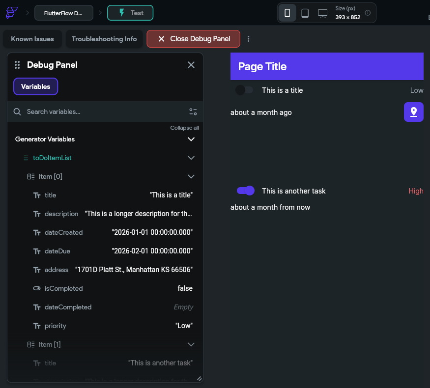
Take a close look at this interface and see if everything looks correct:
You can check the App State in the debug panel on the left and make sure that the data shown there matches the user interface on the right.
One thing you might quickly notice is that each to do task is shown in a very large block, which isn’t quite what we want. So, to fix this, we can go back to our FlutterFlow App Builder tab in our browser and find the Container widget that contains each of those items, and remove the default height value from the Properties Panel
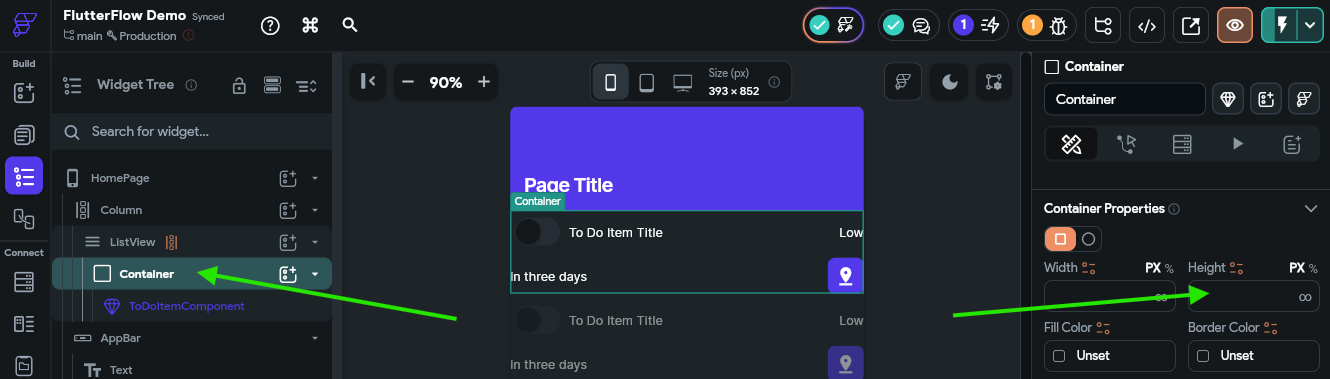
Then, we can jump back to the tab showing our Test Mode view and click the Instant Reload button to reload our test view with those changes.
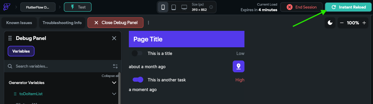
Awesome! Now our app looks like it is coming together nicely.
This is the first major checkpoint for this tutorial. Before moving on, make sure your app works in test mode and looks like you expect it to. We’ll add the interactive functionality over the next few pages, but it is important to make sure things look good here first. If you are having any issues getting to this step, contact the course instructors for assistance!
At this point, we have configured a basic mobile application that can display to do tasks from the application’s internal state. However, this isn’t very useful, since the data only lives on the device, and we have no way to edit or update that data. In the next part of this tutorial, we’ll add some interactive functionality and explore ways to store our data in the cloud!
We now have a basic mobile app that displays some data from the app’s internal state, but we have no way to modify that data. So, let’s explore the basics of making our application interactive by allowing us to edit and create data.
Let’s start with the simplest case - marking a task completed. We already have a Switch widget in our ToDoItemComponent to represent this data, but now we want to be able to press that switch in our interface and update the underlying data. Before we can do this, we need to pass some additional data in our application.
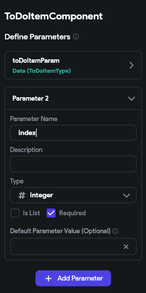
First, let’s go back to our ToDoItemComponent and add a new Component Parameter called index that should contain an integer. We’ll use that to keep track of the index of the current to do task in our overall list so we can refer back to it.
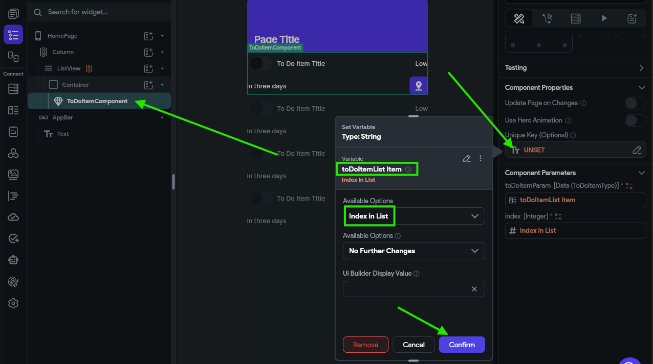
Next, we’ll head back to our HomePage and configure a couple of options for the ToDoItemComponent that is placed inside of our ListView widget. Here, we want to set the Unique Key to the toDoItemList Item option, and then select the Index in List option from the available options.
We also want to configure the new index parameter to the same value:
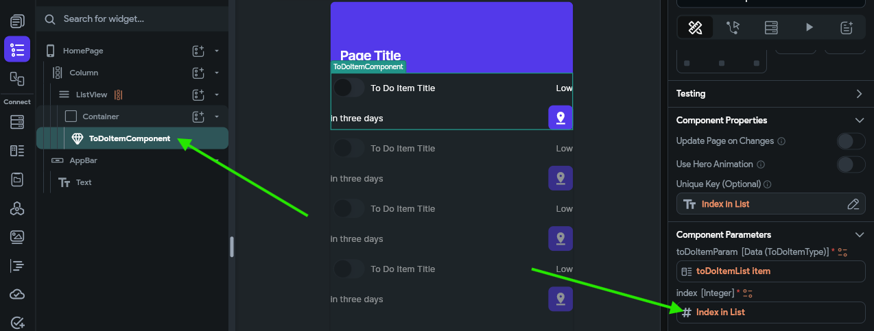
This allows us to access the index of the item in the list from within our ToDoItemComponent custom component. We’ll need that value to know which task we need to update.
To configure the switch interaction, we first need to find that widget in our Widget Tree and then look at the Properties Panel to the right. There, we should see a button to configure the actions for this widget.
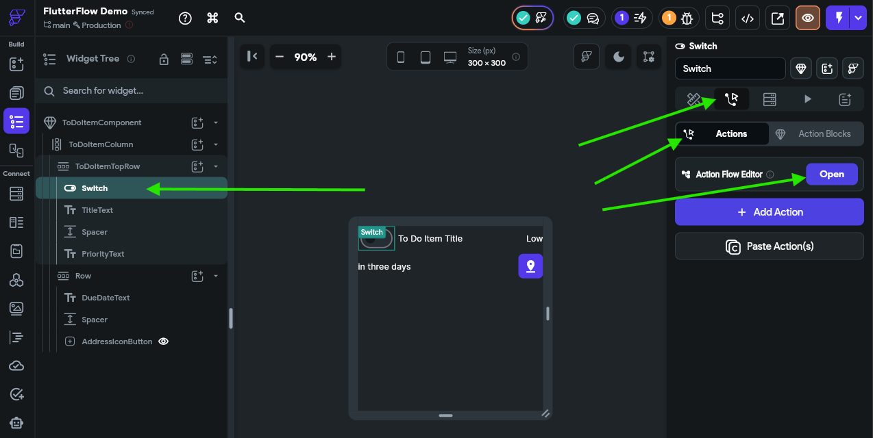
Once on that page, click the Open button to open the Action Flow Editor, which is one of the easiest ways to configure these actions.
In the window that appears, there are two action triggers to choose from. Let’s start with the On Toggled On trigger. This trigger will fire when the switch is moved from the Off state to the On state. So, in our data model, we want to mark the underlying task as completed. To do this, we’ll click the Add Action button, then look for the State Management actions and choose Update App State.
We’ll then be able to click an Add Field button to indicate which field in our app state we want to update. We’ll choose our toDoTasks app state variable as our field to update, then we’ll set the Update Type to Update Item at Index. The Item Index can be set to the index component parameter, and then the Update Type under that should be Update Field(s). Finally, we can click the Add Field button in the popup window and select the isCompleted field, and set the value to the True value found under the Constants list. The full process is shown in the animation below or the video at the top of this page.
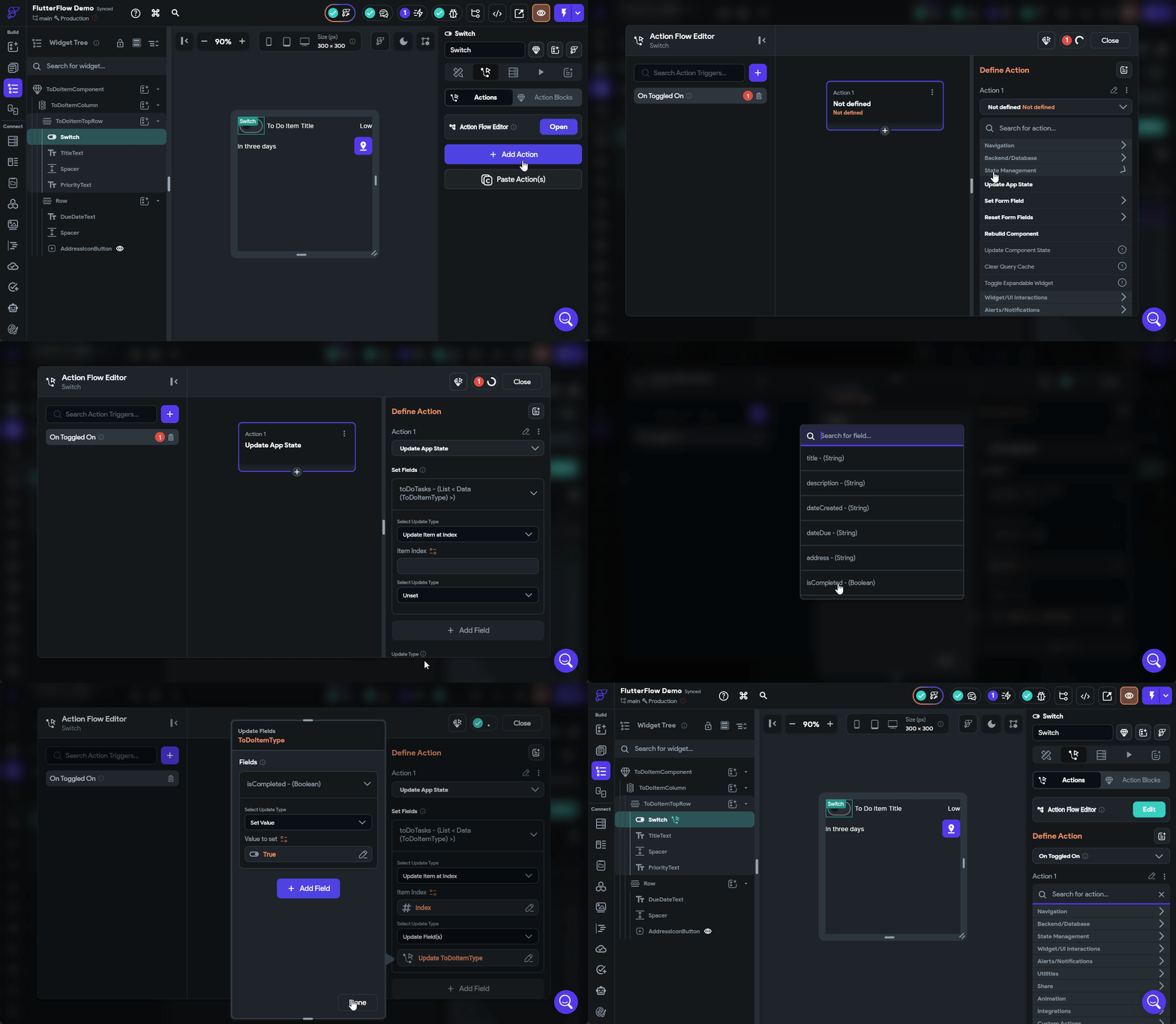
Next, we’ll need to do the same process for the On Toggled Off trigger, but this time we’ll set the value for the isCompleted field to False instead. The rest of the process is the same.
Once that is done, we can launch our app in test mode to see if our action is working properly. In the Debug Panel on the left, scroll down to find the App State section, and watch the data shown there change as you toggle the switches.
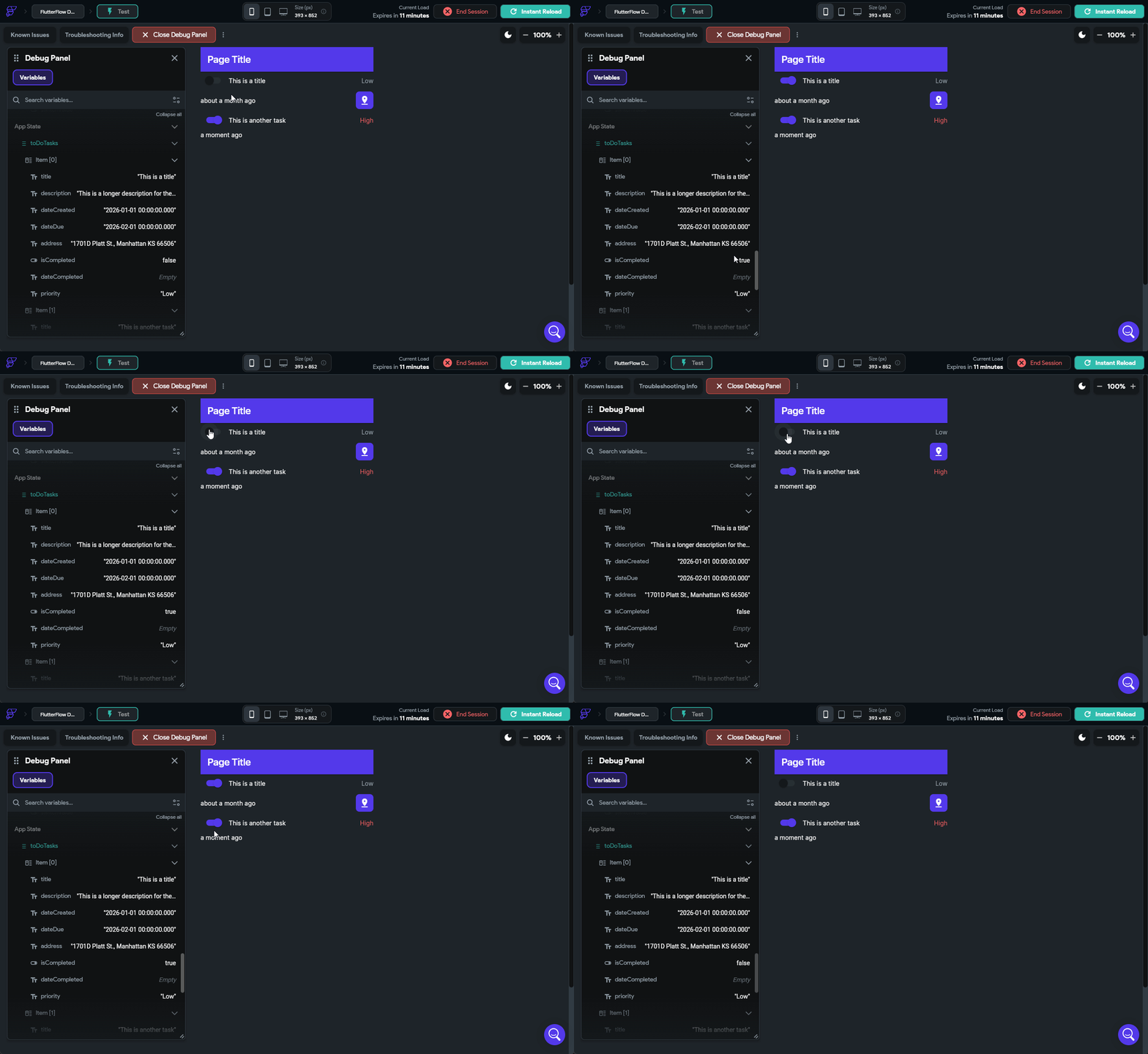
If everything is working correctly, you should see the app state update to match what is shown in the interface!
We also want our application to keep track of the completion date, so let’s go back to those actions we just configured in the ToDoItemComponent on the Switch widget and add an additional option to update the dateCompleted field. When we toggle the switch on, we should set the value to the Current Time option found under Global Properties, and when we toggle the switch off, we should set that value to the Empty String option found under Constants instead. The animation below shows that process.
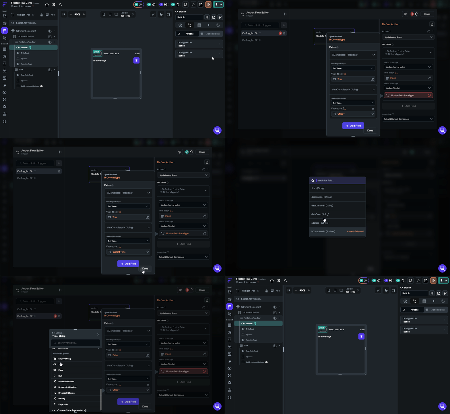
We can now test our application again by clicking the Instant Reload button if it is still running in the Test Mode tab, and see if our date is now also updating.
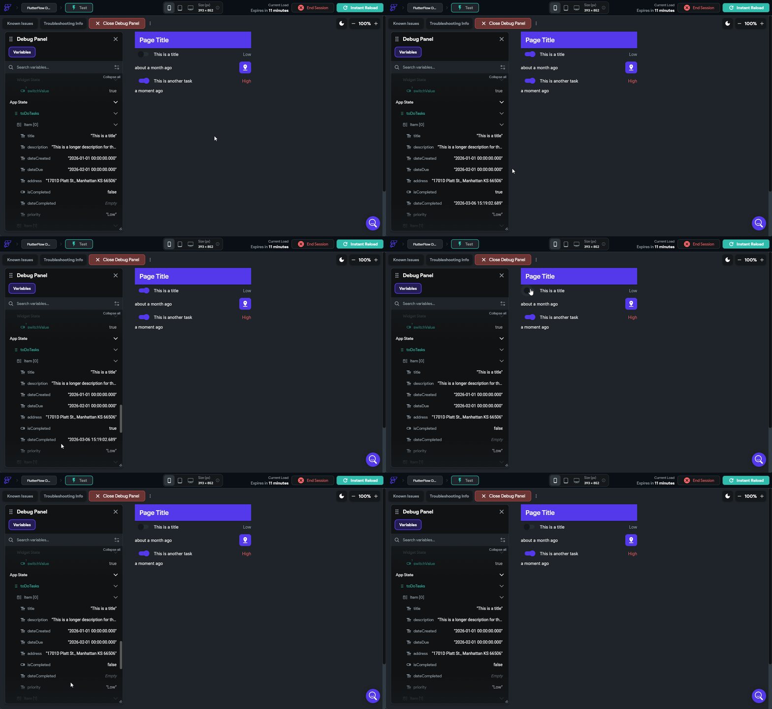
There we go! We can now mark our tasks as done, and when we do, it will even update the dateCompleted value along with it. This is really the core concept behind building interactivity in our application.
We can currently mark our tasks as completed, but what if we want to edit a task? That’s another big part of this project, so let’s create another custom component to edit our tasks. We’ll start on the Page Selector tab and press the button to create a new blank component. Let’s name this one EditToDoItemComponent.
In this component, we’ll start with a Column widget layout, and then place a few widgets in the Widget Tree following the diagram below:
TitleFieldDescriptionFieldDueDateTextDueDateButtonPriorityDropDownAddressFieldCancel ButtonSave ButtonWhen fully set up, your component should have this layout:
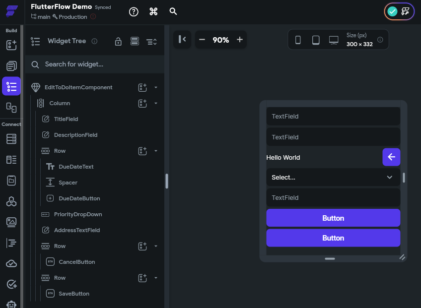
Before moving on, feel free to take a minute to adjust the design of this component by adding spacing between each item, setting or removing item widths, and having items expand to fill the space or use the minimal amount of space required. The examples shown here already have some design changes applied to them, but at this point you should be able to click around and adjust the design as desired!
This component will also need to have a couple of parameters. In fact, they will be the exact same parameters we used for the ToDoItemComponent earlier, which are toDoItemParam using the ToDoItemType and an index parameter representing the index of the item in the list:
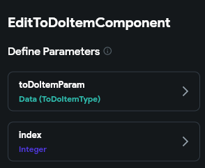
Now we can connect each widget’s display values to the toDoItemParam parameter just like we did previously. For TextField widgets, we can also set a Label value and Hint value as well. Below is an example of setting up the TitleField TextField widget:
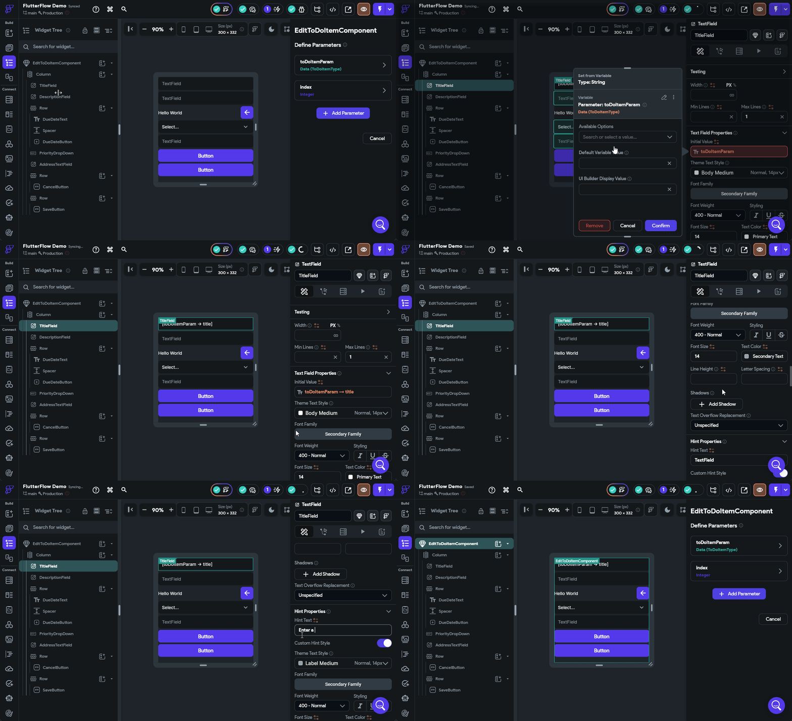
Go ahead and do the same process for the text field widgets displaying the description and address fields.
For the DueDateText Text widget, we’ll connect it directly to the dateDue field so we can see the complete due date.
Finally, for the PriorityDropDown, we’ll set the Initial Option Value to be the priority field from our toDoItemParam parameter, and we can also configure the drop-down to have both Low and High as options.
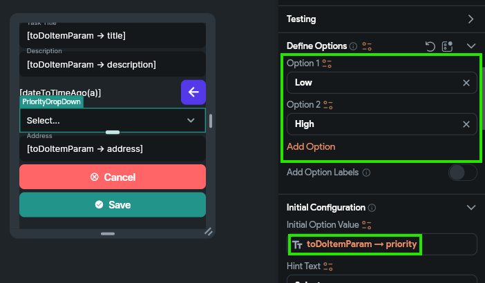
To test out our widget, let’s configure both the CancelButton and SaveButton actions to do the same thing. When creating an action, we’ll choose the On Tap action, and then look for the Widget/UI Interactions section in the list of actions, and choose Bottom Sheet and then Dismiss. See the animation below for an example of configuring the CancelButton with this action.
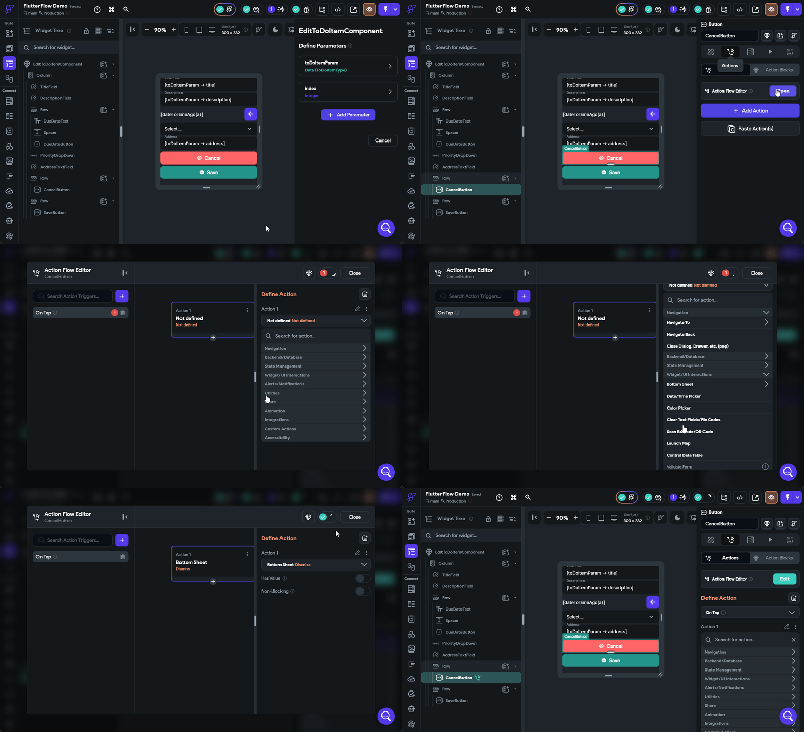
Make sure you configure the SaveButton to perform the same action for now. We’ll come back and update it later with additional functionality to actually save our changes.
That’s a basic component to edit tasks!
Now that we have a component available to edit our tasks, let’s add some functionality to our interface that allows us to actually edit our tasks. For this, let’s add an IconButton to our ToDoItemComponent at the end of the top row. We’ll call this an EditButton and configure the design a bit:
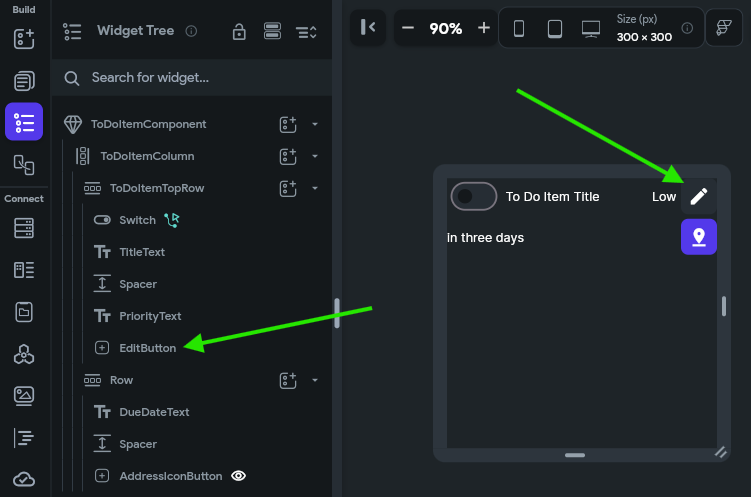
For this button, we’ll configure the On Tap action to open a Bottom Sheet and place our EditToDoItemComponent in that area. We’ll also link the toDoItemParam and index parameters to this sheet, and enable the Safe Area option just to make sure our interface does not interfere with anything else on the screen. The animation below shows the full process.
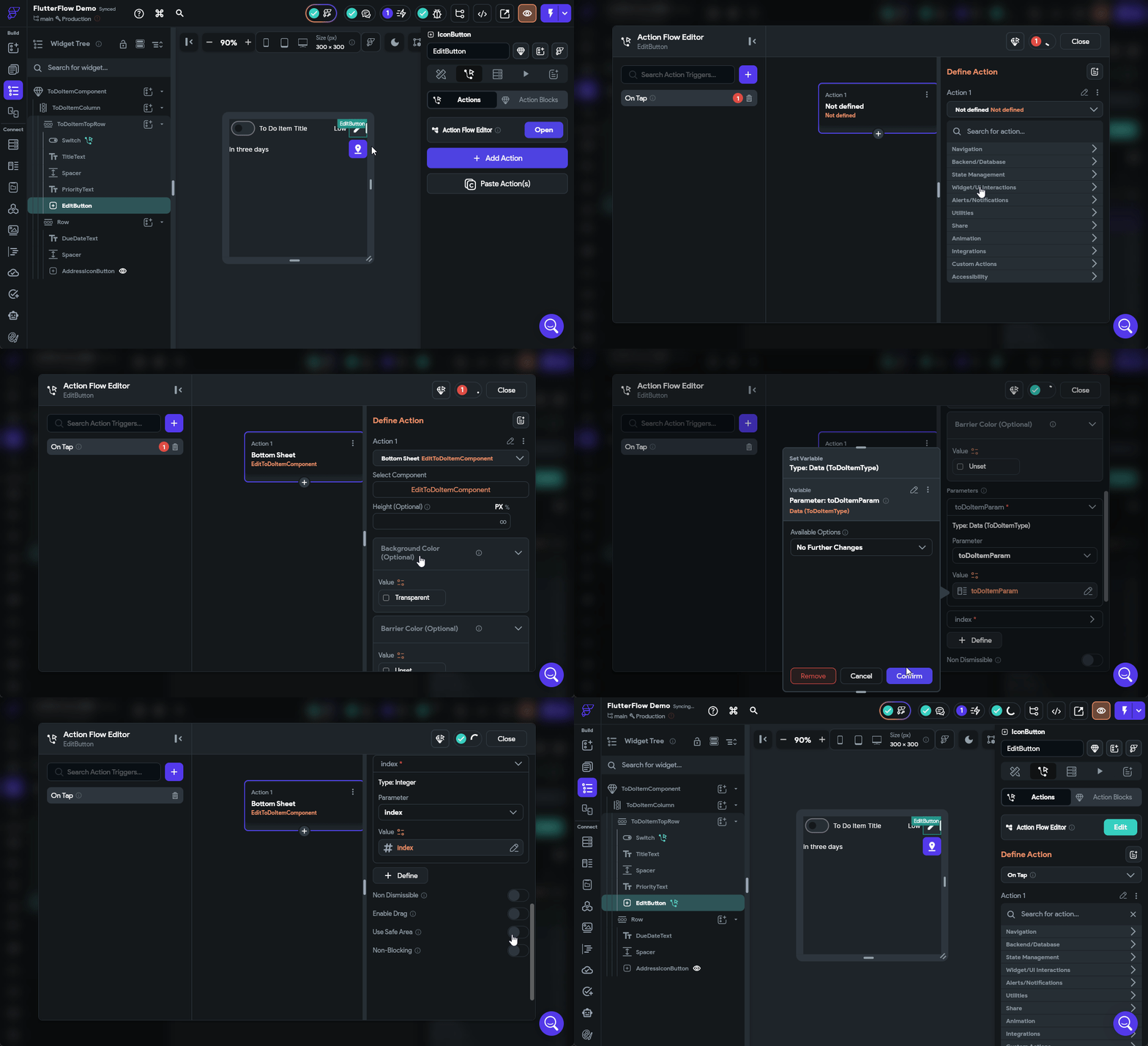
Once we have configured that button, we should be able to launch our application in Test Mode and test it out!
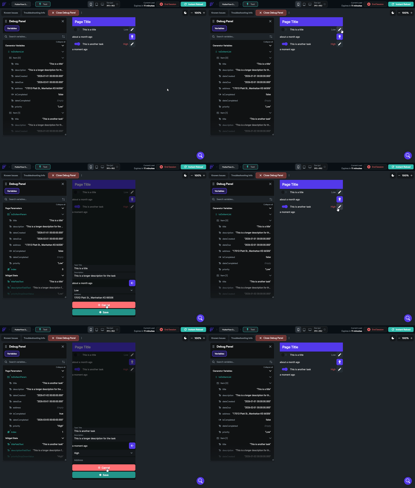
If everything is working correctly, we can click on the Edit button in each of our to do tasks, and we’ll see a little pop up on the bottom of the screen showing the settings for that task!
We can place any component in that Bottom Sheet area by configuring an action to launch it.
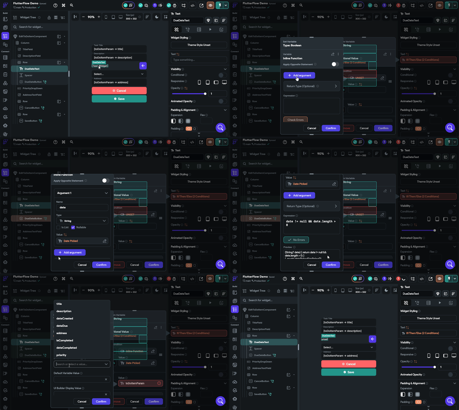
Let’s go back to our EditToDoItemComponent and configure the DueDateButton widget’s On Tap action to open a Date/Time Picker under the Widget/UI Interactions section so we can choose a due date. We’ll set it to the Date+Time type and allow the user to select any valid date and time in the future.
Once the user has selected a value, we can find that value in the Widget State under the Date Picked value. So, let’s configure the DueDateText to use that value if available using a Conditional Value configuration to check if a date has been selected. The process is shown in the animation below.
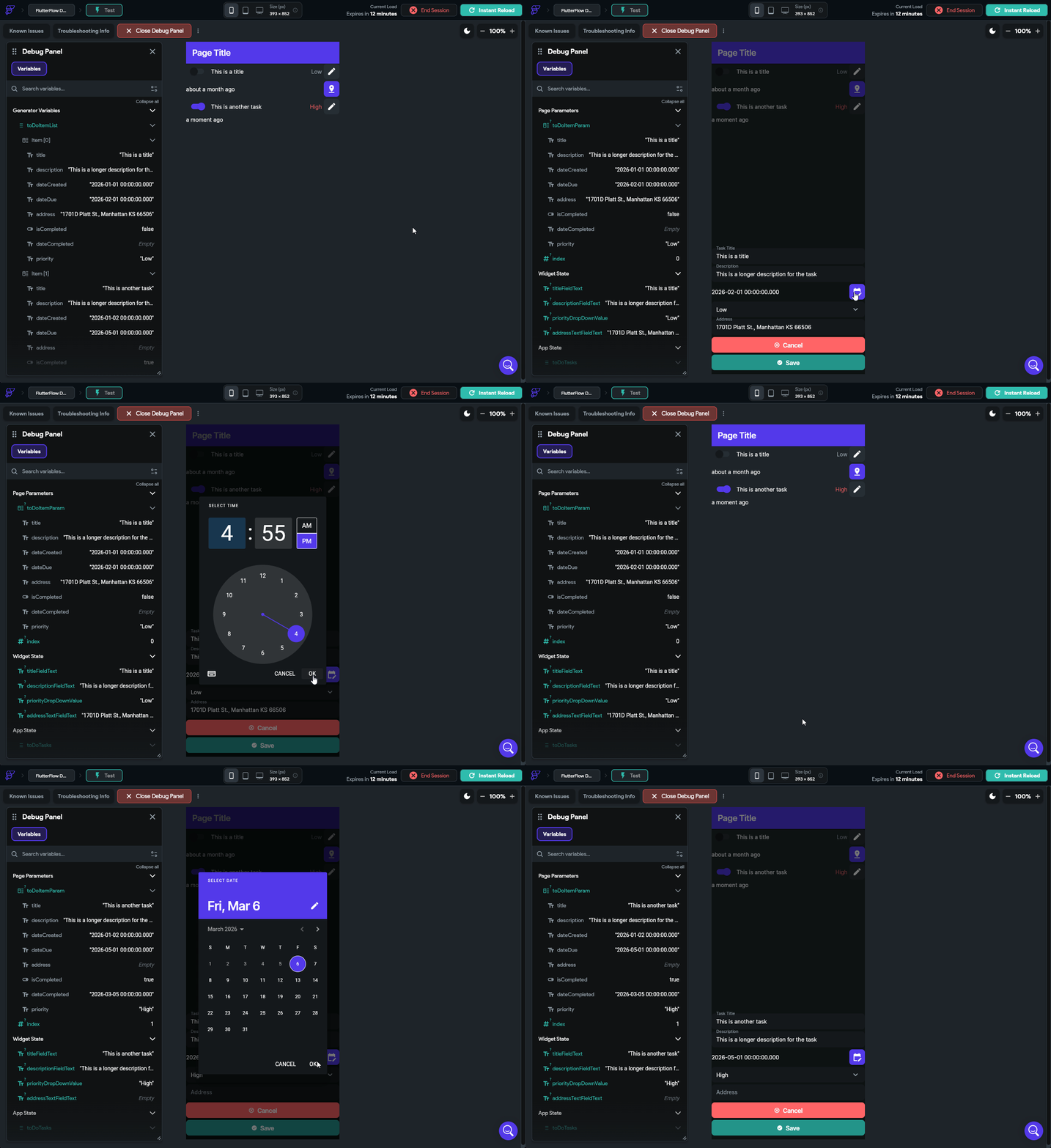
Let’s reload our Test Mode and make sure that this is working before continuing.
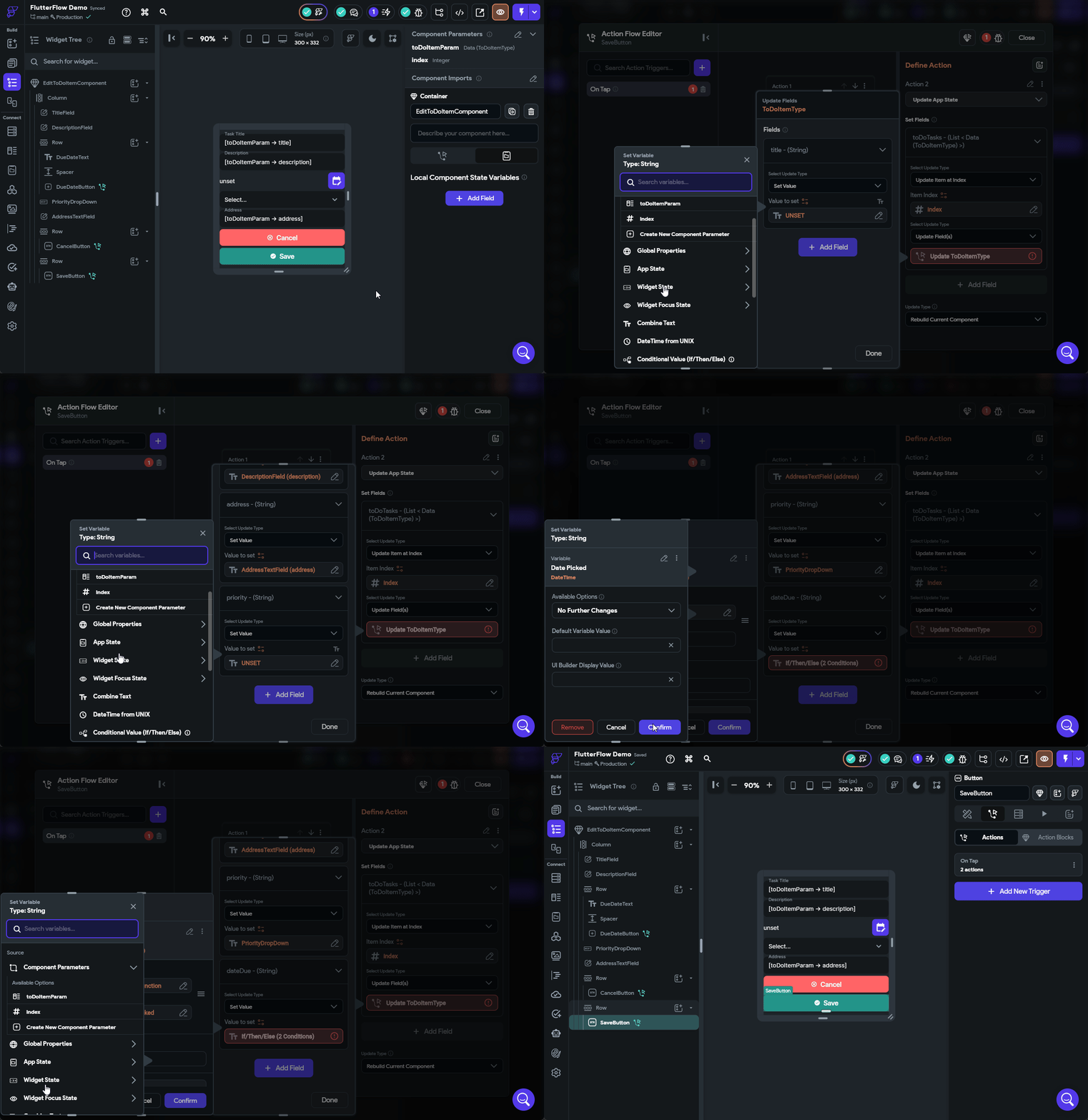
Finally, let’s update our SaveButton action to actually save the data. This is very similar to what we did when we configured the Switch widget to mark a task as completed. We’ll start by going back to our EditToDoItemComponent and then clicking the SaveButton and editing the Actions applied to it. In the Action Flow Editor, we need to add a second action that will save the data before dismissing the bottom sheet. So, we can click the Plus button at the bottom of that action and create a new action. In that action, we’ll look for the State Management option and find Update App State, then click the Add Field button to choose our toDoTasks App State field. Then, just like before, we’ll select the Update Item at Index option and set the Item Index to our index variable, then we can set the individual fields by matching them to either the text fields and drop down fields on our component or the Date Picked state from our Widget State for the due date if it has been selected, using a Conditional Value similar to what we did before. The full process is shown in the animation below or the video above.
Once that is done, we can reload our app in Test Mode and make sure that the edits we make are properly saved in the app state that is shown in the Debug Panel on the left side.
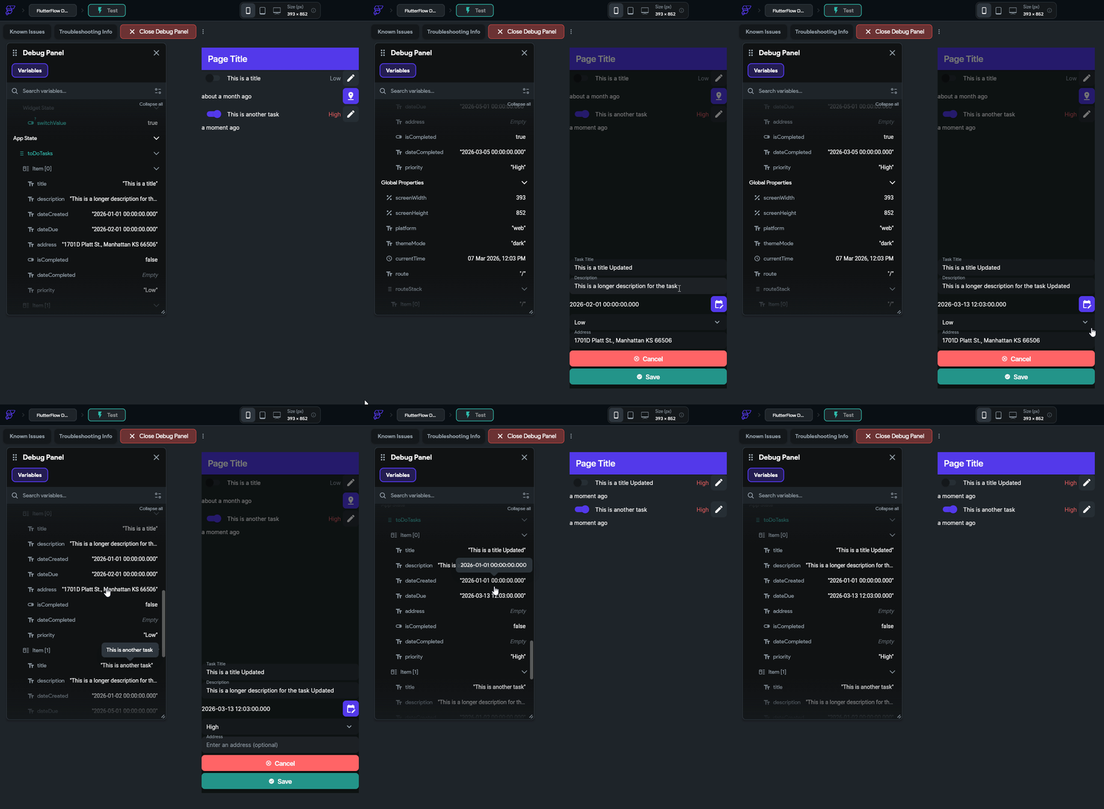
There we go! We can now update our state easily!
The process to create a component for creating a new to do task is very similar. Let’s look at that process and see how it differs.
First, let’s create a duplicate of our EditToDoItemComponent - we’ll call it CreateToDoItemComponent to follow our existing naming scheme. You can duplicate a component by right-clicking it in the Page Selector and selecting Duplicate Component. Once it is created, we can rename it to the appropriate name.
Next, we can remove the two component parameters from this component since they aren’t needed at all. So, choose the component in the Page Selector and find the Component Parameters section of the Properties Panel and remove the toDoItemParam and index parameters from that list.
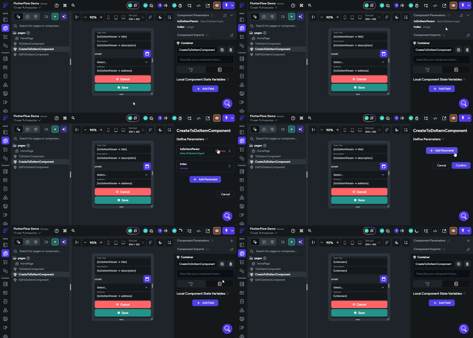
We’ll also need to update the Initial Value settings for each of our fields since they are no longer relevant. They can just be completely removed for now. Remember to update the three Text Field widgets as well as the Drop Down widget for priority and the else case in the Text widget for the due date (it can be set to the Empty String constant).
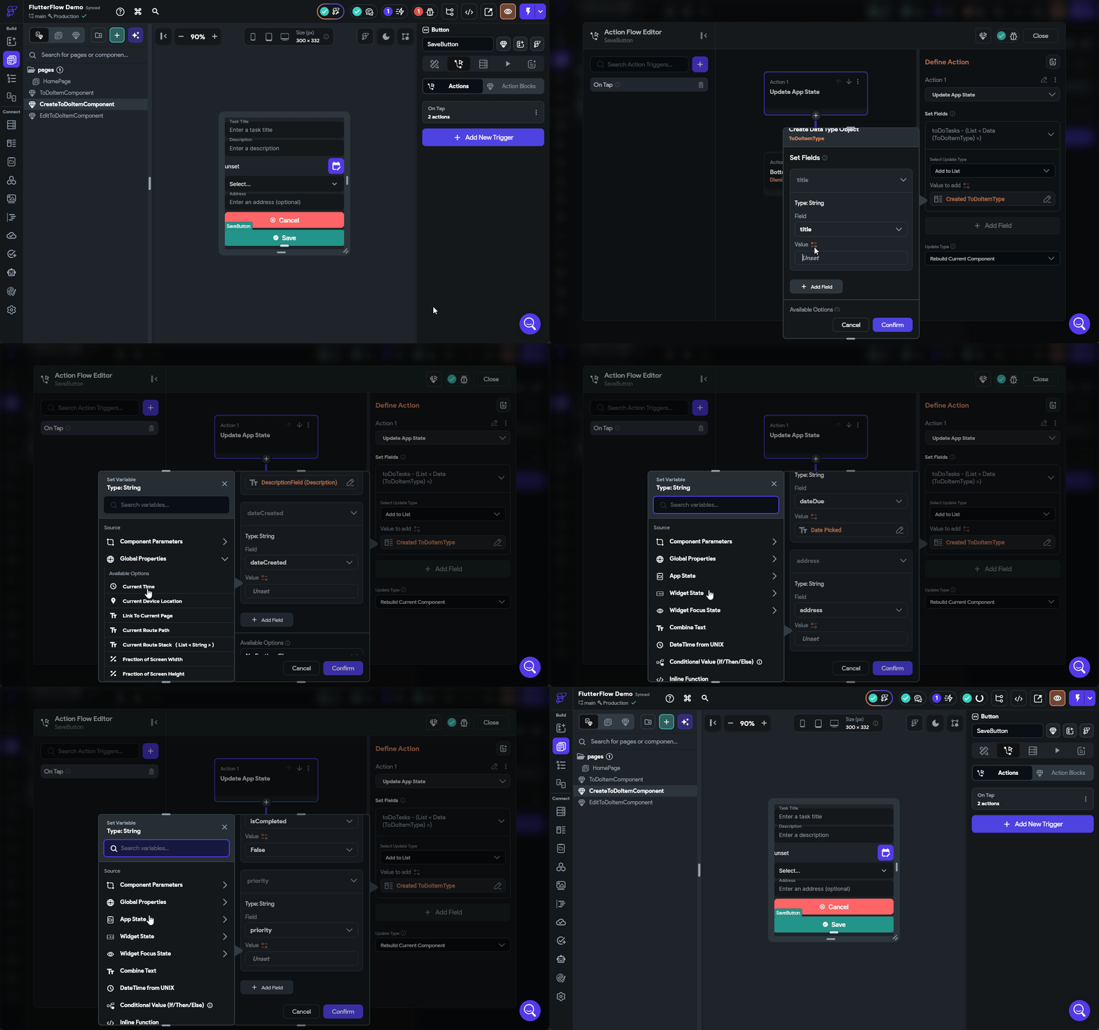
Finally, we need to modify the SaveButton action to Add to List instead of Update Item at Index. The process of matching up the fields is the same as before, but with a few important changes:
dateCreated can be set to the Current Time option found under Global StatedateDue can be directly set to the Date Picked option under Widget StateThe full process for editing that action is shown below.
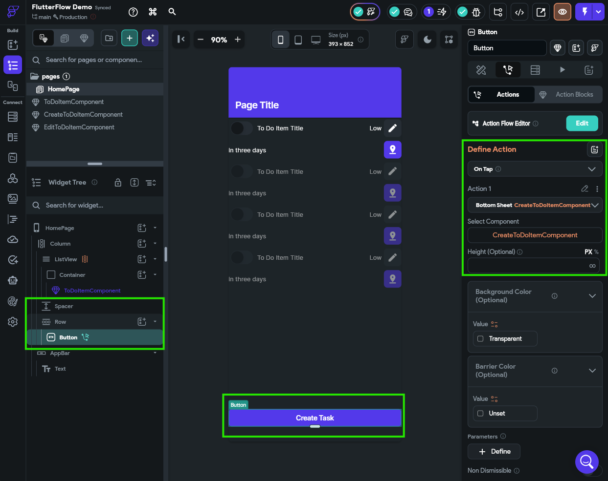
Finally, let’s quickly add a Button widget to the bottom of our HomePage to allow us to create a new task. The On Tap action for that button will be to open the CreateToDoItemComponent as a bottom sheet. For the example, we chose to add that at the bottom of the Column widget in a new Row widget so it could expand to fill the whole width, and we added a Spacer widget as well.
Once again, at this point we can open our app in Test Mode to confirm that we can actually add new items to our App State.
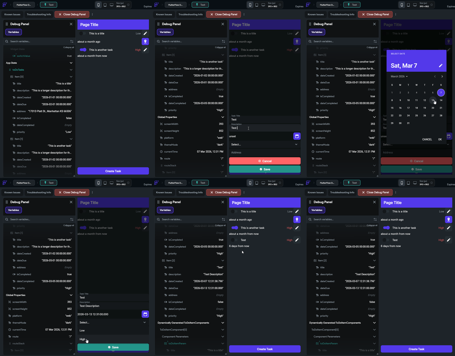
Awesome! It looks like it is working!
One of the major topics we aren’t covering in this tutorial is Form Validation. For example, what if the user doesn’t enter a title? Or what if the user forgets to select a due date? Our current application will allow this (the widget will still work and just show default values), but in practice we may not want to. FlutterFlow includes a Form widget that we can use to add validation logic to our form fields. More information can be found in the FlutterFlow - Form Validation documentation.
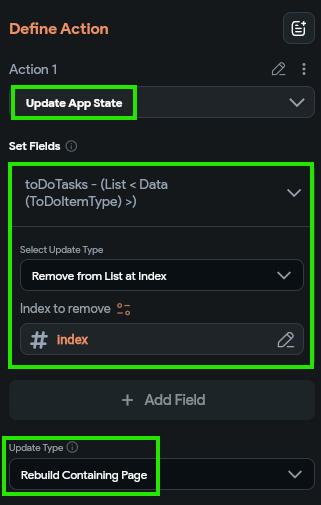
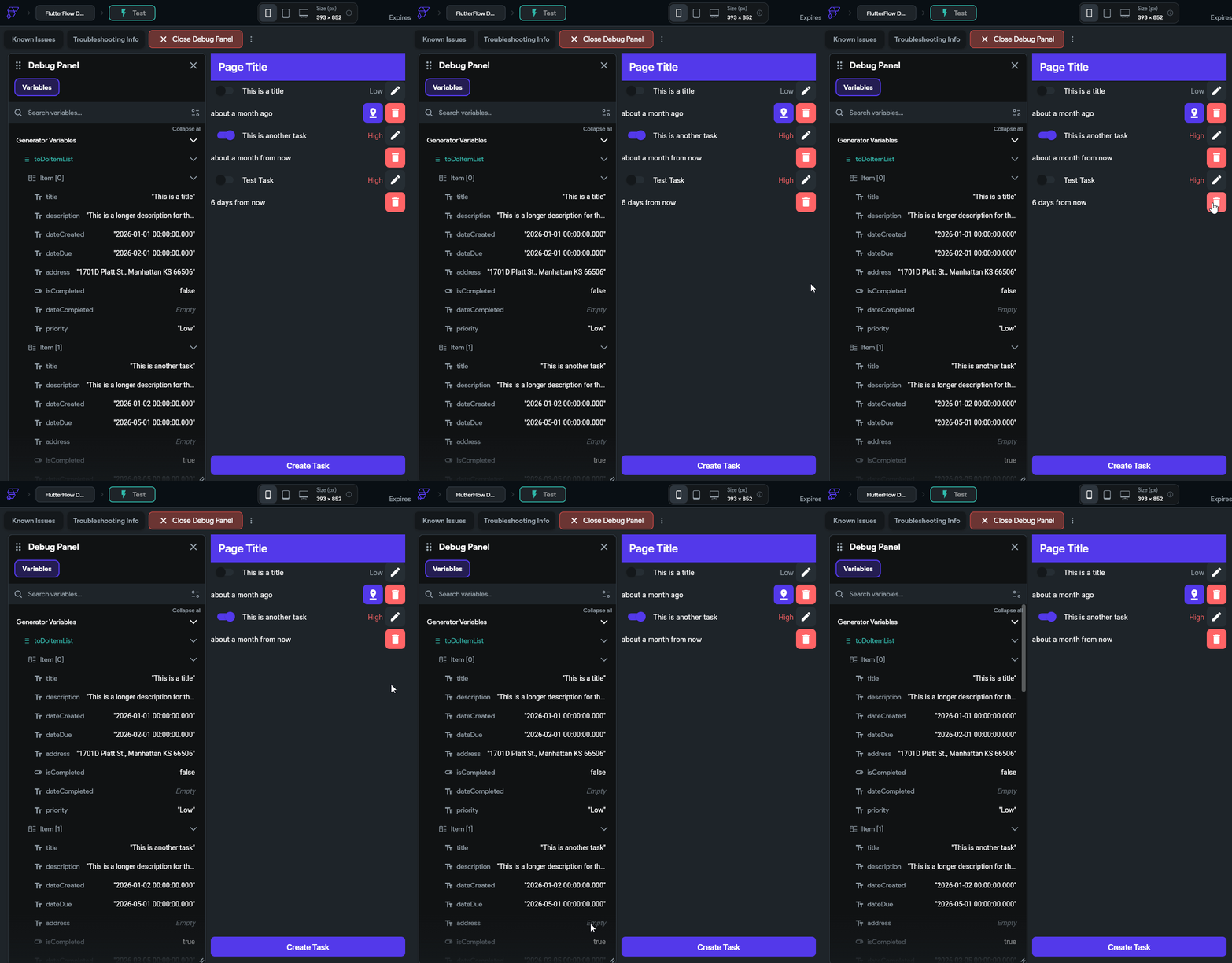
Finally, let’s add another button that allows users to delete data. This is actually quite simple - we just add a new button to our ToDoItemComponent and set the action to Update App State then choose the Remove From List at Index option and select the index parameter. However, this time we also want to set the Update Type at the bottom to Rebuild Containing Page since we are updating the app state beyond this component. By setting this option, it will refresh the entire list and remove this component once the underlying App State is updated.
With that in place, we should also be able to delete items from our application.
Let’s take a minute to go back to that initial list of features and check off the ones we have already implemented:
We are already nearly one third of the way through the list! At this point we have an app that has quite a few interesting features. Next, we’ll work on connecting this app to the cloud and adding user accounts.
At this point, we have the basic concept of a mobile application that helps a user track to do tasks. However, currently our data is only stored in the local application state, which is only accessible on a single device. In addition, at any time a user could choose to clear the application’s cache, and all data would be lost. So, let’s explore adding a cloud service to our application that will store our user’s data for us. In addition, we’ll use this service to manage our user accounts and authentication.
For this tutorial, we’re going to use Google’s Firebase as our chosen cloud database. There are many options available, and we could even choose to build our own backend for storing user data (and many large applications do), but Firebase is fairly common and easy to use so it makes a great choice for our application. However, as we’ll see in this tutorial, there are some important concepts we need to understand when using Firebase to avoid exposing our users’ data to malicious actors on the internet.
We encourage you to take a look at the Firebase Documentation and bookmark that link for easy access in the future. Specifically, you may want to review some of the basic concepts in the Understand Firebase Projects section of the documentation before continuing.
At its core, Firebase is a cloud database that we can use to store and retrieve data within our application. Unlike traditional relational databases that use Structured Query Language (SQL) and have a defined structure, Firebase is a Document Database that is designed to store and retrieve JSON-style documents, just like what we created earlier when defining our to do tasks.
Before beginning, make sure you can log in with your Google Account on the Firebase Console. This ensures that your Google Account is properly configured to use Firebase. Contact the course instructors if you have any issues getting access to Firebase.
Once we have confirmed that our Google Account is working with Firebase, we can add it to our mobile app in FlutterFlow. To find this setting, go to the Settings and Integrations page found on the Navigation Menu, and then find the Firebase settings under Project Setup.
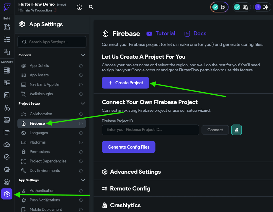
Here, we can click on the Create Project to have FlutterFlow create a new project for us in Firebase. Then, in the window that appears, we can give our project a helpful name and ID, and also choose the region. For the region, it is often best to choose a location closest to you. Once configured, click the Sign in with Google button to connect FlutterFlow to your Google Account and start the setup process.
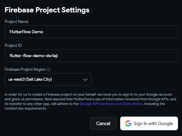
As part of this process, we are giving FlutterFlow access to our Google Account and allowing that tool to make changes to our Firebase configuration. While this is great for a demo application, it can also be a security concern later on if you plan on releasing this application.
For example, what if FlutterFlow’s app platform or your FlutterFlow account is compromised? Hackers could use that to gain access to your entire app’s database on Firebase and more.
A more secure option would be to configure your Firebase project separately and give FlutterFlow the existing Project ID. You can also refer to the FlutterFlow Docs - Firebase and FlutterFlow Tutorial - Firebase Setup for additional information about this process.
Once the setup process is complete, you’ll see the Firebase Project ID populated in your FlutterFlow settings, and also some additional options to enable features such as Authentication and Storage. We’ll come back to these options later.
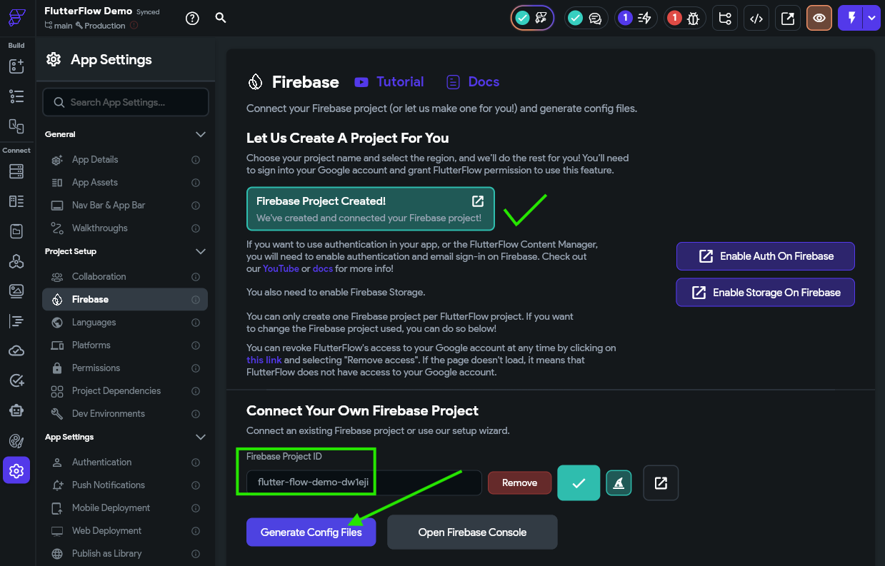
At this point, we’ll just click the Generate Config Files button to generate the required configuration files for our application to use Firebase. When we do so, we’ll be prompted to enter a Package Name for our application. This package name is generally our application’s online domain name reversed (for example, myapp.example.com becomes com.example.myapp). For this example we’ll use a domain name unique to our course and our K-State eID, such as edu.ksu.mc565.<your_eid>.demoapp.
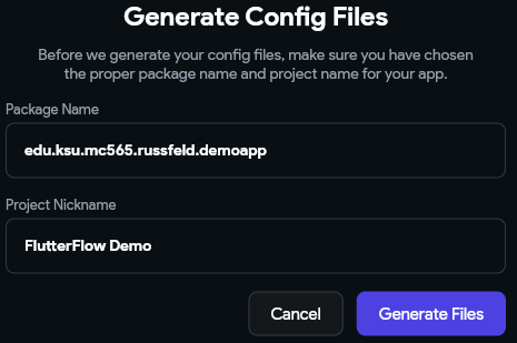
Once we click the Generate Files button, FlutterFlow will generate some configuration files for our application so it can fully use Firebase. Once it is done, we should see a message appear on the settings page.
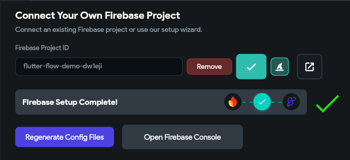
There we go! Now our application is configured to use Firebase as the cloud database for our application. Next, let’s work on reconfiguring our app to use it.
First, we need to configure our collections in Firebase. A collection is just a list of documents that all have a similar data structure, such as a list of user accounts or a list of to do tasks. To accomplish this, click the Firestore option on the Navigation Menu in FlutterFlow. Here, we can click the Create Collection button to create a new collection.
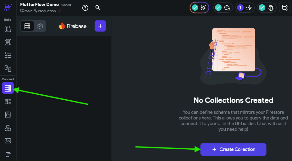
In the window that appears, we’ll create a collection named to_do_tasks (Firebase prefers variable names in lower_snake_case with underscores) and click the Create button. Then, instead of choosing a template collection, we’ll just select the Start from scratch option to build our own structure.
Here, we’ll simply need to duplicate the structure of our to do tasks from earlier. Below is a JSON listing of a single task to remind us of what it should look like:
{
  "title": "This is a title",
  "description": "This is a longer description for the task",
  "dateCreated": "2026-01-01 00:00:00.000",
  "dateDue": "2026-02-01 00:00:00.000",
  "address": "1701D Platt St., Manhattan KS 66506",
  "isCompleted": false,
  "dateCompleted": null,
  "priority": "Low"
}
Once this process is completed, we should see the following schema:
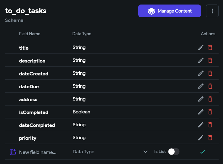
Now we are ready to start using this in our application!
You might notice that Firebase has a DateTime option in the list of data types, but we chose to use String instead for items that represent a date. This is because often the String data type is more convenient since it allows us to store null or "" (empty string) values, which may be useful in our application. However, it does mean that our application is constantly converting between String and DateTime formats, which may be a bit inefficient. Feel free to experiment with data types in your applications to see what works best for your uses!
Unfortunately, FlutterFlow does not allow us to simply reuse the ToDoItemType that we created earlier as the data type for our Firebase collection. Instead, each Firebase collection defines its own data type. This is because Firebase collections do not support all of the data types available in FlutterFlow. So, we’ll end up reconfiguring a few items as we go to match that structure.
Next, click the Settings button at the top of the Firestore page to see some of the important settings for our Firebase setup.
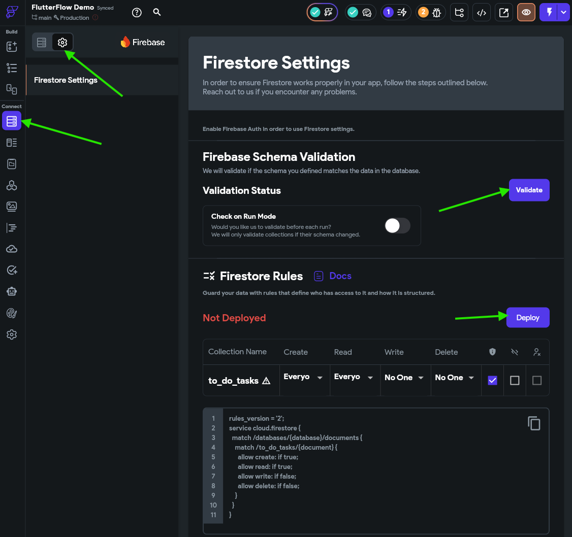
Here, we’ll click the Validate button to validate our schema, then the Deploy button to deploy a set of access rules for our Firestore collections to Firebase. In the window that appears, you can review the changes being made to the existing rules in Firebase. Click the Deploy Now button to deploy the changes.
Right now we are deploying a set of insecure rules to Firebase for testing. We’ll discuss security later in this tutorial. For now, just remember that everything is insecure and you should definitely review the later section n security before deploying this app.
First, let’s update the List View on our application’s HomePage to show the data from Firestore instead of our App State. To do this, we’ll go back to the HomePage on the Page Selector, then find the ListView widget in the Widget Tree and look for the Backend Query tab in the Properties Panel
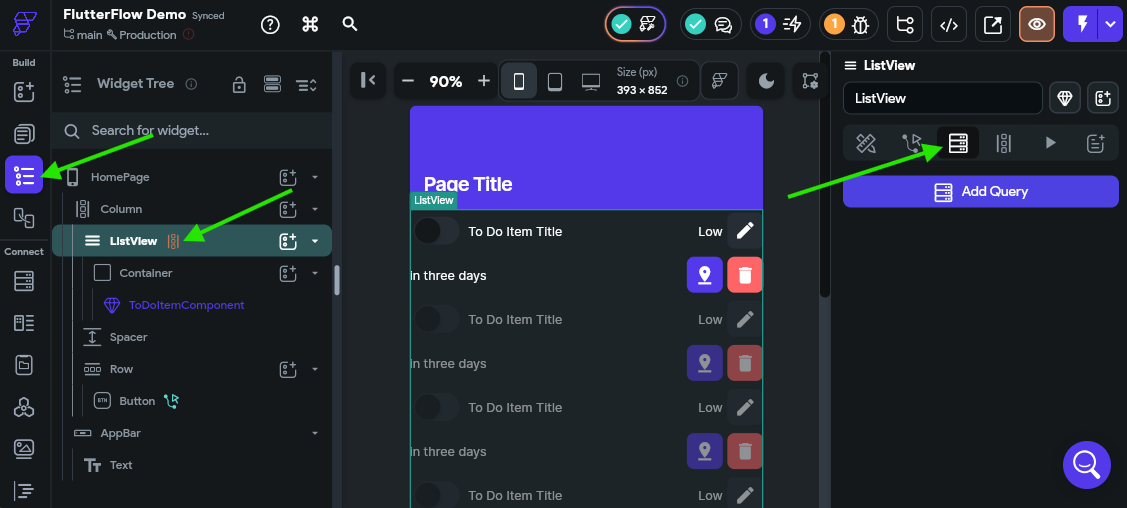
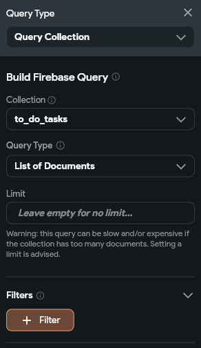
Here, we can click the Add Query to add a new Firebase query to our component. In the Query Type, we can choose Query Collection, and then choose our to_do_tasks collection. The internal Query Type will be List of Documents with no limit defined.
We’ll also leave the Filters alone for now, but we’ll come back to that later.
Below, let’s add an Ordering to our query. We want to sort our tasks by completion, priority, and due date in that order. The isCompleted value should be sorted in decreasing value (so the unchecked values will be shown before the checked ones), but the others should be sorted in increasing value.
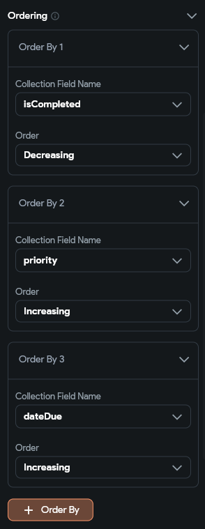
Finally, we’ll want to make sure we leave the Single Query and Infinite Scroll options Unchecked at the bottom. This allows our application to automatically update itself as we make changes.
Finally, we can click the Confirm button to save our query. This will replace the Generate Dynamic Children settings we set previously.
Next, since our list view just uses our own ToDoItemComponent, we just have to update the parameters we are passing to that component. First, let’s go to that component and update the expected parameters.
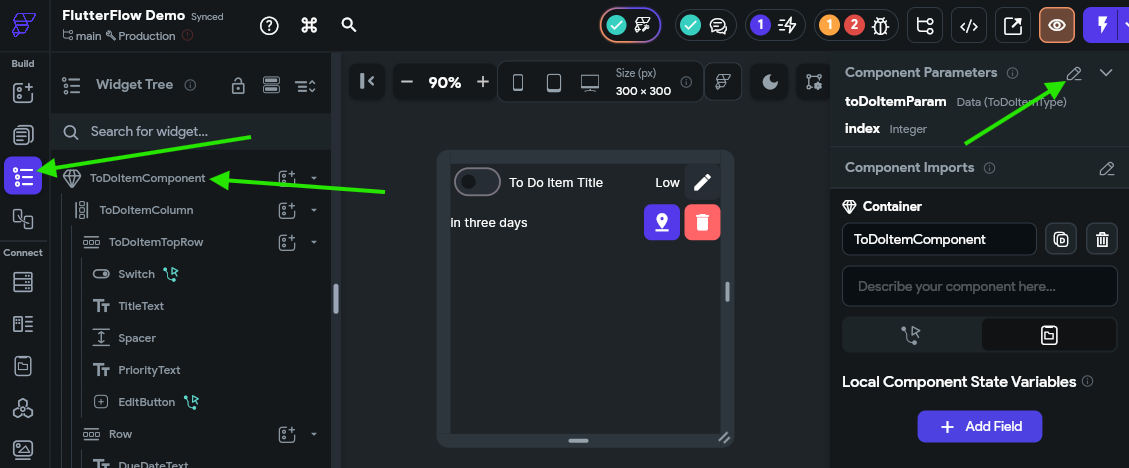
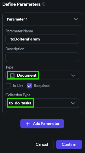
Here, we’ll remove the index parameter, and also update the type of the toDoItemParam to be the Document type, and choose the to_do_tasks Collection Type
Once we do that, we’ll need to update all of our UI widgets to connect to the correct values. The screenshot below shows an example of updating the TitleText widget:
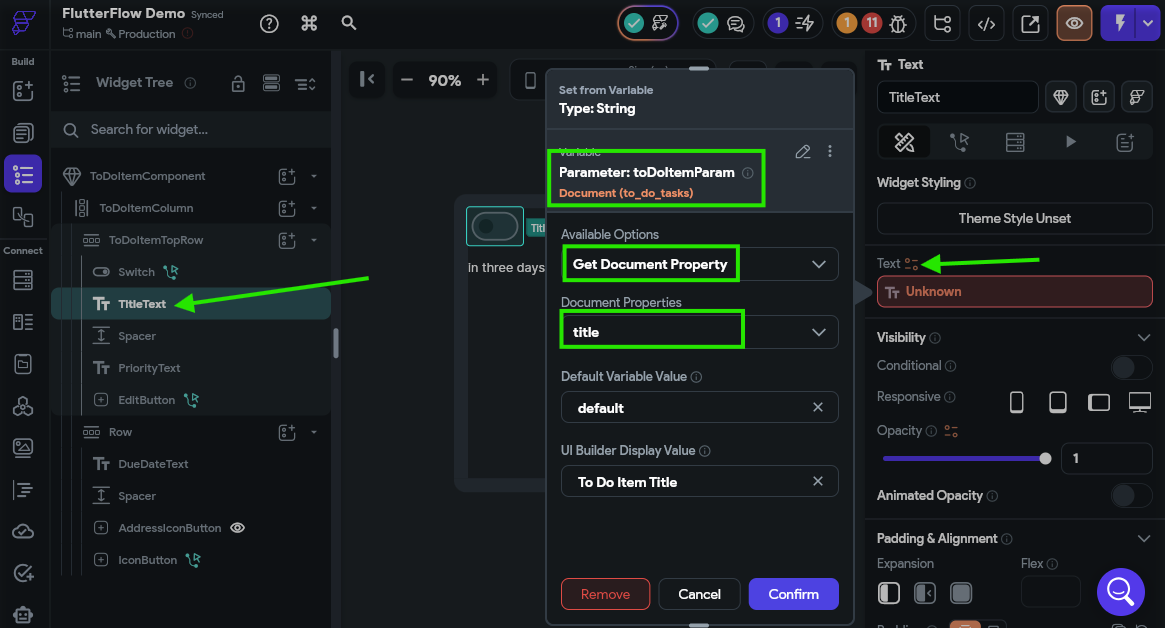
We’ll need to go through and update all the widgets on this component to display the correct data. Remember to update the conditionals for the PriorityText and AddressIconButton as well. We’ll come back here to update the buttons a bit later.
Once that is updated, we’ll go back to our HomePage and find the ToDoItemComponent in our Widget Tree and find the settings at the bottom that need updated.
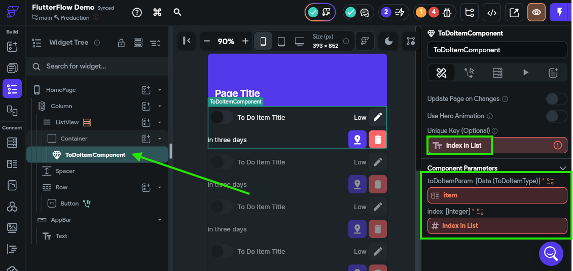
Now, when we look at our available variables, we’ll see a new to_do_tasks Document option that represents the current document in our collection of to do tasks that are queried from Firestore. So, we’ll set the Unique Key to the to_do_tasks Document’s Document ID option. We’ll also update the toDoItemParam to be the to_do_tasks Document’s Document option.
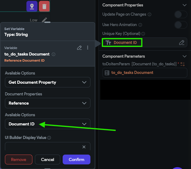
There we go! Now that list view should display tasks from Firebase instead our internal App State. However, we still need to update a few things to be able to create, edit, and delete tasks.
Since we are now sorting the list in our query, the index of each item in the list will change as it is updated. Because of this, we can no longer assume that value will be the same for each item as it is updated. So, when working with Firebase, it is always best to use either the document reference or the document’s unique ID instead of it’s index in the list to uniquely identify it.
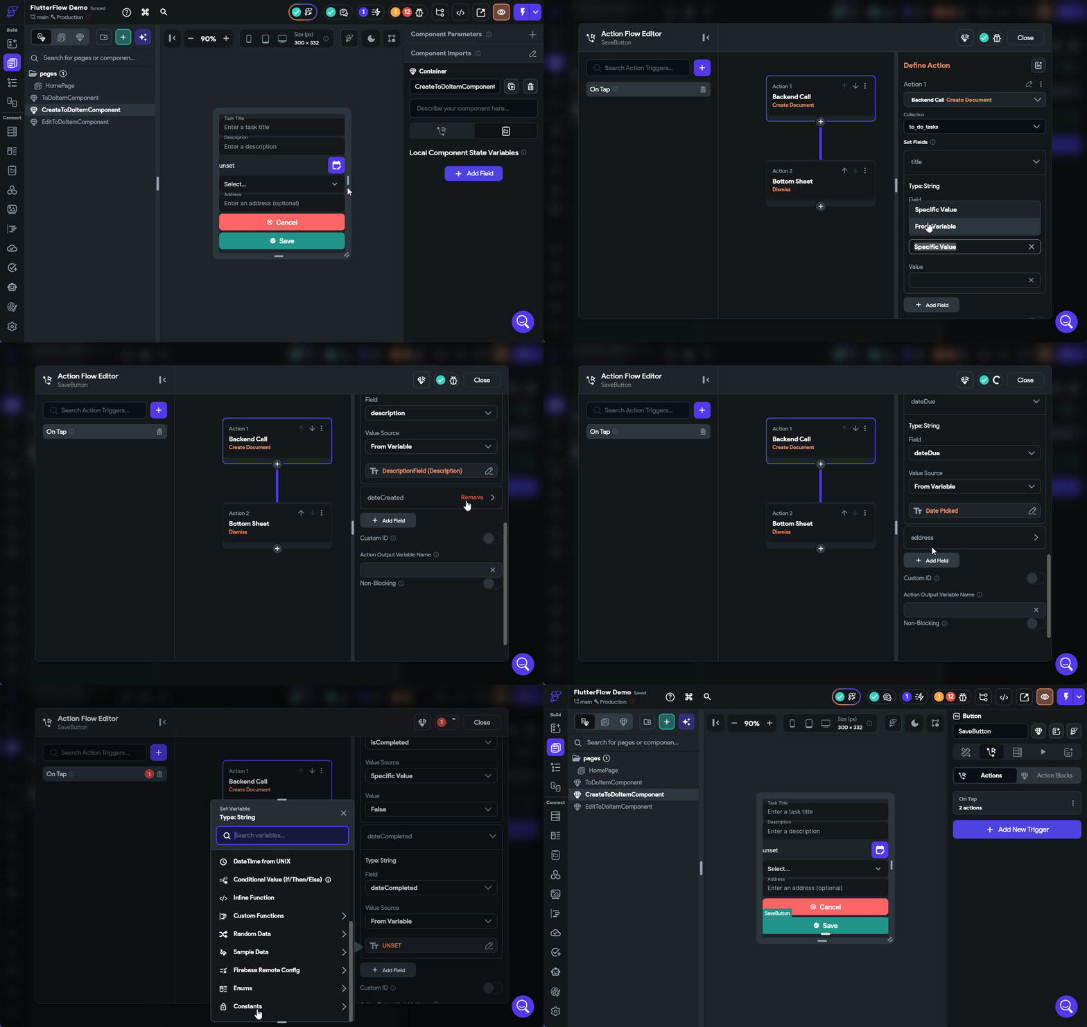
Let’s take a look at the CreateToDoComponent next. This component is easy to update since it doesn’t require any parameters. All we have to do is update the action on the SaveButton to create a new document in Firestore instead of a new item in our App State. The process for matching up each field to a Widget State or Variable is very similar to what we’ve done before. The full process is shown in the animation below.
Next, we need to update our EditToDoItemComponent to accept an updated parameter just like we did above for the ToDoItemComponent, but this time we also want to update the index parameter to be a ref instead, and we’ll set the type to DocumentReference and choose the same collection:
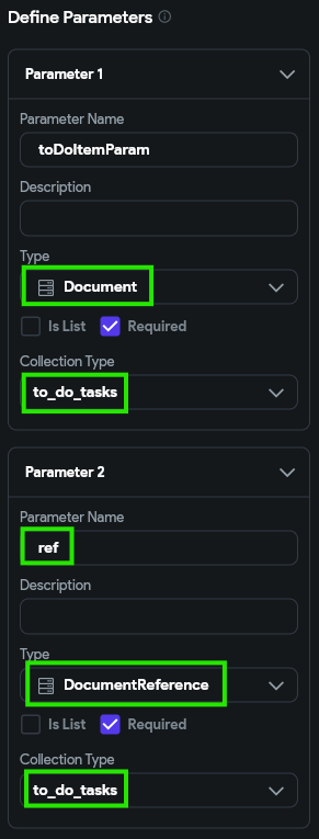
This allows us to actually access both the underlying document in Firestore and the data it contains.
Next, we’ll have to go through each widget in our interface and update the Initial Value to read the correct items from our new toDoItemParam. Below is a screenshot showing the process for updating the TitleField widget:
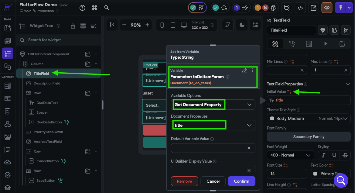
Finally, we’ll need to update the SaveButton action. This time, we’ll choose the Backend/Database > Firestore > Update Document option from the list of actions, and choose our ref parameter as the Reference to Update option.
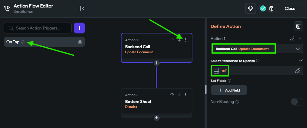
Then, we’ll just need to go through and add all the fields to this action, just like we did above. See the animation above for updating the CreateToDoItemComponent component for the full process, but remember to use a Conditional statement for the dateDue just like we did before.
Finally, let’s go back to the ToDoItemComponent and update the EditButton. As you might guess, we just need to update the parameters passed to the EditToDoItemComponent as shown below:
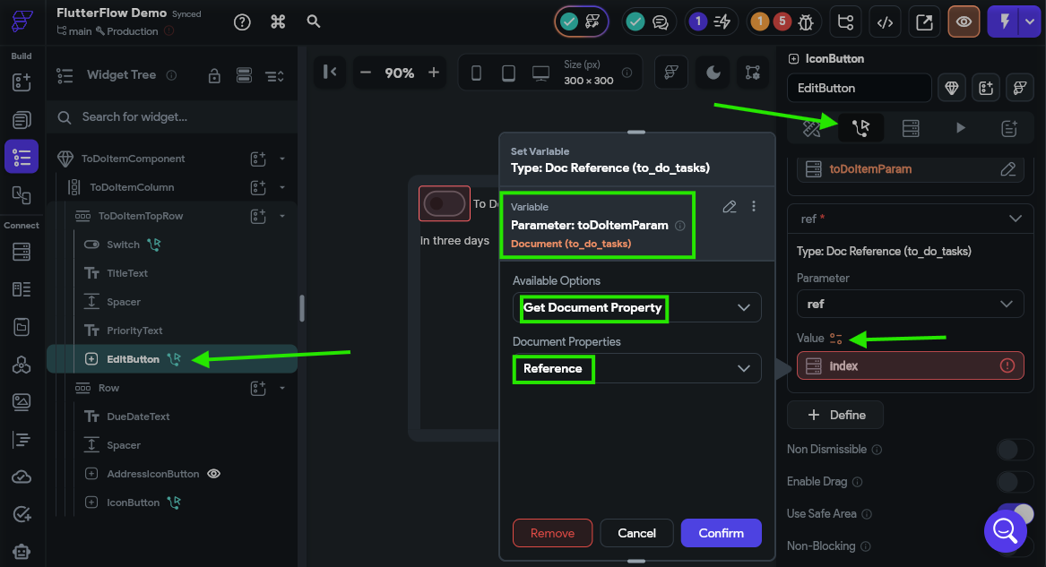
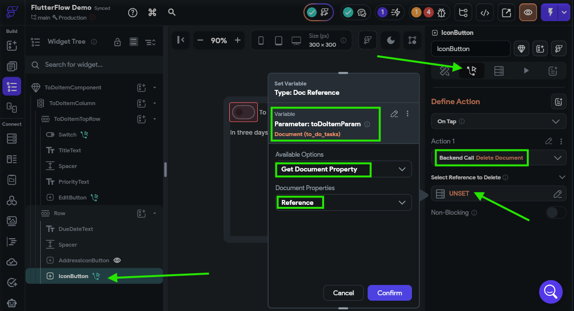
Likewise, we’ll need to update the DeleteButton to delete the document from the underlying Firestore collection:
Finally, we need to update the Switch widget to properly mark the task as completed or incomplete. The process is similar to what we’ve already done above.
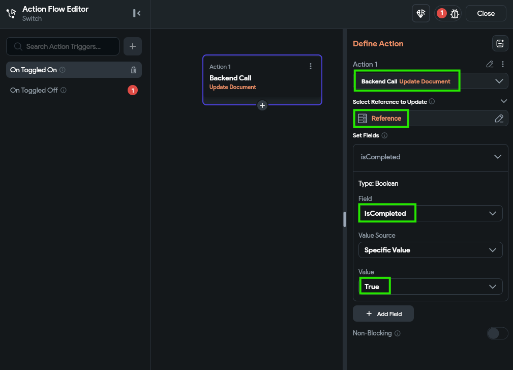
Remember to update both the On Toggled On and On Toggled Off action triggers.
There we go! That should be all of the updates we need to make on our application to configure it for Firebase!
At this point, you should check the Project Issues option at the top of the FlutterFlow app designer:
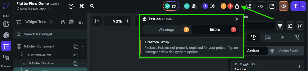
At this point, you should have 1 warning about Firebase rules and 1 warning about Firebase indexes, but no other errors. If you still are seeing errors here, it is probably because you missed updating a particular UI element. Click the error to be taken to the source of the error in your application. This is a great point to reach out to the course instructors if you are having issues getting everything updated.
Before we can test our application, we must do one more step to update our Firebase indexes. This is because we are querying our Firestore database in our application and asking it to sort the data using a few different fields, so Firebase needs to create an underlying index for those fields.
To update this, click on the Firestore option in the Navigation Menu, and then click the Settings button at the top of that page. Look for the Firestore Indexes section, and click the Deploy button to update them.
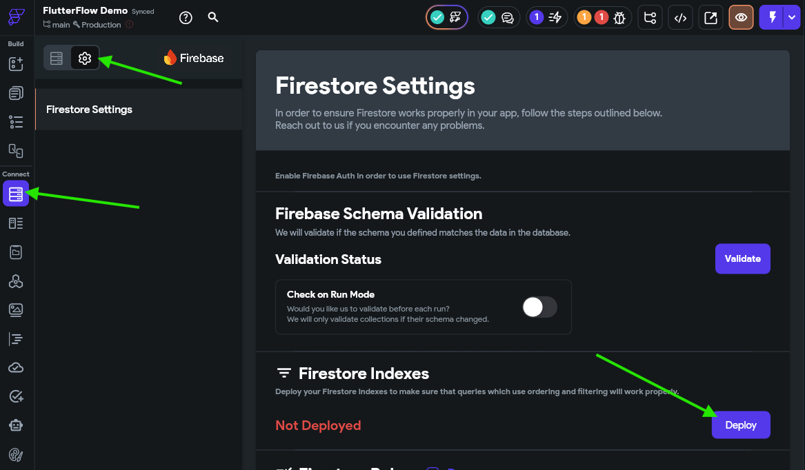
Thankfully, FlutterFlow will remind us anytime we need to update our indexes via the Project Issues button at the top of the page, so keep an eye on that anytime things are not working in your application.
Once you click the button to deploy your Firestore indexes, you must wait a little bit before starting your app. It can take a few minutes to build a new Firestore index, and you’ll receive errors in your app if you try to load data while the indexes are still building.
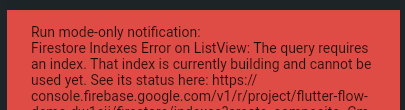
You can check the status of your indexes in the Firebase Console
Finally, we are ready to run our app in Test Mode. So, let’s check it out!
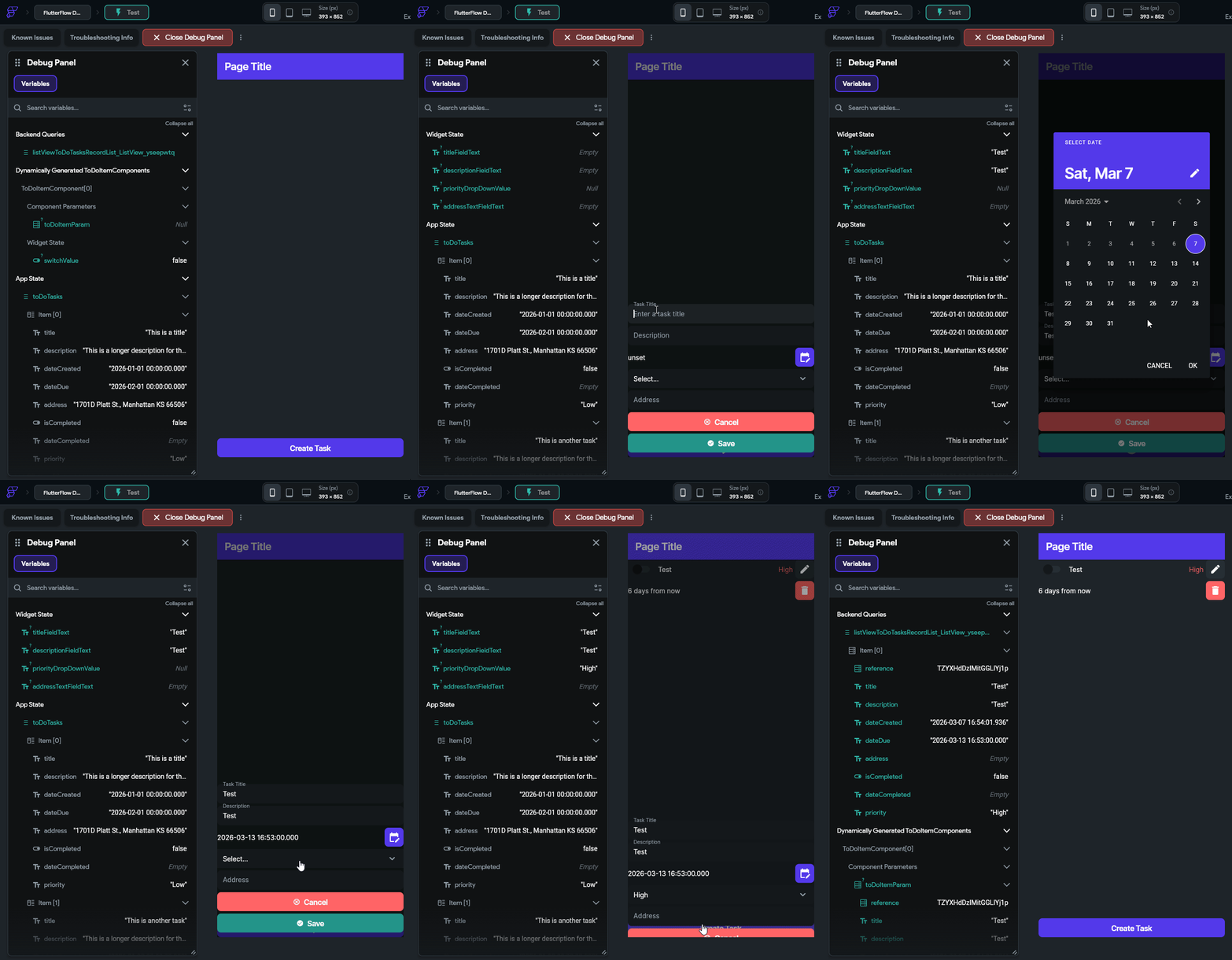
If everything works correctly, we should be able to create a task and have it appear in our list. However, if we leave some fields blank, such as dateDue and priority, it may not appear due to our sorting rules.
We can also go to our Firebase Console and view the data there as well:
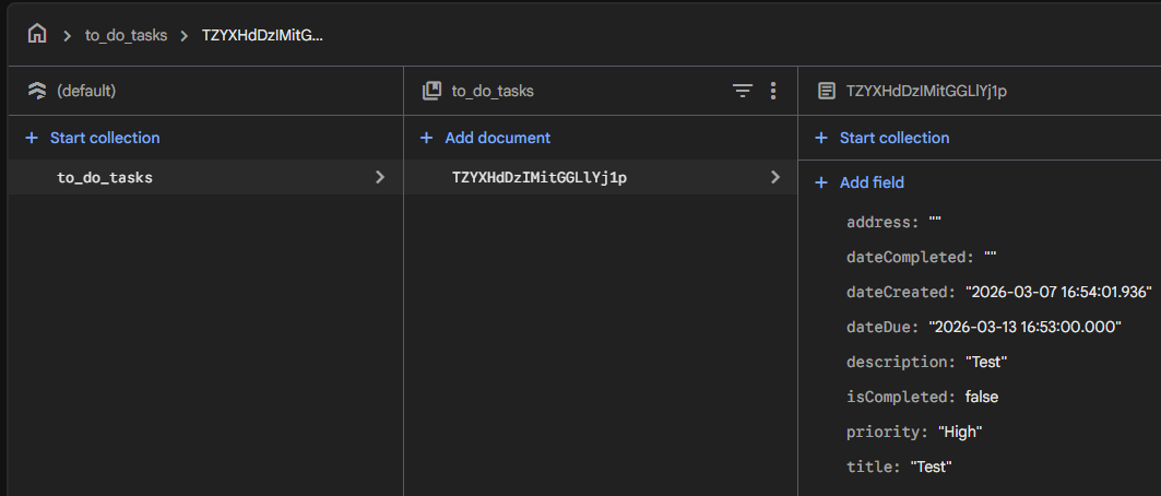
This view will update in real time as you make changes within the app. So, give it a try and see if everything is working!
We’ve now successfully connected our application to cloud database so our data will synchronize across different devices. In the next section, we’ll add user accounts and user authentication to our app, and explore how to properly secure our data.
Now that we have a working application that is synched with a cloud database, it is time to add user authentication and user accounts to our project. Thankfully, Firebase already includes all of the functionality we need to add authentication directly into our application, and FlutterFlow includes some scaffolded UI elements to make this a breeze. Let’s dive in!
First, it is important to remember what authentication is. Recall that authentication is the process of determining that a user of an application is the person they claim to be, usually through the use of one or more authentication factors such as a username, password, email address, phone number, or biometrics. However, authentication is different from authorization, which determines whether that user should have access to the data; put succinctly, authentication does not automatically imply authorization. In this part of our tutorial, we’ll only focus on authentication, and we’ll deal with authorization in the next section.
To begin, let’s add some new pages to our FlutterFlow application. Up to this point, we’ve been primarily focused with just the main page that contains our to do tasks in a list. However, most useful applications consist of many pages, such as a login page, a main page, a settings page, and more. Thankfully, we can use some of the most powerful features of FlutterFlow to make this process quick and easy.
Much of this process is also covered in the Introduction to Flows YouTube video from FlutterFlow. Feel free to refer to that as well as this guide!
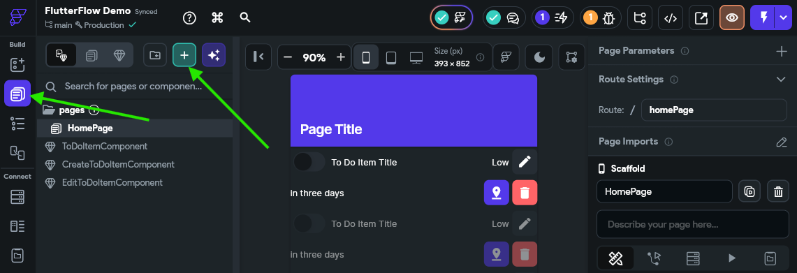
First, go to the Page Selector in the Navigation Menu, and then click the button at the top to add new content to our application.
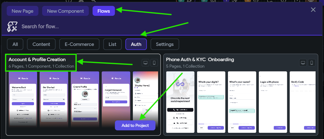
In the pop up window that appears, this time we’ll select the Flows option at the top, and then the Auth filter below that. Look for the flow titled Account & Profile Creation in the list of available flows, and click Add to Project at the bottom of that flow:
FlutterFlow includes many pre-built components, pages, and flows to choose from. Over the next few parts of this tutorial, we’ll shift from building our own UI elements to using some of the pre-built elements available in FlutterFlow. This helps us quickly add loads of common functionality to our application in a short amount of time. As you start developing your own apps, take a look at the available options here to get ideas of other items you might want to add to your application or to get inspiration for additional features to implement.
When we select that option, we’ll see another popup window that lists the items we’ll be adding to our application, as well as the underlying data collections and other options that will be enabled for us.
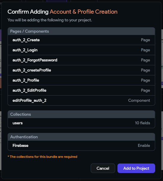
As we can see, this flow includes 6 new pages and a new component that will be added to our application. In addition, notice that it will handle adding a users collection to our Firestore cloud database as well as enable authentication via Firebase in our application. Click Add to Project again to add all of these items to our project.
In the next window that appears, we can give our flow a name. We’ll stick with the default AccountProfileCreation for now. Finally, click Create Flow to create it in our application.
After a few moments, we should see all of the new content appear in our application. You may have to click the AccountProfileCreation folder in the Page Selector to see all of the new items.
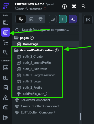
Before we start configuring those pages, let’s look at some of the settings that were enabled for us in the background.
First, in FlutterFlow, let’s go to the Settings and Integrations option in the Navigation Menu, and then we’ll look for the Authentication settings under App Settings in the list on the left.
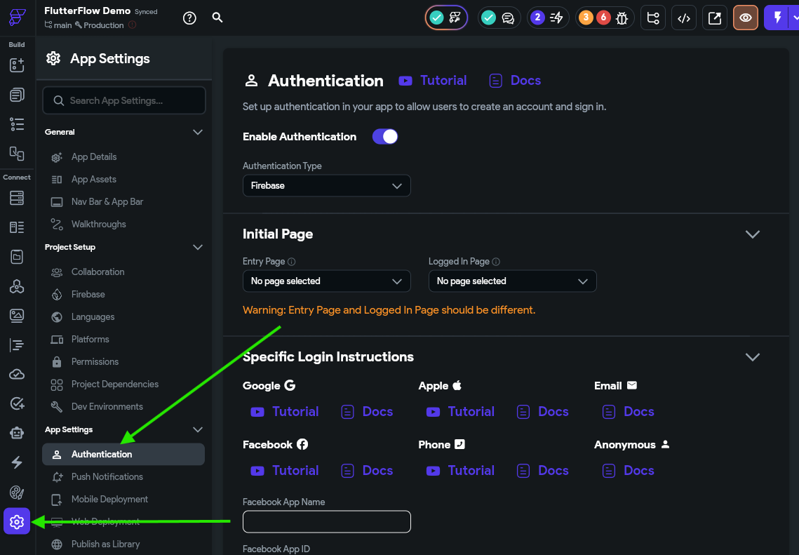
Here, we can see that the Enable Authentication option has already been enabled, and Firebase is selected as our authentication provider. This was done for us when we added the Account & Profile Creation flow earlier.
However, we do need to configure our initial pages for our app. These settings tell our app where to send users when they arrive at the application, and change depending on whether the user is authenticated (or “logged-in”) or not. So, let’s set the Entry Page to the new auth_2_login page, and the Logged In Page to our HomePage we created earlier:
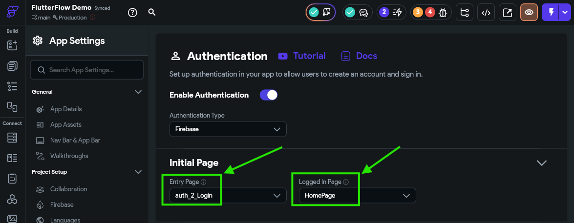
There we go! Now our app has some default pages set up.
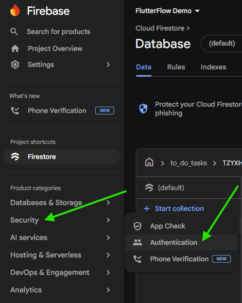
Next, we need to go to the Firebase Console and enable authentication there. To do this, find your project in the list of projects, and then go to the Security -> Authentication page:
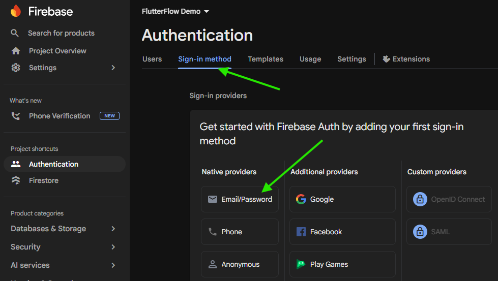
On the page that opens, click the Get Started button to start configuring authentication for your Firebase project. Then, under the Sign-in method tab, choose the Email/Password option
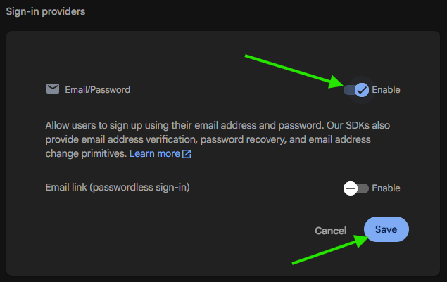
Under that option, choose the Enable option to enable that authentication method, then click Save to save that setting.
There we go! That is the basic setup for authentication in Firebase. However, keep this tab open since we’ll need to come back to it later when we start testing our application.
In this tutorial, we’ll only use the Email/Password option, but Firebase supports many other authentication providers such as Google, Facebook, Apple, GitHub, Microsoft, and more. They are all relatively easy to implement, but you’ll want to refer to the documentation and ensure that you understand how they work before using them.
Now, let’s go back to FlutterFlow and look at our new Login page, which can be found on the Page Selector named auth_2_login:
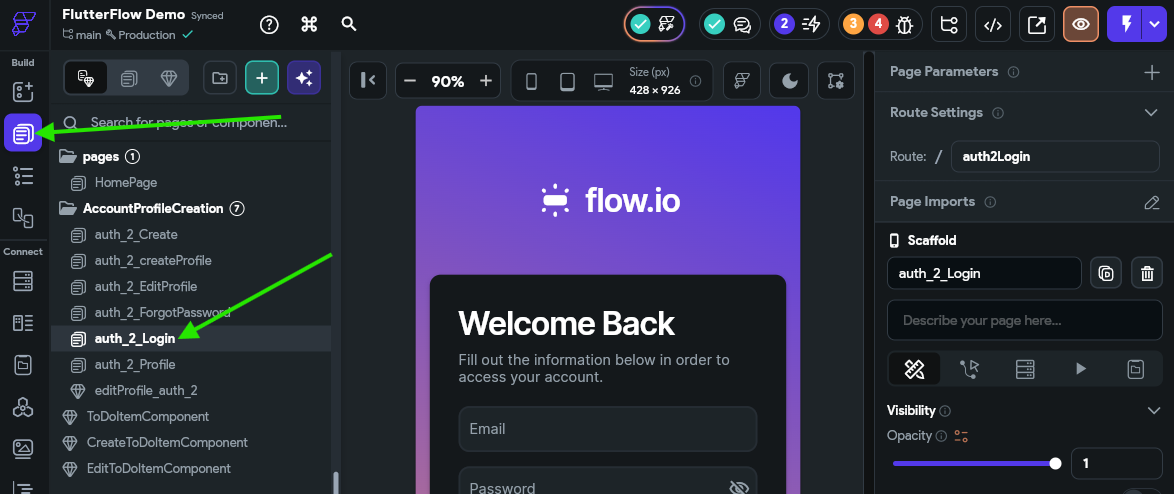
This page already includes a lot of the functionality we need to log into our application. For example, if we click the Sign In button and look at the Actions for that button, we can see that it is already configured to authenticate our user using the Auth -> Log In action:
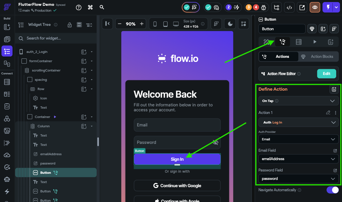
So, it looks like a lot of the functionality for our application is already configured for us! This one of the major advantages of using the built-in flows in FlutterFlow - it does a lot of the heavy lifting for us. In fact, we can even go to the Storyboard option on the Navigation Menu to see an overall layout for our application:
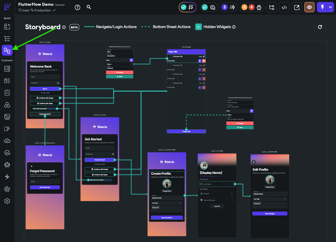
Your layout may look a bit different than the one shown here. That’s ok - we have adjusted our layout for this tutorial to make it a bit easier to see in a screenshot. You can click and drag pages and components in this storyboard layout to organize it however you want!
As we can see, our application already has a lot of functionality built into it from that pre-built flow! We’ll test it shortly, but for now we need to update a couple of things.
First, we need to configure the application to actually create a document in our Firestore users collection when a new user is created. To do this, we’ll go to the Page Selector and find the auth_2_Create page, and click the Create Account button and look for it’s actions:
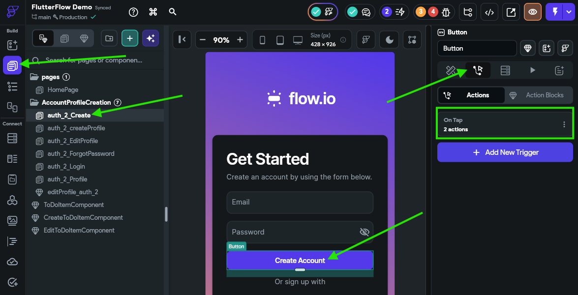
Click the button to open the Action Flow Editor and find the Auth -> Create Account action. Here, we need to checkmark the Create User Document option:
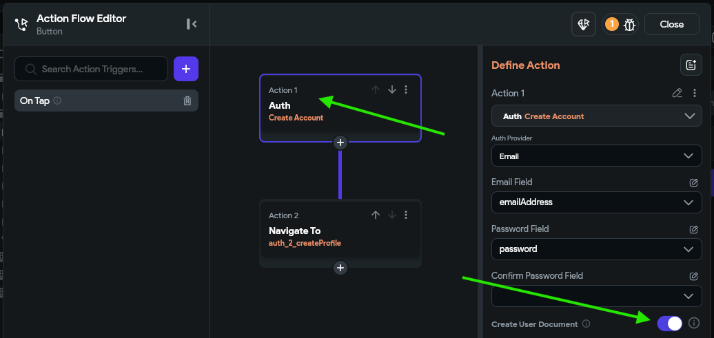
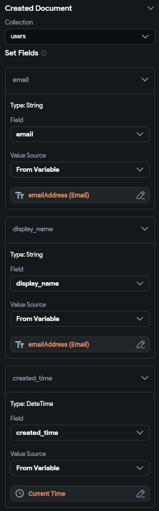
Below that, we’ll select the users collection, and then we can configure any desired fields. For example, we’ll set the email and display_name fields to use the emailAddress widget state, and we’ll also set the createdTime to match the current time on the device.
Finally, we need to make sure that we turn off the Navigate Automatically option at the bottom of that list:
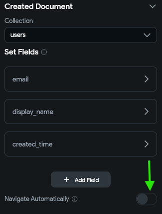
This is because we cannot automatically navigate in our application if we are creating a user document, but thankfully this action already has a second step to handle navigation for us, so we are all set!
Once configured, we can click the Close button at the top to save those changes. Now, when a user account is created, it will create a matching document in the users collection in Firestore for that user. We can use that document to store additional information about our users!
Next, we need to remove the ability for users to upload their own profile pictures. We’ll reconfigure this option later on in this tutorial, but for now we’ll just remove it.
Unfortunately, the free Firebase account does not include support for Firebase Storage, so we aren’t able to use it in this tutorial. However, it is a quick and easy way to allow users to upload files and data to your application and store them in the cloud. So, if you do want to build an app with that support, you can easily switch to a paid Firebase account to enable support for Firebase Storage.
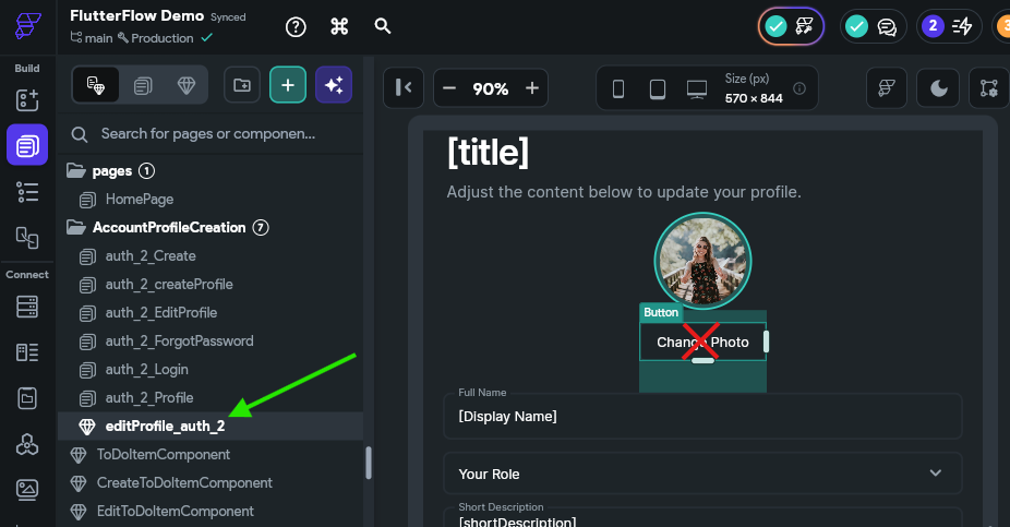
To do this, find the editProfile_auth_2 component in the Page Selector, and then click the Change Photo button in that component and simply remove it.
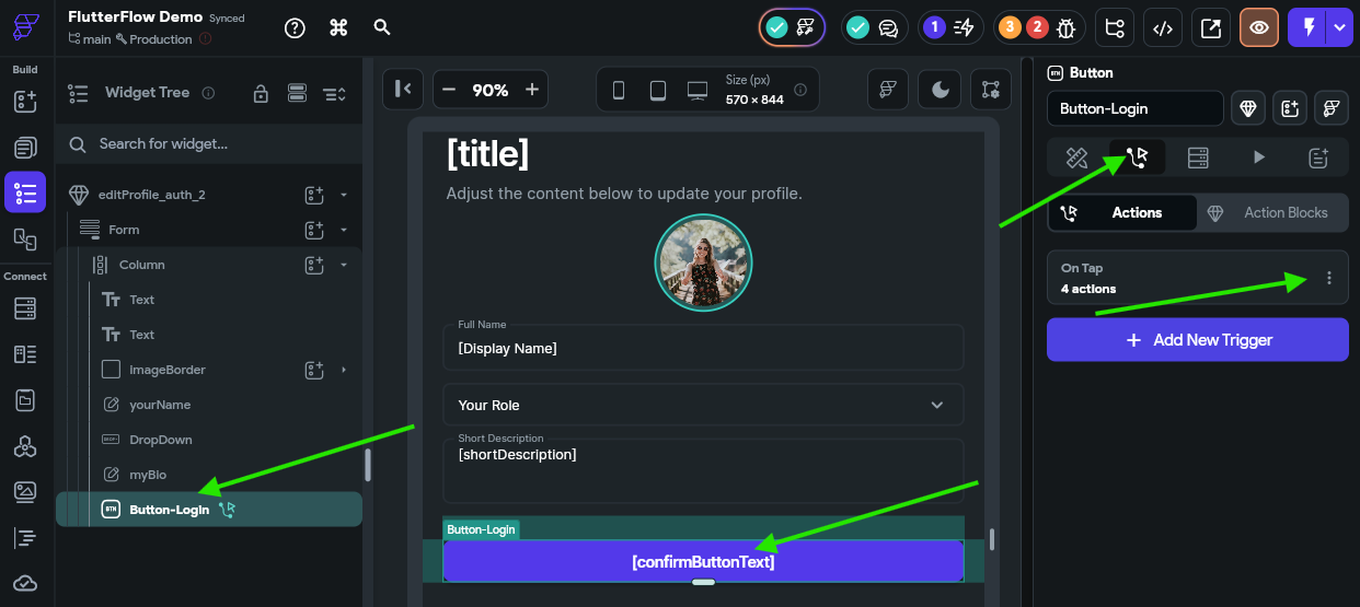
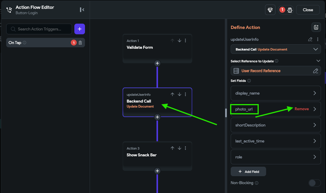
Next, find the Button-Login widget, and update the action to remove the photo_url from the list of fields to be updated.
Finally, we need to remove the Path from the uploadedImage widget since we don’t have a way to display user images currently:
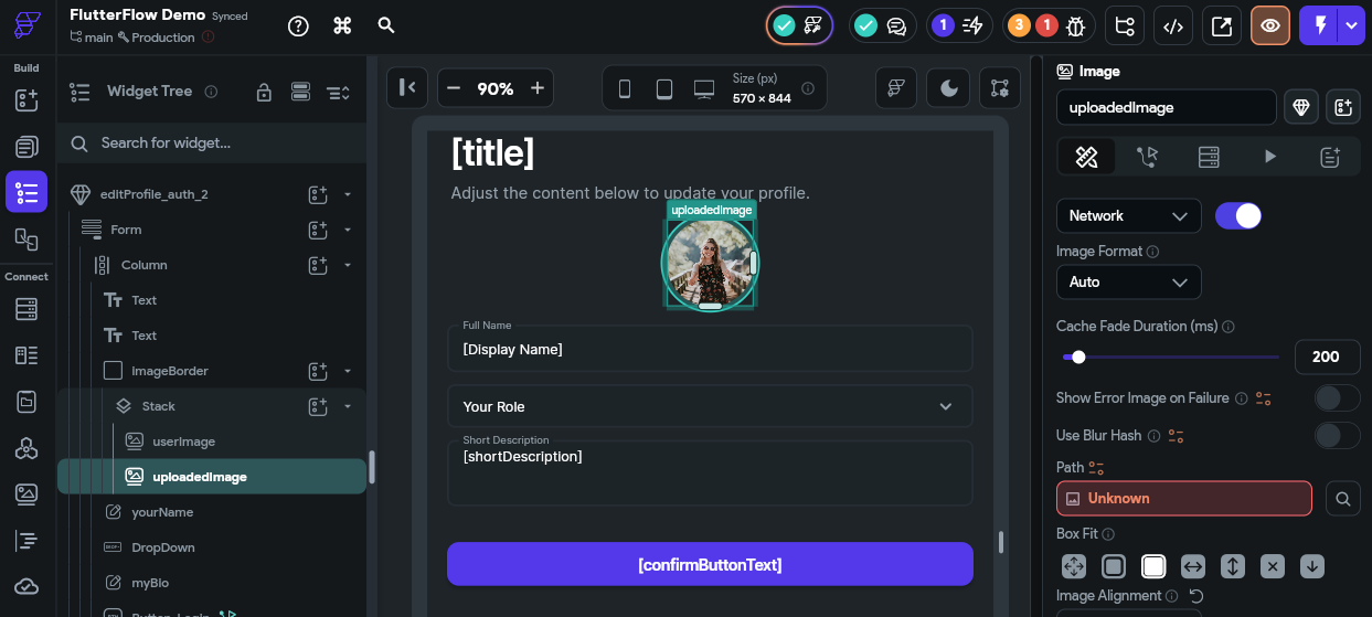
We can set this to a blank value for now. It may replace that with a default image from the Unsplash stock image site, which is great for now!
At this point, we should no longer see any errors at the top of our application in the Project Issues area, just a few warnings about Firestore Rules:
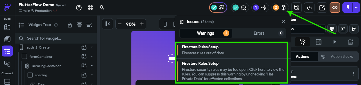
If you are seeing other errors or warnings here, see if you can resolve them by clicking the error and editing the item you are taken to. If you run into any errors you cannot resolve, contact the course instructors for assistance!
At this point, click on the first option that warns us that our “Firestore rule out of date.” That will take us to our Firestore settings, which we can also find by going to the Firestore option in the Navigation Menu and then clicking the Settings gear icon at the top:
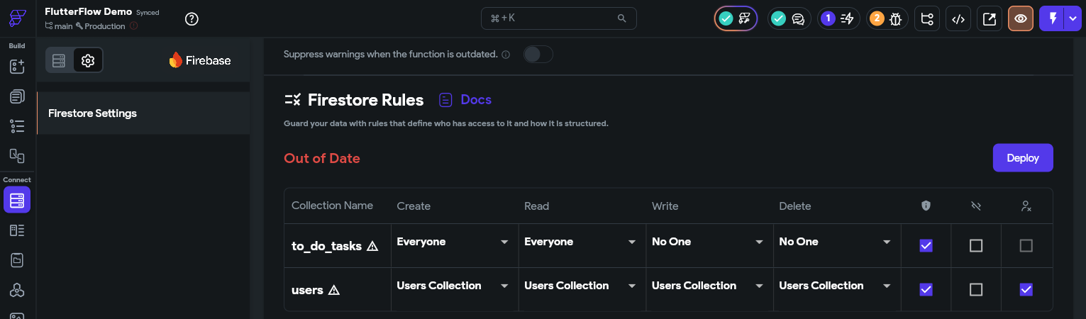
For now, just click the Deploy button to deploy the new Firestore rules.
We will still have a warning stating that our Firestore rules may be too open. We’ll ignore that for now, but come back to it later in this tutorial.
At long last, we can click the button to run our app in Test Mode and see if it works!
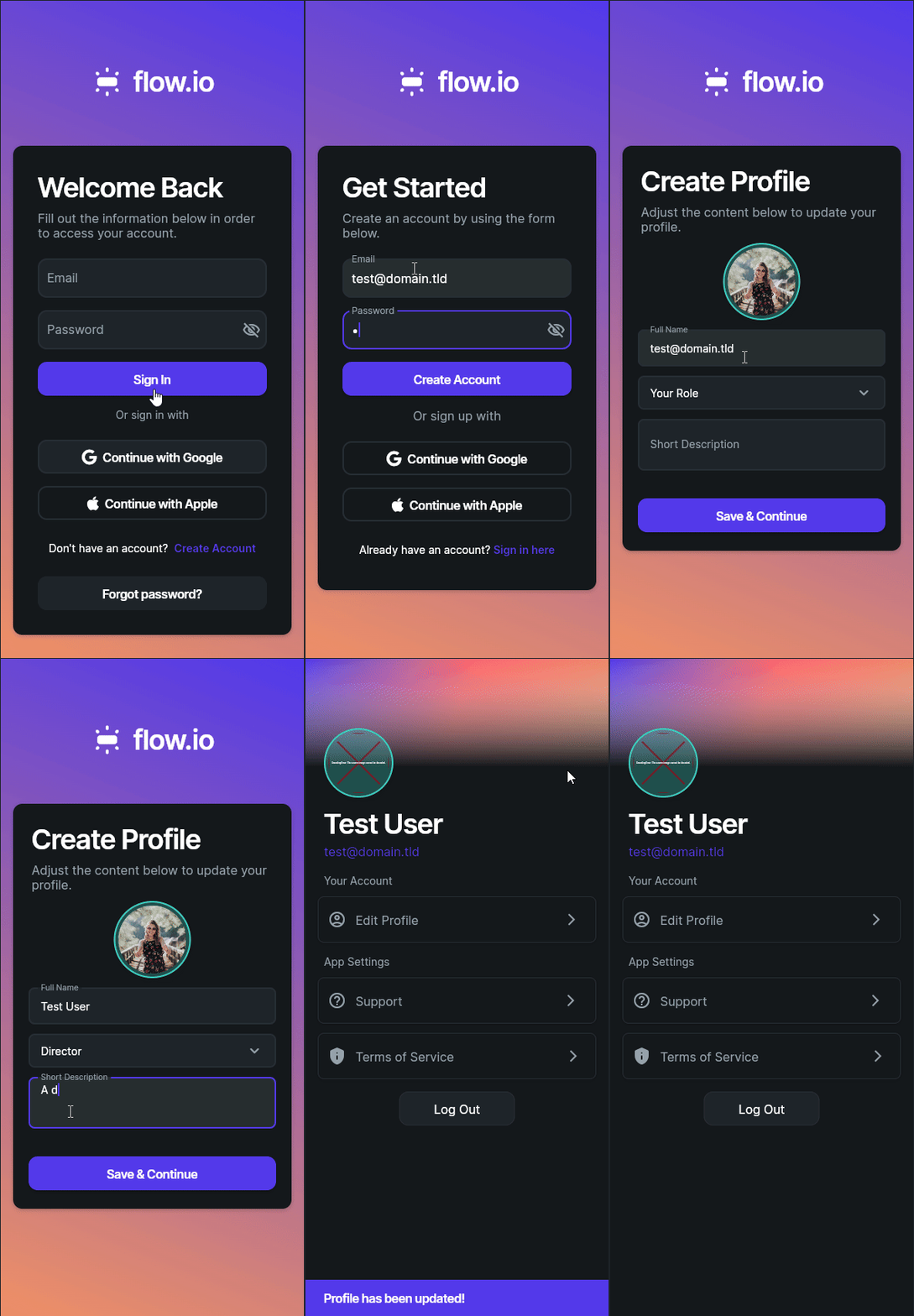
In this animation, we see that we can go through the entire process of creating an account in our application!
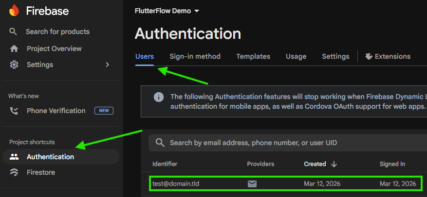
Behind the scenes, we can go back to the Firebase Console and see that our user account has been created successfully:
We can also see that the corresponding user document was created as well:
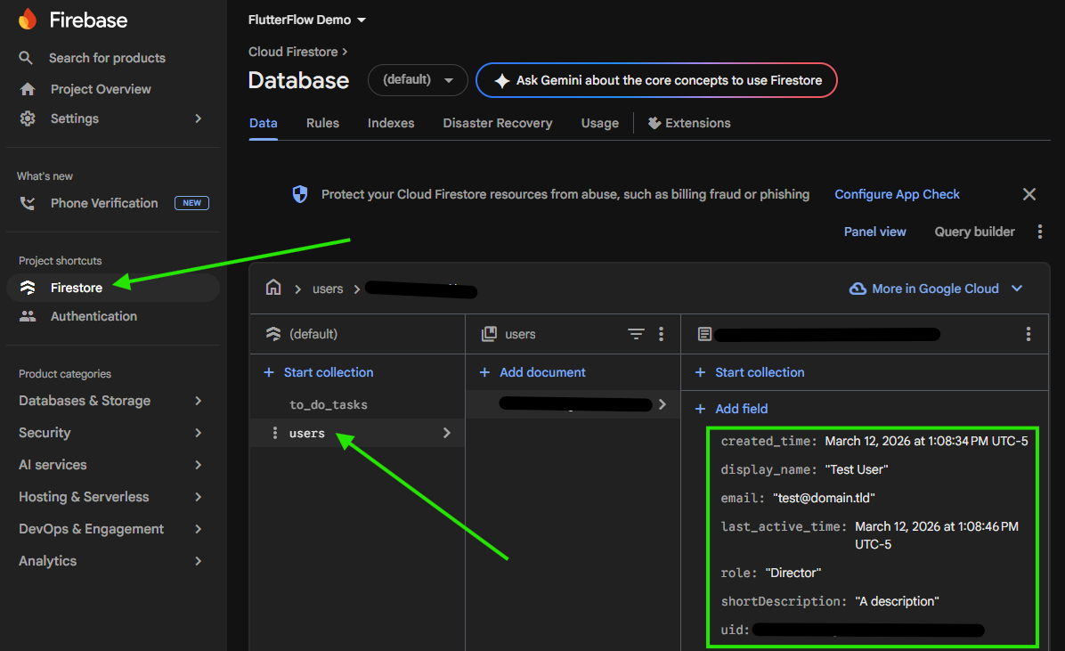
In Firebase, each individual user is assigned a unique user ID that matches the document ID assigned to their user account. Since those user IDs control access to secure data, it is always a good practice to redact them and not include them in any screenshots, documentation, or log files. So, in the screenshot above, we are following best practices and redacting that sensitive item!
Unfortunately, we might quickly notice that it is difficult to navigate in our application since we haven’t provided a clear way to get back to the HomePage where our list of to do tasks is kept, and once on that page, we don’t have any easy way to get back to the user profile page and the logout button. So, let’s configure some navigation options in our application to make things easy to use!
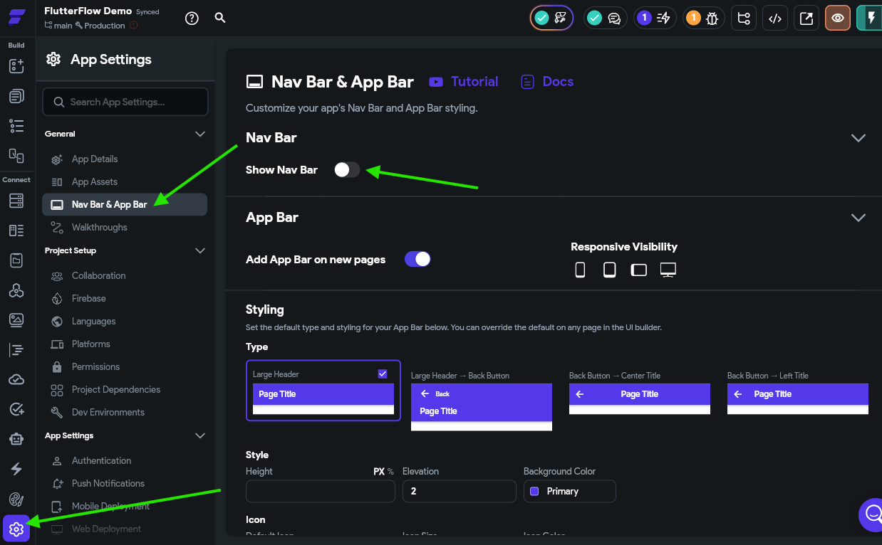
Thankfully, it is very easy to configure some basic navigation options for our application. First, we need to enable the Nav Bar in our Project Settings on the Nav Bar & App Bar page:
Next, we can add pages to our Nav Bar by finding the HomePage in our Page Selector and then looking at the Nav Bar Item Properties at the bottom of the Properties Panel
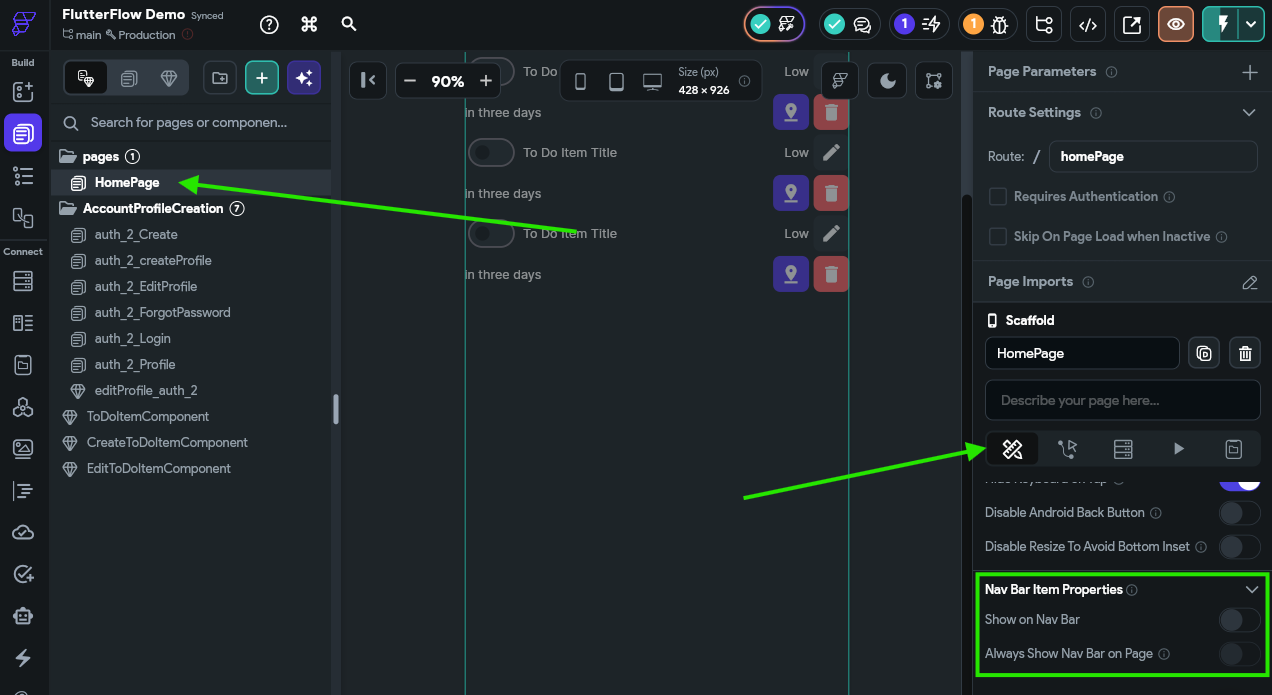
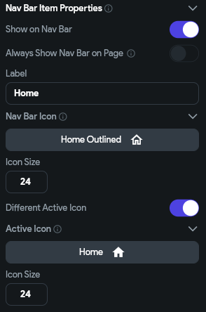
Here, we’ll turn on the Show on Nav Bar option. Below, we can set the name and icons used for the page as well:
We can also do the same for the auth_2_Profile page to add it to the list as well:
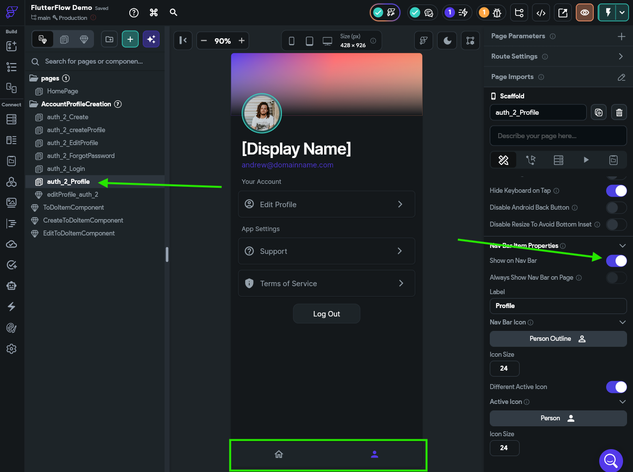
Notice that we can now see our application’s Nav Bar at the bottom of the screen? Now, we can reload our application in Test Mode and explore our new Nav Bar! We can even log out and log back in and see that everything is working!
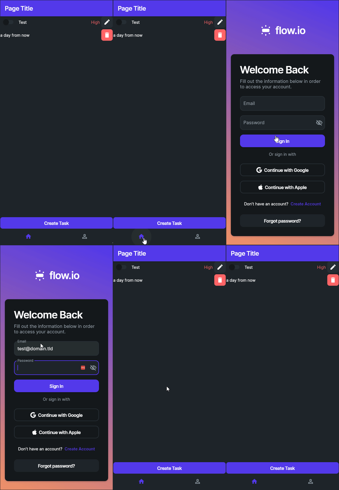
At this point, take a moment to click through the application and confirm that everything is working as intended.
Once again, let’s go back to our list of features and see how we are doing:
We’re over halfway there! Next, we’ll look at how we can properly secure our user’s data in Firebase!
Our application is currently storing both our user’s data in the cloud as well as our to do tasks. However, we have yet to properly configure the Firestore Rules for our application, and that creates a major security flaw. Before we look at how to fix this, let’s take a minute to explore the flaw and truly understand why it is so important to fix correctly.
One of the key security concepts to keep in mind when developing applications (both mobile applications as well as web applications) is that we can never trust anything that is in control of the user. This includes their device, their web browser, or any other tool that they use to interface with our application. A user could modify the contents of their device, inspect its memory, change settings, send back malicious data, and generally do anything they want. So, we have to take that into account when developing the security settings in our applications. In short, we must enforce security in a location that is not accessible to the user.
As we’ve seen, Google Firebase is a cloud database that can be accessed directly without going through any other service. This means that everything needed to access data in Google Firebase has to be stored directly in our application, which would eventually be installed on user’s phones. This means that any relatively skilled user could open up the memory in our application and find all of that information. In fact, it is stored directly in a firebase_config.dart file inside of the code for our FlutterFlow application, the code of which is shown below
import 'package:firebase_core/firebase_core.dart';
import 'package:flutter/foundation.dart';

Future initFirebase() async {
  if (kIsWeb) {
    await Firebase.initializeApp(
        options: FirebaseOptions(
            apiKey: "AIzaSyDR7S<redacted>",
            authDomain: "flutter-flow-demo-<redacted>.firebaseapp.com",
            projectId: "flutter-flow-demo-<redacted>",
            storageBucket: "flutter-flow-demo-<redacted>.firebasestorage.app",
            messagingSenderId: "1086985<redacted>",
            appId: "1:1086985<redacted>:web:640e1e74f5a<redacted>"));
  } else {
    await Firebase.initializeApp();
  }
}Of course, some items have been <redacted> because they would compromise the security of the actual demo application being built for this tutorial!
So, if a user can export those settings, what can they do with it? Let’s find out!
For this demo, we used Google Copilot to quickly create a demo application in JavaScript that uses the standard client libraries to access Google Firebase. This is the exact same process a web application written in a JavaScript framework, such as React or Vue, would use.
In just a few seconds, we are given this piece of code:
import { initializeApp } from 'firebase/app';
import { getFirestore, collection, getDocs } from 'firebase/firestore';

// Initialize Firebase
const firebaseConfig = {
  apiKey: "AIzaSyDR7S<redacted>",
  authDomain: "flutter-flow-demo-<redacted>.firebaseapp.com",
  projectId: "flutter-flow-demo-<redacted>",
  storageBucket: "flutter-flow-demo-<redacted>.firebasestorage.app",
  messagingSenderId: "1086985<redacted>",
  appId: "1:1086985<redacted>:web:640e1e74f5a<redacted>"
};

const app = initializeApp(firebaseConfig);
const db = getFirestore(app);

// Fetch and print to_do_tasks collection
async function getTasks() {
  try {
    console.log('Fetching to_do_tasks collection from Firebase...');
    const querySnapshot = await getDocs(collection(db, 'to_do_tasks'));

    if (querySnapshot.empty) {
      console.log('No tasks found in the collection.');
      return;
    }

    const tasks = [];
    querySnapshot.forEach((doc) => {
      tasks.push({
        id: doc.id,
        ...doc.data(),
      });
    });

    console.log('\n=== TO-DO TASKS ===');
    console.log(JSON.stringify(tasks, null, 2));
  } catch (error) {
    console.error('Error fetching tasks:', error);
  }
}

// Run the function
getTasks();
As you can see, it includes the exact same configuration that was found in our FlutterFlow application. When we run this code, we see the following output:
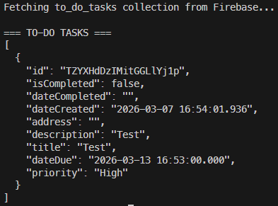
Yikes! As we can see here, we were able to access the entire contents of the to_do_tasks collection from Firestore with just that configuration. We didn’t have to log in, we didn’t have to create a user account, we didn’t even have to do anything except borrow a few settings from our app!
What if we try to do the same to the users collection? Let’s try that:
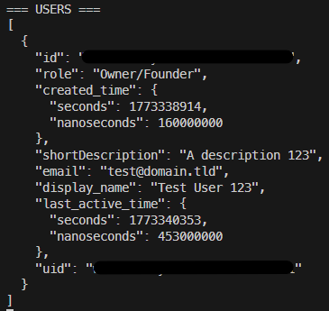
Super yikes! We can even get a list of all of the users in our application! This is a major security flaw! Effectively, this means that anyone who downloads our application can see all of this data, and they can start trying to guess individual user’s passwords or worse.
A quick search for “firebase data breach” will turn up a number of case studies and news articles referencing this issue:
Sadly, Firebase security misconfigurations are shockingly common errors, often made by inexperienced application developers who don’t understand the security aspects of storing data in the cloud. Before releasing an app publicly, it is important to do a full security review and ensure data is properly protected.
Thankfully, Firebase has a solution available in the form of it’s Firestore Rules, which allow us to define the requirements users must meet in order to access data in our database. Let’s look at our current rules, which can be found in the Firebase Console:
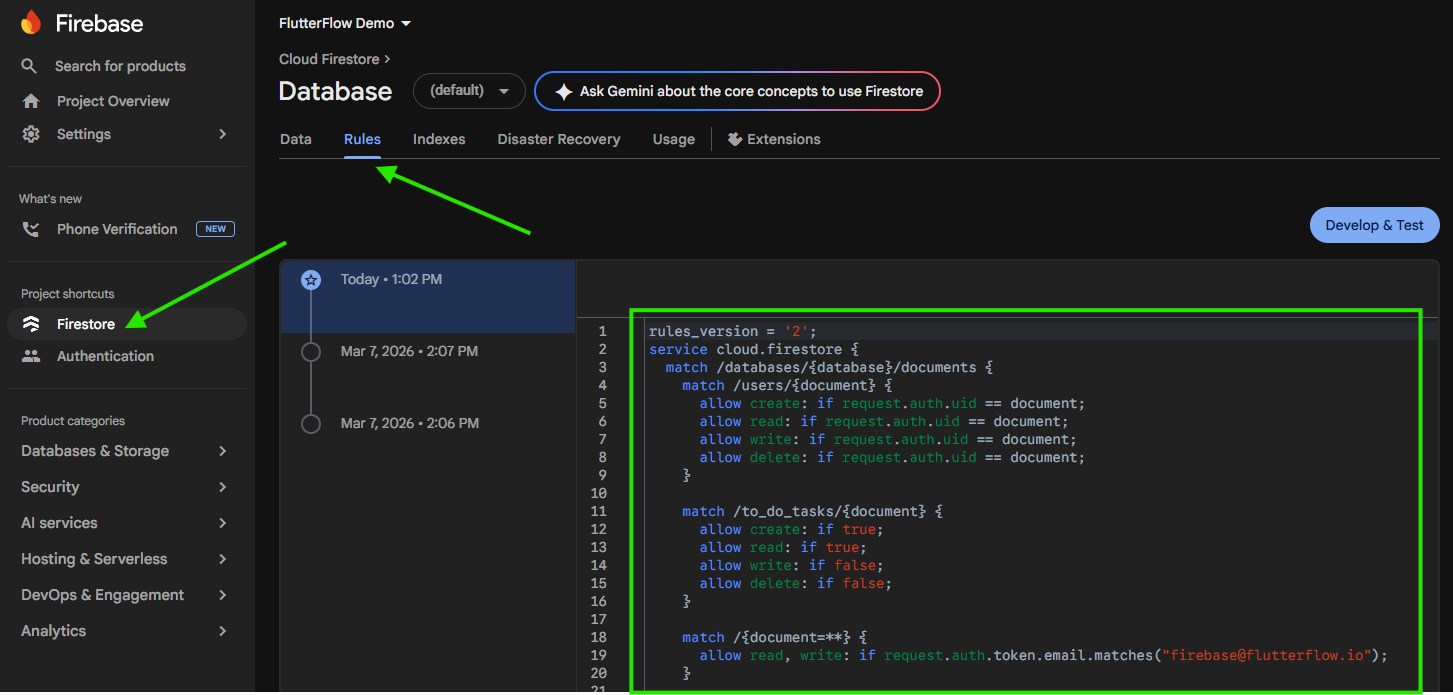
Here are the current rules that are defined for our demo application:
rules_version = '2';
service cloud.firestore {
  match /databases/{database}/documents {
    match /users/{document} {
      allow create: if request.auth.uid == document;
      allow read: if request.auth.uid == document;
      allow write: if request.auth.uid == document;
      allow delete: if request.auth.uid == document;
    }

    match /to_do_tasks/{document} {
      allow create: if true;
      allow read: if true;
      allow write: if false;
      allow delete: if false;
    }

    match /{document=**} {
      allow read, write: if request.auth.token.email.matches("firebase@flutterflow.io");
    }

    match /{document=**} {
      // This rule allows anyone with your database reference to view, edit,
      // and delete all data in your database. It is useful for getting
      // started, but it is configured to expire after 30 days because it
      // leaves your app open to attackers. At that time, all client
      // requests to your database will be denied.
      //
      // Make sure to write security rules for your app before that time, or
      // else all client requests to your database will be denied until you
      // update your rules.
      allow read, write: if request.time < timestamp.date(2026, 4, 6);
    }
  }
}
While we won’t go too deeply into all of the details in this setup, we should hopefully see a couple of things jump out automatically:
firebase@flutterflow.io accountSo, before we do anything else, let’s remove both of those rules so that it looks like this:
rules_version = '2';
service cloud.firestore {
  match /databases/{database}/documents {
    match /users/{document} {
      allow create: if request.auth.uid == document;
      allow read: if request.auth.uid == document;
      allow write: if request.auth.uid == document;
      allow delete: if request.auth.uid == document;
    }

    match /to_do_tasks/{document} {
      allow create: if true;
      allow read: if true;
      allow write: if false;
      allow delete: if false;
    }
  }
}
Once we are satisfied, we can click Publish to save our changes:
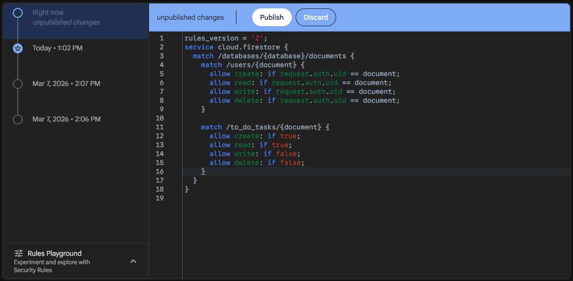
Now that we have deployed those rules, we’ll try to read the users from the users collection again and see if that works:

Great! As we can see, we can no longer access all the user accounts in our application. However, if we try to access the to_do_tasks collection, we see that it still works:
So, we need to modify our rules a bit to secure our to-do tasks.
To configure the security in FlutterFlow, let’s go back to the Firestore page and look at the Firestore Settings again. Here, we can see the Firestore Rules section that we can configure for our application:
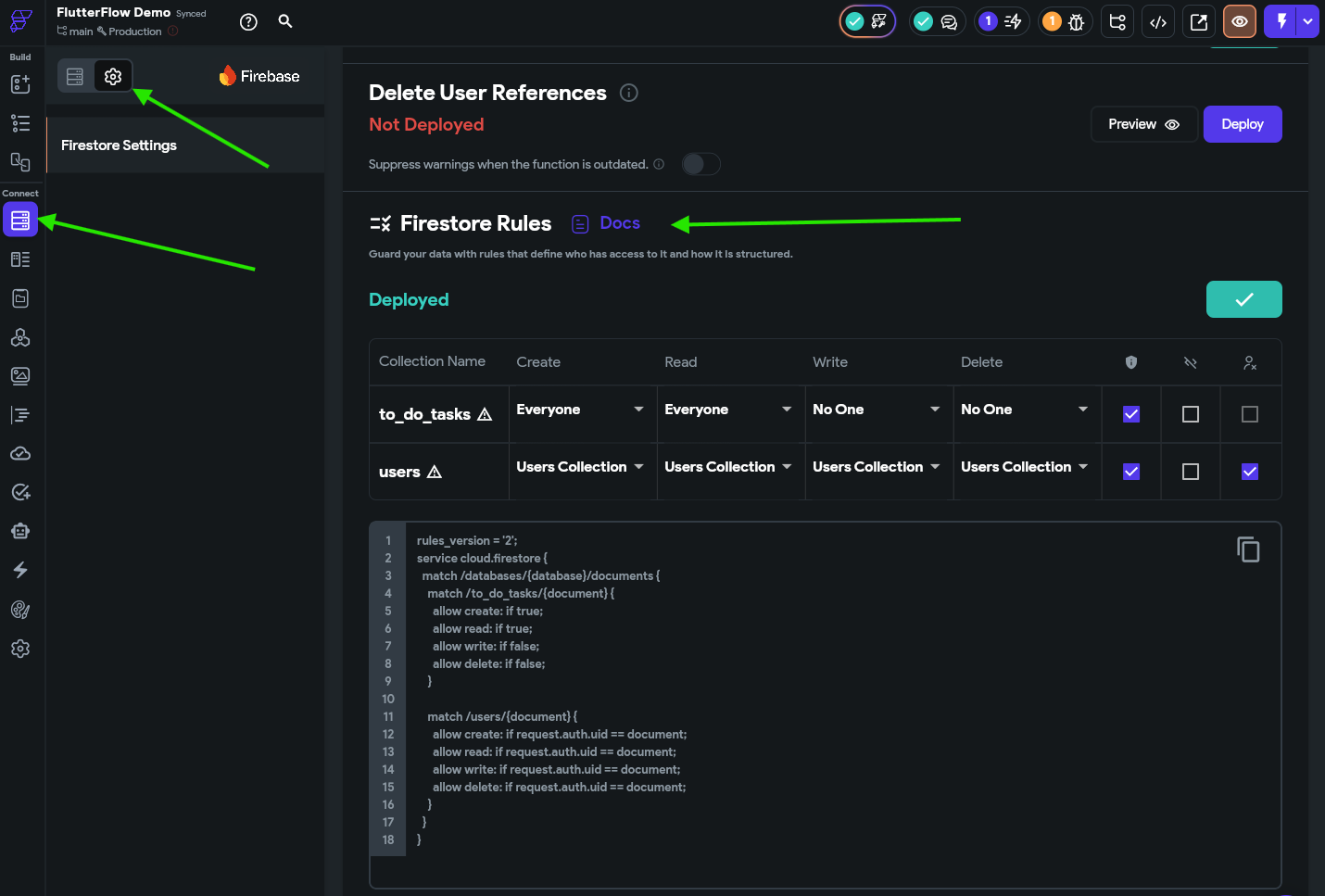
Here, we can see that some of the rules are pre-configured for us. First, let’s look at the users collection. It already has all of its options set to Users Collection, which, in the Firestore rules code, looks like allow <action> if request.auth.uid == document. This option basically means that a user can only perform and action on it’s own document in the users collection. So, this prevents any other user from accessing or modifying that data. This is what we want!
Now, let’s look at the to_do_tasks collection. Right now we see that everyone can create documents and read documents, but with the current rules, no one can write to existing documents or delete them. Before we can update that, however, we need to configure our to_do_tasks collection to store a user’s ID along with the task.
So, back on the Collections tab, let’s add a new field called uid to the collection, and give it the type String. We’ll use this to store the user’s unique ID in the database.
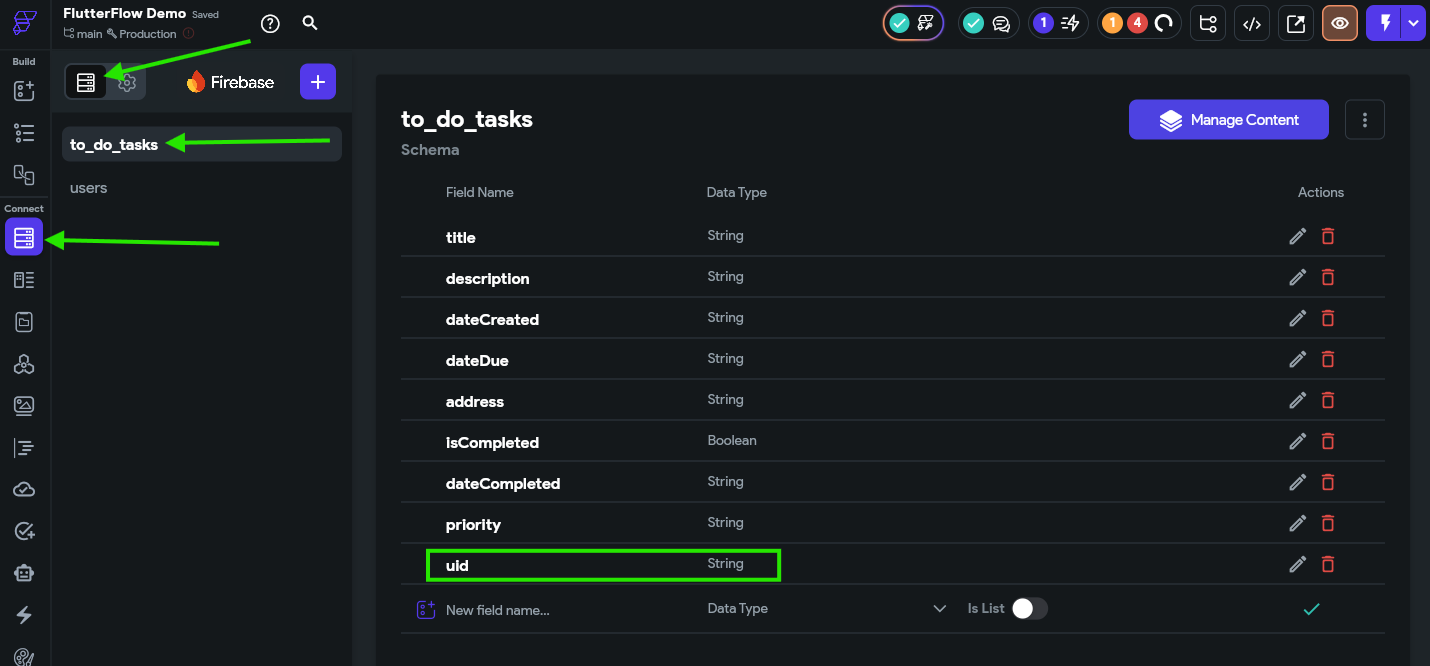
Next, on the CreateToDoItemComponent, we need to modify the Save button action to set that field to the User ID field under Authenticated User:
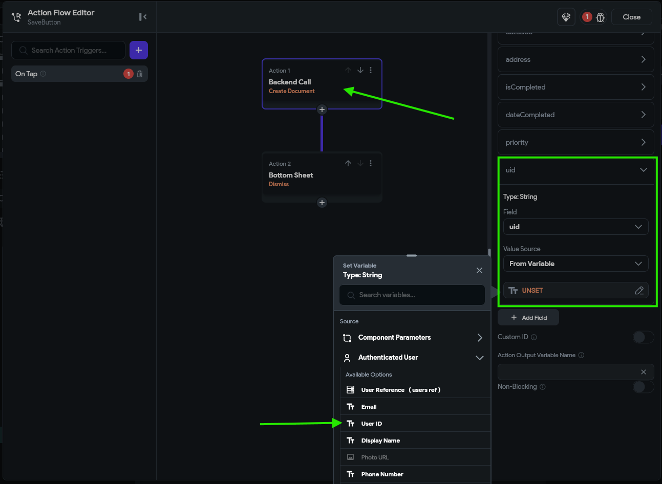
Finally, in our Backend Query for the ListView widget on our HomePage, we need to add a Filter that checks that the uid should be equal to the authenticated user’s User ID:
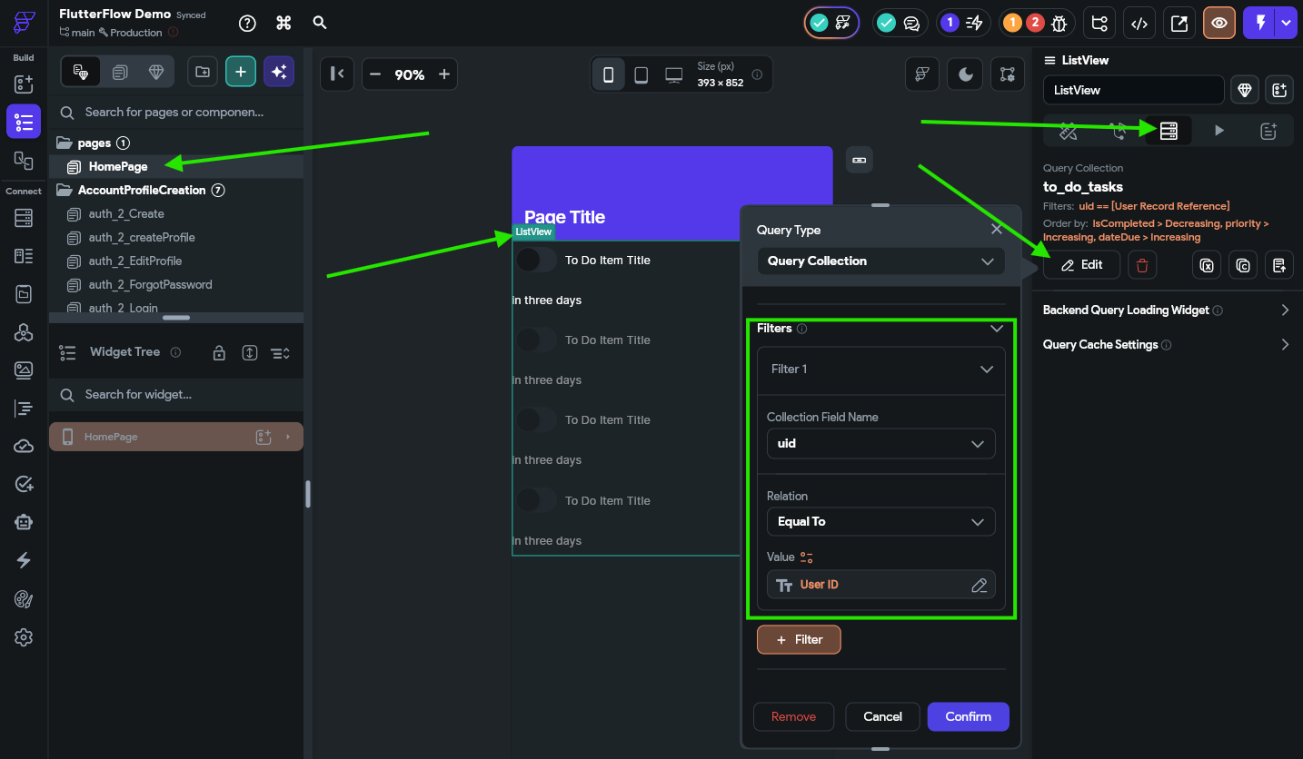
With those changes, we are making sure that a newly created task will include the user’s ID, and that our list of tasks will only show those tasks that are assigned to that user.
Once the Firestore rules are configured, a filter is required on any backend query that is accessing the data, and it must match or be more strict than the rules that are configured. So, if we don’t add a filter here, Firebase will return an error even though there may be items that the user can view.
Now, back in our Firestore Rules, we can set the Read, Write, and Delete actions on the to_do_tasks collection to only allow tagged users to access them, and reference the uid field as the tag that identifies the user:
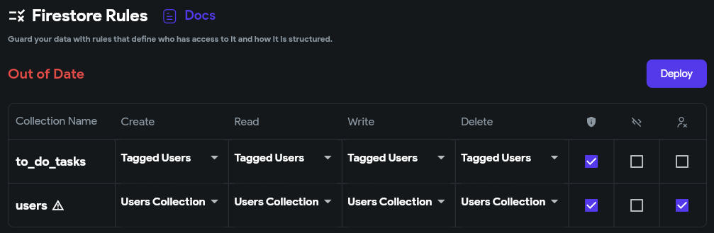
Below that, we should see rules similar to this:
rules_version = '2';
service cloud.firestore {
  match /databases/{database}/documents {
    match /to_do_tasks/{document} {
      allow create: if request.auth.uid == request.resource.data.uid;
      allow read: if request.auth.uid == resource.data.uid;
      allow write: if request.auth.uid == resource.data.uid;
      allow delete: if request.auth.uid == resource.data.uid;
    }

    match /users/{document} {
      allow create: if request.auth.uid == document;
      allow read: if request.auth.uid == document;
      allow write: if request.auth.uid == document;
      allow delete: if request.auth.uid == document;
    }
  }
}
Notice that the top section of rules now includes the code allow <action> if request.auth.uid == resource.data.uid for most actions? This ensures that only the user tagged in the task is able to create, read, edit, or delete those tasks.
Once we have made those changes, we can click on the Deploy to deploy these rules to Firebase.
Also, since we made changes to our Firebase to_do_tasks collection and the backend queries, we should also scroll up to the Firestore Indexes section and click Deploy there as well.
Once you click the button to deploy your Firestore indexes, you must wait a little bit before starting your app. It can take a few minutes to build a new Firestore index, and you’ll receive errors in your app if you try to load data while the indexes are still building.
With all of that in place, let’s test our app in Test Mode and see if it works. For the demo animation below, we already created a second user account and populated it with some data, but now we should be able to see how each user stores their own data.
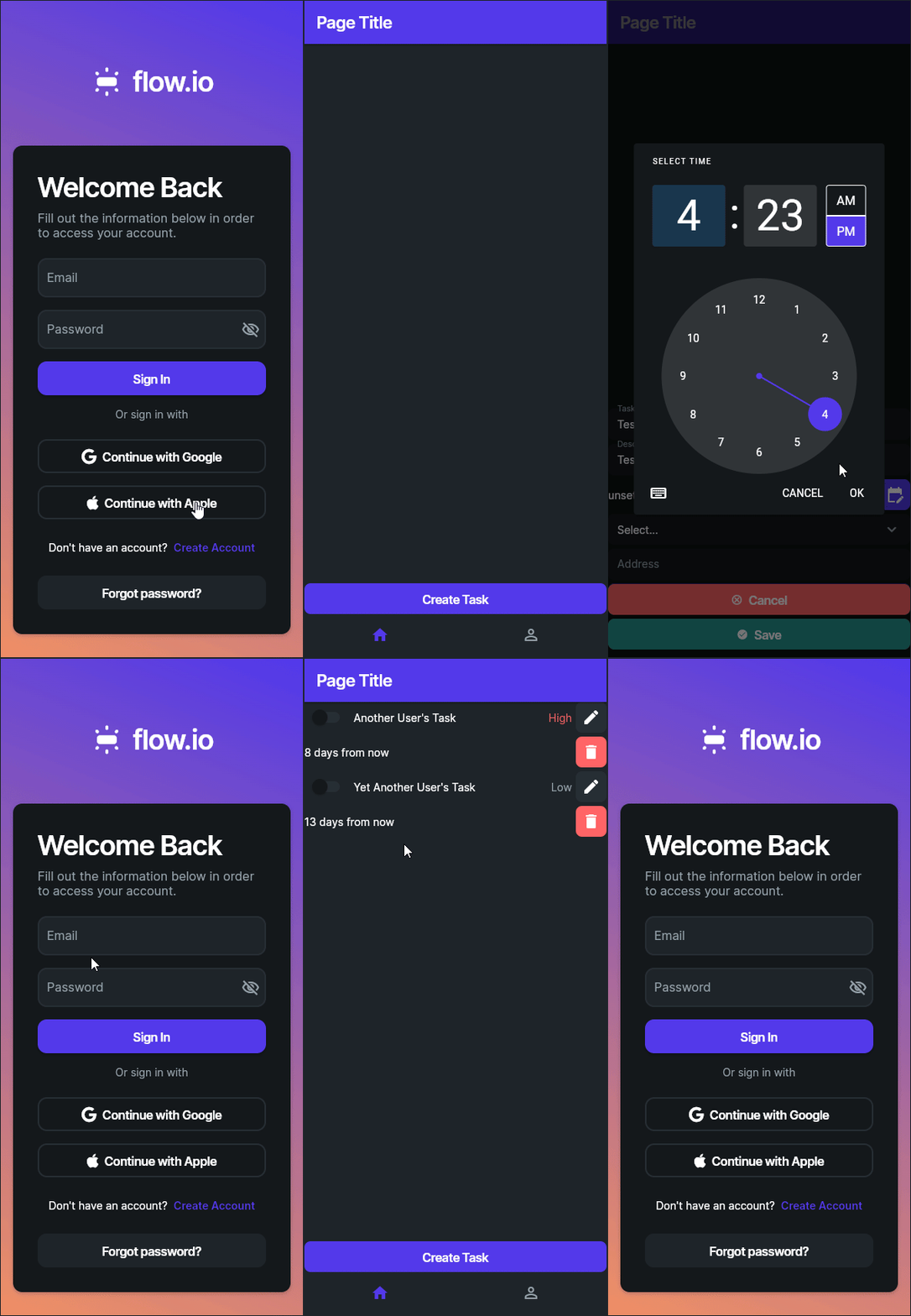
There we go! It looks like it is working correctly.
At this point, our app has enough features, functionality, and security that we could start letting some users test it out. There are still many features to add, but it is a good start. Before that, however, it is always a good idea to fully test all features of your application, and if you aren’t confident working with Firebase security, consult with an experienced developer to have them review your app’s settings and see if they spot any errors. Finding and fixing data leaks and security breaches is an important part of developing any app that is entrusted with a user’s data.
Another commonly used method for protecting data in Firebase is to store a user’s data inside of a list directly within their user document (in the users collection in our tutorial). This can be a bit simpler since we don’t need to tag each task with a users uid and we can simply use the Authenticated User document in FlutterFlow to access that list without a backend query. In fact, this may even be an easier way to accomplish the same task!
For the purposes of this tutorial, we chose to separate the tasks into their own collection to have a deeper discussion and understanding of Firebase security and Firestore rules. This is purely a design decision on our part, and as we’ll see later in this tutorial, it enables some more advanced features later on.
Now we have created an application that stores data in the cloud and even includes proper security rules to prevent unauthorized access to the data. Next, we can focus on adding even more useful features to our application!
Now that we have a mobile application with most of the basic features implemented, let’s go through a quick process to implement some additional features that we included in our specification that are relatively easy to add.
As a reminder, here is our current progress on our application:
Let’s start working on a few of these!
One quick feature we can add is the ability to request directions to a location stored in the task if one is present. To do this, let’s go to our ToDoItemComponent and add an action to the AddressIconButton widget. In the Action flow editor, we’ll start by adding a Conditional Action to to the On Tap action to check if the application is running on the web using the Is Web entry under the Global Properties list.
On the TRUE branch, we’ll use the Launch URL action found under the Share option. Then, we’ll create a quick Inline Function that uses the address field as a parameter and includes this code:
"https://www.google.com/maps/search/?api=1&query=" + Uri.encodeComponent(address)This will construct a Google Maps URL that will search for that address on the web.
On the FALSE branch, we can find the Launch Map action under the Widget/UI Interactions section, and then set the Place Type to Address and then link it to the address field in our task.
The full process is shown in the animation below:
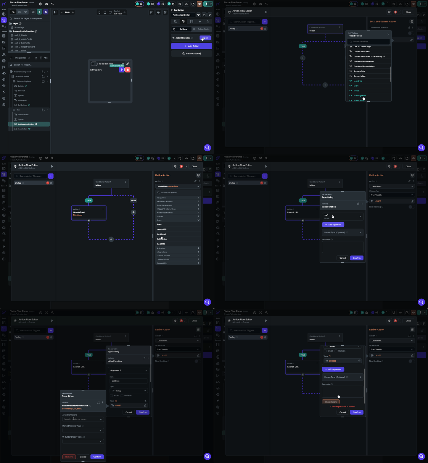
Once that is done, we can test it out in Test Mode to confirm that it works!
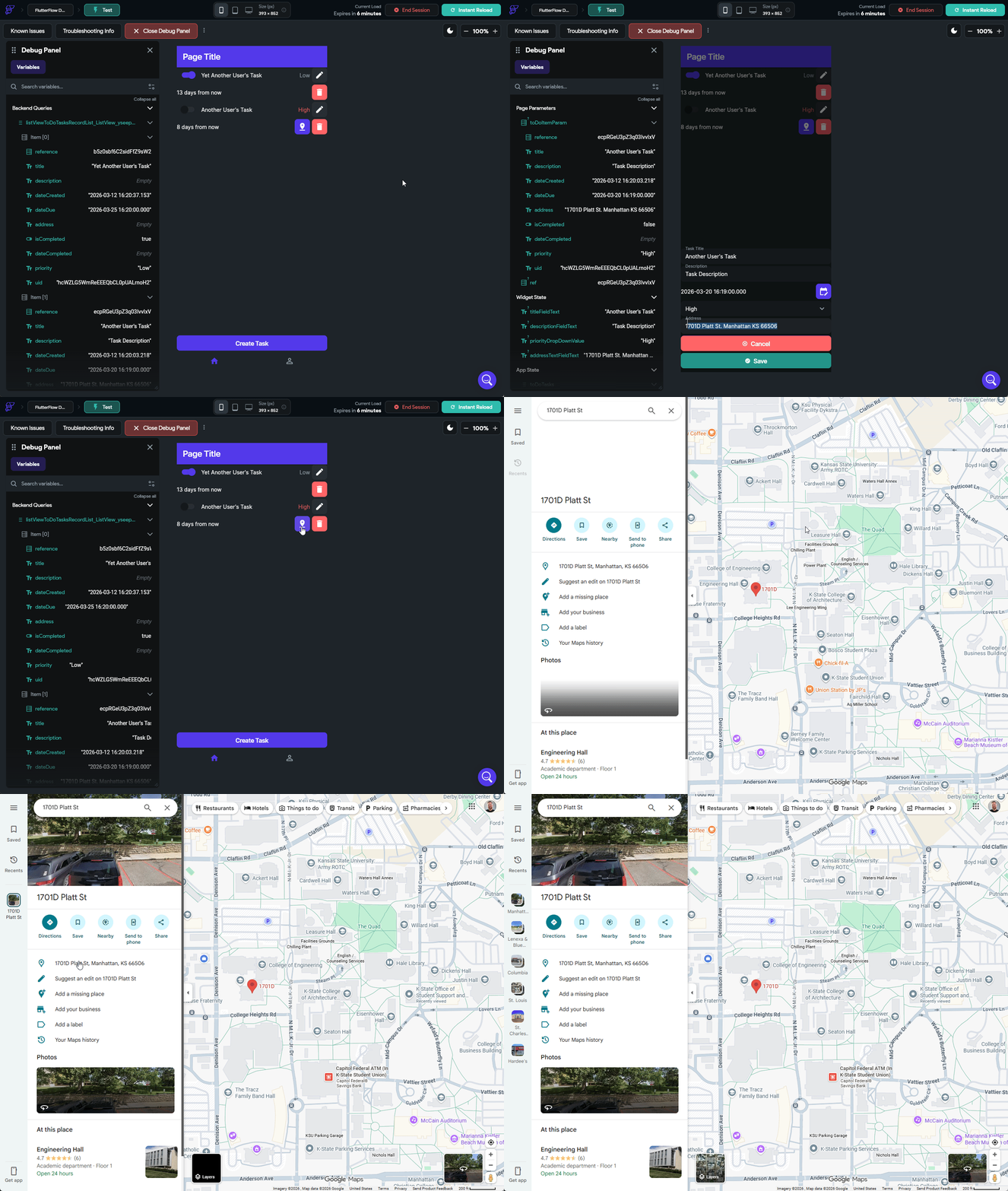
As we can see, many of these more complex actions can be handled directly by FlutterFlow!
Another feature we should include in our application is the ability to track the location where a task was completed. To enable this, we first must go to the Settings page and look for the Permissions section under Project Setup, and then enable the Location permission. When we install our application on a device, this will request access to the device’s location so we can use it in our application.
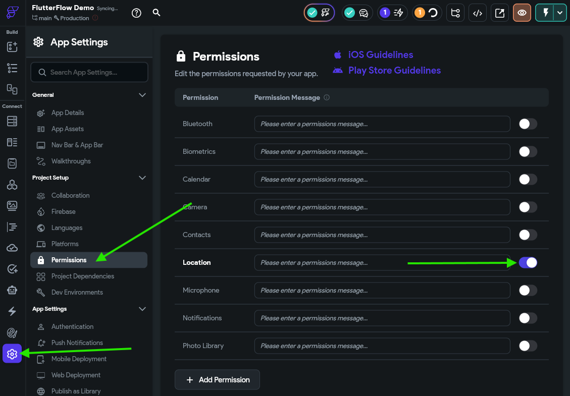
When publishing an application to an app store, it must abide by guidelines concerning the data collected and how it is stored and processed. As a developer, it is our job to make sure we read, understand, and adhere to those guidelines. Thankfully, there are helpful links at the top of the Permissions settings page where we can find the current guidelines for each app store.
We can also add a new locationCompleted field using the Lat Lng data type (short for “Latitude Longitude”) to our to_do_tasks collection in Firestore to store this data:
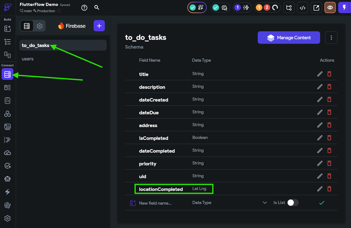
Now that we’ve enabled that setting, we can update the On Toggled On action attached to our Switch widget in the ToDoItemComponent to also set the locationCompleted field to the value in the Current Device Location option under Global Properties
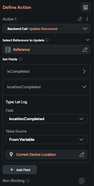
We may also want to make a similar change to the On Toggled Off action that clears the locationCompleted field.
Now, when we run our app in Test Mode, we should see our application try to store the location where a task is completed via the Firebase Console
Unfortunately, the FlutterFlow Test Mode does not support actually loading the user’s current location through the web browser, so we’ll only see the coordinates [0° N, 0° E] stored in Firebase. On a real device, this location would be read from the phone’s settings.
Of course, this assumes that the user has allowed the application to read the device’s location, and that location services are enabled. A more advanced app would include some logic here to check if the location is enabled and available first, and if not it can prompt the user to enable it.
We already have a place where user’s can update their profile’s display name and other settings, but we don’t currently have a way for users to change their password. So, let’s change that!
First, we need a component that we can load to prompt the user to change their password. While we could build this component by hand, let’s try some of the AI assisted features in FlutterFlow to see how they work.
First, we’ll go to the Page Selector and then click the Generate with AI button at the top to add new content to our application.
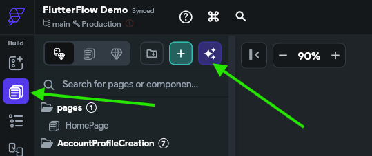
In the window that appears, let’s provide an easy to follow prompt for the system. The prompt we’ll use is
Generate a component to be loaded as a bottom sheet to allow the user to edit their password. It should include two password text fields, as well as save and cancel buttons. The design should follow the standard theme used throughout the application with helpful colors and icons.
Finally, click the Component button at the bottom, then click the Up Arrow button to let the AI start generating. At the top, you’ll see a new icon start spinning while the AI is working in the background, and after a minute or so, you should be able to click on it and see the newly generated component. Here’s what our example looked like:
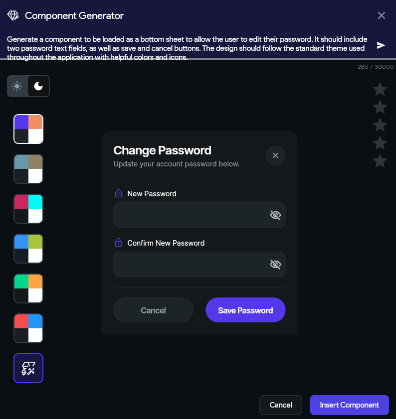
In this view, we can customize our prompt, set some color schemes, and more. If we are satisfied, we can click the Insert Component button at the bottom to add that component to our application.
Now, let’s go to our auth_2_Profile page and add a new button to allow users to change their password. We’ll just quickly duplicate the Content View widget used for the Edit Profile button and tweak it a bit to match our needs. Remember that you can duplicate a widget simply by right-clicking on it and choosing Duplicate.
Once it is customized, we’ll set the On Tap action to load our new component in a bottom sheet:
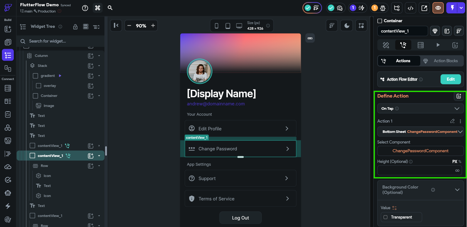
Finally, on our new component, we need to configure the Cancel button to dismiss the bottom sheet:
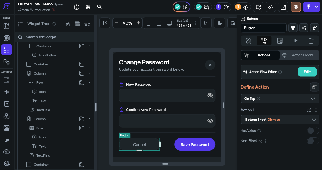
Likewise, we need to configure the Save Password button to actually update the user’s password using a the Update Password action as shown in the animation below:
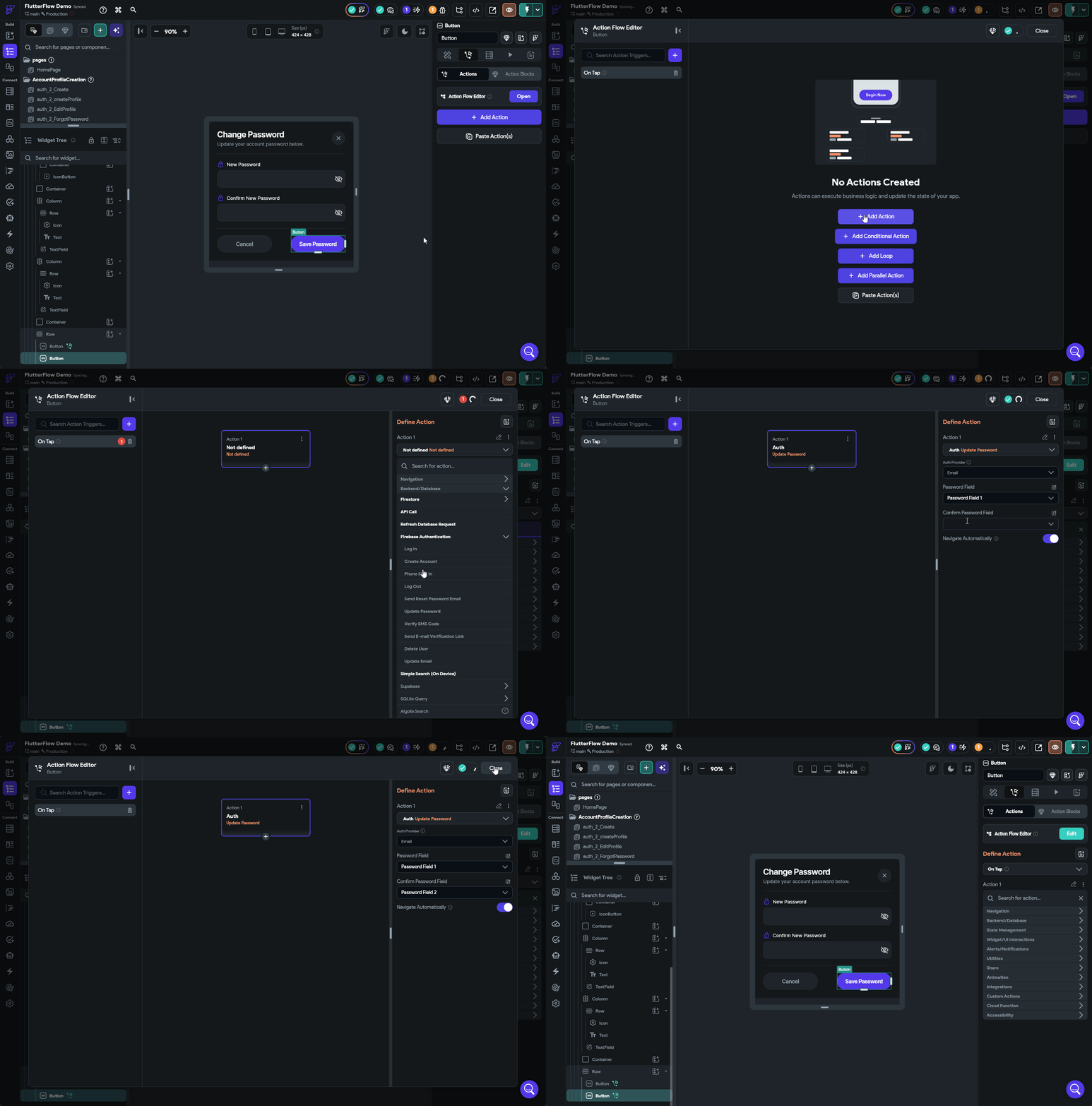
Once that has been updated, try the application in Test Mode and see if you can update your password!
As a security measure, Google Firebase requires a recent authentication in order to change a user’s password. A simple way to do this is log out and log back in before trying to change the password.
In a real application, often we would add additional functionality to ask the user to input their current password again to perform a new authentication first, then show the interface for updating the password.
Next, let’s go through the process of deleting data for a user account. Many apps today are required to provide this functionality to comply with various privacy laws, and it is always a good feature to have implemented in case a user wants to stop using the application. Thankfully, doing so is very simple with Google Firebase.
Once again, we’re going to add a new button to our auth_2_Profile page by duplicating an existing button and tweaking a bit just like we did above.
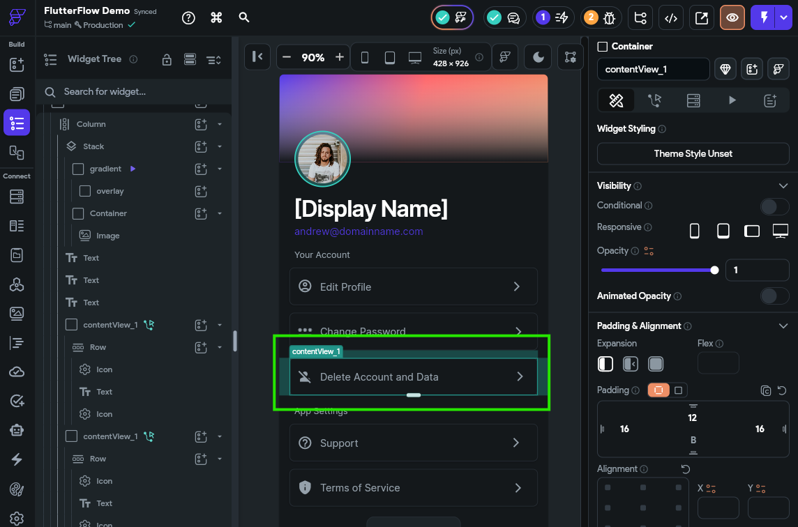
Then, choose the action for that button and look for the Delete User action that can be found under the Backend/Database options within the Firebase Authentication list.
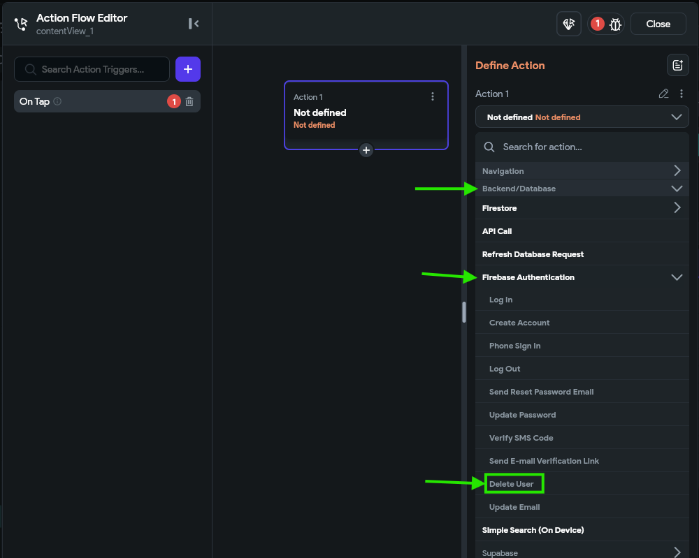
Once that is configured, we must go back to our Firestore Settings to configure the collections that have data which must be deleted when a user is deleted. To do that, we just checkmark the last column in the list of collections under Firestore Rules to flag the records which should be deleted.
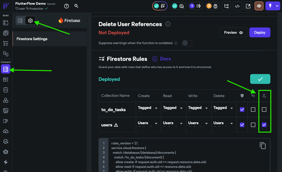
Unfortunately, the last step in this process would be to go to the Delete User References section above and click the Deploy button to deploy those rules. However, those rules are only supported in a paid Firebase plan, which we aren’t using for this demo. In a fully deployed application, you should switch to a paid Firebase tier to enable this option fully and test it before releasing the application.
Thankfully, since we have properly secured our data there is no risk of that data being visible to other users, but it is still stored in our system.
Another cool feature we can implement in our application is the use of Gravatar profile images in place of our own system for storing and retrieving images. This makes our app a bit simpler since we don’t have to store user profile images in a paid Firebase storage plan, and many users on the web already have a Gravatar profile configured to make this quick and easy. The full documentation for this process can be found in the Gravatar Documentation.
In effect, all we must do is create a sha256 hash of our user’s email address, and then construct a URL to request the image that looks like the following:
https://gravatar.com/avatar/<hash>?d=mpThe simplest way to do this in our current application is to build this URL when the user account is first created and store it in the user profile’s photo_url field. First, we’ll need to install the crypto library, which allows us to generate the sha256 hash of a string. For this, we’ll go to our Settings & Integrations page and then find the Project Dependencies section. Under Custom Pub Dependencies we’ll just add the crypto library. Then, we click the Refresh button at the top right to update our project dependencies.
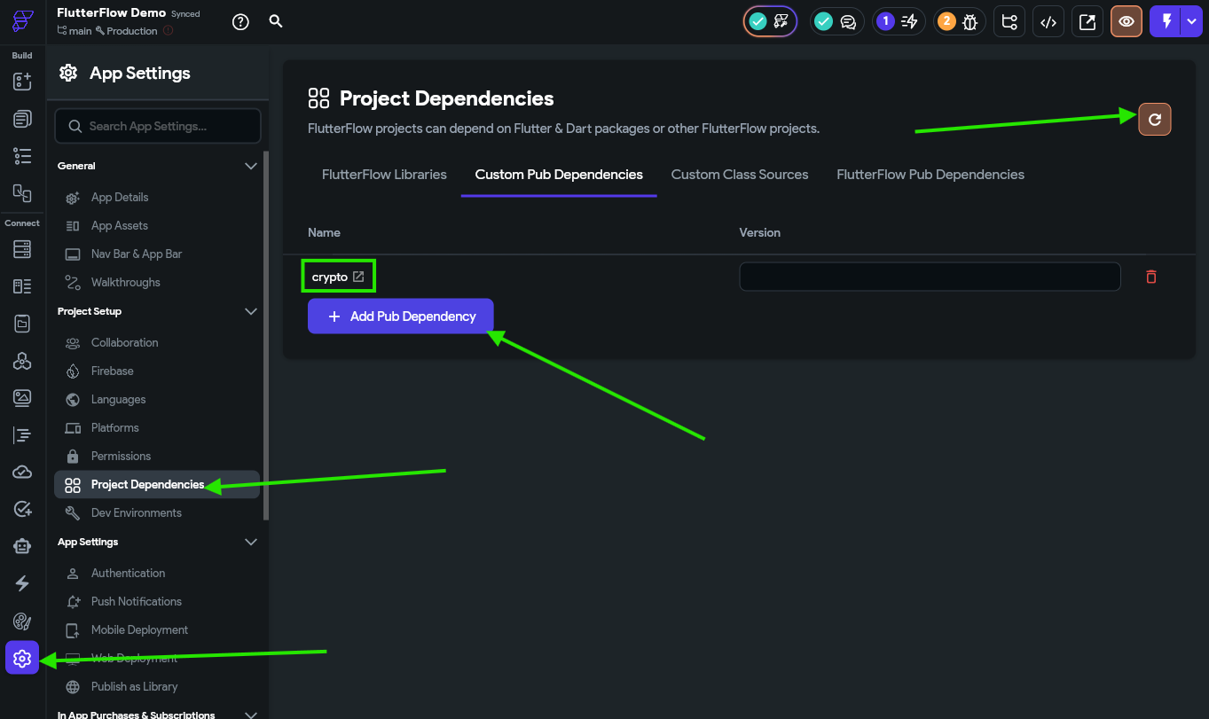
This will refresh our project and install the new library so we can use it in our code.
Just like many other programming frameworks, Flutter includes a whole range of custom packages that we can easily install in our application. You can search for packages to add to your application at pub.dev.
In fact, there is even a Gravatar package we could use, but it hasn’t been updated in 12 years so it may be best to build our own.
Once the project dependencies are updated, we can write a quick custom action that can generate the proper Gravatar URL for us. Let’s go to the Custom Code page again and create a new custom action called generatePhotoUrl with the following code:
// Automatic FlutterFlow imports
import '/backend/backend.dart';
import '/backend/schema/structs/index.dart';
import '/flutter_flow/flutter_flow_theme.dart';
import '/flutter_flow/flutter_flow_util.dart';
import '/custom_code/actions/index.dart'; // Imports other custom actions
import '/flutter_flow/custom_functions.dart'; // Imports custom functions
import 'package:flutter/material.dart';
// Begin custom action code
// DO NOT REMOVE OR MODIFY THE CODE ABOVE!

import 'package:crypto/crypto.dart';
import 'dart:convert';

// Set your action name, define your arguments and return parameter,
// and then add the boilerplate code using the green button on the right!

Future<String> generatePhotoUrl(String email) async {
  String emailLower = email.trim().toLowerCase();
  var digest = sha256.convert(utf8.encode(emailLower));
  return "https://gravatar.com/avatar/" + (digest.toString()) + "?d=mp";
}
Finally, after saving the action, make sure the return type is set to ImagePath in the sidebar, even if the function itself returns a String value. This is important for making sure our value matches what the database expects in a later step.
The full setup for this is shown below:
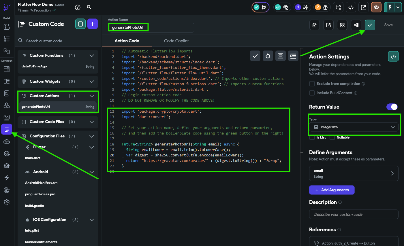
Notice that this time we chose to create a new custom action instead of a custom function? This is because we cannot import code libraries in a custom function, so we aren’t able to access the crypto library there. Instead, we can make a custom action that includes that import. We just have to make sure the code will compile properly by checking it before continuing.
So, let’s go back to our auth_2_create page and update the action on the Create Account button.
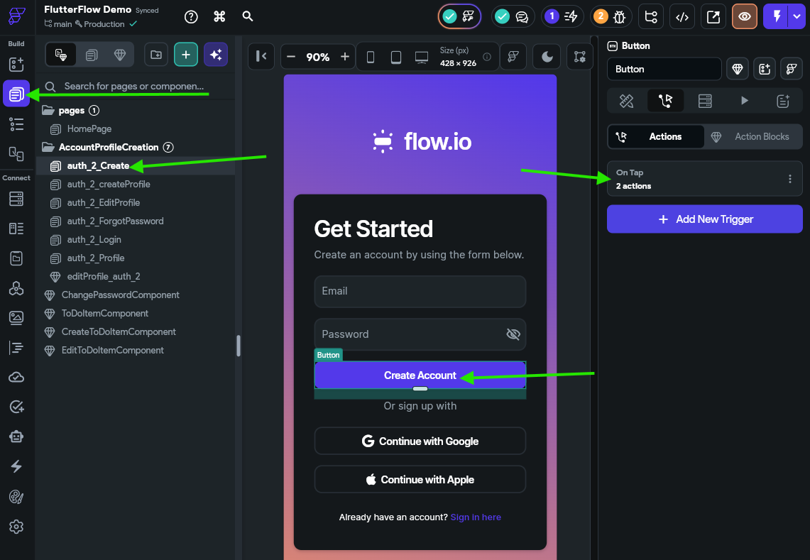
In the Action Flow Editor, we’ll need to add a new action to the top of the chain that is our new generatePhotoUrl action, with the email variable set to the emailAddress widget state. We can name the output variable gravatar for now.
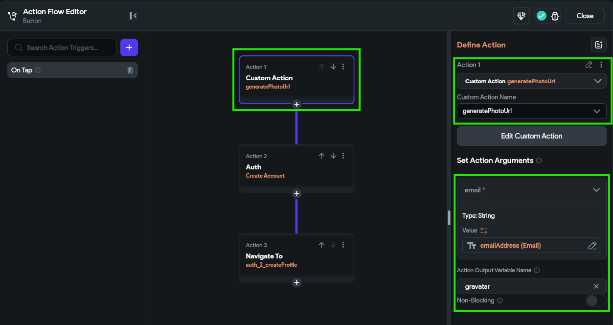
Finally, in the Create Account action, we can add the photo_url field and set it’s value to the gravatar variable, found under Action Outputs from the previous action.
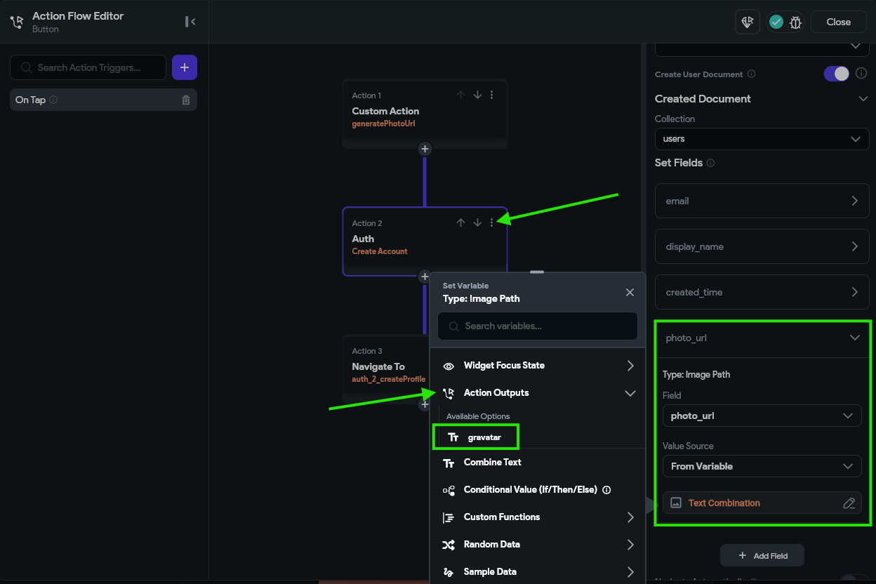
If you get an type mismatch error here, it is probably because you need to back to the generatePhotoUrl custom action created above and manually set the output type in the sidebar on the right to be ImagePath and not String.
Now, with all that in place, we can run our application in Test Mode and see if it works. Of course, we’ll need to create an account using an email address that is already registered with Gravatar.
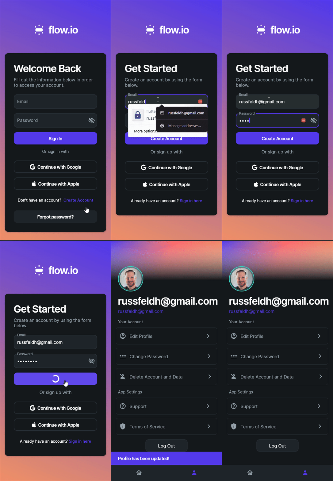
As we test this, we may see a few places that still use the old placeholder image, so we can go through and update those as needed to use the correct photo_url field.
Right now our application just stores the URL of the user’s Gravatar image directly in the application. However, by storing that URL instead of the photo itself, it allows the user to update their profile image directly in Gravatar and then that new image will be shown in our application (because the URL of that image itself did not change). This allows users to seamlessly update their profile images without our app having to do anything!
At this point, we have implemented a large number of the features we wanted to include in our application:
All that is really left is tracking the percentage of tasks completed on-time and building a leaderboard. We’ll cover that on the next page of this tutorial.
One of the last features we could add to our application is a leaderboard, which keeps track of the percentage of tasks that are completed on time. This will demonstrate some additional functionality we can build in Firebase to allow users to share data in a protected way throughout the application.
In these last parts of the tutorial, we’ll shift to showing a bit less of the process in screenshots and assume that you are becoming comfortable with navigating through an application in FlutterFlow. However, if you get stuck at any point, refer to the video above for a visual walkthrough of the whole process.
First, we’ll need to create a leaderboard collection in Firebase with the following attributes:
onTime - IntegertotalCompleted - IntegerdisplayName - StringphotoUrl - Image Pathuid - StringAfter creating that collection, we should see this layout:
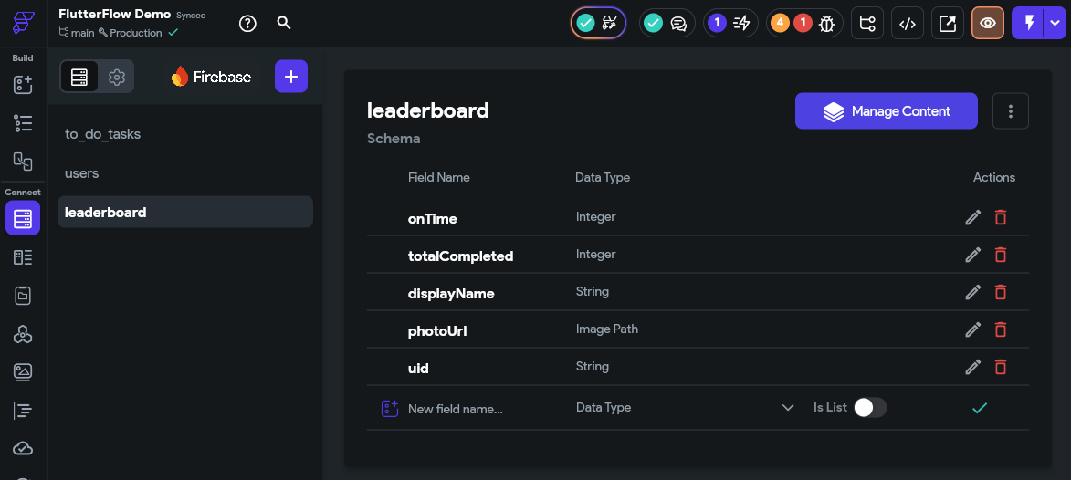
Next, we’ll go to the Firestore Settings and scroll down to the Firestore Rules section. Here, we’ll set the leaderboard collection to have the following rules:
uid attribute)uid attribute)uid attribute)With this setup, users will be able to create, update, and delete their entry in the leaderboard, and all authenticated users will be able to read the contents of the leaderboard. This is what allows us to display the leaderboard for each user!
Finally, checkmark the box to delete data if the user account is deleted as well. When completed, the final rules should look like this.
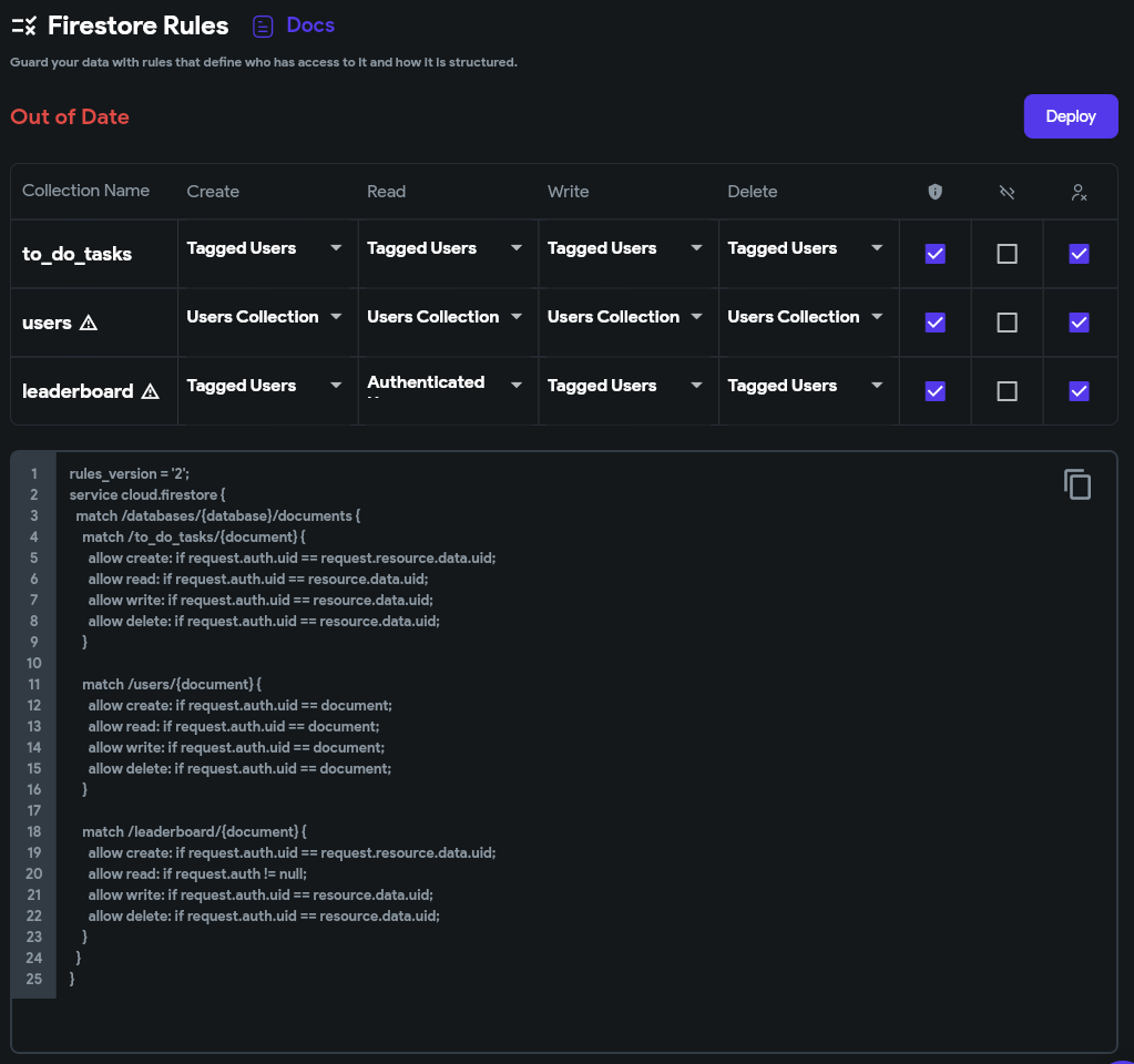
Go ahead and click the Deploy button to deploy those rules to Firestore.
Next, we need to update our process for creating a new user to add an entry to the leaderboard collection as well. So, we’ll go to our auth_2_Create page and update the action tied to the Create Account button to add another step. This step will create a document in the leaderboard collection with the following field values:
onTime - 0totalCompleted - 0displayName - emailAddress widget statephotoUrl - gravatar action output from the generatePhotoUrl actionuid - the User ID from the authenticated userThe final setup will look like this:
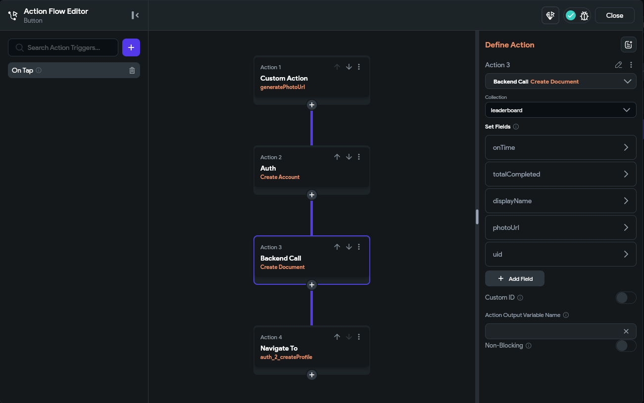
Now, when we create a new user account, we’ll also create an entry for that user in the leaderboard collection.
Of course, we also want to allow the user to update the display name shown in the leaderboard. So, in the editProfile_auth_2 component, we need to update the action attached to the Button widget at the bottom to update that document as well. First, we need to add a Backend Query to the top-level Form widget in this component to get the user’s leaderboard entry so it is accessible in the widget’s state.
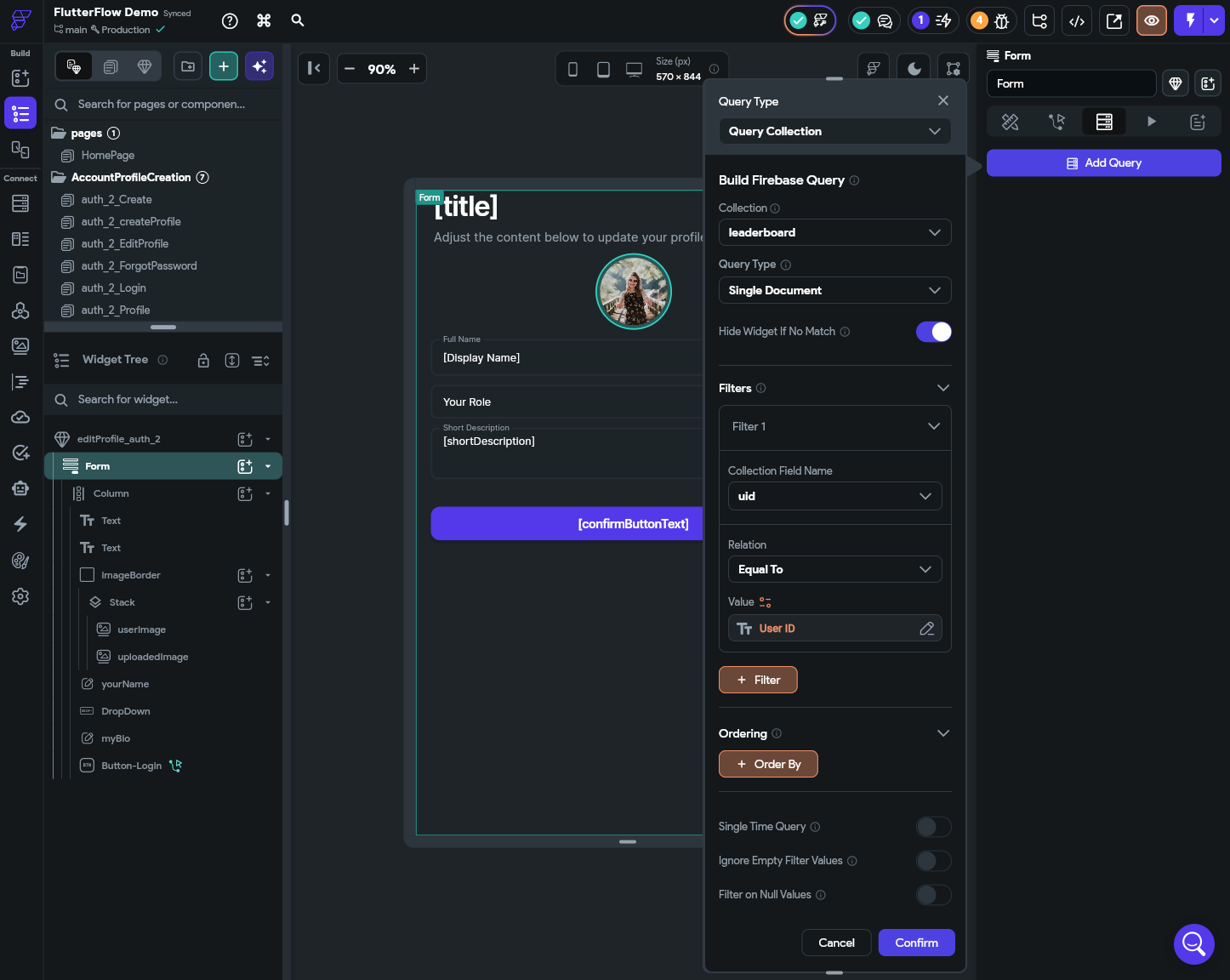
Now, we can use that query result to update the user’s leaderboard entry in the Button widget’s action. For this, we’ll add a new Update Document action below the existing one in the action flow, and update the displayName field in the leaderboard document to match the yourName field’s widget state.
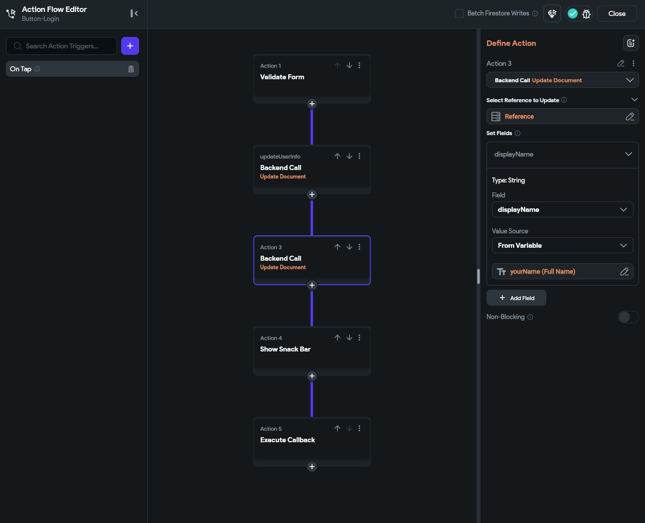
This allows the user to update their name on the leaderboard. Of course, to update their display image, they’ll have to update their entry on Gravatar.
Now for the fun part! Let’s update our process for marking tasks complete to track the statistics in the leaderboard. For this, we’ll once again start by adding a backend query, but this time we’ll add it to the HomePage of our application. This query will again get the user’s document in the leaderboard collection:
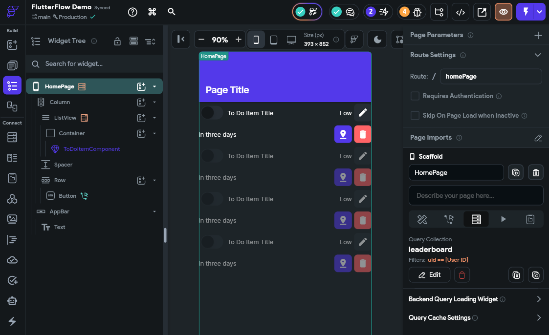
Next, we’ll need to pass that query value to each of our ToDoItemComponent components in the ListView widget. So, we’ll start by defining a new parameter for that widget that accepts the leaderboard document.
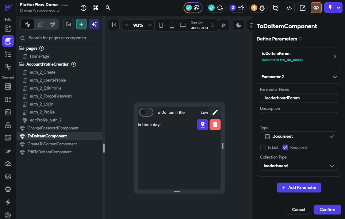
Then, we’ll set that parameter to match the leaderboard document in our HomePage page from the query we just created.
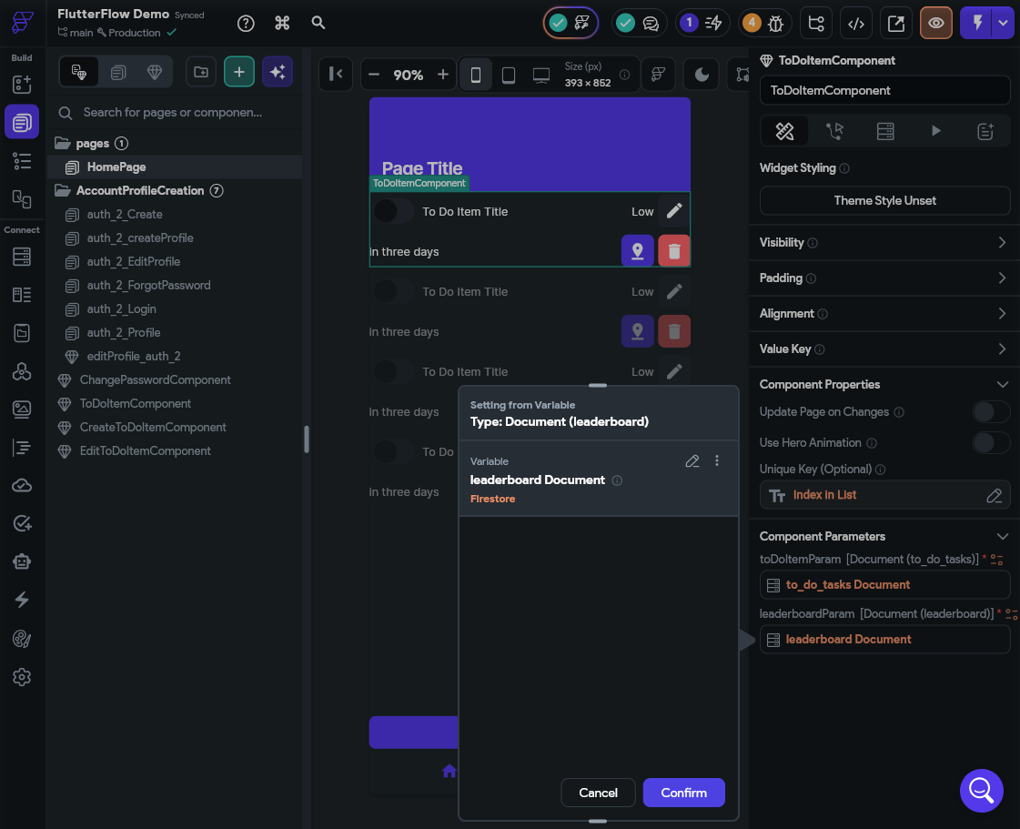
After that, we’ll need to create a quick custom function to help us compare dates. We’ll call this dateIsBefore and set it up with the following settings:
date1 as a Stringdate2 as a StringThe contents of the function will be a simple date comparison:
bool dateIsBefore(
  String date1,
  String date2,
) {
  /// MODIFY CODE ONLY BELOW THIS LINE

  return date1.compareTo(date2) < 0;

  /// MODIFY CODE ONLY ABOVE THIS LINE
}
The final code will look like this:
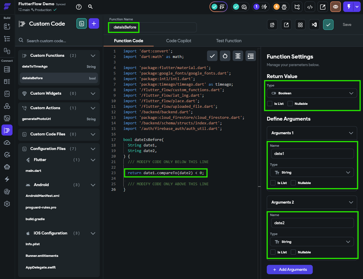
Once created, save the function and check the code to make sure it is valid before continuing.
Now, back on our ToDoItemComponent component, we need to update the logic attached to our Switch widget. For this, we’ll add another action to each of the states.
For the On Toggled On action, we’ll do the following:
totalCompleted field by 1 (in the Value Source, look for an Update option to find Increment)onTime field by 1, otherwise leave it alone.To do this, create a Conditional Value for the increment value, and use the new dateIsBefore function to compare the device’s current time with the dateDue value of the task. If the current time is before that date, then increment by 1. Otherwise, increment by 0 (leaving the value unchanged).
The key here is that we’ll need to do this action before we update the to_do_tasks document, to make sure that our leaderboard is updated before the tasks list is updated.
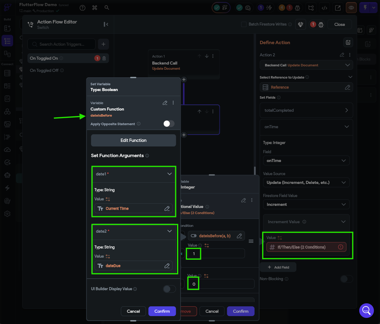
We’ll do something similar for the On Toggled Off action:
totalCompleted field by 1dateCompleted value of the task is less than the dateDue, also decrement the onTime field by 1. Otherwise, leave it alone.Just like before, we’ll need to do this action before we update the to_do_tasks document, since we need to access the dateCompleted field before it is reset. So, when adding this action to the action flow, make sure it comes first.
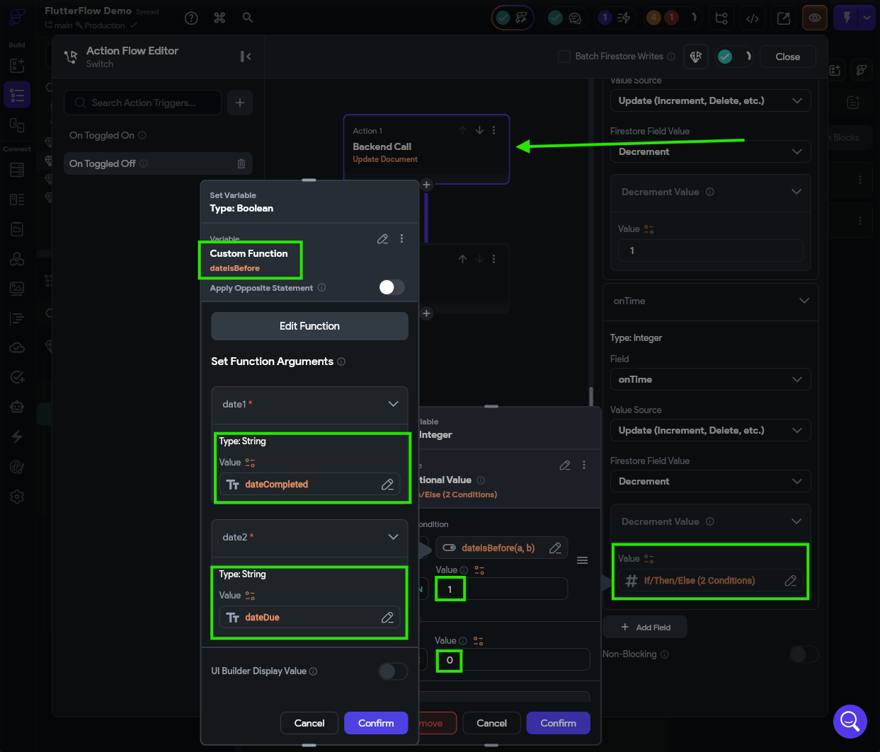
Finally, let’s test this setup in Test Mode to make sure it is working correctly. It may be helpful to also have the Firebase Console open at the same time to see the changes as they are made. Remember that you’ll have to create a new account for this to work!
In fact, now is a good time to completely clear out Firebase, including all accounts and documents, since this is the last major change we’ll be making to our Firebase structure. This gives us a clean slate for future testing.
If everything goes to plan, we should be able to see our leaderboard updating in real time as we complete tasks in our list.
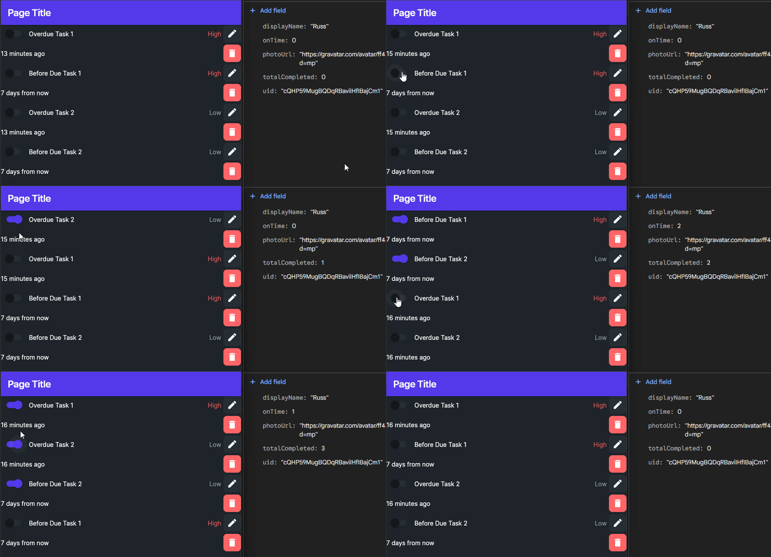
Now all we have to do is create a page to display that leaderboard!
The last step in this process is to create a page to display our leaderboard. This is left as an exercise for you to complete, but here are some basic things you’ll probably need to do:
leaderboard collection and make sure it gets updated each time a task is completed (or marked as incomplete).
leaderboard collection based on the percentage of tasks completed on time.A final, working design for this page might look like what is shown below:
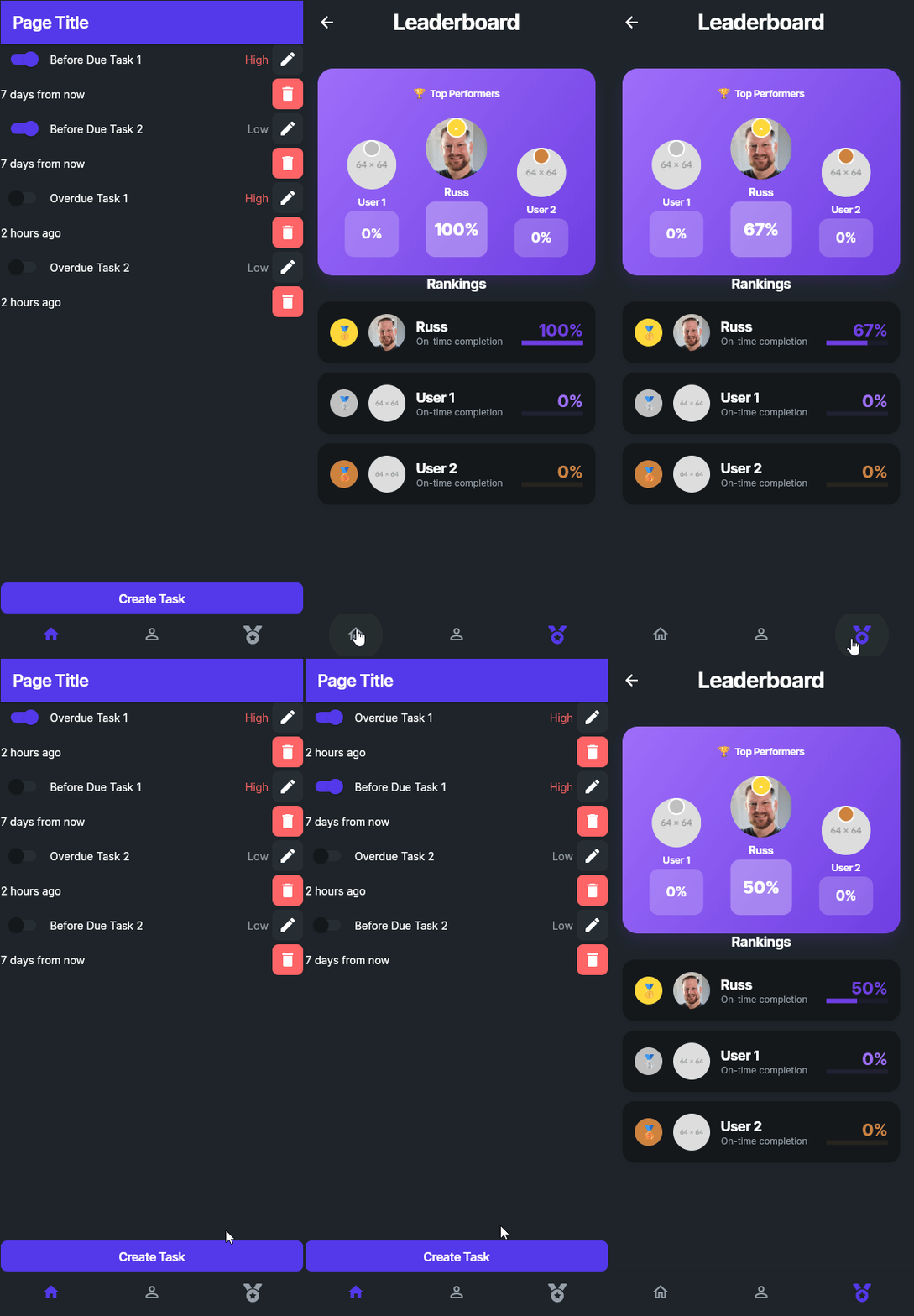
Finally, we have completed all of the features in our original feature list for this application:
At this point, we have implemented a large number of the features we wanted to include in our application:
There are still lots of design elements we can update and personalize to make this app our own, and there is still plenty of room for additional testing before preparing this application for release. In the next part of this tutorial, we’ll add one other important feature to our application and prepare it for deployment.
Another very useful feature we may want to include in our application is the ability to query data directly from a web API and include that in our application. So, let’s look at the basic process of adding an API call to our application.
Recall our discussion from earlier in this tutorial about the security concerns that are inherent in building a mobile application that is installed on user’s devices. Anything contained in the application is potentially visible to the user, and this includes any API keys used within the application itself. An API key is how users are identified when they access a paid API service, such as a weather data service or an AI chat service.
For example, consider a situation where you want users of your application to talk with an AI chat service. To enable this, you as the developer sign up for an API key to access the AI service, and then use that API key within your application. Each message sent to the AI chat service involves some cost paid by you, but you are able to offset that by payments from your users who use the application. However, one user decides to take apart your application and finds your API key - now they can send unlimited message to the AI chat service, and you’ll be the one stuck paying the bill!
To avoid this, you must either embed your API key in a cloud function (either one hosted on Firebase or elsewhere), or build a back-end service for your application that contains your secure API key and other information. Either way, your app must talk to another service that includes the API key so that the API key isn’t part of the app itself. Building such a system is outside of the scope of this tutorial, but FlutterFlow does include some options for routing API calls through a secure cloud function if that is available to you in a paid Firebase plan.
For this tutorial, we will only use free APIs that don’t require an API key.
There are many lists of APIs available on the web. One notable list is the Public APIs list hosted on GitHub. It contains a long list of free, publicly available APIs, many of which don’t require any API keys at all.
For this example, we’ll use the random quotes API provided by ZenQuotes.io. They provide many examples of retrieving a quote in the ZenQuotes Documentation, but for this example we’ll just use their random quote generator, available at this URL: https://zenquotes.io/api/random
A response from that URL has this structure:
[
  {
    "q": "Tis not too late to seek a newer world.",
    "a": "Heraclitus",
    "h": "\u003Cblockquote\u003E“Tis not too late to seek a newer world.” — \u003Cfooter\u003EHeraclitus\u003C/footer\u003E\u003C/blockquote\u003E"
  }
]
The response consists of a list containing a single object with 3 attributes:
q - the raw text of the quotea - the attributed author of the quoteh - a pre-formatted HTML snippet containing the quote and the authorAs we can see, this is a very simple but useful structure we can use in our application. So, let’s add it to FlutterFlow.
To add an API call, go to the API Calls page found in the Navigation Bar, then click the Add button at the top to add a new API call.
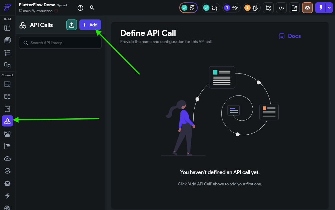
On the Call Definition section, we’ll give the API call a name and add the URL. Since we don’t need to add any parameters or headers, we’ll leave the rest blank for now.
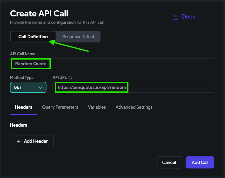
Then, on the Response & Test section, we can click the Test API Call button to test our API and receive a response.
Below, we can also add some JSON paths to our API to make it easier to find certain parts of the response in our application. Let’s just add the three suggested paths for this example.
Once we add them to the list, we can give them useful names such as quote, author, and html.
Finally, we can click the Add Call button at the bottom to save our API call in our application.
Now, we can use our API call in our application. For this example, we’ll create a new simple page using the AI page generator to display our quote as well. For our example, we used the following prompt:
Create a simple page to display an inspirational quote. It should have text widgets for the quote text as well as the attributed author on a simple background.
We ended up with this page with a very simple layout:
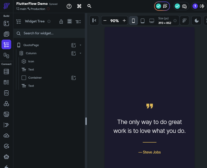
To use this page, we must first add our API call to the page itself. This can be done on the Backend Query tab, and this time selecting an API Call as the query type.
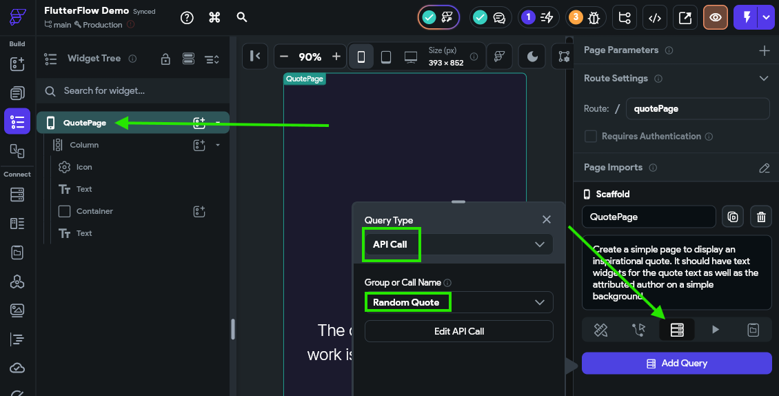
Once that is done, we can set the text for each Text widget to the results of the API call:
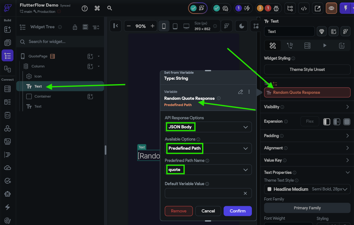
That’s really all there is to it! For testing, we’ll add this page to our nav bar so it is accessible. Then, we can load our application in Test Mode to see it in action!
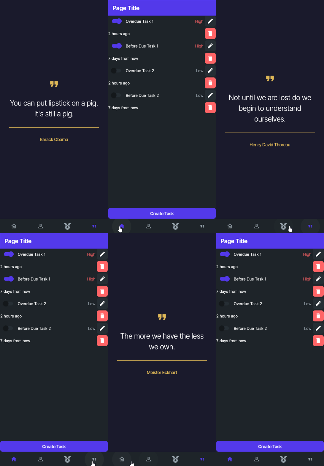
Each time we reach the quotes page, it will pull a new quote from the API.
As we can see, using an API in our application is very straightforward. Here are just a few things you could use APIs for in your application:
The possibilities are endless! Just make sure you protect your API key for any paid APIs as discussed above.
The last step in this journey is to release your project to the world!
First, you’ll probably want to test your application and make sure it is ready for deployment. FlutterFlow has a great place to start:
Once you are ready, you can publish your application on various platforms. The FlutterFlow documentation includes detailed guides for each platform:
You can also connect your project to GitHub and deploy from there:
Happy coding!