Elements
Once we’ve created a window, a panel, and selected our layout manager, we can finally start to add elements to our GUI. This page will list some of the common GUI elements that we can choose, and describe how they can be used best in our applications. Where possible, we’ll also link to official documentation and some tutorial resources so we can learn how to use each of these in our programs. Refer to the links for screenshots and examples of how each of these elements can be used in our programs. Examples below are taken from the TkDocs documentation site.
Panel

A panel is the container element in the GUI. It usually doesn’t appear to have any graphical component, though it can be styled as shown in the screenshot above. Other elements are typically added to a panel, which uses a layout manager to determine how the elements are placed within the panel.
Label
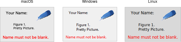
A label is simply a piece of text added to the GUI that is not editable by the user. They are typically used to provide information to the user or “label” other controls, such as text boxes.
Single Line Text Input
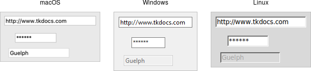
- Java: JTextField (Tutorial)
- Python: Entry (Tutorial)
These controls are used for a single line of text input, such as a username or password field.
Multiple Line Text Input
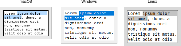
These controls handle multiple lines of text input, such as in a word processing program.
Button
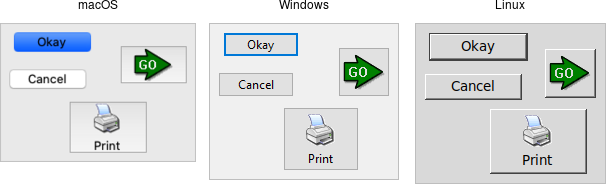
A button is one of the simplest controls. When a user clicks on a button in our GUI, we can then call a function in our code to perform any action required.
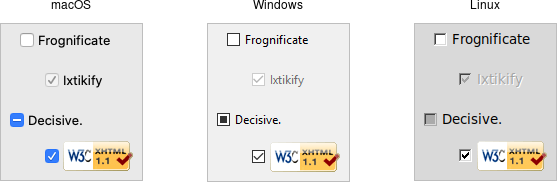
Checkbox
- Java JCheckBox (Tutorial)
- Python Checkbutton (Tutorial)
A checkbox, sometimes referred to as a toggle, allows the user to manipulate a boolean value, such as “on” and “off” by clicking it. Checkboxes typically include their own text label, and don’t need to have a separate label added to them.
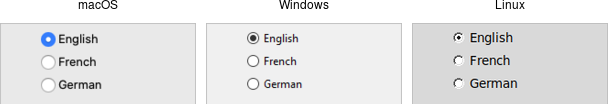
Radio Button
- Java JRadioButton (Tutorial)
- Python Radiobutton (Tutorial)
A radio button is part of a set of buttons that are similar to checkboxes, but only one option can be selected at a time. The name comes from old radios that had a set of buttons that could be used to recall stations, and pressing one button would cause any other button pressed to pop back out, such that only one button could be pressed at a time.
List Box
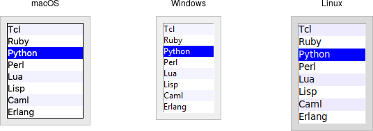
A list box displays a list of options to the user, and then the user can choose one or more options from the list, depending on how it is configured.
Combo Box
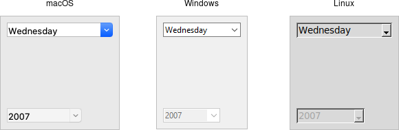
A combo box, sometimes referred to as a drop-down menu, allows a user to select a single option from a list of options, or possibly enter their own option. It is really a combination of a list box and a text input field in one, hence why it is called a “combo” box.