Responsive Design Exercise
Responsive Design Exercise
Fitting the Screen
Fitting the Screen
The @media rule was originally introduced in CSS version 2. It was used to differentiate between different kinds of devices, i.e. a computer screen, printer, etc. Only the print type saw broad adoption, but it remains useful. Let’s see how we can use it.
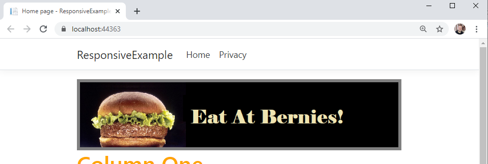
If we look at our Pages/Index.cshtml page, we can find an <aside> element that contains a banner advertisement for Bernie’s. The <aside> element is a semantic element - one that implies a specific meaning for what it contains. The meaning it implies is something ’extra’ to the page that isn’t part of its main thrust - in this case, an advertisement.
Beyond implying a meaning, it’s equivalent to a <div> element, it is simply a block-level element that divides up the page and can be used to attach CSS rules.
Let’s assume that we don’t want this to appear on the page when we print it. Let’s add a class of "advertisement" to it:
<aside class="advertisement">
    <img src="~/img/ad.png" alt="Eat at Bernies!"/>
</aside>
And in our wwwroot/css/site.css, let’s create an @media rule for printing:
@media print {
    .advertisement {
        display: none;
    }
}
Any CSS enclosed in the curly braces following @media print will only be applied when the page is printed. In that case, we set any element wit the class advertisement to not display. Try running the program, and in the browser, select print preview.
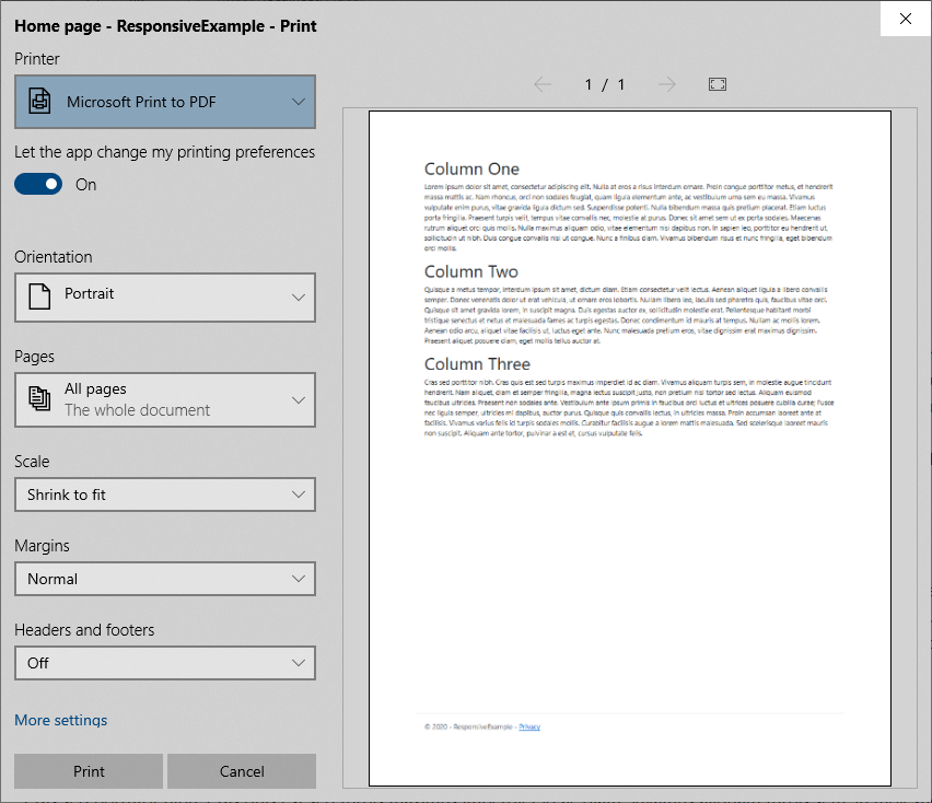
The advertisement does not appear! But it still shows up in the browser.
This simple technique can be used to easily create printer-friendly versions of your webpage by changing colors to gray tones, replacing fonts, and removing elements that will require a lot of in to print.
But the media @ rule is also the basis for an even more powerful mechanism, media queries, which we’ll look at next.
In CSS3, the @media rule was extended to include the concept of media queries, a technique that allows us to conditionally apply CSS rules using a broader range of values. Some of the most commonly used are:
Media queries are primarily used to enable responsive design, which refers to your page re-arranging itself for display on different devices.
A media query expands the @media rule that we used previously. It consists of the @media keyword followed by an optional media type (all, print, screen, or speech), and then any media features we want to query for within parenthesis.
Let’s start with a simple example. Let’s change the color of our h1 elements based on the orientation of the screen. Add these two rules to your wwwroot/css/site.css:
@media (orientation: landscape) {
    h1 { color: green; }
}

@media (orientation: portrait) {
    h1 { color: orange; }
}
Now if you run your server, the <h1> elements will probably be green. Resize your window until it is taller than it is wide, and they will turn orange.
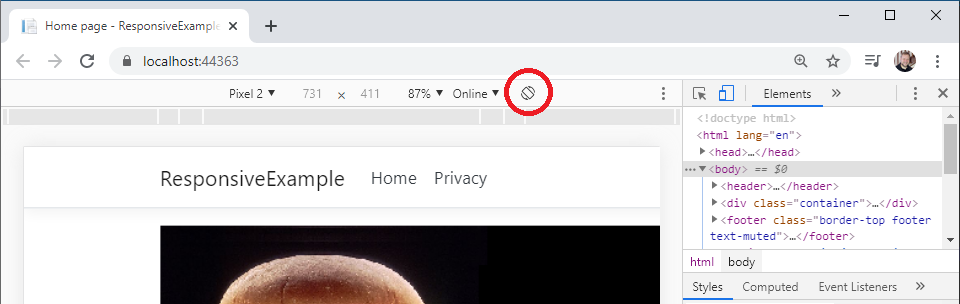
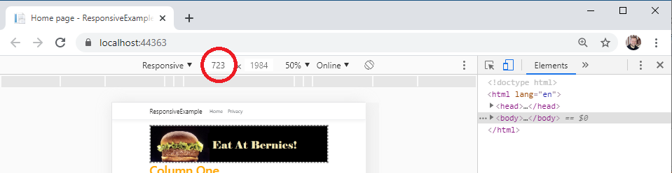
While we can definitely stretch our browser window to try different sizes, there are far better tools available. Let’s see how Chrome’s Developer Tools can make our lives as a developer easier.
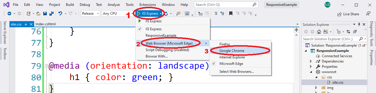
First, set Visual Studio to use Chrome as the browser it launches your website with. From the build target dropdown, select the ‘Web Browser’ option, and select ‘Google Chrome’:
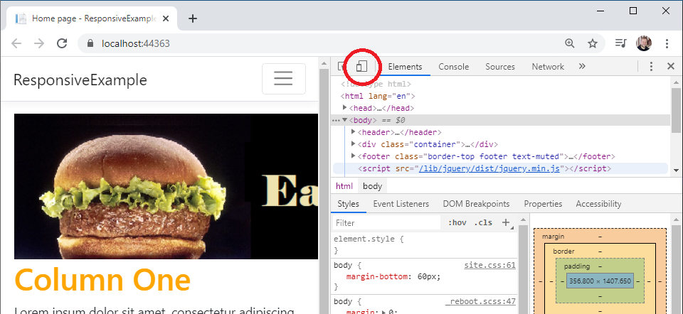
Now run your program. When Chrome loads, turn on developer tools by either pressing CTRL + SHIFT + I or right-clicking on the page and selecting ‘Inspect’. This launches the developer tools in thier own pane in the window. At the top of the developer pane is an icon that resembles a cellphone in front of a screen.
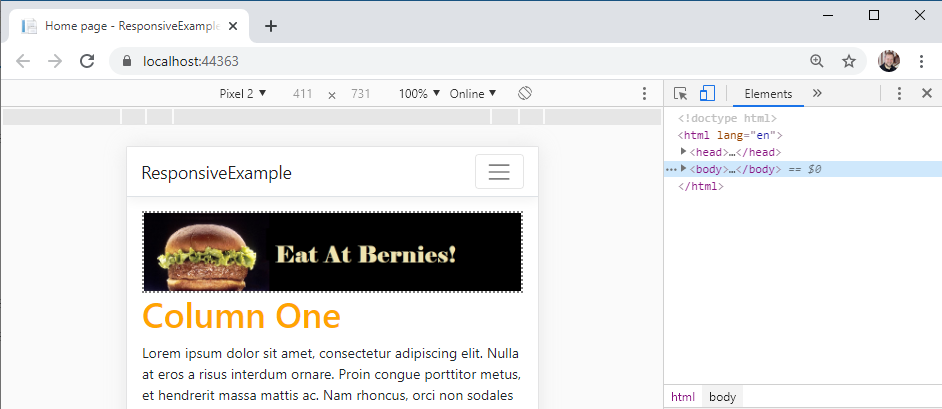
Clicking it will toggle the device toolbar, which allows you to emulate different devices, choosing from several common phones and tables, or use the ‘responsive’ category to set a custom size:
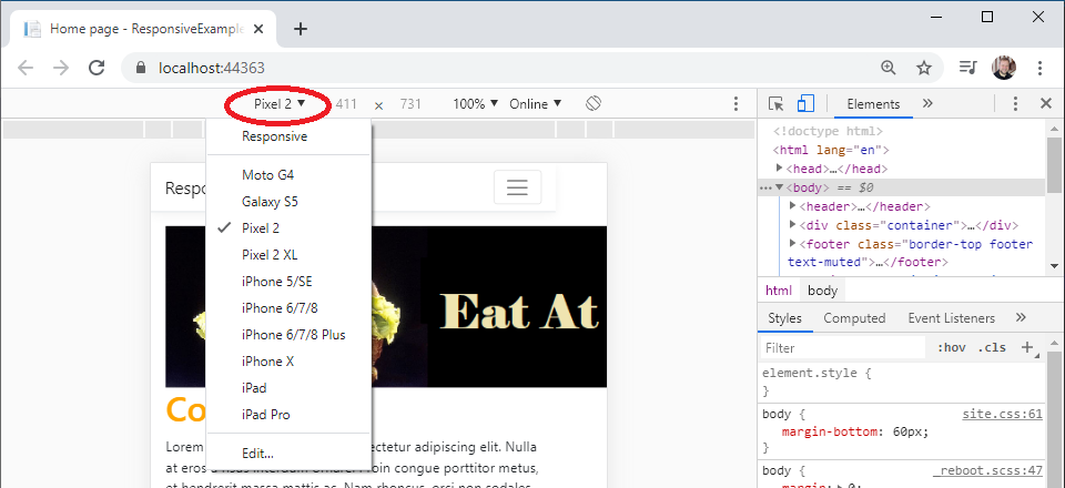
In addition, you can change the orientation of the device with the rotate button:
Try selecting a mobile phone and then using the rotate button to change the orientation. Watch how your <h1> elements change color!
Next we’ll look at how we use media queries in responsive design.
Developer tools are actually a part of all modern web browsers, so if you prefer to use a different browser you can learn its tools instead. Here are links to the documentation for the major browsers:
Now that we have seen the concept of responsive breakpoints, let’s put them to use creating a layout for our web page. Currently we have three <div> elements, each with a header and placeholder text. We’d like to arrange these into a row of three columns if the screen is large enough, and collapse them into a single column on smaller screens, such as a mobile phone.
We’re going to explore several strategies for accomplishing this. First, we’ll look at float-based layouts. This is an older strategy for creating columns, and it is based on the float css property which is traditionally used to float images and figures to the right or left of a body of text.
We can instead leverage it to create columns by setting each <div> we intend to behave as a column to have a float: left; property. This makes each column float to the left of the one after it. Let’s give it a try.
First, in your Pages/Index.cshtml, we’ll add a class to the outermost div, just under the <aside> we manipulated previously:
<aside class="advertisement">
    <img src="~/img/ad.png" alt="Eat at Bernies!"/>
</aside>
<div class="float-columns">
    <div>
        <h1>Column One</h1>
        ...
Then we’ll add setting the float property in our wwwroot/css/site.css:
.float-columns > div {
    float: left;
    width: 33%;
}
We use the child selection operator > to apply the css rules to all <div> elements that are a direct child of the <div> we gave the class of float-columns to. We’ll make each of those children <div> elements behave like columns by making them float to the left of the column declared after them, and set them each to be roughly 1/3 the width of the page with width: 33%.
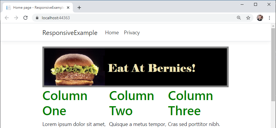
If we run the page now, we’ll see that we have our columns:
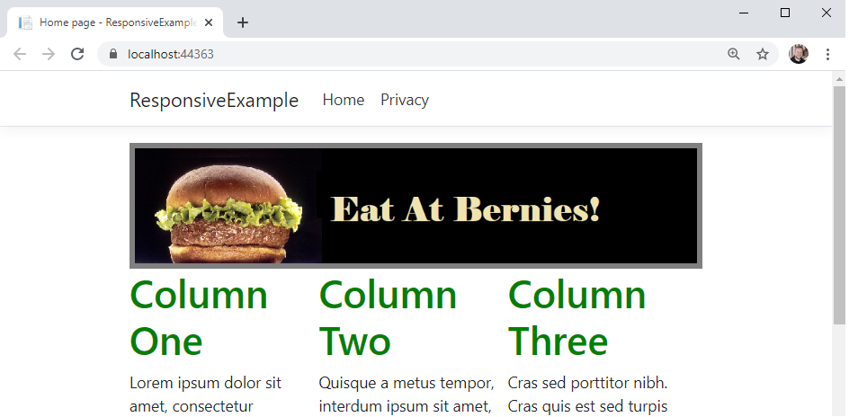
But when you scroll down, you’ll also see a problem:
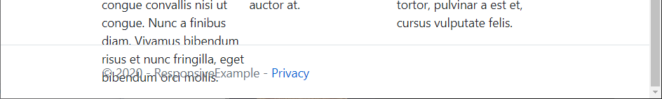
Because the use of float takes elements out of the usual flow layout algorithm, the elements that follow them often end up in unexpected positions. We have to explicitly turn the normal flow layout back on when we’re done with our floating elements with a clear property, which can be left, right, or both.
This normally is done by adding an empty div with the clear: both rule applied after the last column; a technique called a clearfix. Let’s go ahead and declare our clearfix class in wwwroot/css/site.css:
.clearfix {
    clear: both;
}
And then in our Pages/Index.cshtml, we’ll add a <div> element with that class, just after our containing <div> (it will be the last element in the file):
<div class="clearfix"></div>
Now when we render the page, we’ll see the columns behave as expected:
!The float error fixed](/images/3.3.5.3.png)
However, our page is not responsive at this point. So we’ll need to add a media query to establish a responsive breakpoint for smaller screens. Let’s use 490 pixels as our breakpoint. We’ll need to add this new rule below the ones we created for our .float-columns in wwwroot/css/site.css, as we will be overriding those when the media query is true:
@media (max-width: 490px) {
    /* Reset the columns to render with the flow of the page */
    .float-columns > div {
        float: none;
        width: 100%;
    }
}
We simply reverse the rules we applied to the columns by setting the properties back to their defaults. Now the columns will change to their stacked appearance when we look at the site on a smaller screen.
In web development, Responsive Design means making your webpages adjust to the device they are displayed on. This is especially important today, where a user might be browsing the web from a desktop, a tablet, a phone, or even a console built into a refrigerator, a car, or an airplane seat!
Before we go farther, there are a couple of concepts we need to understand. The first is the device width and device height, which are the actual size of the device’s screen. Next is the viewport, which is the area of the screen that the web browser actually gets to render into, and has its own width and height. The viewport width and height can be smaller than the device width and height, as is the case when the browser is displayed in a window that is not maximized. In that case, only the area of the browser window (less the toolbars) is the viewport.
A viewport can also be larger than the device width and height. When mobile phones first started allowing users to browse the web, they had tiny screens. Phone manufacturers had to decide how to display webpages that were never designed for these devices. They settled on an approach of setting the viewport to a size consistent with computer monitors of the day, and then scaling the entire page down to fit onto the actual screen. The result was you could see the entire webpage, but it was tiny.
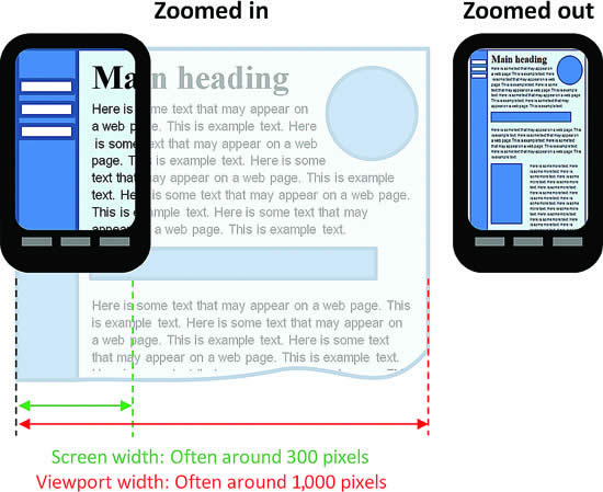
This remains the default behavior of mobile browsers to this day - and because the viewport is not aligned with the device size, media queries targeting the viewport also do not correctly account for device size.
However, this can be overridden through the use of a <meta> element. The <meta> element must be placed in the <head> of a webpage, and applies some kind of metadata to the webpage. Historically, it was used to supply key words to search engines, but this practice was routinely abused and search engines have ceased to rely on it. However, other kinds of metadata can be added with a <meta> element, and one of the most important for responsive design overrides the default viewport settings. Thus, a responsive webpage should always declare the following <meta> tag:
<meta name="viewport" content="width=device-width, initial-scale=1">
This tells the browser to set the width of the viewport to the width of the device, and to not scale the final rendering of the webpage (scale is on a range of 0 to 1, where 1 is 100%). This ensures that the viewport and the device sizes are the same.
If you look in your project’s _Pages/Shared/Layout.cshtml file, you will notice that this <meta> tag is already defined. In fact, it is included as biolerplate in all ASP.NET projects genreated by Visual Studio that include Razor pages. But if you find yourself writing pages from scratch that you want to be responsive, you’ll need to add this. You can read more about it on MDN.
Once we know our viewport is set up to be the same size as our device, we can turn our attention to using media queries to respond to different widths of screens. For example, we can define all the CSS rules we would normally use, and then a media query that would limit those for a smaller screen - say under 750 pixels. Let’s try this out by adding a border to our aside, and changing its apperance in a smaller screen:
aside { border: 5px solid gray; }

@media (max-width: 750px) {
    /* applies when the screen is under 750 pixels wide */
    aside { border: 3px dashed gray; }
}
Now when the viewport is wider than 750 pixels, you’ll see a solid gray border around the banner ad:
And if you size down your viewport, you’ll see that banner go to a smaller dashed gray:
We can extend this approach by adding another media query for even smaller screens, say those under 490 pixels:
@media (max-width: 490px) {
    /* applies when the screen is under 490 pixels wide */
    aside { border: 2px dotted gray; }
}
As this rule is declared after the first two border rules, it will override them both, replacing the values for the border (note, any previously declared rules that have not been overridden will continue to apply). Now if you size your screen even smaller:

This strategy of using successively smaller media queries to override CSS styles at different screen widths is known as responsive breakpoints, because at those widths you specify, the appearance of your page changes.
It is a good idea to have the starting point of your page (when no media queries are applied) be a normal desktop resolution so that your site appears normal in very old browsers.
Now, the float-based layout is really a bit of a hack, as the intent of the float property is really for the embedding of images and callouts to the sides of text content. Unfortunately, floats and tables were the only mechanisms in earlier versions of CSS to allow for more nuanced layouts.
However, that has changed with CSS3, which has introduced several new layout algorithms to supplement the traditional flow and table ones. One of these is flexbox, which we will explore now.
Flexbox provides an alternative means for laying out HTML elements within a containing element. You set the containing element’s display property to flex, and choose a flex-direction (row, column, row-reverse, or column-reverse).
It is very easy to set up our three-column layout with flexbox. Let’s do so now.
First, we’ll change the class we are applying to our containing div element in Pages/Index.cshtml. Let’s use "flex-columns" instead of our previous "float-columns":
<aside class="advertisement">
    <img src="~/img/ad.png" alt="Eat at Bernies!"/>
</aside>
<div class="flex-columns">
    <div>
        <h1>Column One</h1>
        ...
We can then add additional CSS rules to our wwwroot/css/site.css to apply the flex layout:
.flex-columns {
    display: flex;
    flex-direction: row;
}
Now if we run our program and look at our page, we’ll see that the flex algorithm has automatically arranged the children <div> elements into three equally-sized columns for us!
Moreover, if we were to add or remove columns, the layout would automatically change to keep them balanced. You can also apply a number of additional properties to provide more fine-grained control of the layout; the CSS Tricks A Complete Guide to Flexbox offers a great guide to the details.
Now to make our layout responsive, we just need to switch the direction of our container:
@media (max-width: 490px) {
    .flex-columns {
        flex-direction: column;
    }
}
Now when we view our page on a smaller screen, it will use columns instead of rows!
We also no longer need to bother with a clearfix <div>, though leaving the one we created in the prior example in place won’t cause any problems.
TODO: float based responsive layouts
TODO: float based responsive layouts